


Previously known as George and Jo’s, consumer research revealed a significant mistrust in the brand. The names ‘George’ and ‘Jo’, along with their illustrative representations on the packaging, were fictional characters created to represent the collective of farmers who raised the chickens. However, consumers were sceptical; they questioned the credibility of the brand’s claims of being 100% antibiotic-free and free-range if the characters themselves were fabricated.
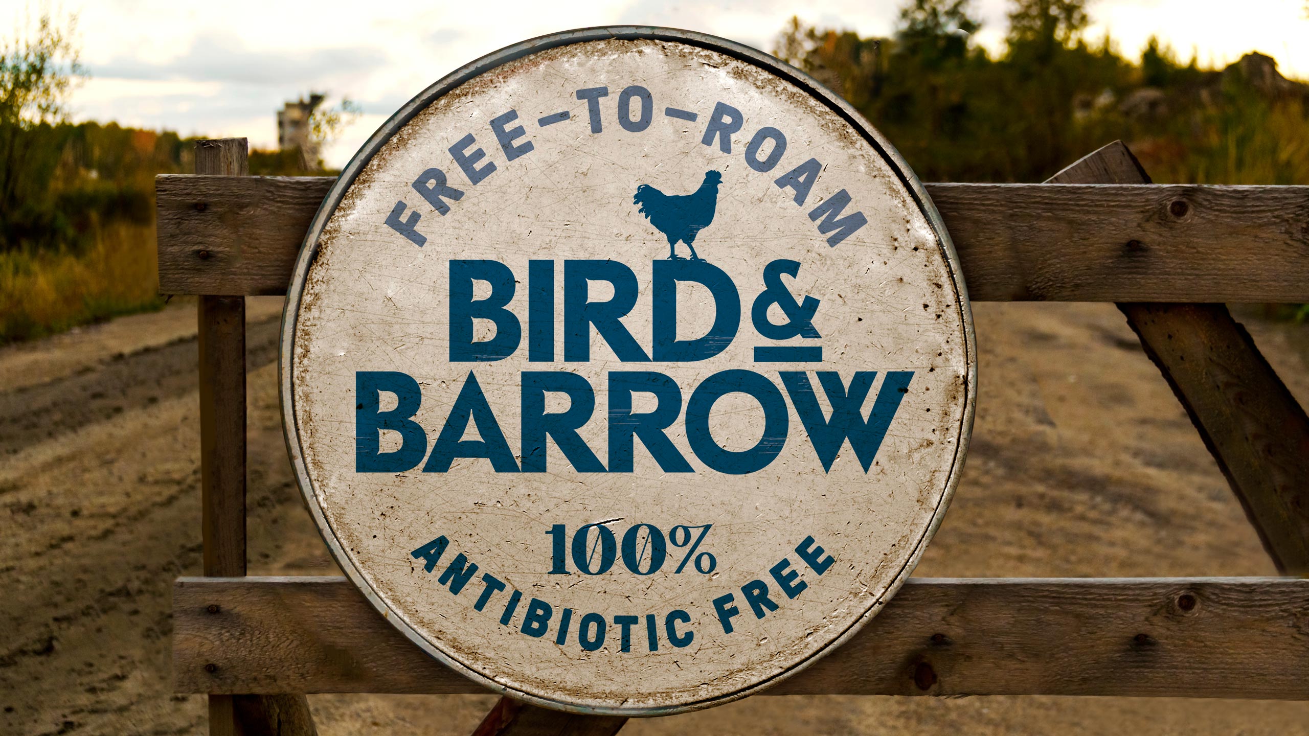
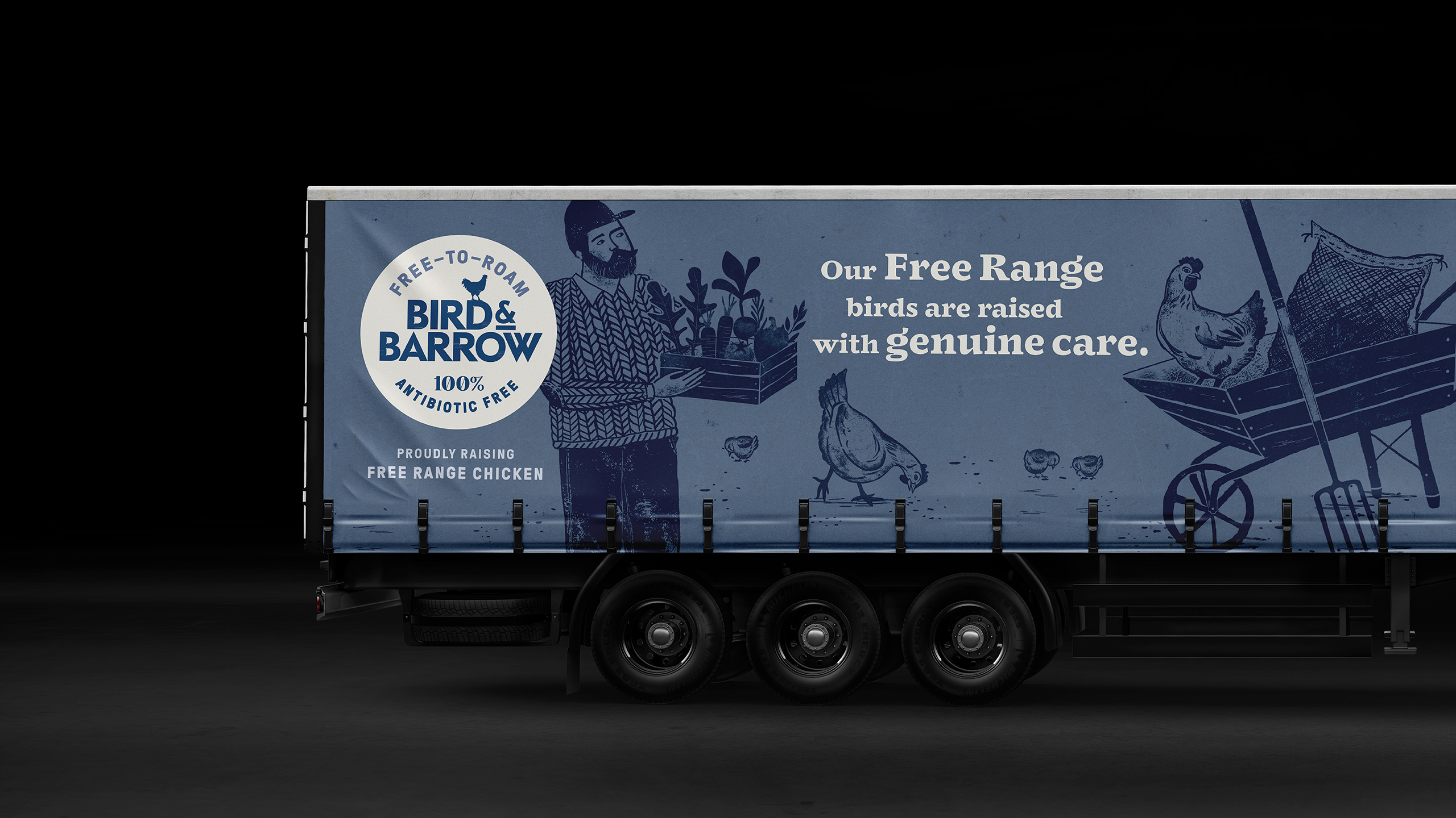
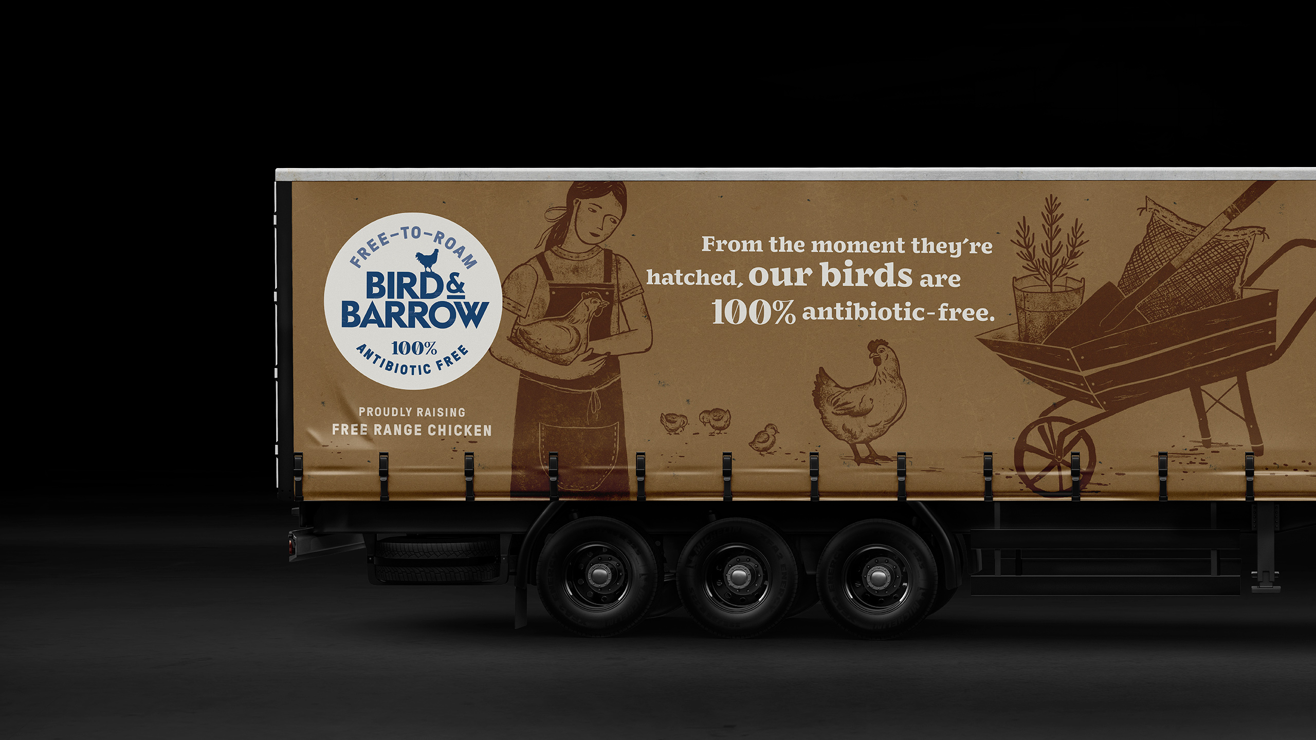
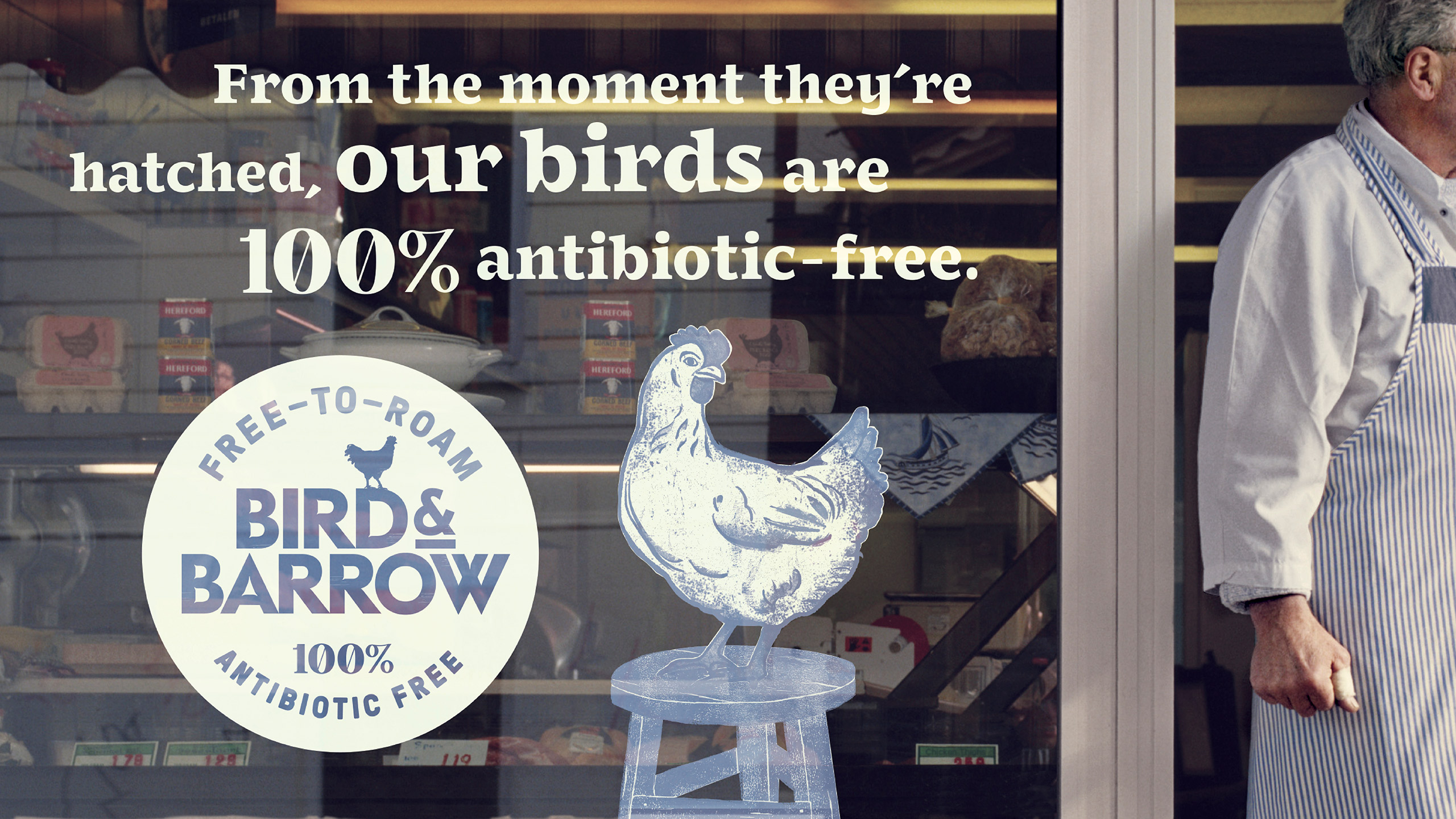
To address this issue, we developed a new brand platform and name: ‘Bird & Barrow Free Range, 100% Antibiotic Free Chicken’. This new identity was designed to clearly communicate the unique qualities of the chicken, emphasising the hard work of the farmers, their respect for the environment, and their genuine care in producing chicken that consumers can trust for their families.
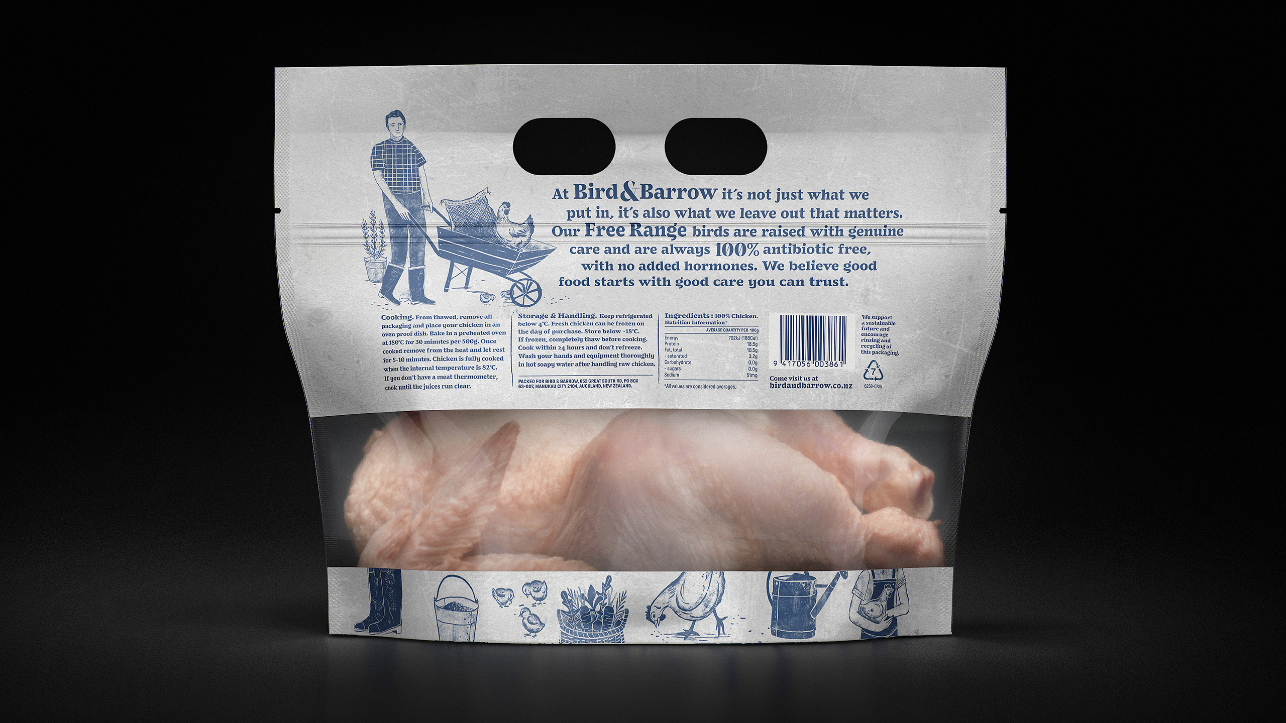
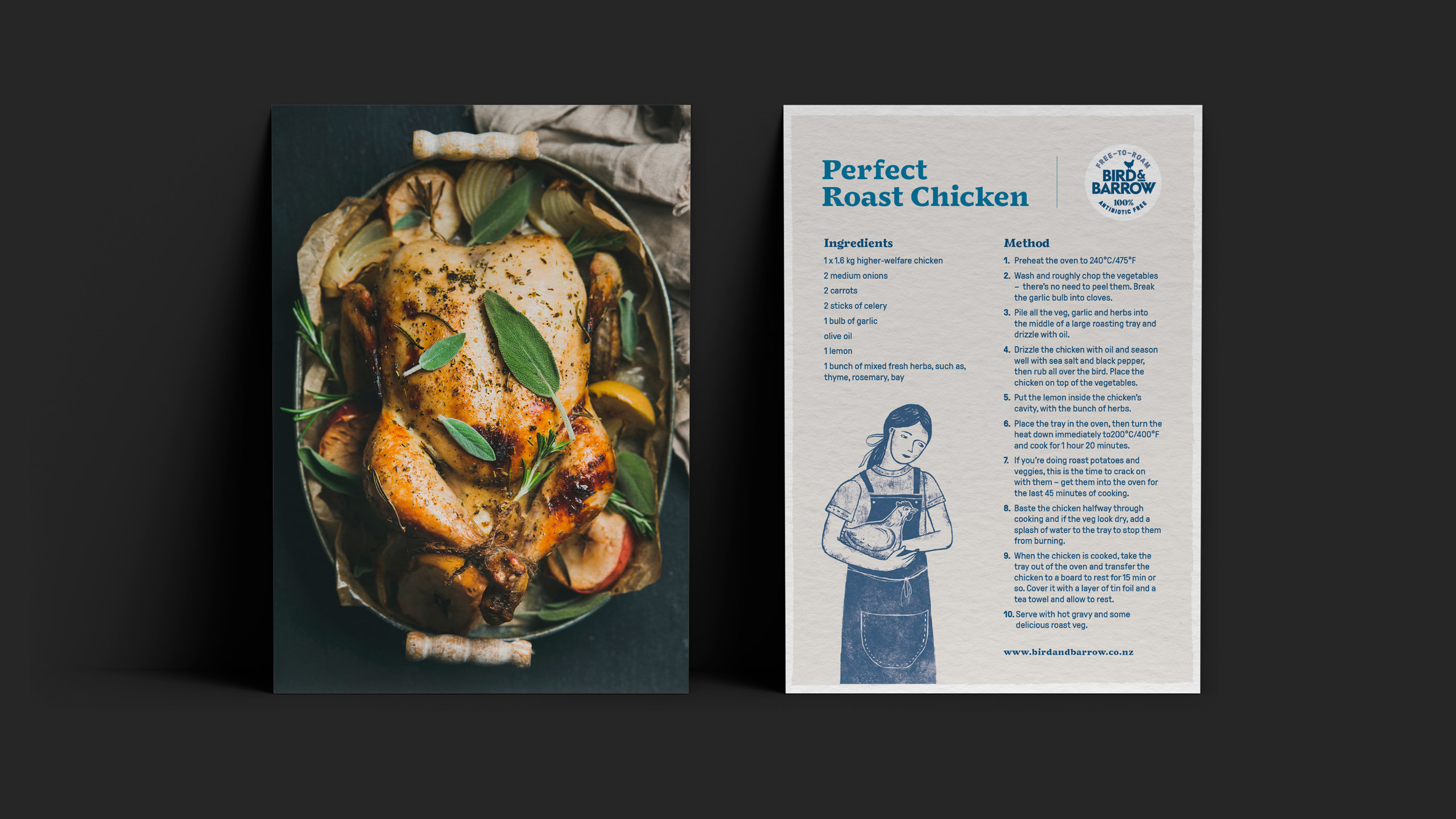
We believe in transparency and share your concerns about the food we eat. Knowing the origin and treatment of our food from farm to fork is crucial. Bird & Barrow farmers are dedicated to a higher level of care, ensuring that they provide truly good Free Range Plus 100% Antibiotic Free chicken. Their commitment is evident in every step of their process, from the humane treatment of the chickens to maintaining stringent standards of care and control.
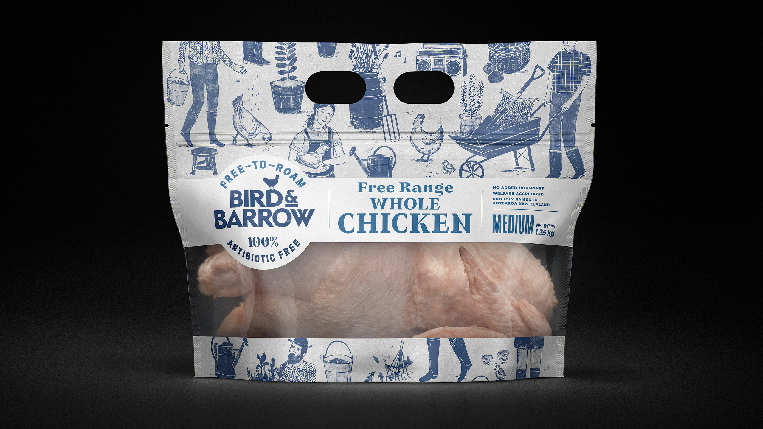
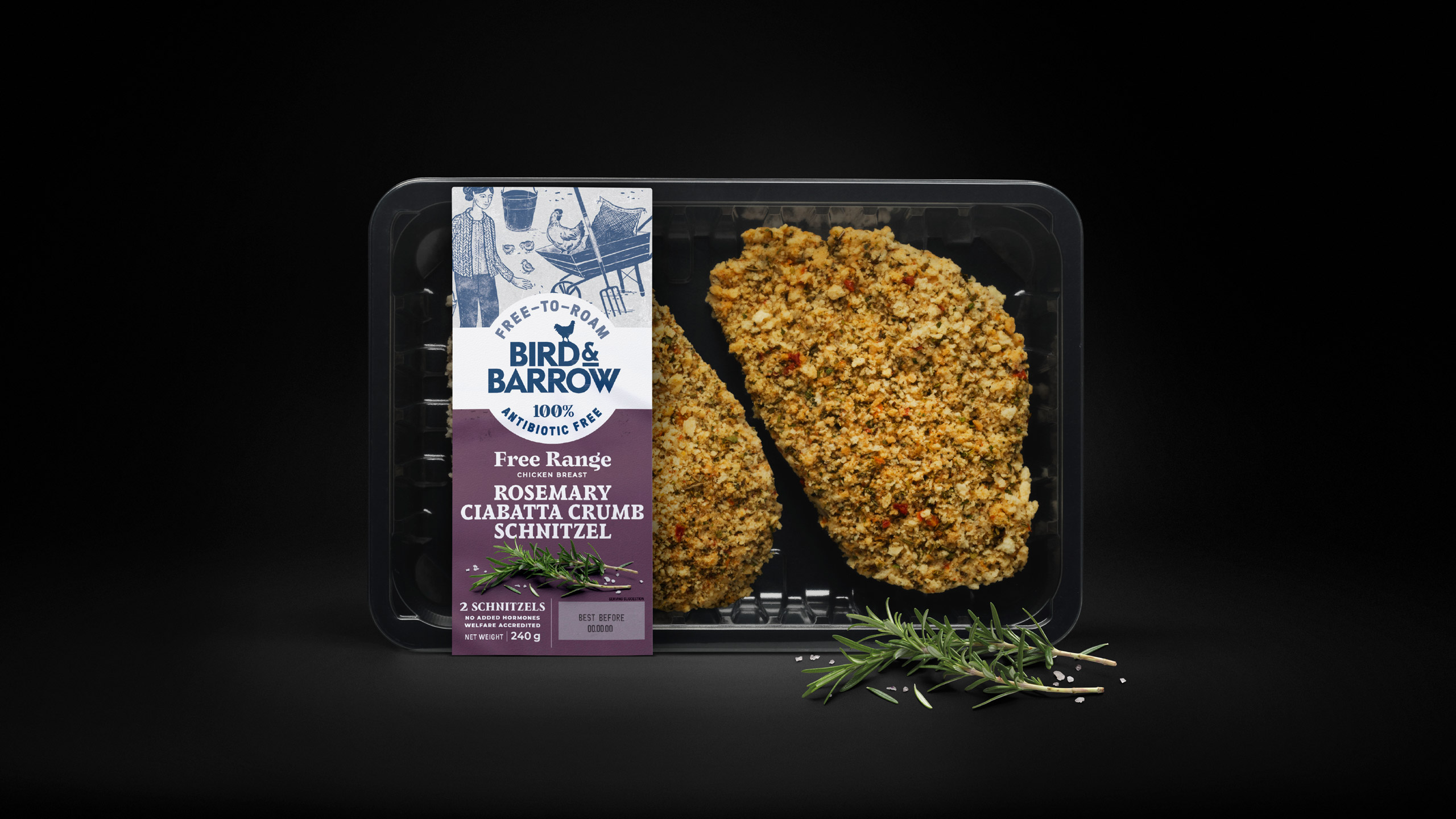
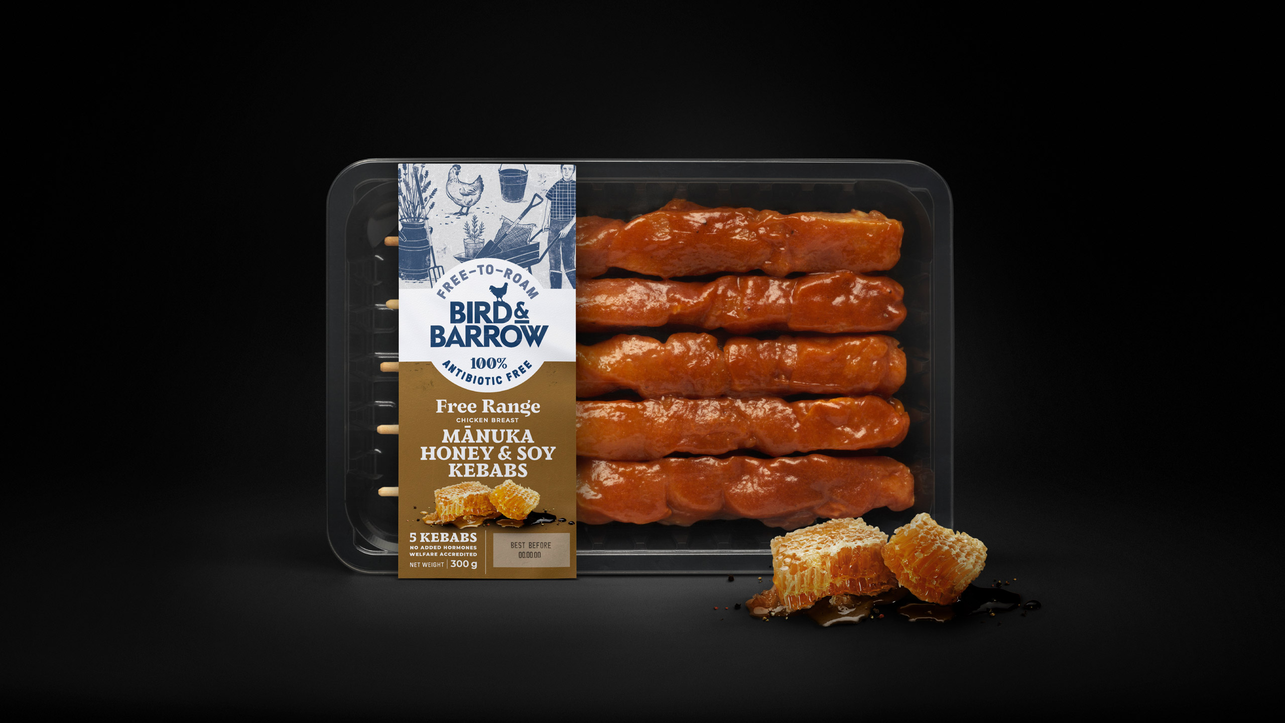
In a market saturated with green packaging, Bird & Barrow’s distinctive blue packaging stands out, capturing attention on the supermarket shelf. The charming illustrations on the packaging vividly depict the story of the high standards of care, control, protection, and freedom that allow these chickens to be antibiotic-free. Every detail, down to the radios played to keep the chickens entertained, highlights the exceptional care taken to ensure their well-being.
This new brand identity not only differentiates Bird & Barrow from its competitors but also builds consumer trust by providing a transparent and authentic narrative. The focus on the farmers’ dedication and the meticulous care they take in raising the chickens reinforces the brand’s commitment to quality and ethical practices. Bird & Barrow is not just a name; it represents a promise of integrity, sustainability, and excellence in producing chicken you can confidently serve to your family.
CREDIT
- Agency/Creative: Tried & True Design
- Article Title: Tried & True Design’s Authentic Branding and Packaging for Bird & Barrow Antibiotic-Free Chicken
- Organisation/Entity: Agency
- Project Type: Packaging
- Project Status: Published
- Agency/Creative Country: New Zealand
- Agency/Creative City: Auckland
- Market Region: Oceania
- Project Deliverables: Brand Identity, Branding, Design, Graphic Design, Illustration, Logo Design, Packaging Design, Rebranding, Typography
- Format: Bag, Sleeve, Tray
- Industry: Food/Beverage
- Keywords: chicken illustration design packaging
-
Credits:
Creative Team: Tried&True Design


