How I packaged a South African icon for the European Market.
Sunbird Rooibos is the first company to sell organically grown single-origin Rooibos, and it is introducing this uniquely South African product to international markets. Their mission is to transform Rooibos’s image from a humble South African household staple to a premium internationally recognised beverage.
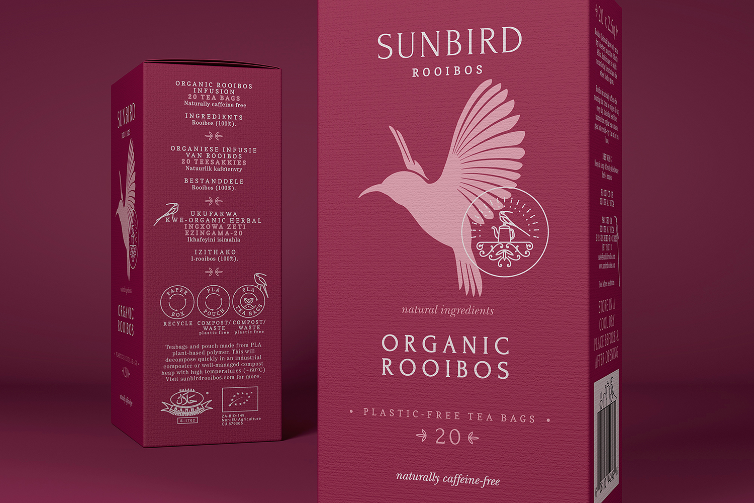
Sunbird Rooibos wanted a more relaxed packaging and design concept for their European / Scandinavian branding. The packaging needed to communicate this relaxed feel while reflecting its price point. The product for the European market is price-sensitive, so the packaging has to reflect quality and value.
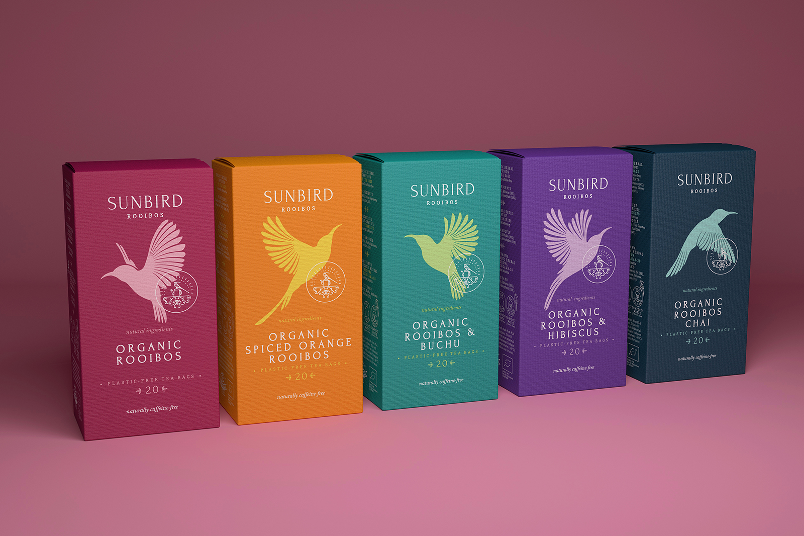
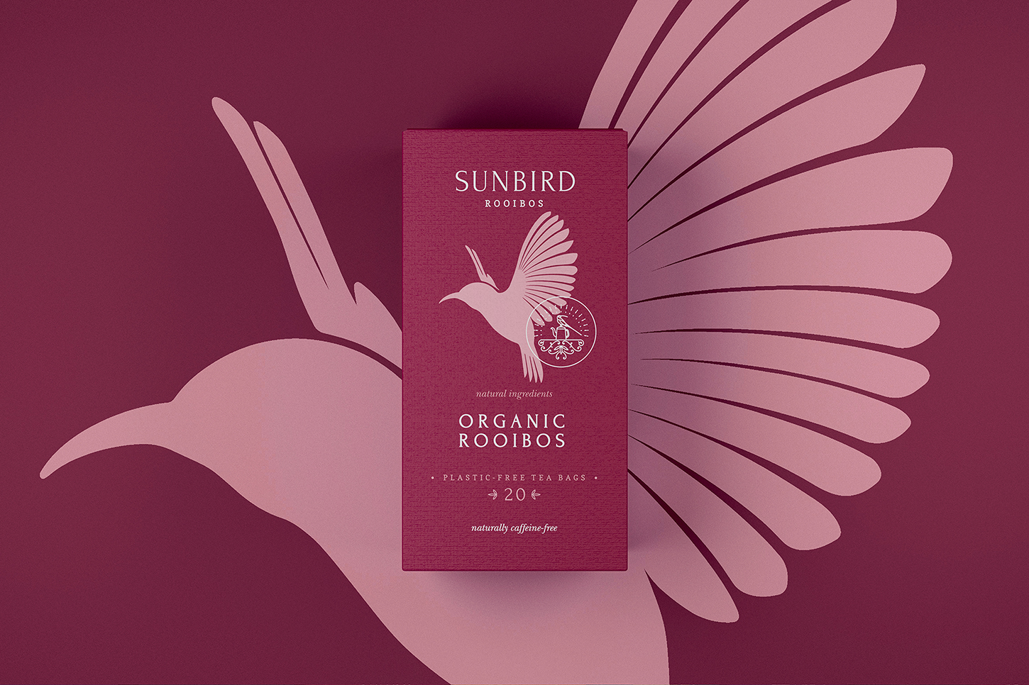
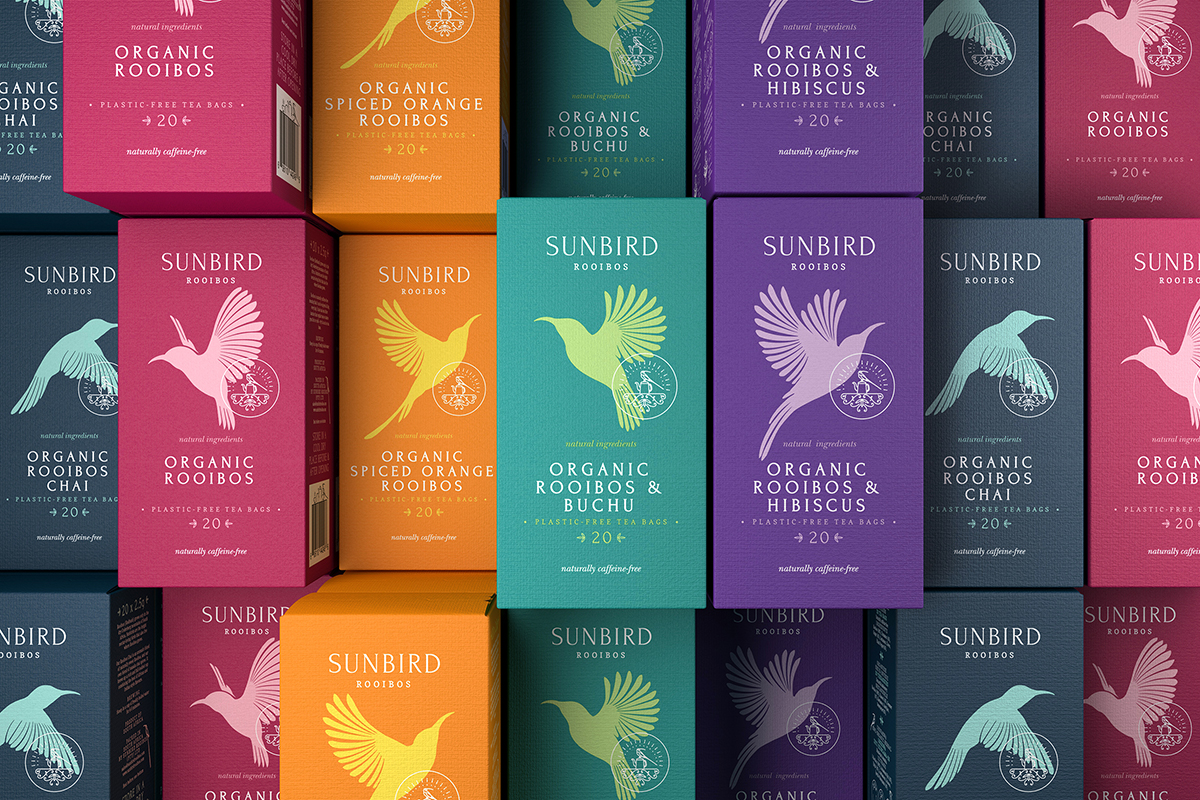
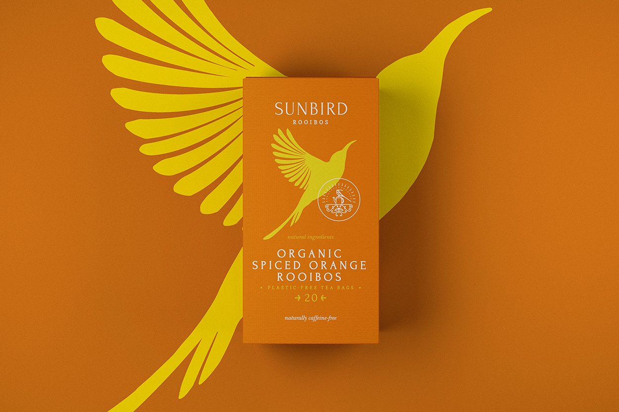
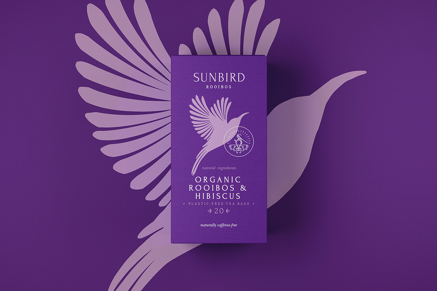
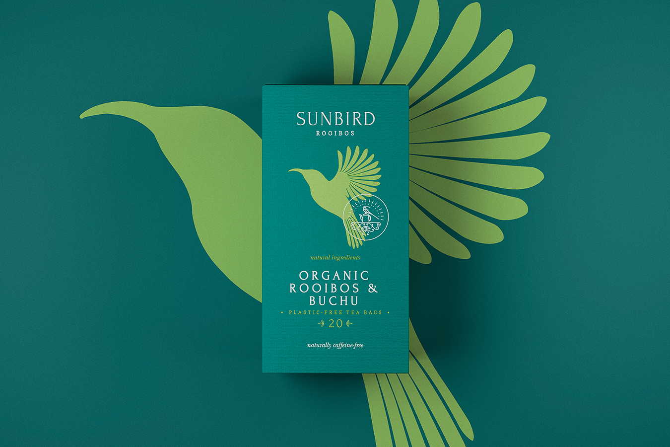
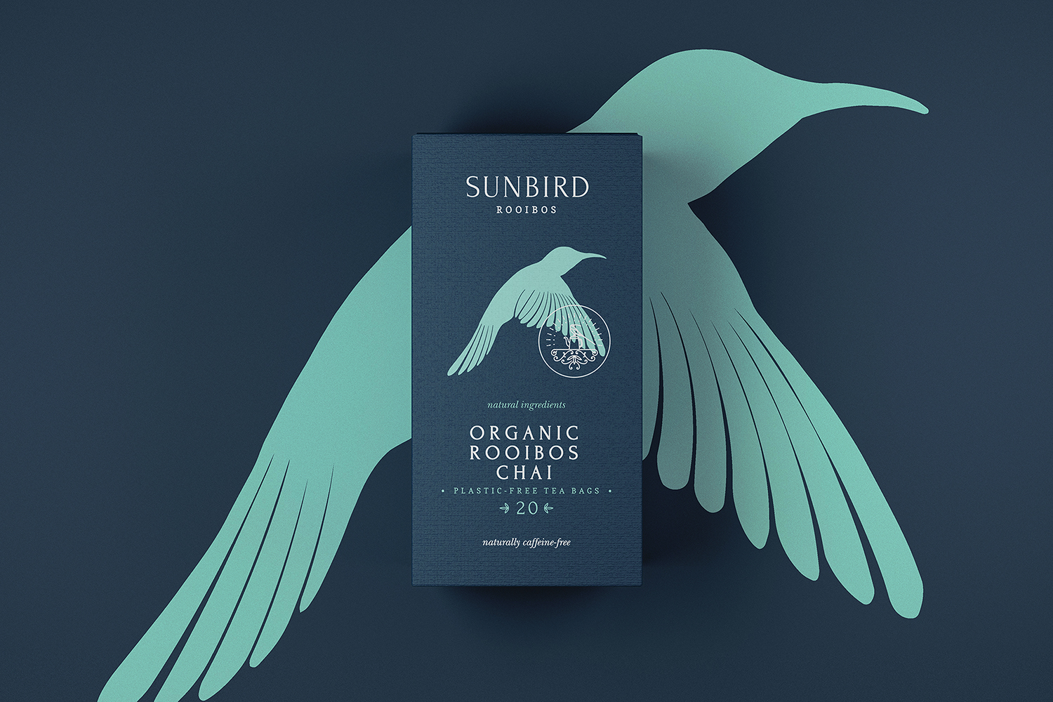
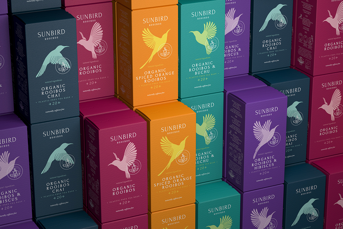
I simplified my original design for the South African premium range and ensured impact through bold contemporary colours and illustrations. I illustrated five sunbirds working as a single unit and creating a moving image across the entire line when they are in the retail space. The logo, wordmark, and icon are separated, and the icon serves as a “stamp of approval”. I tweaked these design elements, which are part of the original packaging, to have a more contemporary and informal feel. I used simplistic font and type execution to ensure that the focus is on the sunbird illustration and logo.
Ginger Storm’s creative flair ensures the Sunbird Rooibos range is beautifully situated in the European / Scandinavian market. The packaging is simple, whimsical, elegant, and contemporary while also reflecting exceptional value for money and premium taste.
CREDIT
- Agency/Creative: Ginger Storm
- Article Title: Ginger Storm Creates Sunbird Rooibos Tea for the European Market
- Organisation/Entity: Agency
- Project Type: Packaging
- Project Status: Published
- Agency/Creative Country: South Africa
- Agency/Creative City: Cape Town
- Market Region: Europe
- Project Deliverables: Illustration, Packaging Design
- Format: Box
- Industry: Food/Beverage
- Keywords: tea, packaging, illustration
-
Credits:
Creative Director: Storm Wiggett


