England’s leading rosé brand gets a new look fitting of its stature, ready to rival if not exceed the best of Provence.
Founded in 2019 with a vision to show the world that England can make amazing still rosé. Founders Elisha and Tom, obsessed with the pursuit of perfection, set out to create a rosé to rival Provence. A dry, fresh, and undeniably delicious English rosé that creates joy for wine drinkers – surprising some, delighting all. Five years on and they’ve become England’s leading rosé brand, combining the finest grapes from the South East of England with world-class winemaking to deliver a beautifully balanced and refreshing rosé for all to enjoy.
After experimenting with four different bottle designs in as many years, Folc called upon Regular Practice, for a bold new redesign that signals their ambition and intent. “English wine is having its time in the sun, literally and figuratively,’ says Ed Little, partner and strategy director of Regular Practice.
‘However, while brands like Chapel Down and Nyetimber led the way in English sparkling wine, taking on champagne, there hasn’t been a rosé to rival Provence. Until now.’ The challenge from a brand perspective was how do you create a provencal style rosé with a distinctively English edge. One that would appeal to both modern rosé drinkers, and more traditional ones.
‘If you look at brands from the South of France they’ve almost become pastiche of themselves’, says Kristoffer Sølling, founder and creative director. ‘Our interest in this project came from founders Elisha and Tom, who weren’t interested in creating another wine brand from your parents’ vineyards.’ Instead they wanted to create a wine that defied expectation and invited conversation.
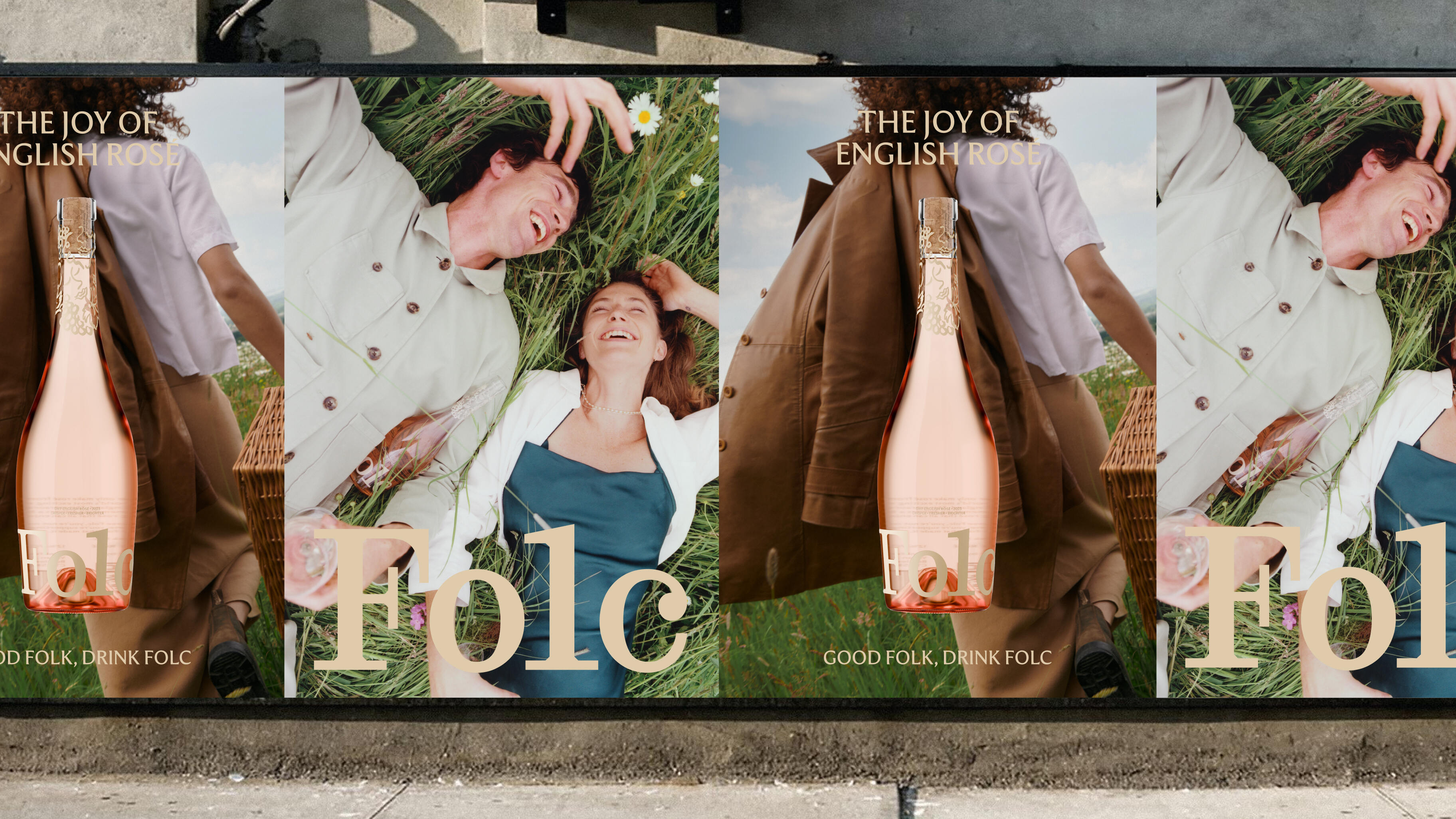
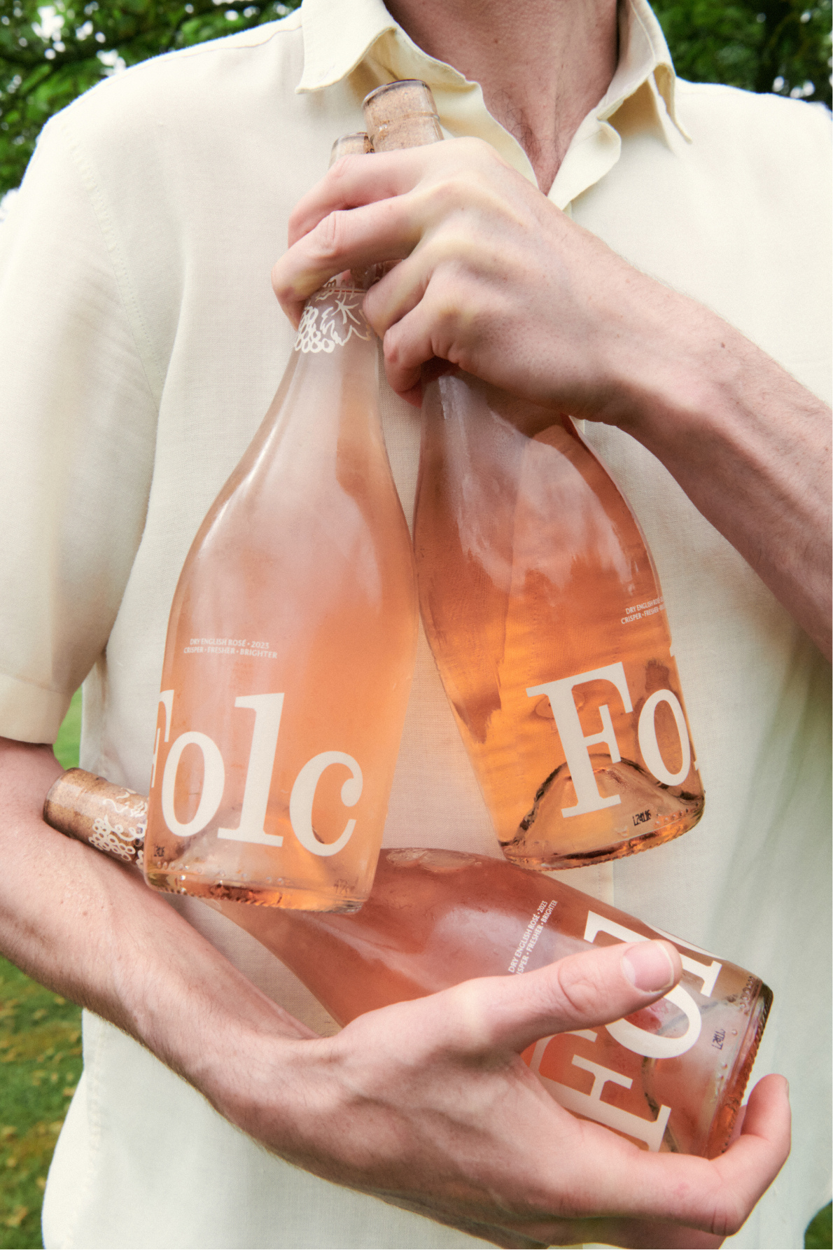
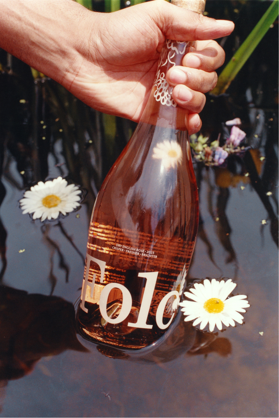
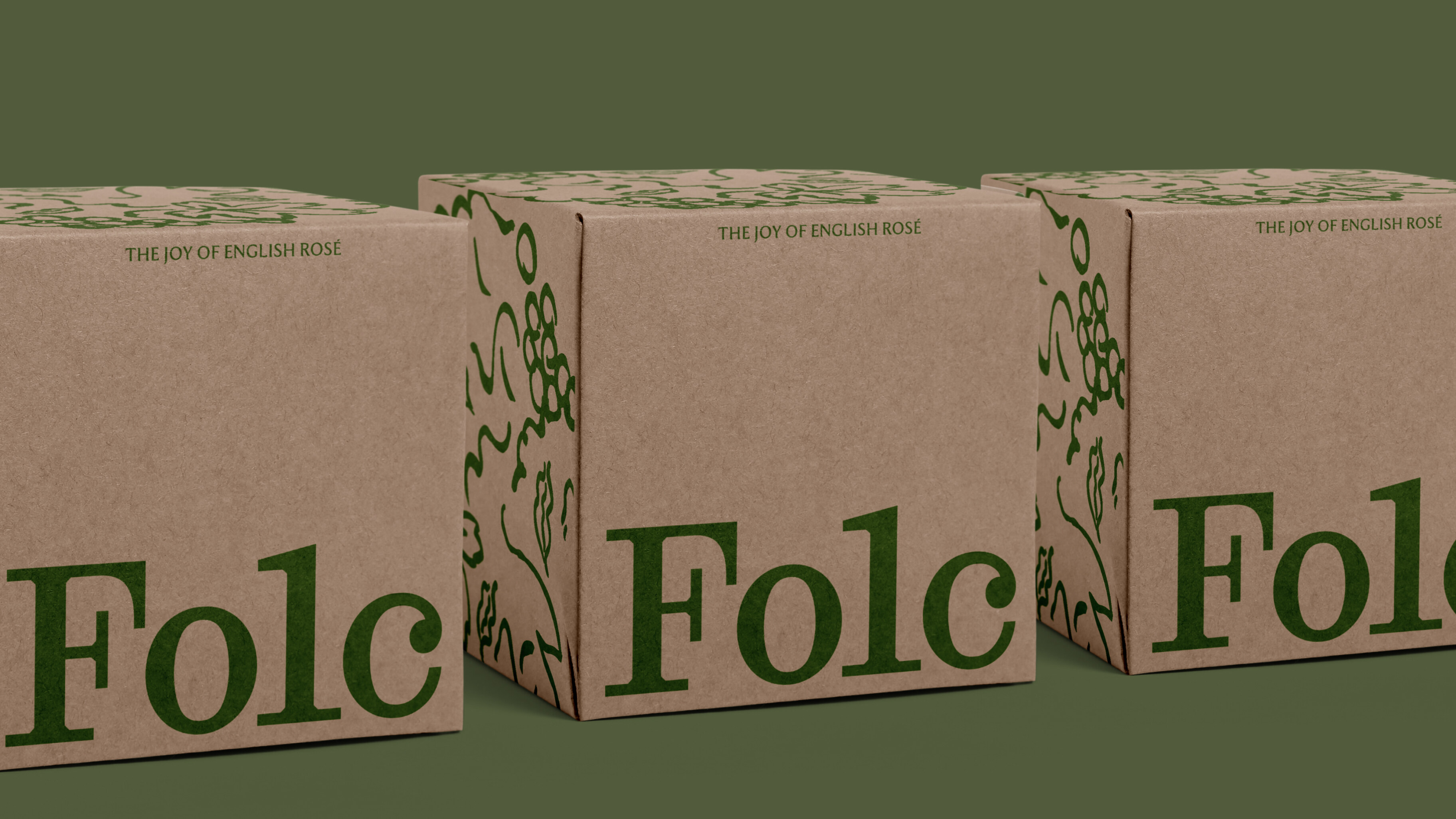
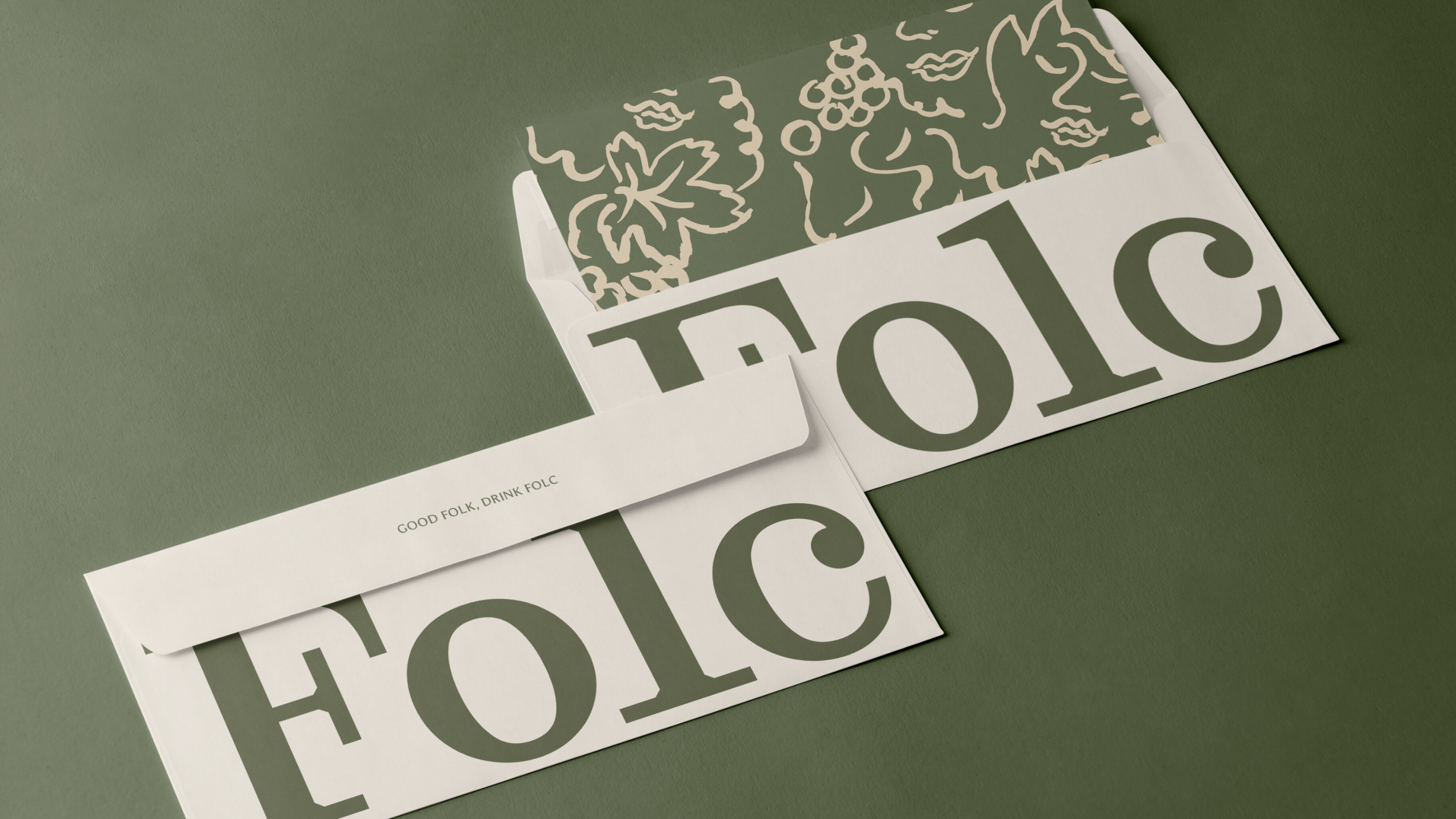
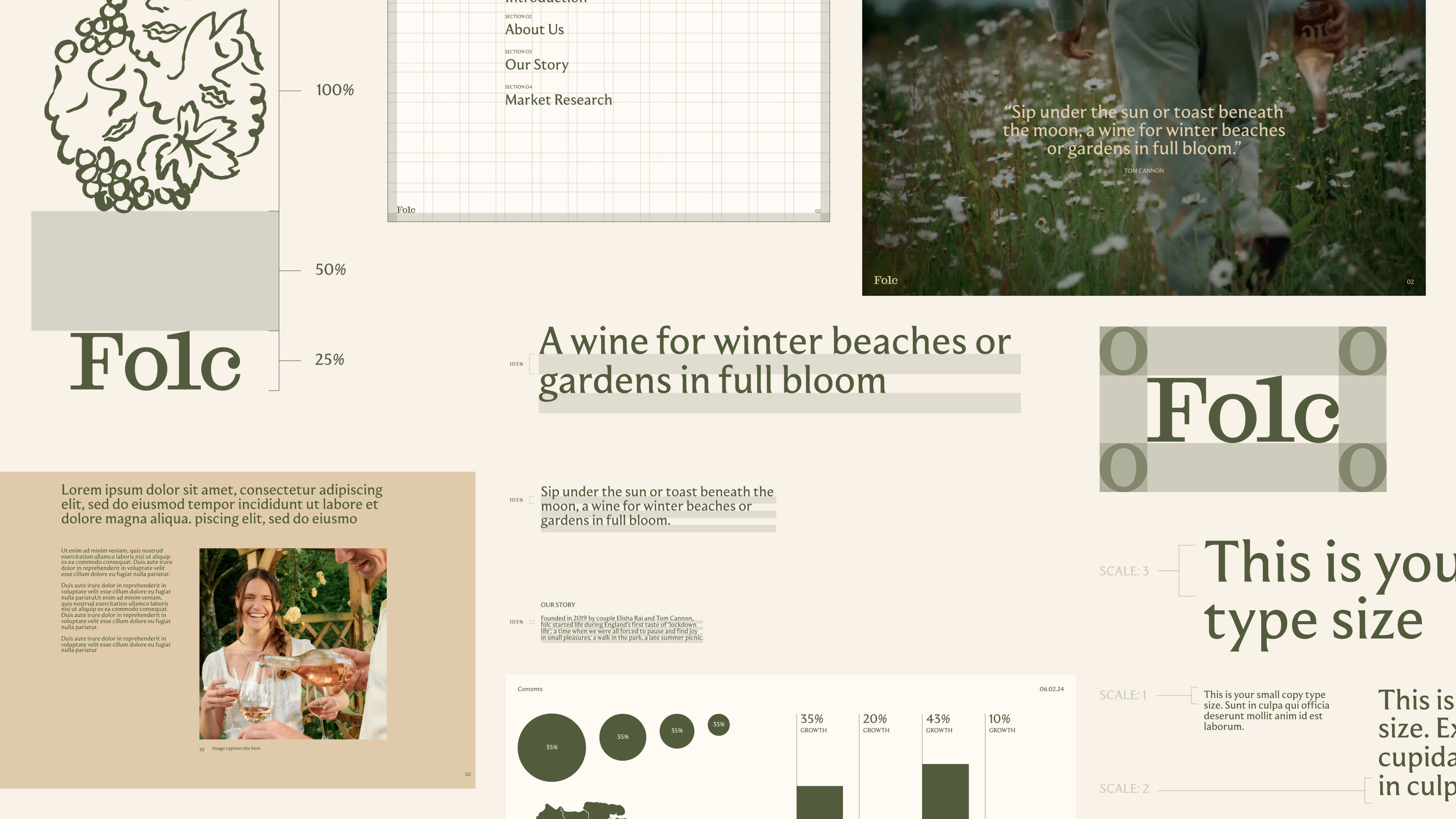
Looking to break down the traditional boundaries and barriers of winemaking. This remit was brought to all elements of the bottle and brand. The logo, for example, was created from traditional English references but used at a much bigger and more modern scale contrasting sharp chiselled edges with full bodied, characterful letters. This is paired with the typeface moulin that demands authority in full caps and a softness in lower case.
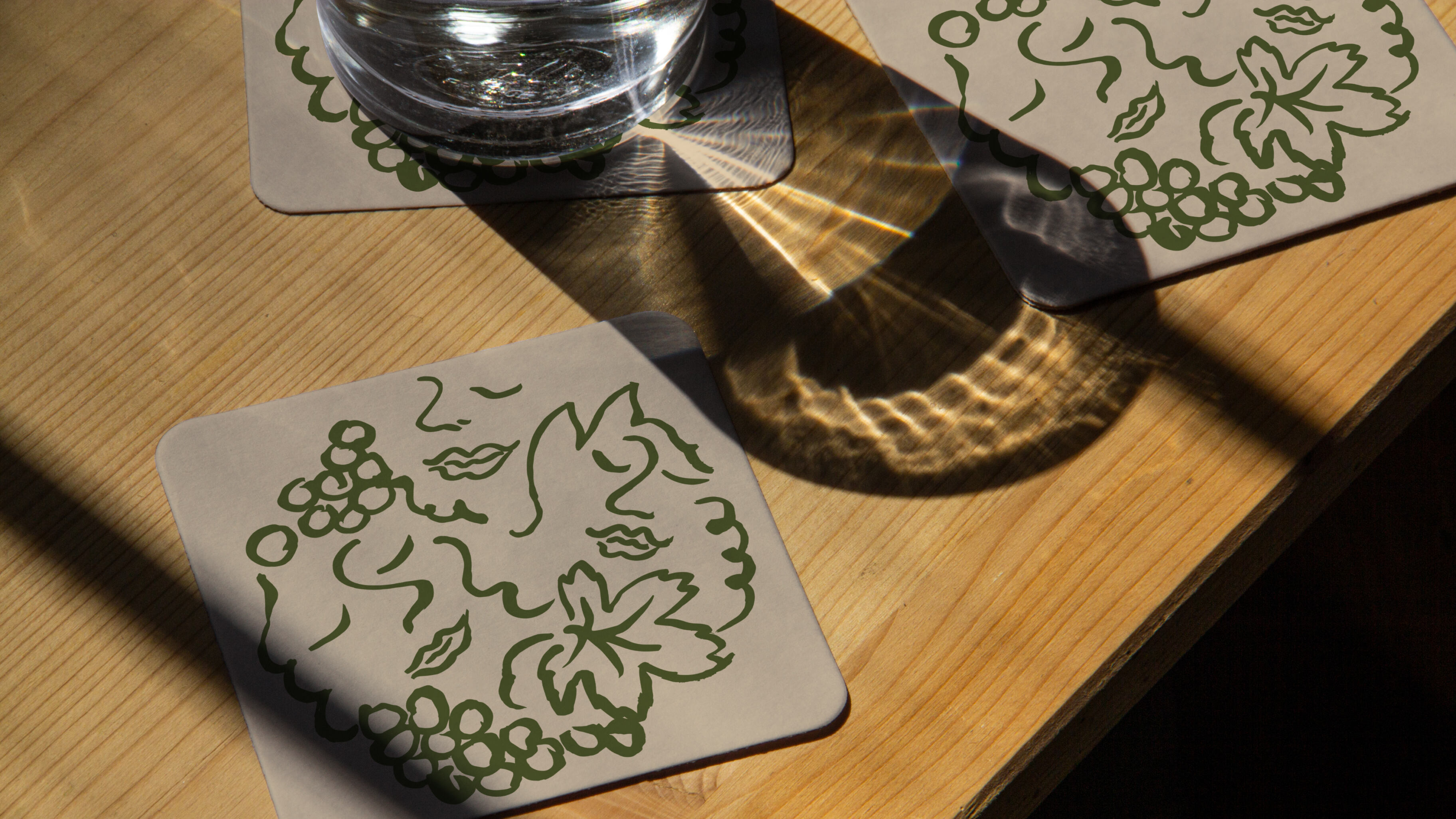
‘One of the core tenets of the brief was to build more equity into the name,’ says Tom Finn, founder and managing director. ‘The illustration style draws on old English folk tales showing faces celebrating amongst grapes – the perfect embodiment of the joy of togetherness’. The illustrations were created by Olga Prader, a Parisian based illustrator and graphic designer. These bespoke illustrations decorate the neck of the bottle while also featuring on a range of printed and digital ephemera. Finally, the art direction was inspired by idyllic English countryside settings, styled in a way more akin to fashion brands than wine brands.
Looking at the recent success of other English winemakers such as Chapel Down and Nyetimber, a new generation of winemakers is emerging, not following the rules laid down before them but forging paths of their own. And for Folc that future is rosé tinted.



CREDIT
- Agency/Creative: Regular Practice
- Article Title: Regular Practice Rebrand FOLC, the Joy of English Rosé
- Organisation/Entity: Agency
- Project Type: Identity
- Project Status: Published
- Agency/Creative Country: United Kingdom
- Agency/Creative City: London
- Market Region: Europe
- Project Deliverables: 3D Design, Brand Guidelines, Brand Redesign, Brand Strategy, Brand Tone of Voice, Branding, Label Design, Packaging Design
- Industry: Food/Beverage
- Keywords: Wine, English, Rosé, Bottle
-
Credits:
Production: Tiny Studios


