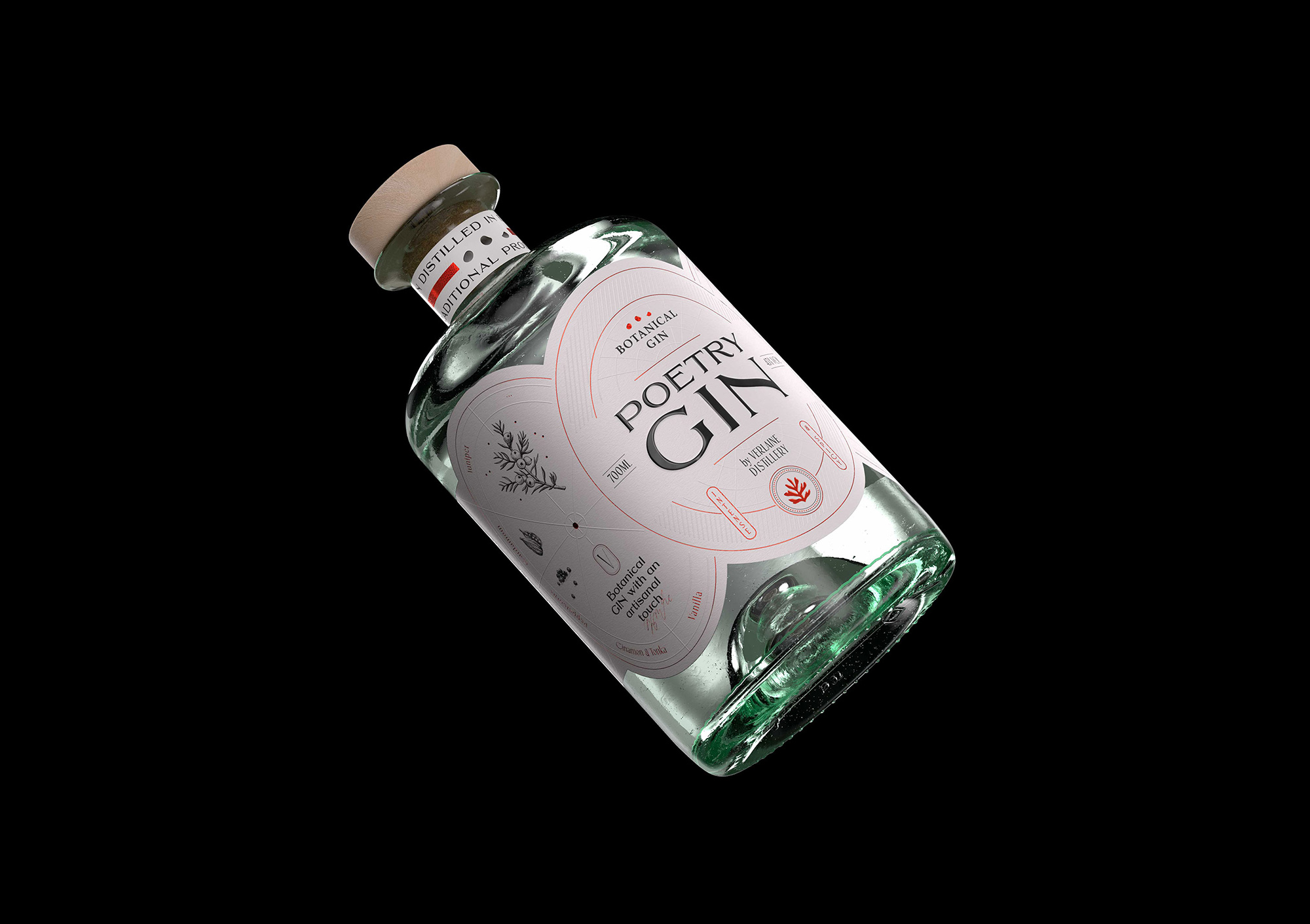
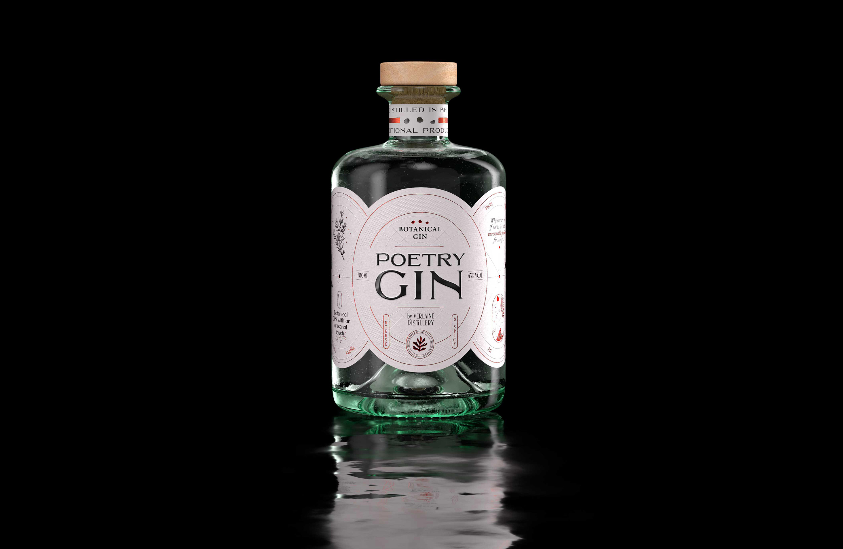
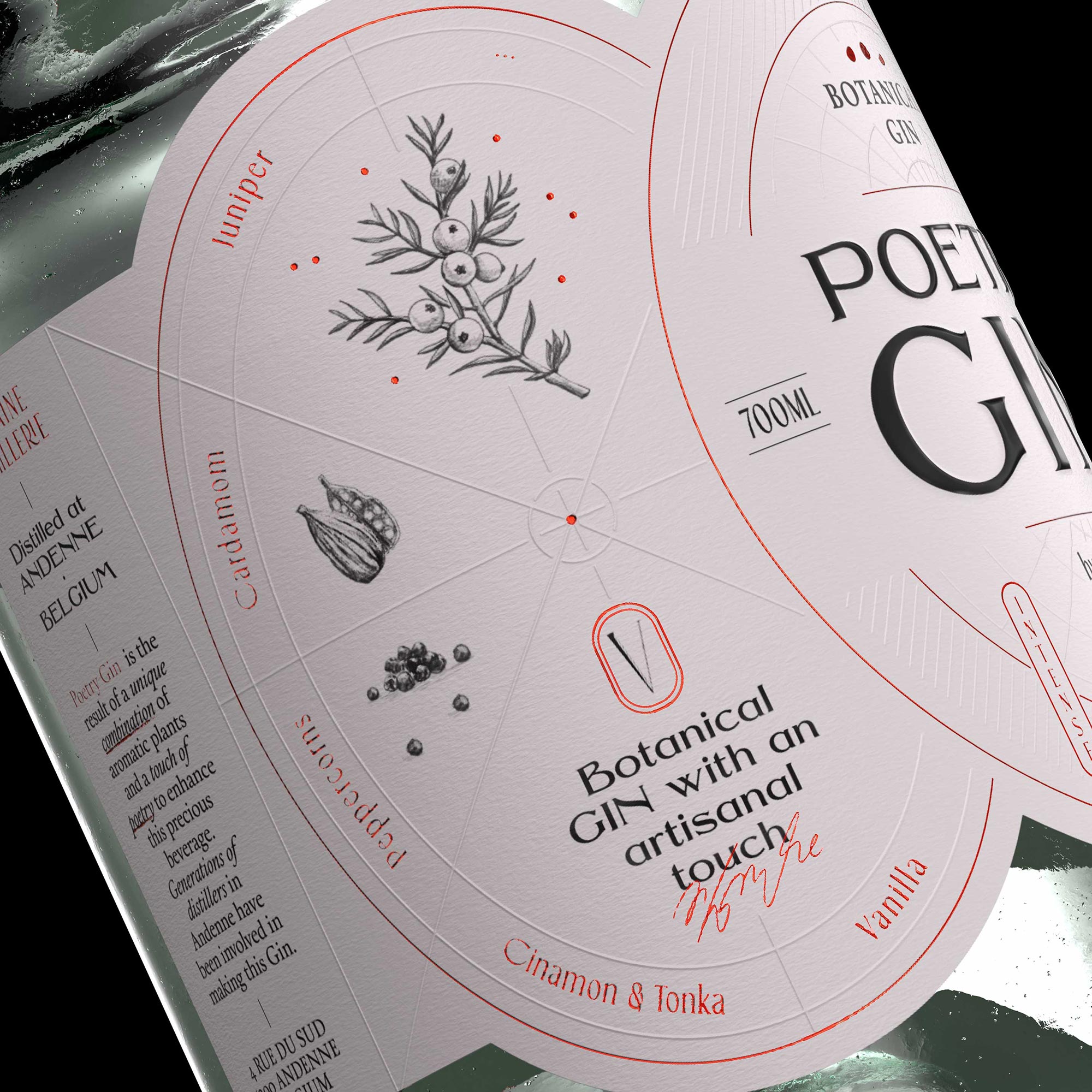
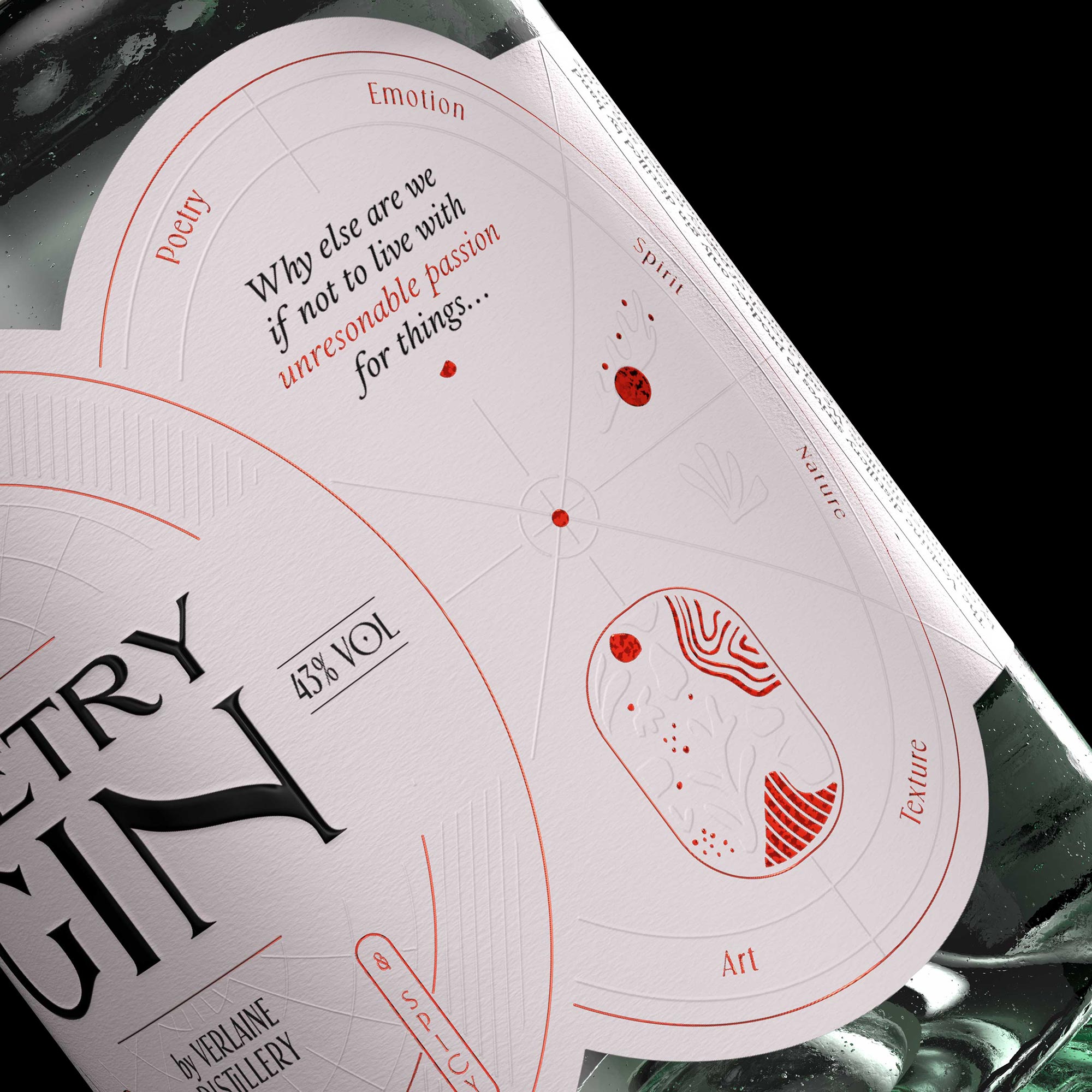
The Art of Creating Emotion: The artistic composition of the label is inspired by various elements of nature and incorporates each botanical ingredient and spice found in this gin. The whole forms an abstract tableau that adheres to the codes of Japanese art and appeals to the senses. With construction lines reminiscent of da Vinci’s Vitruvian Man,
The label geometrically reinterprets the three organic forms of the graphic identity, illustrating the associated values:
Left part: art & nature
Central part: spirit & texture
Right part: emotion & poetry
The Subtle Order of Elements: The branding concept allowed us to design three unique icons, three forms interacting together. These organic forms represent both juniper berries and peppers (the main ingredients of Poetry Gin) as well as the three major areas of expression on the label.
On the left side, you can find the various ingredients that make up Poetry Gin (juniper berries, cardamom, red peppercorns…), maintaining an element of mystery about the distiller’s fabulous work. The right side is dedicated to the world of poetry and the emotion it evokes in each of us.
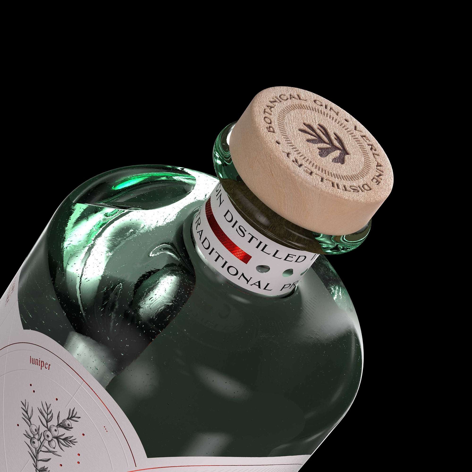
Techniques and Details: The different techniques used (red hot stamping, transparent varnish, and embossing) highlight the precious details of the label. At first glance, the white of the label gives a pure appearance to the whole, but when the consumer takes a closer look at the details, they discover each element present in the tableau.
Thus, just like the three stages of tasting a wine or spirit, the viewer’s vision follows the logic of the gustatory revelation of Poetry Gin’s flavors…
A Balanced Composition: The subtle meeting between a Cartesian approach and a dreamy spirit allowed Studio Boam to conceive the composition as a structured and balanced whole. Each element finds its place in the overall structure and adheres to a precise artistic logic.


CREDIT
- Agency/Creative: Studio Boam
- Article Title: Unveiling the Artistic Techniques in Poetry Gin’s Unique Label Designed by Studio Boam
- Organisation/Entity: Agency
- Project Type: Packaging
- Project Status: Published
- Agency/Creative Country: France
- Agency/Creative City: Paris
- Market Region: Europe
- Project Deliverables: Art Direction, Brand Identity, Packaging Design
- Format: Bottle
- Industry: Food/Beverage
- Keywords: Poetry, La belle, Gin, Emotion, Nature, Botanical, Geometrical, Spirit, Art
-
Credits:
Graphic Designer: Pauline Laboria
Art Director: Andy Migevant
Art Director: Alexandre Arzuman
3D: Miguel Maldonado
3D: Better Stronger


