The global organic trend is gathering momentum as consumers look for more natural and less processed foods. Post pandemic, people have become particularly concerned with their health and as a result, the quality and safety of the food they eat. Simply Delish have produced an organic range of dips to answer this consumer need and tap into a rapidly growing market.
When we first received this brief we were thrilled that no extra callouts on pack were needed. It is such a rare thing to be able to create a brand and packaging that stands for one thing only, and doesn’t need to clutter its communication with multiple supporting claims and benefits. The great thing about designing packaging for simple, honest products is that the packaging can also be simple and honest. Simply Delish’s Organic range is just that. When the one single reason for being is captured in the name, the branding and packaging can be bold and eye-catching. No need to shout about protein, fat or sugar content, just simple, bold graphics and plenty of taste appeal.
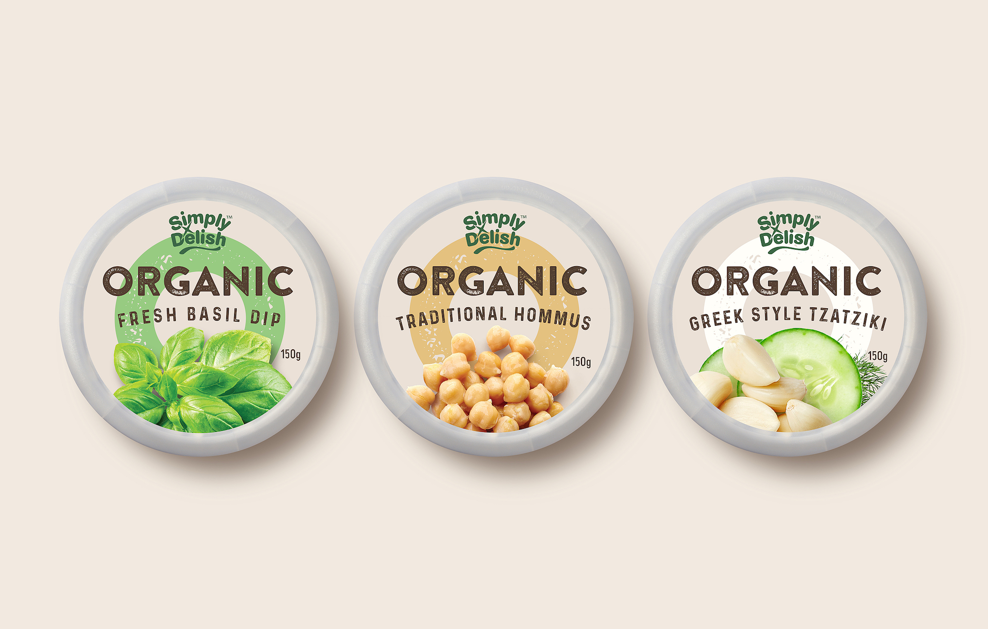
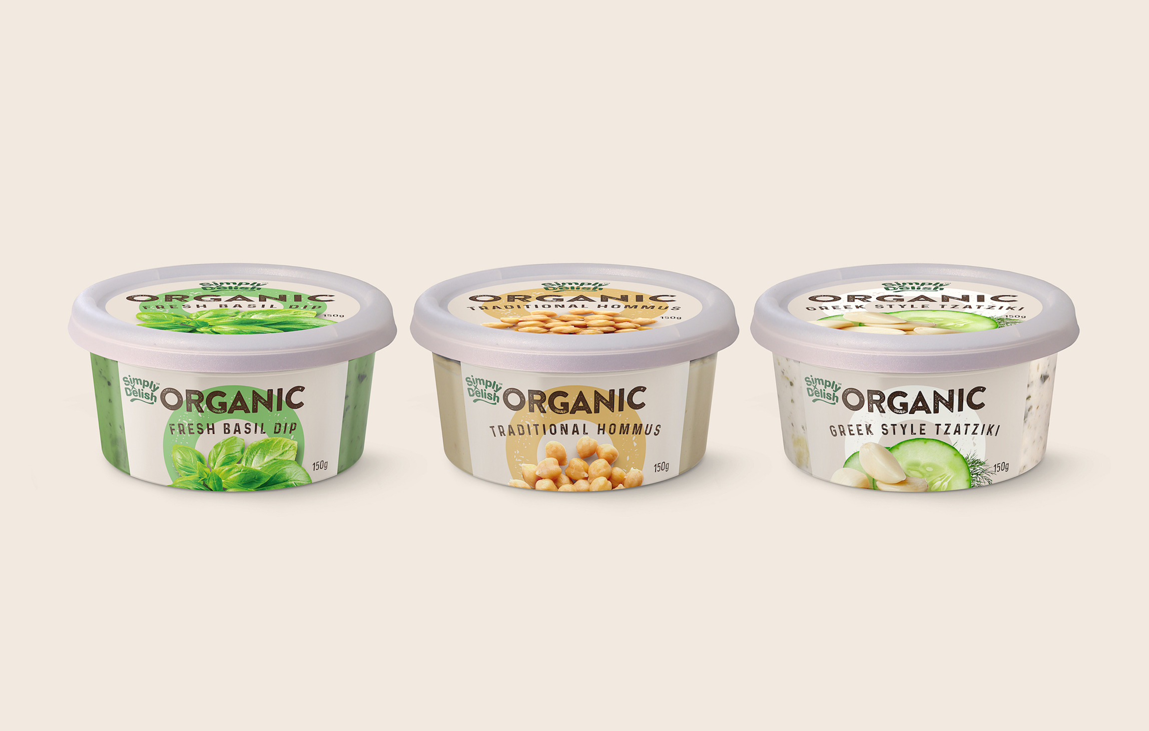
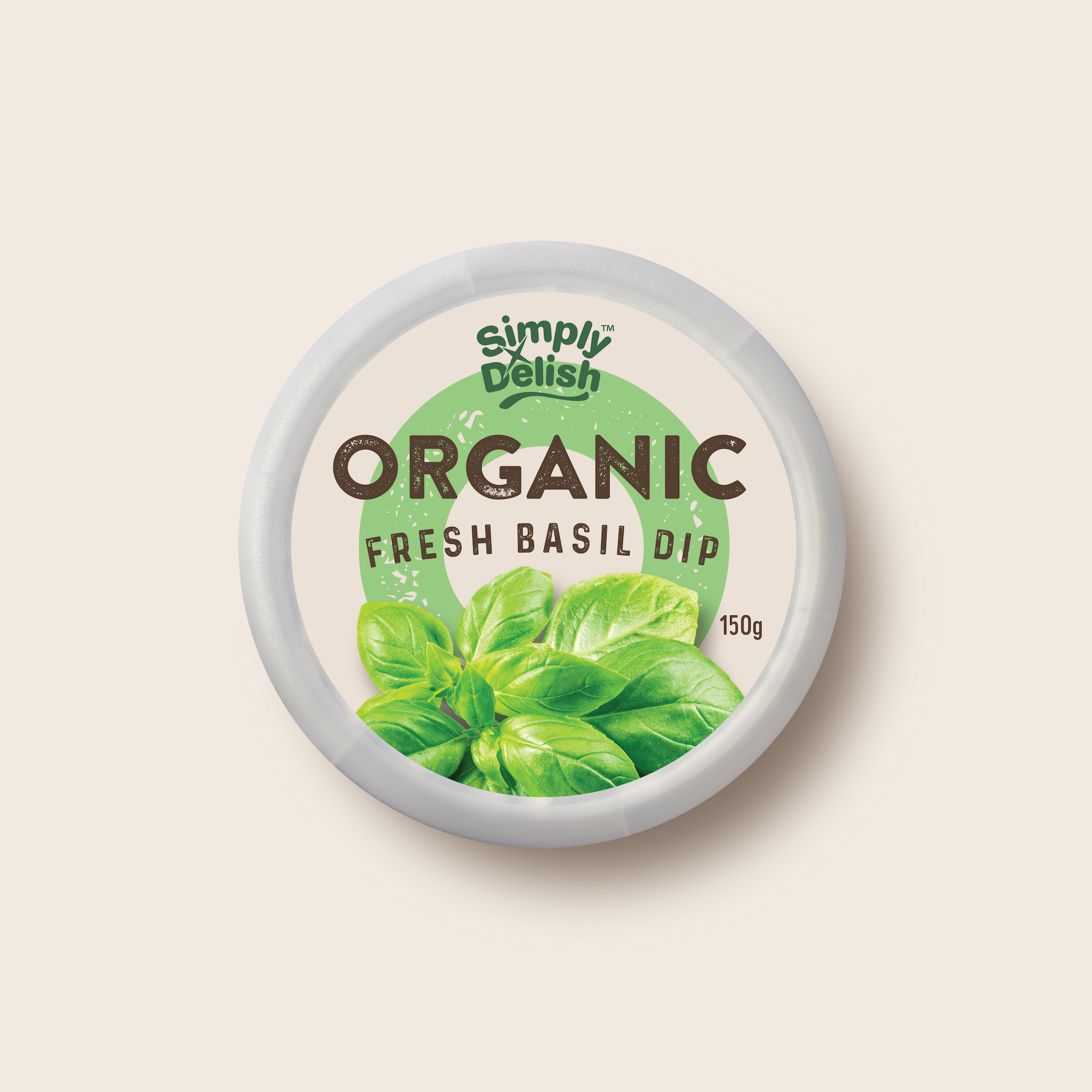
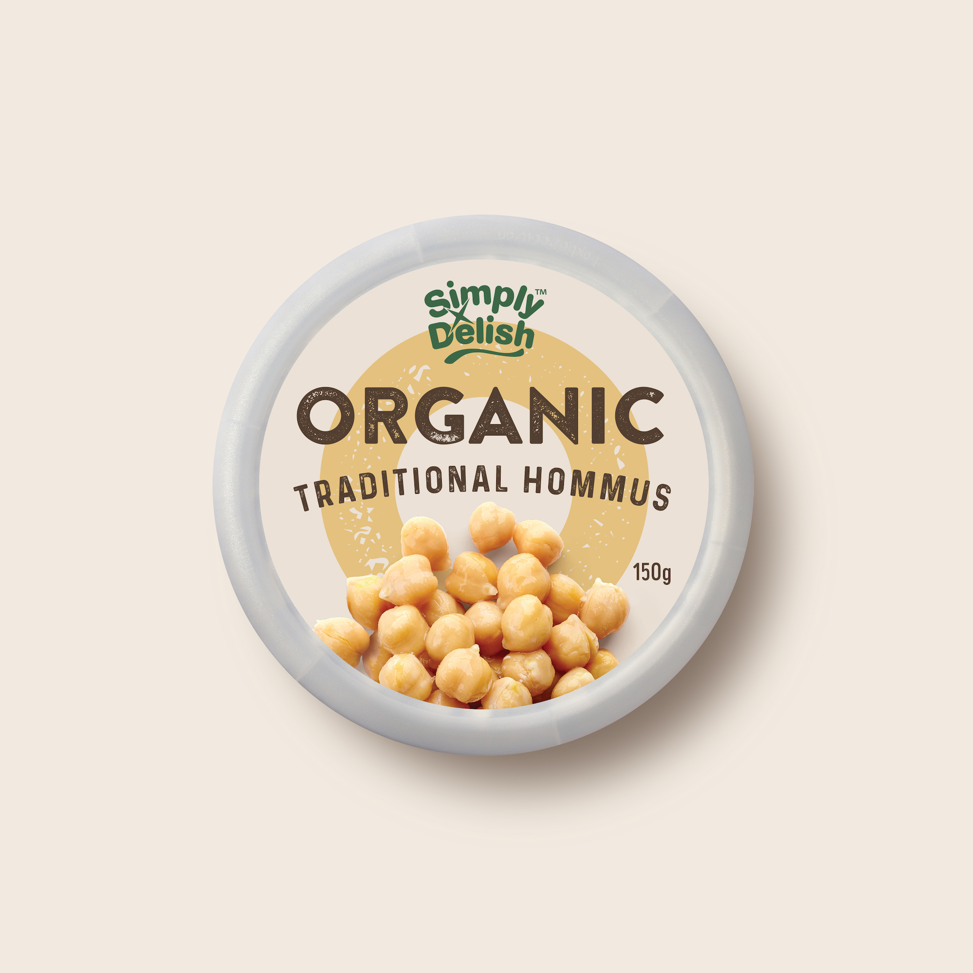
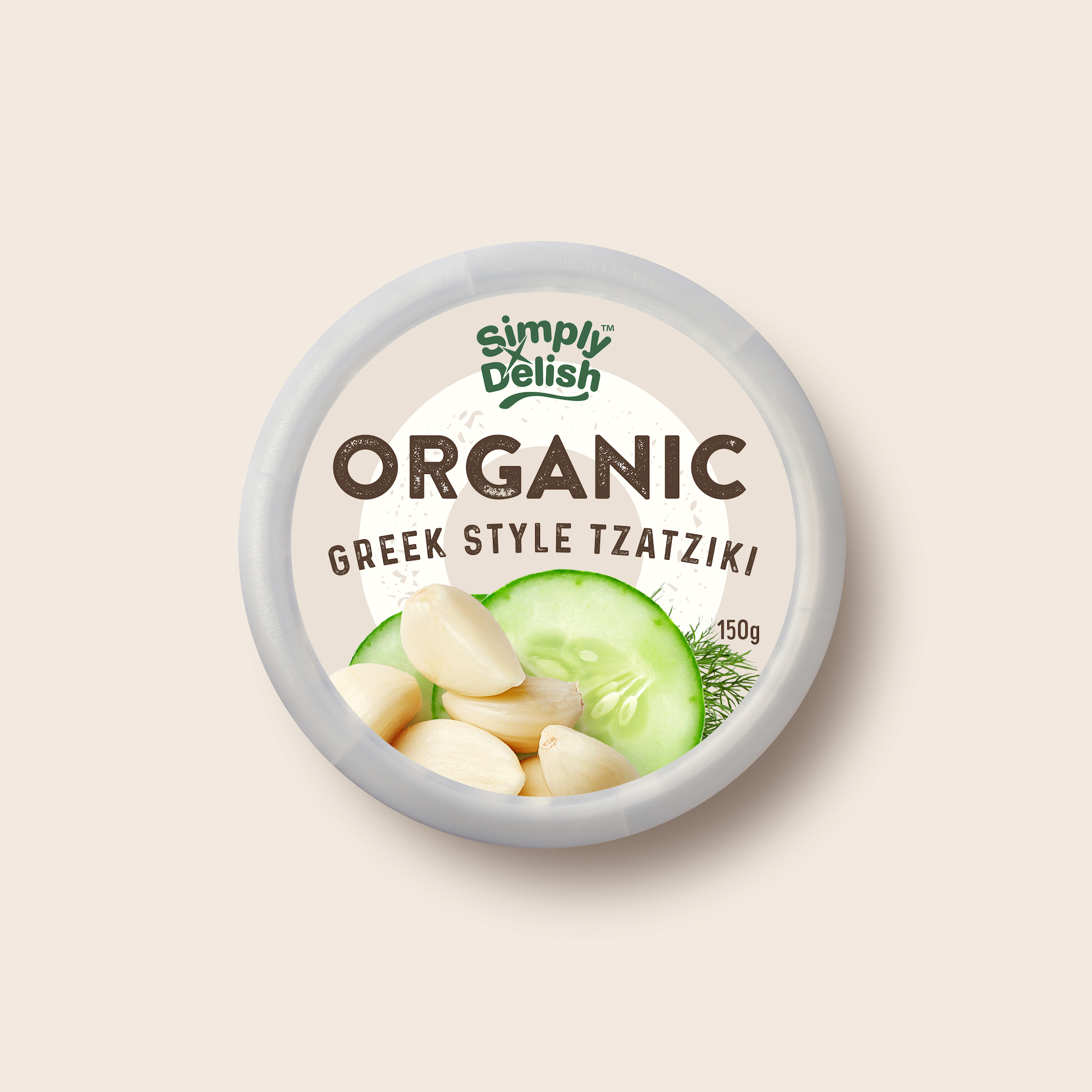
The Simply Delish brand mark is distinctive enough and so well known to consumers that changing its colour to suit each of their ranges works, without affecting brand recognition. While this strategy may rub some branding purists up the wrong way, its success in this case is borne out through both research and sales. The earthy green of the brand mark and the warm off white background set the scene for a very healthy and natural range.
We took the ‘O’ from Organic and made it a big, format friendly variant colour device that’s very distinctive in the dips category and a very ownable part of the brand’s equity. Combine that with simple, distressed, natural-feeling typography and prominent, beautiful ingredient cameos and you’ve got some great-looking packaging. The simplicity of this design perfectly captures the spirit of an organic offer.
CREDIT
- Agency/Creative: Asprey Creative
- Article Title: Asprey Creative Create Distinctive Simply Delish Organic Dips Packaging Design
- Organisation/Entity: Agency
- Project Type: Packaging
- Project Status: Published
- Agency/Creative Country: Australia
- Agency/Creative City: Melbourne
- Market Region: Oceania
- Project Deliverables: Brand Identity, Brand Mark, Packaging Design, Typography
- Format: Bowl, Pot
- Industry: Food/Beverage
- Keywords: Tub Design, Brand Identity, Typography, Organic, Dips, Simply Delish, Asprey Creative
-
Credits:
Executive Creative Director: Peter Asprey


