The rebranding of Chicken Man signifies a significant shift in culinary innovation and creativity. The decision to initiate this transformation stemmed from a deep sense of admiration for heroic qualities. Drawing inspiration from heroism, we embarked on a bold endeavor to infuse the brand with vigor and dynamism. The introduction of the captivating color blue as a focal point of our rebranding effort symbolizes resilience, assurance, and integrity. This vibrant hue serves as a representation of Chicken Man’s core values – bold, resolute, and truly engaging. The rebranding journey extended beyond a mere change in identity; it permeated every aspect, creating an environment teeming with vitality and enthusiasm.
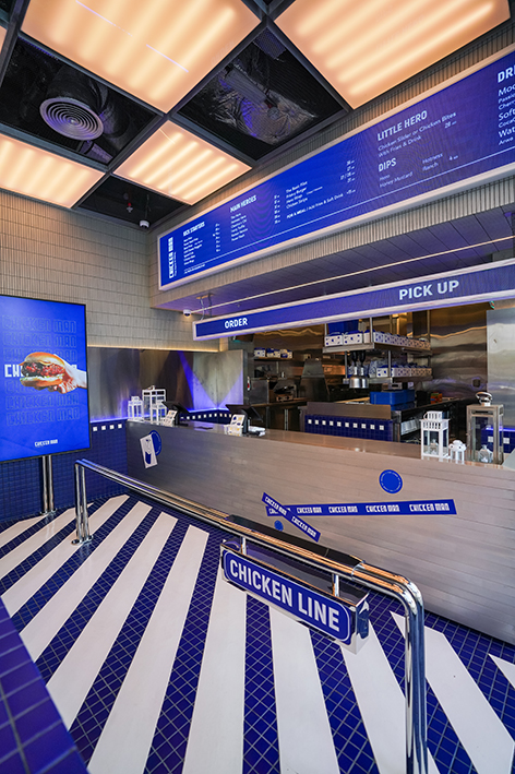
The interior design, in particular, mirrors the renewed identity by artfully integrating elements of heroism with sophistication. From furnishings to artwork, each detail pays homage to the indomitable spirit of everyday heroes. The new logo, embodying the essence of a fearless protector, stands as a beacon of strength and commitment. This transformation also includes an updated menu that reflects our dedication to culinary excellence and innovation. By incorporating bold flavors and creative dishes, we aim to provide an unforgettable dining experience that resonates with our patrons’ appreciation for quality and adventure.
What differentiates Chicken Man from other fried chicken restaurants, whether on a local, regional, or international scale, is that everything served at Chicken Man is made fresh inside their central kitchen. This commitment to freshness ensures that customers enjoy the highest quality meals with every visit. the brand focus on how crunchy the chicken is sets us apart, delivering a satisfying texture that customers crave. Additionally, they have created a wide range of homemade sauces, allowing customers to personalize their meals with unique flavors that complement signature chicken perfectly.
Our rebranding effort extends comprehensively across all branding aspects, ensuring a cohesive and engaging customer experience at every touchpoint.
A bold art direction has been adopted to create a visually striking and cohesive brand image. This includes vibrant colors, dynamic graphics, and superhero-themed illustrations that capture the essence of Chicken Man.
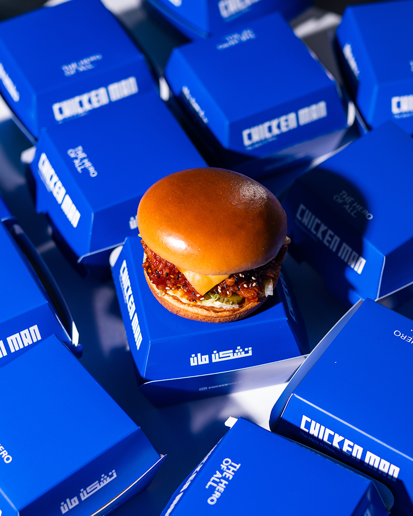
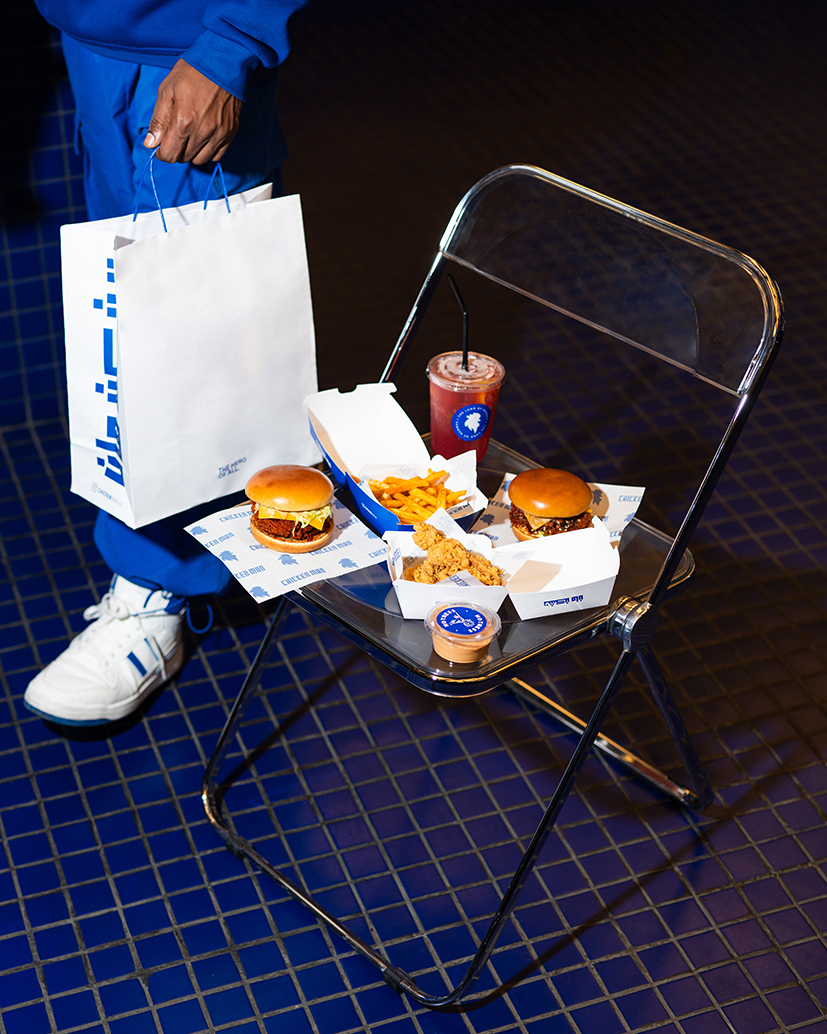
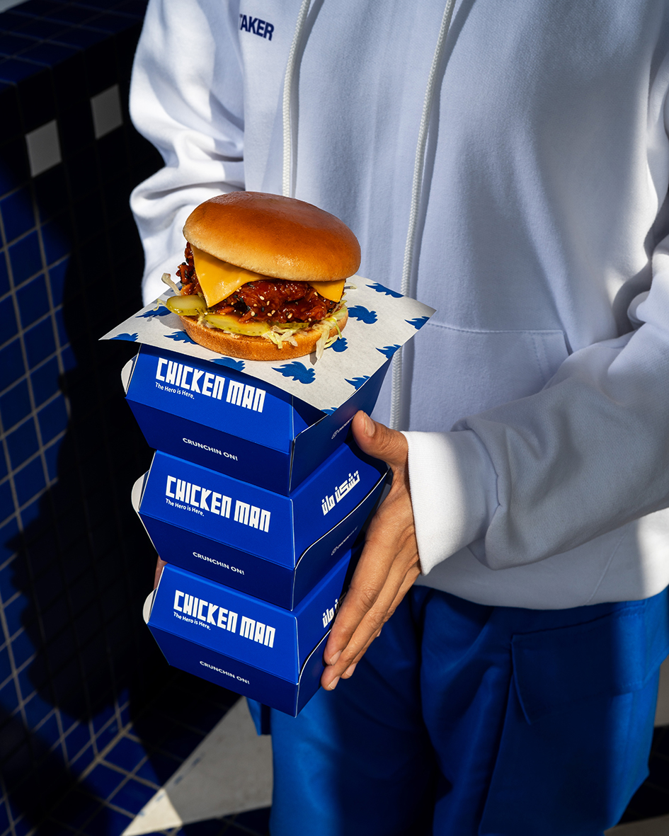
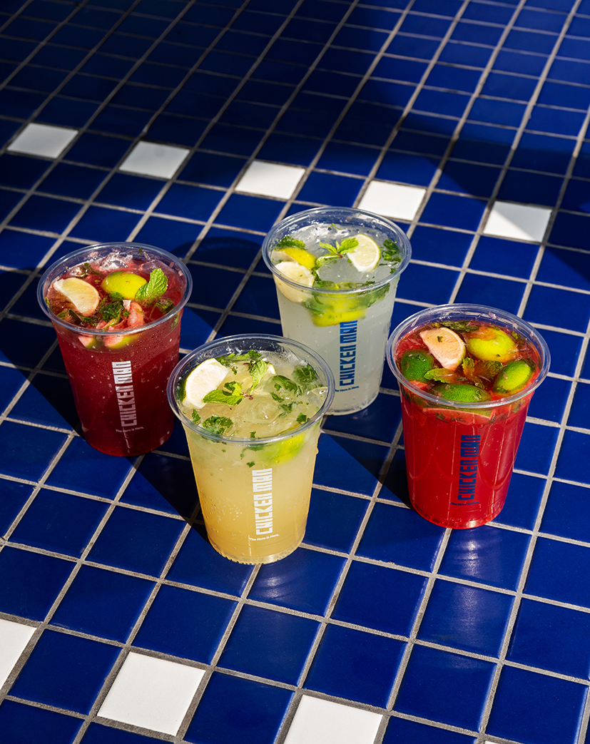
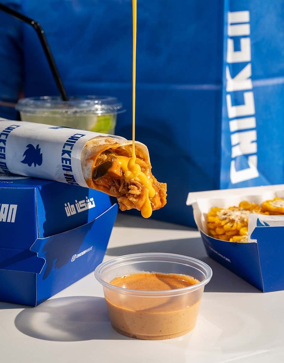
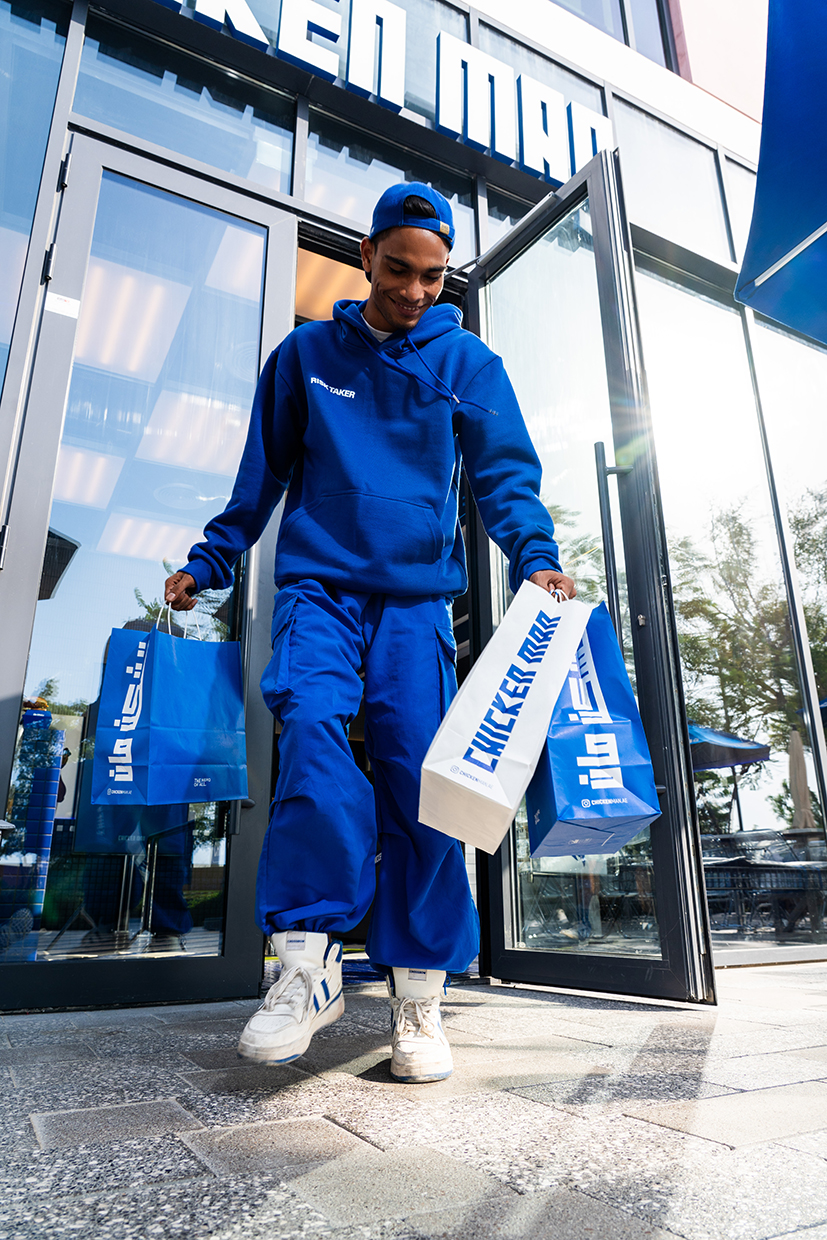
Our packaging has been completely redesigned to reflect the superhero theme. Each box, bag, and container features vibrant and bold along with inspirational quotes and heronic visual elements. This not only enhances the visual appeal but also reinforces the brand’s core values of resilience and integrity.
Our digital applications, such as the loyalty program digital card has been revamped to align with the new branding. The interface features dynamic graphics and animations that bring the Chicken Man superhero theme to life. Customers can interact with engaging content, including behind-the-scenes stories, special promotions, and loyalty rewards, all presented in a visually captivating manner that enhances user experience.
All stationery and marketing materials have been updated to reflect the new brand identity. Business cards, letterheads,… etc, feature the bold blue color and heroic imagery associated with Chicken Man. Promotional materials, such as posters, and digital ads, consistently utilize the superhero theme, ensuring a unified brand message across all channels.
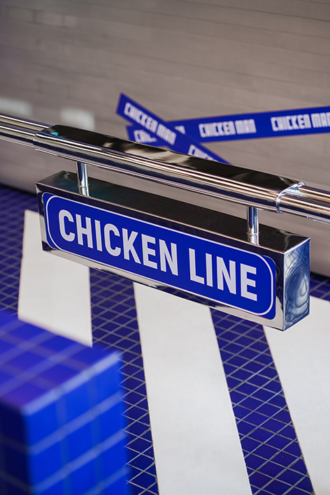
The superhero theme is prominently featured in the design of our restaurants. From the moment customers walk in, they are greeted by a vibrant and immersive environment. Each element, from the color scheme to the decor, has been thoughtfully selected to reinforce the brand’s identity.
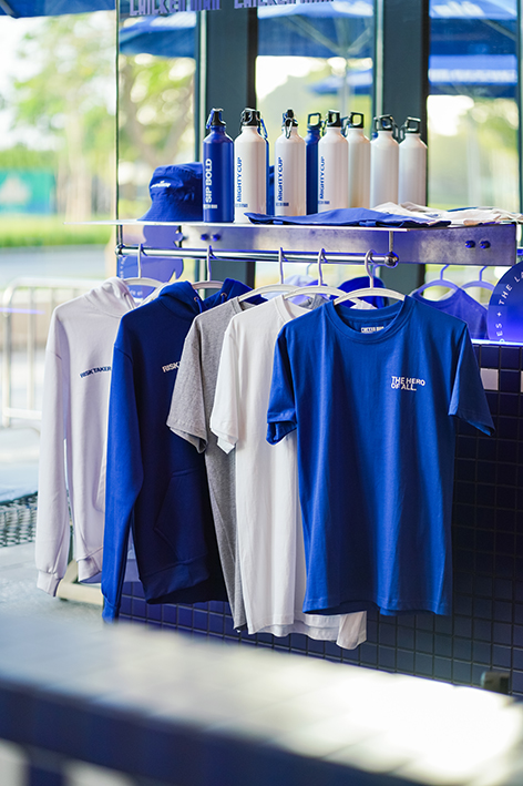
Employee uniforms have been redesigned to incorporate the new branding, with bold colors and the Chicken Man logo prominently displayed. This not only creates a cohesive look but also instills a sense of pride and unity among staff.
Overall, the rebranding of Chicken Man is a comprehensive transformation that celebrates heroism, culinary artistry, and community spirit. Through this journey, we are committed to delivering an extraordinary dining experience that honors the essence of everyday heroes while setting new standards in the culinary industry.
CREDIT
- Agency/Creative: Marwa Hassanin
- Article Title: Chicken Man’s Vibrant Rebranding With Fresh Designs and Dynamic Blue Hues by Marwa Hassanin
- Organisation/Entity: Agency
- Project Type: Packaging
- Project Status: Published
- Agency/Creative Country: United Arab Emirates
- Agency/Creative City: Kyan Creative Studio
- Market Region: Middle East
- Project Deliverables: Art Direction, Brand Guidelines, Brand Identity, Brand Redesign, Brand Strategy, Creative Direction, Packaging Design, Packaging Guidelines
- Format: Bag, Box, Case, Cup, Pouch, Sleeve, Tag, Wrap
- Industry: Food/Beverage
- Keywords: Chicken Burger
-
Credits:
Creative Art Director: Marwa Hassanin


