The Silver Spoon Company collaborated with Bristol-based strategic brand design studio, Outlaw, to reimagine the Crusha brand, increasing its relevance to a much bigger and broader audience.
Since the 1950s, Crusha has been the original milkshake syrup. However, the brand needed a fresh visual identity to appeal to a new generation of milkshake lovers and feel more modern.
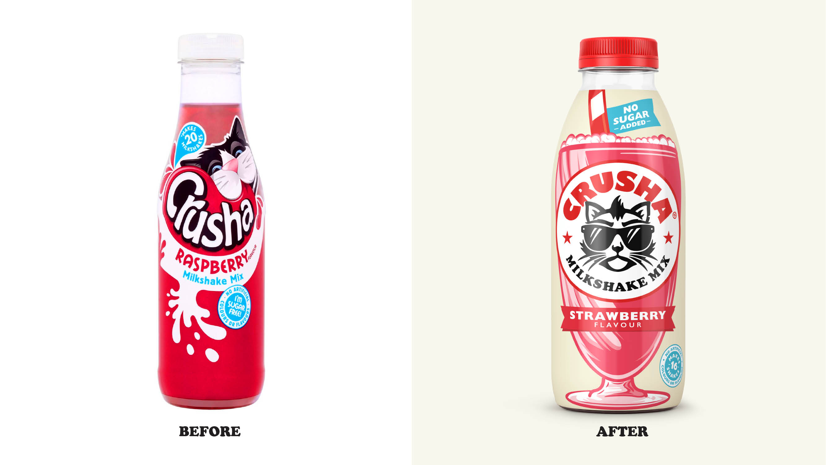
Outlaw’s mission therefore was to rejuvenate key brand assets, bringing back the exciting, irreverent and distinctive personality that consumers unmistakably recognise as Crusha.
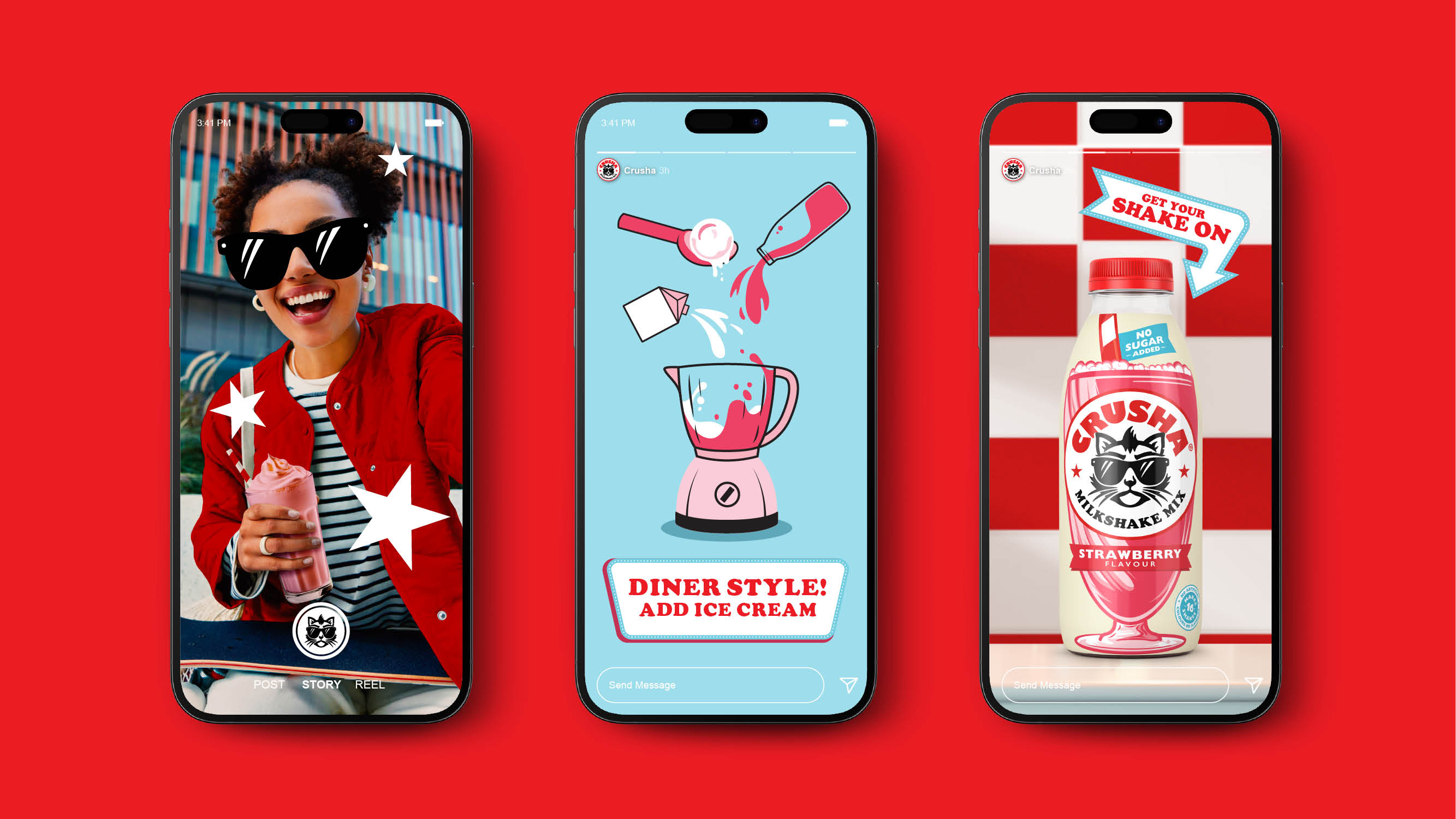
To achieve this, Crusha needed to balance shelf standout with personality and broad appeal, ensuring the brand’s youthful attitude shone through across every touchpoint.
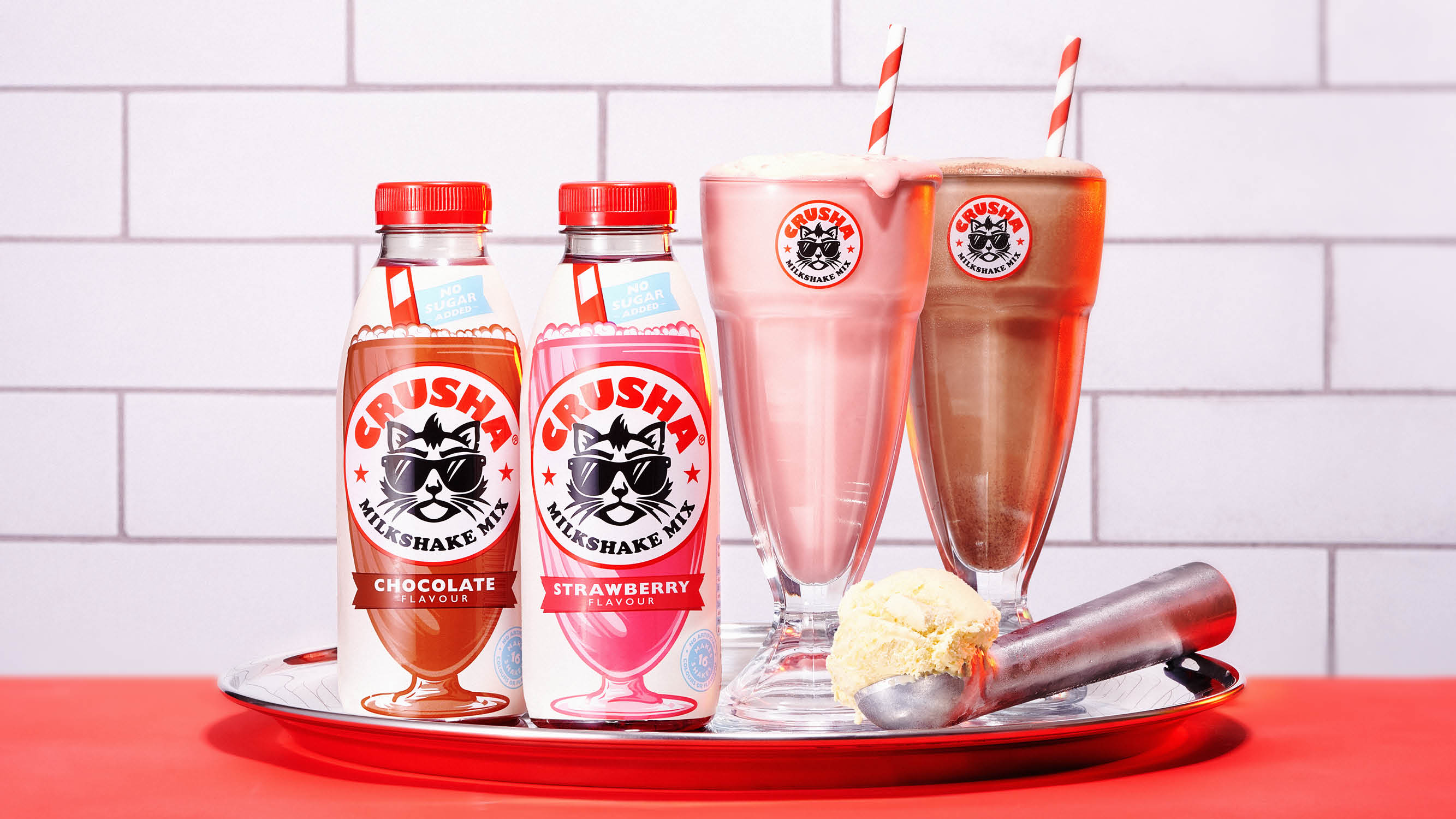
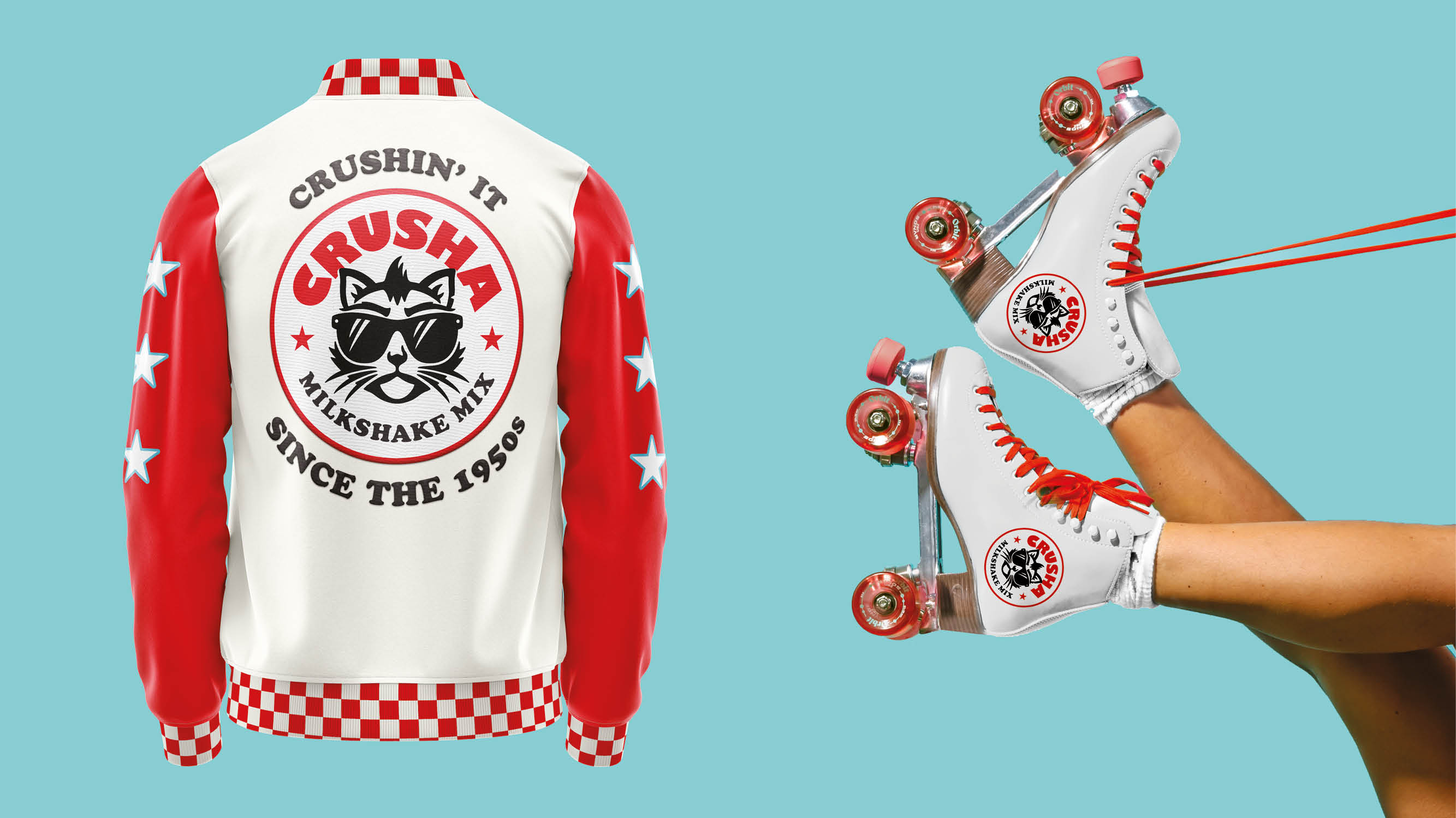
Rooted in the world of American diners – epicenters of youthfulness and rebellion throughout pop culture, from Grease to Pulp Fiction – the new design leverages the visual codes of ‘proper’ diner milkshakes, including striped straws, tall glasses and thick, creamy, frothy shakes.
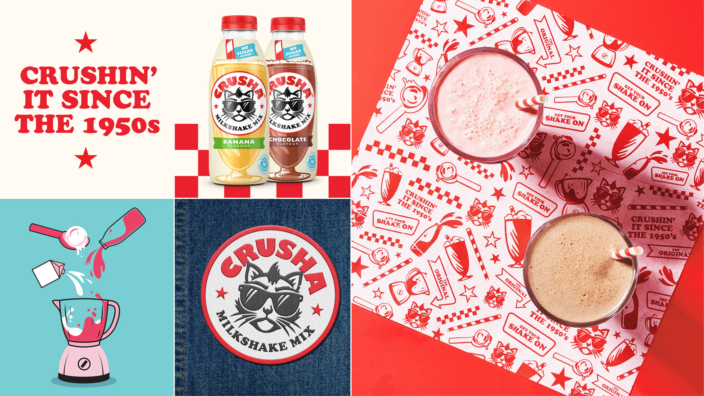
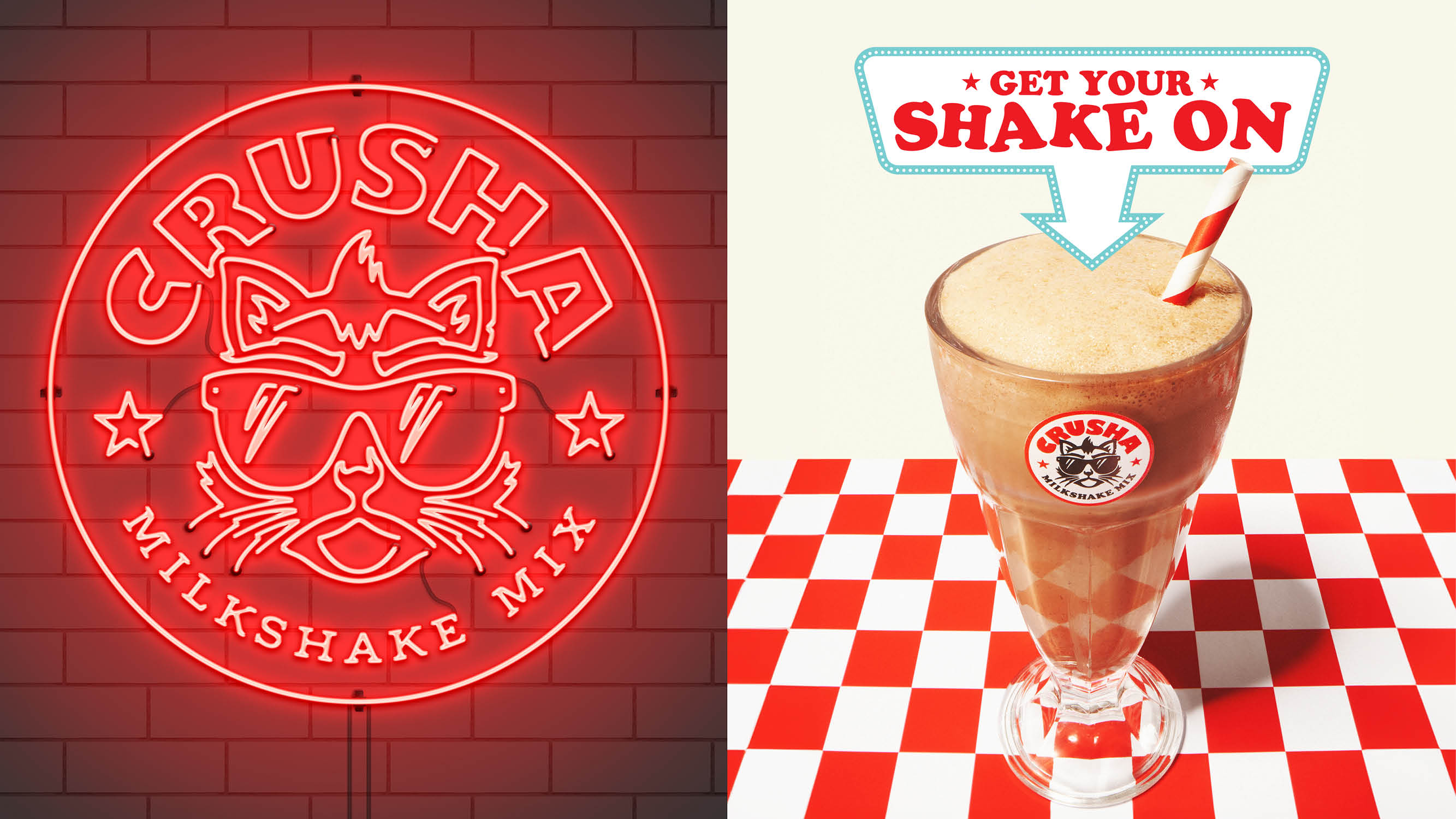
Visual elements like the checkerboard pattern ground the design in the classic diner aesthetic and re-establish Crusha as the authentic, original milkshake syrup – the only choice when it comes to a real at-home milkshake experience.
Errol – the irreverent cat – had always been a fundamental part of the Crusha brand. However he’d become too soft, infantile and playful in recent years and needed to appeal to a broader audience. So Outlaw enlisted the help of a local illustrator to bring the furry mascot to life again, unleashing the original Errol attitude and placing him centre-stage within the main Crusha brand lock up.
The result is a new visual identity and packaging design that reinvigorates the brand, positions Crusha as the authentic at-home milkshake mix and creates a design system with flex for exciting future innovation.
Outlaw Design Director, Alex Rexworthy said: “Our new design channels the irreverent attitude of Errol the cat, who was the heart and soul of the original advertising. Drawing inspiration from classic milkshakes mixed with Americana, our design promises joy, to the very last slurp.”
The Silver Spoon Company Marketing Director, Tim Albert said: “We’re delighted to work with Outlaw again on creating an exciting new future for our beloved Crusha brand. Milkshakes are super popular, for all ages, so we’re excited for the impact the new reimagining will have on purchase intent.”
CREDIT
- Agency/Creative: Outlaw
- Article Title: Crusha Undergoes a Major Reimagining as It Recreates the Authentic Modern Diner Milkshake Experience in the Home With a Disruptive New Identity by Outlaw
- Organisation/Entity: Agency
- Project Type: Identity
- Project Status: Published
- Agency/Creative Country: United Kingdom
- Agency/Creative City: Brtistol
- Market Region: Europe
- Project Deliverables: Brand Architecture, Brand Design, Brand Identity, Brand Mark, Brand Redesign, Brand Rejuvenation, Brand Tone of Voice, Brand World, Character Design, Packaging Design
- Industry: Food/Beverage
- Keywords: brand, design, packaging design, redesign
-
Credits:
Design Director: Alex Rexworthy
Senior Designer: Dane Winterson
Account Director: Josh de Sancha
Account Manager: Ruby Goom
Designer: Beth Vizard-Overbury


