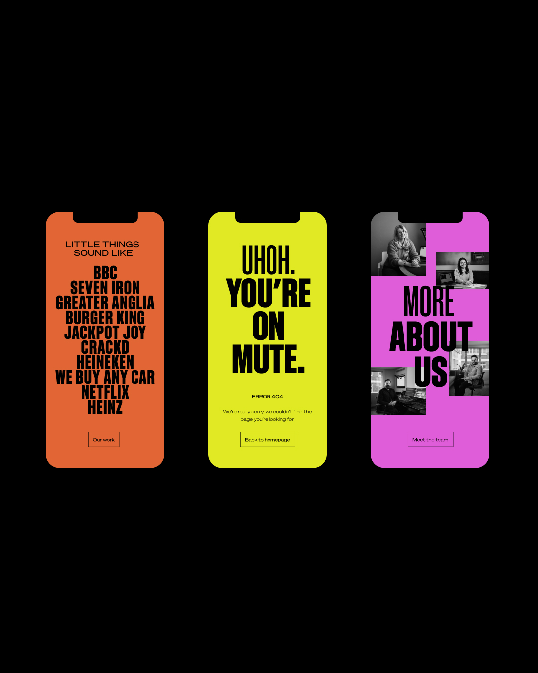
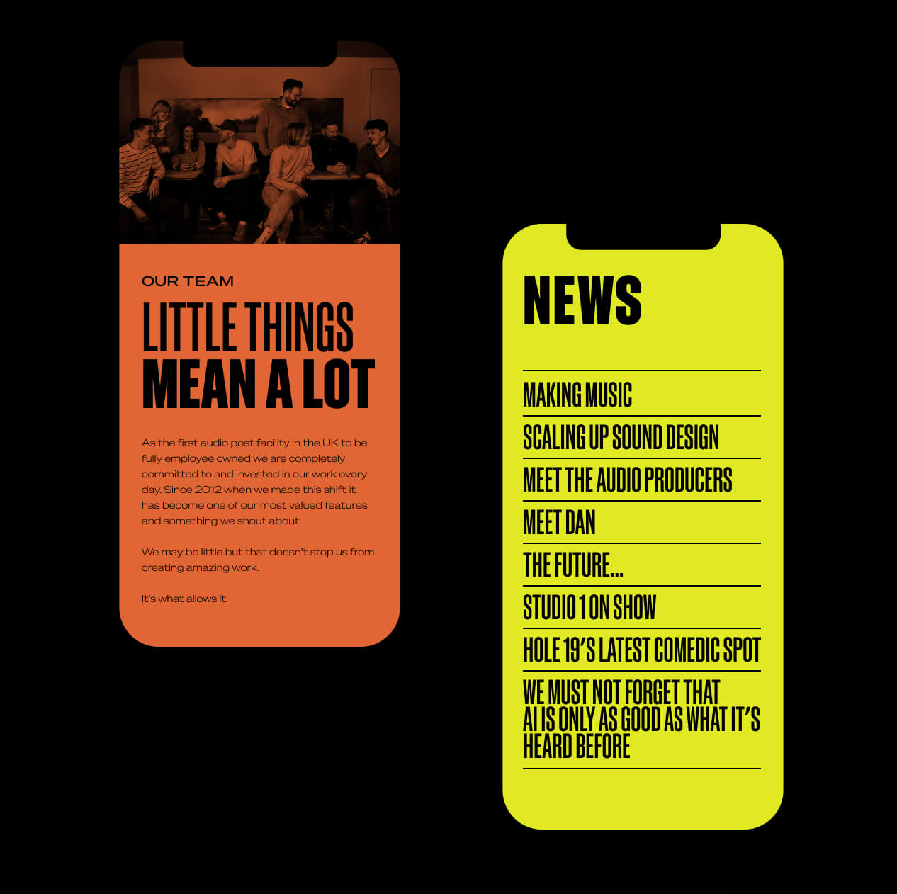
A new name and brand that encapsulates the essence of an independent sound design studio making waves across the industry. With a stellar client list that includes BBC, Mark & Spencers and Netflix, Clearcut Sound felt that their naming and branding no longer suited their output and vision. Deep developed a new name and visual brand that is vibrant and modern whilst focussing on the element that makes them who they are; their boutique size and approach. Previously known as Clearcut, they felt their name was no longer fitted who they are or the values that they stand for. Through a series of workshops we dialled down to the fact that being a small team allows them to focus on the little things that bring projects to life and foster strong client relationships. Changing their name to Little Things perfectly encapsulates this.
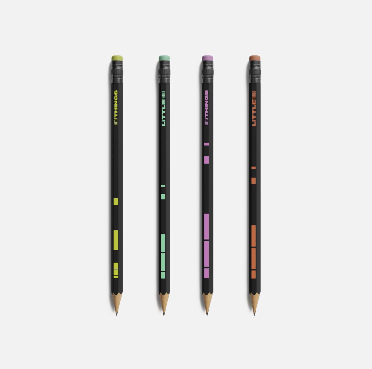
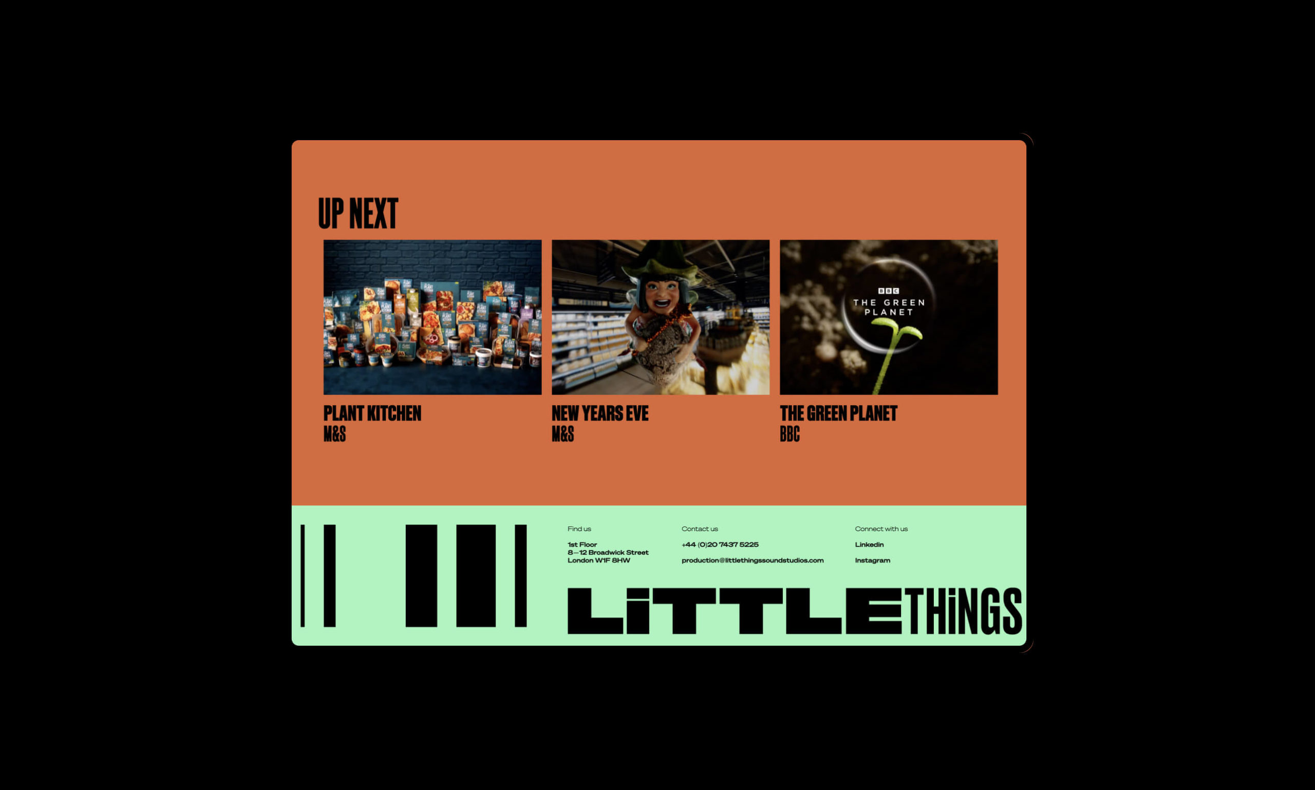
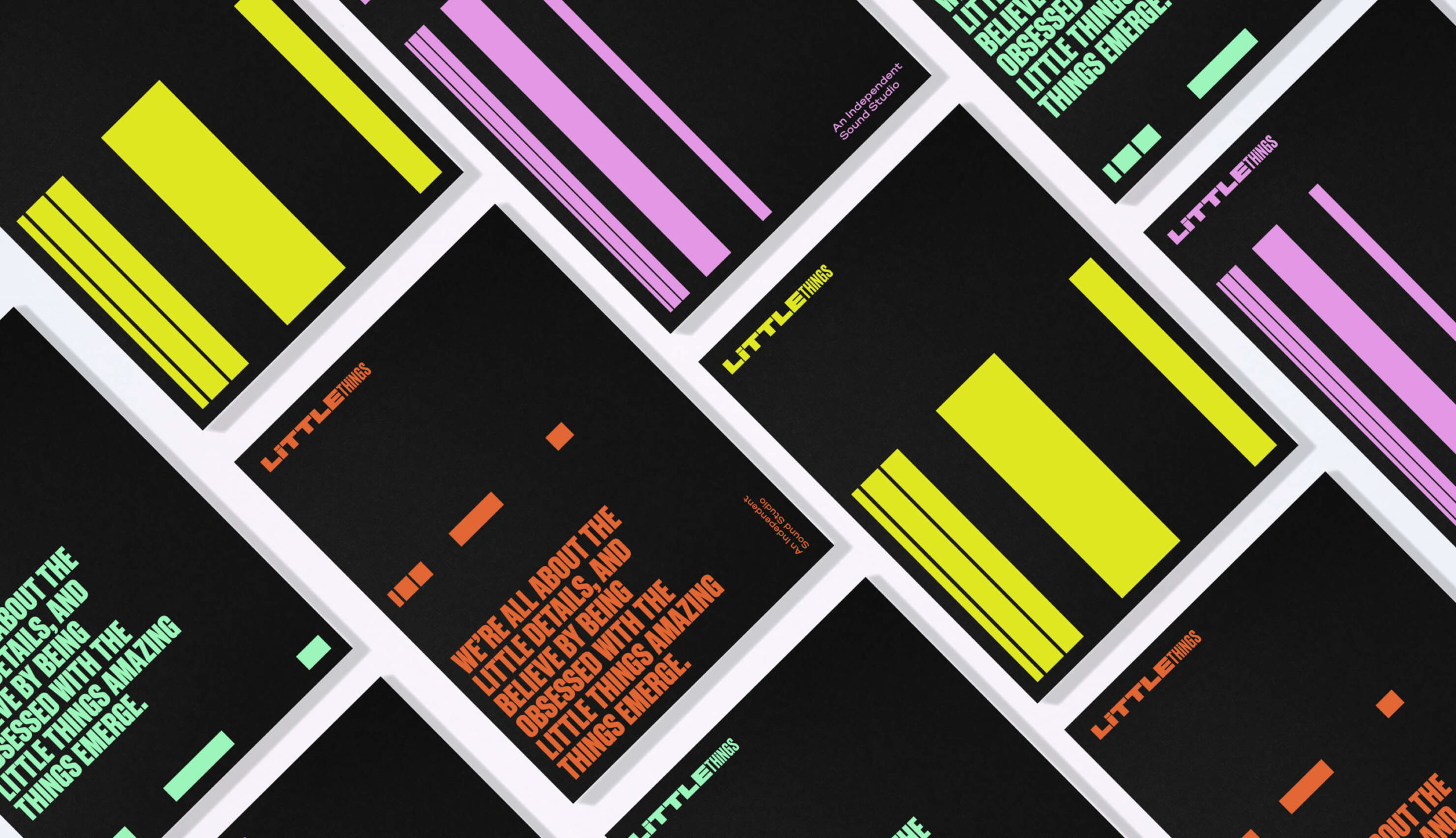
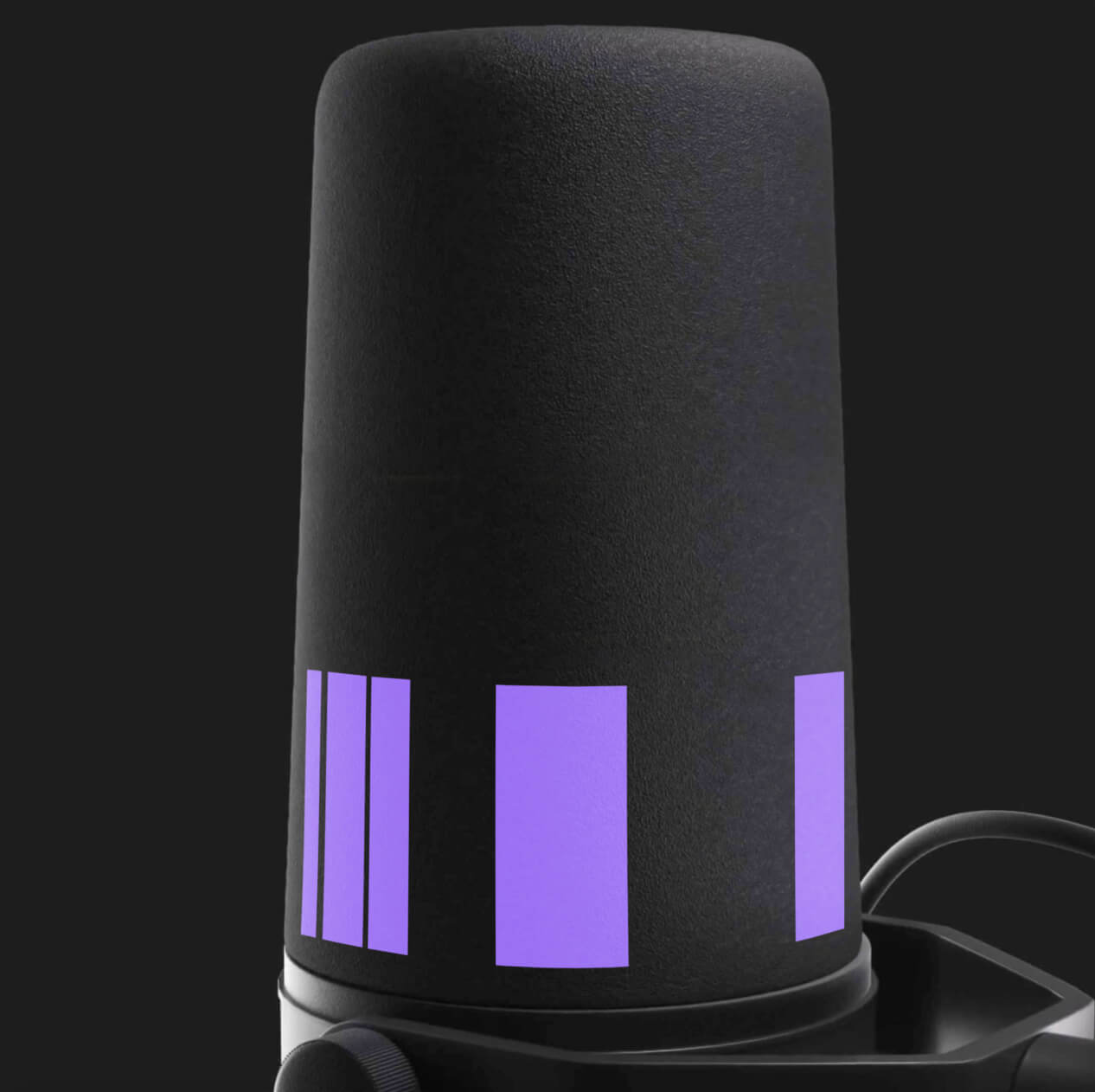
A dynamic graphic device is devised from their attention on the little things – crossing the Ts and dotting the Is, as well as taking direct inspiration from their day to day practice as producers and sound engineers. Literally taking the the crossbar from the T and the dot from the I creates a dynamic and versatile graphic device that can be either used as static or animated. A vibrant colour palette is used to reflect the neon signage that is famous with London’s Soho, where their boutique sound studio is based. Modern and engaging typography plays a strong role within the brand, creating a brand that reflects Little Things as the go to place for sound design.



CREDIT
- Agency/Creative: Deep
- Article Title: Deep Reinvents Clearcut Sound With a New Name and Vibrant Branding
- Organisation/Entity: Agency
- Project Type: Identity
- Project Status: Published
- Agency/Creative Country: United Kingdom
- Agency/Creative City: London
- Market Region: Global
- Project Deliverables: Brand Design, Brand Guidelines, Brand Identity, Brand Naming, Web Design
- Industry: Entertainment
- Keywords: Branding Naming
-
Credits:
Design Director: Stuart Lamont


