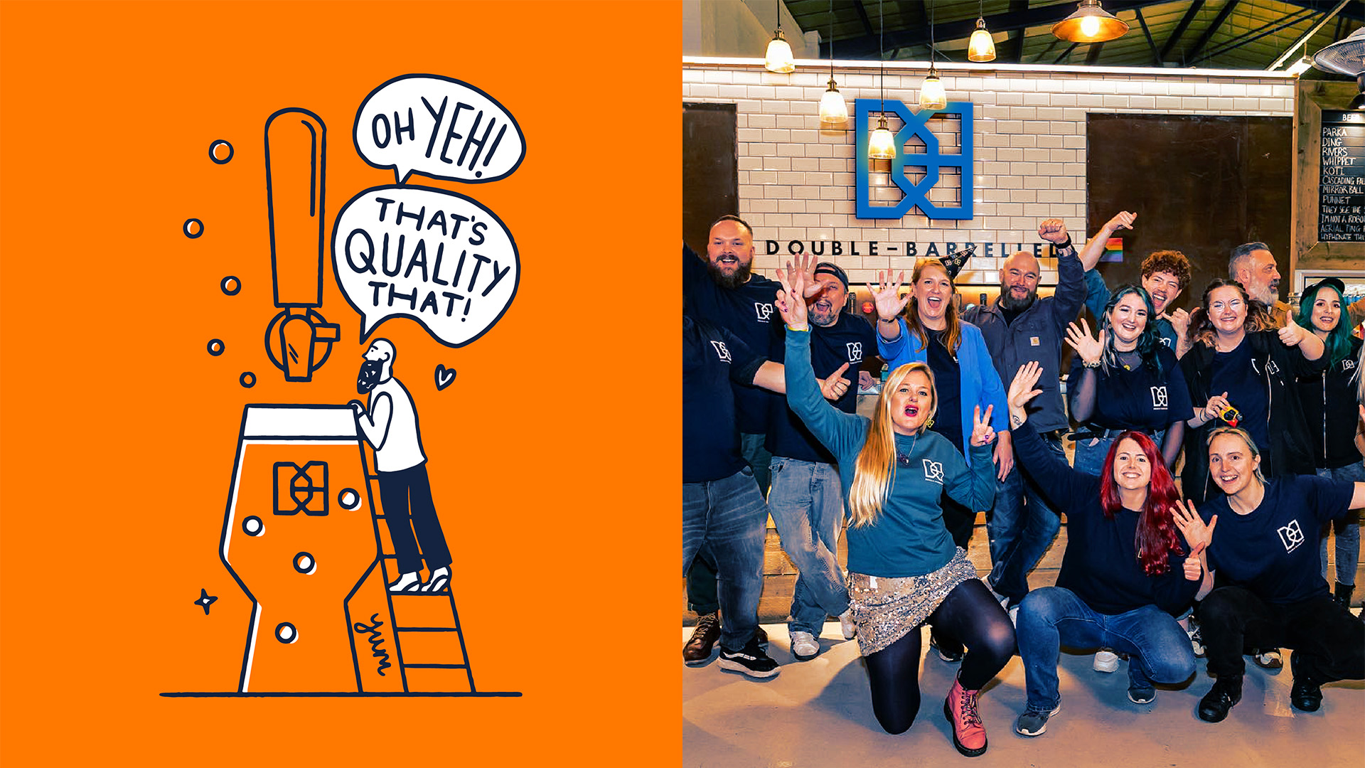
We first developed Double-Barrelled’s brand in 2017, and have worked with them ever since, as they have positioned themselves as one of the UK’s most successful and prolific craft breweries.
In early 2024, approached by a major UK retailer, Double-Barrelled knew they were ready to upgrade their brand to compete on-shelf in supermarkets, and we worked with them to dial up their brand and packaging.
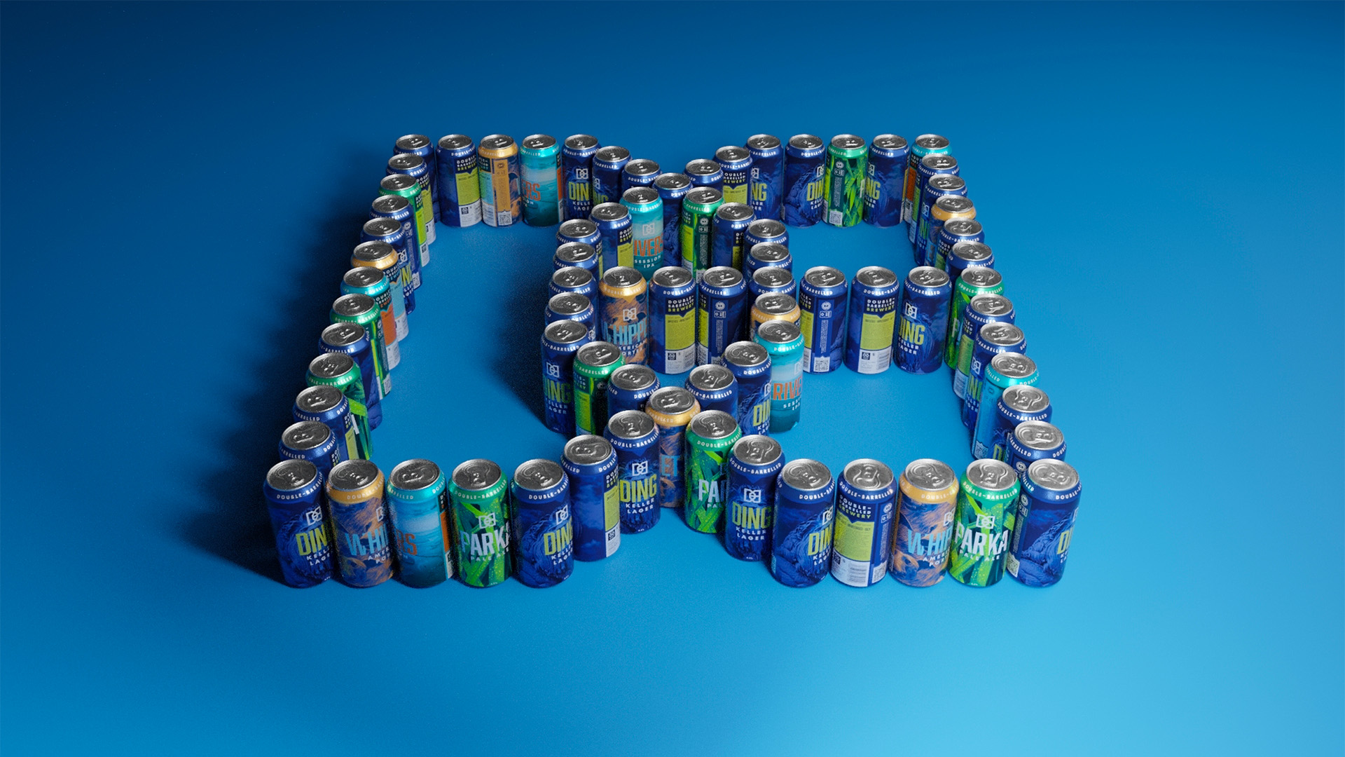
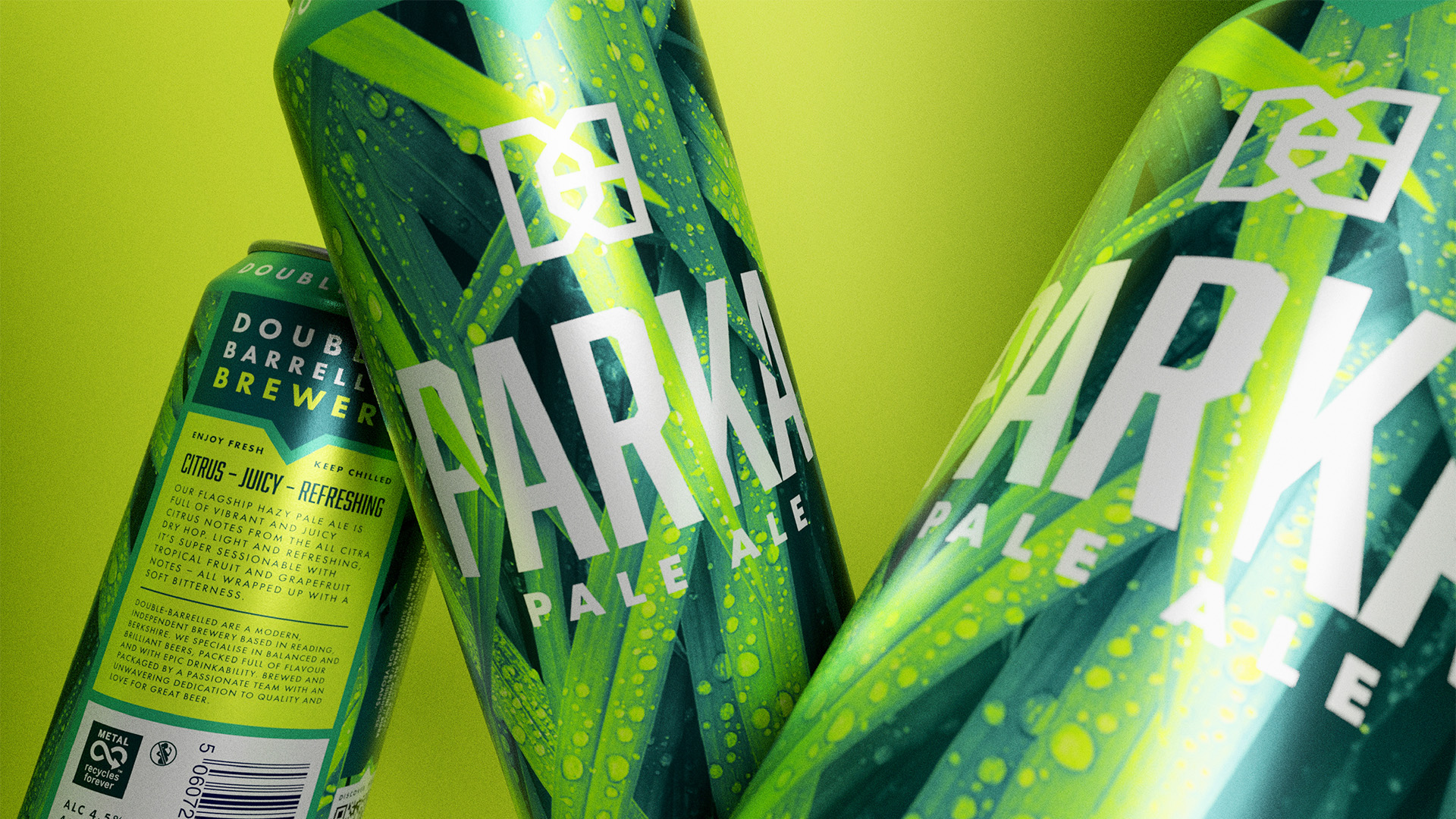
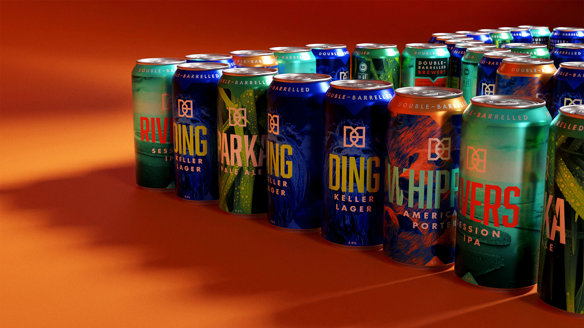
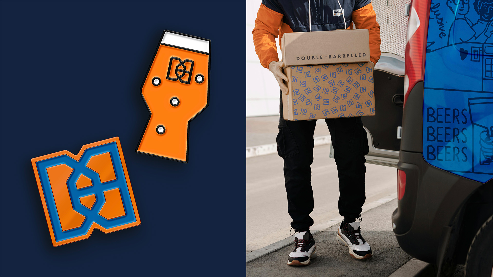
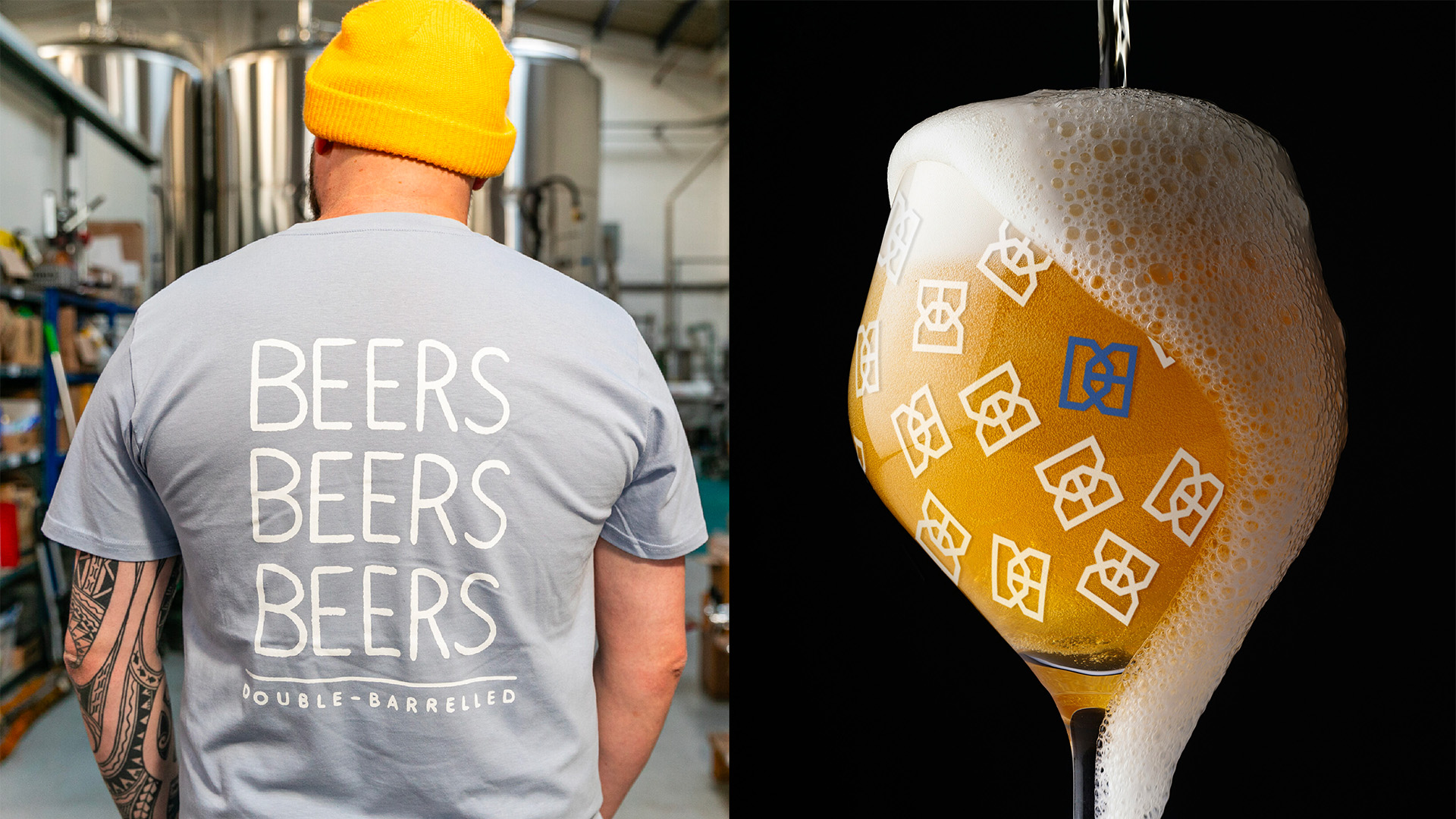
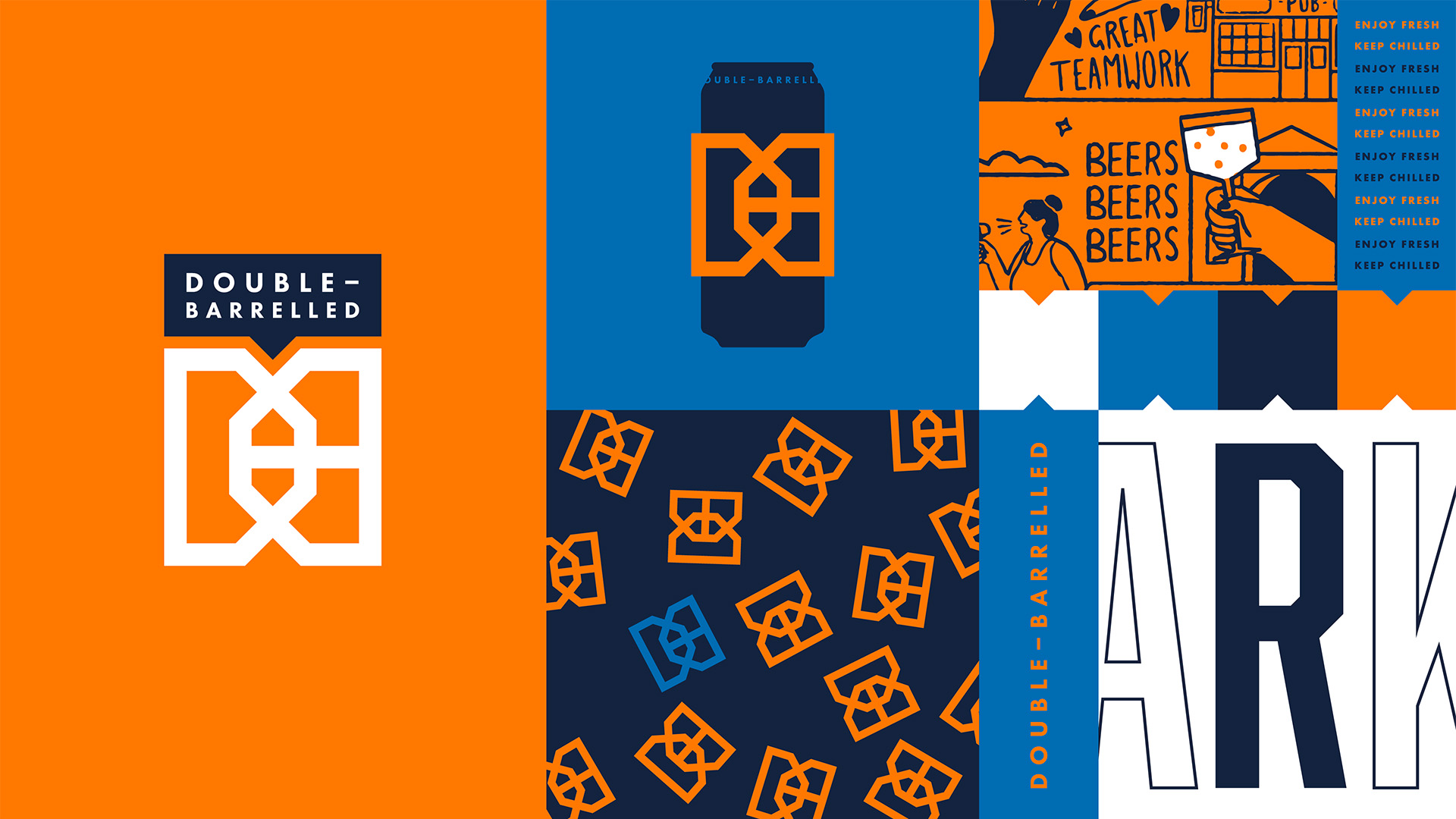
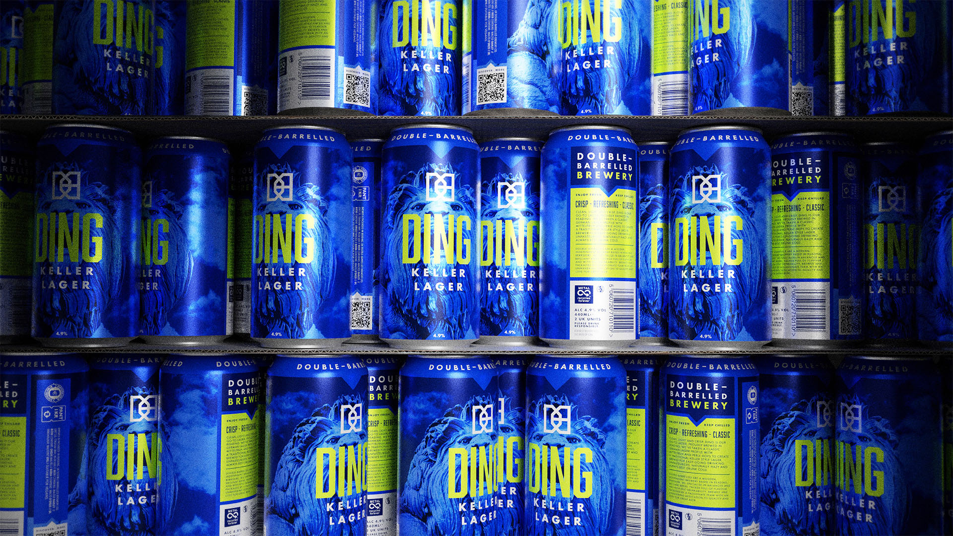
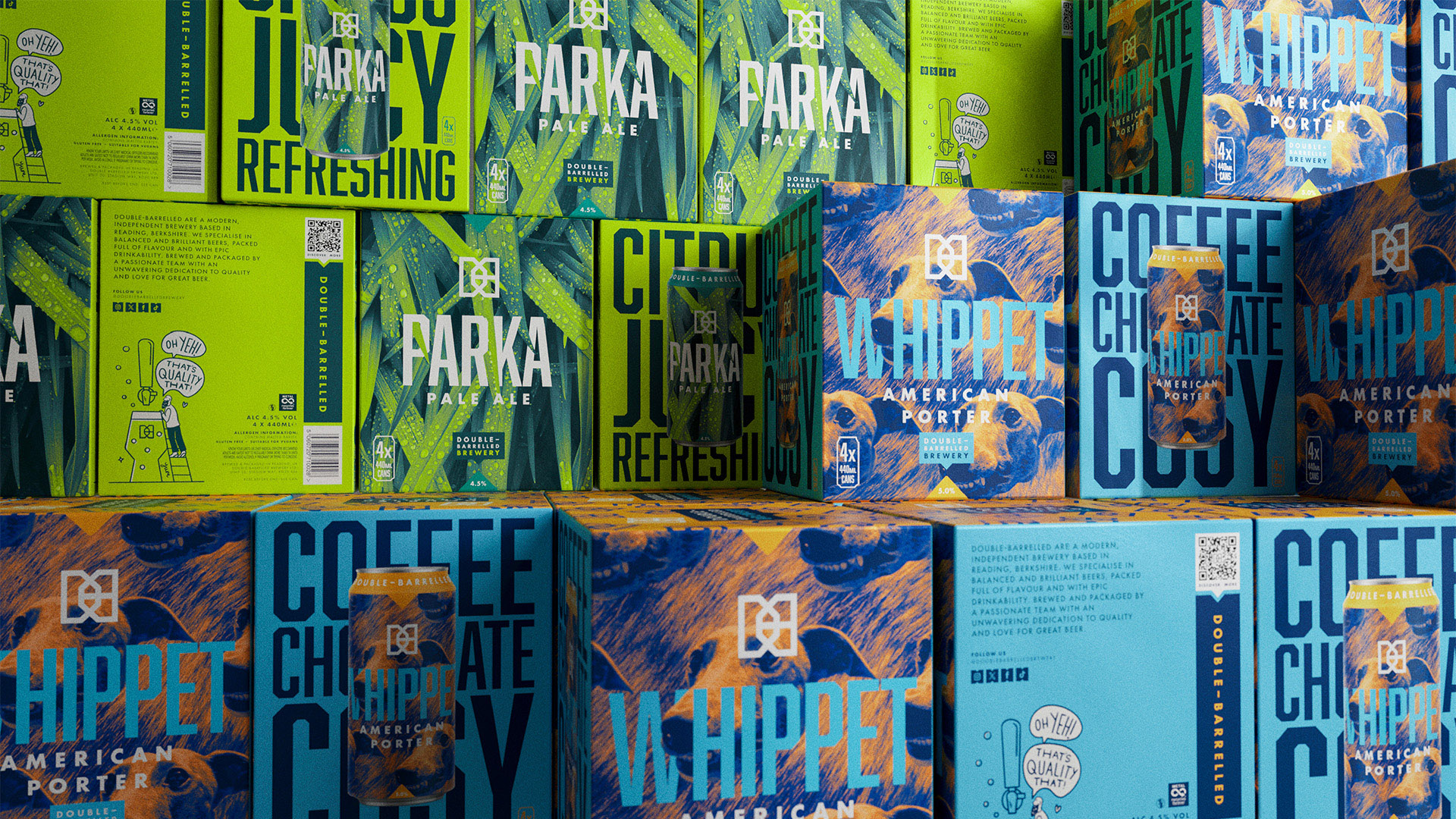
To stand out in the crowded supermarket craft beer category, Double-Barrelled’s packaging needed to be bolder and stronger. For the refresh, we strengthened their iconic logo-mark with a bolder line weight, and introduced a new typeface featuring angled corners that runs through the brand, connecting with the logomark and other assets. With the Double-Barrelled team, we strengthened the naming system with single word product names for the core range. By making more of a focus of each beer variant name, the packaging gives each core product a punchier impact, and better shelf stand-out. Full-print cans take the brand out of the ‘small craft’ world and give a sense of ‘big brand’, and the colour palette has been taken up a gear to give vibrant shelf stand–out, both helping the brand to stand up to its supermarket contemporaries.
We built brand salience across the range with a layout structure and design system which allows for easy roll-out of new beers. Waymarking for use in the off-pack world harks back to the notch shape, which has become synonymous with the Double-Barrelled brand – featured in their original packaging, and integrated into their new can designs.
CREDIT
- Agency/Creative: Kingdom & Sparrow
- Article Title: Kingdom & Sparrow Refresh Double-Barrelled Brewery: Same Great Beer; Brand New Look
- Organisation/Entity: Agency
- Project Type: Packaging
- Project Status: Published
- Agency/Creative Country: United Kingdom
- Agency/Creative City: Falmouth
- Market Region: Europe
- Project Deliverables: Animation, Brand Design, Brand Guidelines, Brand World, Branding, Design, Identity System, Packaging Design
- Format: Box, Can
- Industry: Food/Beverage
- Keywords: WBDS Agency Design Awards 2024/25 , identity refinement packaging style guide
-
Credits:
Project Management: Leona Mounsher-Quirk
Project Management: Polly Arrowsmith
Creative Direction: Johnny Paton
Design: Liam Tomlin
Design: Chris Porter


