Slice Design creates packaging design and identity for new pet food brand Tilly & Ted.
Slice Design were tasked with creating a brand new modern premium pet food brand in partnership with disruptive marketing firm B.Unleashed. The new brand plays into the key humanisation trend that offers pet owners a foodie and no nasties proposition for their beloved cats and dogs.
The brief was to create a brand that is engaging, contemporary and can capture a millennial audience. It was key that the brand should be visually distinctive and playful with a straight talking down to earth tone of voice.
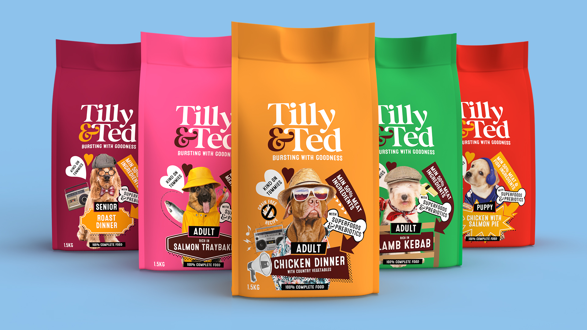
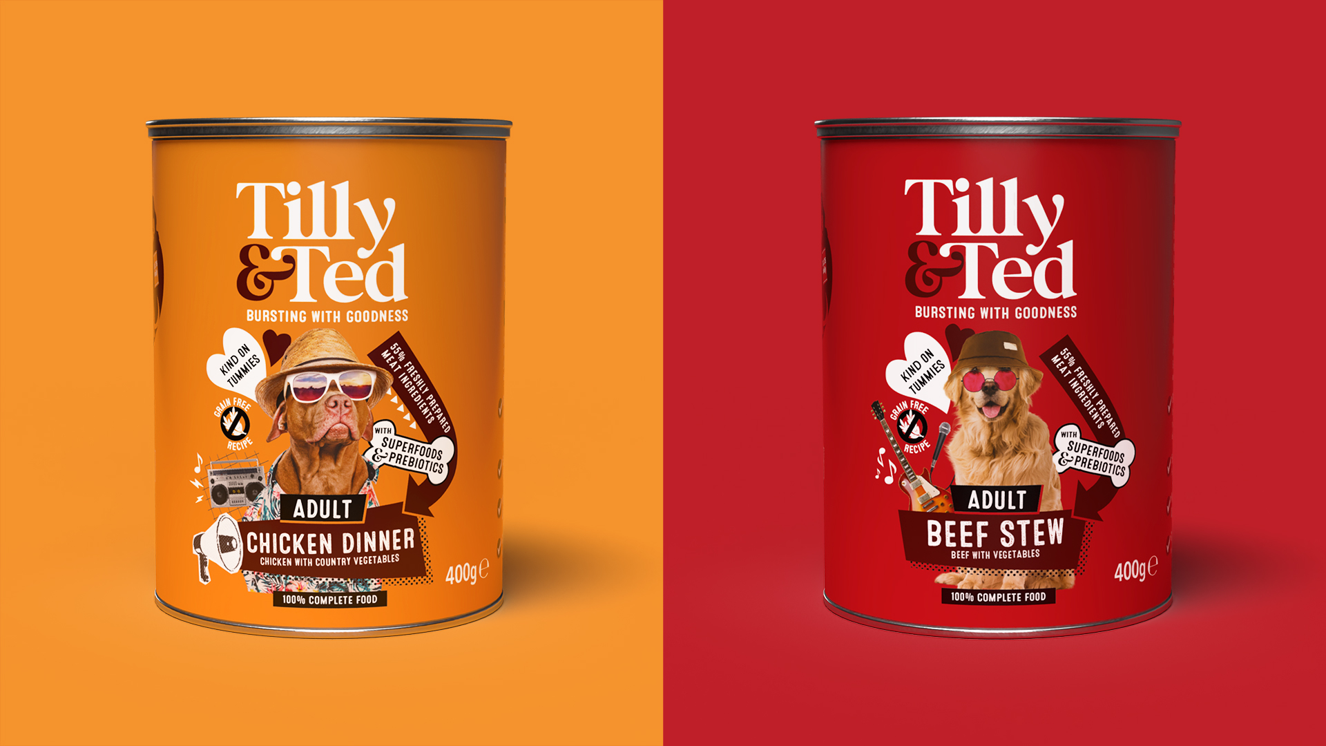
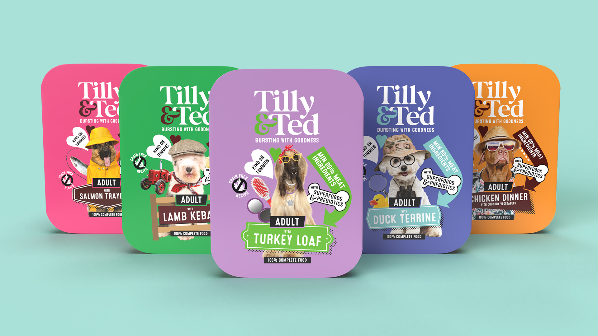
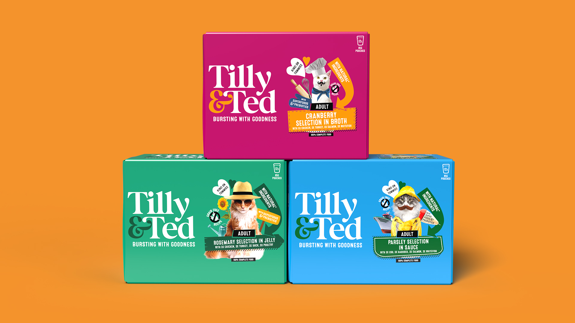
Tilly & Ted know what an integral part of the family pets can be and their personality traits are just as individual as their owners! We wanted this to be reflected in Tilly & Teds’ packaging by showcasing each cat or dogs’ unique and quirky characteristics as if they were portraits in a family album. Each flavour has its own personality from Penelope, a lady of leisure who loves to be in front of the camera to Monty, an outdoor cat who loves tinkering in the garden. Engaging flavour names such as Chicken Paella were introduced to tap into the humanisation trend and disrupt the market norms.
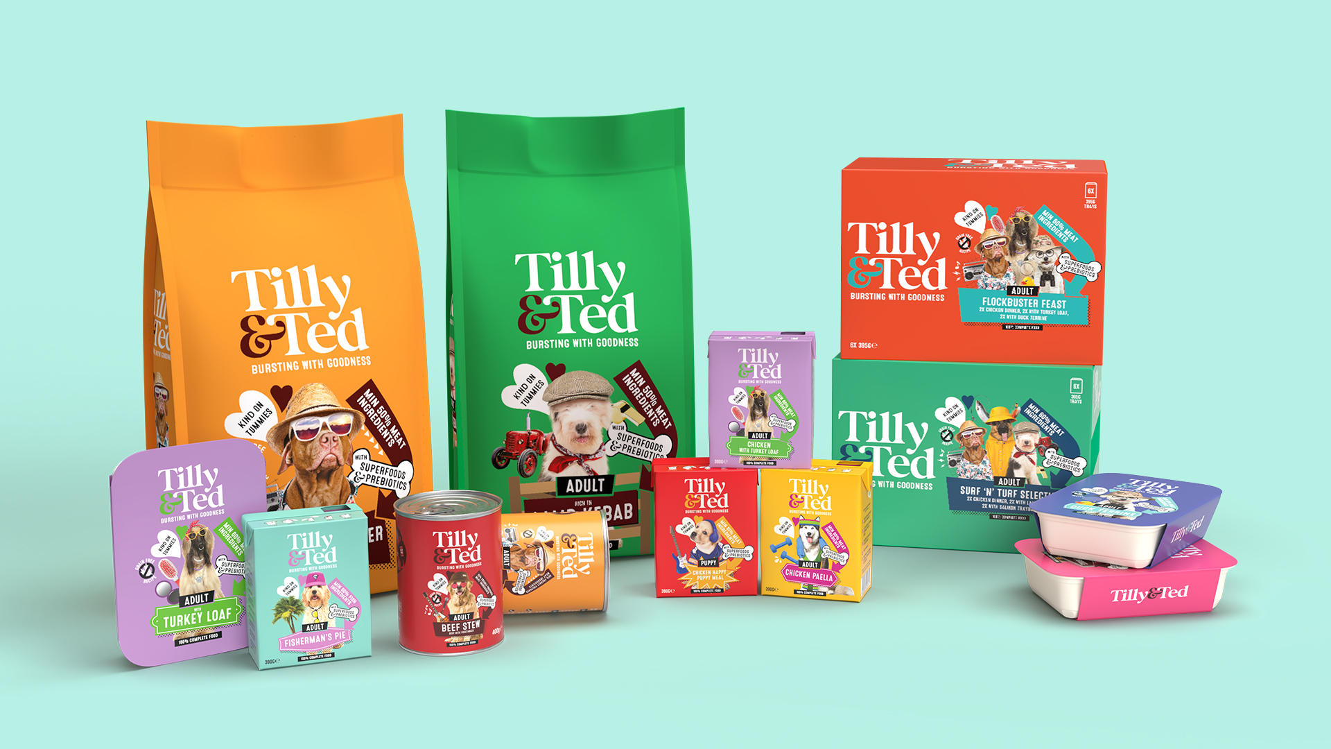
Our packaging design for Tilly & Ted uses light hearted, quirky and unique photo montages that combine personality, flavour and benefits. The packs are full of vibrance and playfulness which gives instant stand out on shelf and entices customers to explore the pack.
The range consists of dried food and wet food over 43 SKUs with each flavour having its own individual cat or dog. As everything included in Tilly & Ted’s recipes has an important role to play, key benefits are prominent on the front of pack and the strap line, ‘Bursting With Goodness.’
Tilly & Ted’s range of pawsitively delish pet food is available in ASDA from May 1st. ASDA Buyer added: “Our customers want to feel good about the food they’re giving their pets, knowing that it’s not only delicious.”
Agency Comments (Alan Gilbody, Founder & Director)
Alan Gilbody at Slice Design Limited helped to explain some of the design features on pack.
“It was key for us that the packaging design for Tilly & Ted captured that pets are an integral part of the family and their characters can be quite unique and eccentric just as we are. We used this insight to create a range of unique individual characters, capture the owners attention and provide an engaging way to talk about the flavours.”
Client Comments (Bianca Harris, Marketing Manager for Tilly & Ted)
“Our commitment to quality drives everything we do. For us, delivering delicious meals for pets at an affordable price is top priority. We aim to raise the bar without breaking the bank.”




CREDIT
- Agency/Creative: Slice Design
- Article Title: Slice Design Creates Packaging Design And Identity For New Pet Food Brand Tilly & Ted
- Organisation/Entity: Agency
- Project Type: Packaging
- Project Status: Published
- Agency/Creative Country: United Kingdom
- Agency/Creative City: Slice Design
- Market Region: Europe
- Project Deliverables: Brand Creation, Brand Design, Packaging Design
- Format: Bag, Box, Can, Pouch
- Industry: Food/Beverage
- Keywords: Packaging, Packaging Design, Branding, Brand
-
Credits:
Creative Director: Alan Gilbody
Senior Account Manager: Charlotte Burrows
Designer: Alie Brown
Designer: Ellie Welsh
Artworker: Meghann Longmoor


