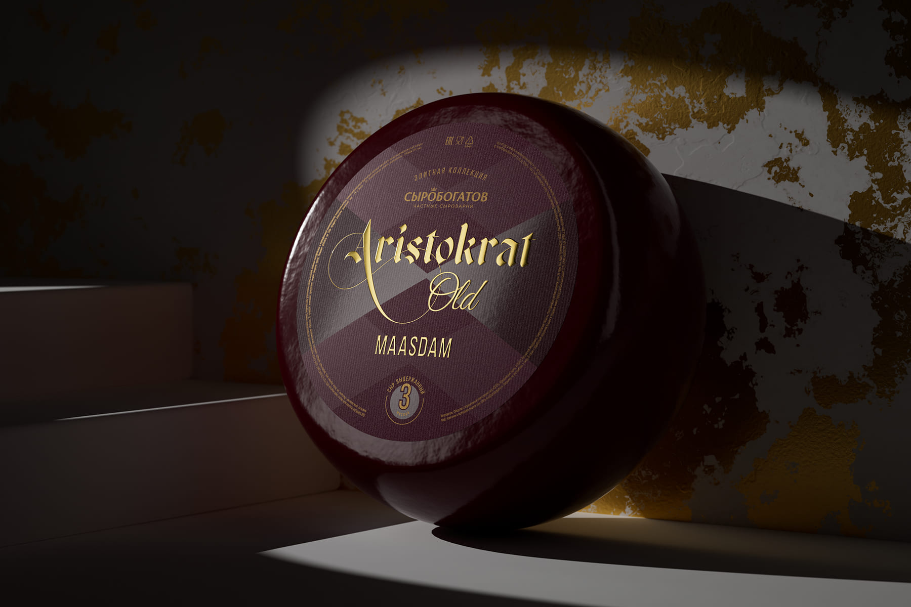
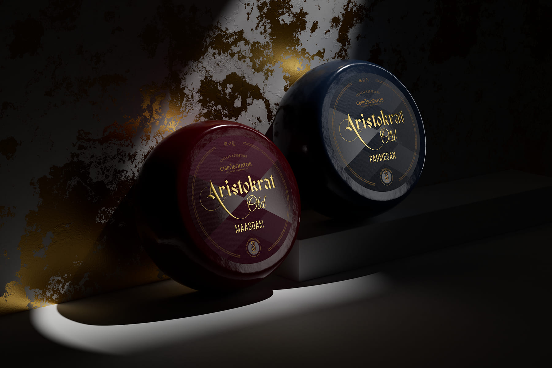
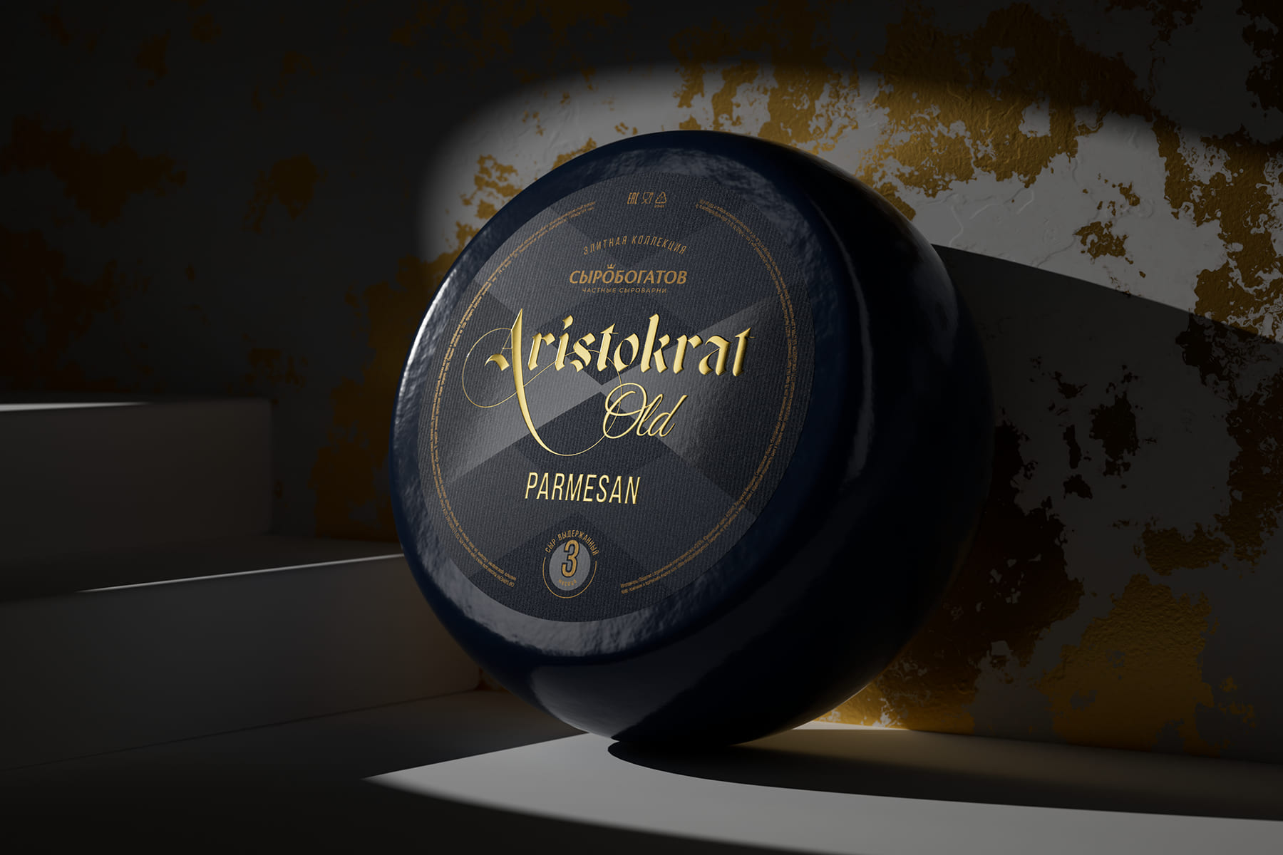
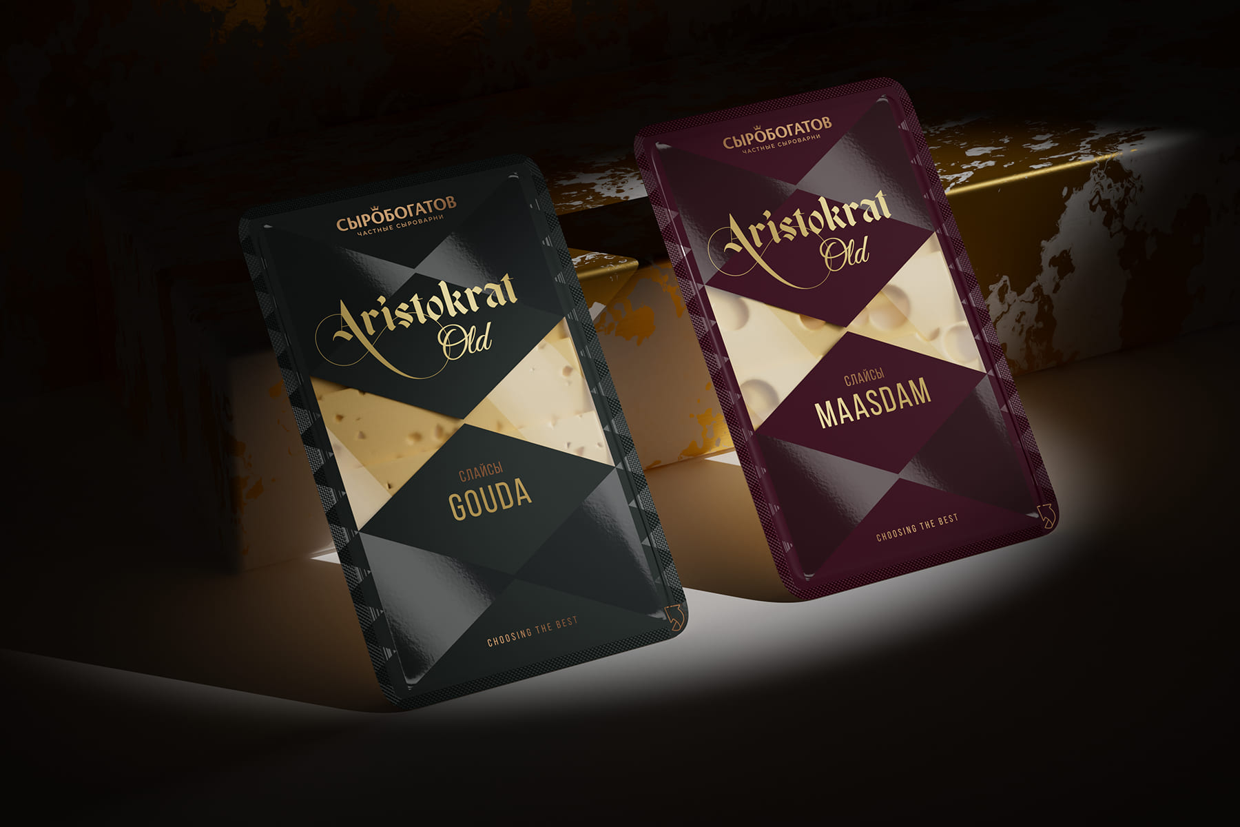
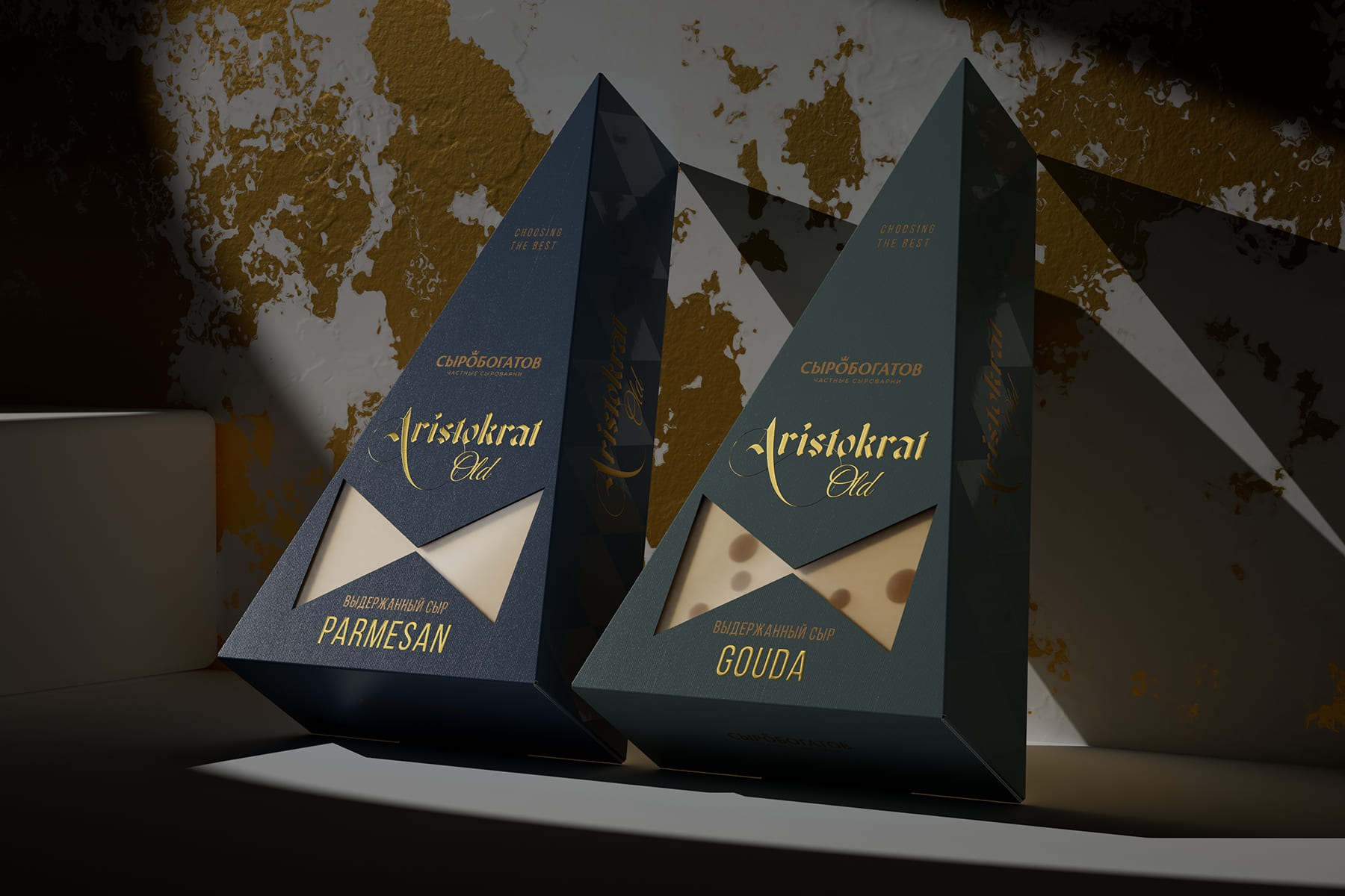
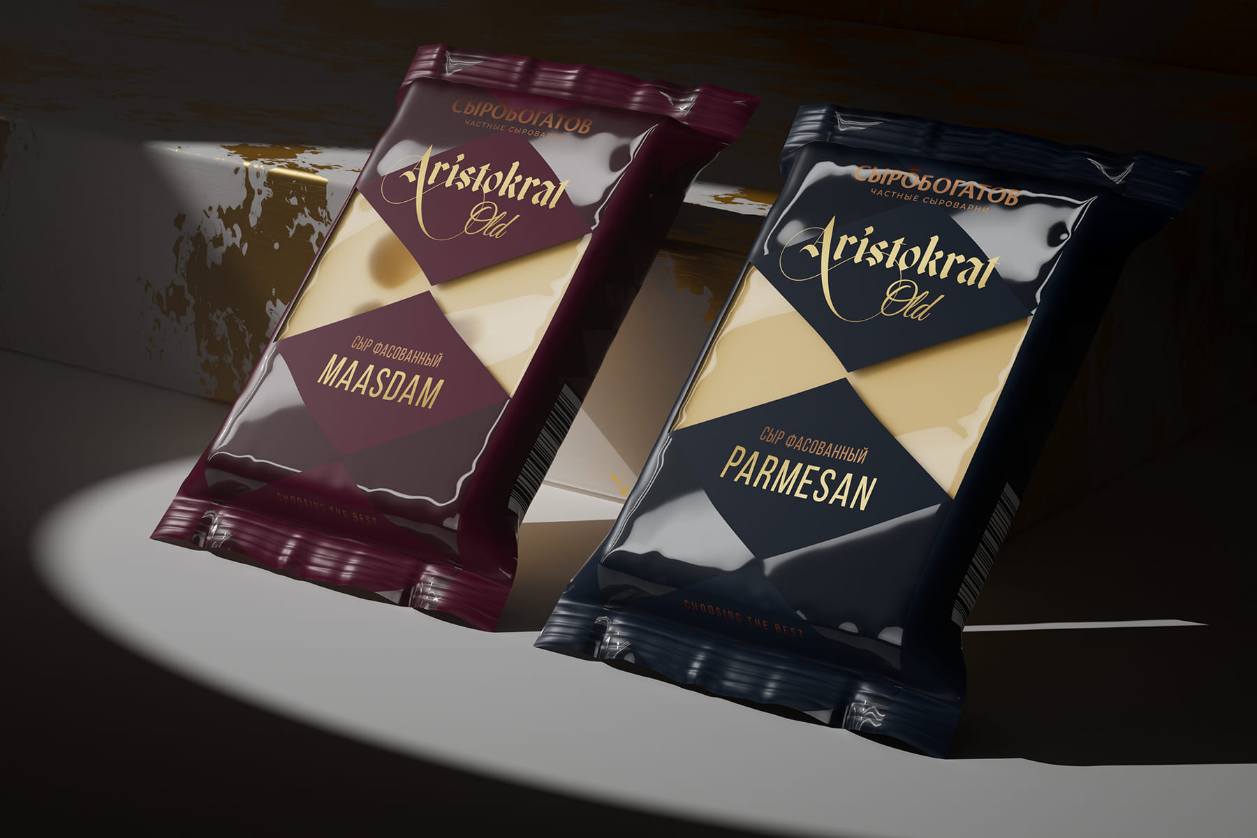
Тask: Aristokrat are premium hard cheeses. When developing the packaging design, our task was to emphasise the elitism of the product.
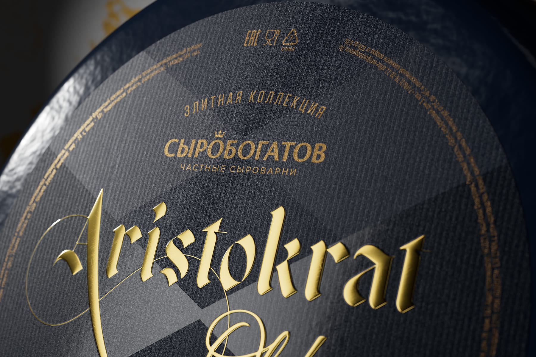
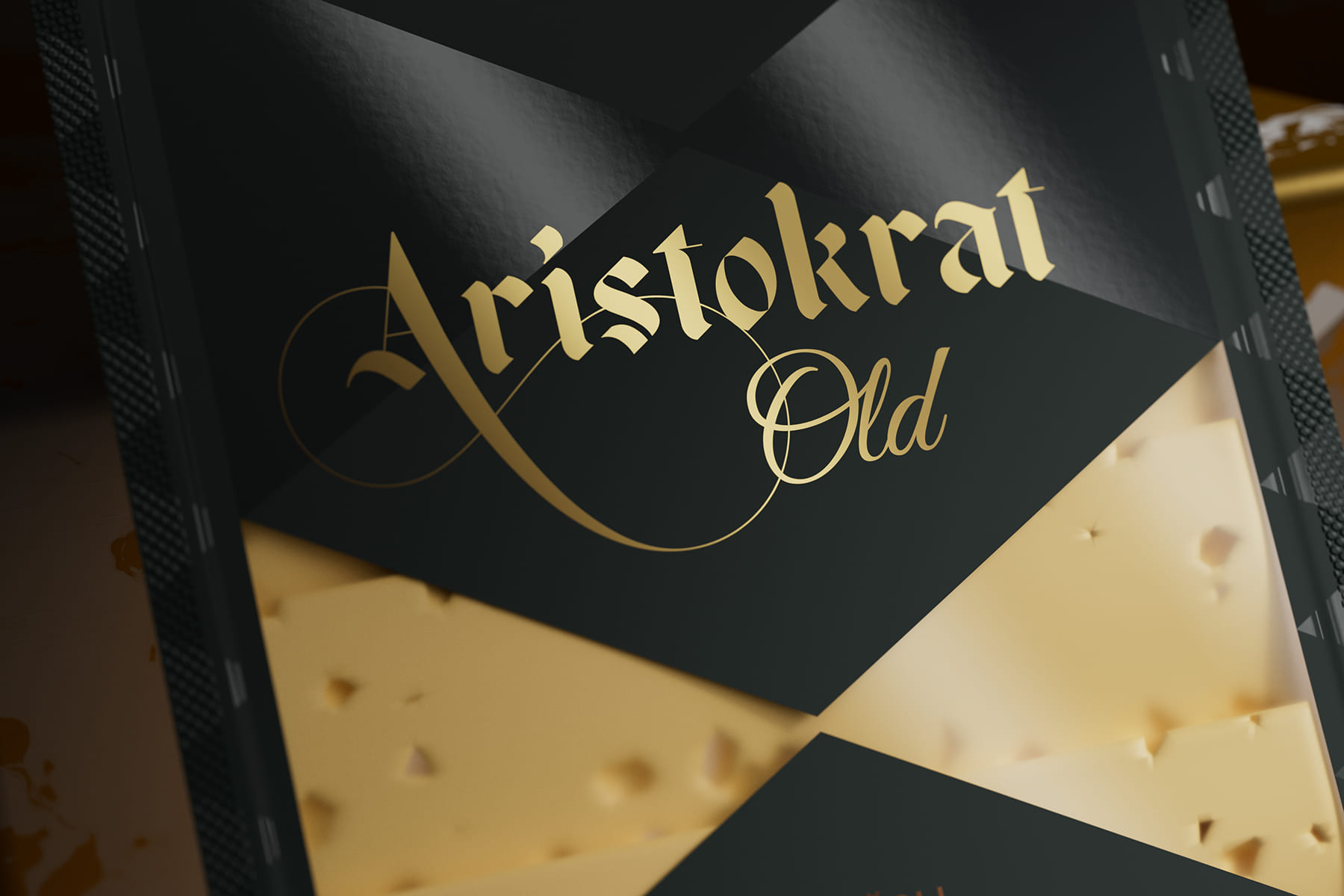
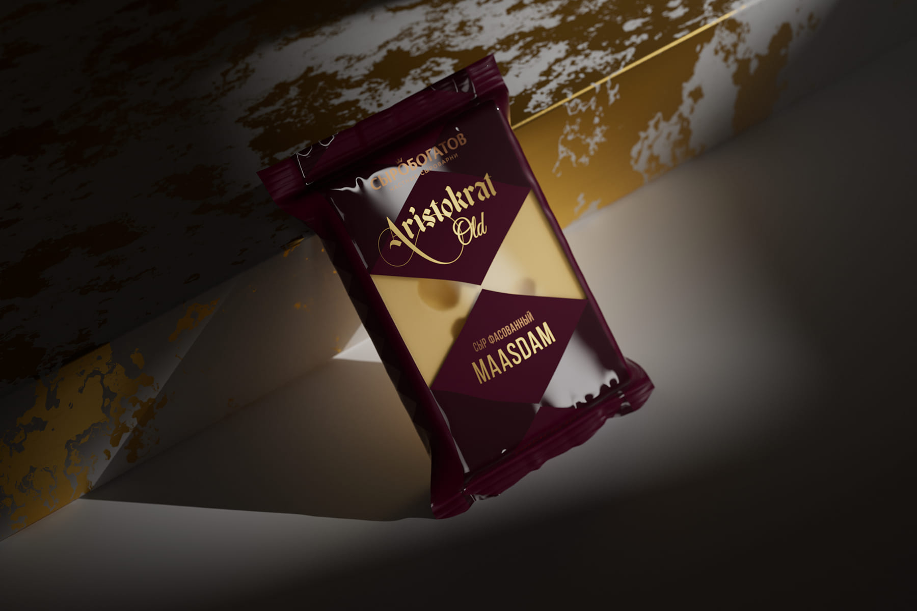
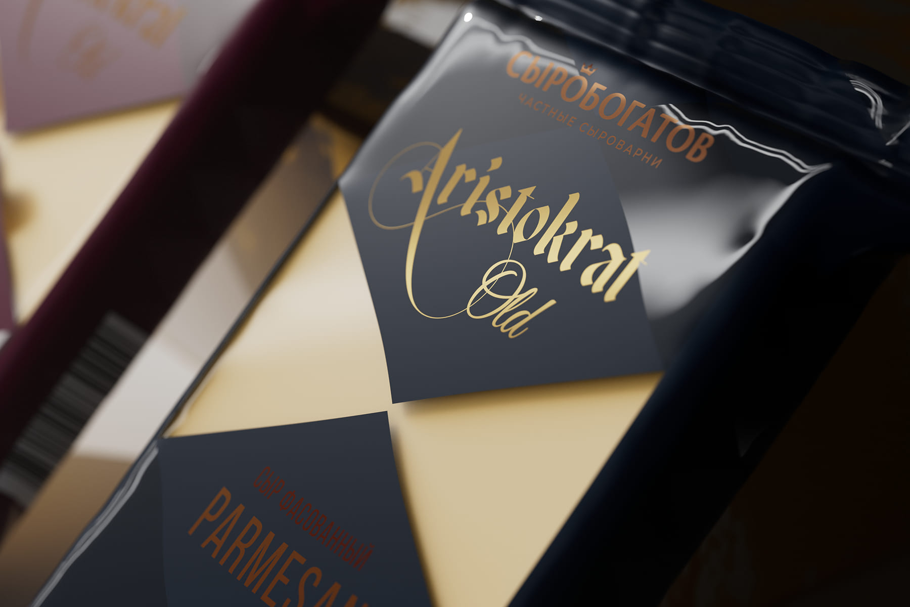
Idea: What unites aristocrats? A refined, refined and verified appearance, an integral attribute of which is a bow tie. The shape of the butterfly rhymes with the shape of a piece of cheese cut from the head. This similarity formed the basis of the packaging design. The second reference point of the style was the Gothic font, also symbolizing aristocracy: at the dawn of printing, it was Gothic fonts that were used, and only educated and usually well-off people could buy books. Over time, Gothic settled into heraldry and is still used for coats of arms.
The design is based on the shape of a bow tie, as well as a Gothic font as a symbol of aristocracy and quality.
CREDIT
- Agency/Creative: Commersart Branding Agency©
- Article Title: Commersart Create Packaging Design for Aristokrat Premium Hard Cheeses
- Organisation/Entity: Agency
- Project Type: Packaging
- Project Status: Published
- Agency/Creative Country: Russia
- Agency/Creative City: Москва
- Market Region: Europe
- Project Deliverables: Branding
- Format: Blister-Pack
- Industry: Food/Beverage
- Keywords: design, branding, Logotype, Packaging, Brand Design, Cheese, Food, packaging design, product 3D
-
Credits:
Design Agency: Commersart


