


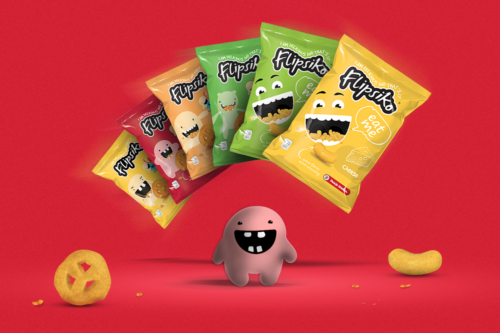
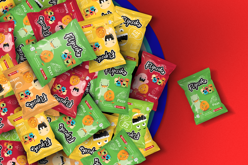
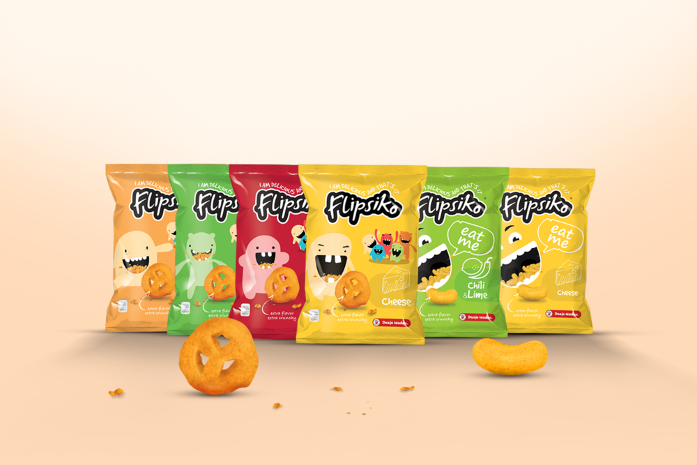
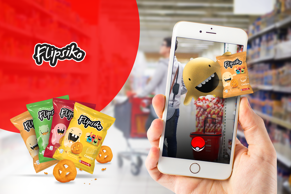
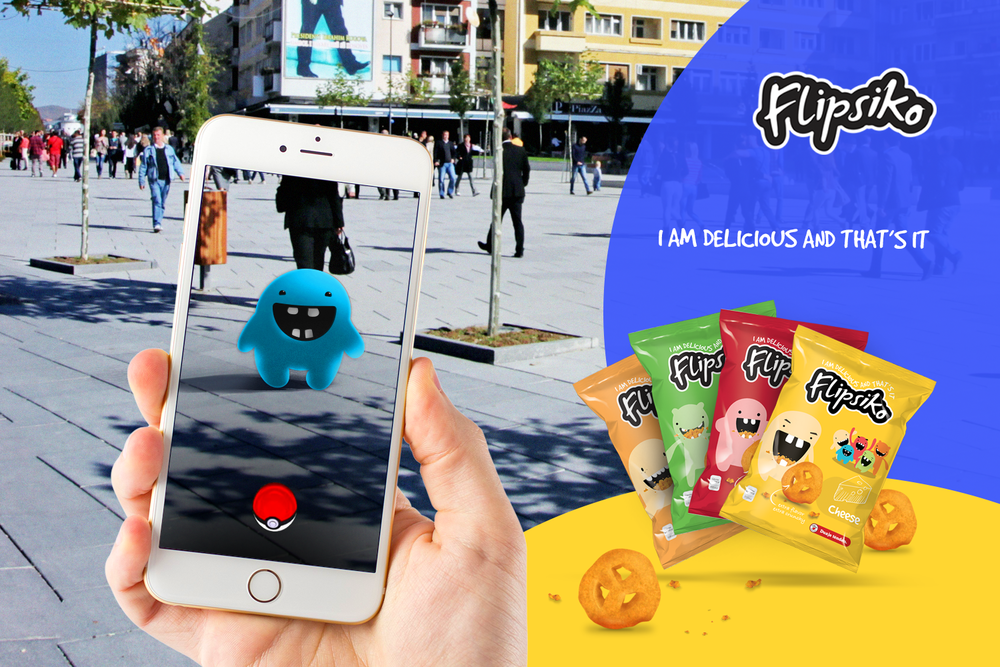
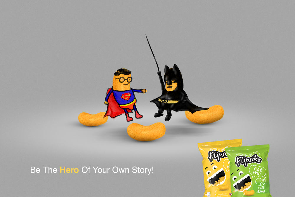
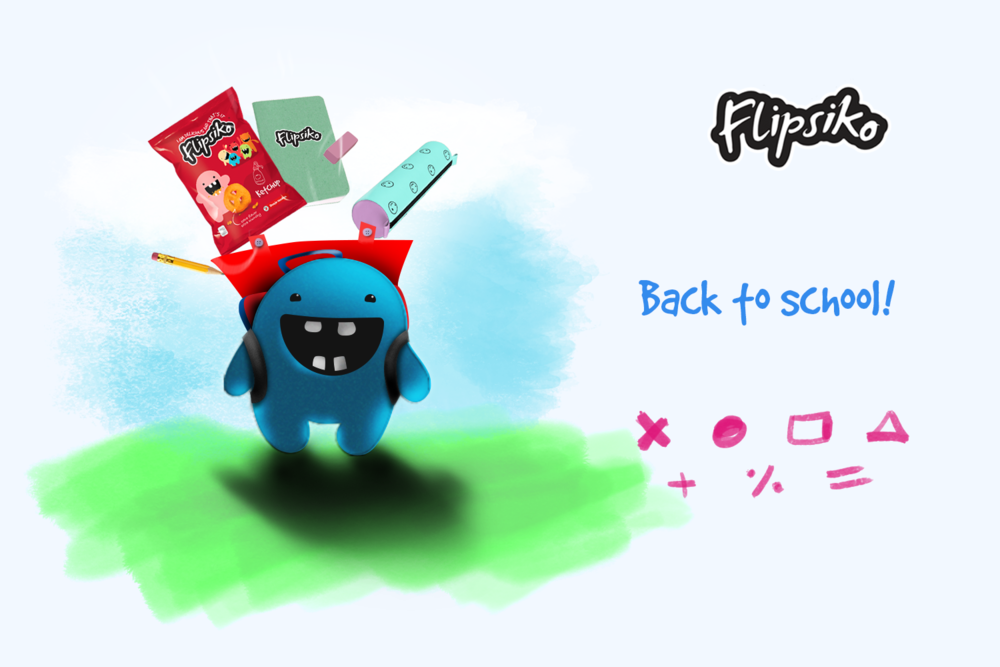
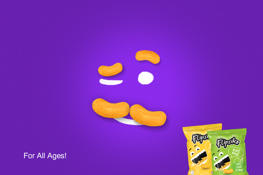
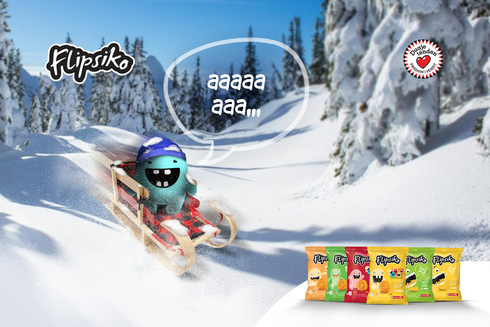
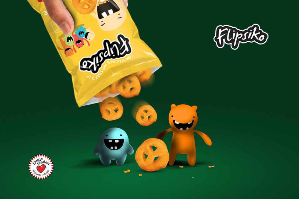
“Flipsiko’s design is mainly focused on the characters and stories that follow them. It is planned that every character will eventually be incorporated into their own short clips for advertisement, but of course they always remember to bring their flips along with them. Each character will slowly develop their own personality which will help make the product more relatable to customers. Flipsikos design doesn’t focus and dedicate the majority of the packet to showing you the flips but instead has chosen to carefully place the characters to grab the attention of younger generations.
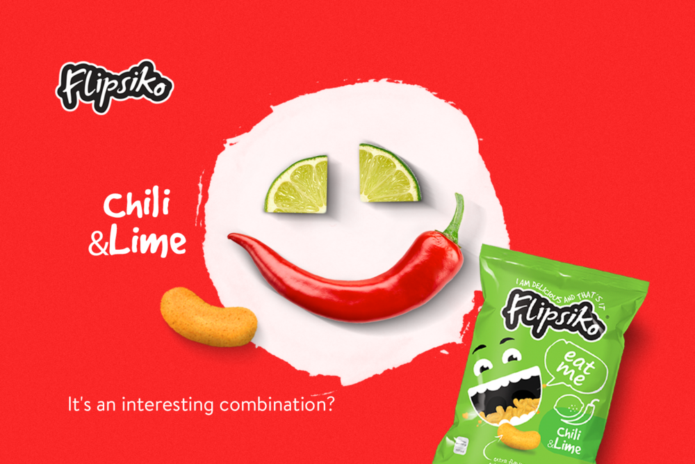
Each flavour has a pastel colour of it’s own, Flipsikos branding lets the simplistic design speak for itself with just the characters popping out. Colour on each packet is either related to the flavour or compatible with it. So as it has always been the ketchup flavoured flip has a pastel red colour. The colors I used are of the same tone yet easy to tell apart, a huge part of the color selection process was so that the colors would still be highly compatible amongst themselves no matter how the seller structures them in store.
I created all the visual identity; from naming, packaging and all sales peripherals.”
CREDIT
- Agency/Creative: Armend Berisha
- Article Title: Armend Berisha – Flipsiko
- Project Type: Packaging
- Format: Bag
- Substrate: Metal


