Kuudes – 3 Kaveria Rebranding
“”The secret of this ice cream is there’s no secret.”
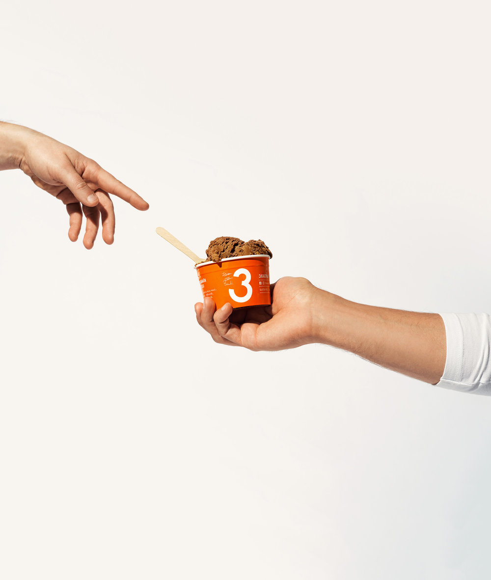
At its launch in 2012, 3 Kaverin Jäätelö (3 Friends Ice Cream) was the first craft ice cream brand in Finland. Since then, this company founded by 3 passionate ice cream lovers has been the forerunner in the Finnish ice cream scene. Just like true friends, 3 Kaveria ice cream doesn’t keep secrets. It’s made from only good and natural ingredients, so there’s no reason to explain or hide anything.
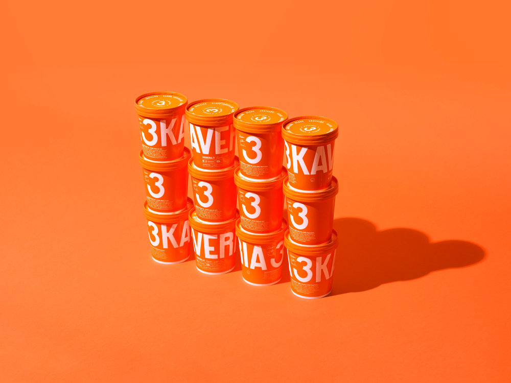
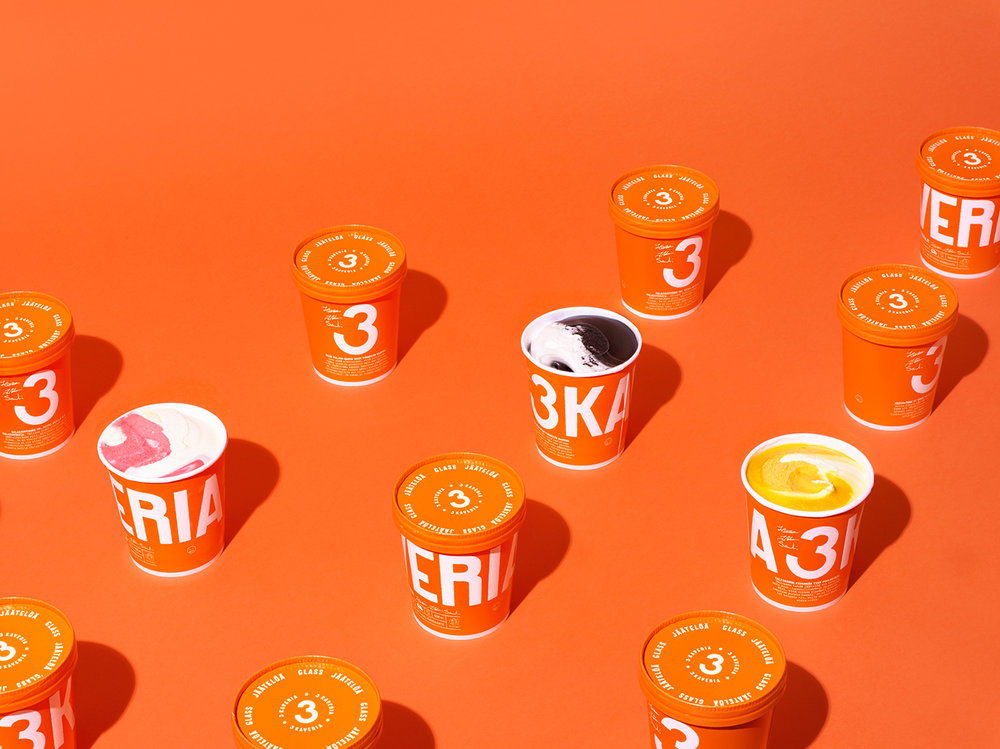
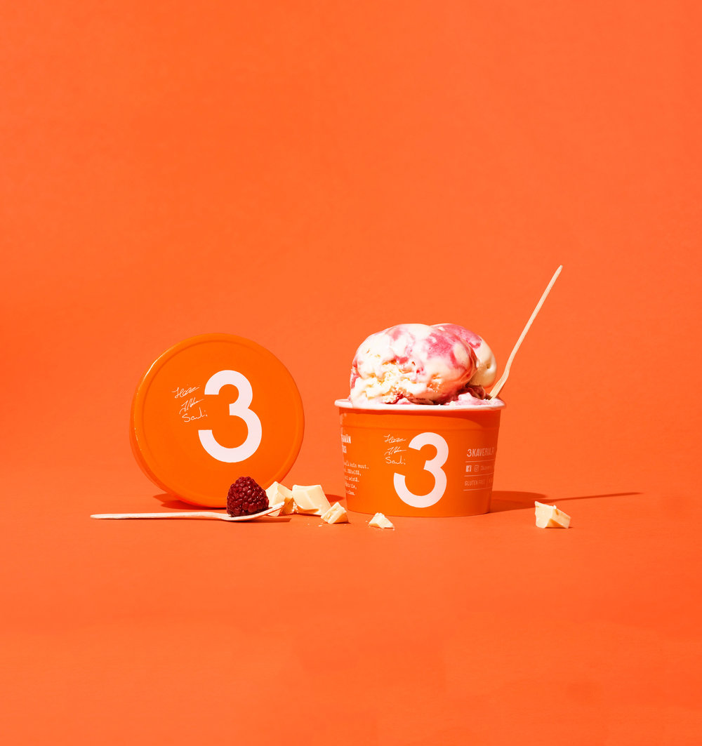
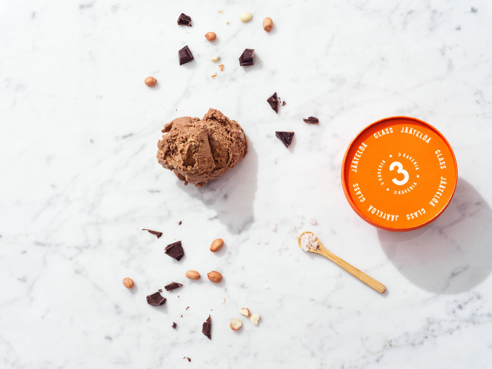
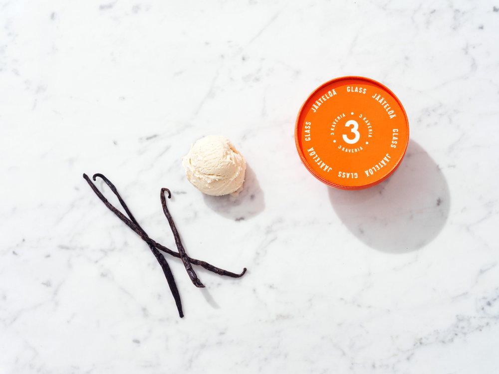
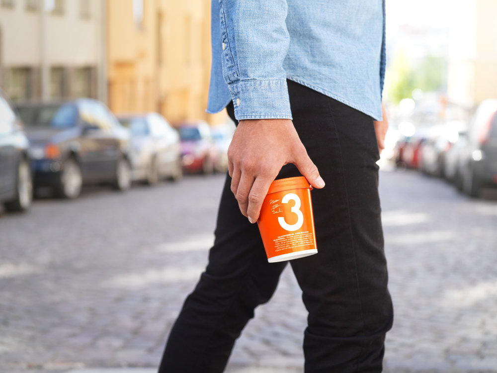
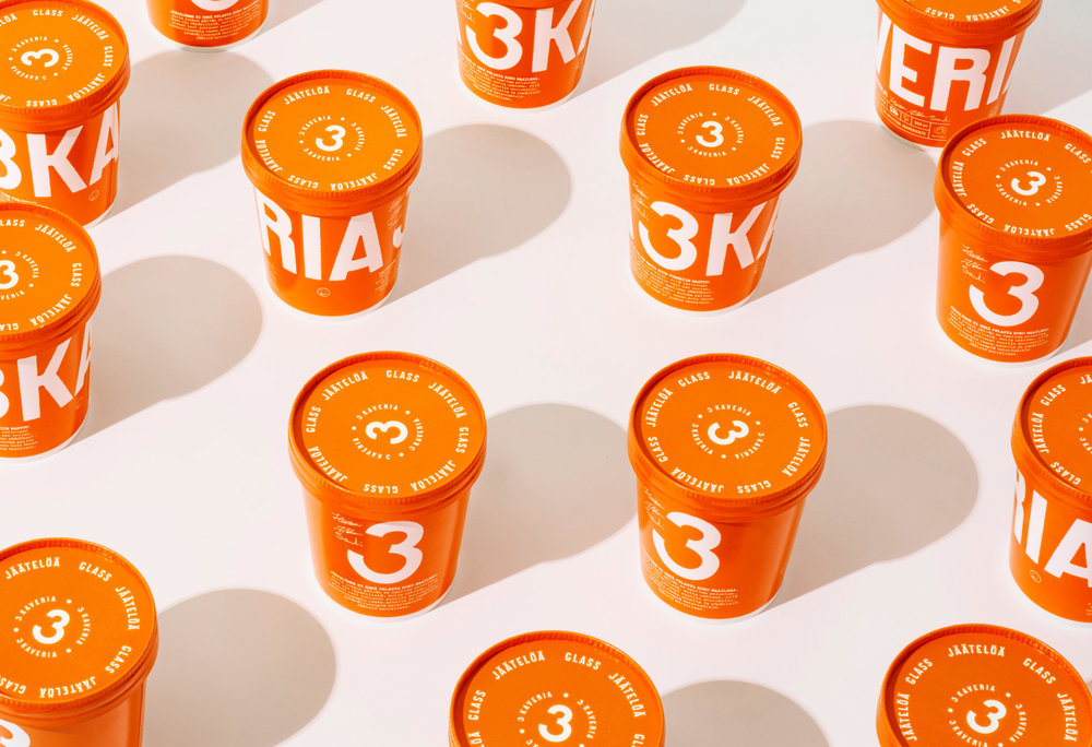
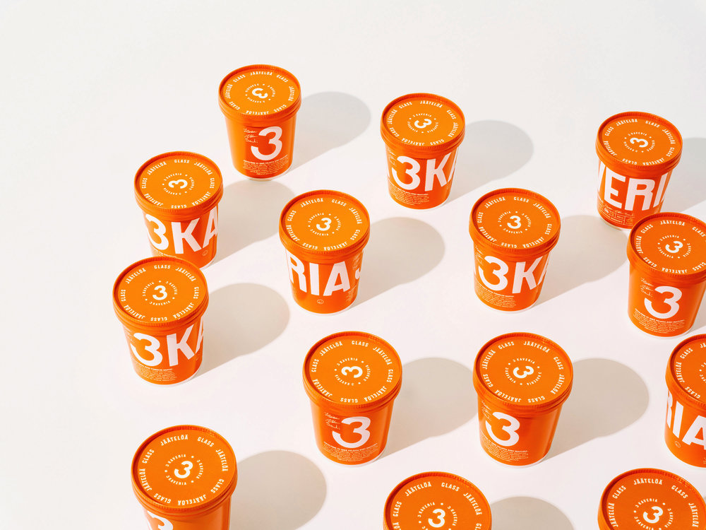
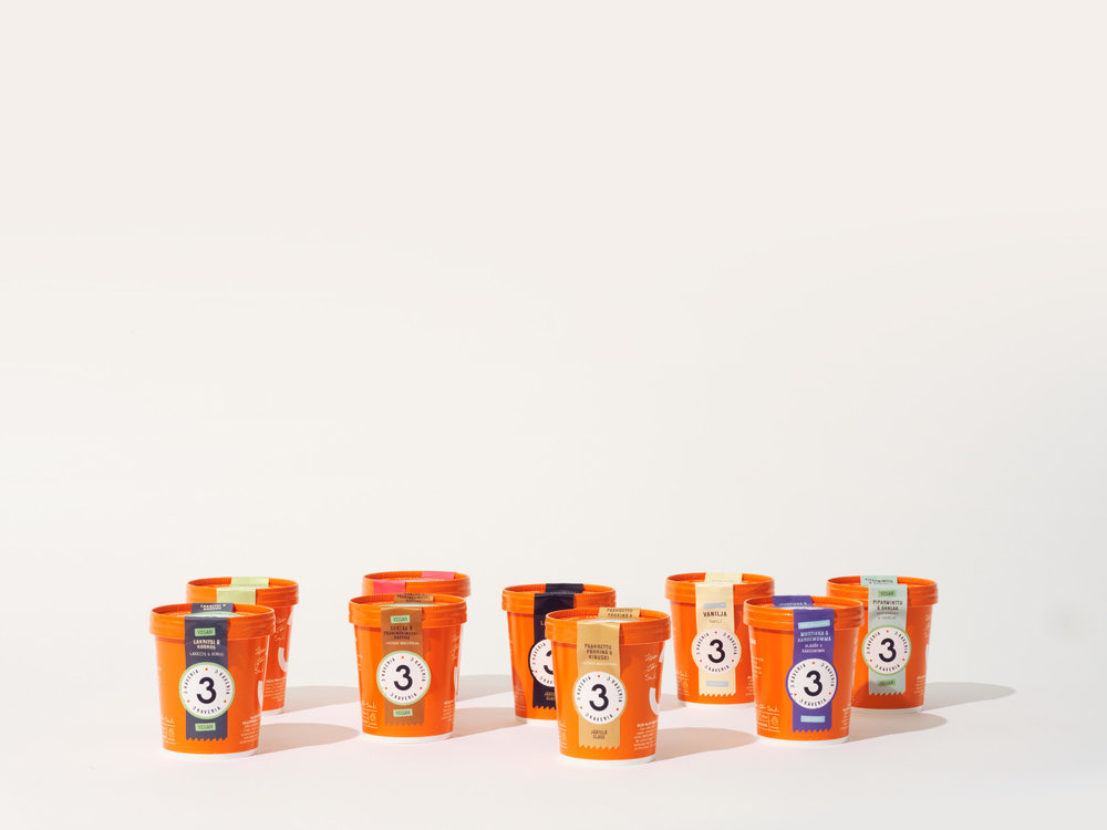
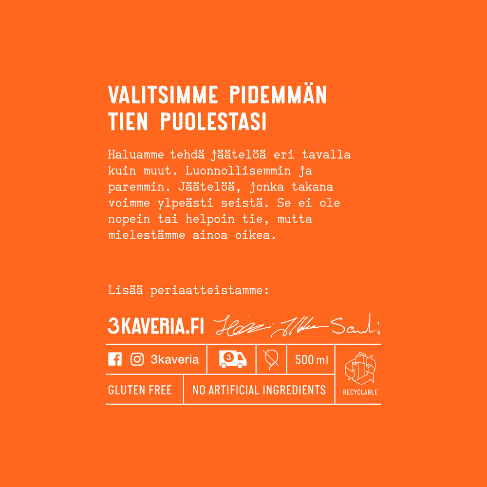
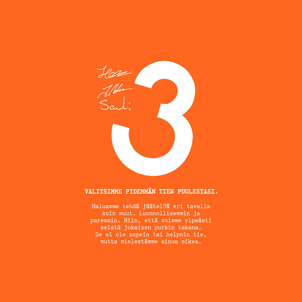
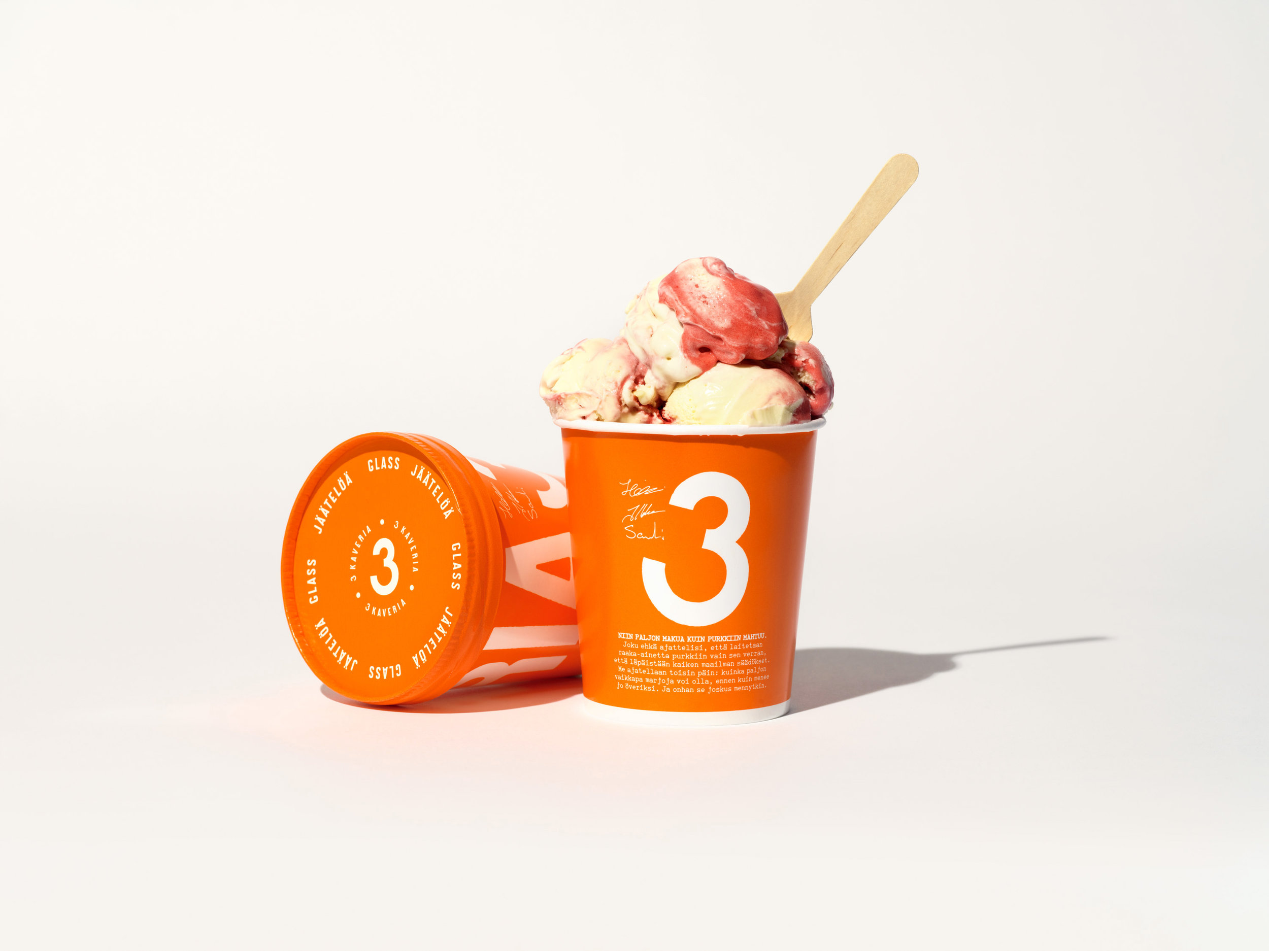
The mission of Kuudes was to better reflect the great quality of the product, strongly communicate the philosophy behind the taste and, most importantly, increase credibility to support sales in international markets. We were briefed to make a design evolution instead of a revolution. That’s why we kept the iconic orange brand colour but tuned it just a little brighter.
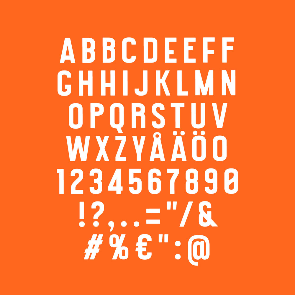
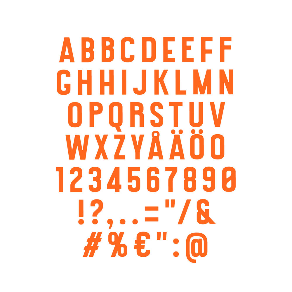
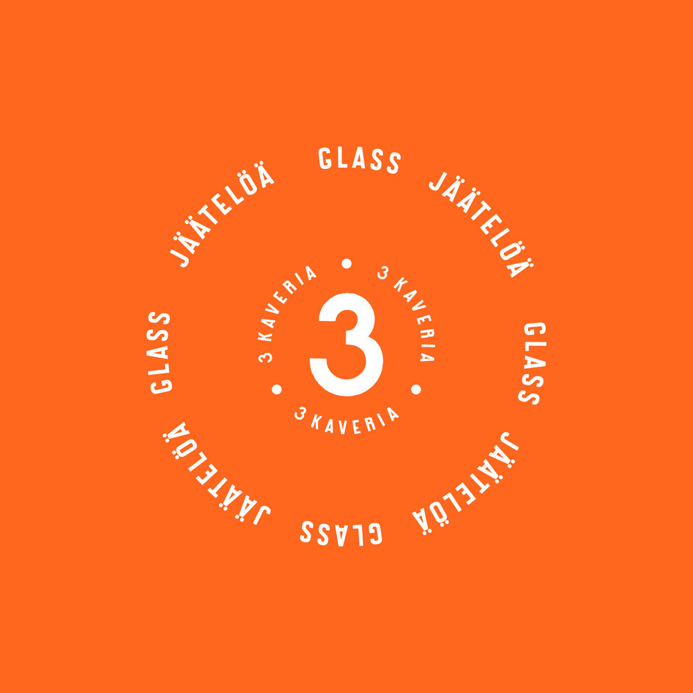
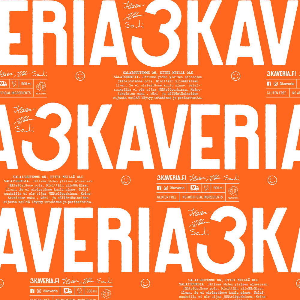
To stand out better in the freezer, we wanted the beloved brand name and number 3 to be more prominent in the visual identity. The typography of the rotating 3 KAVERIA text on the carton was inspired by an Italian sign post and brought to life with a custom font designed by Juho Hiilivirta.
“One could call it an instant crush. When we first met, the team from Kuudes asked all the right questions. We had so many stories to tell about our ice cream and the principles behind it. We just did not know how to tell them. As our brand grew unnoticed without much effort it was a big step for us to do a makeover. Kuudes turned out to be a great partner with a lot of knowledge on consumer behaviour and experience with single-packed consumer goods. After all, our passionate fans were the ones who created our brand, so we needed consumer insight. We are very satisfied and happy with our new brand identity and especially our new ice cream pints! Best of all, we made new friends and the brainstorming continues – with some ice cream, of course.”
– Heikki, Co-founder, 3 Kaveria
