At design164, we were commissioned by Supreme Ingredients to undertake a brand refresh for one of their top-selling product lines: the chicken fry mix. The brief presented a challenge as Supreme aimed to differentiate itself in a crowded market, particularly targeting the younger demographic, who are increasingly inclined towards home cooking.
The Approach:
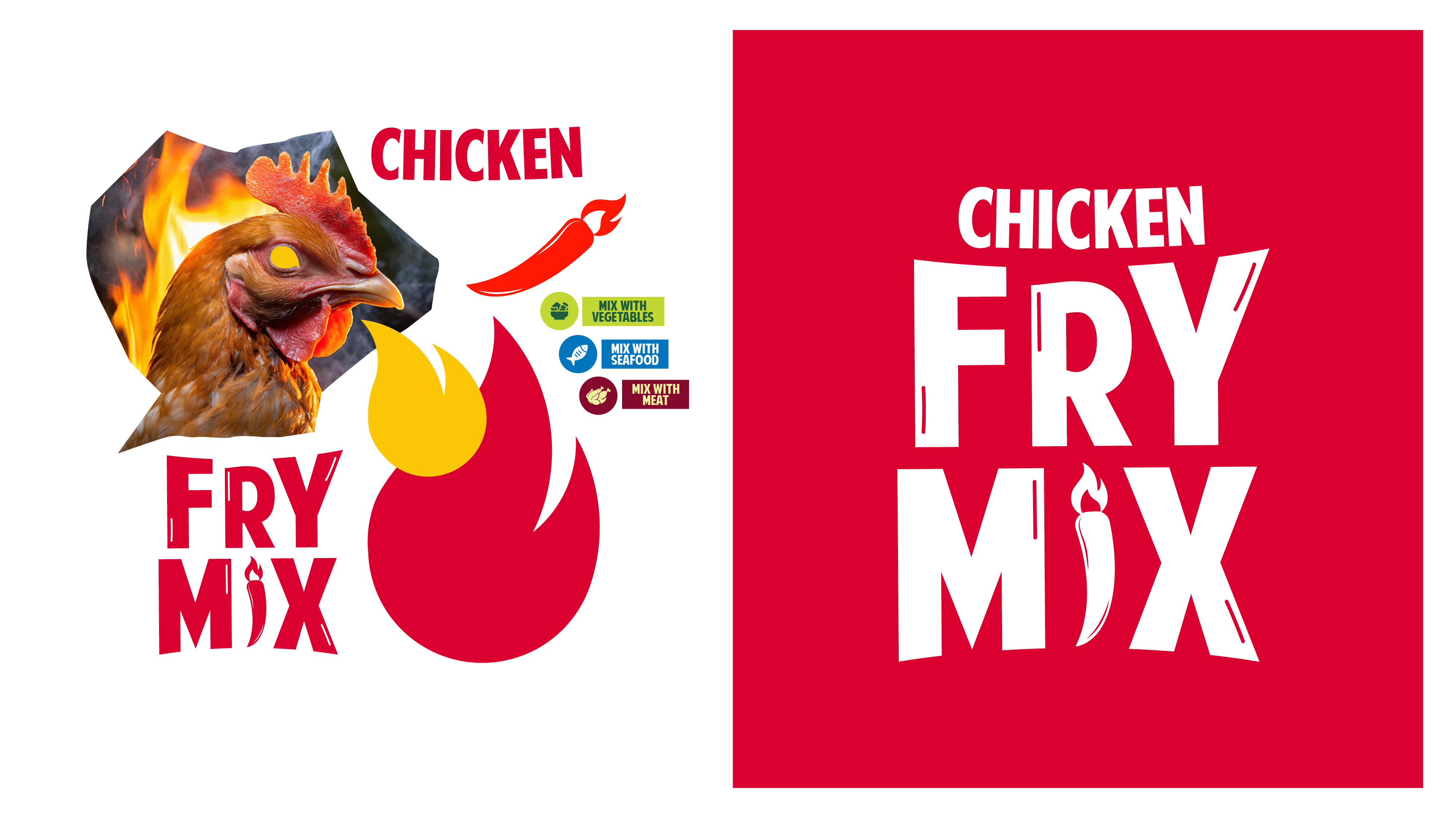
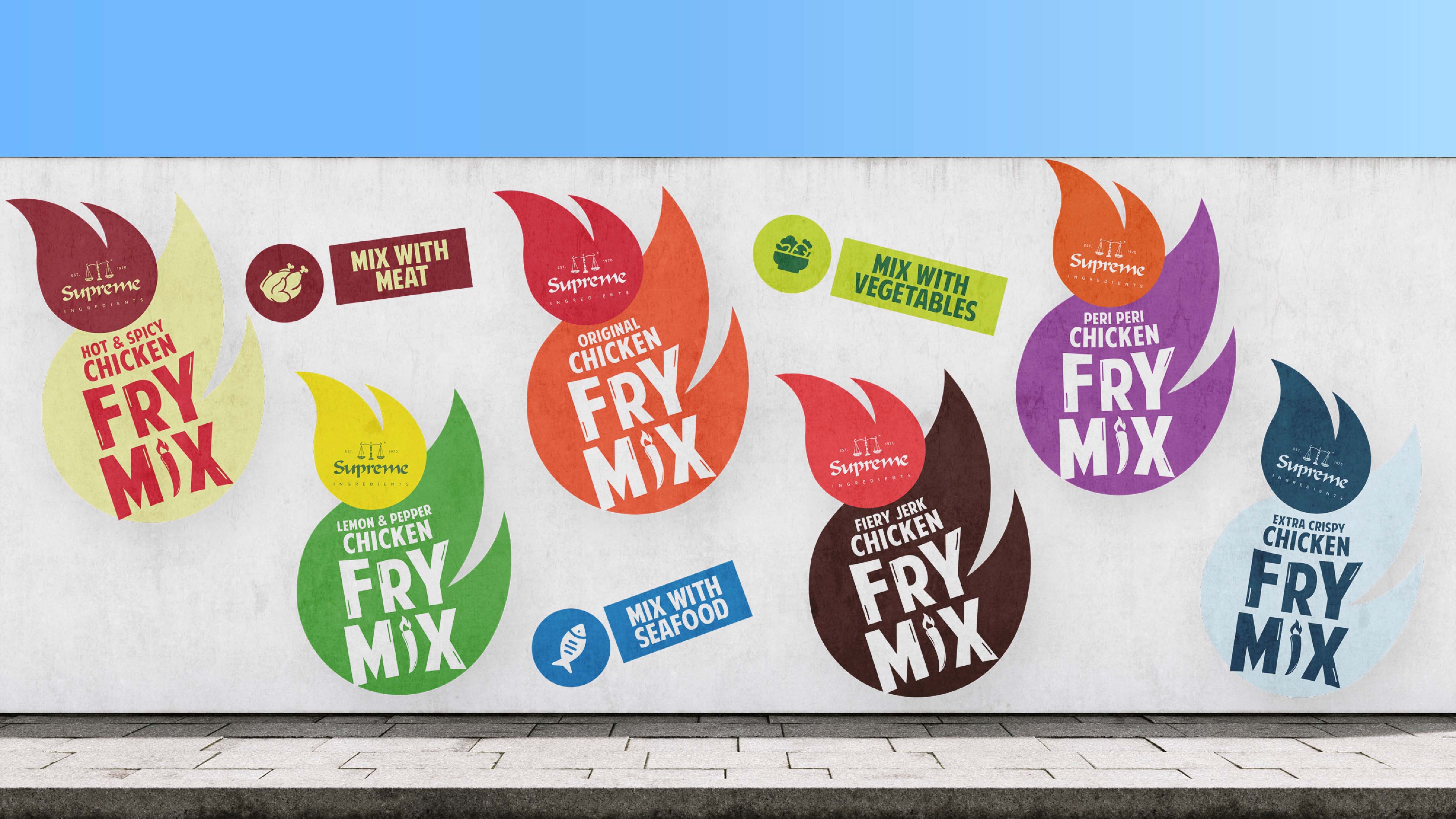
Our team kicked off with thorough market research, visiting various stores and analysing the competition. What became apparent was the lack of uniqueness among brands a perfect opportunity for us to introduce freshness and excitement. Thus, we brainstormed and conceptualised “Spice Sensation.” This innovative idea combined the fiery imagery of a chicken head with a chili icon in the product’s identity, promising a game-changing appeal. We opted for the bold typography of “American Purpose” after meticulous research and introduced a triangle eye feature highlighting the product’s versatility beyond just chicken it’s perfect for meats, vegetables, and seafood alike.
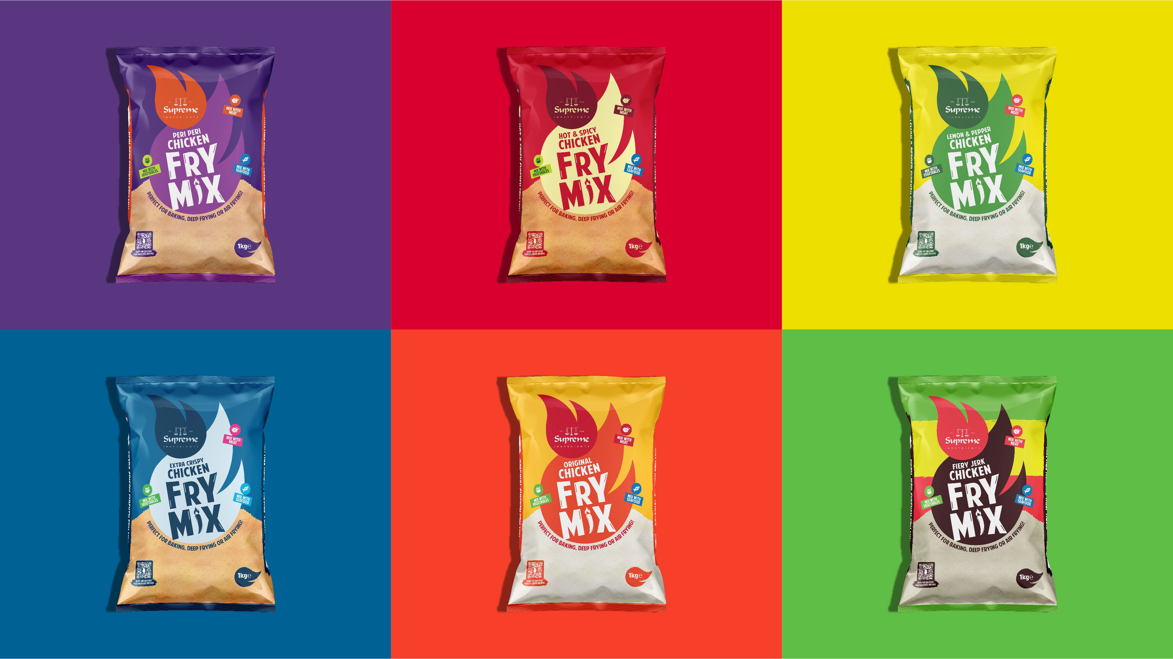
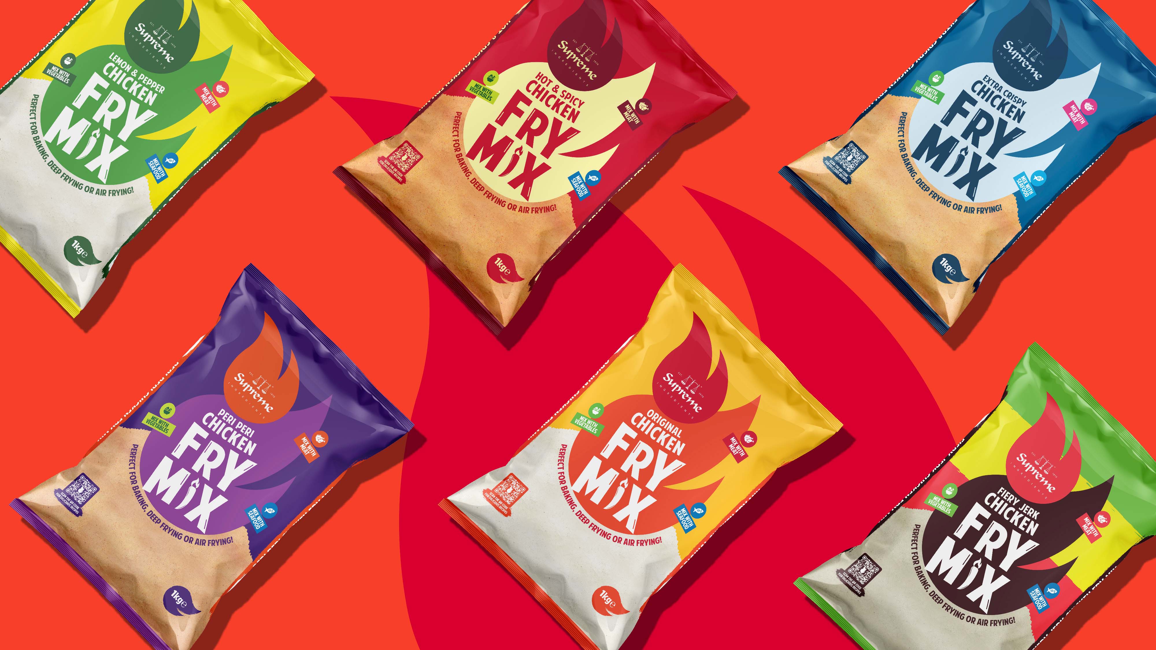
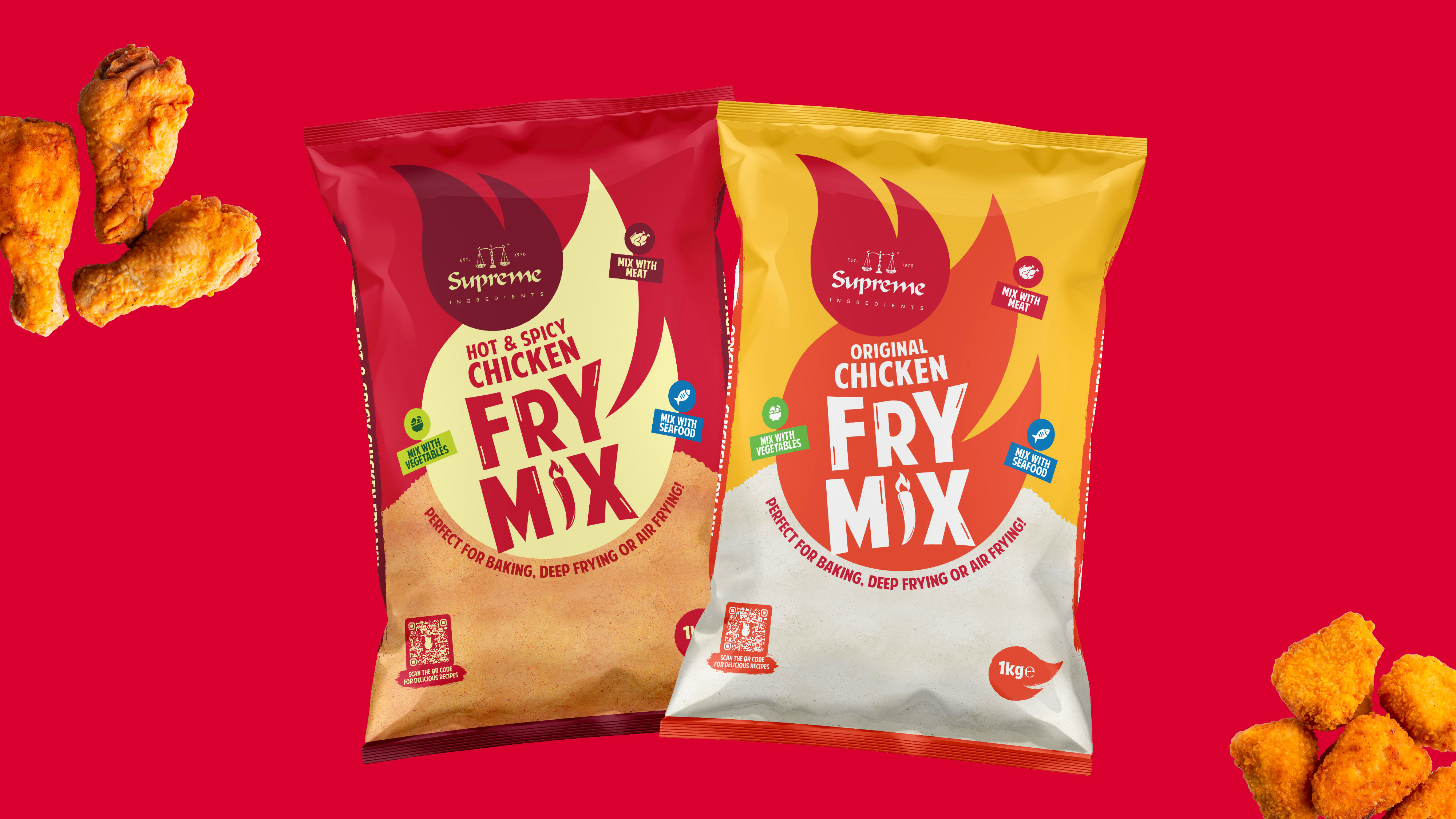
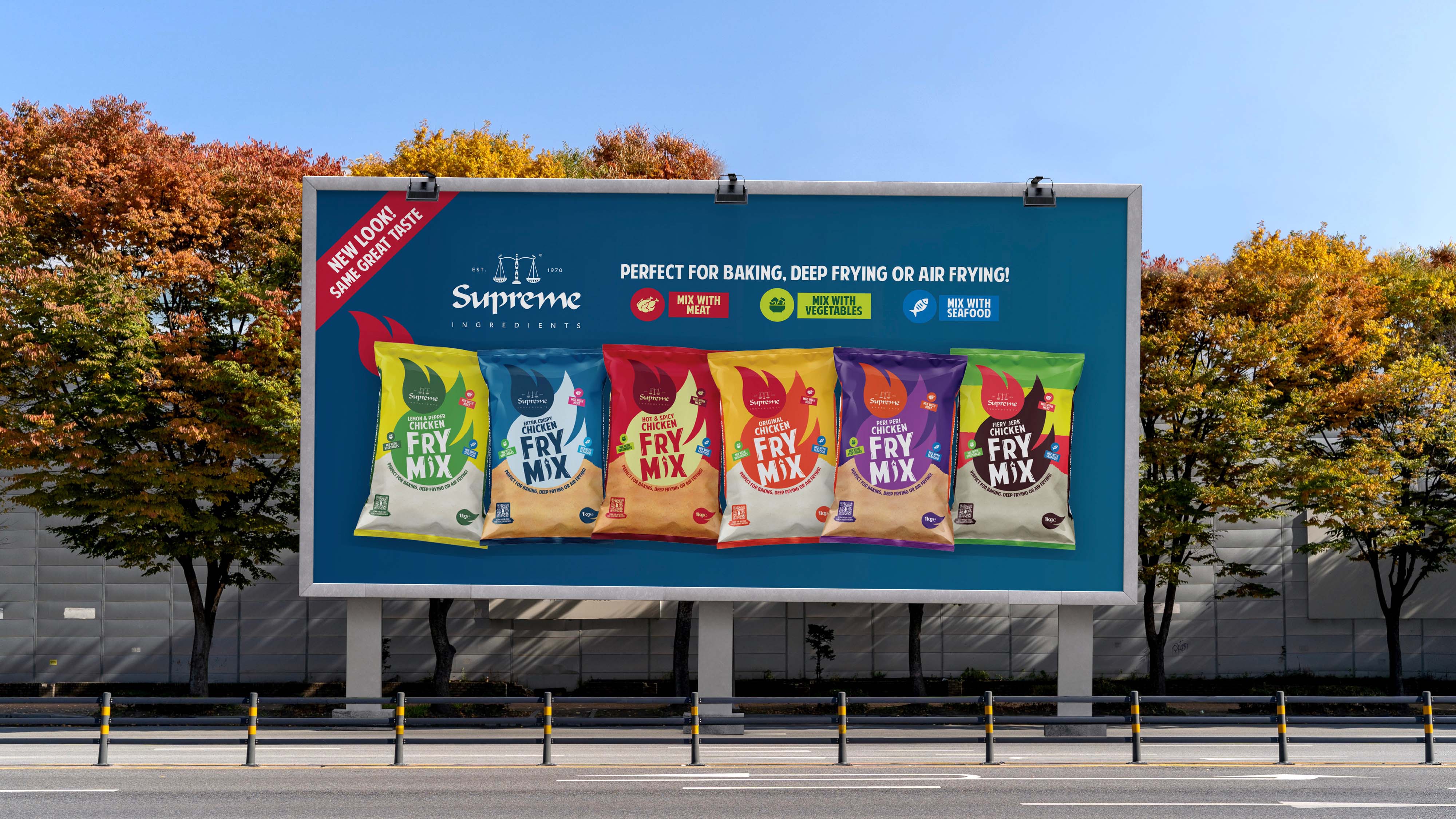
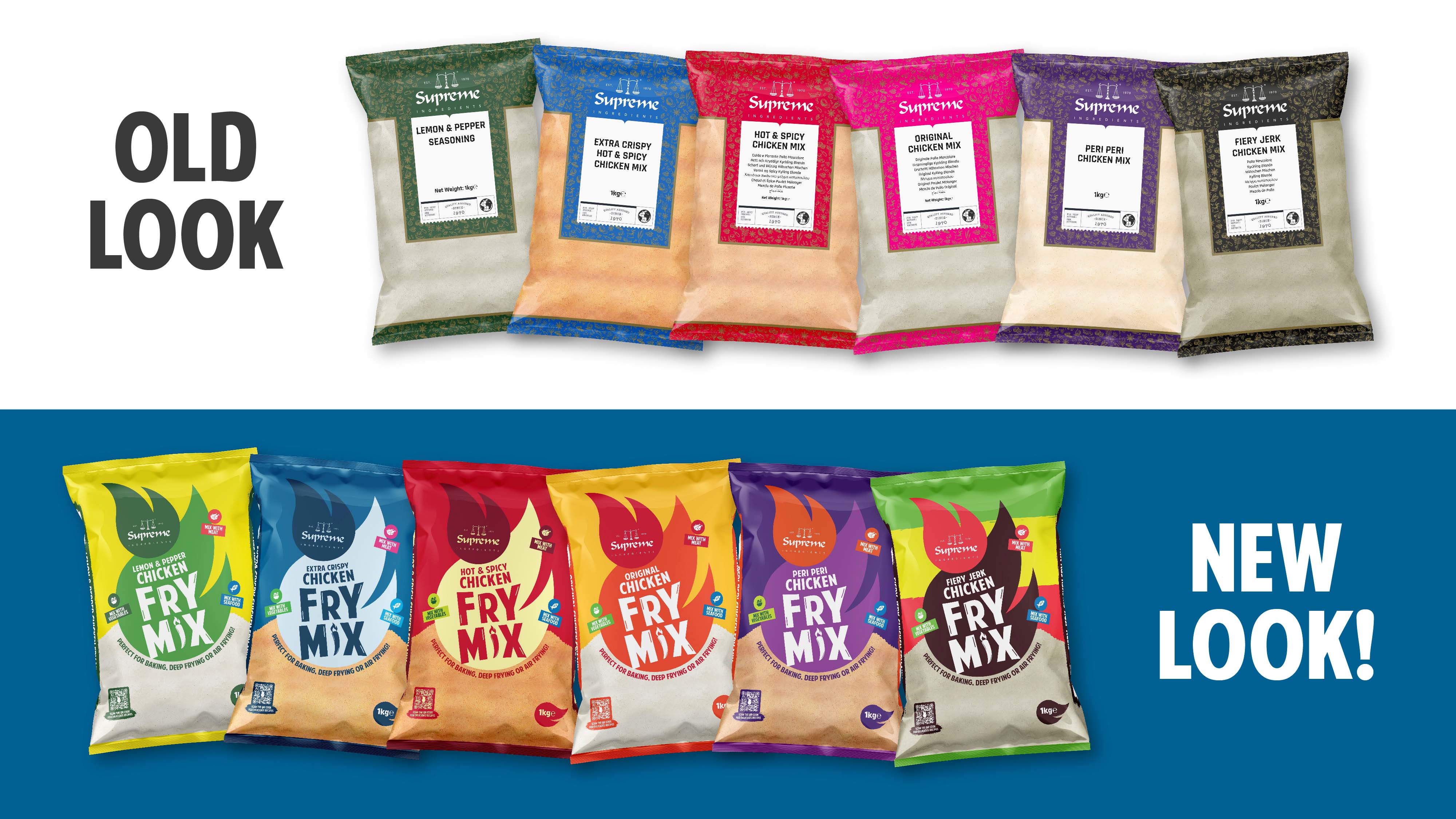
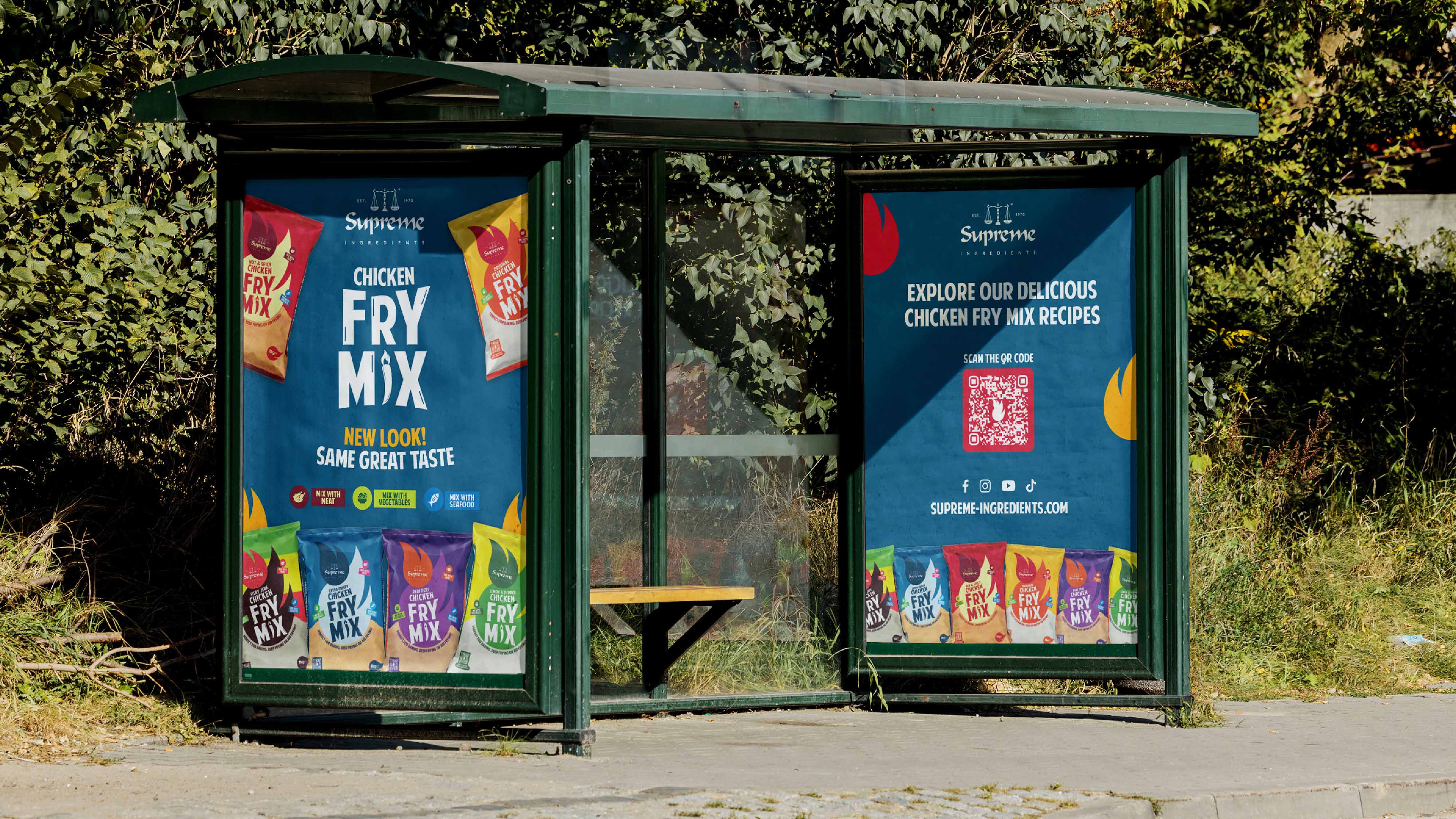
Building upon our research and the introduction of “Spice Sensation,” we crafted a consistent identity for Supreme Ingredients Chicken Fry Mix range, comprising six flavours. We understood that colour would play a pivotal role in standing out on shelves, hence we employed Vibrant palettes to breathe life into the packaging. The result? A noticeable increase in brand sales and consumer trust. The revamped packaging not only spoke volumes about the product’s taste but also reinforced Supreme Ingredients’ reputation for delivering quality products. Every step of this product refresh was immensely enjoyable for us at design164.
In conclusion, our journey with Supreme Ingredients’ Chicken Fry Mix was a flavourful adventure from start to finish. By infusing the brand with our Spice Sensation concept, we didn’t just refresh packaging—we ignited excitement. Through meticulous research, innovative design, and a commitment to quality, we elevated Supreme’s product line to new heights. The surge in sales and enhanced consumer trust are testaments to the success of this collaboration. At design164, we’re thrilled to have been part of this transformation, and we look forward to continuing to innovate and inspire.
CREDIT
- Agency/Creative: Design164
- Article Title: Supreme Ingredients Chicken Fry Mix Packaging Design by Design164
- Organisation/Entity: Agency
- Project Type: Packaging
- Project Status: Published
- Agency/Creative Country: United Kingdom
- Agency/Creative City: Bradford
- Market Region: Europe
- Project Deliverables: Brand Redesign, Graphic Design, Packaging Design
- Format: Pouch
- Industry: Food/Beverage
- Keywords: Packaging, Graphic Design, Packaging Refresh
-
Credits:
Senior Graphic Designer: Burhanuddin Muffaddal


