The National Museum in Kraków (MNK) is the largest museum in Poland and the main branch of Poland’s National Museum. The Museum consists of 21 departments which are divided by art period: 12 galleries, 2 libraries, and 12 conservation workshops, holding approximately 780,000 art objects.
The new brand identity system was intended to be developed based on the goals listed below:
One brand: The brand identity should communicate that the 12 branches are part of one brand.
Diversity: The museum’s collections include a very wide range of art—from antiquity to contemporary times, crafts, objects, book collections, and biographical exhibitions. The brand identity should showcase the diversity of MNK’s collections.
Timelessness: The language of visual identification should be neutral and timeless enough not to overshadow the main heroes: the artworks themselves. It should not be strongly associated with a specific artistic trend, era, style, or domain.
MNK: The abbreviation MNK is a recognizable and commonly used name by audiences. The symbol should be based on the abbreviation “MNK,” which should be a distinctive element of the identification.
The Creative Idea – DNA Thread
The new identity is based on the metaphor of weaving threads of inspirations and artworks into the vast body of art—as the basis and DNA of the collection.
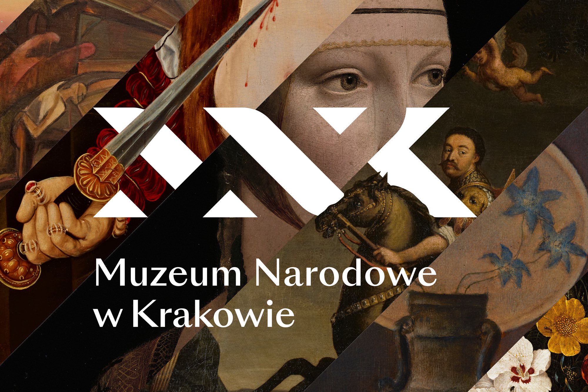
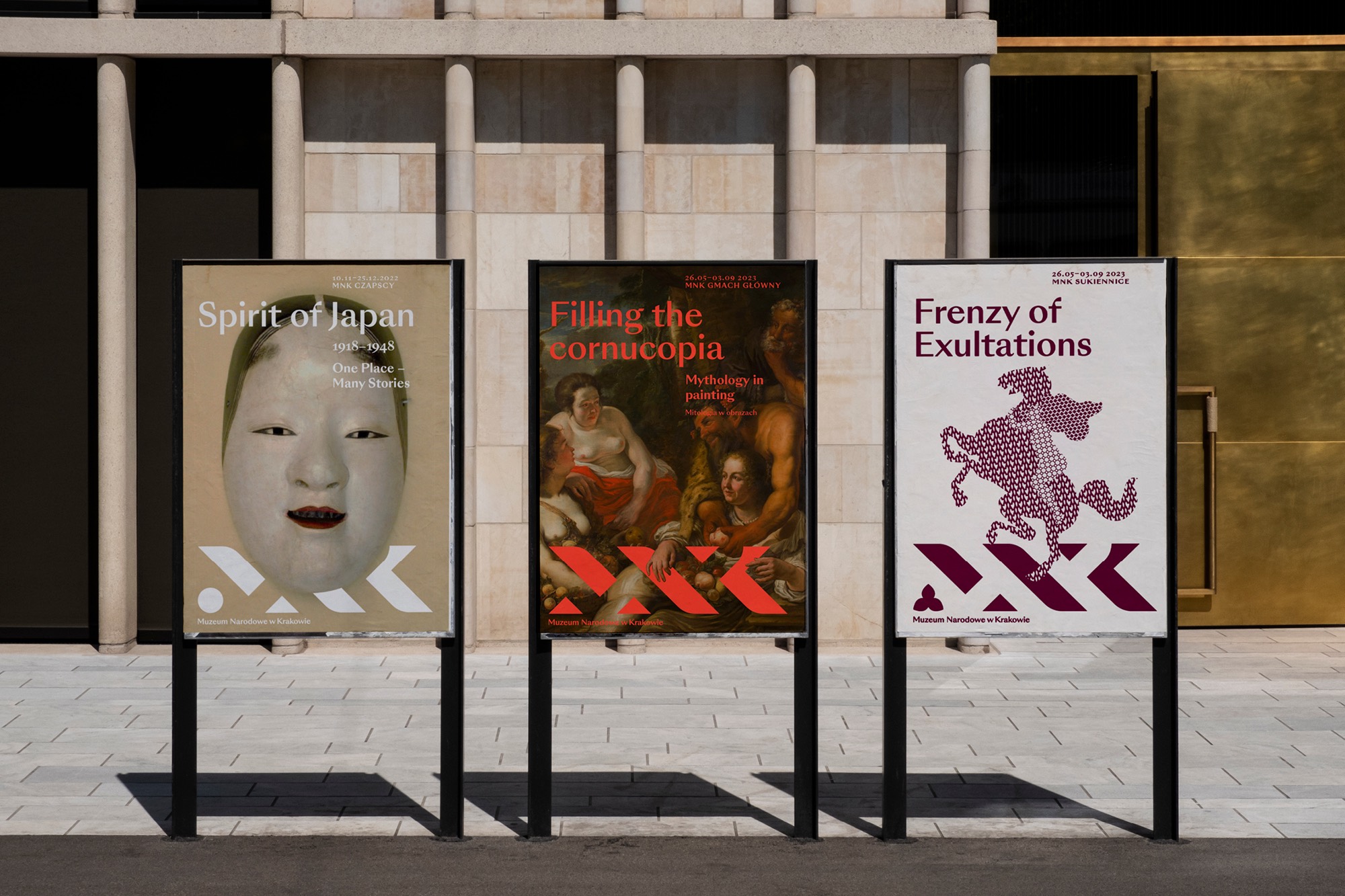
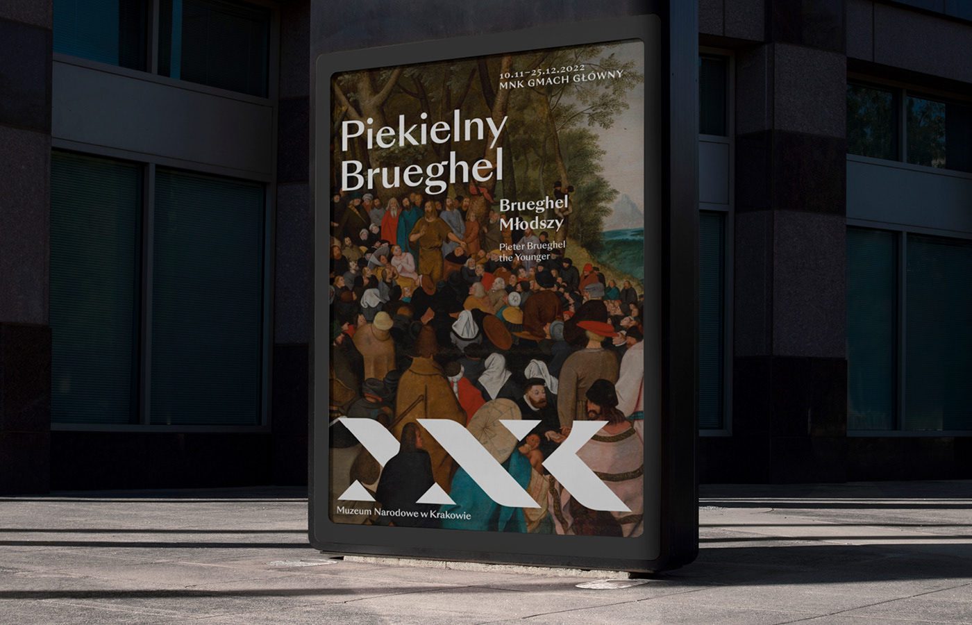
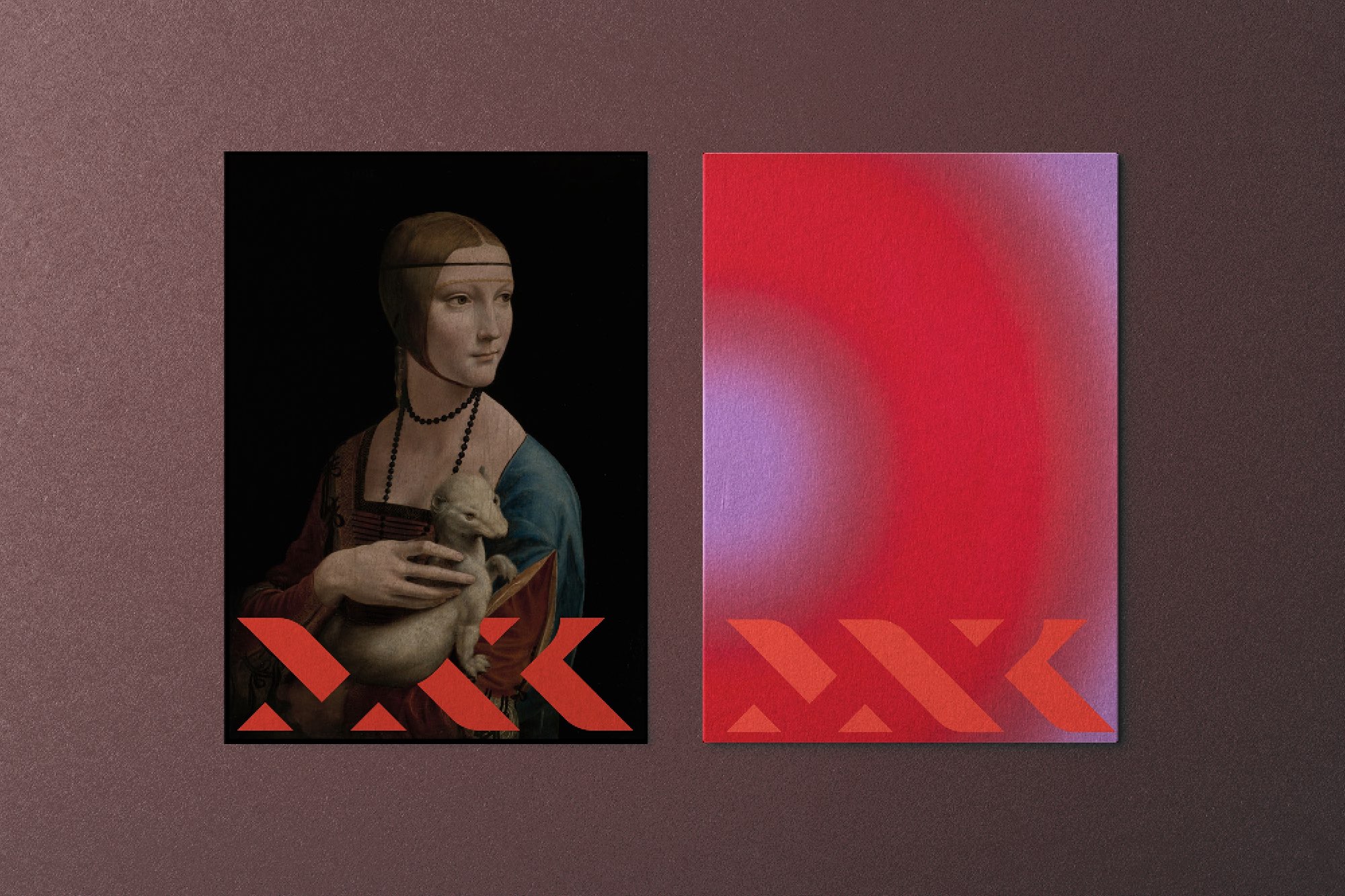
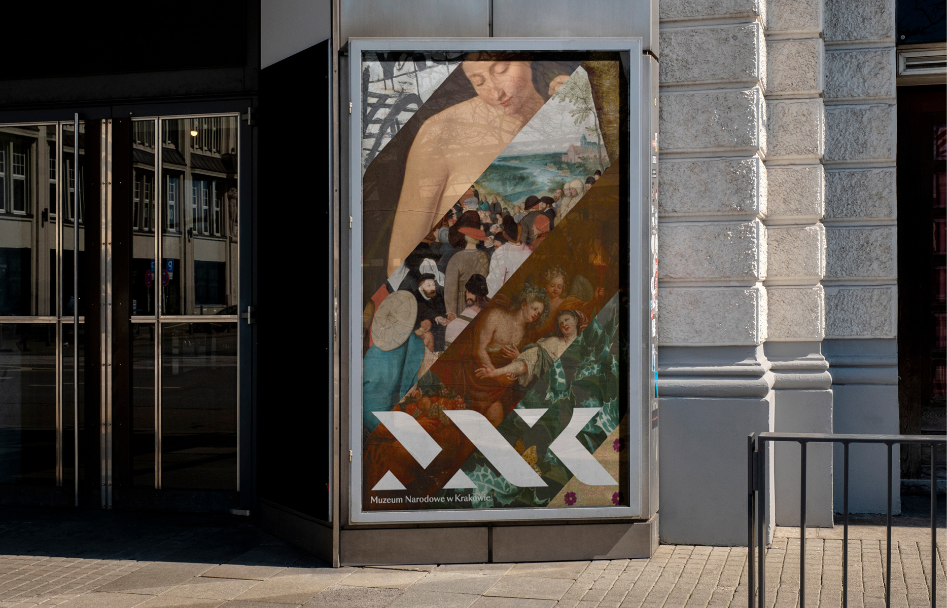
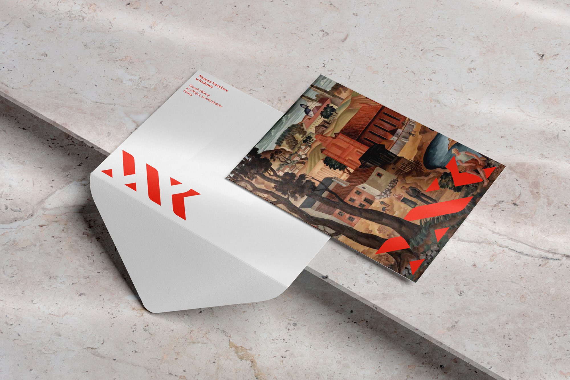
The logo: The symbol is timeless and abstract in its geometric interpretation of classical typography. It is a graphic rendering of the abbreviated name of the Museum—MNK. The logo is based on a meticulously designed geometric grid that forms the basis for the layout system of the identity. The logo seamlessly interacts with all the different artworks. The visual language fuses the Museum’s symbol and its art into one form. Thanks to the timeless geometry of the symbol, it can be interwoven with medieval paintings and modern abstract sculpture alike.
Naming: During the workshop and strategy phase, we modified the complex and inconsistent names of the Museum’s branches. In collaboration with the Museum, we implemented a new system of concise, memorable names for the branches, linking them to the main MNK brand.
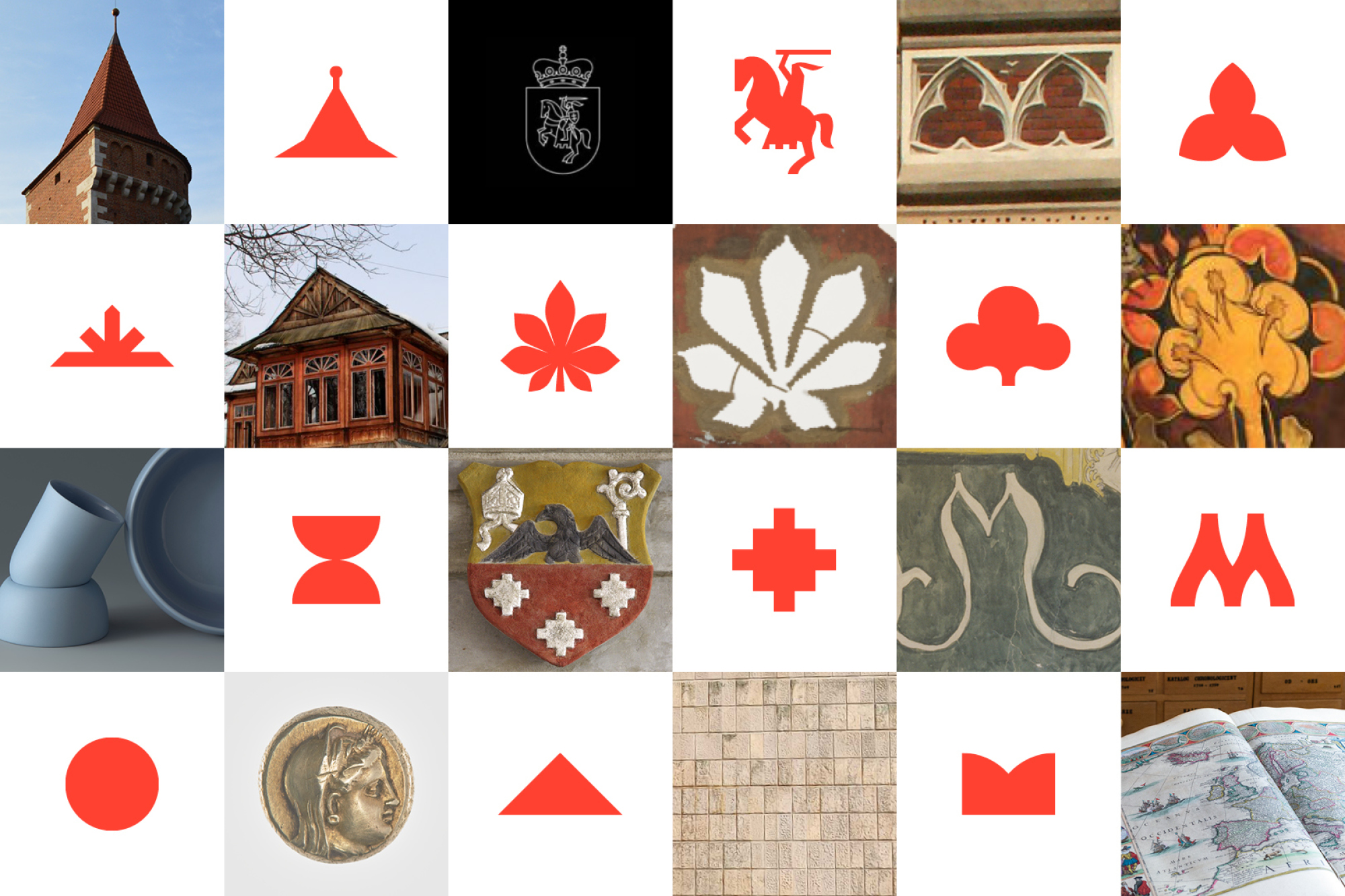
The dynamic serif: To capture the diversity of the 12 branches of the Museum and its collection, the first serif is a dynamic, changing form. Each shape is inspired by the art or building of the branch it represents. They are a product of workshops and consultations with each branch — a process that we are also proud of, that helped us understand the nature and needs of each of the branches and resulted in a range of diverse symbols — a beautiful visual metaphor for the diversity of the Museum itself.
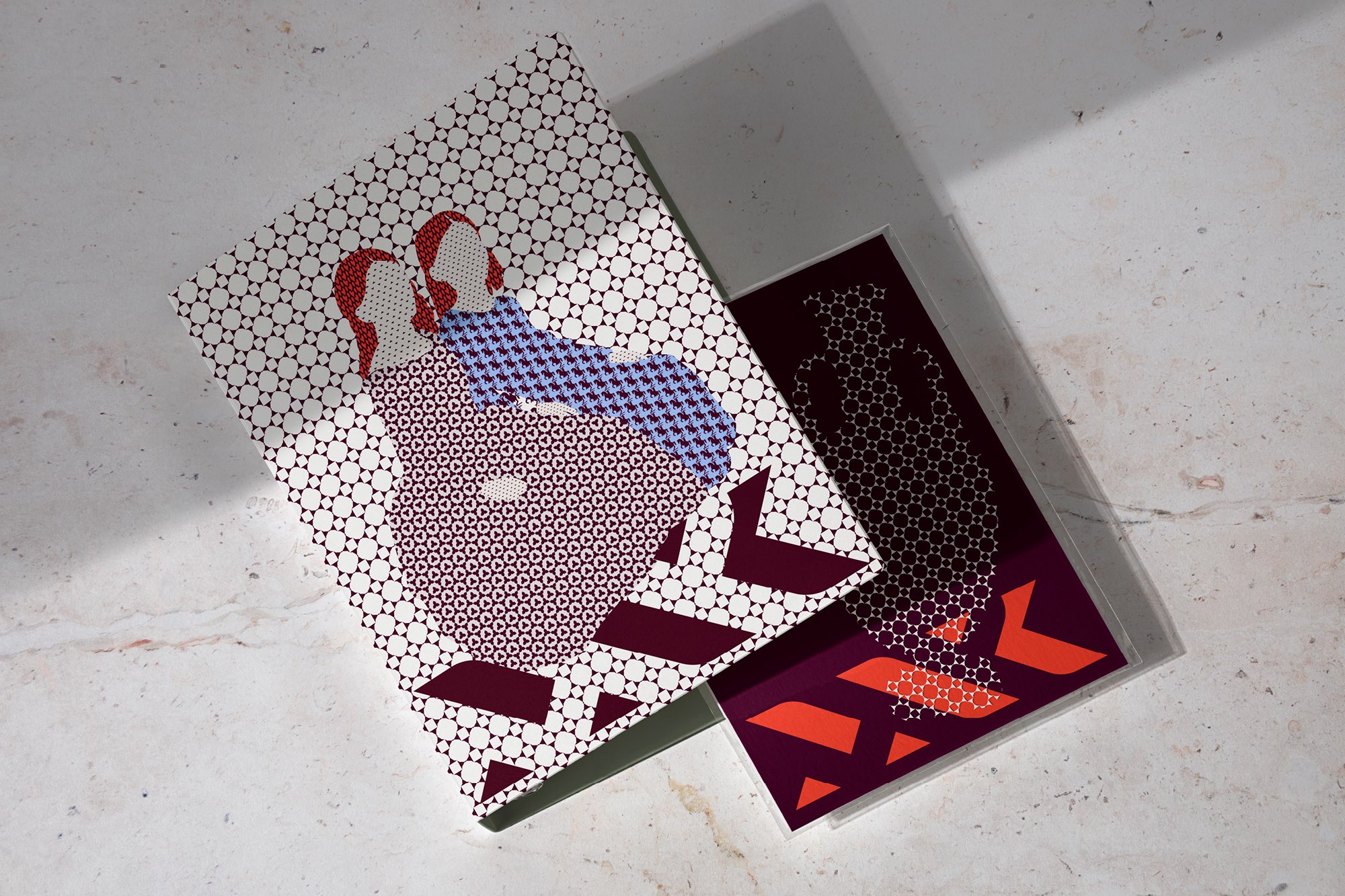
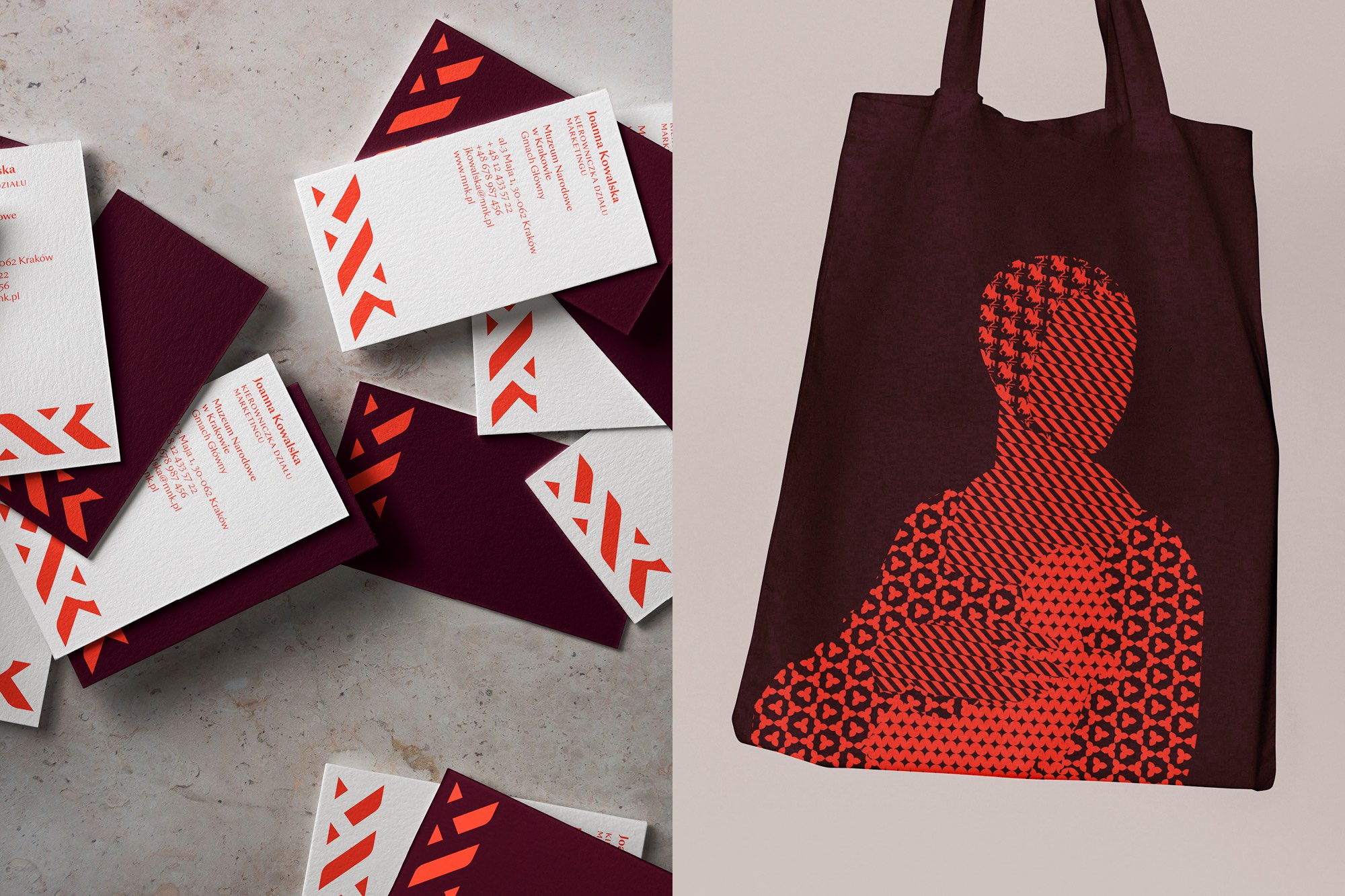
Illustrations & Patterns: Each of the dynamic serifs is a starting point for a decorative pattern. Together, the patterns are an abstract illustration of the rich tapestry of the Museum’s collection.
The system: The new brand identity is an extensive visual language and enables many forms of communication—from the elaborate and artistic to the very functional and straightforward.
CREDIT
- Agency/Creative: Podpunkt studio
- Article Title: The National Museum in Kraków Brand Identity Designed by Podpunkt Studio
- Organisation/Entity: Agency
- Project Type: Identity
- Project Status: Published
- Agency/Creative Country: Poland
- Agency/Creative City: Warsaw
- Market Region: Europe
- Project Deliverables: Brand Architecture, Brand Design, Brand Identity, Brand Mark, Brand Naming, Brand Redesign, Branding, Identity System, Logo Design
- Industry: Public Utility
- Keywords: WBDS Agency Design Awards 2024/25 , visual identity, brand identity, museum,
-
Credits:
Creative Director: Emilka Bojańczyk / Podpunkt
Art Director: Emilka Bojańczyk / Podpunkt
Designers: Emilka Bojańczyk, Zuza Charkiewicz, Diana Makulska / Podpunkt
Illustrator: Zuza Charkiewicz / Podpunkt
Business: Magdalena Dobruk / Podpunkt


