There are a few more iconic pairings than bagels and New York. For 50 years, H&H Bagels has remained NYC’s standard bearer, featured in numerous TV shows and movies, and recognized for its irresistible bagels. As the brand prepared for a nationwide expansion, they turned to creative studio High Tide for a new identity designed to invite everyone, everywhere in America to enjoy an iconic and authentic New York City bagel.
Since its founding in 1972 on the Upper West Side, H&H Bagels has grown to five locations in NYC and become a cultural institution to New Yorkers. But with impending growth, borne from plans to launch many new franchised and company-owned locations over the next few years, the challenge was to modernize its brand across a broader demographic while staying distinctly NYC. It also needed to work cleanly, consistently and impactfully across a diverse array of settings, locations and touchpoints – both digital and physical.
As a New York studio, the chance to rethink H&H Bagels held a special significance for High Tide. “This was more than a project to me, as it brought up memories from my childhood of stopping by H&H on my way to Central Park,” explains High Tide’s Founder and Creative Director, Danny Miller. “We saw it as a huge responsibility to bring an iconic local institution to everyone in a way that shows what makes NY culture so special. That meant giving H&H a more ownable and premium feel while retaining elements that add richness, texture and properly pay homage to its past.”
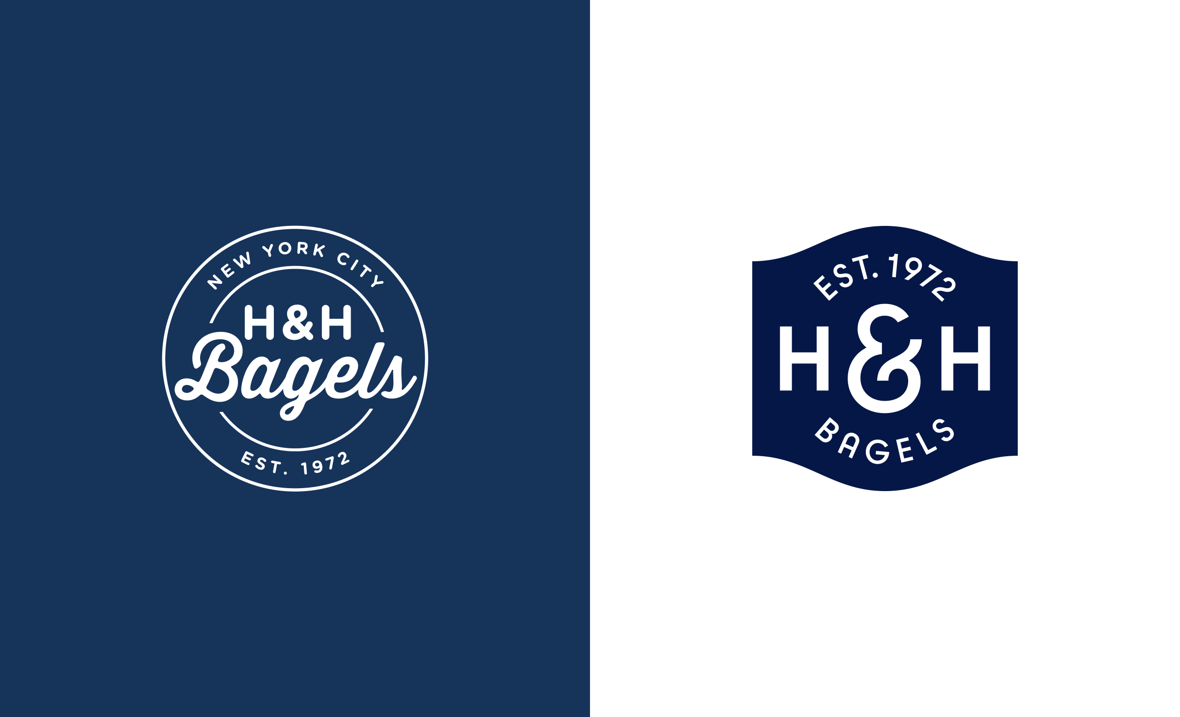
Being more ownable was especially important given that H&H’s original – but often imitated – branding had been co-opted over the years. “Not only was bagel industry branding rife with circular seals with script in the center and type along the perimeter, but one of H&H’s next door neighbors even had a very similar logo, despite working in a different industry,” adds High Tide Senior Designer, Matthew Smith.
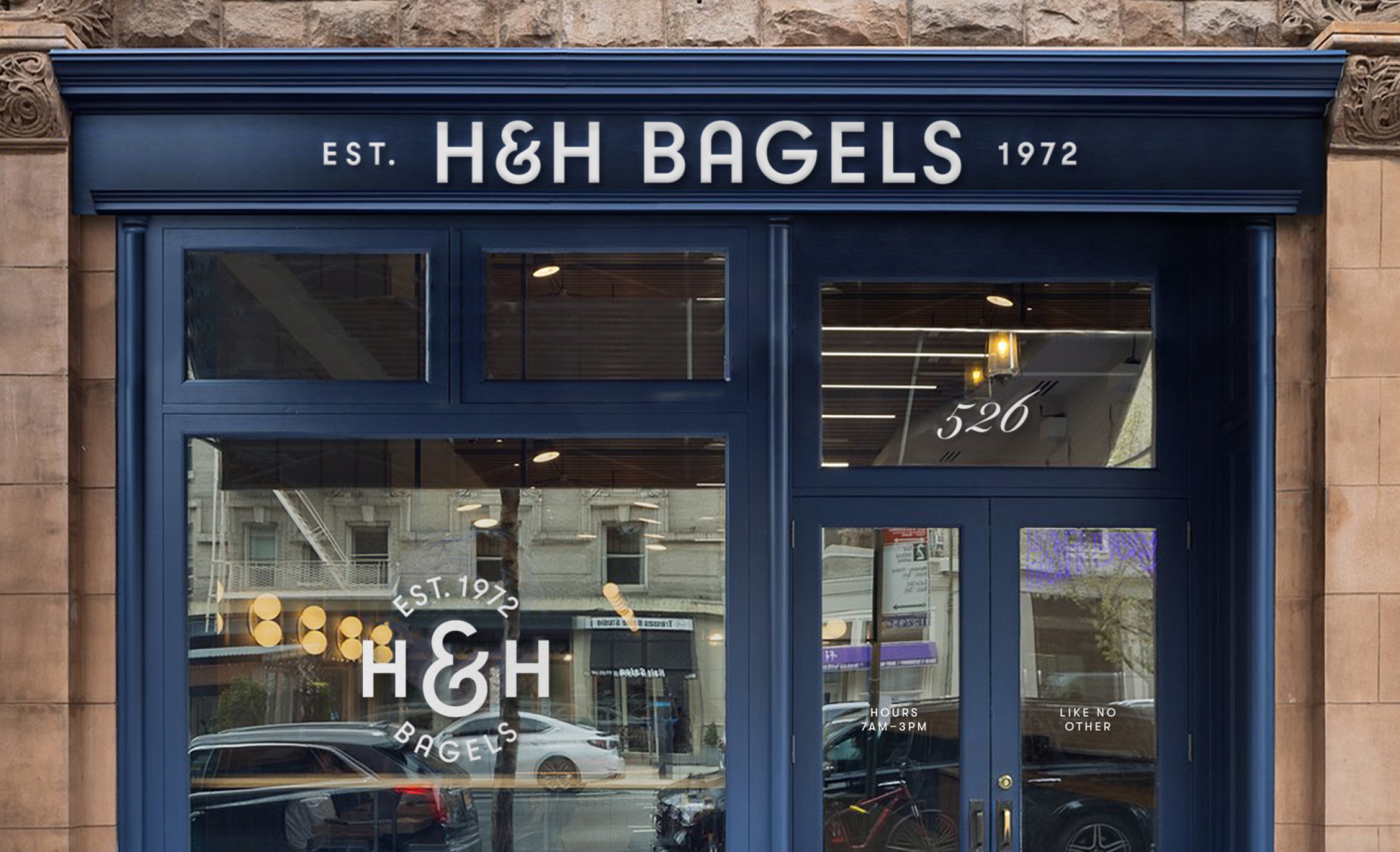
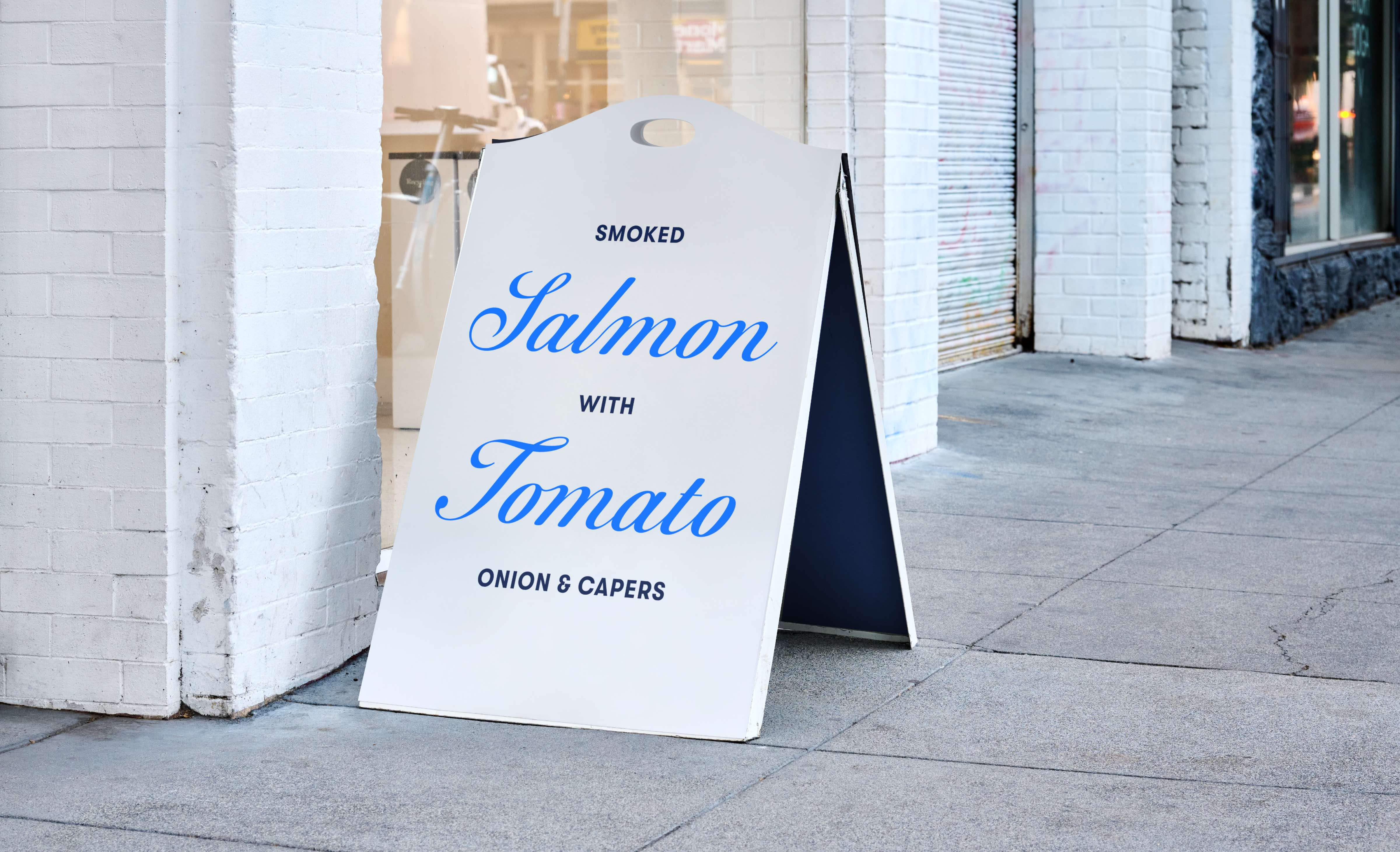
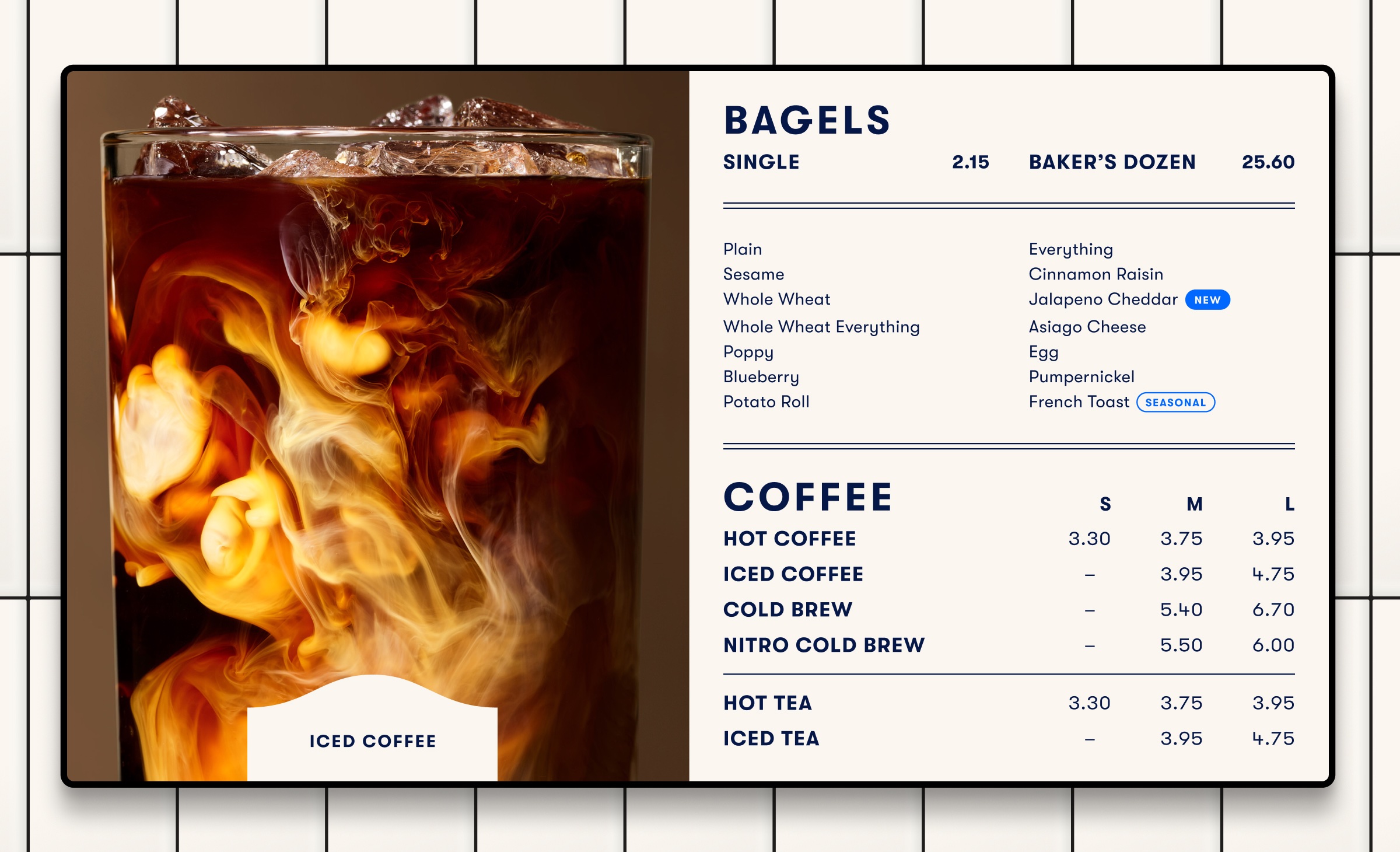
High Tide led the creation of an entirely new visual identity, with website, packaging, art direction, photography and messaging, as well as environmental designs like signage, menu boards, and other elements meant to enrich the interior design of each physical location. For the logo, High Tide embraced an entirely new look and feel with clean custom lettering set against a reconsidered version of their original seal – more unique in shape but with a respectful nod to their old branding. Confident but flexible, the logo works in a variety of orientations and configurations, pairing well with existing and future event or product partners.
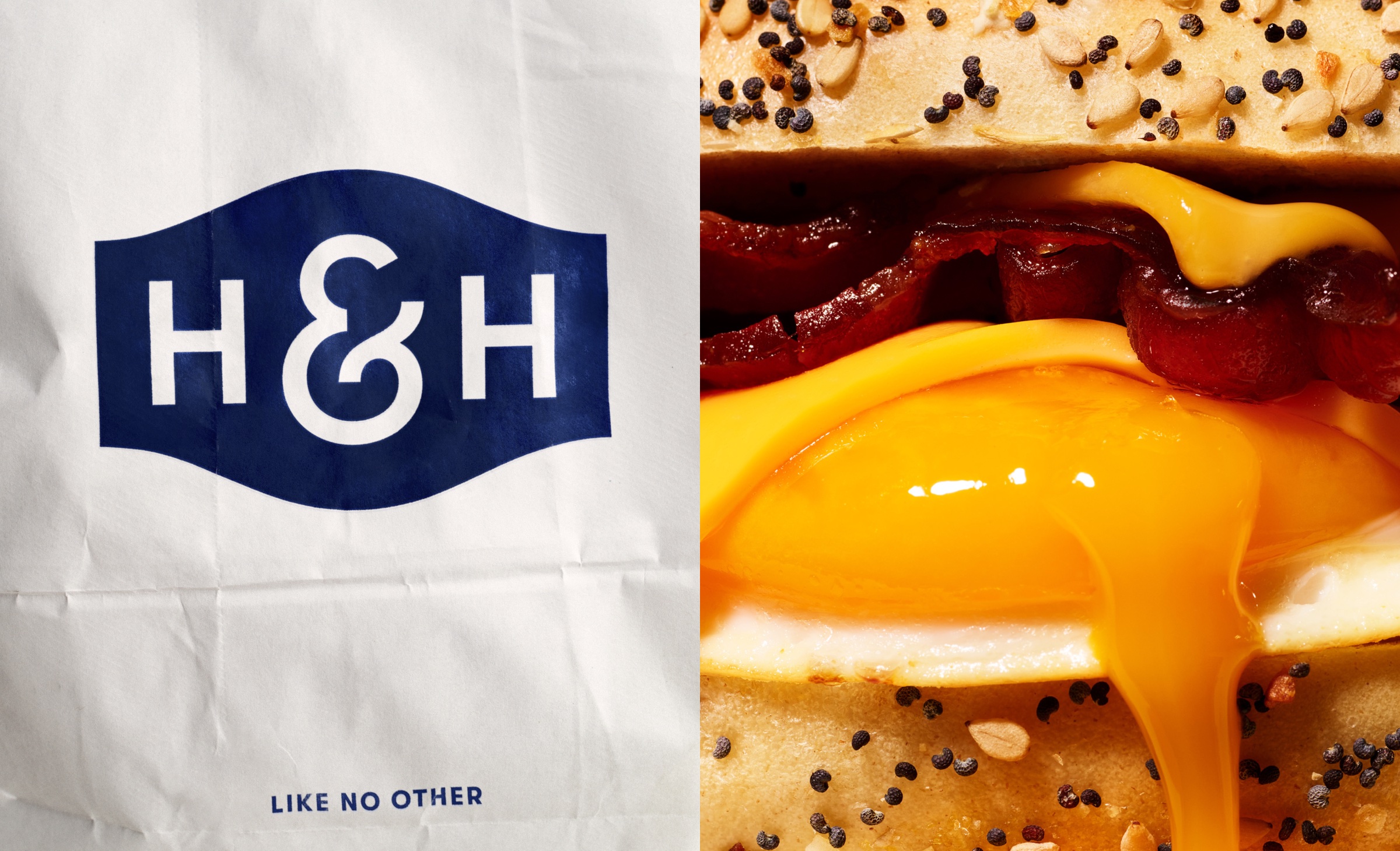
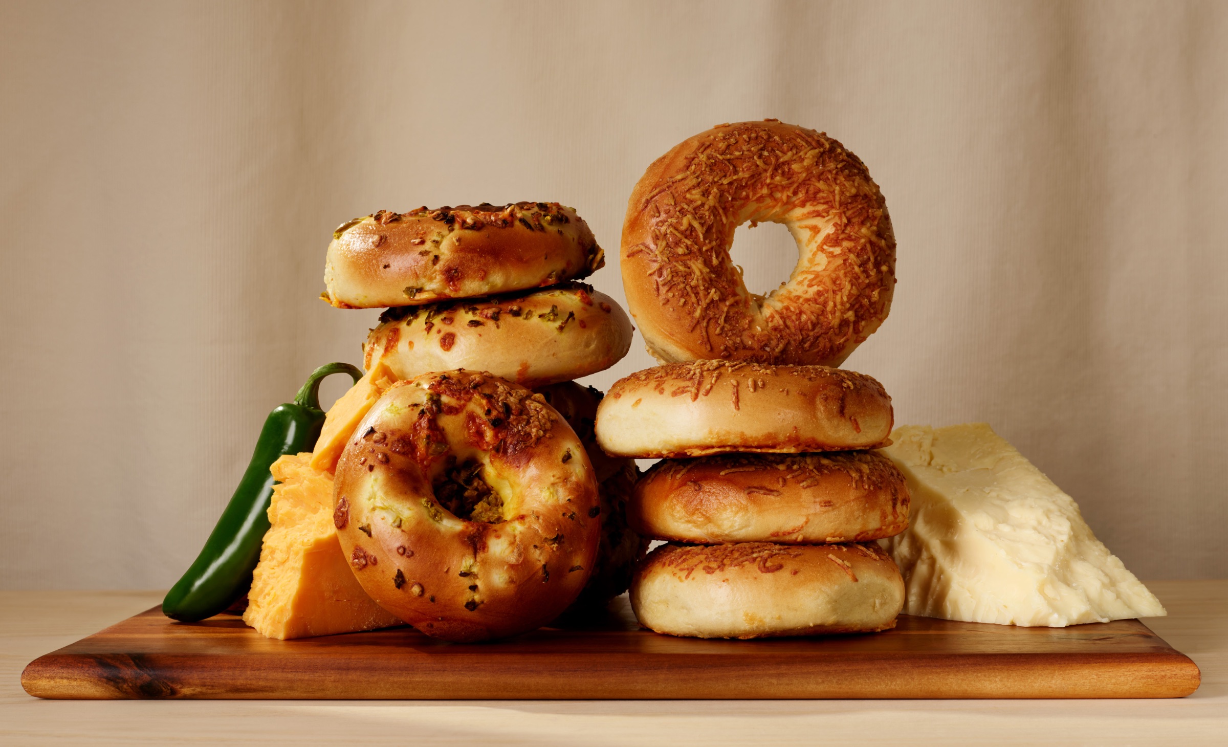
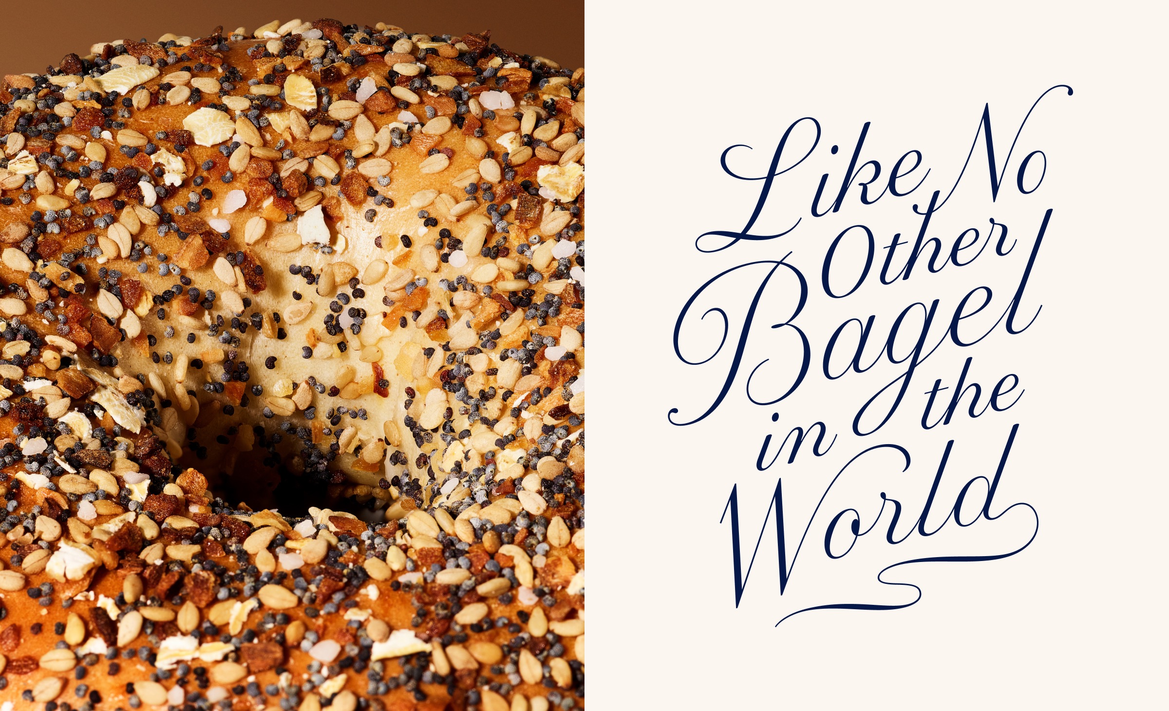
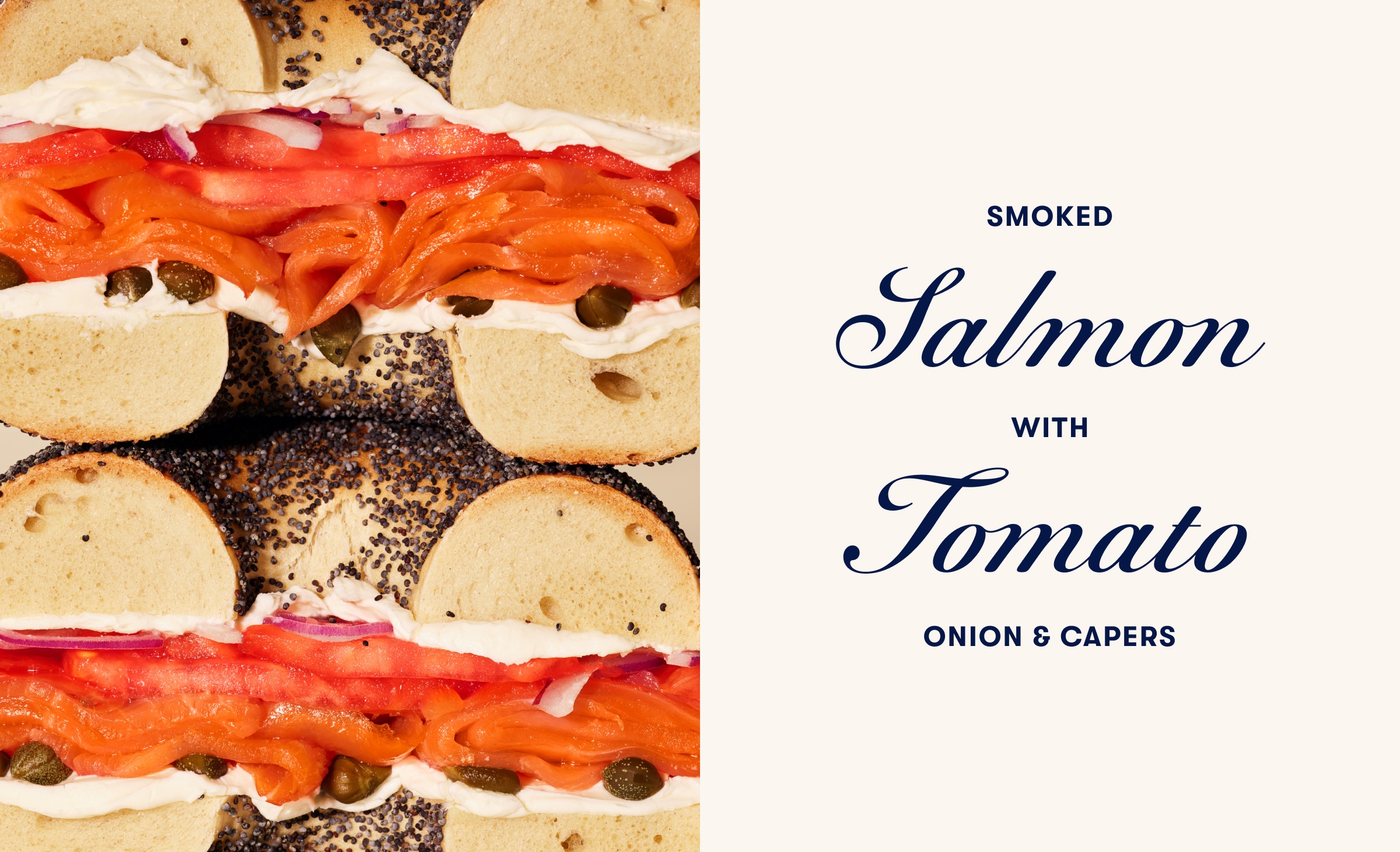
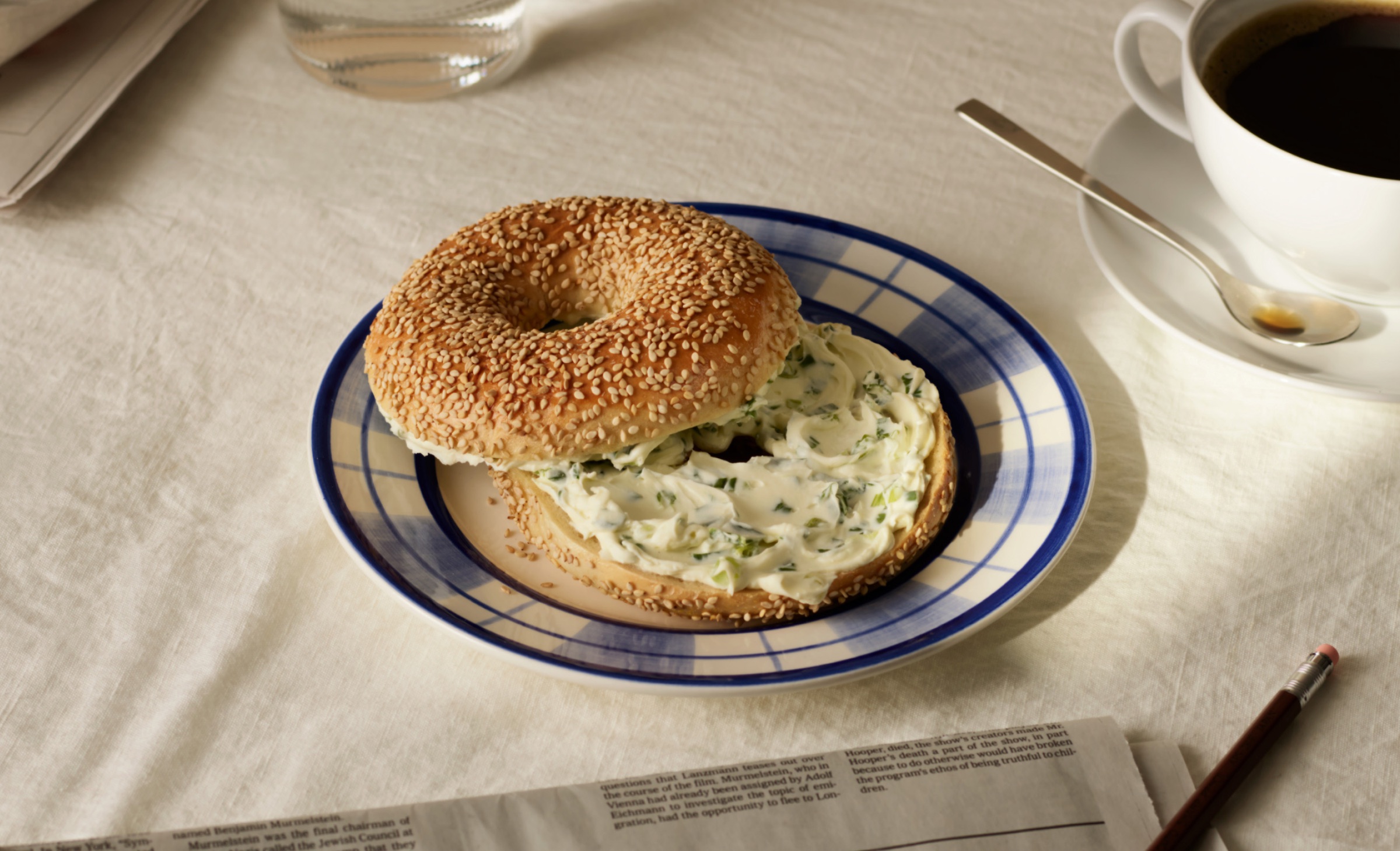
Typefaces feature serif, san serif and an elegant script, all working together to give the brand an accessible but premium feel across menu boards, graphics and the website. A mix of delicious macro and artful food photography elevates the brand even further, spotlighting its fresh ingredients.
Color also played an important role. For years, H&H Bagels had adopted a navy blue across all its designs. High Tide set out to infuse it with more vibrance, brightening it but also pairing it with brief moments of colorful surprise and delight using cobalt blue, avocado green, gold yellow, ketchup red and lox pink. “Through pressure testing and exploring a spectrum of blues, we knew how important it was to be used more intentionally. We also incorporated an off-white flour into the mix to bring depth but kept the navy dark enough to replace black for the sake of accessibility. By simply using the navy for text on the off-white background, it really opened up a whole new way to look at their brand colors and system – allowing the secondary colors to shine,” Miller continues.
Whether in-store, on uniforms, or across social platforms, these elements come together and create a brand experience that feels considered and tasteful but uniquely New York.
“H&H Bagels is beginning a new chapter with our upcoming national expansion,” says Jay Rushin, CEO at H&H Bagels. “This was the perfect opportunity to enhance our visual identity and deliver an elevated experience for our customers. Working with the High Tide team was especially exciting, considering their deep personal history with the H&H Brand.”
Miller agrees, adding, “Wherever someone experiences H&H, the brand should stand out – welcoming others to feel the excitement of eating a classic NYC bagel. We’re happy that our work is helping H&H maintain the essence of a mom-pop brand but with a modern, scalable twist.”
CREDIT
- Agency/Creative: High Tide
- Article Title: High Tide Serves Up New York Flavor with Branding for Iconic H&H Bagels
- Organisation/Entity: Agency
- Project Type: Identity
- Project Status: Published
- Agency/Creative Country: United States
- Agency/Creative City: New York City
- Market Region: North America
- Project Deliverables: Art Direction, Brand Identity, Logo Design, Packaging Design, Photography
- Industry: Food/Beverage
- Keywords: H&H, High Tide, NYC, Bagels
-
Credits:
Founder and Creative Director: Danny Miller


