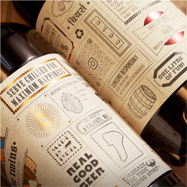
Introducing a groundbreaking venture in the heart of Amravati (Maharashtra), the first-ever microbrewery to grace the cityscape. This ambitious project demanded a packaging design that not only encapsulated the essence of a spirited brand but also set the stage for a unique narrative.
As the visionary designer behind this micro-brewery venture, I am thrilled to present an in-depth exploration of the label design that seamlessly intertwines tradition with a youthful, quirky spirit, redefining the conventional perception of beer labels.
The label design for this microbrewery stands as a testament to innovation and creativity. Distinctive and memorable, each label acts as a storyteller, beckoning the consumer to explore the vibrant personality embedded within. In a market saturated with labels that often go unnoticed, our design disrupts the norm by encouraging a pause, inviting enthusiasts to delve into a narrative crafted for a young, dynamic audience.
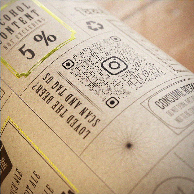
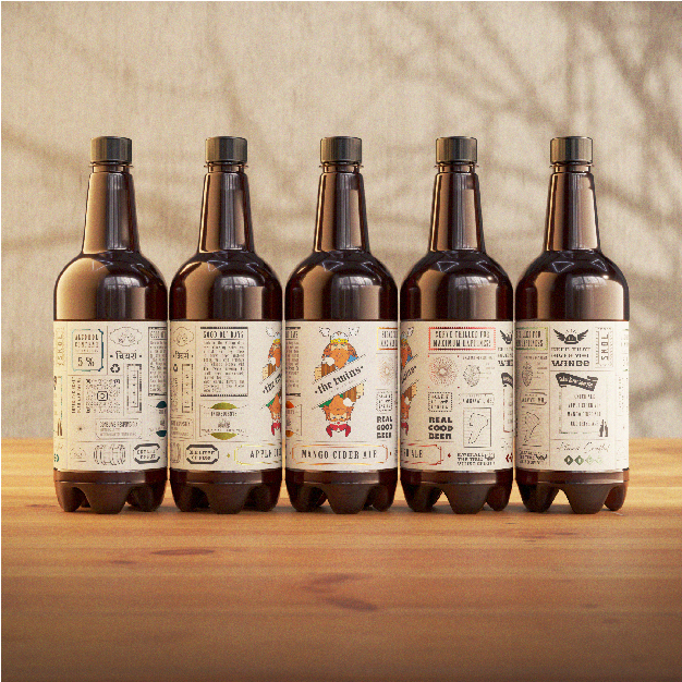
Embodying a fresh perspective on beer branding, our labels feature a rich array of metallic foiling, enhancing not just the aesthetic appeal but also imparting a touch of sophistication and premium quality. The reflective surfaces elevate the overall presentation, offering a tactile and visual experience that transcends the ordinary. The use of metallic foiling is a nod to the exclusivity and distinctiveness of the microbrewery’s offerings, setting it apart from the competition. Adding another layer of distinction, each beer variant boasts a unique colour scheme, allowing for instant differentiation on the shelves. This thoughtful colour-coding strategy not only serves as a practical solution for quick identification but also contributes to the overall brand identity, making a bold statement in a sea of homogeneity. The incorporation of vibrant hues, playful typography, and a dynamic layout reimagines traditional beer labels, capturing the essence of a young, spirited microbrewery that is unapologetically different.
The design pays homage to the city of Amravati’s rich heritage while propelling it into the future, marking a historic moment as the first microbrewery in the region. In conclusion, this label design is not merely an embellishment; it is a visual manifesto, a reflection of a pioneering spirit that defines Amravati’s inaugural microbrewery. Elevate your beer-drinking experience with a product that marries tradition and innovation, as encapsulated by our meticulously crafted labels – a story in every sip, a journey in every bottle. Welcome to a new era in beer branding; welcome to Amravati’s finest.


CREDIT
- Agency/Creative: Namrata Mantri
- Article Title: Label Design for The Twins Brewing Co.
- Organisation/Entity: Freelance
- Project Type: Packaging
- Project Status: Published
- Agency/Creative Country: India
- Agency/Creative City: Pune
- Market Region: Asia
- Project Deliverables: Label Design
- Format: Bottle
- Industry: Food/Beverage
- Keywords: Craft Beer, Packaging, Label Design
-
Credits:
Art Director: Namrata Mantri


