Top Juice began serving up kale and coconut water in their beverages while others were still wondering what kale even was. With a ‘100% real’ philosophy, they are committed to providing juices that naturally fuel real function, health and happiness for everyone, everyday.
There was a disconnect between what the brand looked like, and what it delivers. Our brief was to freshen up Top Juice, leveraging its history and commitment to quality by infusing more love, distinctiveness, personality and story into the brand.
The goal was to build a stronger, more engaging brand, that would elevate customer loyalty, and establish Top Juice as a leader in the dynamic juice category.
We kicked off the project with a strategic review and audit of the juice and complimentary categories to understand the Top Juice brand’s position in the market, as well as consumer trends, and competitors we needed to consider.
After an evaluation of existing Top Juice brand assets to identify strengths and areas for improvement, a workshop with key stakeholders helped to uncover unique selling points, story, and opportunities, culminating in a concise brand strategy to serve as the guiding North Star for creative territories and the brand as a whole.
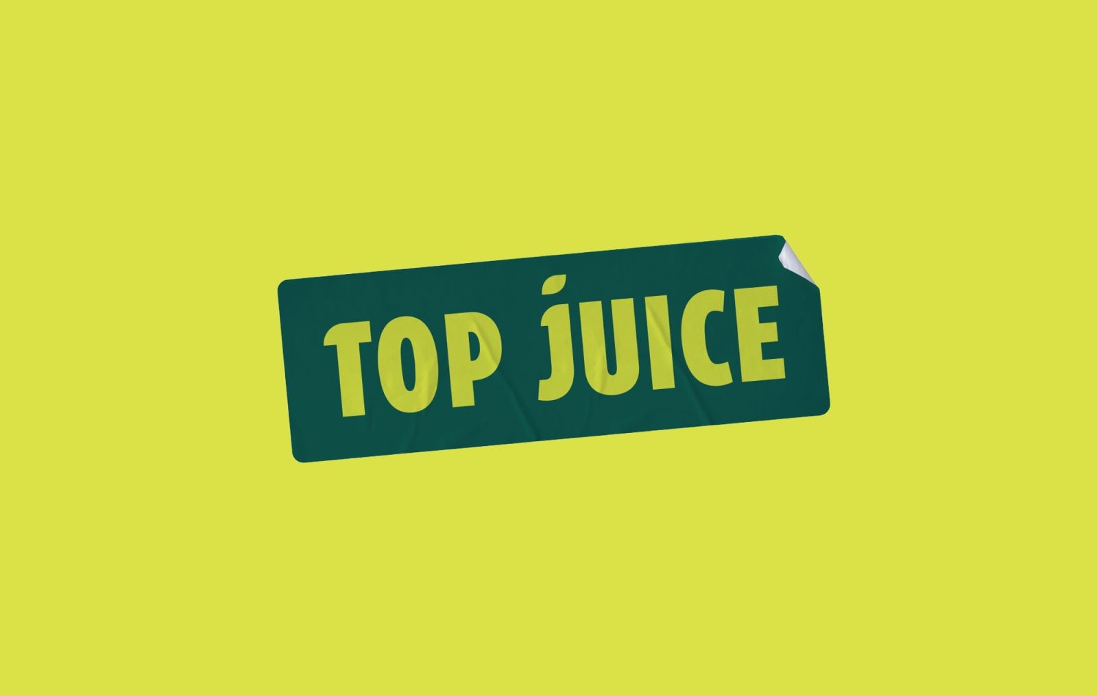
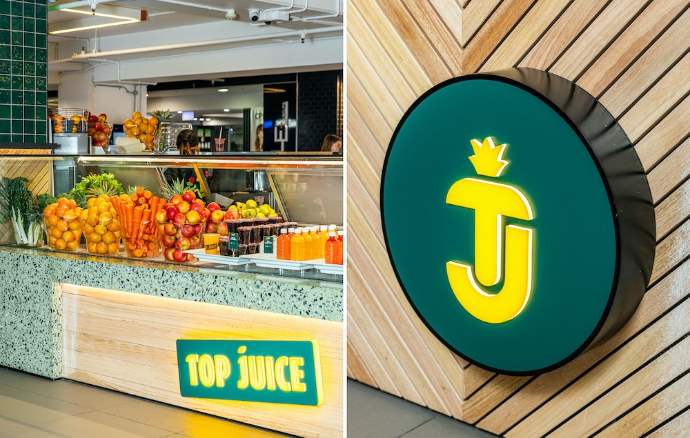
Carefully crafted, the new Top Juice logo exudes freshness, with a more organic, natural feel than the original black and white logo.
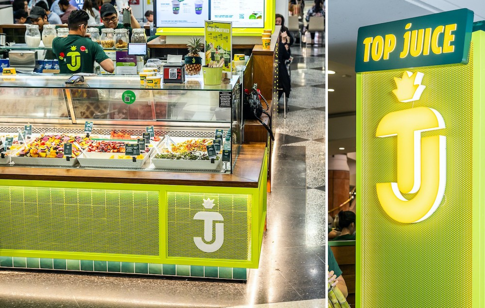
The logotype is modern and confident, with a leaf on the tittle. The ‘TJ’ mark is derived from the updated logotype and forms a pineapple motif to further push real freshness.
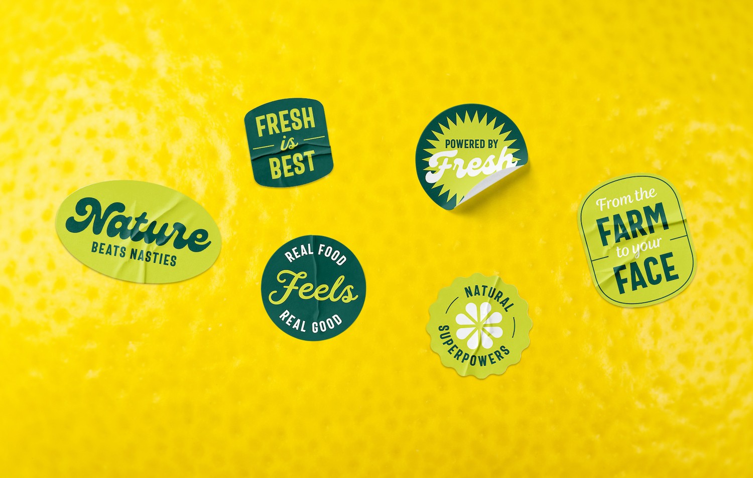
We developed a series of visual assets that centre around a fresh and modern take on the PLU sticker to pay homage to Top Juice’s humble fruit market origins and credentials.
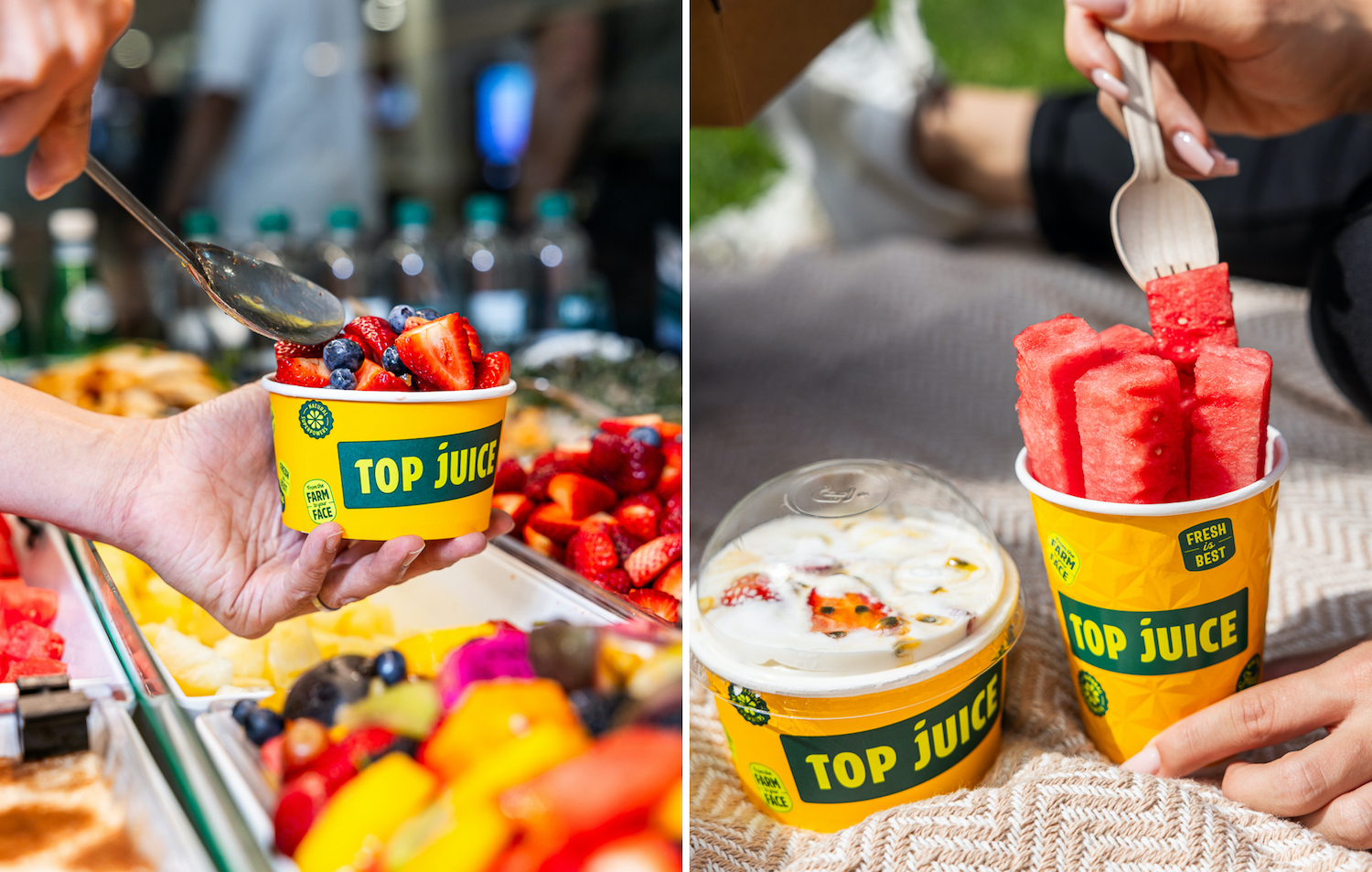
Continuing with the idea of PLU stickers and the pineapple-inspired logomark, we developed a bespoke packaging range that has maximum stand out and is distinct to Top Juice.
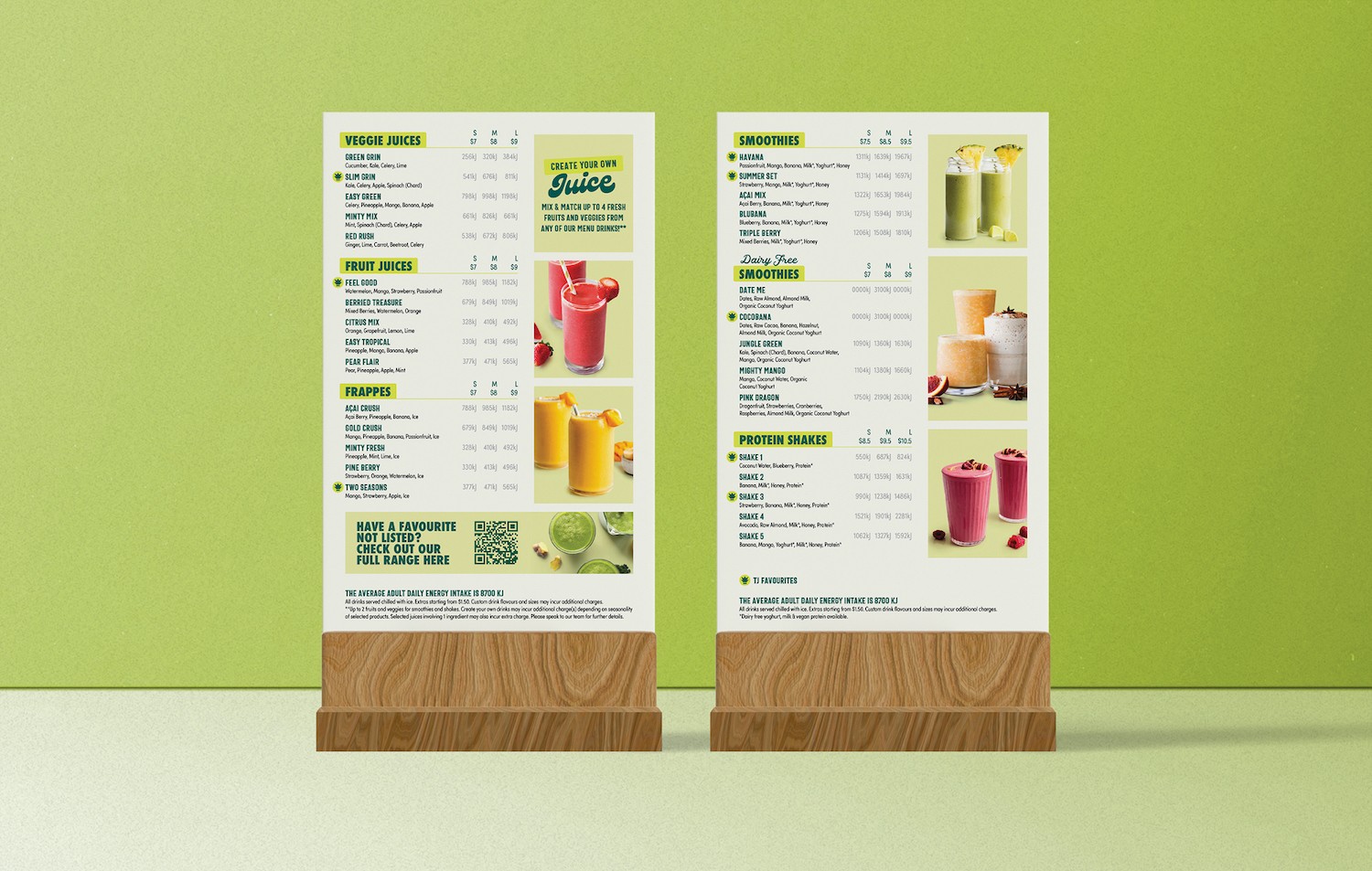
Next, we overhauled the menu design and structure with the objective of driving sales by streamlining the ordering process, improving navigation between categories, maximising legibility, and enhancing the menu’s overall visual appeal.
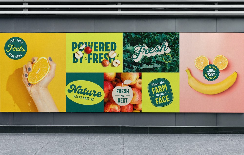
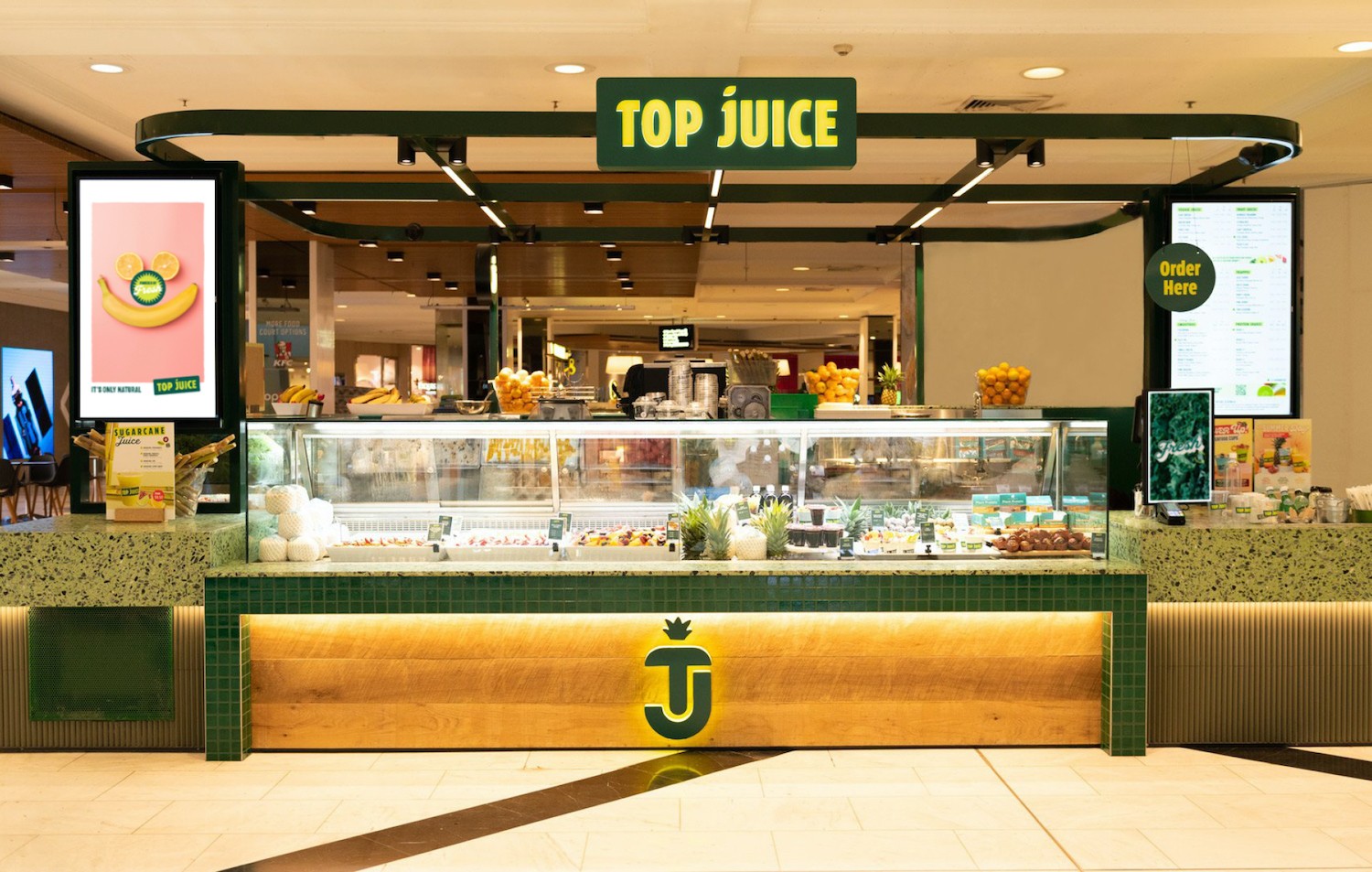
We extended the new Top Juice brand throughout stores and kiosks to improve standout and initiate further brand engagement and, ultimately, sales.
Emmanuel Attard, General Manager of Top Juice, says: “We had the pleasure of working with Tony and his team at The Creative Method only a short time ago where we gave them the significant task of reviewing our brand as we knew it, and creating something new that still honours and respects our roots whilst catapulting us into the future.
“The process was amazing; at each phase we were provided with amazing options which gave us opportunity to weigh-in with feedback to ensure the final product was 100% aligned to our company.
“The task of rebranding ultimately became a fun and exciting period which has ultimately transformed our entire business!”

CREDIT
- Agency/Creative: The Creative Method
- Article Title: Revitalising Australia’s Favourite Fresh Juice Brand
- Organisation/Entity: Agency
- Project Type: Identity
- Project Status: Published
- Agency/Creative Country: Australia
- Agency/Creative City: Surry Hills
- Market Region: Oceania
- Project Deliverables: Brand Design, Brand Experience, Brand Guidelines, Brand Identity, Brand Mark, Brand Redesign, Brand Rejuvenation, Brand Strategy, Brand Tone of Voice, Branding, Copywriting, Craft, Design, Environmental Graphics, Graphic Design, Logo Design, Packaging Design, Rebranding
- Industry: Food/Beverage
- Keywords: Packaging, Top Juice, Rebrand, Brand Strategy
-
Credits:
Creative Director: Tony Ibbotson
Designer: Jacqueline Christian
Copywriter: Lee Nicol
Account Director: Lucy Ryan


