It’s quite simple, really. Food brings us together. Great food leads to great conversation that intimate exchange around a table. And that is what Social Kitchen’s is all about.
SK Food Brands came to The Creative Pack with a big task in hand. Design and develop a brand look and feel that matched their mission of delivering an exceptional eating experience worth taking about. The scope of the project included – new logo, brand story, packaging, print-ready artwork, website design, plus countless hours of collaboration between SK Food Brand and The Creative Pack, where both teams have an eye for detail and push for perfection.
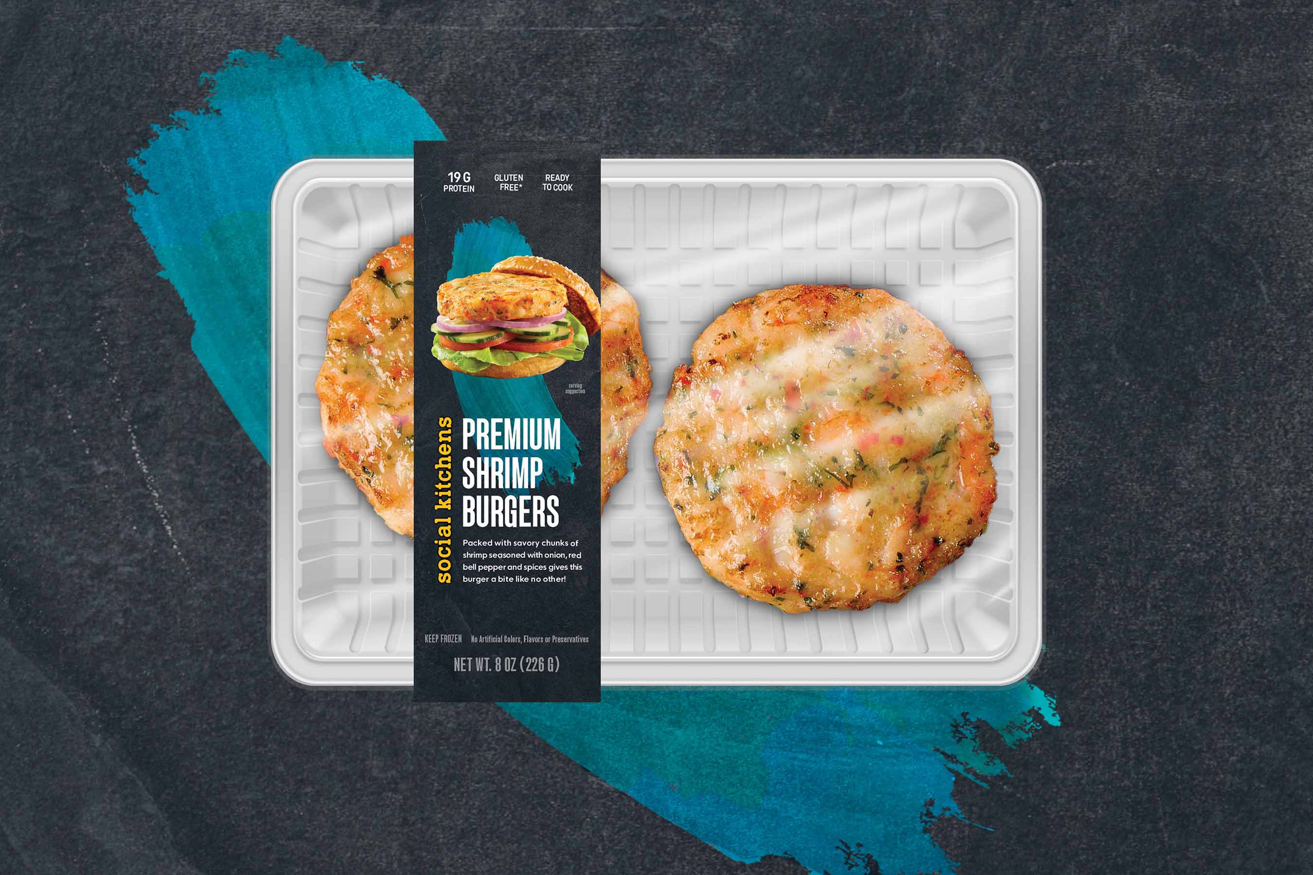
“Danielle and the team over at The Creative pack bring a wealth of knowledge when bringing food and packaging together. Translating taste, texture and smell into an object that offers none of those sense is no easy task. However, their artistry delivers a mouthwatering visual that primes you for the eating experience we aim to deliver,” says Ken Fryer, Director of Product Development at SK Food Brands. The logo is serious yet friendly and contemporary. A look and feel that makes customers see Social Kitchen’s products as a premium offering yet accessible and something everyone can enjoy. The logo is placed in either of Social Kitchen’s signature colors – golden yellow and black. On packaging the golden yellow logo pops against the dark, moody slate background.
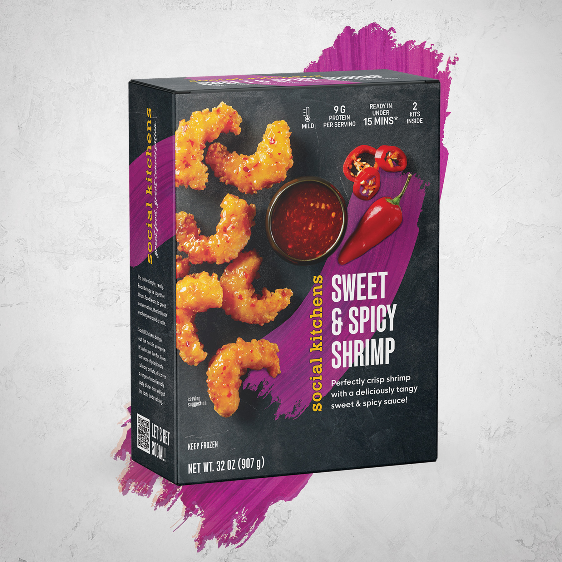
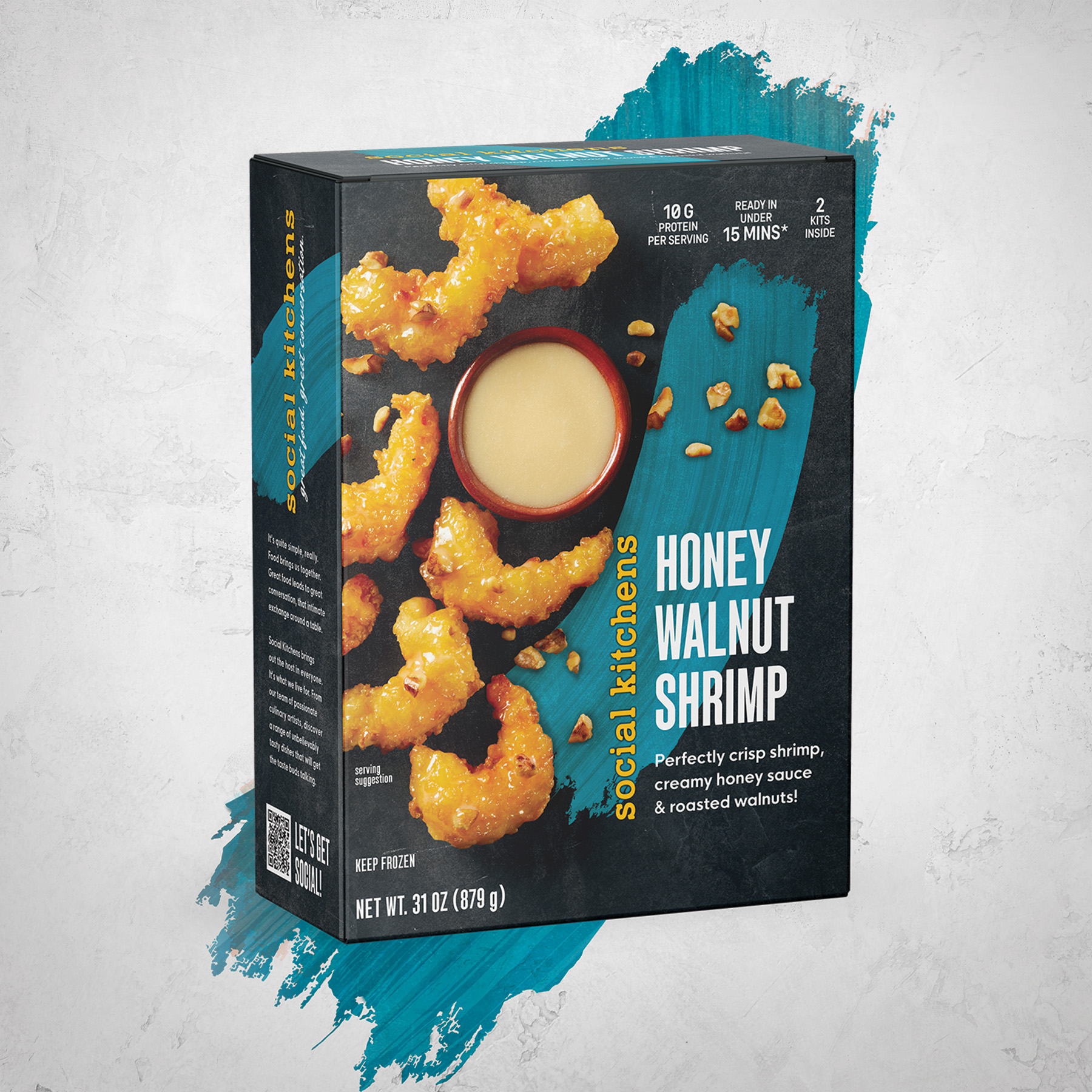
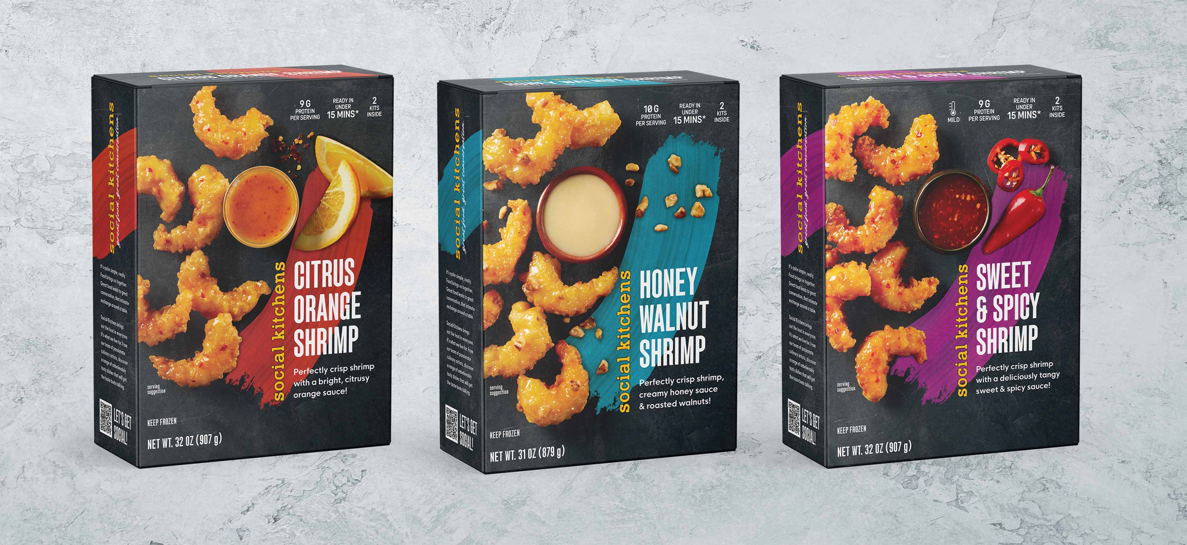
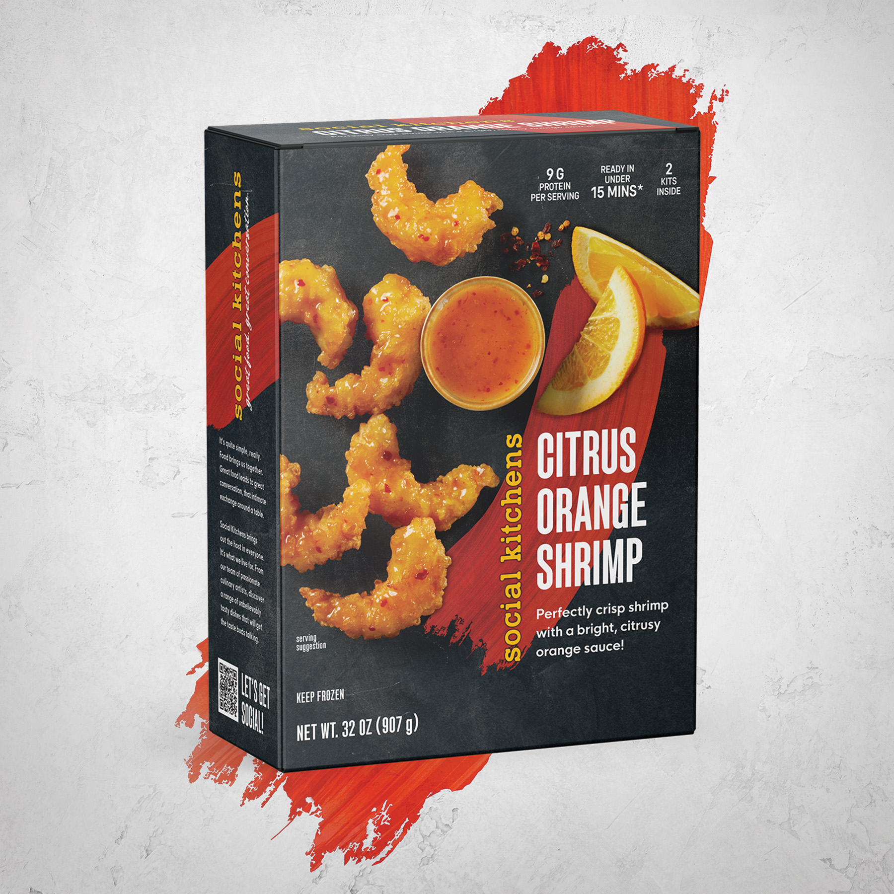
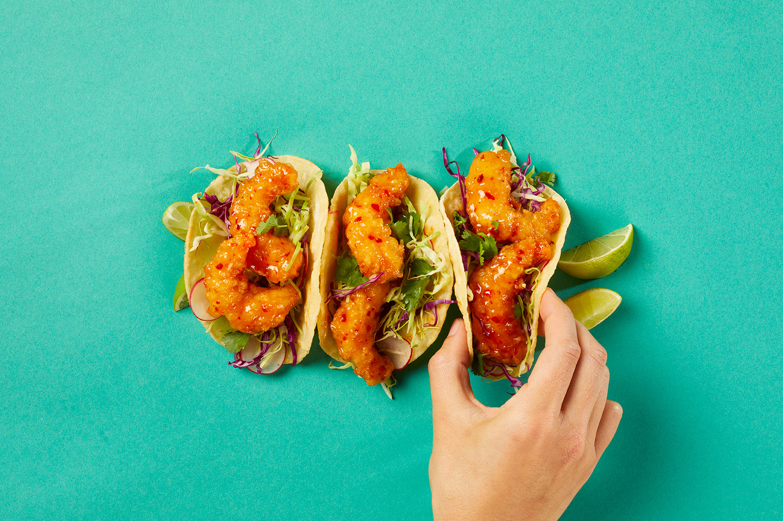
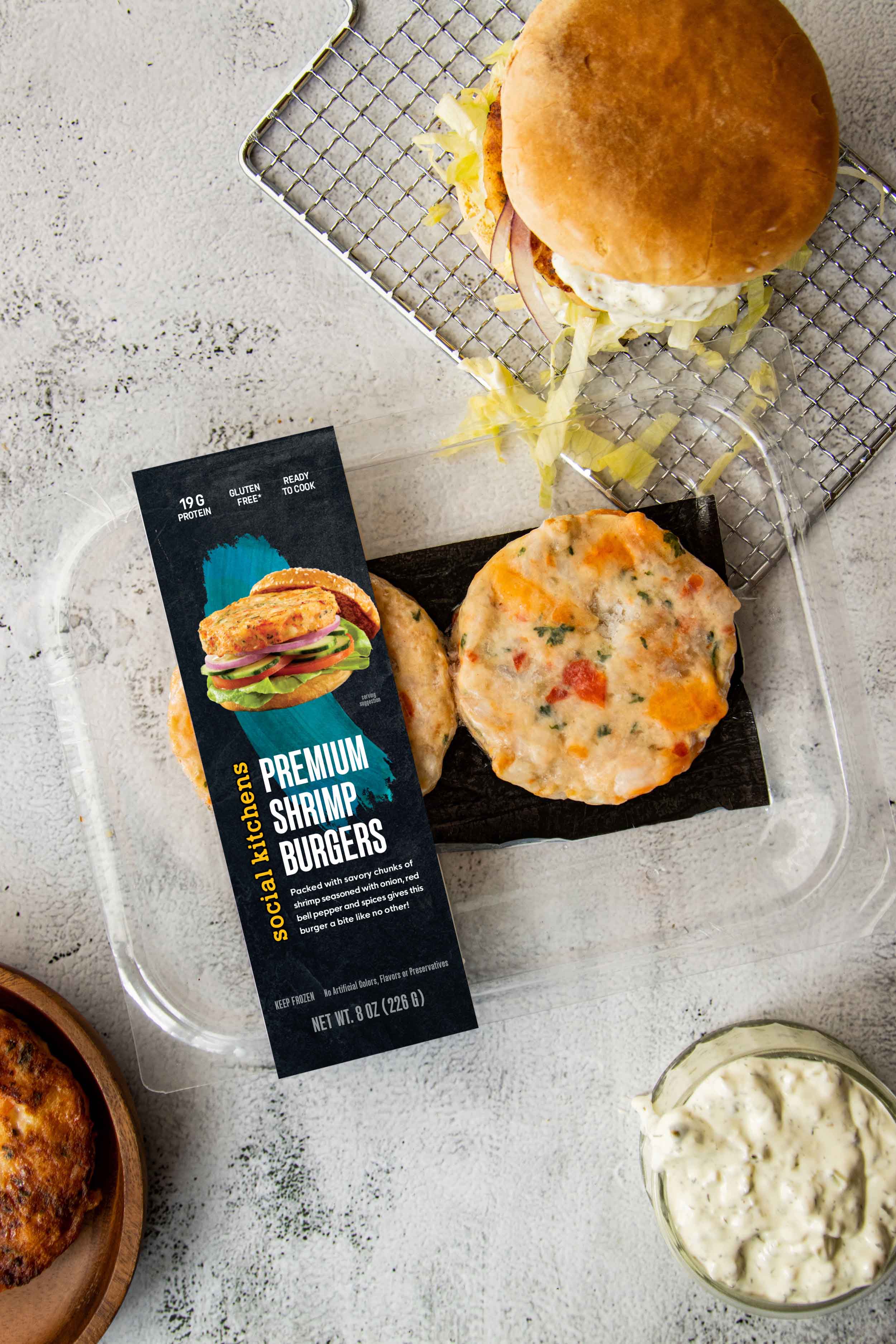
Social Kitchen’s retail packaging kicks things up a few notches. At the core of the design is a mouthwatering scene of interesting eats on a black textured surface that is bursting with color and flavor. The subtle texture alludes to a restaurant environment, just like where the food is made. The entire design is built around the beautifully presented chef-level cuisine – ready for sharing. The food photography says it all, this is a mouthwatering dish. The imagery draws you in immediately, as your eye connects with an energetic stroke of color, whose shape and texture are inspired by a flavorful splash of sauce across a dish. This application of color is the cornerstone for a powerful color-coding system as it’s thoughtfully integrated into the scene. The product titles’ long letterforms feel classic and chic – never ordinary. And it all sits together, perfectly balanced, leaving you wondering what culinary artist created this masterpiece? Bold and energetic, the package is intentionally designed to catch one’s eye even through the often-frosted freezer door.
Overall, this new design is a full-on culinary experience from your freezer aisle. So, the next time you are looking for a meal that will get the conversation started, reach for Social Kitchens. Their culinary team has something for your tastebuds to talk about.


CREDIT
- Agency/Creative: The Creative Pack
- Article Title: Social Kitchens Branding and Packaging Design by The Creative Pack
- Organisation/Entity: Agency
- Project Type: Packaging
- Project Status: Published
- Agency/Creative Country: United States
- Agency/Creative City: Los Angeles
- Market Region: North America
- Project Deliverables: Art Direction, Brand Design, Brand Strategy, Brand Tone of Voice, Branding, Concept Art, Copywriting, Creative Direction, Design, Food Photography, Graphic Design, Packaging Design
- Format: Box, Sleeve
- Industry: Food/Beverage
- Keywords: Branding Design, Logo Design, Branding, Packaging Design, Food Packaging Design, Food Packaging, Frozen Food Packaging, Seafood Packaging, Creative Direction, Graphic Design, Social Kitchens, The Creative Pack
-
Credits:
Founder and Creative Director: Danielle Kidney
Emily Cho: Project Manager
Heather Storie: Art Director and Senior Graphic Designer
Emma Tung: Graphic Designer
Casey Chui: Graphic Designer
Josh Manalang: Graphic Designer


