Brown&co – Bomonti beer
“Brief
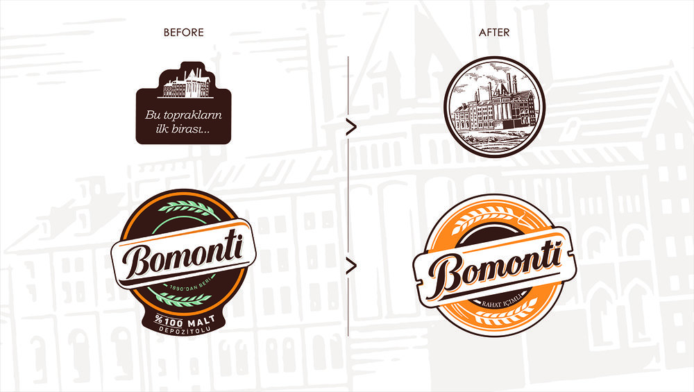
Refine the Bomonti visual language, reunite the family of variants while maintaining simple consumer navigation, mindful that Turkey is the darkest of markets in the promotion of alcohol brands. (i.e. outlawed in many respects)
Problem
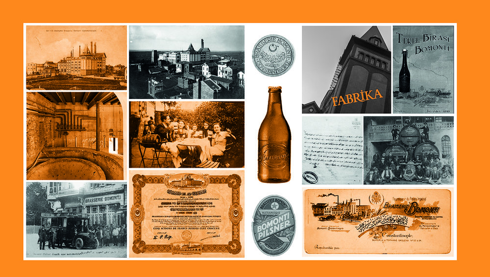
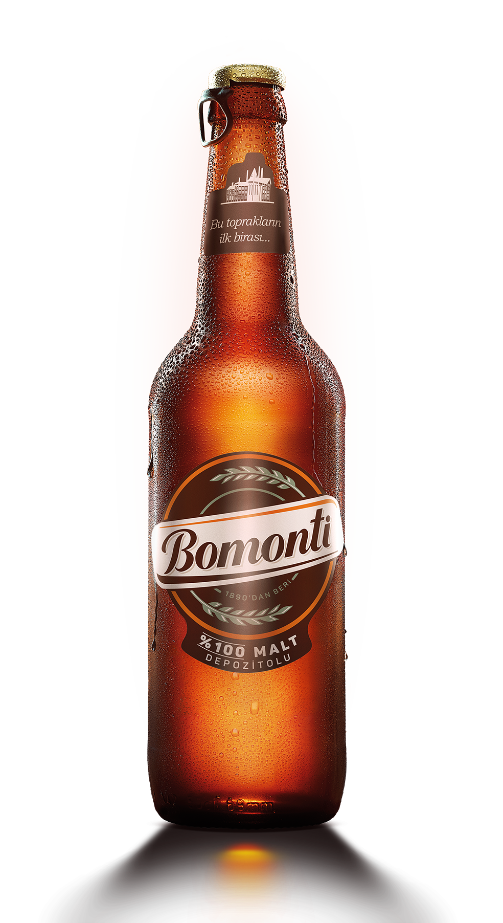
Bomonti was the first beer made in Turkey – they have been making beer their own way since 1890. In recent years, the Bomonti family design has become fragmented. With a strong positioning of Kendine Has (live your way), Brown&co were asked to bring this positioning alive creating a succinct brand family, including the introduction of a new variant.
Solution
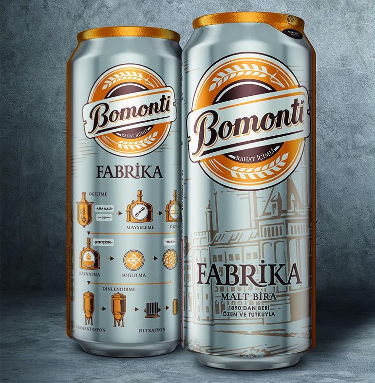
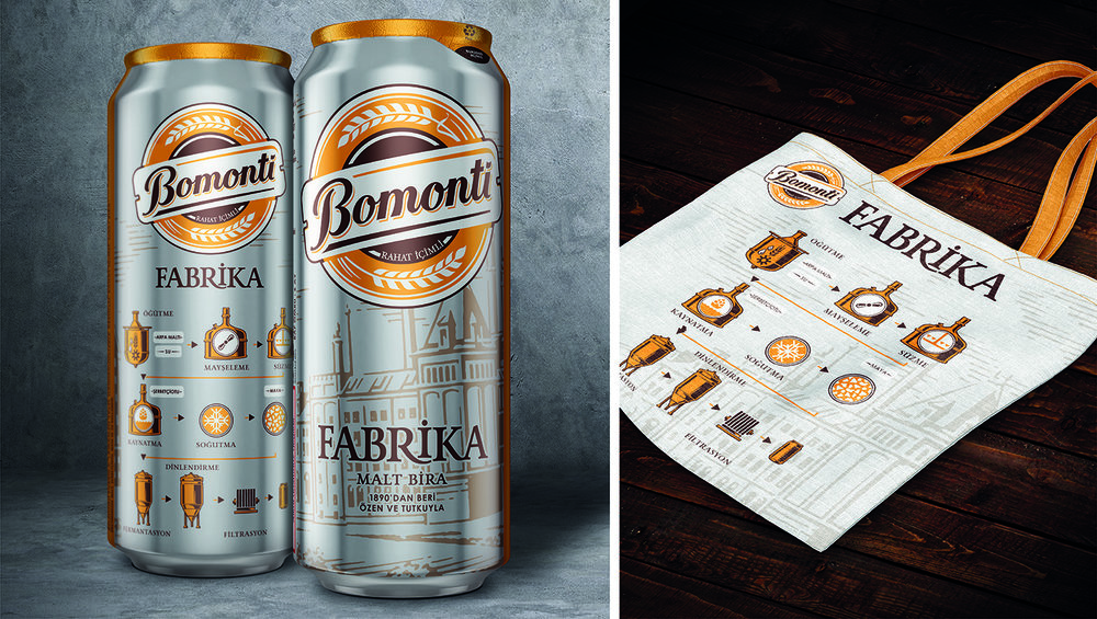
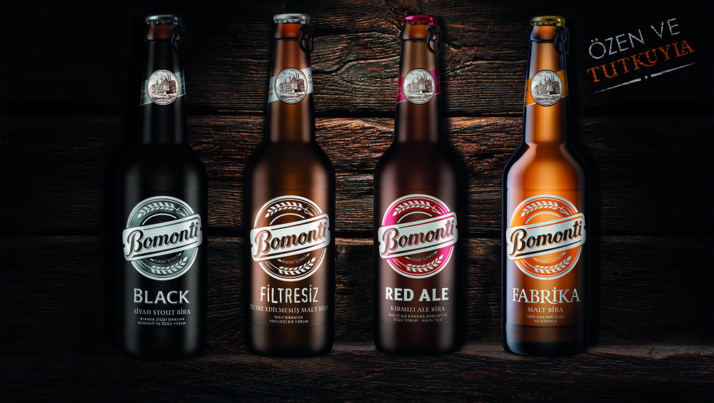
We created a strong visual architecture based on the top performing variant in the Bomonti stable – Filtresiz. The colour coding of the variants allows for simple range navigation, while the basic structure of the label ensures that the Bomonti branding remains consistent. Along with this, we created new innovative designs for cans (including 3D structural proposals) and an identity for their World Beer Series to be used off pack.”
CREDIT
- Agency/Creative: Brown&co
- Article Title: Refining Visual Language and Reuniting Family Variants and Simple Navigation
- Organisation/Entity: Agency Commercial / Published
- Project Type: Packaging
- Agency/Creative Country: Global Collective
- Market Region: Multiple Regions
- Format: Bottle, Can
- Substrate: Glass, Metal


