Fused Label: Dressed to Impress
As the designer behind this exquisite wine label for Lozenitsa Estate, I find great joy in unraveling the story of craftsmanship, ambition, and a touch of modesty that encapsulates every bottle bearing the emblem “Dressed to Impress.”
A Sip of Ambition: Lozenitsa Estate’s Rise
In the picturesque Struma Valley, near the charming Lozenitsa Village in Melnik, Bulgaria, a new star is born – Lozenitsa Estate. An ambitious winery nestled in an amazing region with unique terroir, it sets its sights on the top shelf, offering wines of premium quality that promise an unparalleled sensory experience.
Dressed to Impress: A Modest Aspiration
When tasked with creating the label design, my goal was clear – to weave an aura of class and sophistication around every bottle. The motto, “Dressed to Impress,” became my guiding light, urging me to infuse the label with a timeless elegance that befits the exceptional wines within.
Fusion of Tradition and Technology
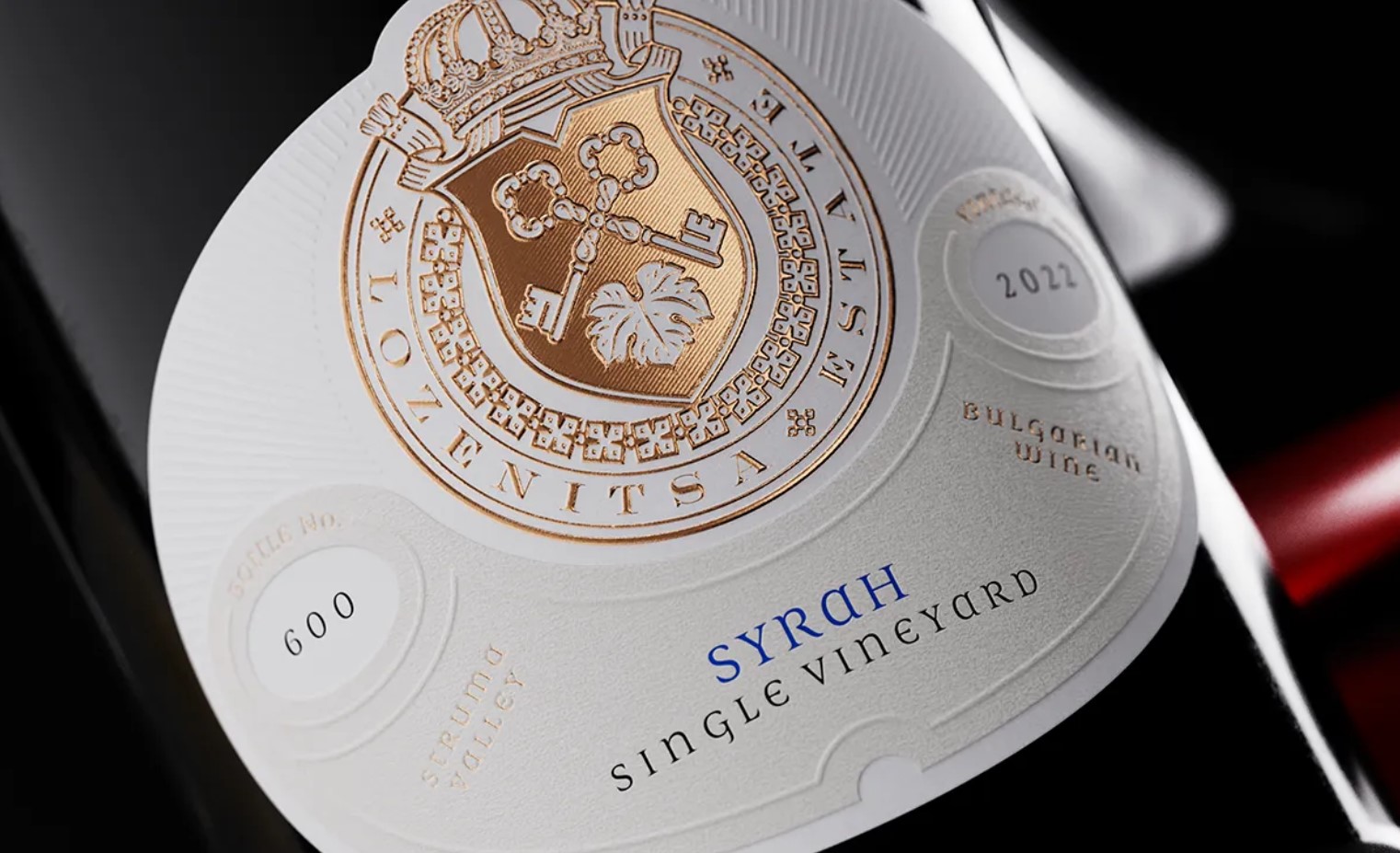
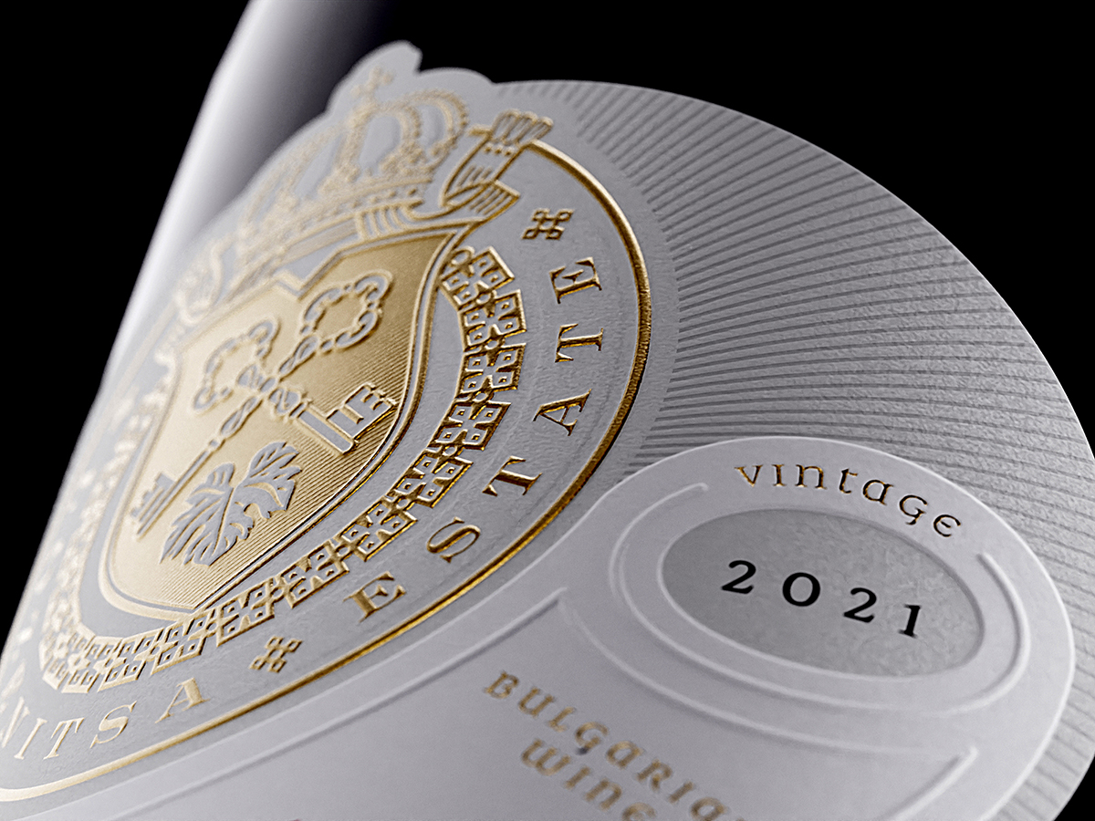
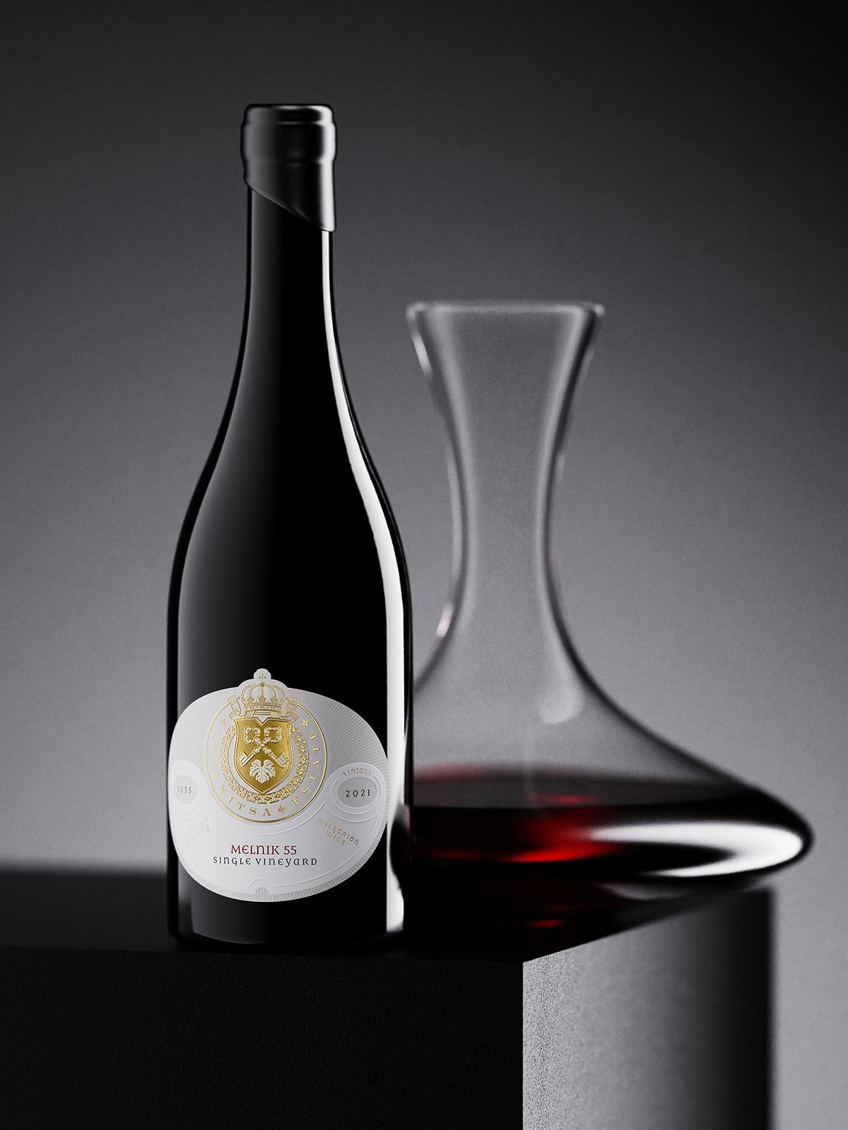
Embracing cutting-edge fused label technology, the label became a canvas marrying tradition and innovation. The bottom layer, sculpted in an oval shape, cradles the gold-stamped crest of Lozenitsa Estate. The intricate details come to life under the strong embossing effect, a nod to the rich heritage of the region.
Beyond the emblem, delicate debossed lines trace the entire shape of the bottom layer, adding a subtle touch that speaks of craftsmanship and attention to detail.
Arcane Elegance: The Top Layer Unveiled
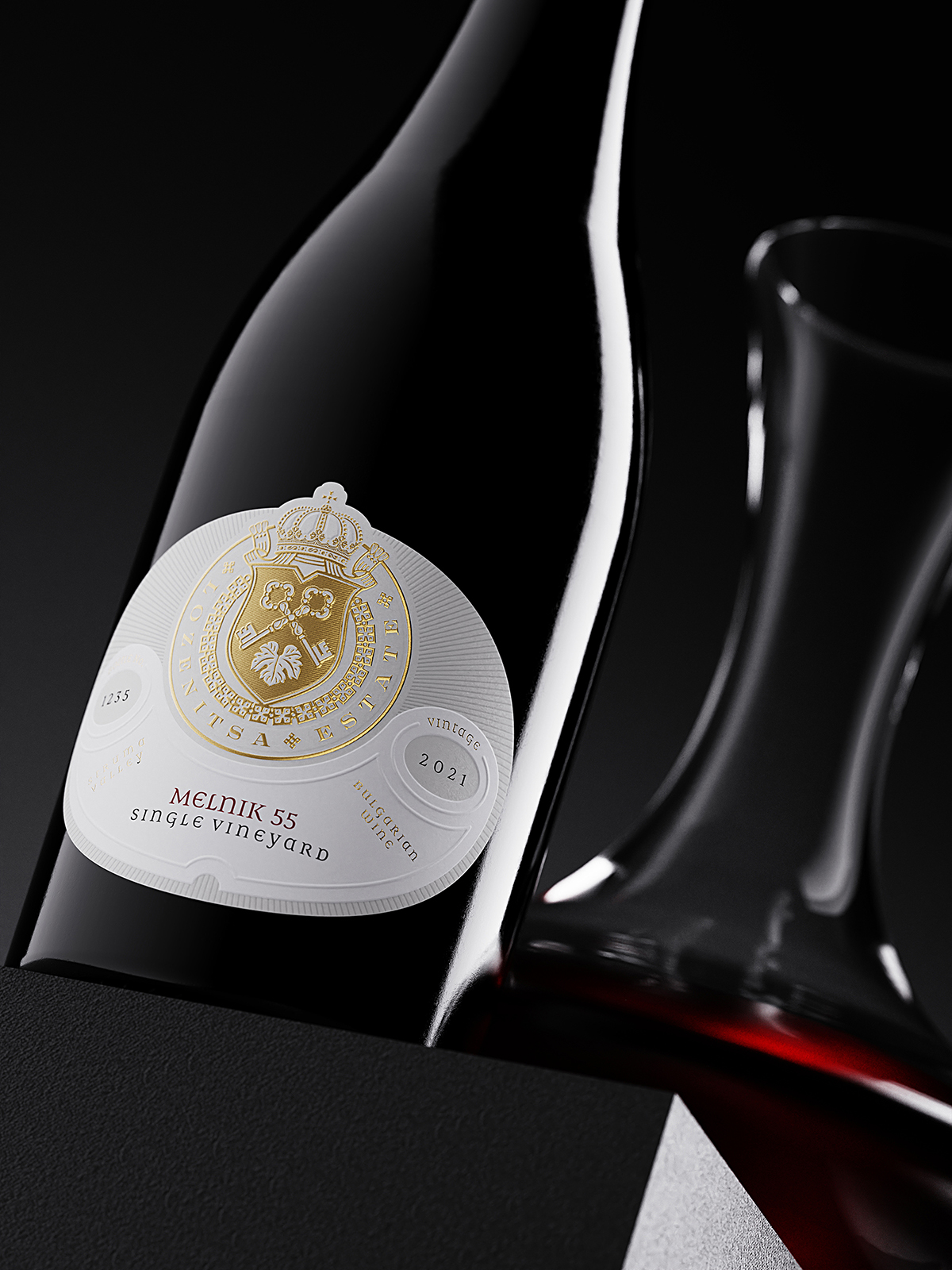
The top paper layer, with its distinctive arc shape, is not just a bearer of information. It’s a visual spectacle, raising the surface level of the label and creating a strong visual impact. Stamped with embossing effects, outlined frames encase essential details like variety, region, vintage, and individual bottle numbering.
Classic Elegance in a Bottle
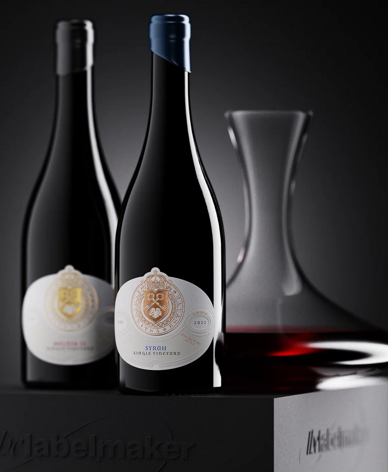
To complement the visual symphony of the label, I opted for a classic heavy Burgundy bottle, sealed with a cork, and adorned with an elegant black wax seal. This choice signifies a harmonious blend of classic aesthetics and modern design.
Conclusion: Uncorking Splendor
Every bottle from Lozenitsa Estate is not just wine; it’s a journey through the vineyards of Melnik, a sip of ambition and dedication. “Dressed to Impress” is not just a label; it’s a modest expression of the artistry and passion that goes into every bottle. As you uncork a bottle from Lozenitsa Estate, you’re not just indulging in wine; you’re unveiling a masterpiece crafted with elegance and a touch of humble creativity.
CREDIT
- Agency/Creative: the Labelmaker
- Article Title: Lozenitsa Estate Fused Label: Dressed to Impress
- Organisation/Entity: Agency
- Project Type: Packaging
- Project Status: Published
- Agency/Creative Country: Bulgaria
- Agency/Creative City: San Francisco
- Market Region: Europe, North America
- Project Deliverables: CGI, Label Design, Packaging Design
- Format: Bottle
- Industry: Food/Beverage
- Keywords: Lozenits Estate, embossed wine label, premium wine label, luxury wine label, white label, debossed wine label, Lozenitsa fused label, fused label design, label over label, gold foil label, wine label innovation, wine design, wine label art, jordan jelev, thelabelamker
-
Credits:
Client: Lozenitsa Estate
Design & CGI: the Labelmaker


