Context
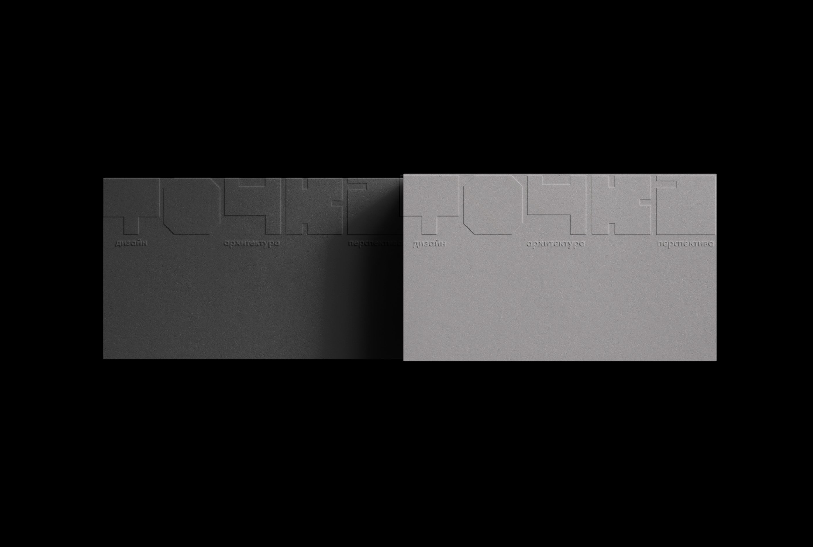
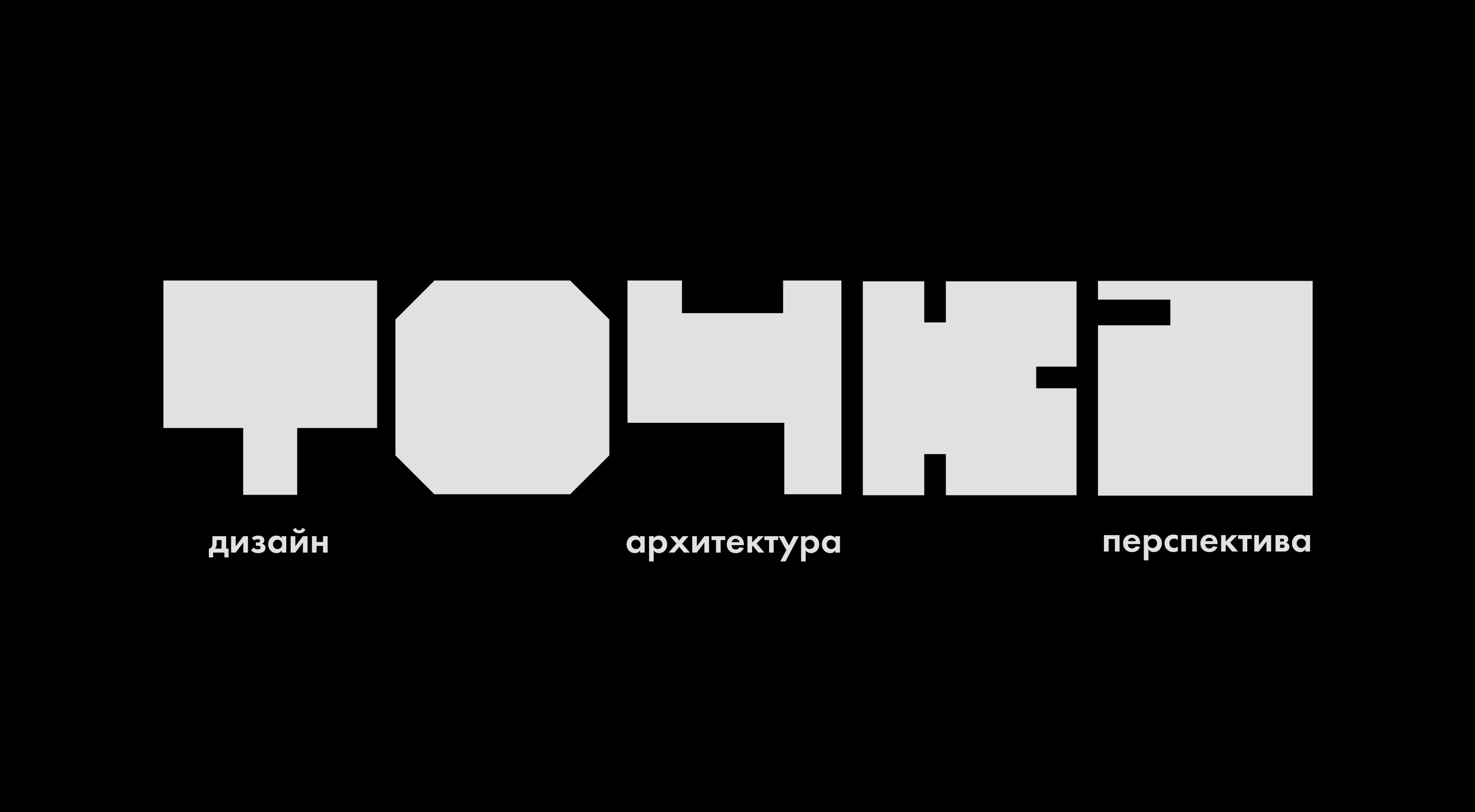
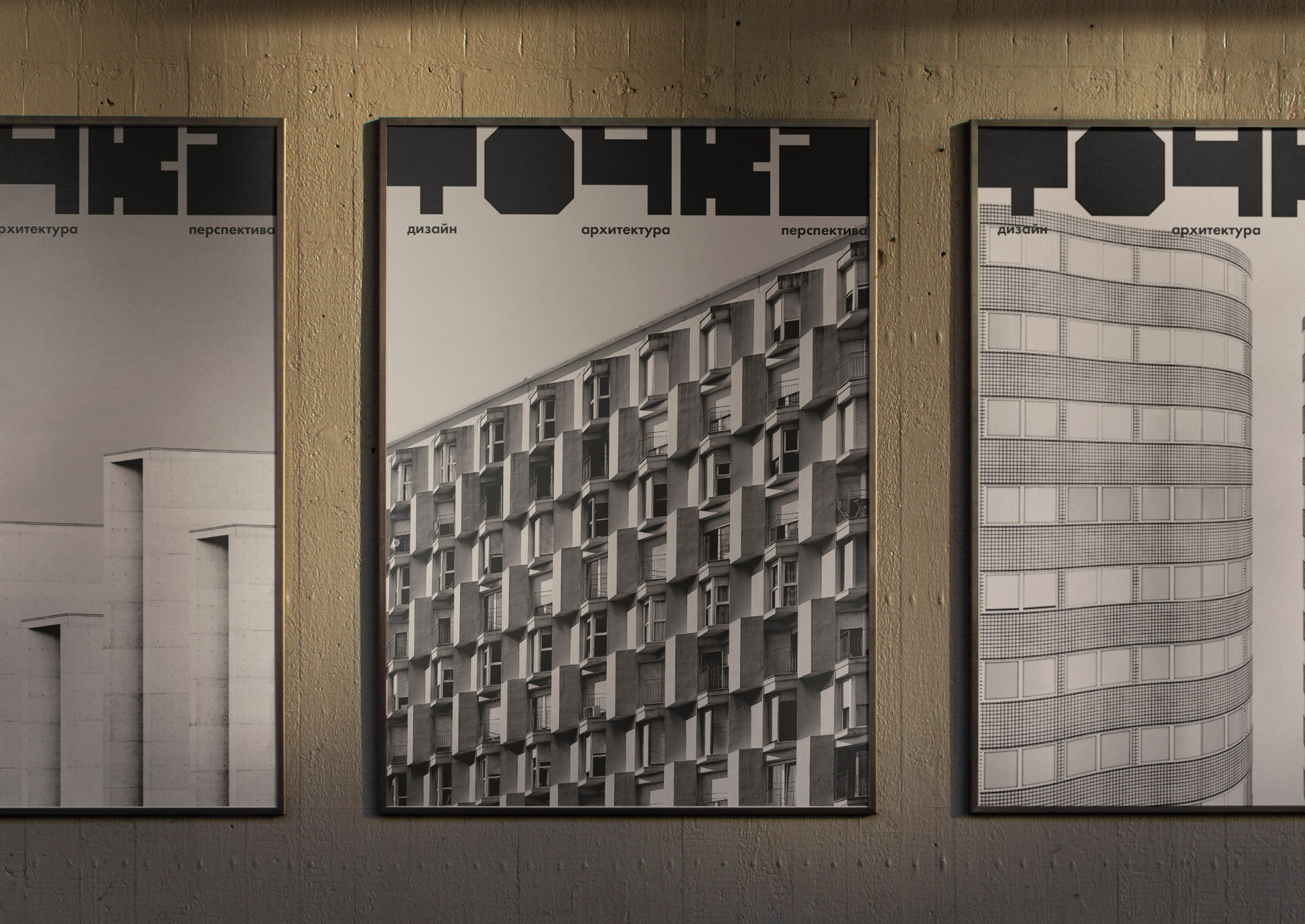
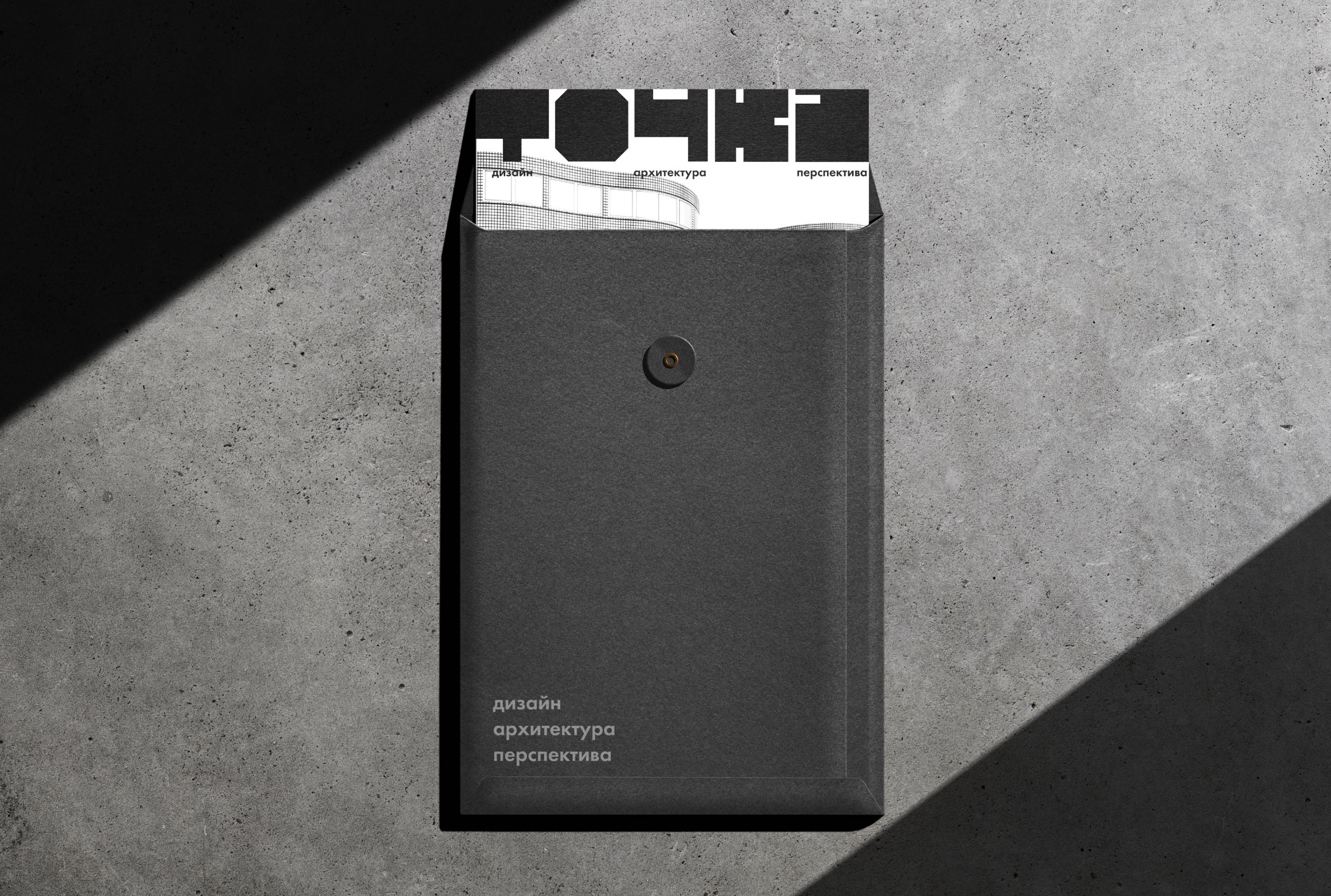
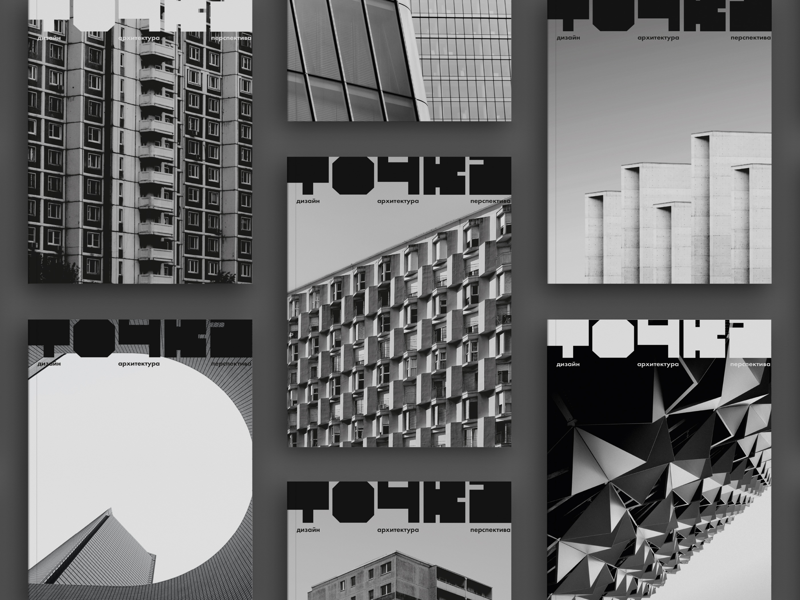
This concept was the result of a workshop at the lettering course at HSE Art and Design School. The task was to cut letters from paper squares with a minimum number of actions. It resulted in an accented grotesque with a rather low contrast, which inspired me to create the identity for an architectural community and a periodical magazine.
About
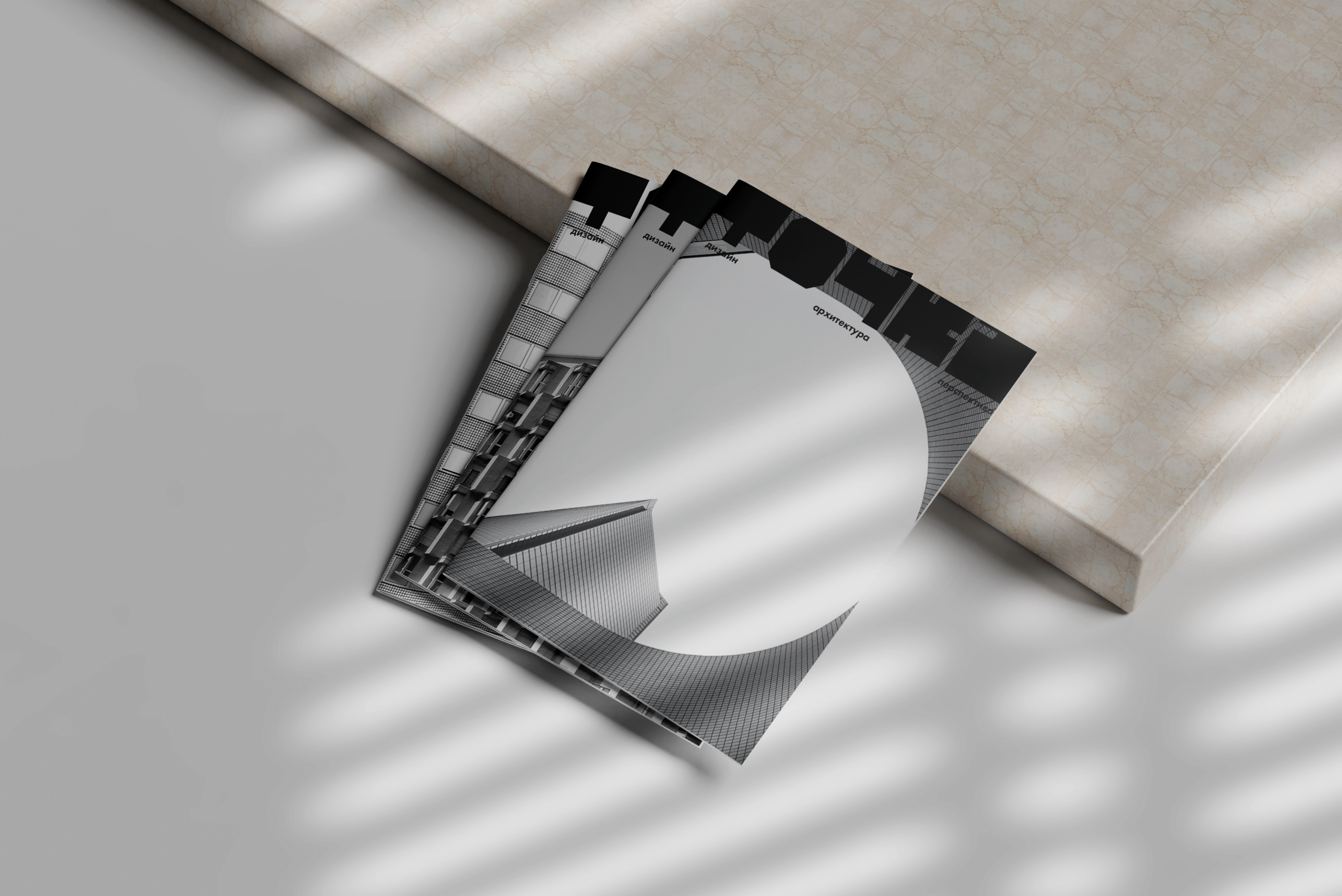
Any project starts and ends with a dot. Dot is a journal and a professional community of people associated with architecture. The community organizes exhibitions, excursions, open calls, discussions, and thematic meetings. They also publish a quarterly journal that contains industry news, announcements of community events, interviews with experts, scientific, educational, and informational articles.
Design
The design is based on the style of Soviet constructivism. This style is characterized by the strictness, geometrism, laconicism of forms, and functionality of buildings. The style is minimalistic and fundamental. Despite the changing architectural trends, the design refers to the origins of the architectural style, which remains relevant to this day.
Colors
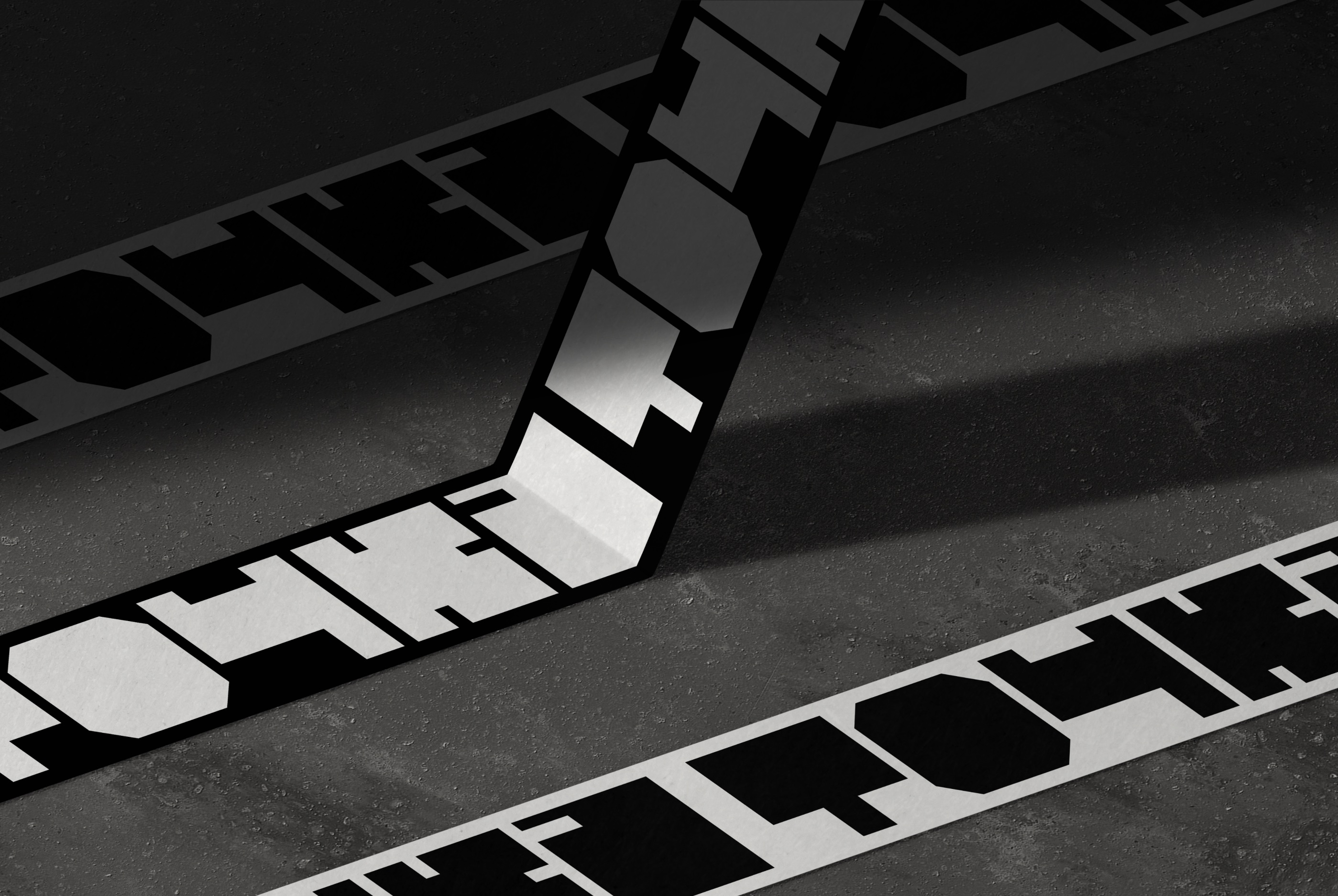
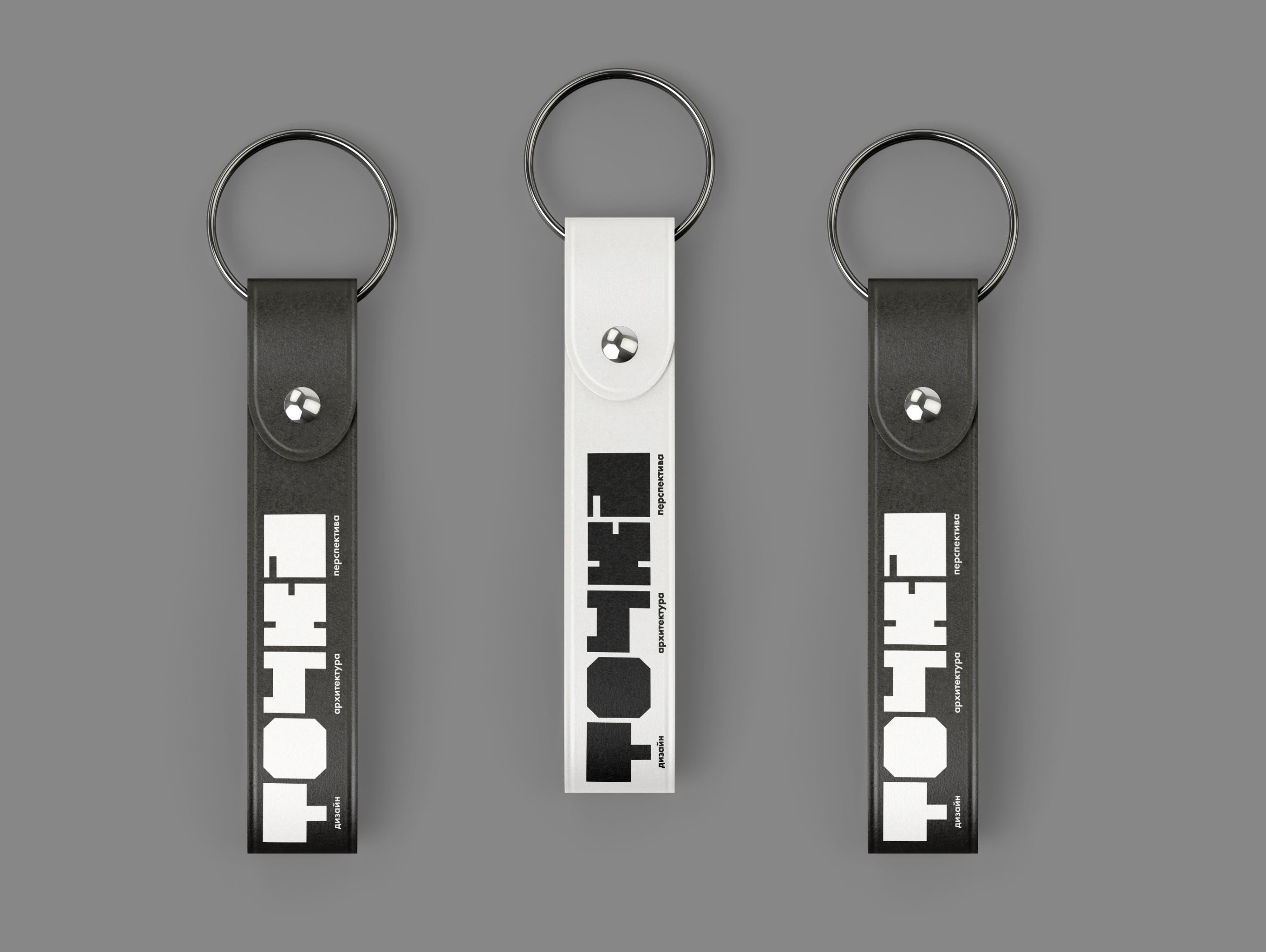
The color palette of the identity contains a gradation from white to black. The inspiration for the color palette was provided by materials such as stone, concrete, metal, and glass.
Typography
The letters seem to have been carved out of a square column with a minimum number of movements. The letters support the ideas of constructivism in minimalism, simplicity, and conciseness of form.

CREDIT
- Agency/Creative: Alina Kravets
- Article Title: Tochka Magazine and Community Identity Concept by Alina Kravets
- Organisation/Entity: Student
- Project Type: Identity
- Project Status: Non Published
- Agency/Creative Country: Russia
- Agency/Creative City: Moscow
- Market Region: Europe
- Project Deliverables: Architecture, Art Direction, Brand Design, Branding, Graphic Design, Logo Design, Poster Design
- Industry: Education
- Keywords: Graphic Design, Brand Identity, Architecture
-
Credits:
Designer: Alina Kravets


