There’s a certain, almost utopian scenario in the realm of graphic design: a mutual trust between client and designer. Enter Vuk, a sound designer and owner of the brand Zvuk. Our journey together was a testament to the power of collaboration and trust in expertise.
Vuk is a multi-disciplinary sound technician, providing sound engineering services and music production. When he’s not crafting the sounds, he’s blending them as a DJ. Vuk is also a uniquely creative person with strong visions. While he’s from the audio-visual background himself, he thought it best to let someone specialized in branding handle the process. He had a vision that needed to come to life.
The name ‘Zvuk’ (pronounced ‘Zvook’) originated from Vuk’s own name. ‘Zvuk’ in the Montenegrin language means ‘Sound’.
Vuk already had some ideas for the logo. He wanted it to resemble an ‘audio phase’, which is basically two horizontal wavy lines. He also expressed a wish for the logo to look like the letter Z. A combination of those two motifs would be perfect. “If it’s possible, good, if not, do your thing” were his words regarding this idea.
I tried many options before we realized that the said combination would undermine the uniqueness of the mark. We agreed that forcing something into existence could drastically hurt the quality of the logo. We decided to try some different approaches.
Where Vuk excelled was his ability to ditch his main idea for the good of the project. This is where many clients as well as many designers fail. He realized that the first idea doesn’t have to be neither the best nor the last. He listened to and acknowledged my suggestions every step of the way, agreed and disagreed based on logic, rather than on pure taste. My goal was to meet this by finding a middle ground: Producing an abstract logo that is unique, yet keeping his ideas present in a subtle way.
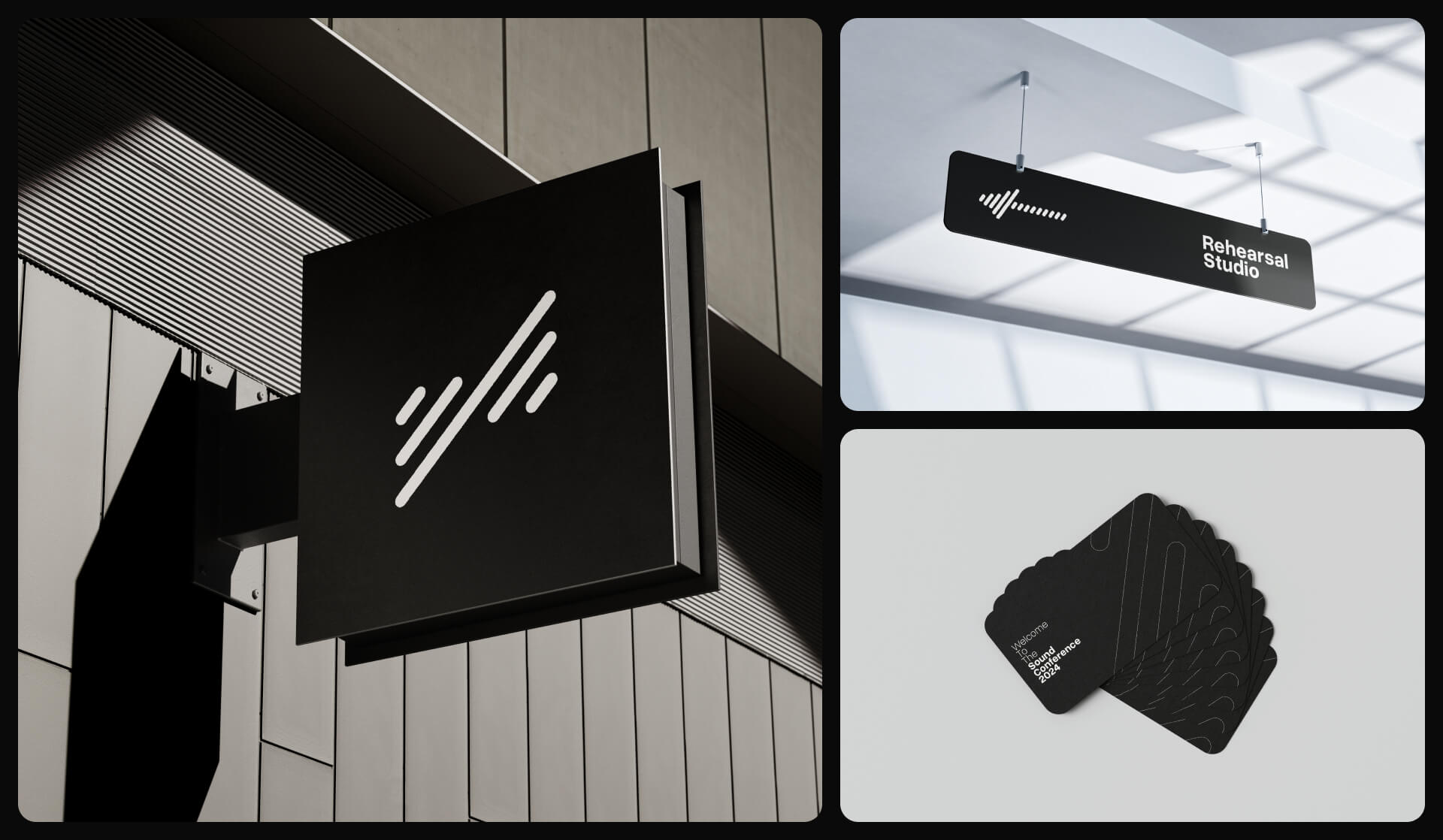
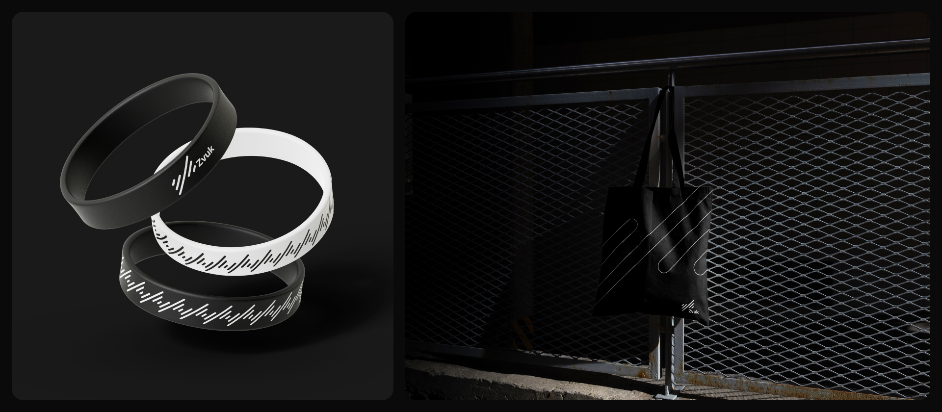
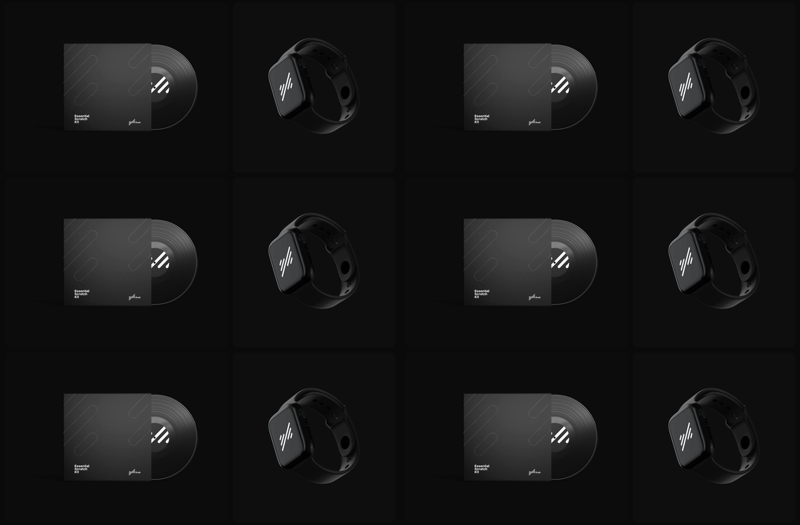
To keep the spirit of the audio phase wavy lines, I designed everything to be reminiscent and also capable of motion. Flowy logo lines, rotating CDs and vinyl records, icons dancing to the beat. The sound is always ‘moving’, so the brand needed to express the same behavior. It needs to be able to both dance and flow smoothly. This is also something I derived from our initial meetings and conversations, or better yet, from Vuk’s mind.
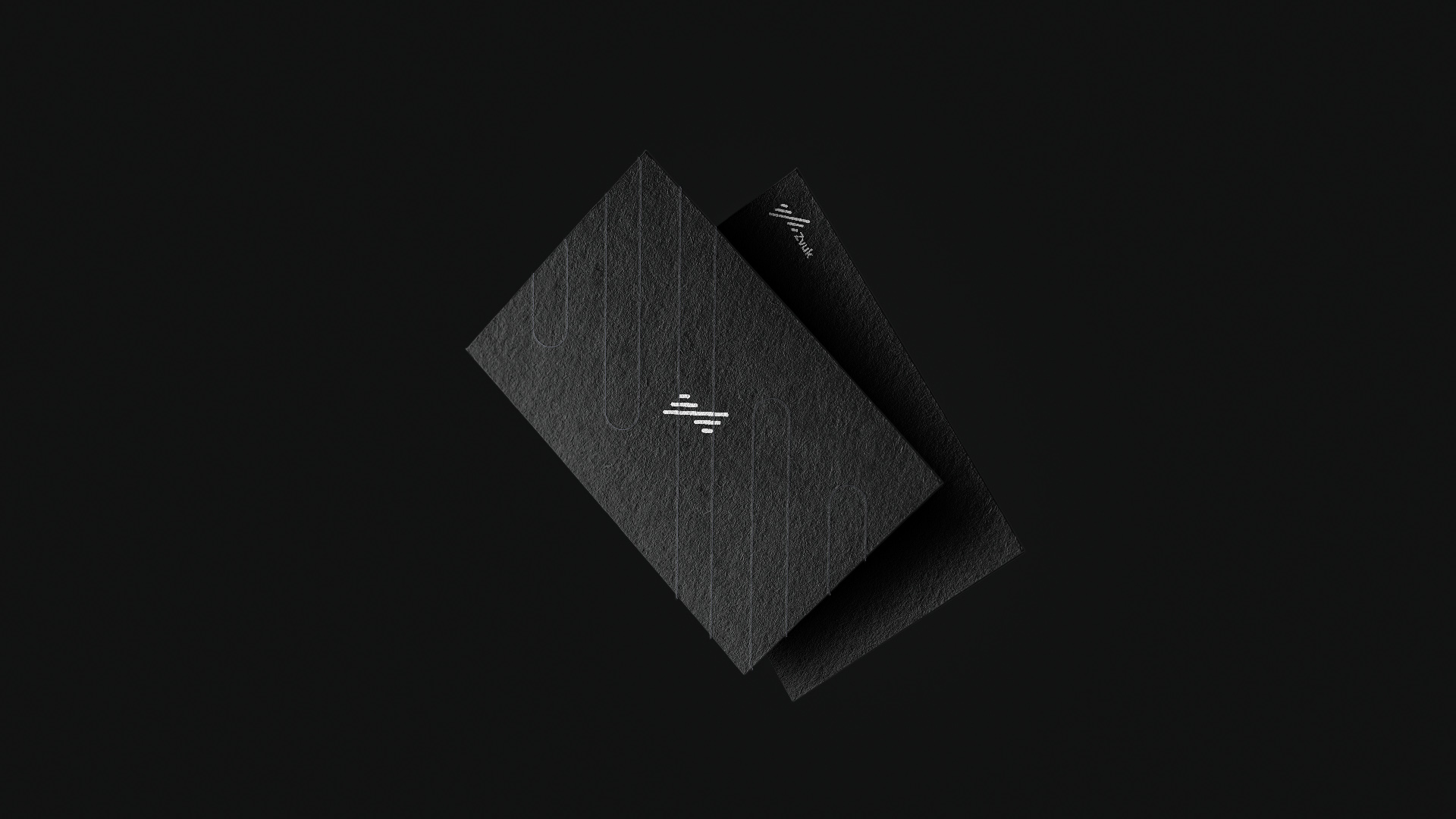
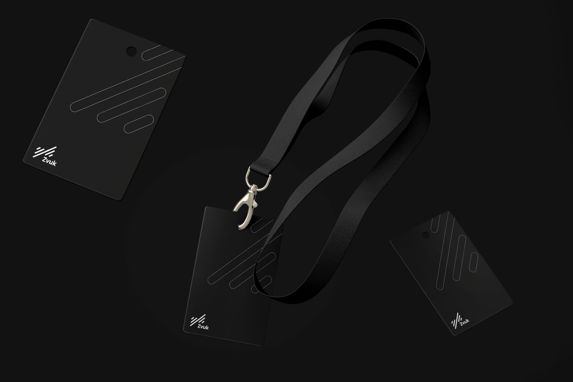
The main thing that I try to accomplish with each brand I work on is to merge the owner’s taste and the logic of business and design into one. The final mark has a very subtle and abstract nod to the letter Z, but it’s there. The flow of the audio phase lines exists in a different form, but it’s there. In the end, Vuk was satisfied, and the quality never suffered. We managed to find a compromise through a firstly established mutual language and understanding.
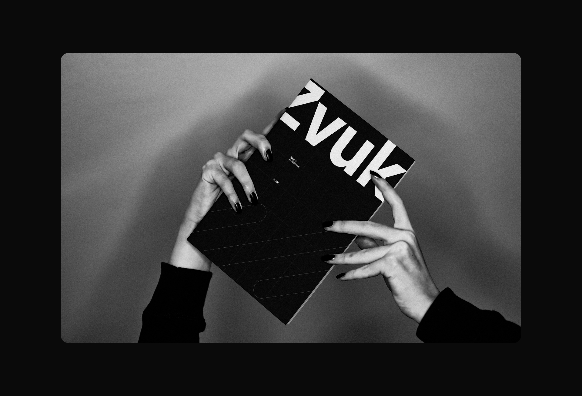
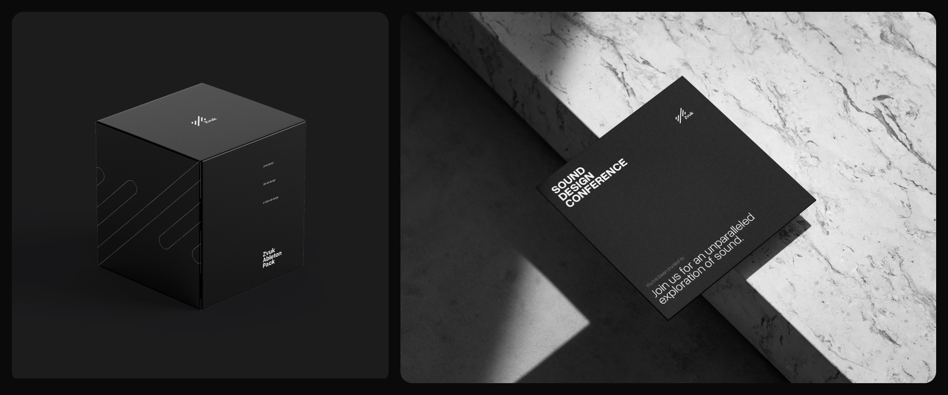
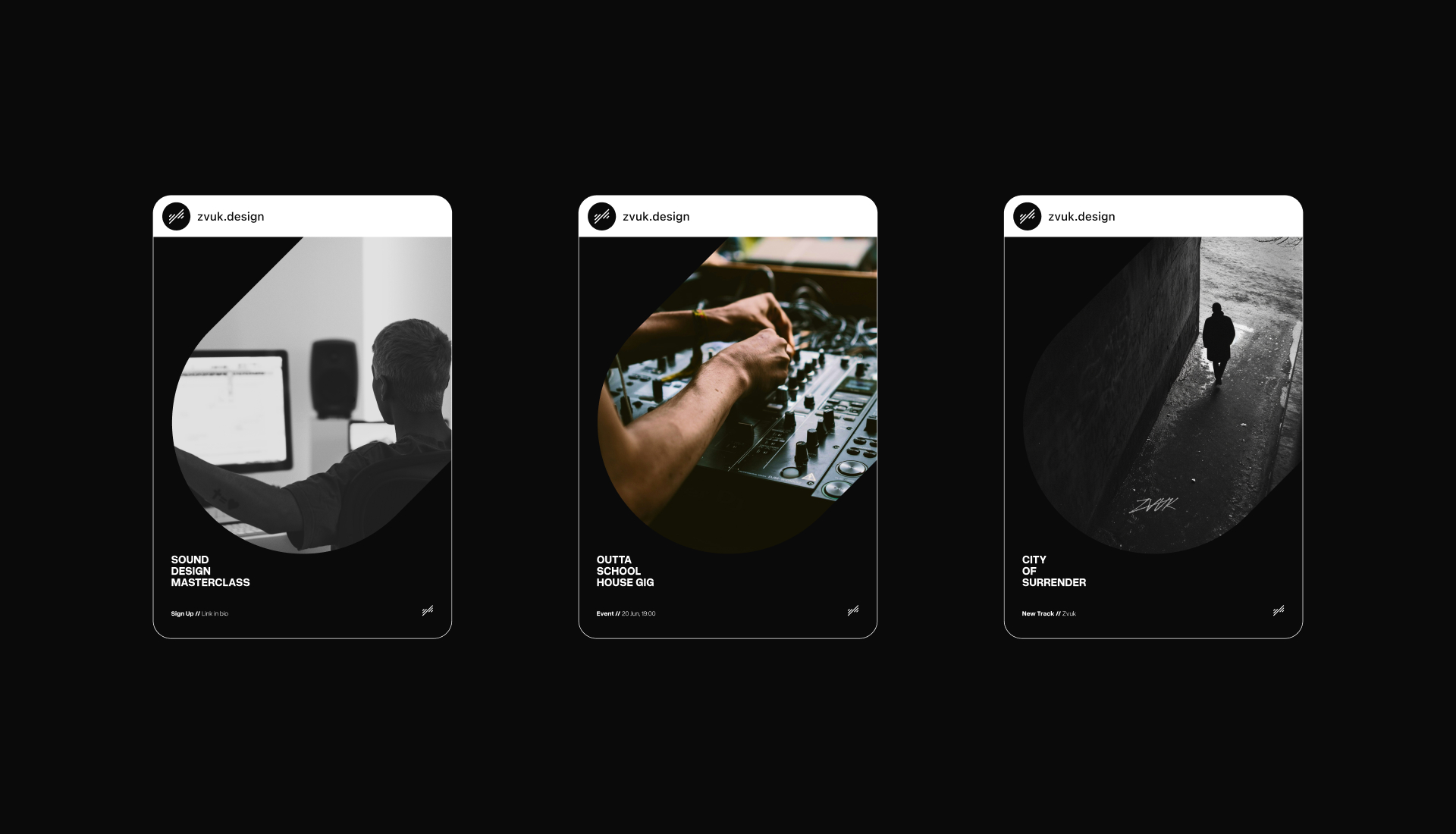
The rest of the brand elements all followed the philosophy of movement, kept the professional essence Vuk wanted to convey, and also had a smidge of Swiss inspiration. Our collaboration continues as the brand grows and his own sound design is added to the visual elements I create.


CREDIT
- Agency/Creative: Nikola Stojanović
- Article Title: Sound Designer’s Brand: The Art of Designing with Trust
- Organisation/Entity: Freelance
- Project Type: Identity
- Project Status: Published
- Agency/Creative Country: Montenegro
- Agency/Creative City: Podgorica
- Market Region: Europe
- Project Deliverables: 2D Design, Animation, Brand Design, Brand Mark, Logo Design, Motion Graphics
- Industry: Professional Services
- Keywords: Sound Designer
-
Credits:
Brand designer: Nikola Stojanović


