Fabula Branding – Belka Games
“ Fabula Branding carried out the rebranding of Belka Games, a developer of popular games for mobile devices. We’ve created the image of a squirrel (“belka” in Russian) that gave new life to the company’s energetic name. Now over 500K people see this image every day when launching games by Belka Games.
The developer had a catchy name but no image to embody it. That is why we created a corporate identity expressing the company’s spirit and the nature of its work and also telling a bit about its history and origins.
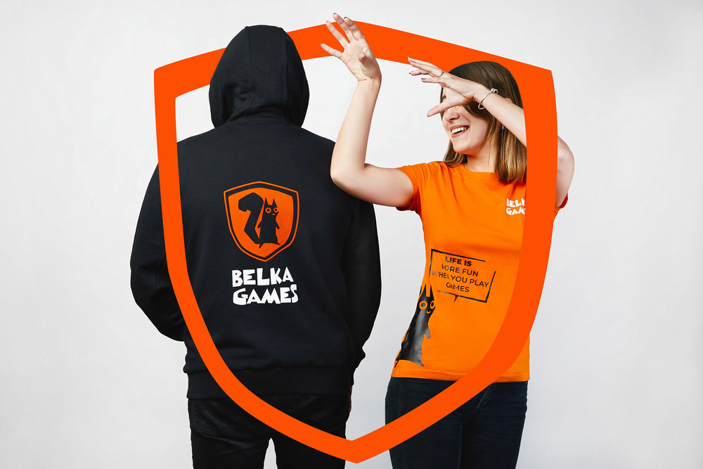
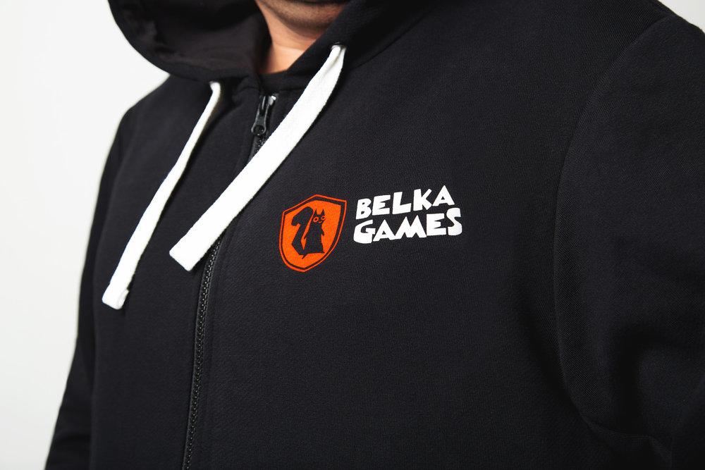
The main character of our design solution is, naturally, a squirrel. In order for it to look more respectable we put it on a coat-of-arms turning it into a heraldic symbol (and showing the status of the company at the same time). We used asymmetrical block-like forms, funny and playful lettering in the text part, and a bringt “squirrel orange” colour to make the concept less serious.
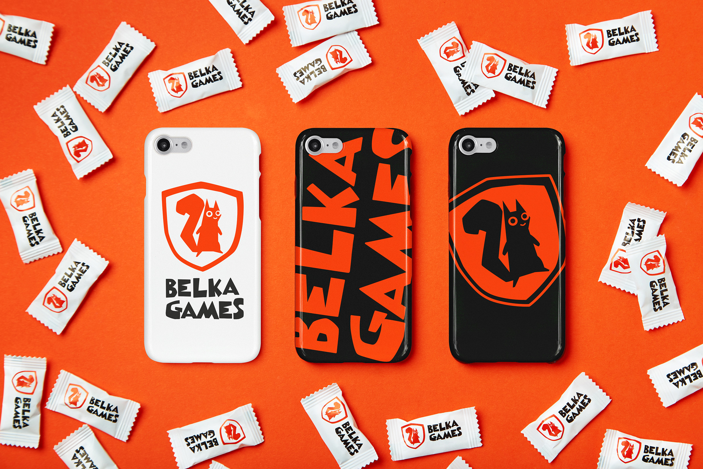
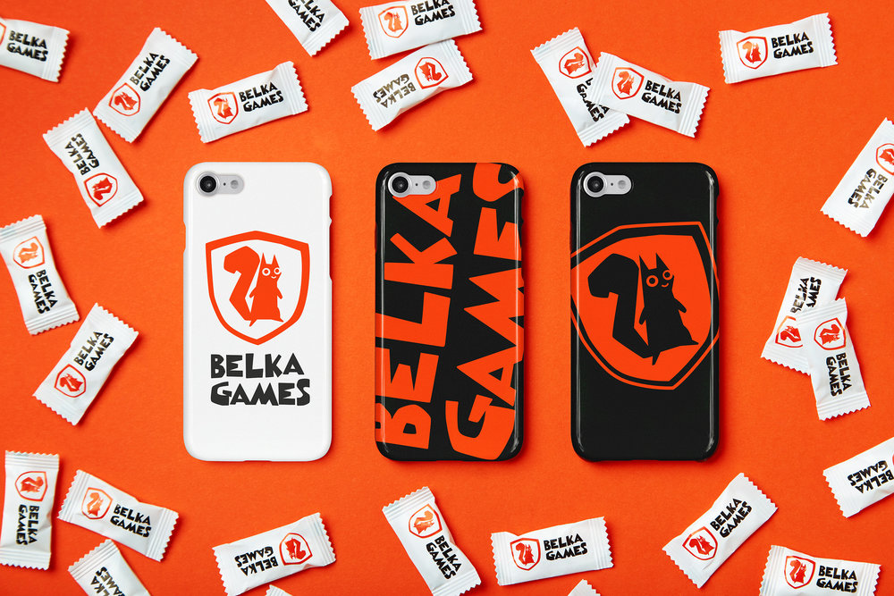
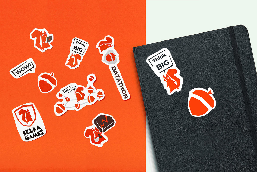
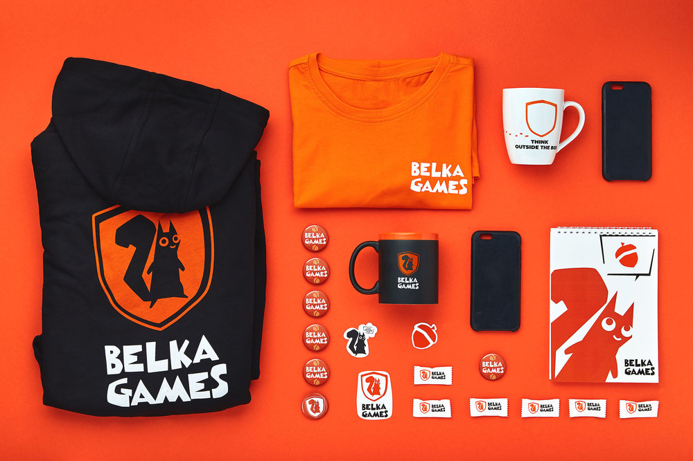
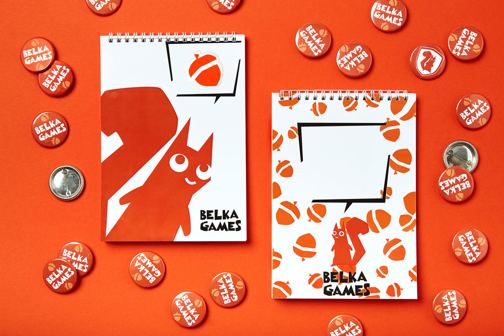
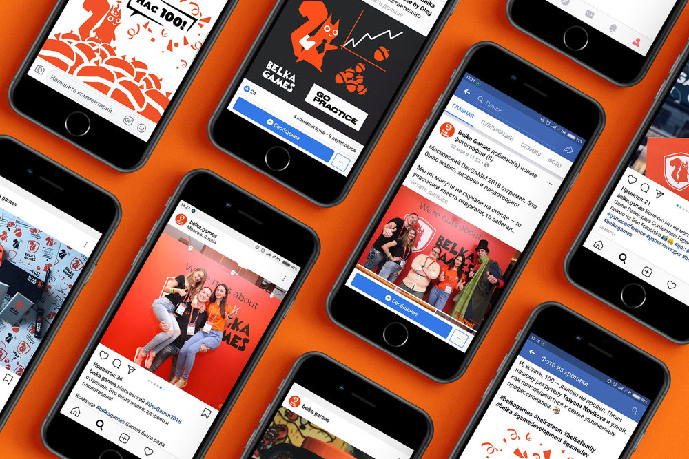
The corporate style develops the idea of the logo: on the merch the character comes to life and starts interaction both with the owners and the users. The squirrel talks, gives advice, and sometimes even leaves the logo looking for acorns. The customer was happy to support this idea, and now the squirrel is the main character of all communications at Belka Games.
Our identity adaptation system provides for quick branding of any media. For many of them we’ve developed different design options for the employees of the company to choose from. This variability of merch solutions is yet another demonstration of the company’s dynamic nature.”

CREDIT
- Agency/Creative: Fabula Branding
- Article Title: Rebranding and Corporate Style of Belka Games
- Organisation/Entity: Agency Commercial / Published
- Project Type: Packaging
- Agency/Creative Country: Belarus
- Market Region: Multiple Regions
- Industry: Technology


