VKM Liquor introduces DOT : Blended Scotch Whisky, with Packaging Design by Iris Design.
DOT Whisky: Drink of Togetherness , Meant for Sharing
Brand Heritage
At VKM Liquor, a legacy of passion flows through each bottle of their finely crafted whisky. Their expert blenders and distillers, guardians of a rich family heritage, have dedicated themselves to the art of whisky-making. By hand-selecting the finest malts from the heart of Scotland, they have perfected the art of blend, ensuring every sip is a tribute to our quest for excellence. Our mission extends beyond crafting remarkable blends; it’s about honoring a tradition, a family legacy that VKM Liquor proudly upholds and shares with the world through DOT Whisky.
Distinctive Features of DOT whisky
Aged Gracefully: DOT Whisky is a testament to patience, aged for three years to achieve its distinguished smoothness.
Harmony of Flavors: The marriage of Indian and Scottish malts results in a blend that sings with the notes of oak and vanillin, a symphony created by the embrace of American oak barrels. DOT Whisky, our drink of togetherness, boasts a natural, smooth texture that only time and tradition can bestow.
Subconscious Design Philosophy
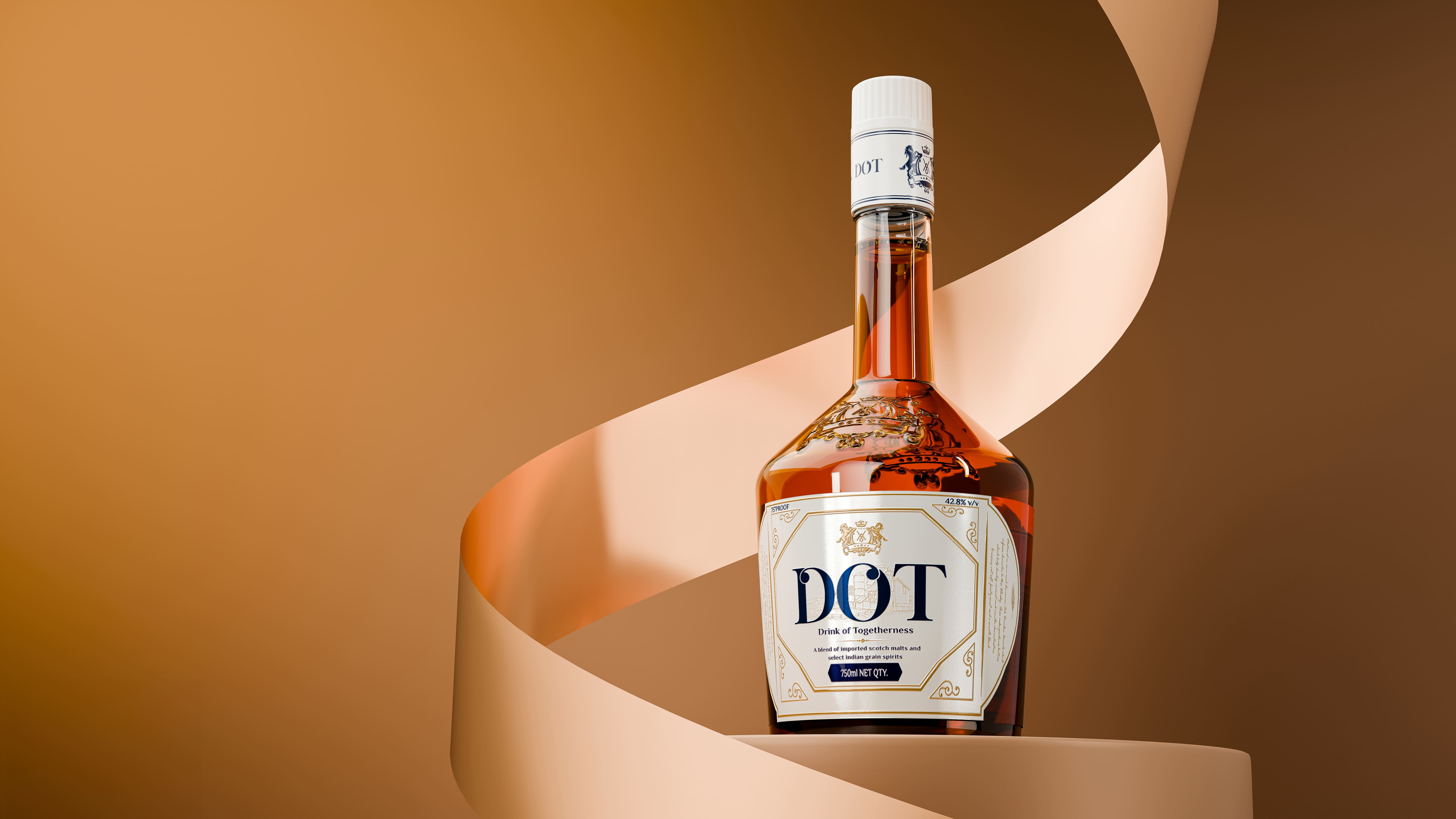
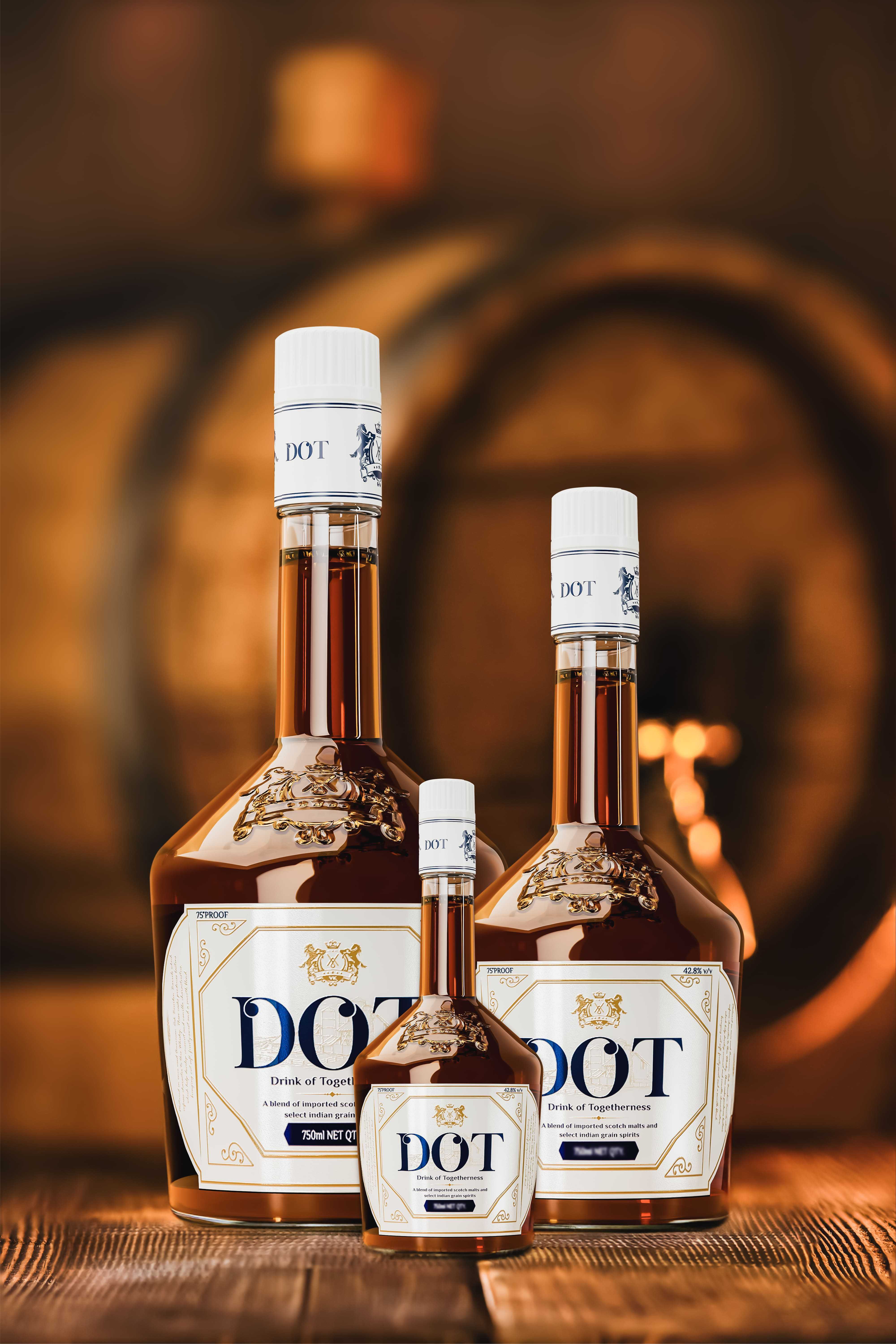
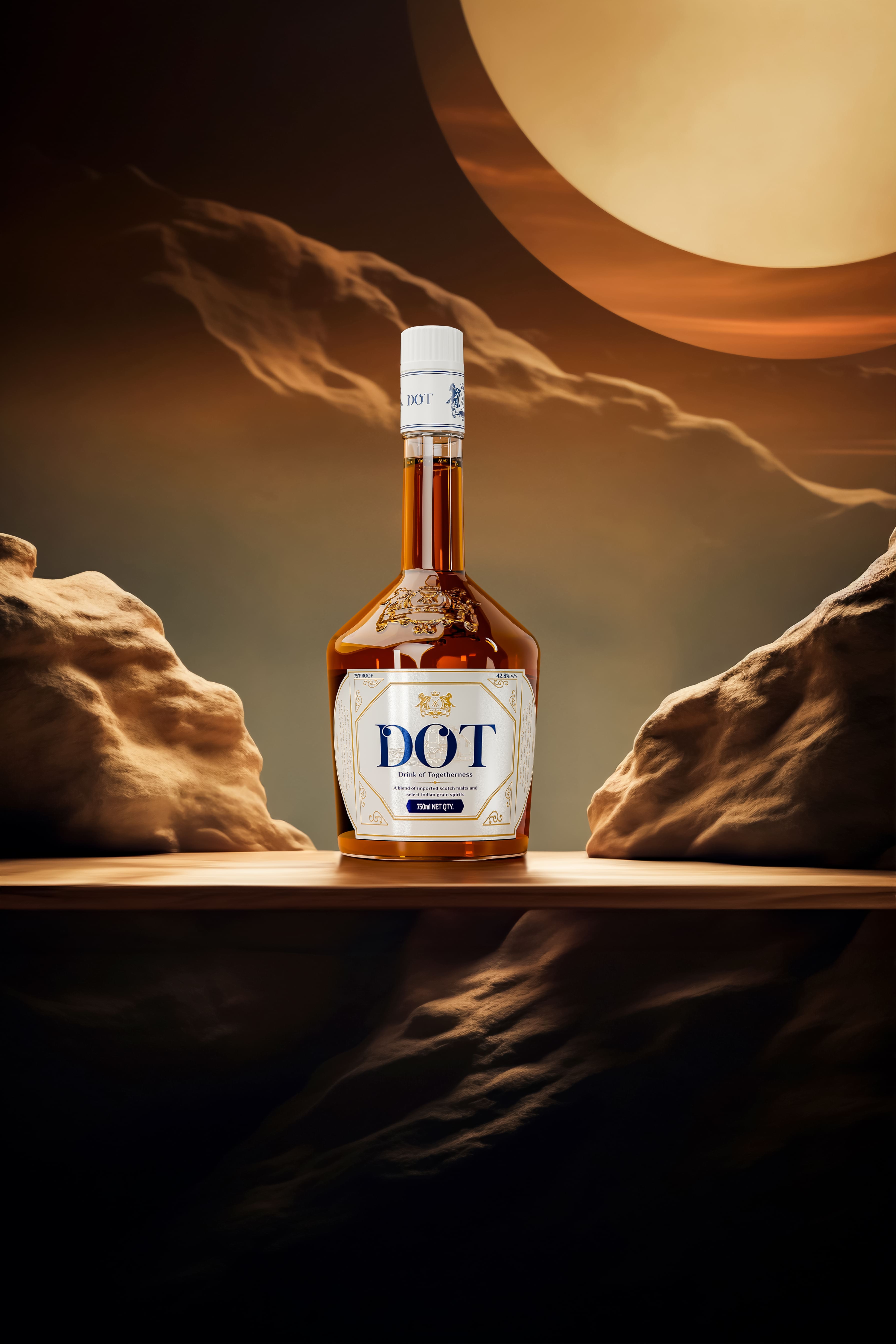
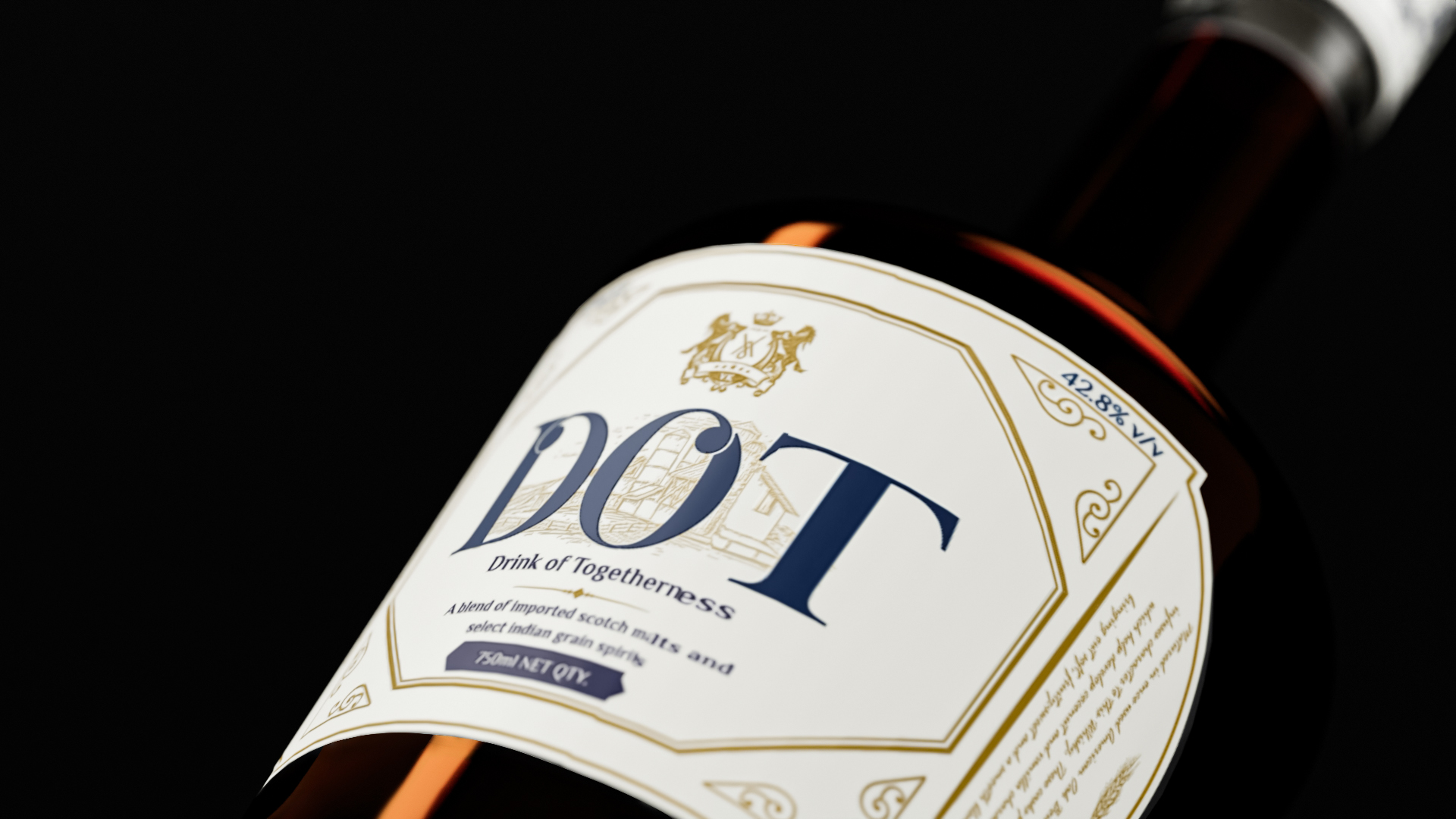
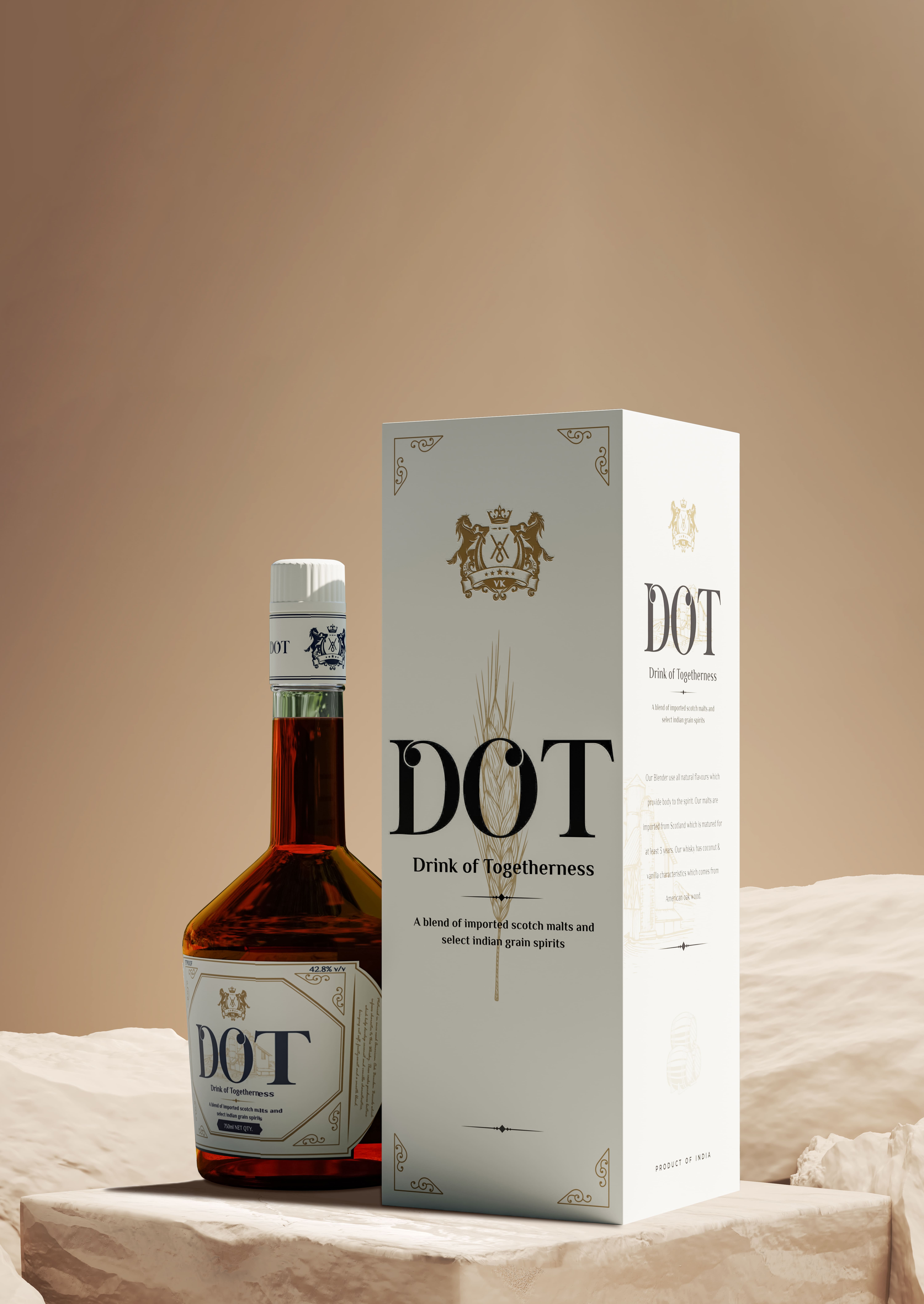
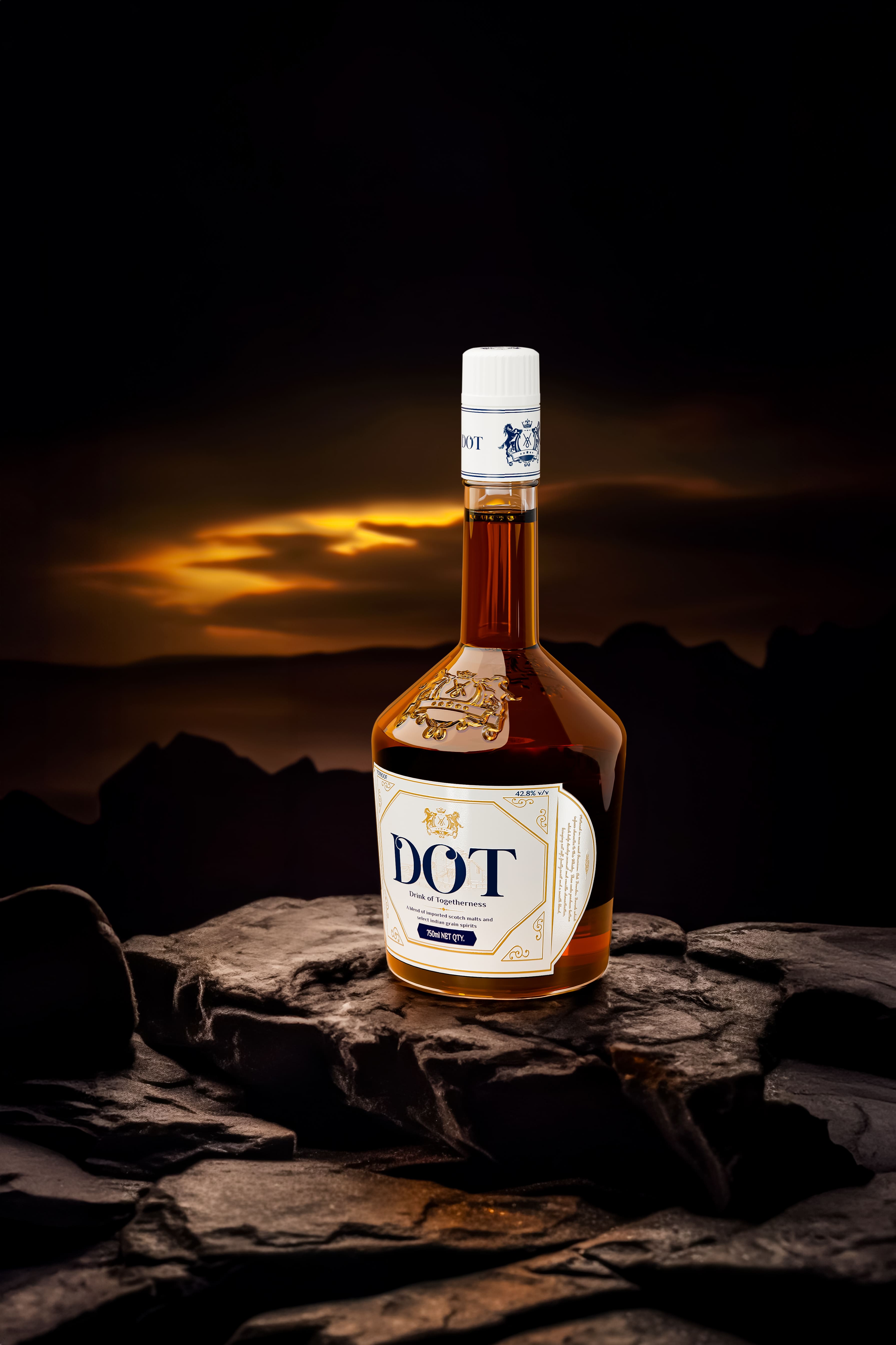
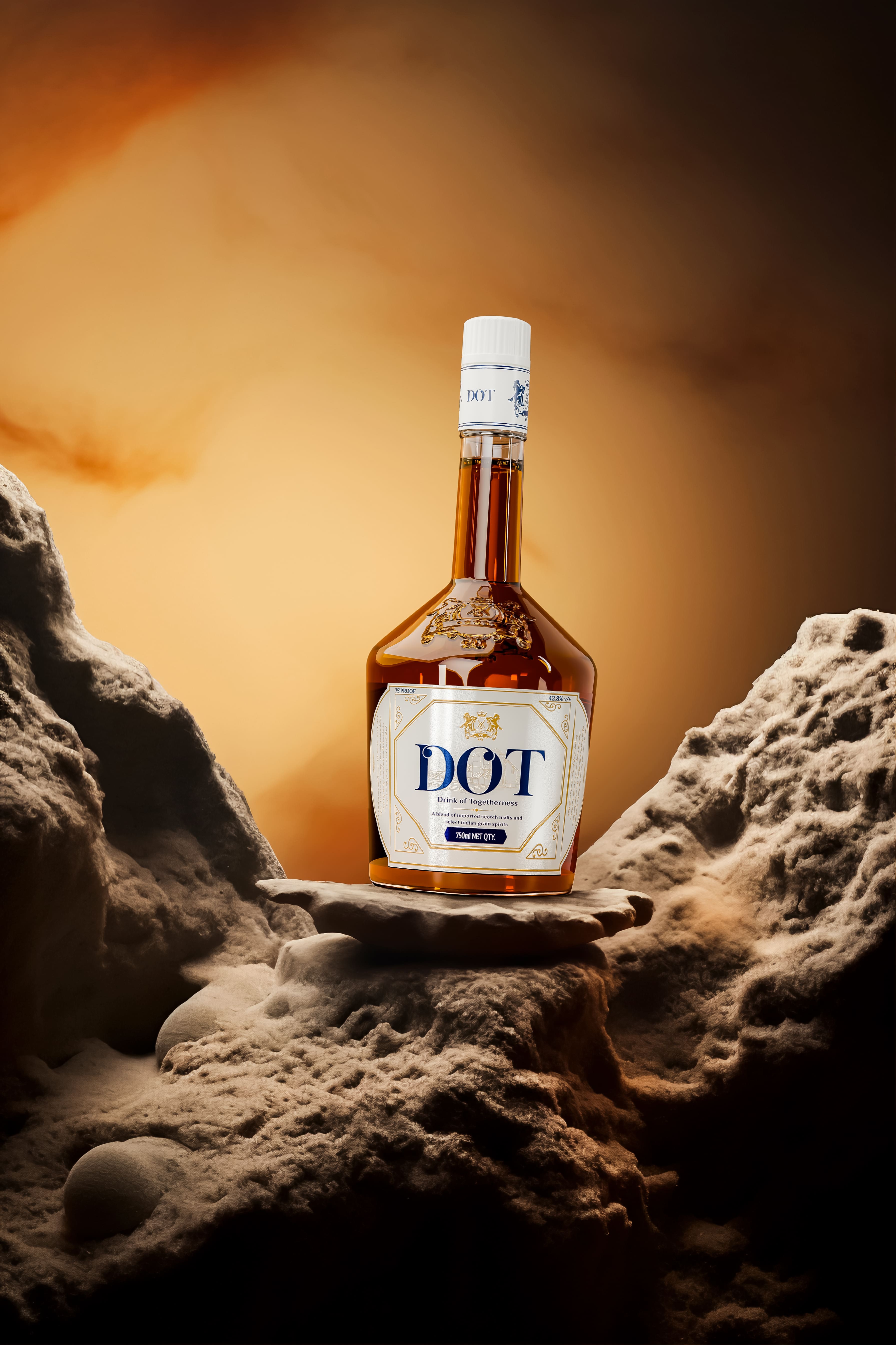
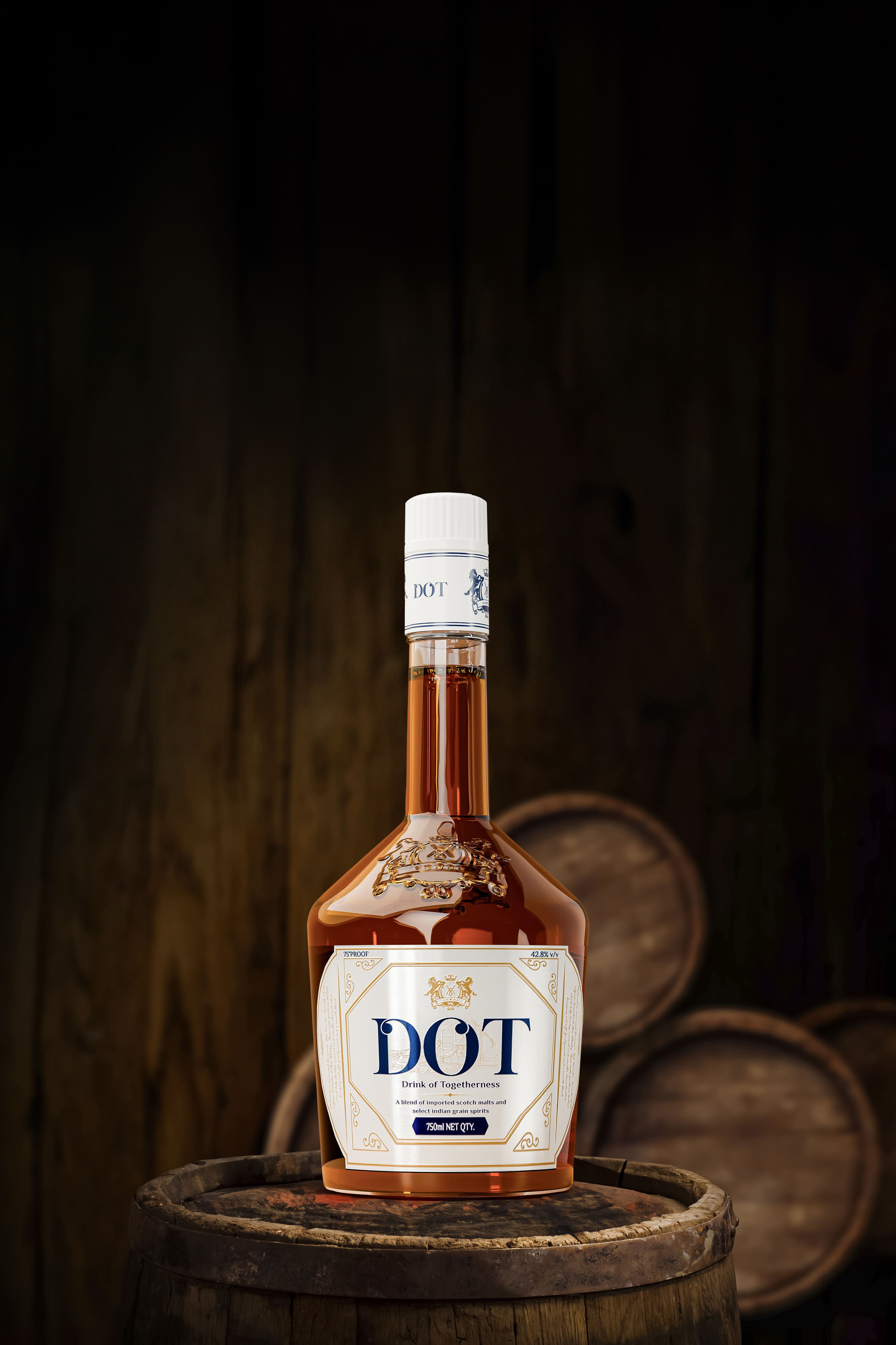
Elegance in Typography: The DOT typeface, with its serif elegance and stylized allure, is a visual representation of our whisky’s refined character.
Innovative Label Design: Straying from the conventional, the label’s unique blend of rectangular and circular shapes captivates and commands attention.
Simplicity Meets Sophistication: With bold, minimalist packaging, DOT Whisky asserts its presence. The design prioritizes clarity, ensuring the message of our blended scotch whisky’s heritage is conveyed with utmost transparency.
Visionary Illustration: The label features a subtle illustration of a distillery, symbolizing the brand’s forward-looking vision and the realization of our first distillery in 2024.
Iris Design Impact
Sales and Expansion: DOT Whisky’s collaboration with Iris Design has catalyzed a remarkable surge in sales, paving the way for expansion into four additional states in India in the coming year.
Digital and Physical Synergy: Our strategic advertising and influential partnerships have positioned DOT Whisky as a digital trendsetter, while maintaining a strong physical market presence.
Vishal Kamboj, our Master Blender, lauds the design for its immediate appeal and high on-shelf visibility, a testament to Iris Design’s creative acumen and commitment to excellence.
A Partnership of Distinction
VKM Liquor’s enduring partnership with Iris Design is a testament to the profound trust and mutual respect between the two. As the sole design partner, Iris Design’s expertise has become integral to VKM’s branding journey. This collaboration has already yielded two successful liquor designs, with the third currently in creation. The union of VKM’s rich heritage and Iris Design’s innovative approach continues to shape a legacy of excellence in the liquor industry.
CREDIT
- Agency/Creative: Iris Design
- Article Title: Packaging Design for DOT Whisky by Iris Design
- Organisation/Entity: Agency
- Project Type: Packaging
- Project Status: Published
- Agency/Creative Country: India
- Agency/Creative City: Lucknow
- Market Region: Asia
- Project Deliverables: Brand Design, Brand Identity, Brand Strategy, Label Design, Logo Design, Packaging Design
- Format: Bottle
- Industry: Food/Beverage
- Keywords: Whisky, DOT Whisky, Packaging Design, Brand Design, Brand Packaging, Brand Strategy, Label Designing
-
Credits:
Design Director: Manvendra Singh
Content Designer: Kanupriya Singh


