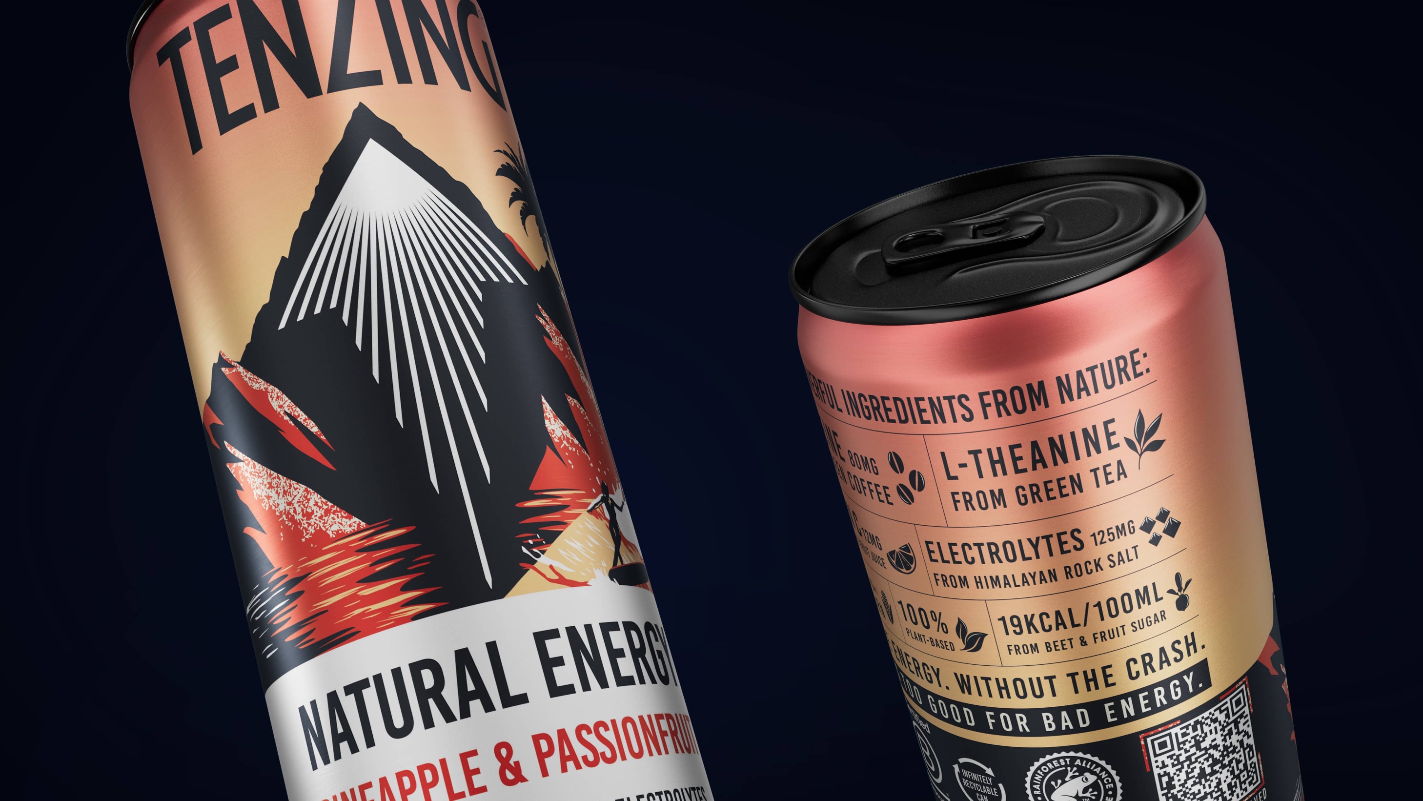
Plant-based and planet-positive, Tenzing natural energy needed to refresh their packaging design and more clearly communicate their natural, sustainable credentials, alongside the power and impact of the ‘energy’ drink. The category is busy, with new entrants fighting for shelf space. The brand needed a clearer, single minded design approach that would draw consumers in and provide bolder standout at shelf.
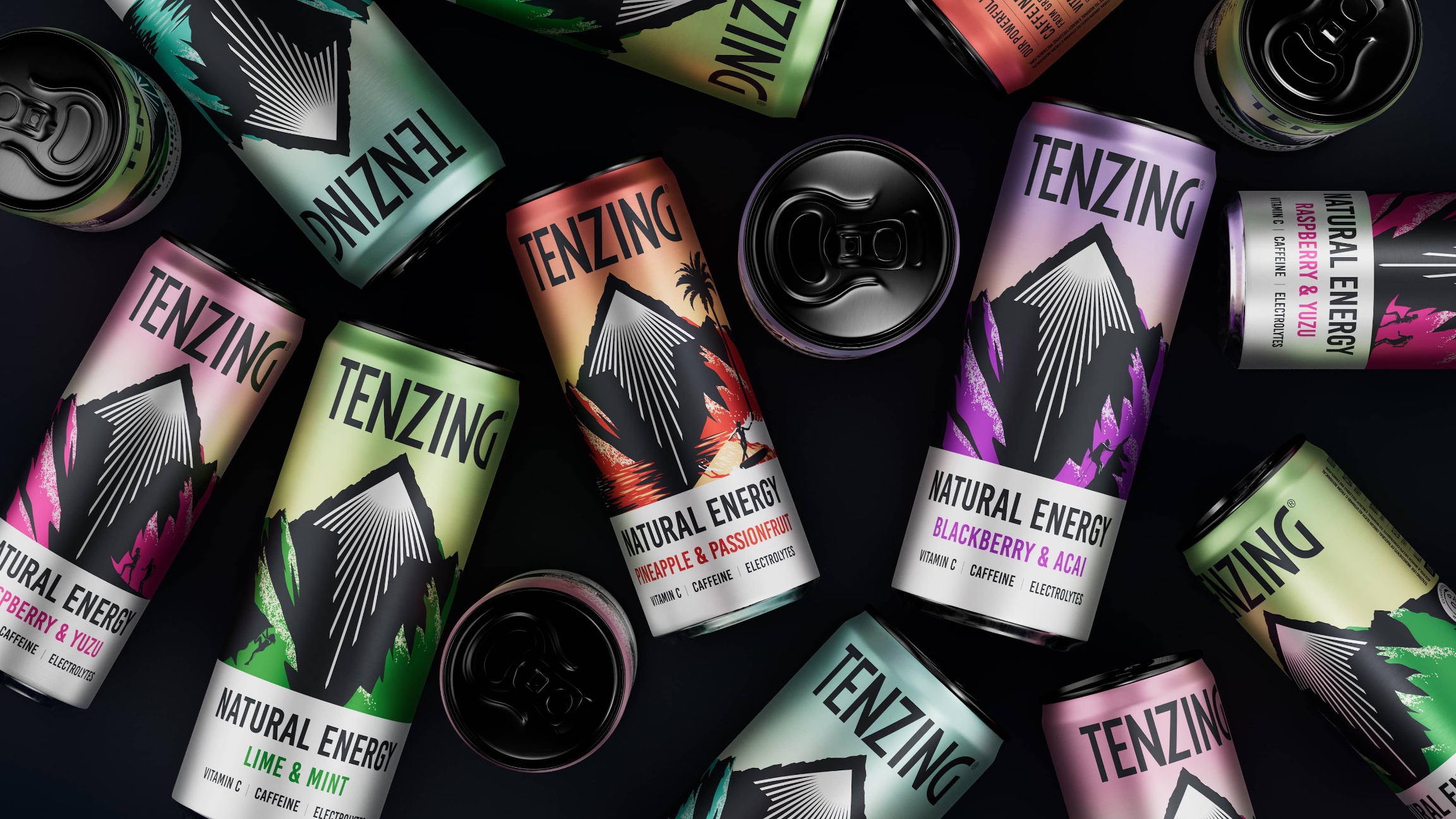
Keen to continue to attract drinkers with a design that inspires and motivates them to sip themselves into a world of natural energy and active lifestyles, we evolved the range’s packaging design to more boldly and simply transport consumers to vast destinations, all whilst cueing natural energy and flavours, and seamlessly enhancing a consistent range look and feel.
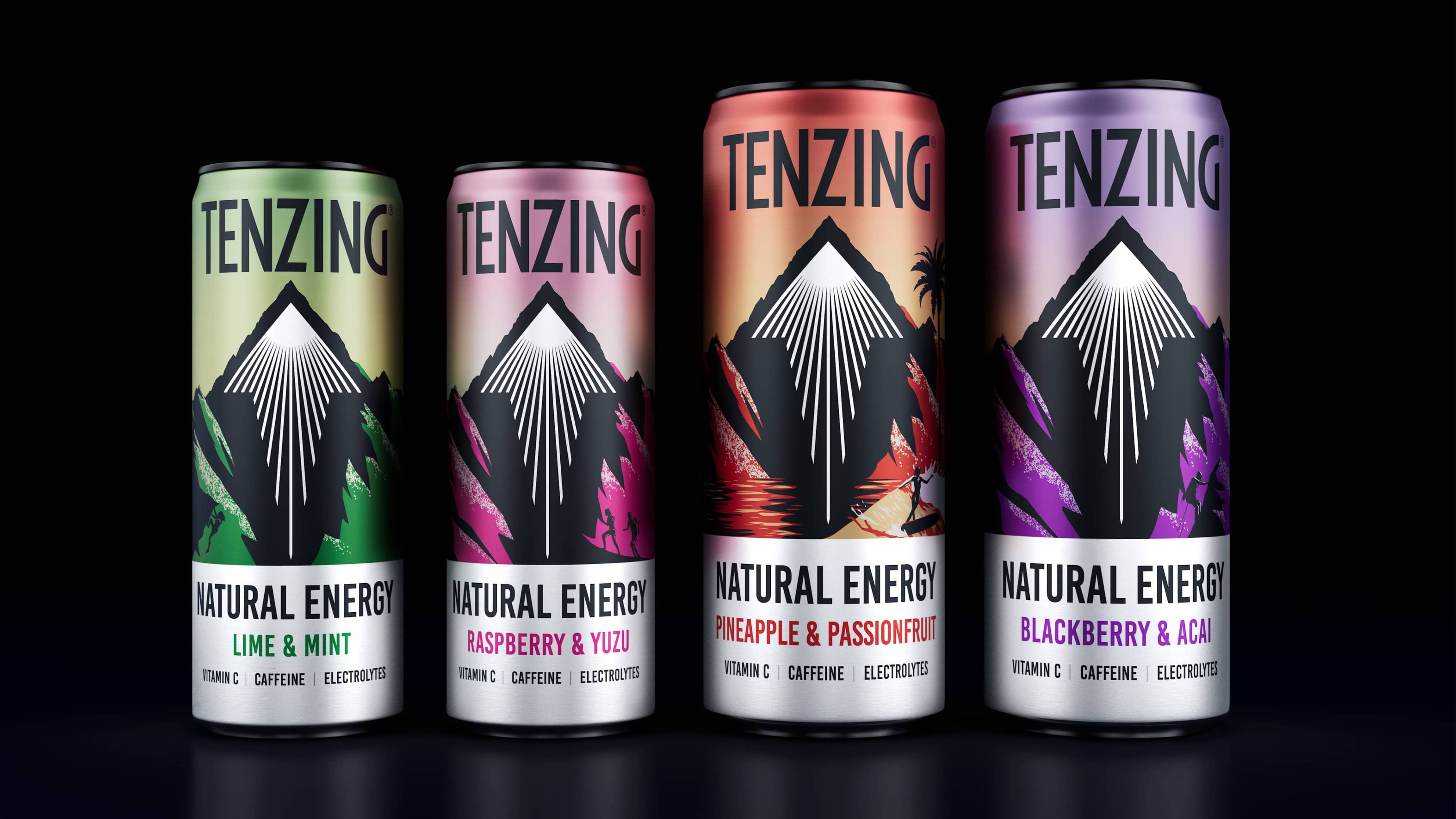
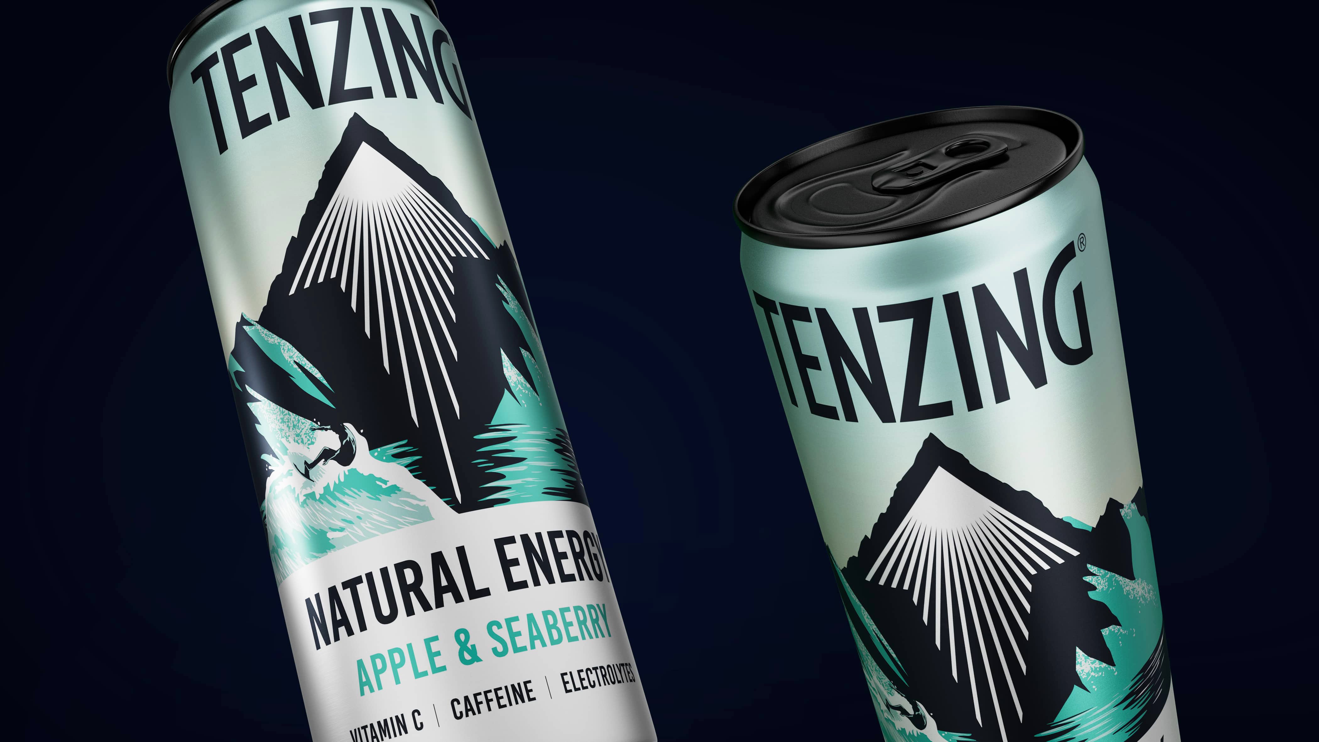
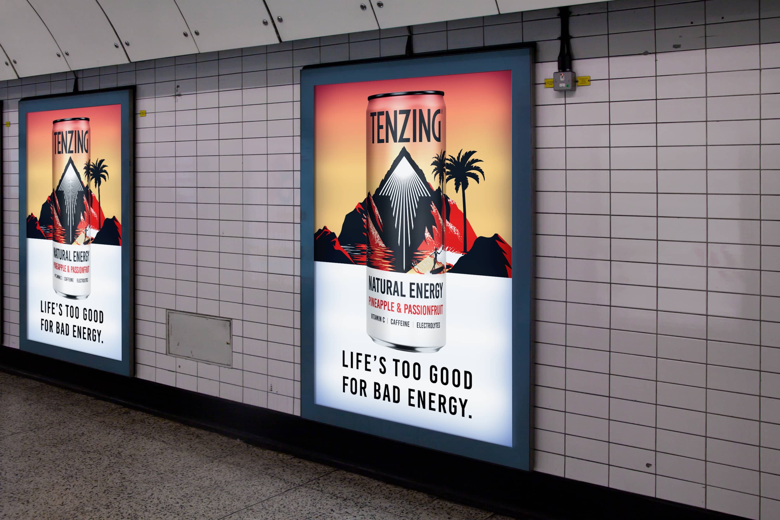
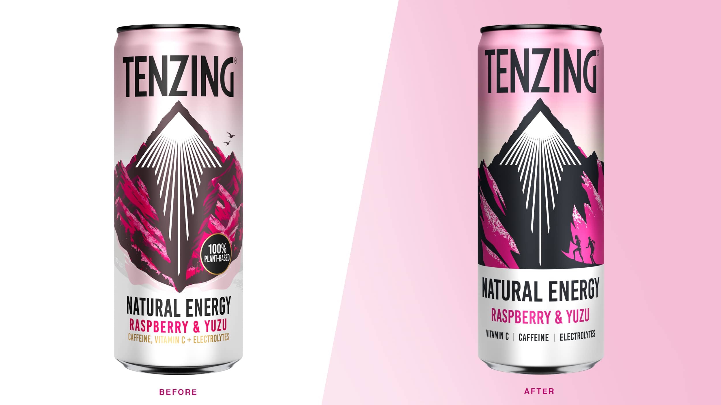
Boundless transitioned the design of the vast mountainscapes to be effortlessly bold and heroic on pack, signifying the strength and impact of the natural energy from the ingredients, whilst also providing a powerful and eye-catching asset at shelf. The dark shadow of the mountain was used to create clear impactful space around the iconic arrow.
To retain and promote the pioneering mindset and lifestyle of the brand, discoverable silhouettes of outdoor pursuit enthusiasts can be found on pack, eluding to the product being for the go getters and adventure seekers.
The newly refreshed pastel colour palette ensures a nod to the brand’s natural credentials, providing strength in creating a more consistent range, whilst feeling bold and contemporary enough to pack a punch of energy.
Hamish Shand, Founder and Creative Director at Boundless said, “Looking to explore how we continue to make Tenzing an icon of natural energy, we pushed them into a contemporary space of refreshment and strength, building on their existing recognisable assets and pushing the brand into a more compelling and dynamic new space. Ensuring they distinguish themselves from the competition by ensuring the packaging is a confident but credible proposition, the bolstered new look helps draw in consumers. With standout colours, the iconic arrow and unmissable logo are helping to aid navigation at the fixture.”
CREDIT
- Agency/Creative: Boundless Brand Design
- Article Title: Tenzing Natural Energy Range Refresh
- Organisation/Entity: Agency
- Project Type: Packaging
- Project Status: Published
- Agency/Creative Country: United Kingdom
- Agency/Creative City: London
- Market Region: Europe
- Project Deliverables: Packaging Design
- Format: Can
- Industry: Food/Beverage
- Keywords: WBDS Agency Design Awards 2023/24
- Keywords: Packaging Design: Product Refinement ,
-
Credits:
Agency Design: Boundless Brand Design


