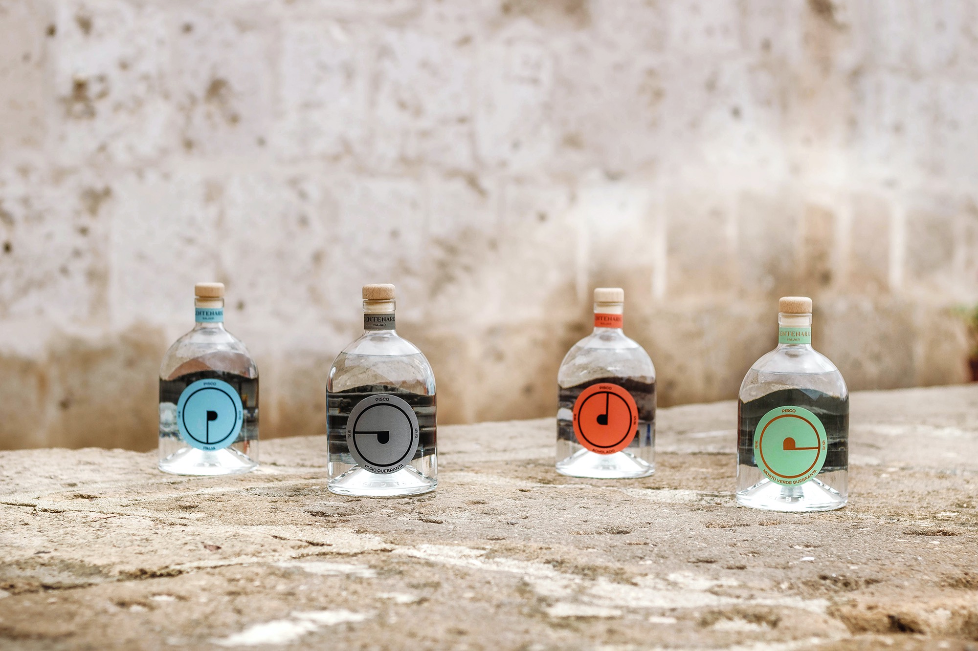
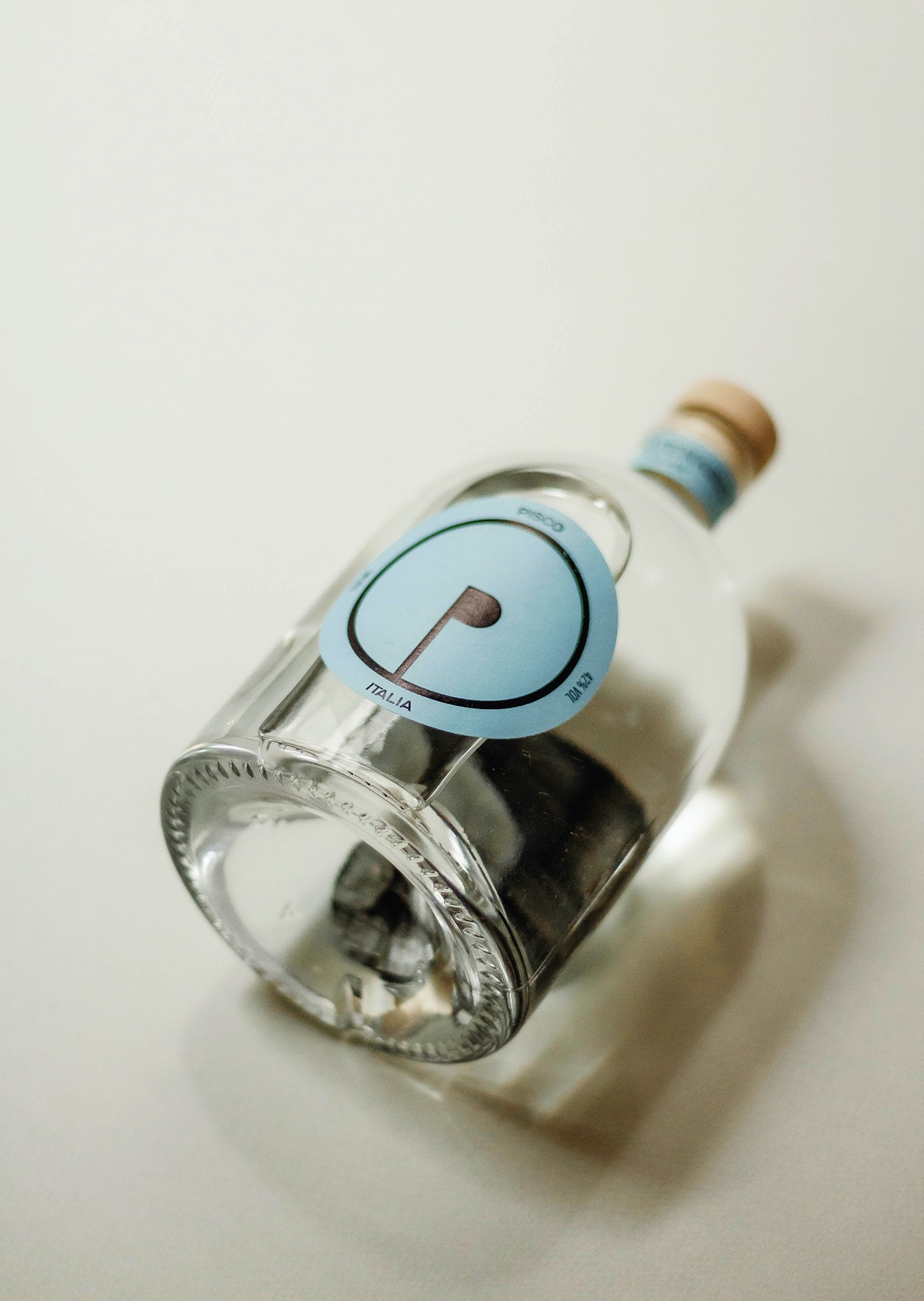
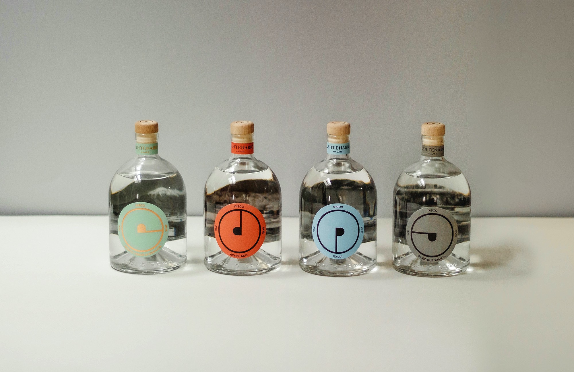
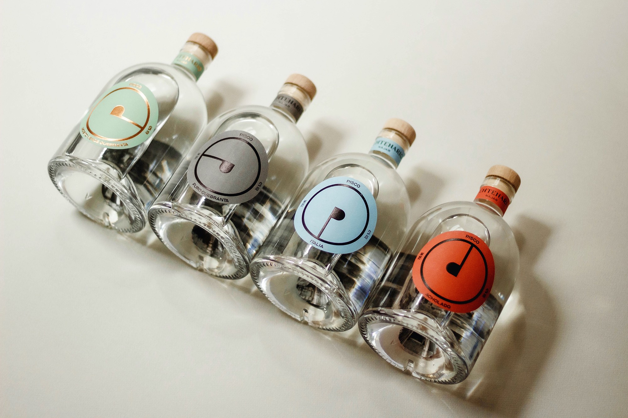
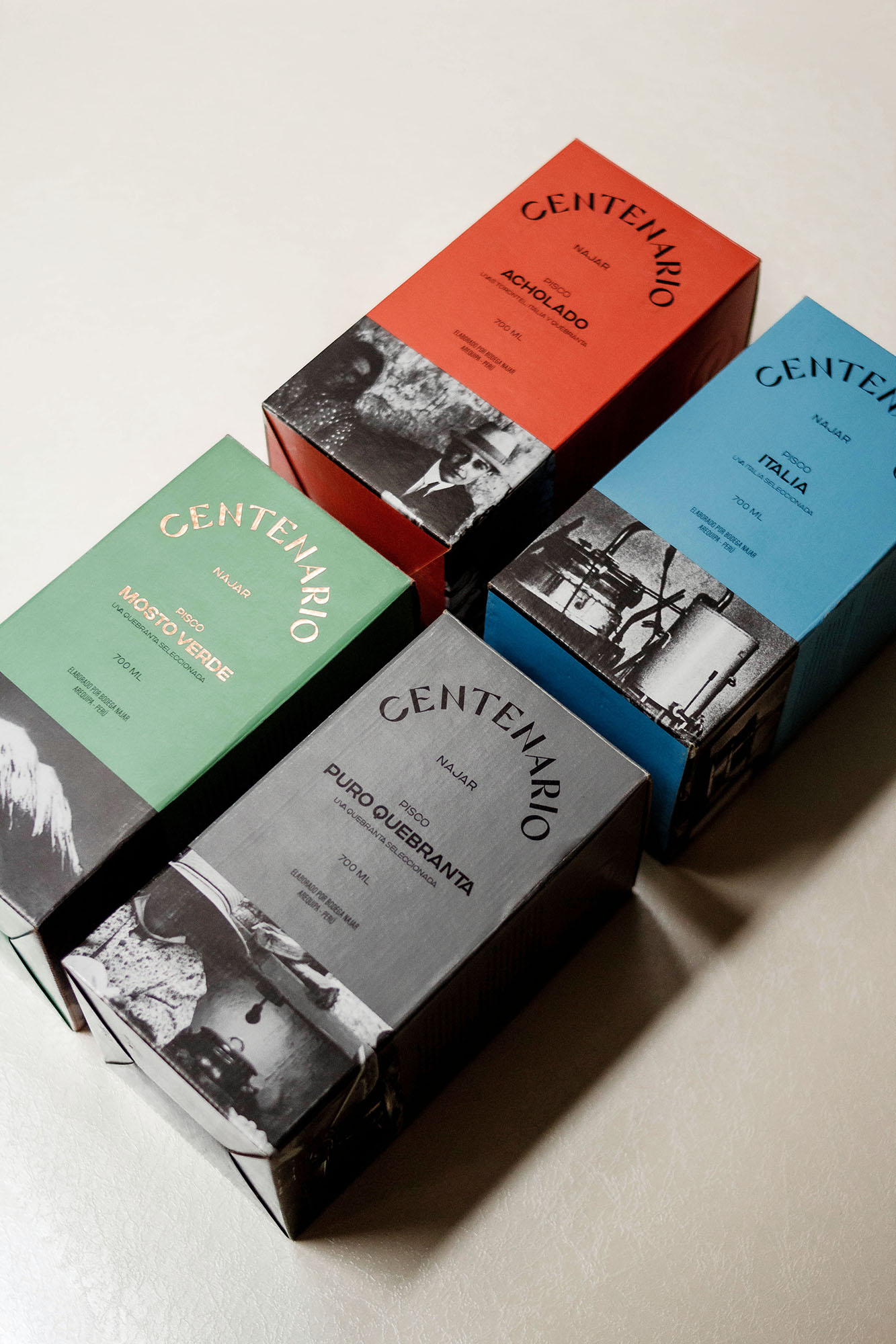
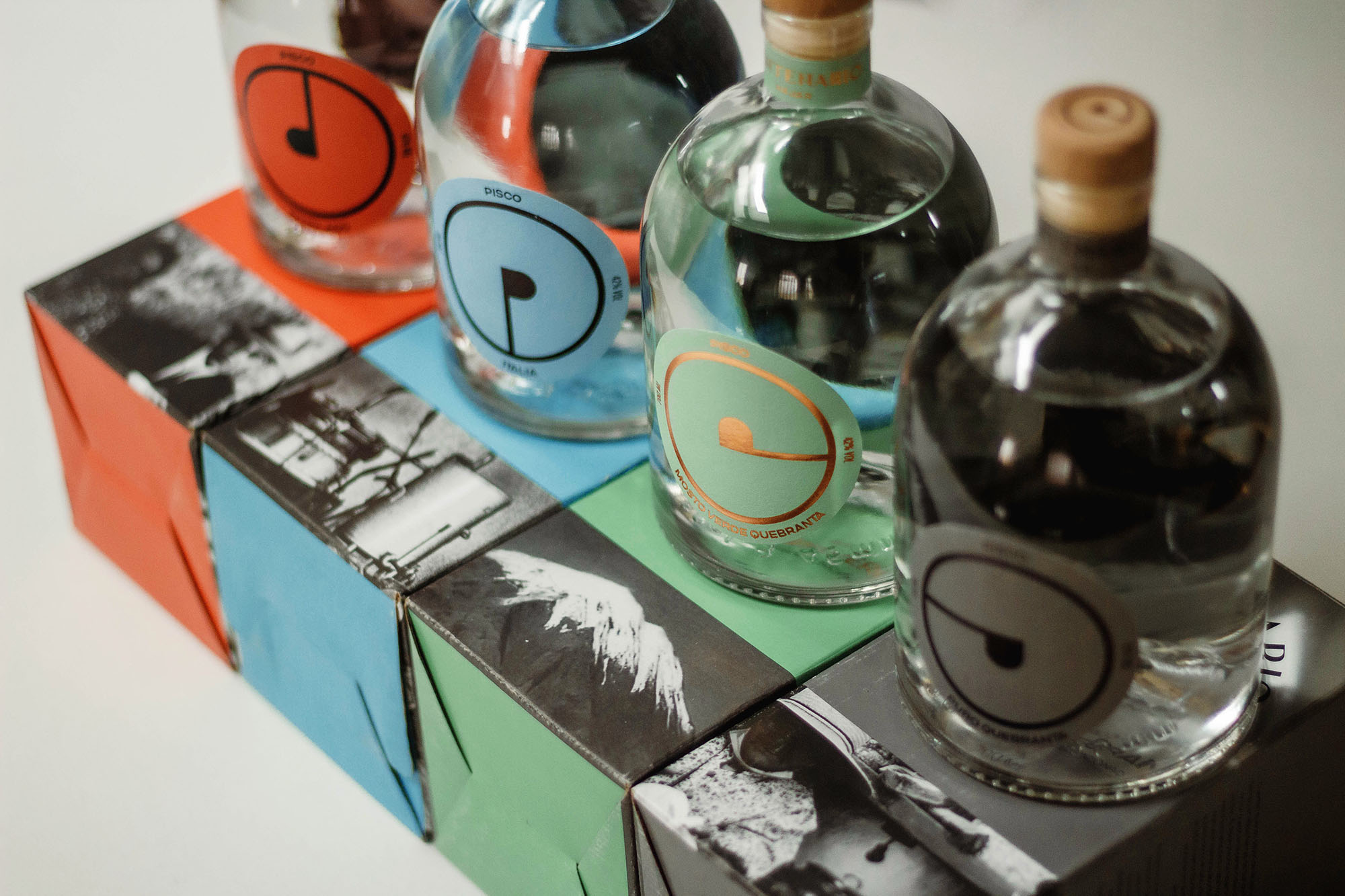
Coming from one of the most traditional distilleries in the country (Bodega Najar), Pisco Centenario is committed to paying tribute and respecting the history of its inimitable winery, pisco and the Peruvian grape, creating a liquor worthy of its demanding audience. Thus, the brand shows this elegance and trajectory at a global level within its identity, with the creation of an iso that subtly shows the union of the shapes of the “P” (for Pisco) and the “C” (Centenario).
Pisco Centenario decides to break with the usual and traditional way in which a pisco label is conceived, generating a solid and disruptive form from the isotype; a huge circle that puts the brand’s new distinctive sign in the foreground. Additionally, on the inside of the back label, we included old, original black and white photographs, belonging to the Bodega Najar archives. This are seen magnified through the bottle and the liquid (pisco) that contains it.

CREDIT
- Agency/Creative: Provincia Estudio Creativo
- Article Title: Pisco Centenario: Distinctive Elegance in Breakthrough Label Design from Bodega Najar
- Organisation/Entity: Agency
- Project Type: Identity
- Project Status: Published
- Agency/Creative Country: Peru
- Agency/Creative City: Arequipa
- Market Region: South America
- Project Deliverables: Brand Identity, Packaging Design
- Industry: Food/Beverage
- Keywords: pisco, peru, spirits, beverages
-
Credits:
Creative Director: Fernanda Medina
Account Director: Andrea Alonso
Designer: Gabriela Machicao
Designer: Daniel Olivares
Designer: Felipe León


