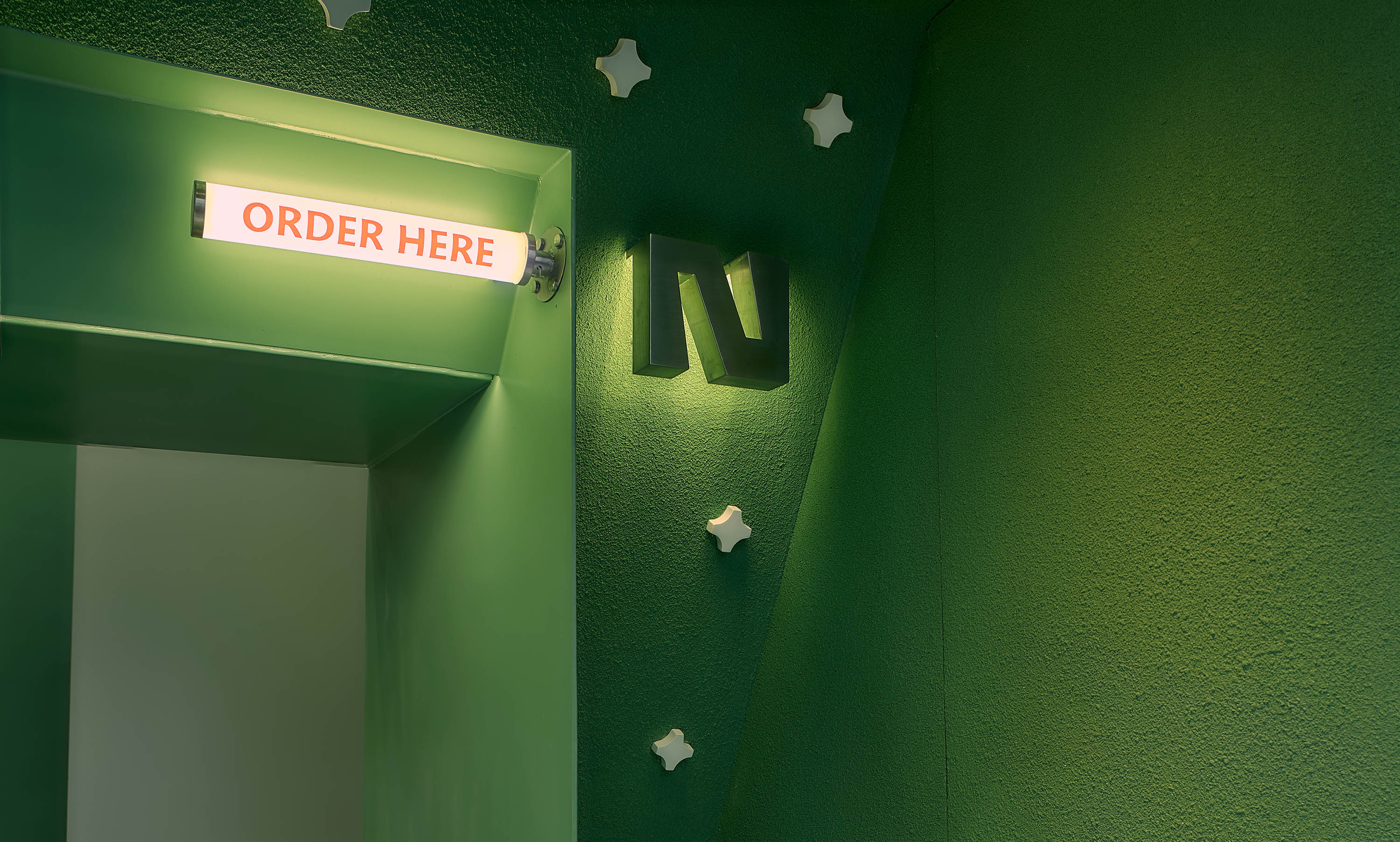
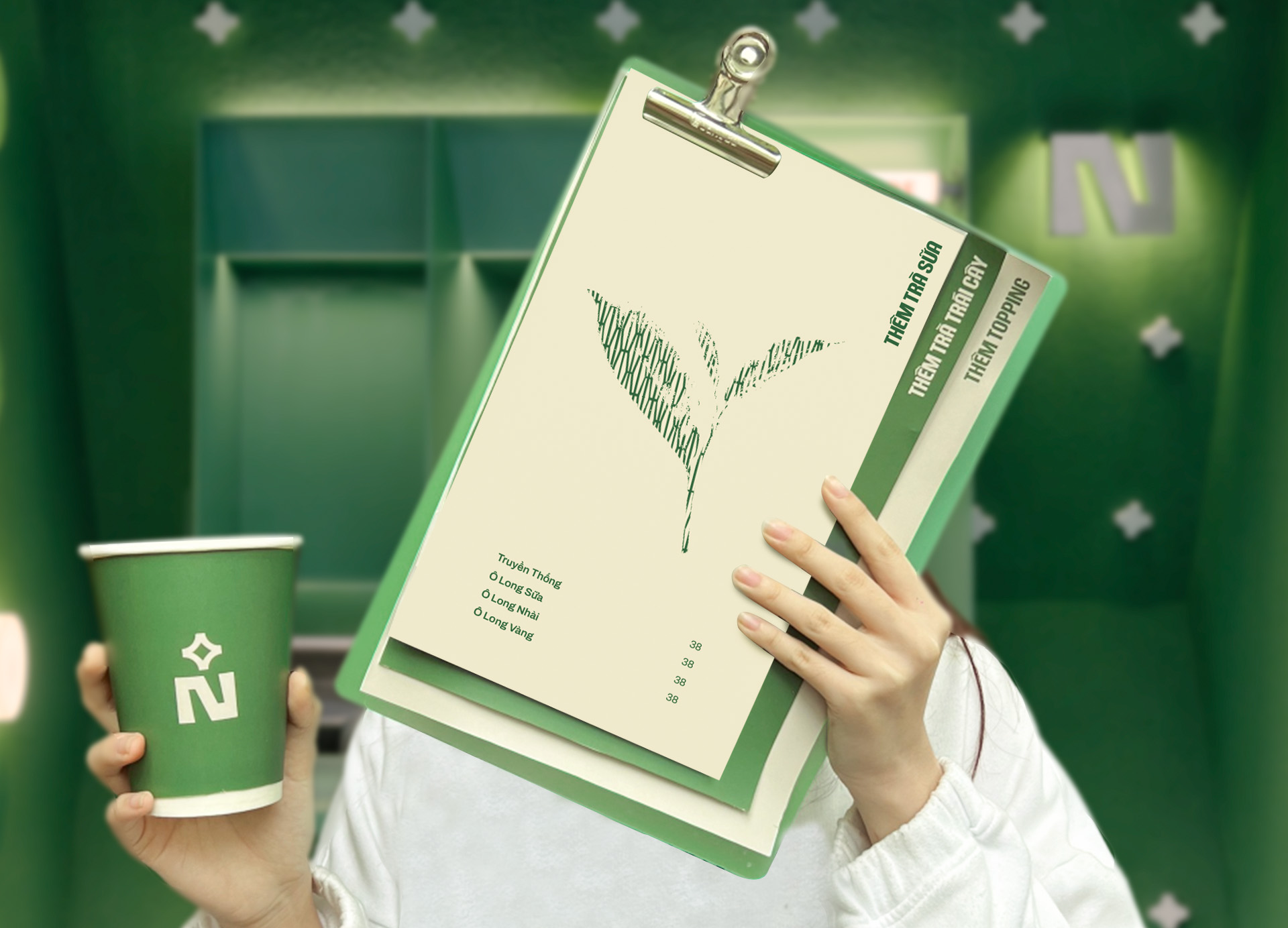
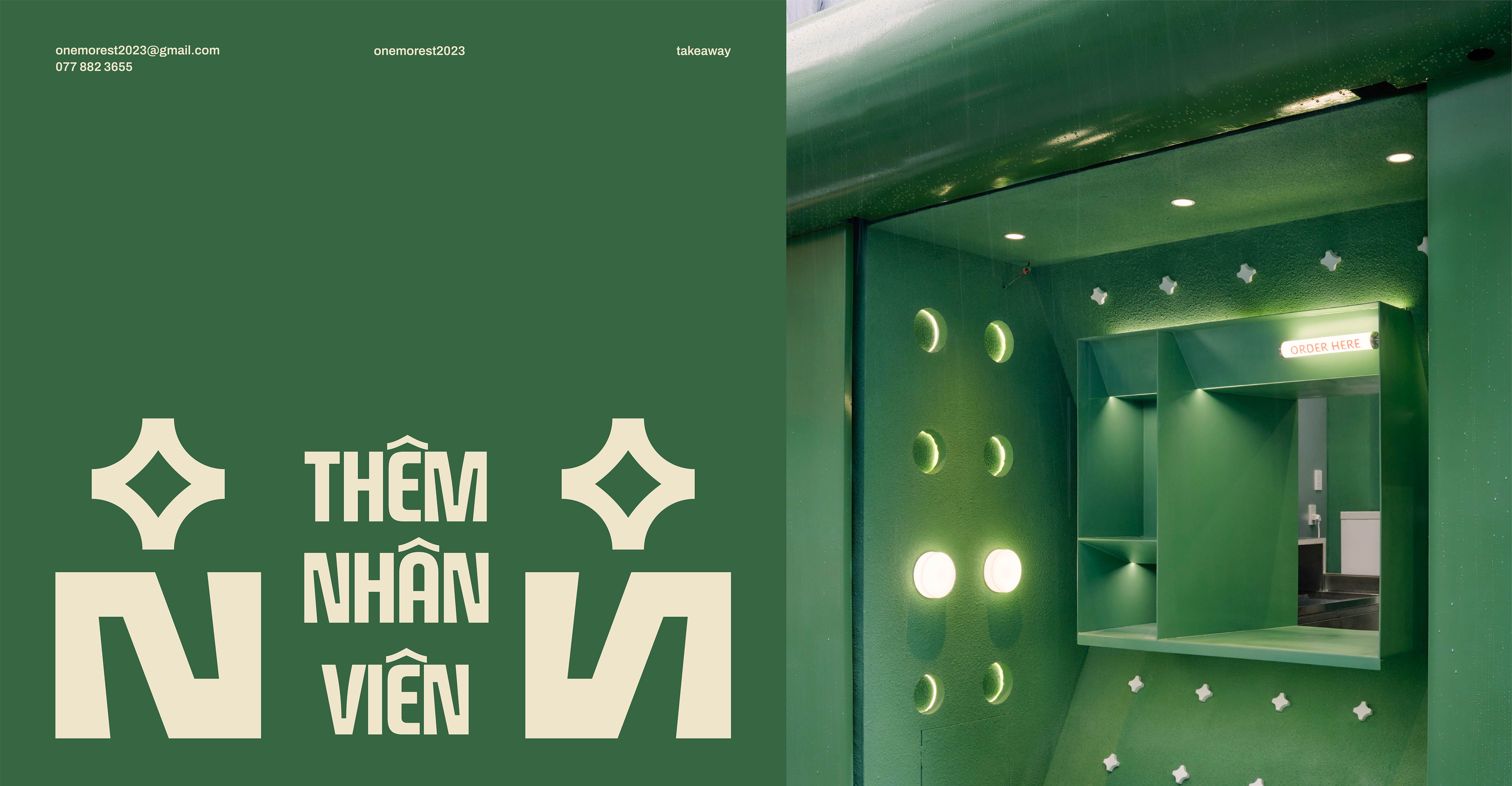
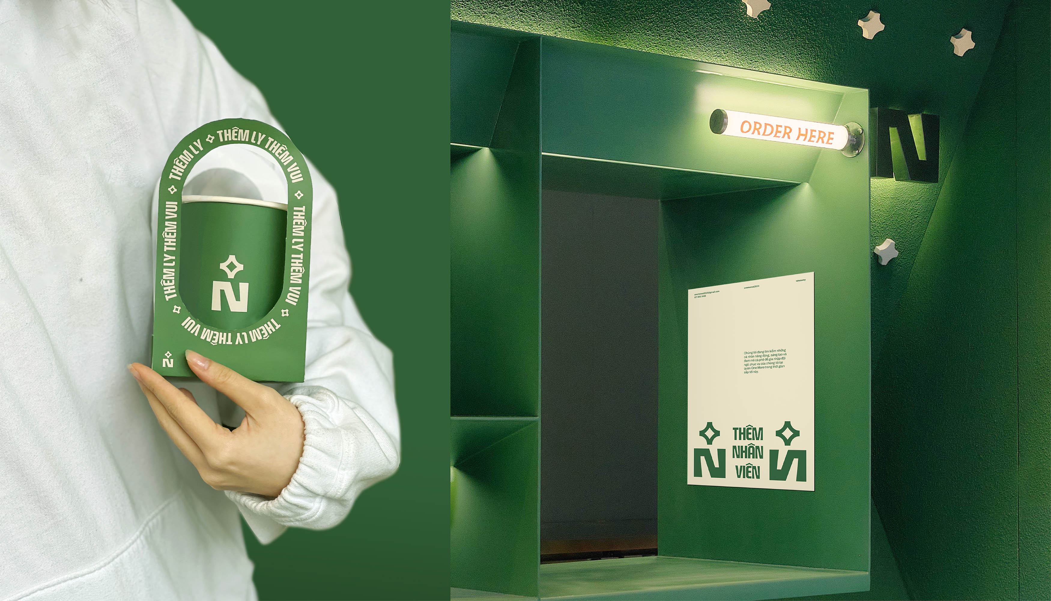
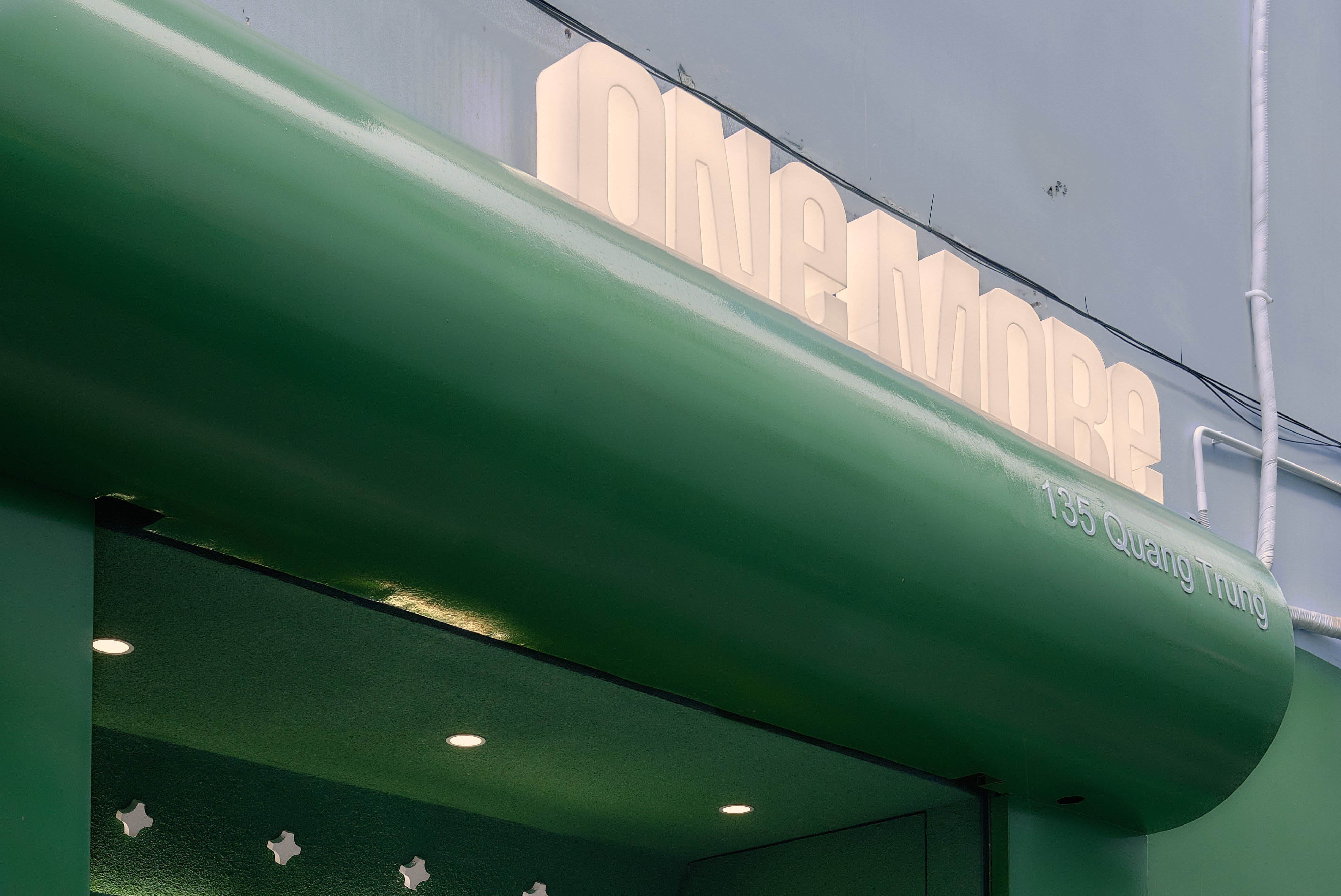
One More – A take away store located in a small alley on Quang Trung street right in the center of Go Vap area. With a pretty appearance and the main color tone being “Green” – One More wants to spread to everyone “Green Energy” to symbolise the energy of Vietnamese agricultural products. The brand believes that each product we bring to customers will be a journey of discovery about the flavours of Vietnamese agricultural products.
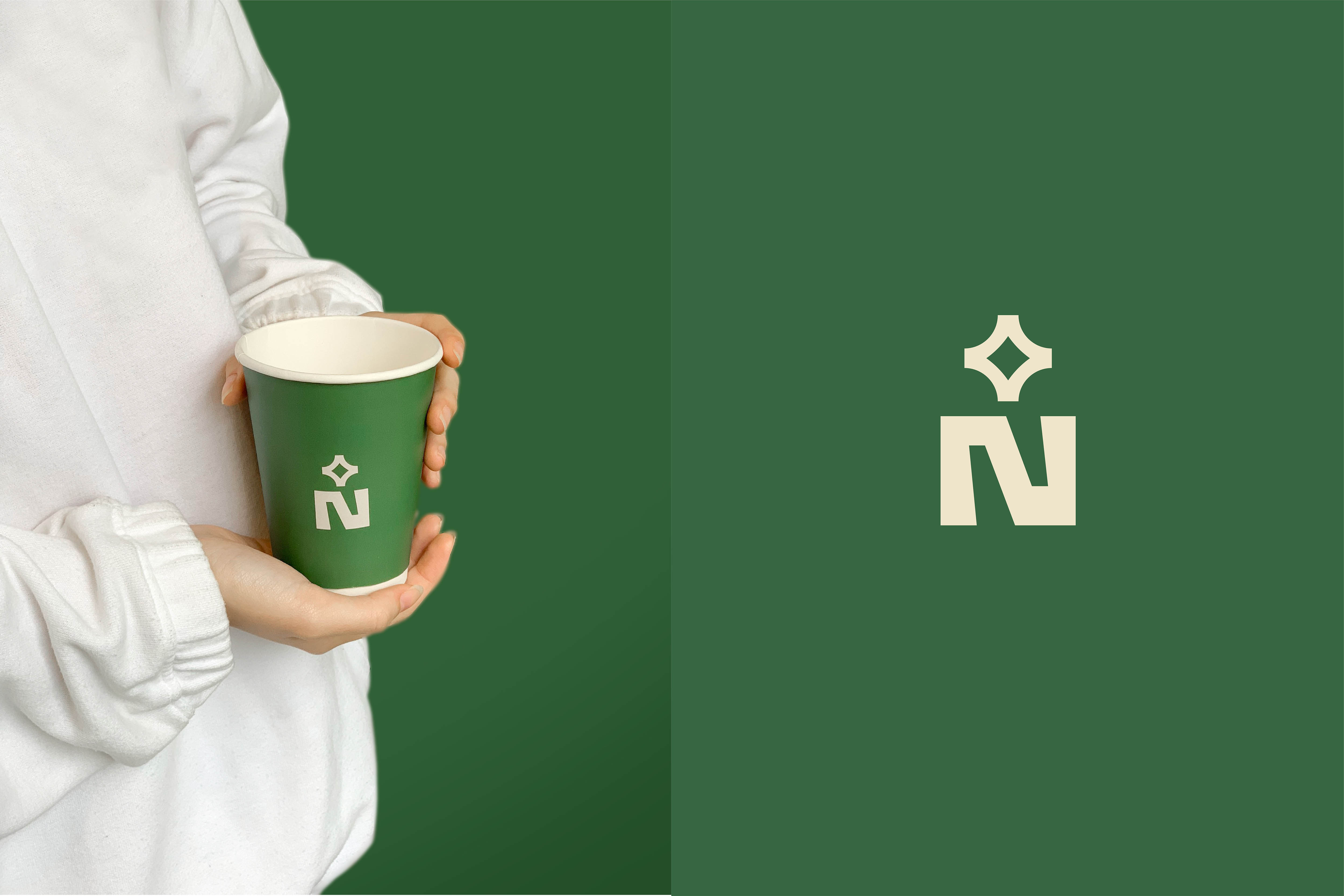
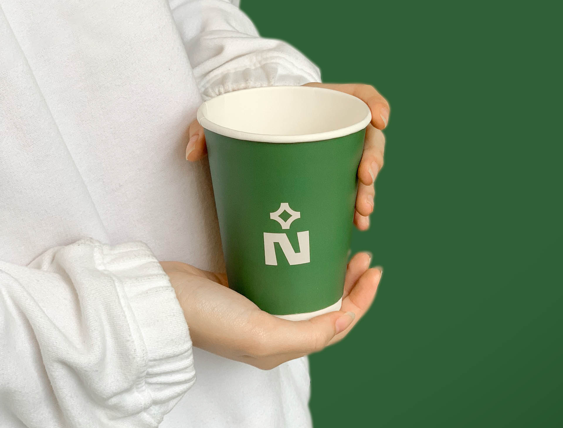
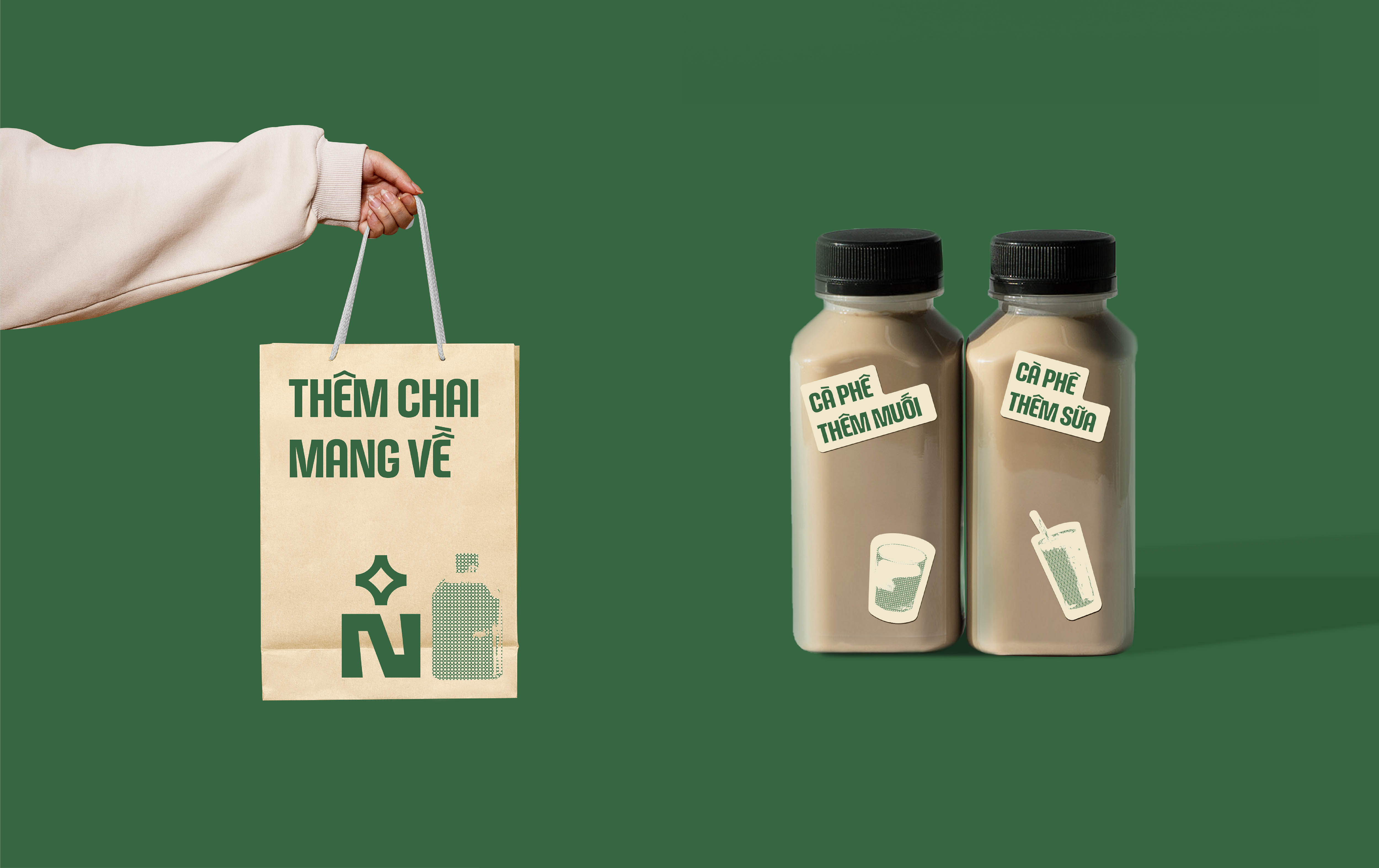
N in mathematics means natural number. Meaning continuous and lasting forever. +N represents gradual and infinite growth, symbolizing development and the meaning of the name One More. We have incorporated classic and modern twists into the letter N. The logo also represents an image of quality and people enjoying a drink. Human connection with drinks, experiencing flavors. N is also the first letter of the word “many”. Inspired by Vietnamese cultural motifs, we stylised the plus sign to match the brand personality. Overall, the symbol is a plus sign, the negative space is a four-pointed star symbolising quality agricultural products.
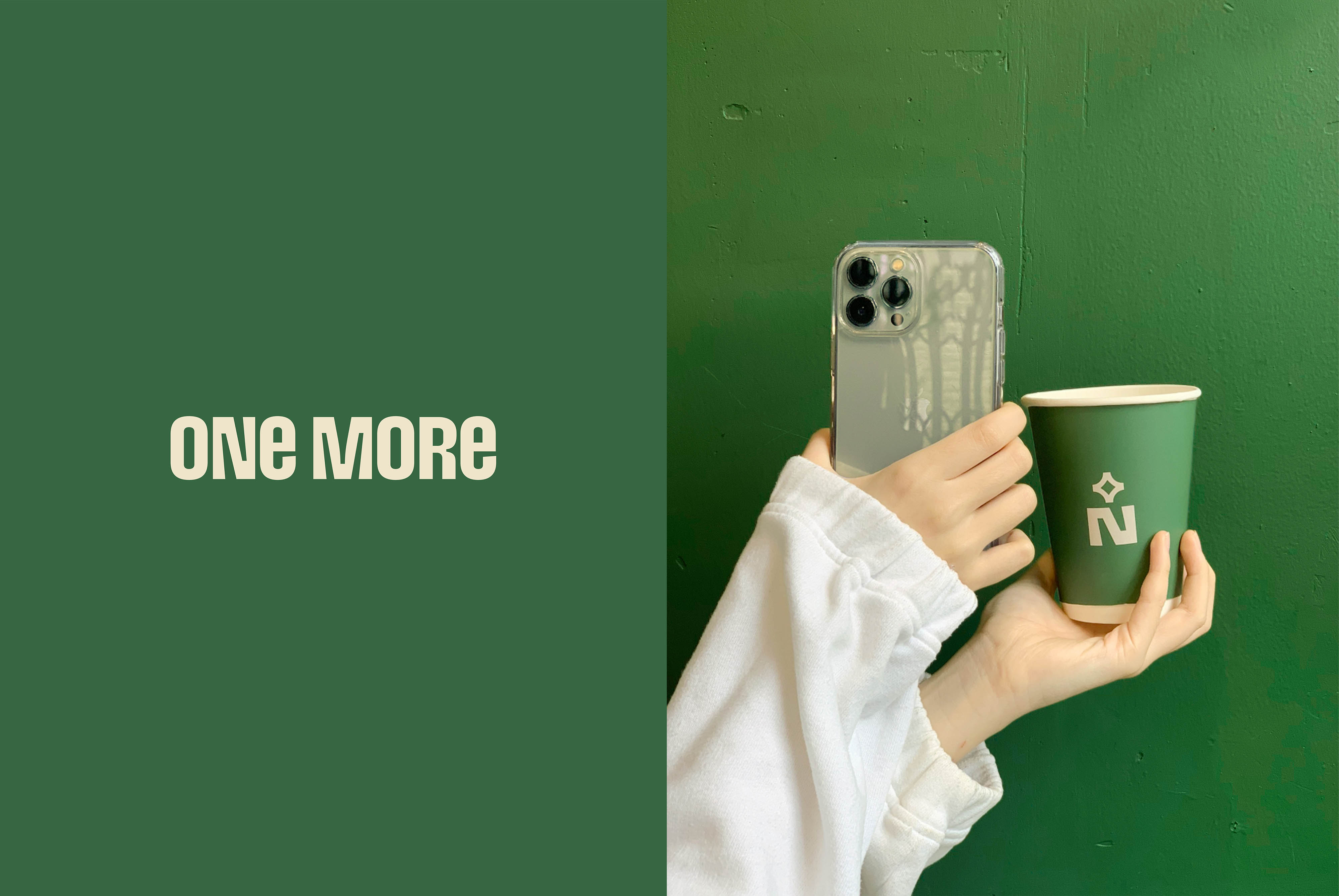
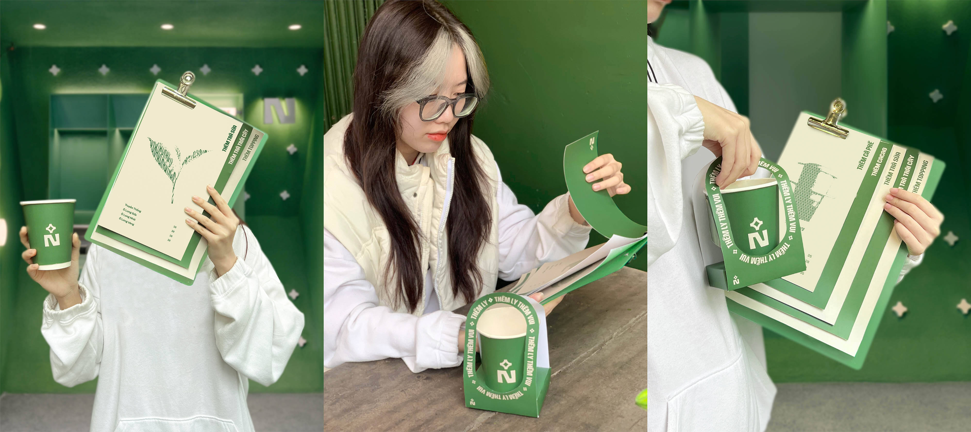
The images of encaustic tiles and iron door frames of Vietnamese culture have inspired the brand and created a striking effect for One More’s drinks. All together create unique graphical elements for the brand. We used the word ”More” taken from the meaning of the brand name as a campaign throughout media publications.
With the message “Green Energy”, we used green colours to represent green agricultural products and freshness. This color also symbolises prosperity and this color is also known for a new beginning in life. The use of the BD StreetSign Sans typeface has contributed to the uniqueness of the brand.
CREDIT
- Agency/Creative: Ceris Creative
- Article Title: From Concept to Cup the Design Story Behind One More’s Unique Visual Brand Identity Created by Ceris Creative
- Organisation/Entity: Agency
- Project Type: Identity
- Project Status: Published
- Agency/Creative Country: Vietnam
- Agency/Creative City: Viet Nam
- Market Region: Asia
- Project Deliverables: Brand Identity
- Industry: Food/Beverage
- Keywords: Ceris Creative, One More, Coffee, Brand Identity, Visual
-
Credits:
Client: One More
Agency: Ceris Creative
Creative/Art Director: Phuoc Thien
Creative Designer: Phuong Thao
Motion & Showcase: Phuong Thao


