British supermarket Morrisons chose Equator for the rebrand of Savers, a lower price point range that aims to deliver great value without compromising on quality.
To inform the strategy for the new Savers brand identity, the Equator team carried out a market audit, considering how other retailers and brands are presenting their value-led ranges. The strategic approach considered shifting consumer perceptions of value ranges, with shoppers of all demographics looking to make sensible choices that can help them reduce the price of a weekly shop to combat the cost of living.
The Equator team highlighted the varied array of motivations driving take up of value ranges, including people who want to shop smarter, those who will select some store cupboard essentials from value ranges because they are ‘just as good’, and those who will buy some value items in order to justify including ‘treats’ in their basket.
The design brief for the new brand identity was for a bold look and feel that celebrates good value, while leveraging Morrisons’ market positioning as a trusted family supermarket that brings the variety of traditional high street shops into a contemporary retail environment. The client wanted an unapologetic aesthetic that celebrates the joy shoppers feel when making a savvy purchase and has a visual appeal that will encourage them to share and champion their Savers purchases.
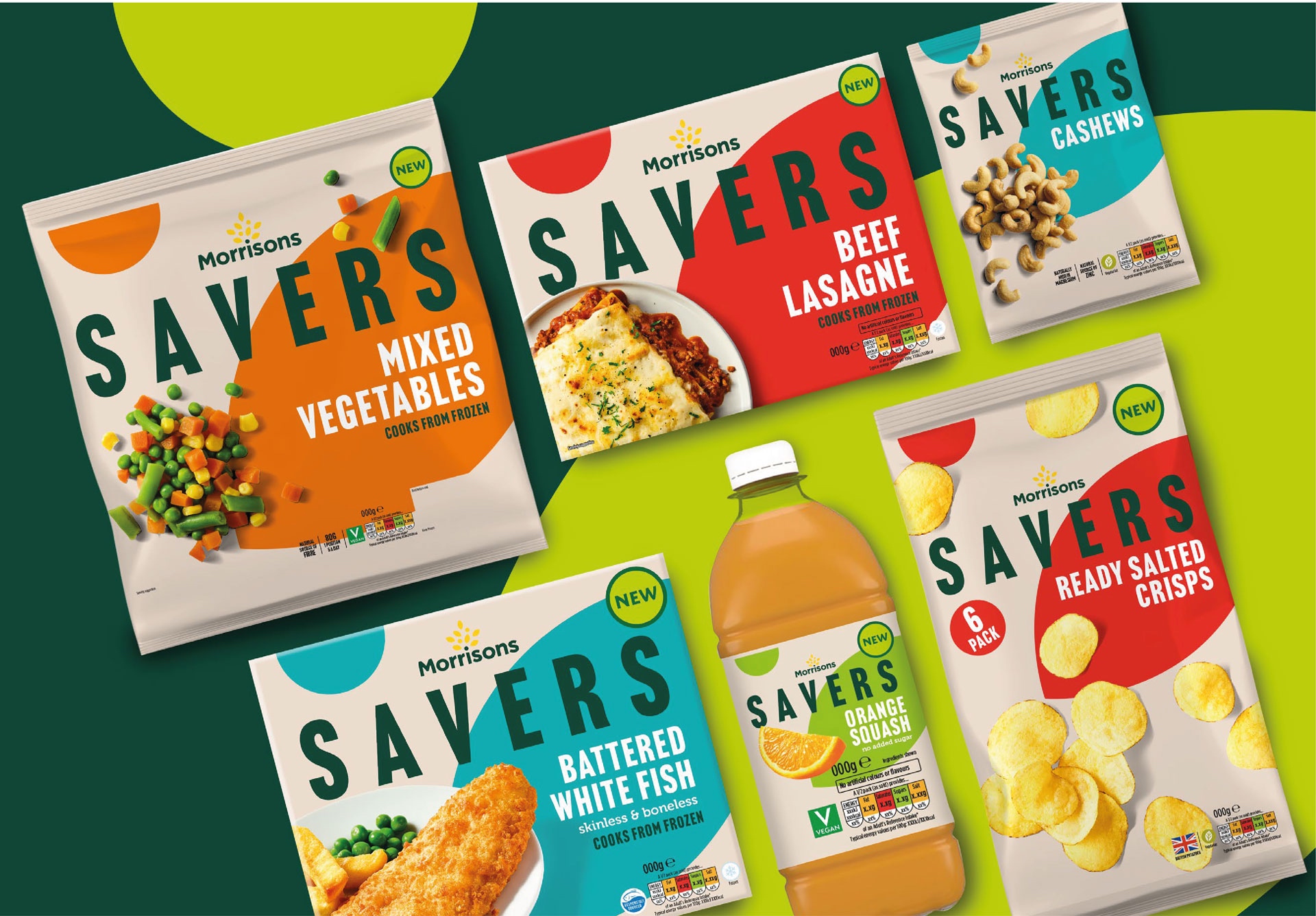
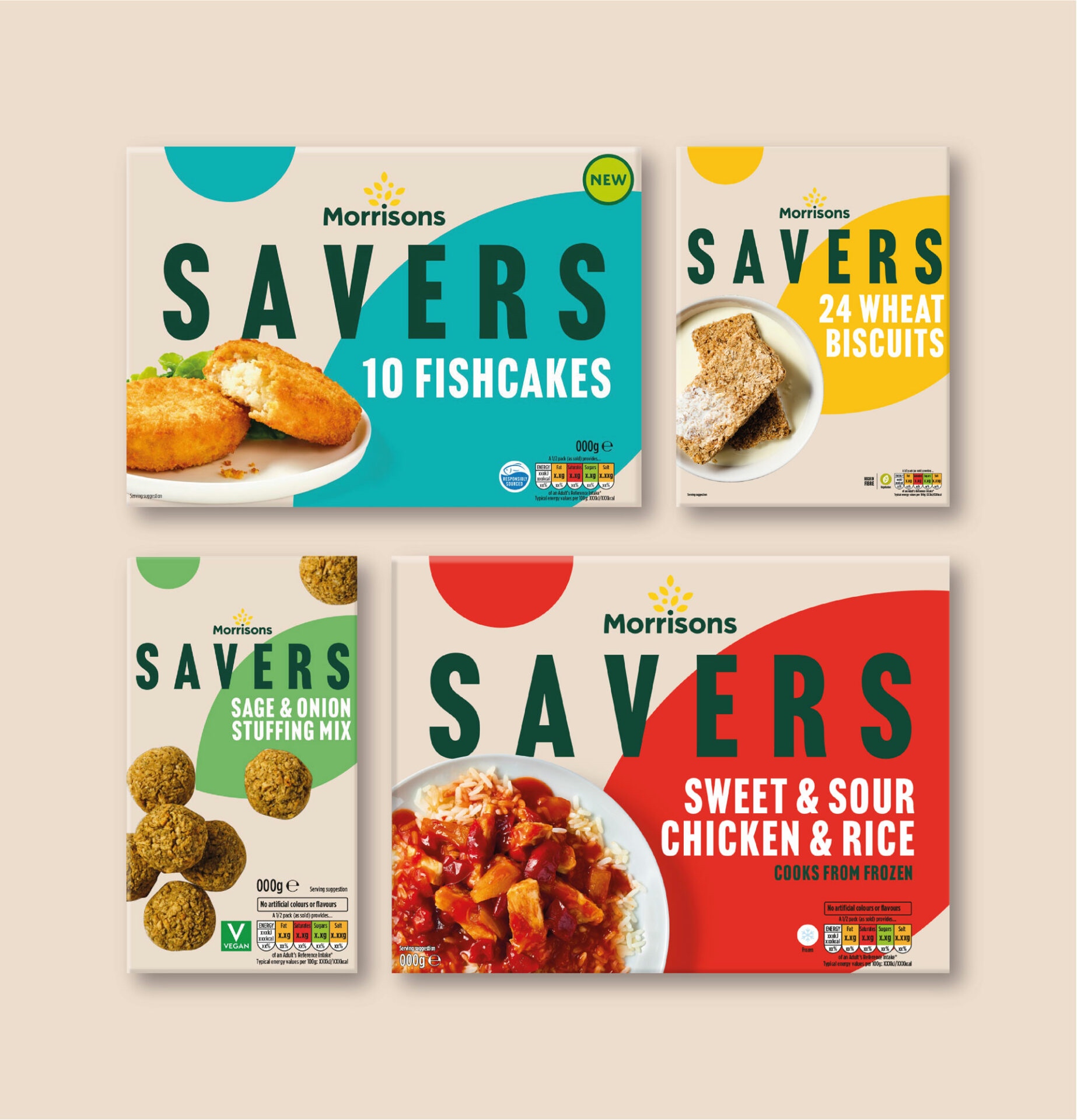
The Equator team, was responsible for the design, creative rollout, photography, and retouch. They used large, bold typography for the Savers logo, which features as prominently as it would on premium-tier equivalents and takes inspiration from high-end disruptor brands from non-food retail sectors.
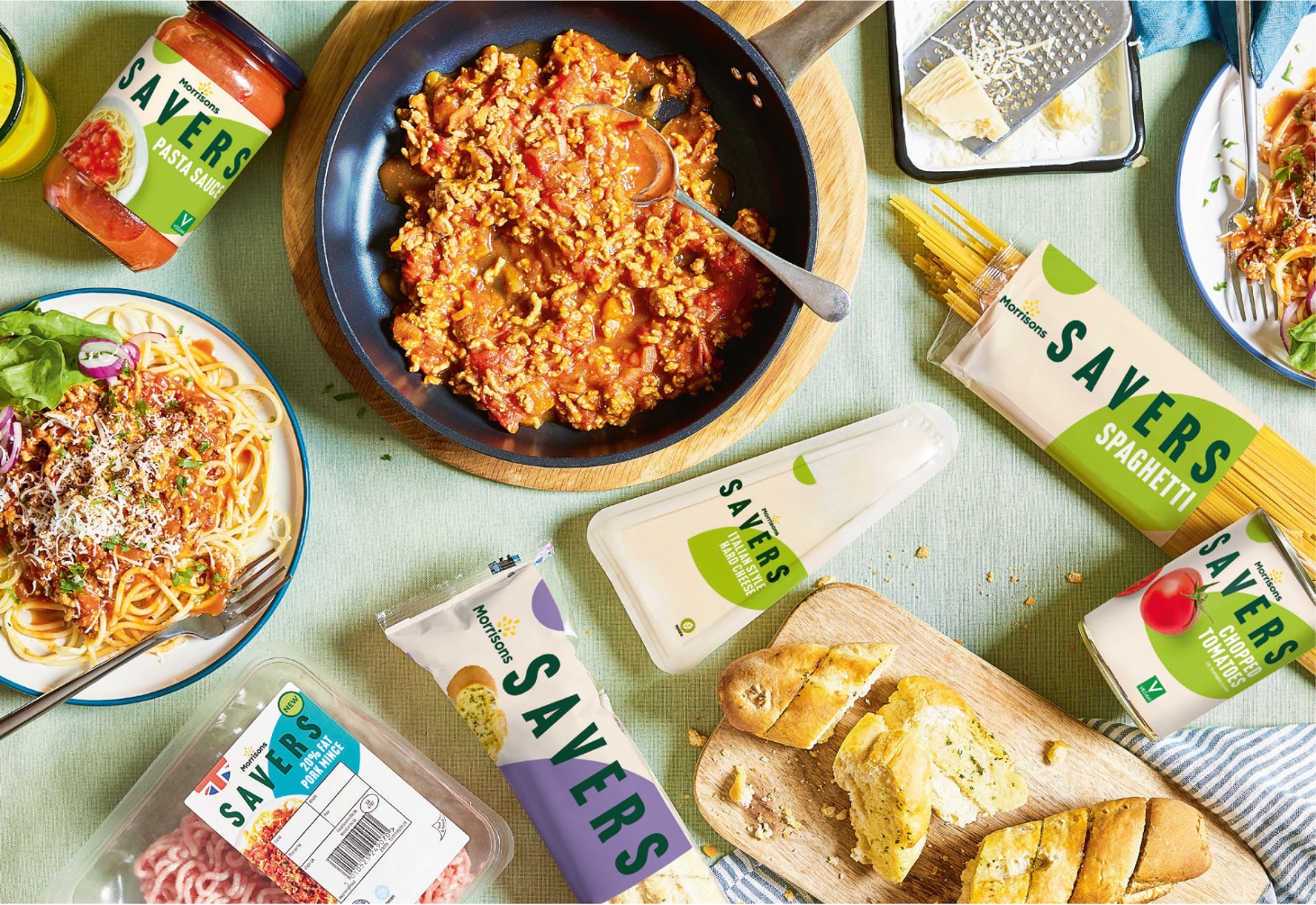
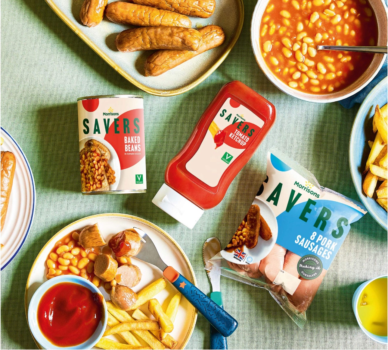
A restricted core colour palette and distinctive leaf shape from Morrison’s logo were implemented to ensure consistency across the range. The colours applied on pack use a logic based on three core principles: learned colours, such as red for ‘ready salted’ crisps; protein colours, where Morrison’s shoppers have come to associate certain colours with certain meats; and complementary
colours where, when not tied to a protein or learned colour, packs feature a colour that contrasts with yet complements the colour of the core ingredient.
The packaging design is complemented by an honest simplicity across photography and food styling from Equator’s in-house studios. The result is a striking, uplifting design with bags of personality that savvy shoppers would be proud to place into their shopping trolley.


CREDIT
- Agency/Creative: Equator Design
- Article Title: Morrisons Savers Brand Identity
- Organisation/Entity: Agency
- Project Type: Identity
- Project Status: Published
- Agency/Creative Country: United Kingdom
- Agency/Creative City: Manchester
- Market Region: Europe
- Project Deliverables: Brand Identity
- Industry: Food/Beverage
- Keywords: Identity, Brand Redesign , WBDS Agency Design Awards 2023/24
-
Credits:
Creative Director: Glyn Robinson
Account Director: Lynn Palmer
Senior Designer: Amy Gooding
Senior Designer: Charlotte Richards
Senior Photographer: Stewart Bimson
Senior Photographer: Emma Prothero
Food Styling: Emma Whitehead
Food Styling: Joe Wright


