The needs of today’s travelers have profoundly changed. Traveling is no longer just reaching a destination but enjoying the journey itself.
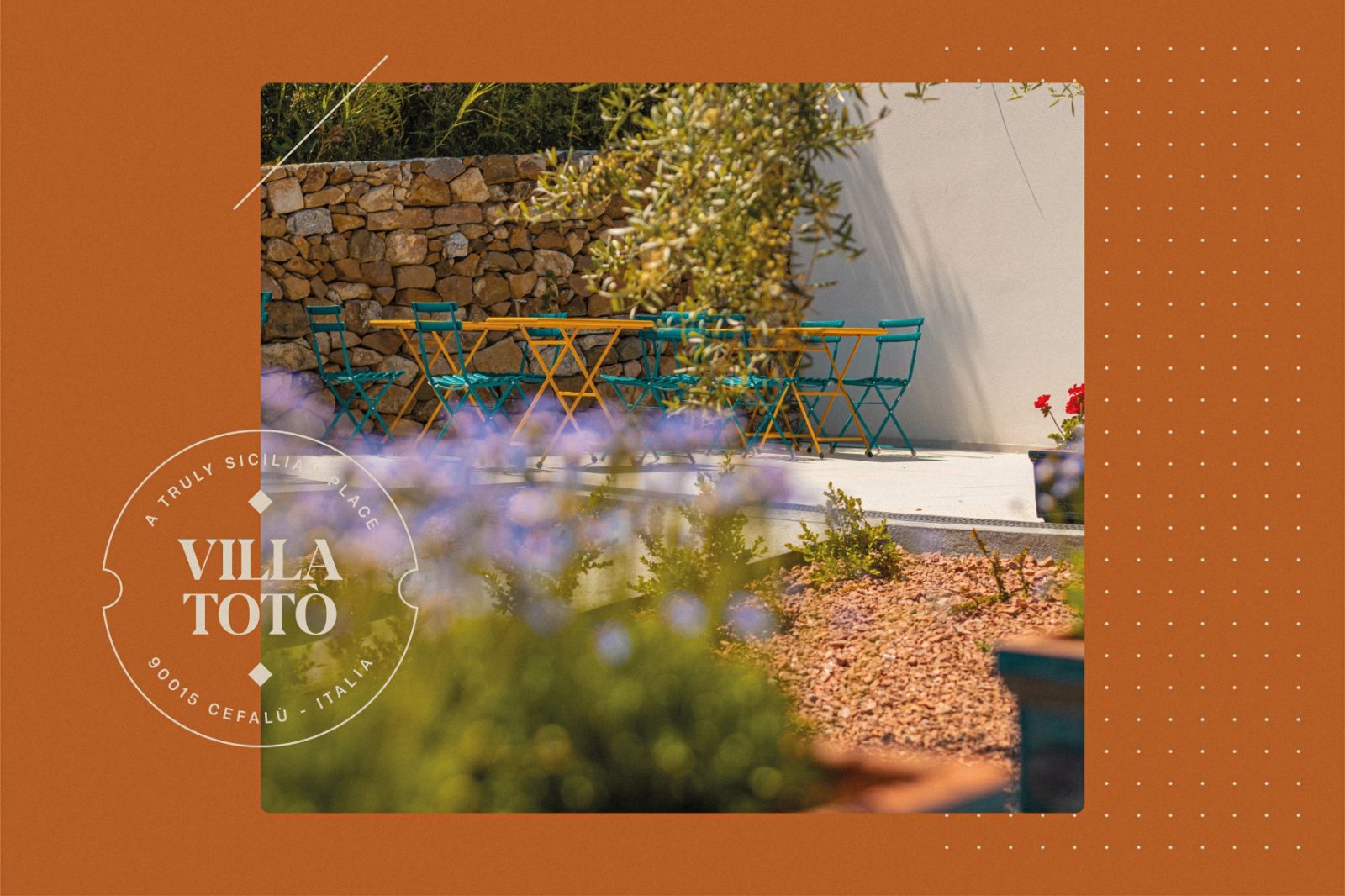
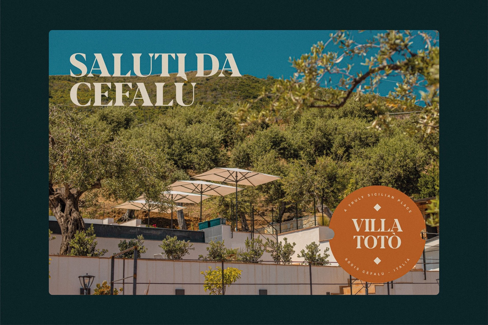
Villa Totò is a resort in Cefalù, an Arab-Norman town on the north coast of Sicily. The property is surrounded by greenery dominated by centuries-old olive trees, and has been finely renovated with high-quality materials which helped maintaining the external appearance of an ancient farmhouse.
The ten rooms, each distinctly different, reinterpret a rustic style in an unpretentious-but-essential modern key. Artworks and furnishings peculiar to the area, such as “Moorish heads” or “terra cotta” vases, are also tastefully combined.
“The uniqueness of the project lies in the fact that each room has been designed with unique and personalized furnishings. Entering and staying in each of these rooms means experiencing a new dimension of the spirit, enjoying the joy of existence that only the creativity of art can provide. Once you step into each of these rooms, art is lived as a dream.” Arch Matteo Franco.
The name, initially intended to be different, pays homage to a highly regarded person in the town: Vincenzo’s father (the owner of the property).
Vincenzo is a successful and ambitious entrepreneur who has traveled extensively. With this project, he immersed himself in the world of hospitality.
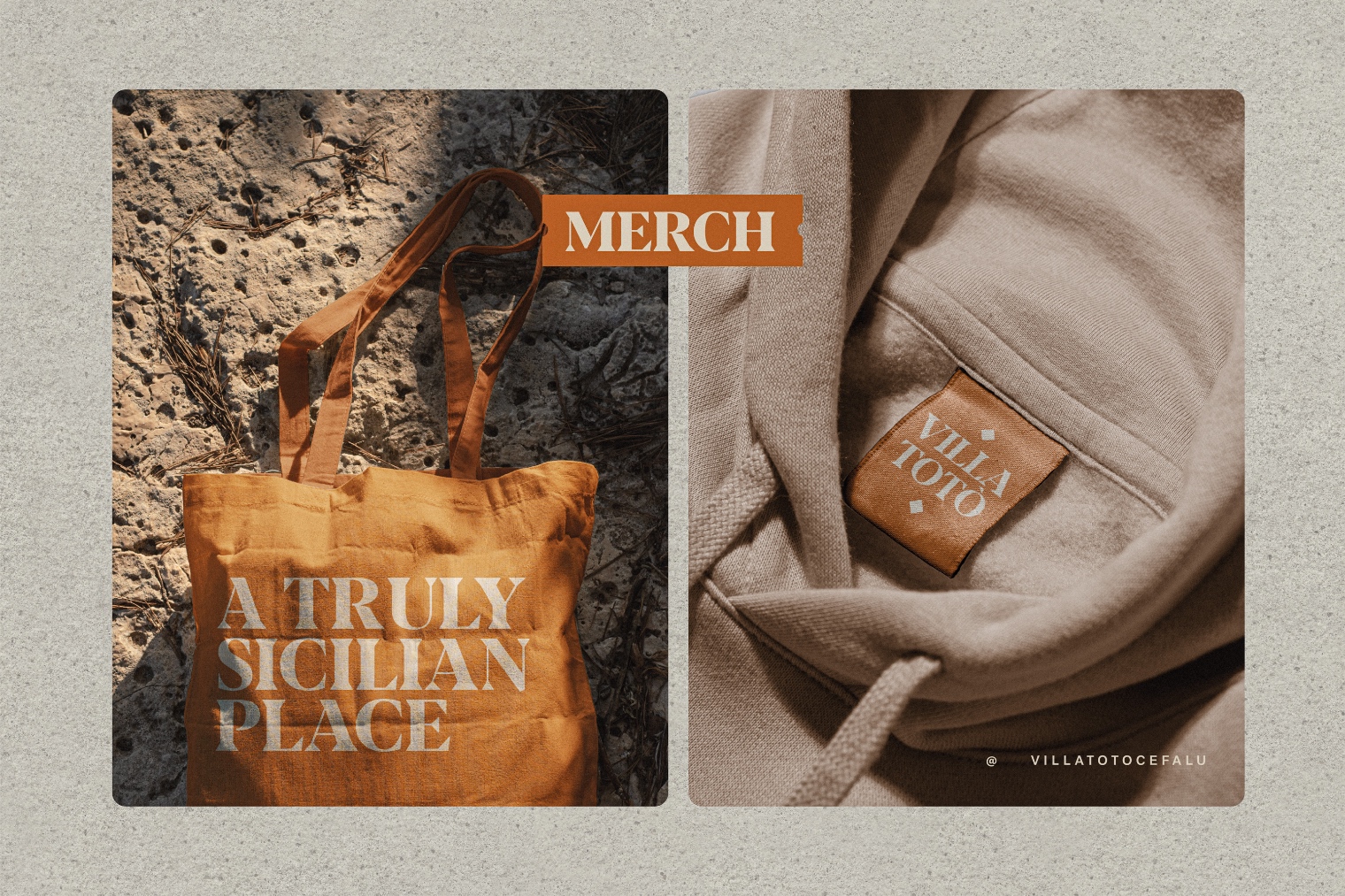
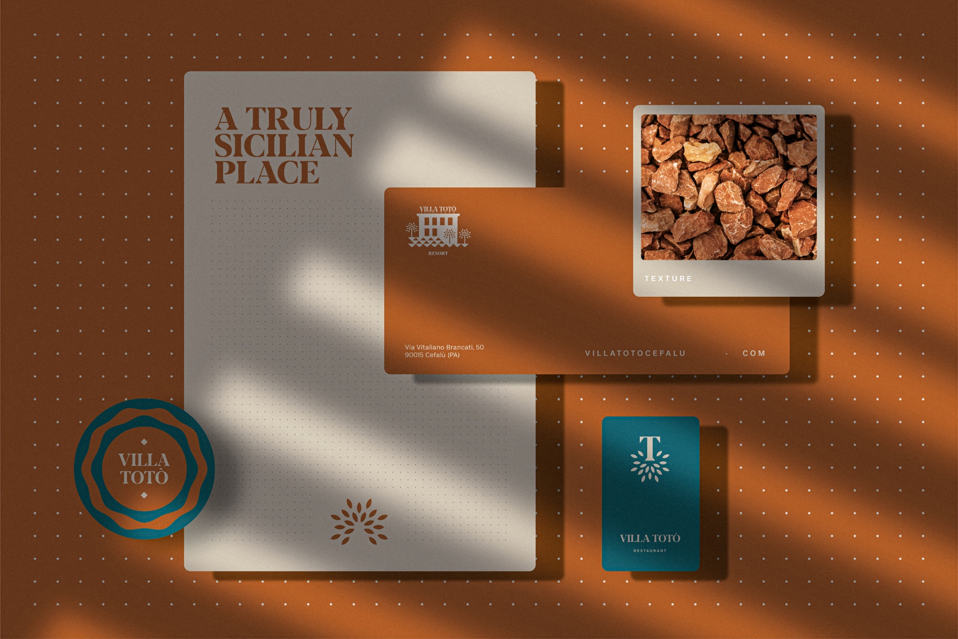
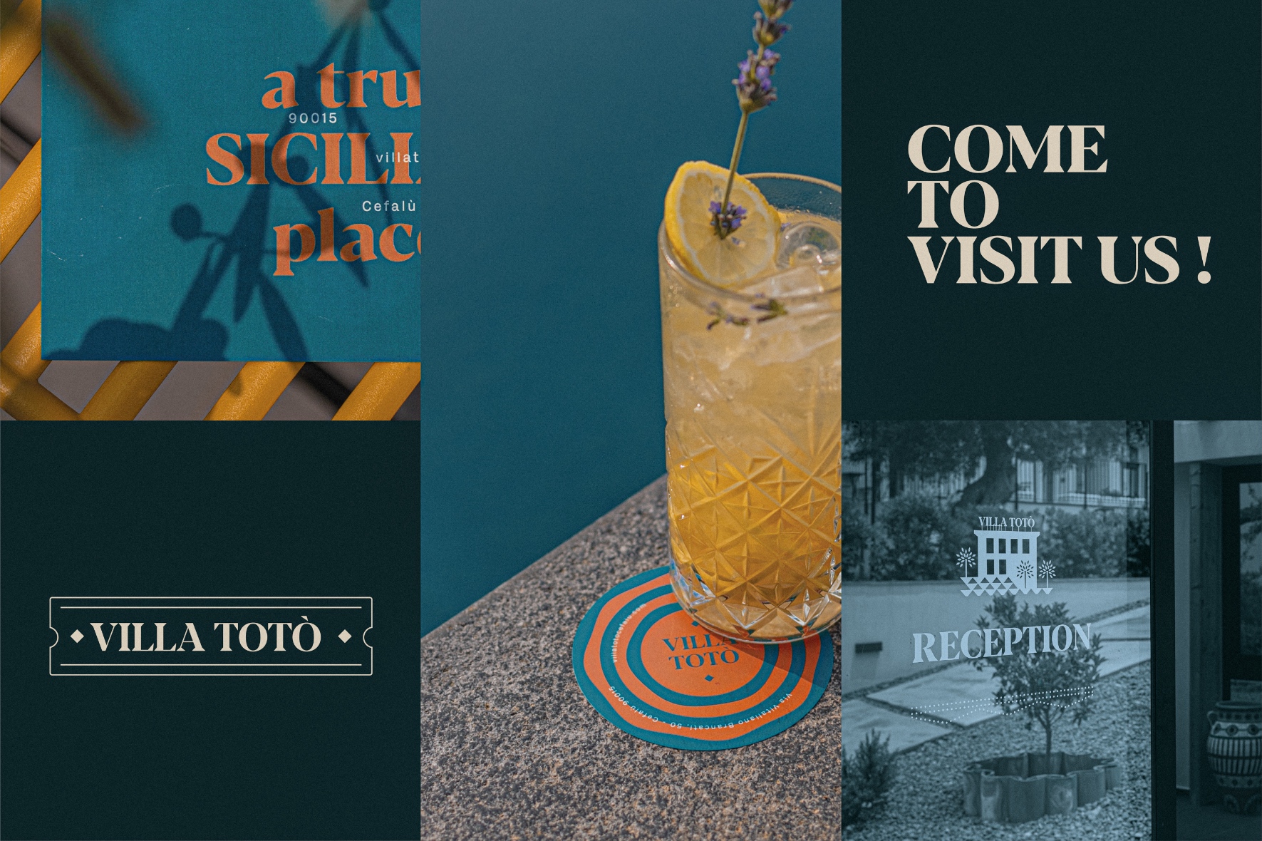
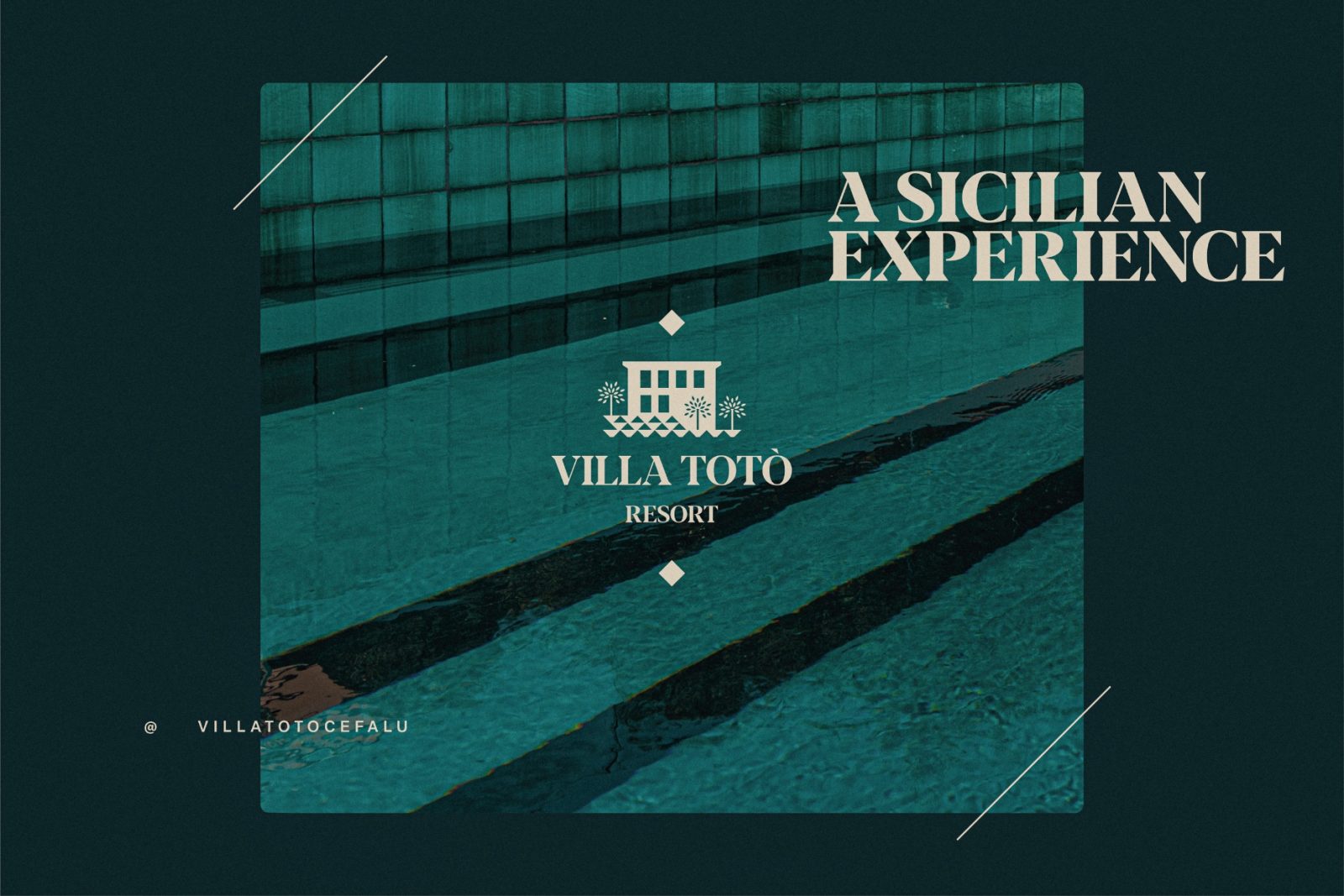
The color palette is closely linked to the materiality of certain details, such as the soil of the avenues, the “raw terracotta” used as flooring, the turquoise glazed artisanal ceramics, and the lava stone around the pool.
The goal of the property and the architecture studio overseeing the project was to achieve a restrained Sicilian identity, avoiding clichés, and allowing to breathe the true essence of island relaxation.
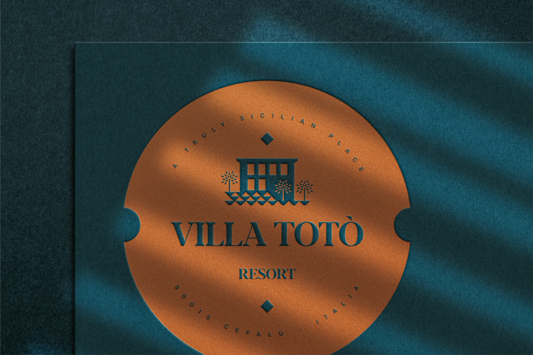
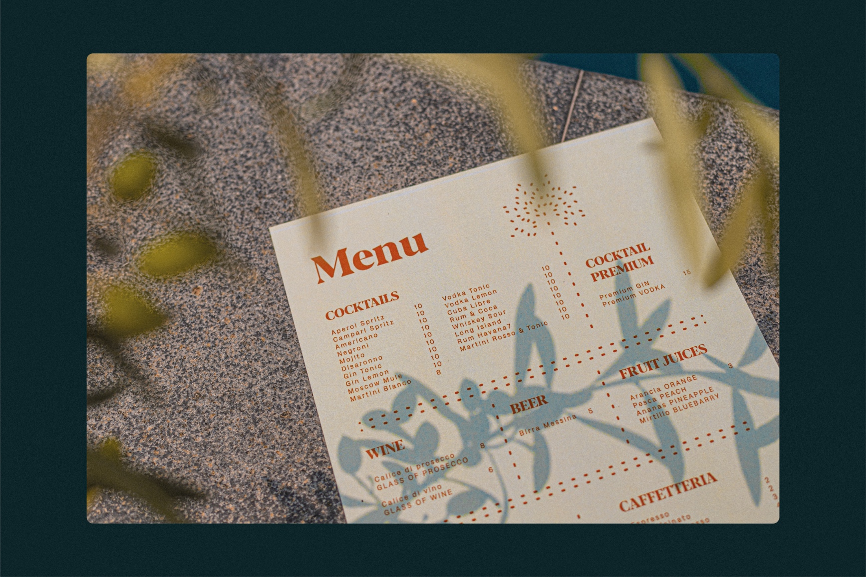
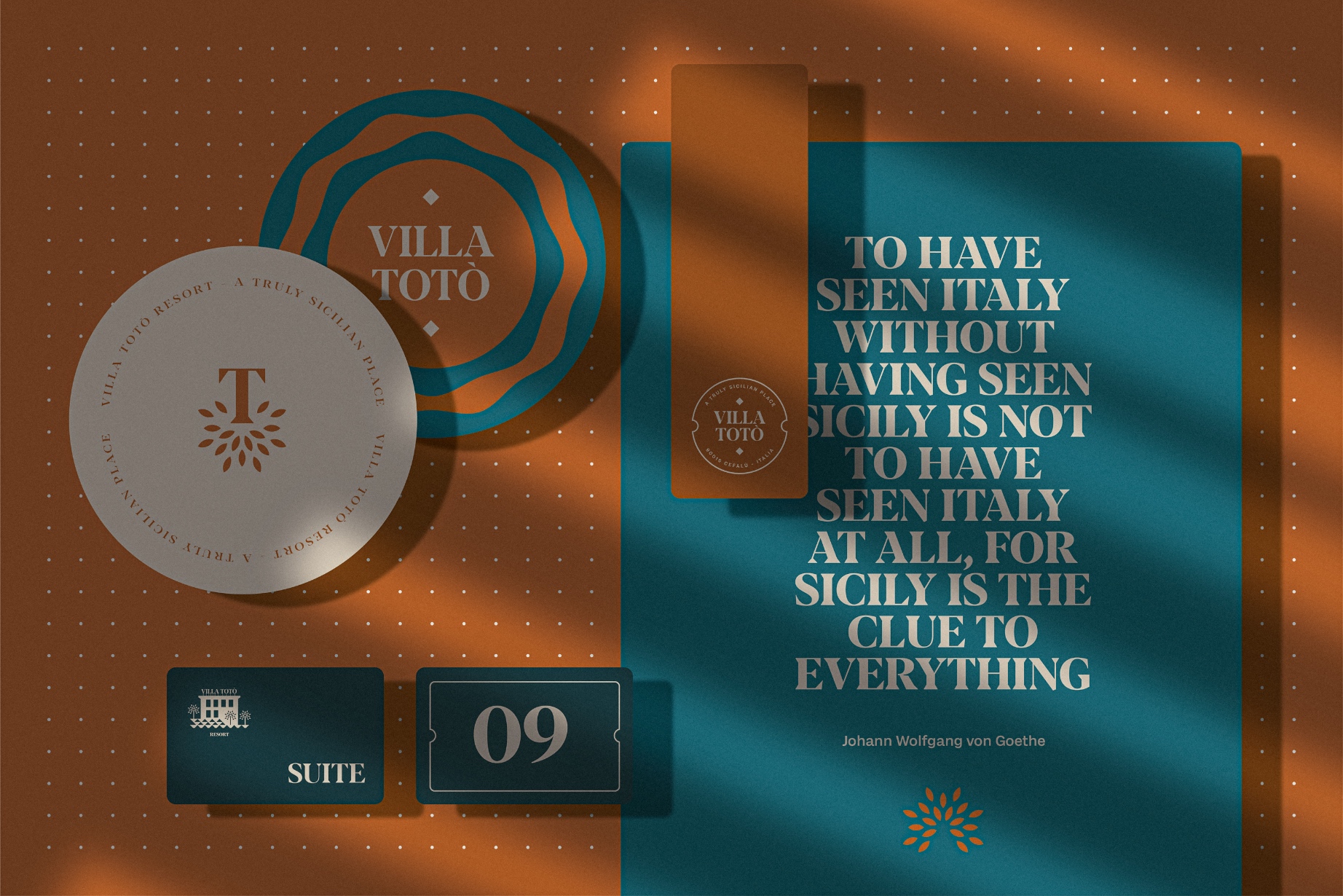
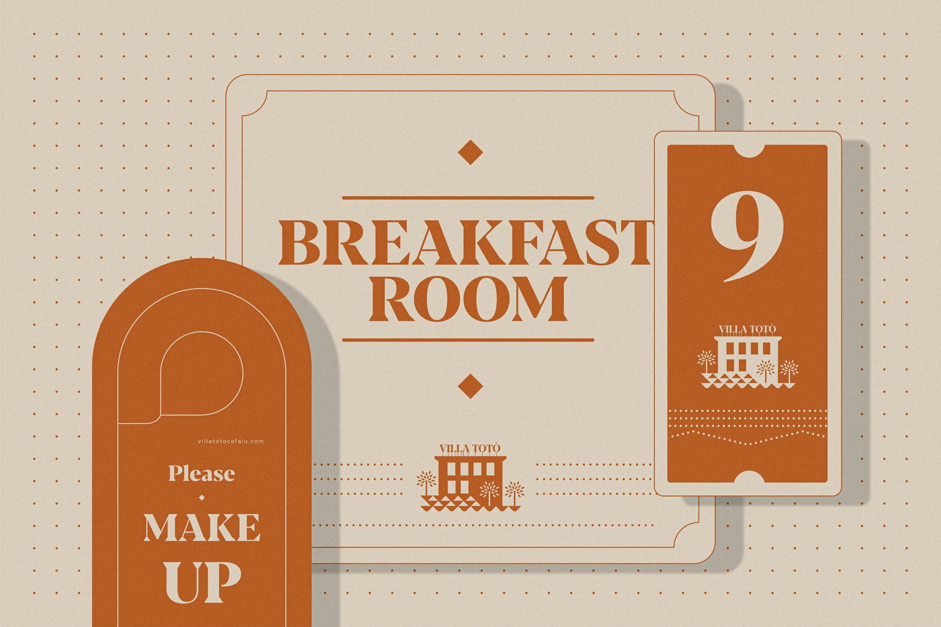
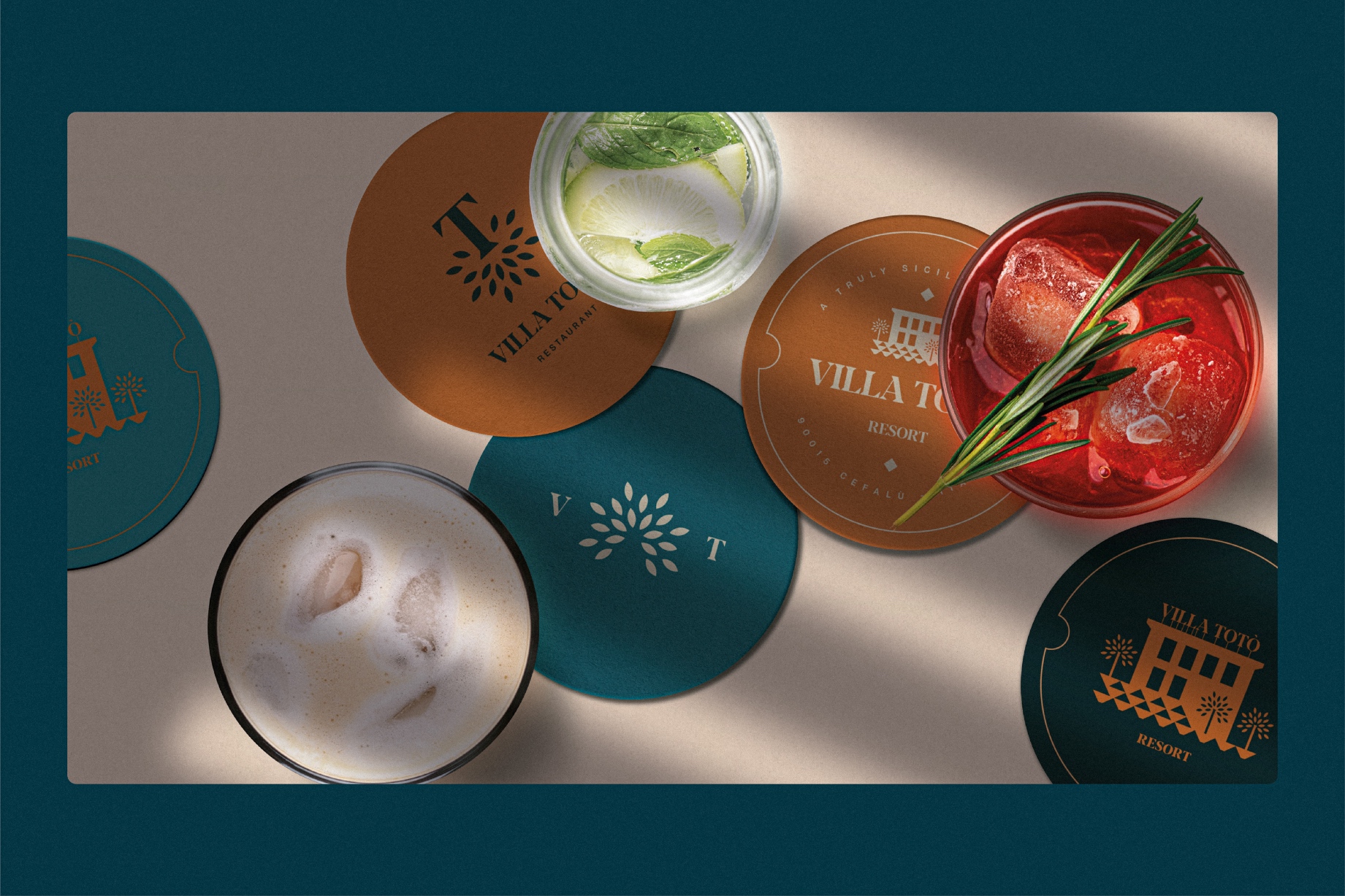
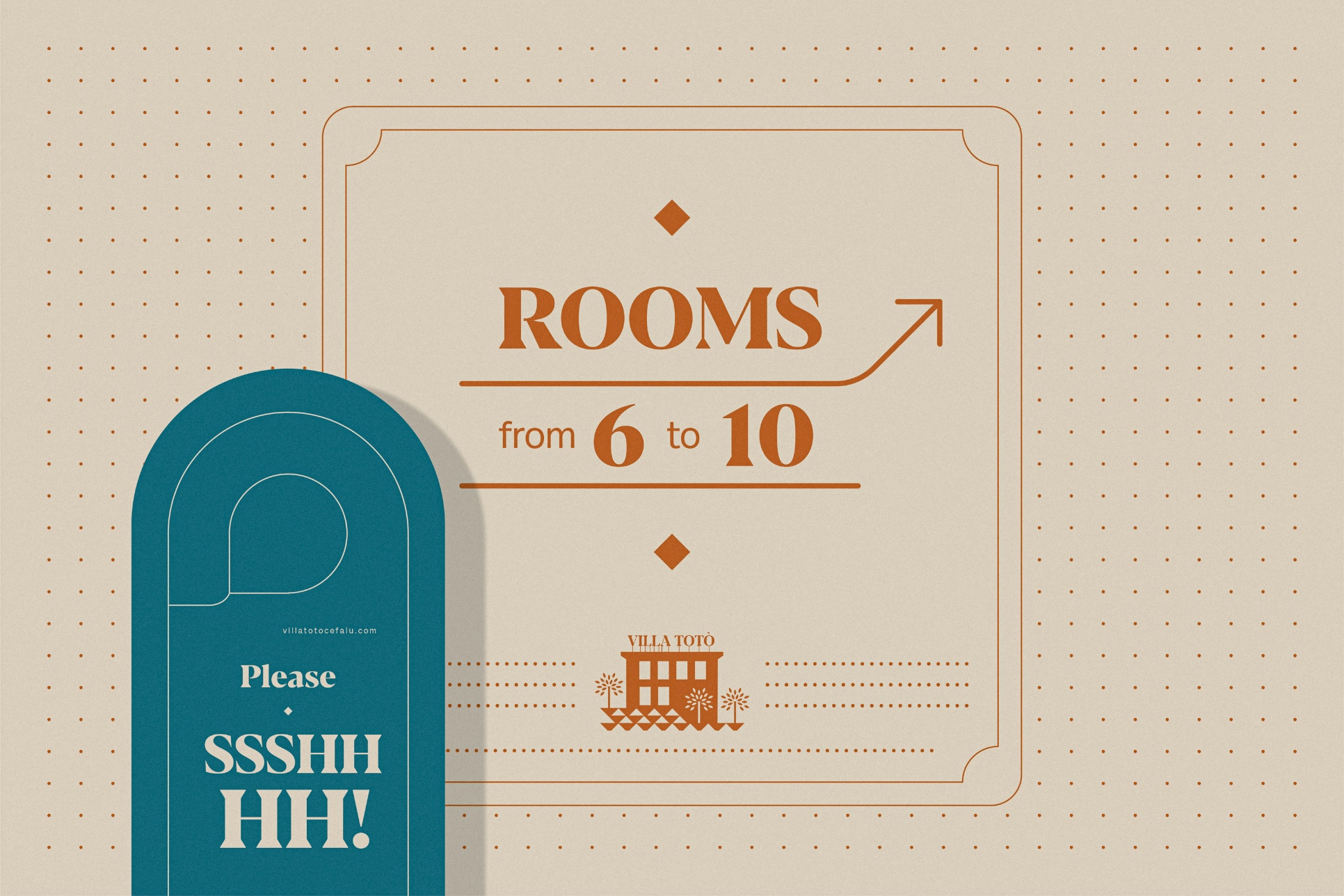
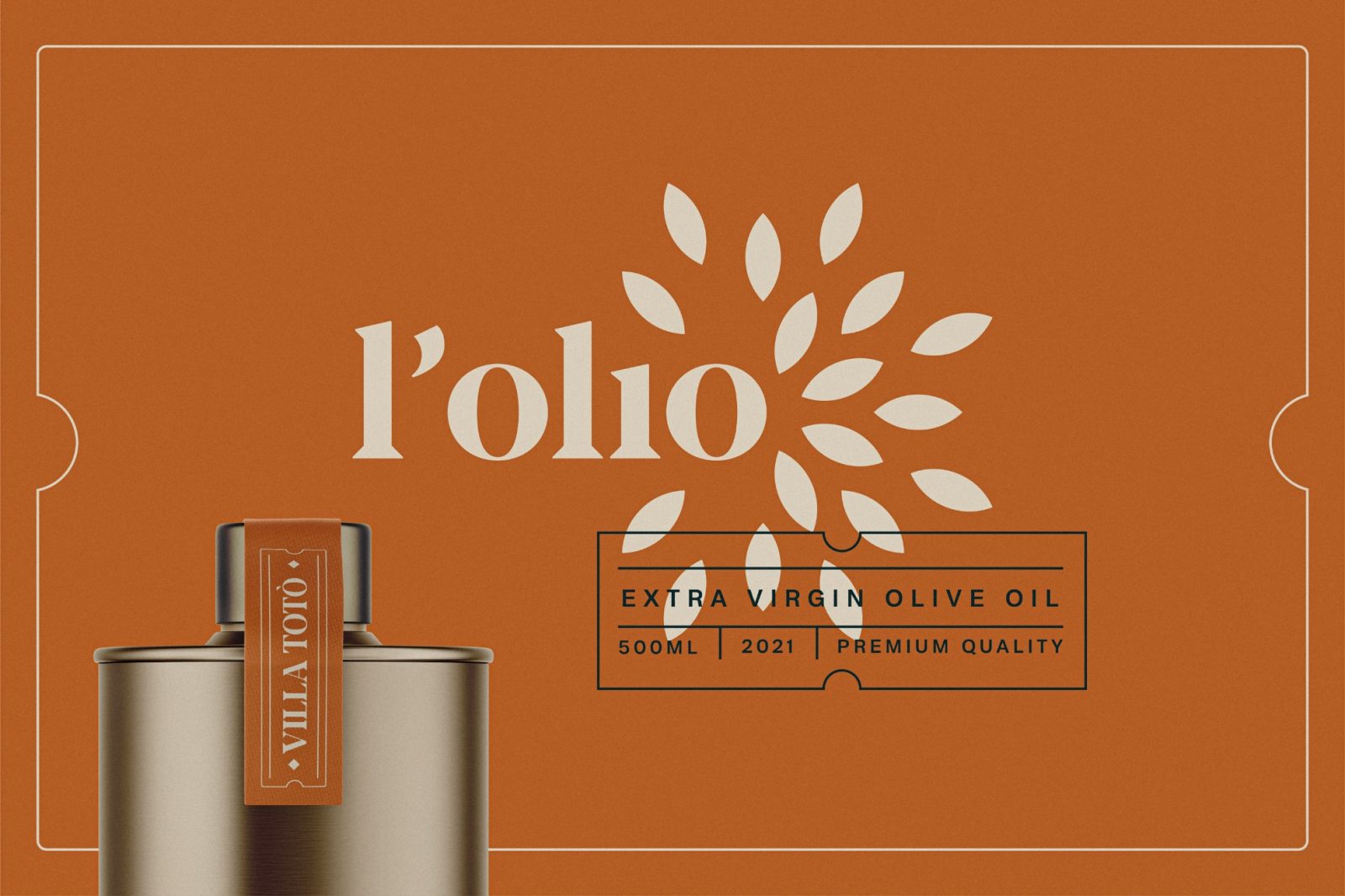
The logo and identity project aim to enhance the narrative. Hence the basic shapes with sharp angles, utilizing negative space to iconographically represent the facade of the villa with its various terraces. Despite keeping a simple look, the Vintage-style frames, dotted lines, and diamonds as space separators effectively complete a very articulated visual system.
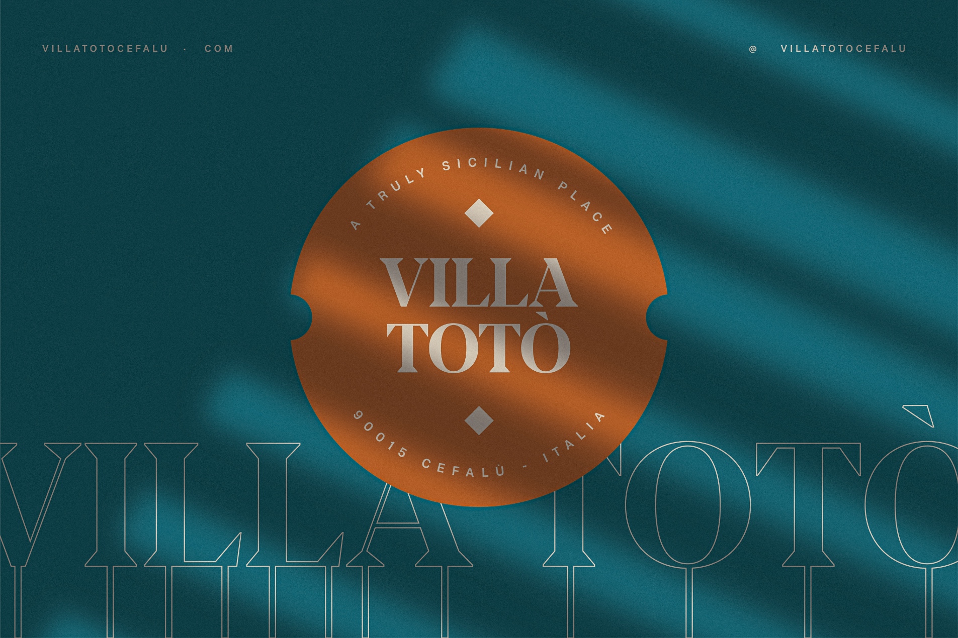
The selected font is Blacker PRO from Type Foundry Zetafonts. Blacker was developed as a take on the style that Jeremiah Shoaf has defined as the “evil serif” genre: typefaces with high contrast, oldstyle or modern serif proportions and sharp, blade-like triangular serifs”.
Despite being only two years old, Villa Totò is an established and sought-after location with over 90% occupancy and an average satisfaction rating of 9.5 out of 10 recorded last season.
CREDIT
- Agency/Creative: HUB87 - Logo & Creative Studio
- Article Title: Villa Totò Resort Branding
- Organisation/Entity: Freelance
- Project Type: Identity
- Project Status: Published
- Agency/Creative Country: Italy
- Agency/Creative City: Roma
- Market Region: Europe
- Project Deliverables: Brand Identity
- Industry: Hospitality
- Keywords: WBDS Creative Design Awards 2023/24
- Keywords: Identity, Brand Design Creation
-
Credits:
Type foundry: Zetafonts
Architect: MF2Arch
Text Translation: Samuele Brusca


