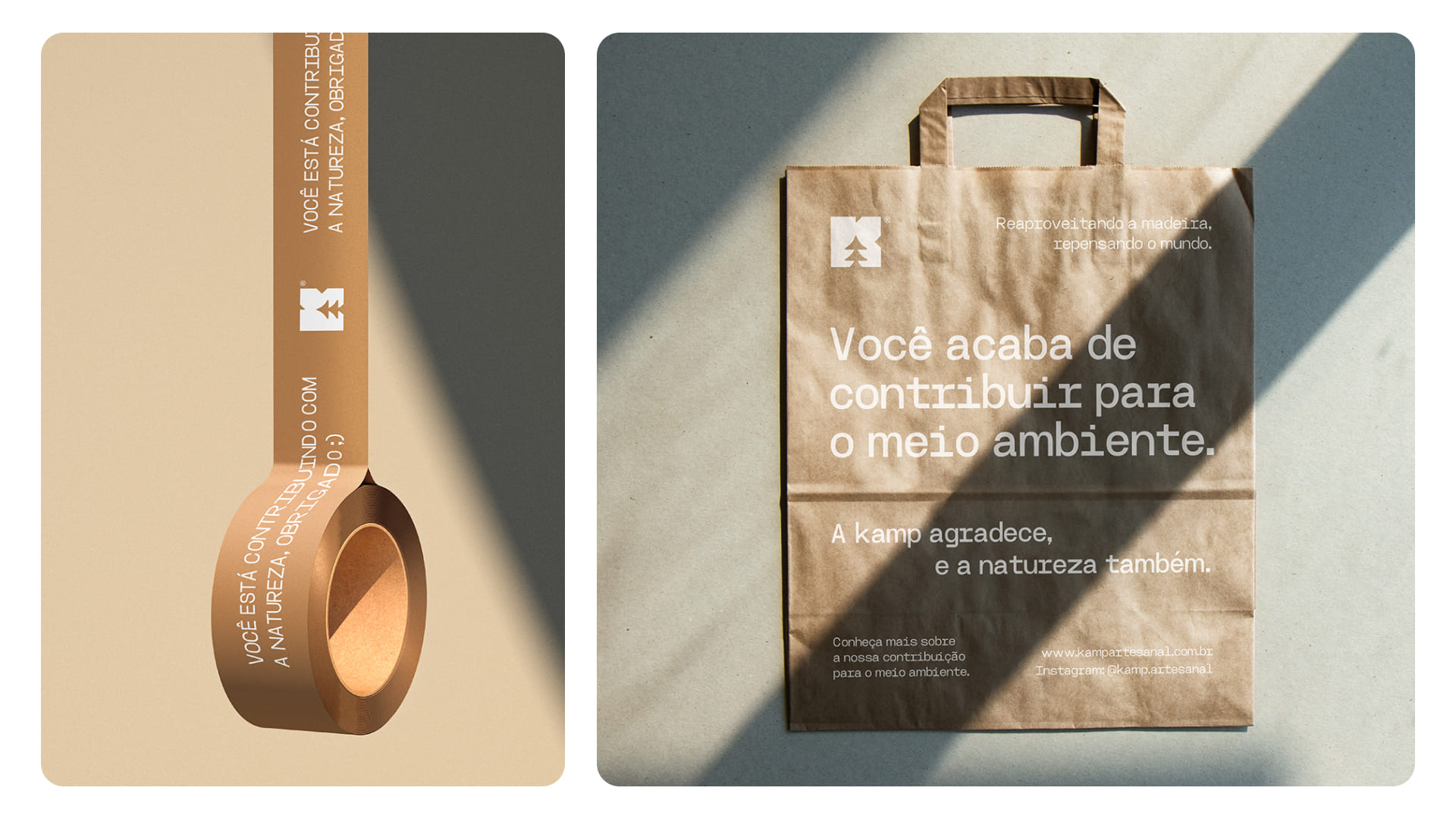
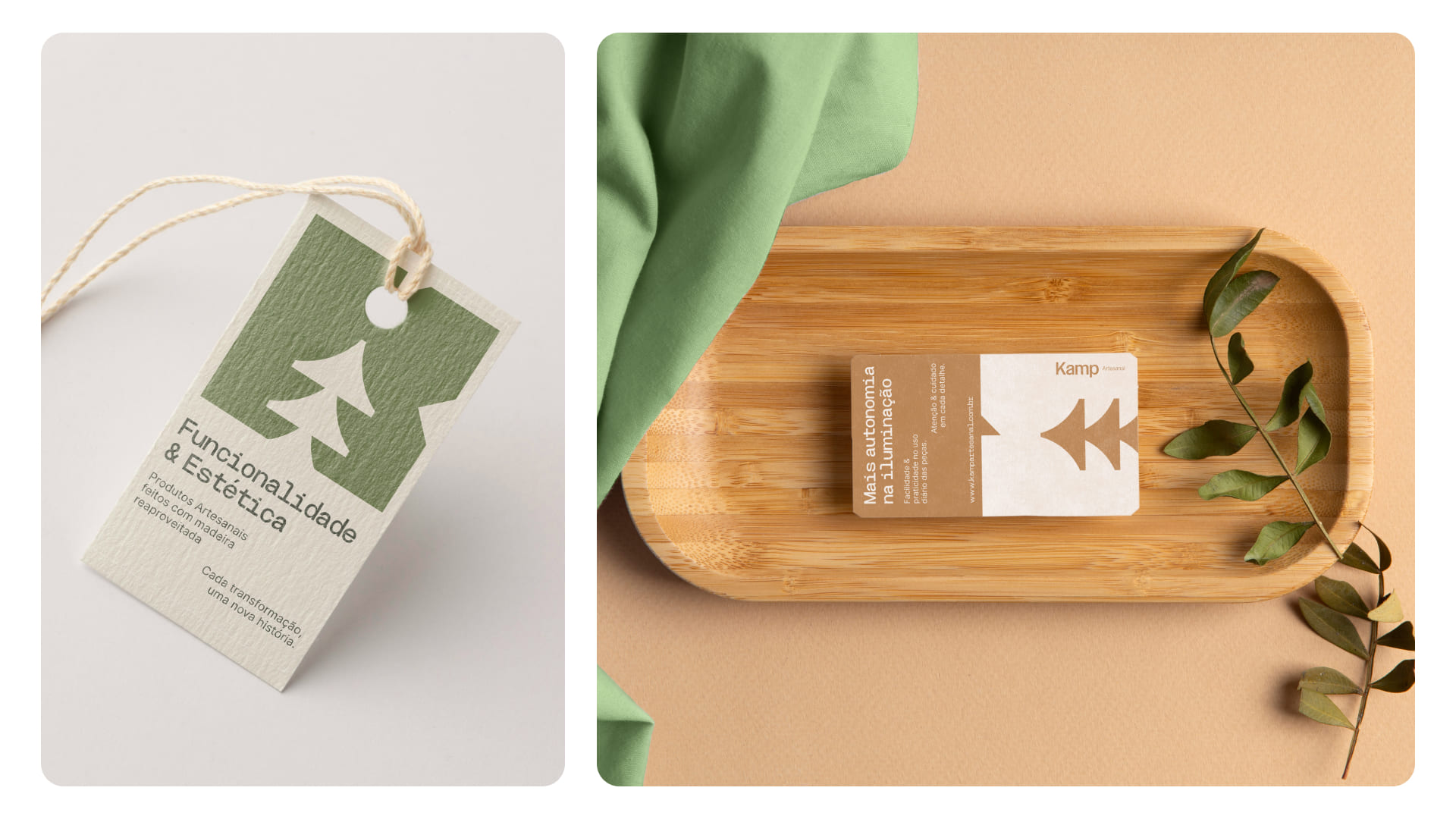
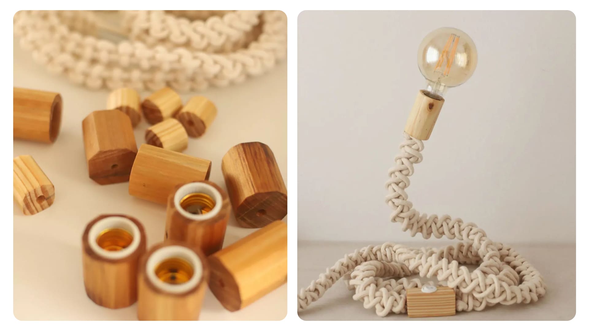
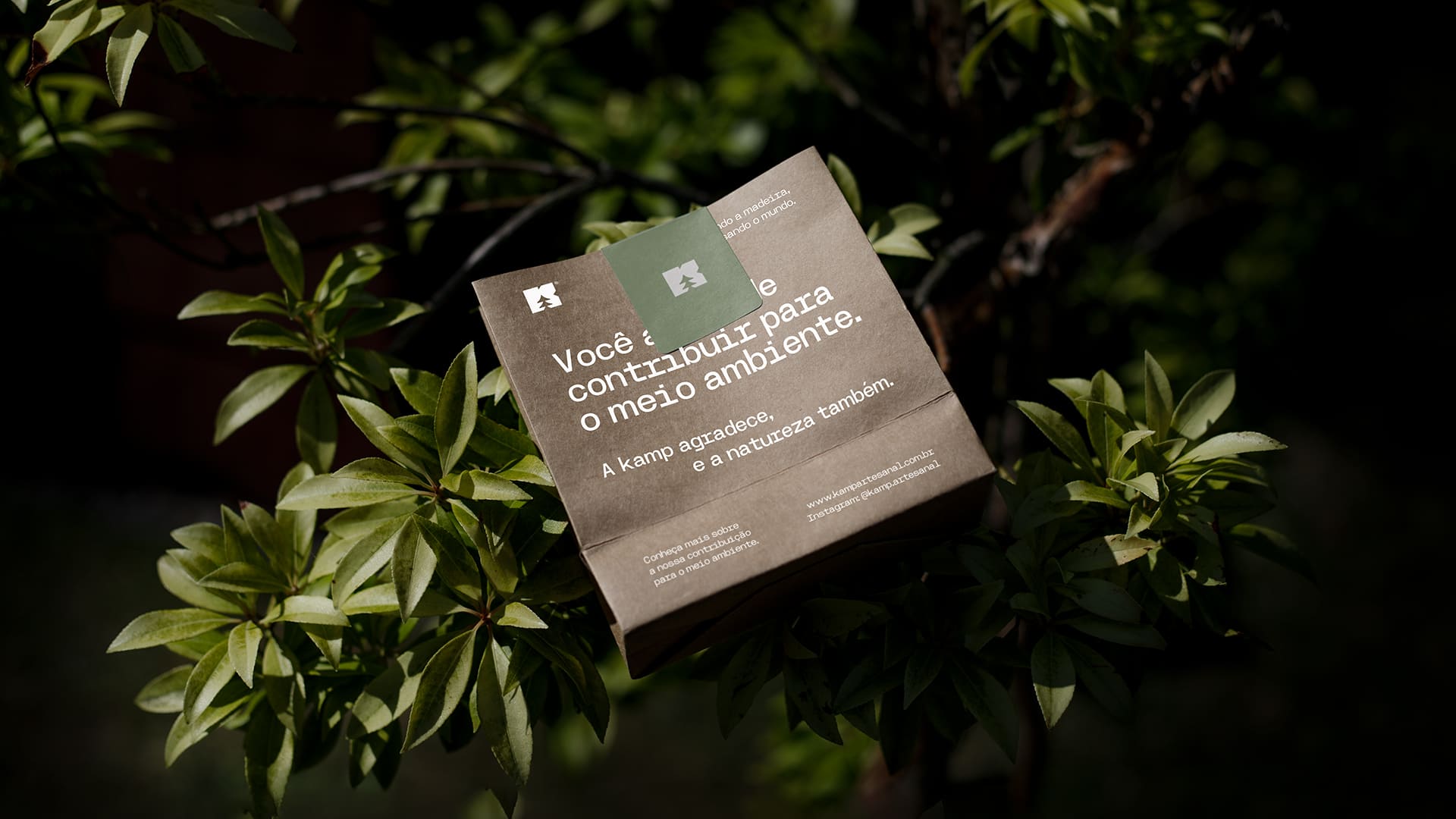
Kamp is a memory of the countryside, it’s a peaceful environment, it’s welcoming, it’s warmth. It’s the promise of a home ready to receive good visitors. The brand had several application problems with its products with the old visual identity, something that was resolved with the new proposal we developed. We also identified that each product told a story, that even though they were visually the same, they were built from a different reuse. We add value not only to the company’s visual identity, making it more professional, but also to the consumer’s experience with delivery.Because we realised that the story is what directly connected the public with the brand. Now the brand always makes sure that the consumer will receive not only the product, but also an account of the entire journey behind the new life that was given to the wood.


CREDIT
- Agency/Creative: Ritter Studio
- Article Title: Ritter Studio Redefine Storytelling for Kamp’s Brand Evolution
- Organisation/Entity: Agency
- Project Type: Identity
- Project Status: Published
- Agency/Creative Country: Brazil
- Agency/Creative City: Palhoça
- Market Region: South America
- Project Deliverables: Brand Identity
- Industry: Construction
- Keywords: decor, home, wood, handmade, sustentability, eco, future
-
Credits:
Designer & Art Director: Mateus Ritter


