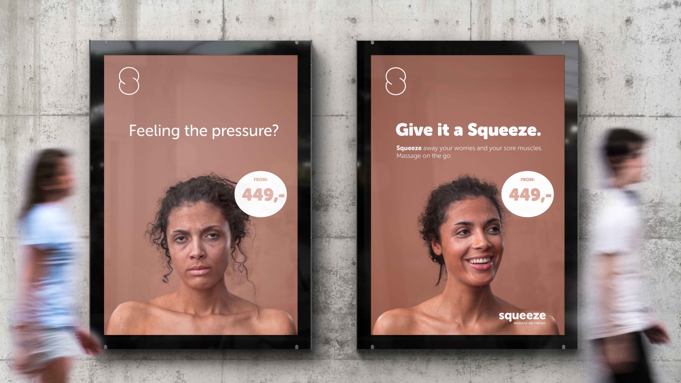
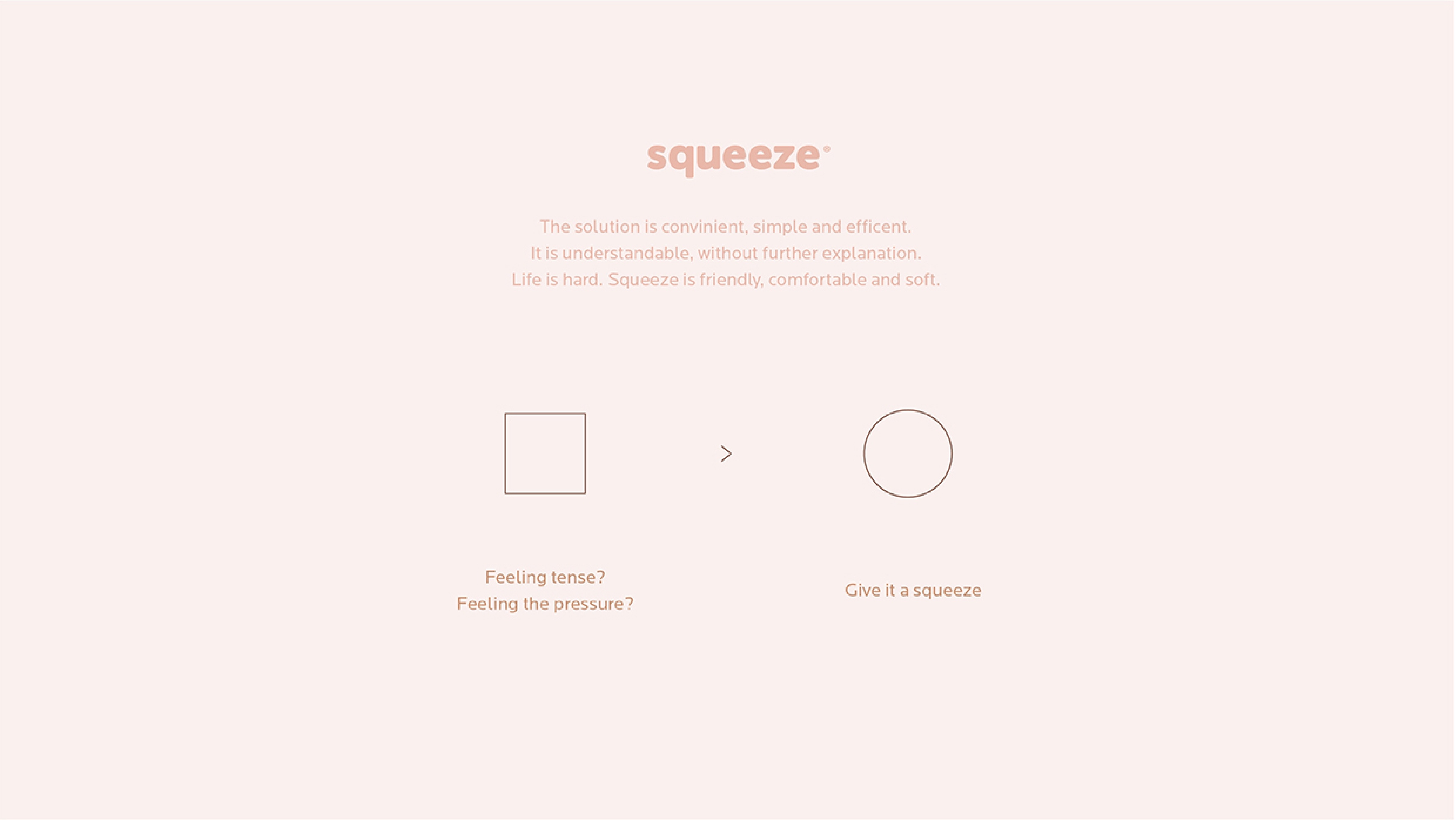
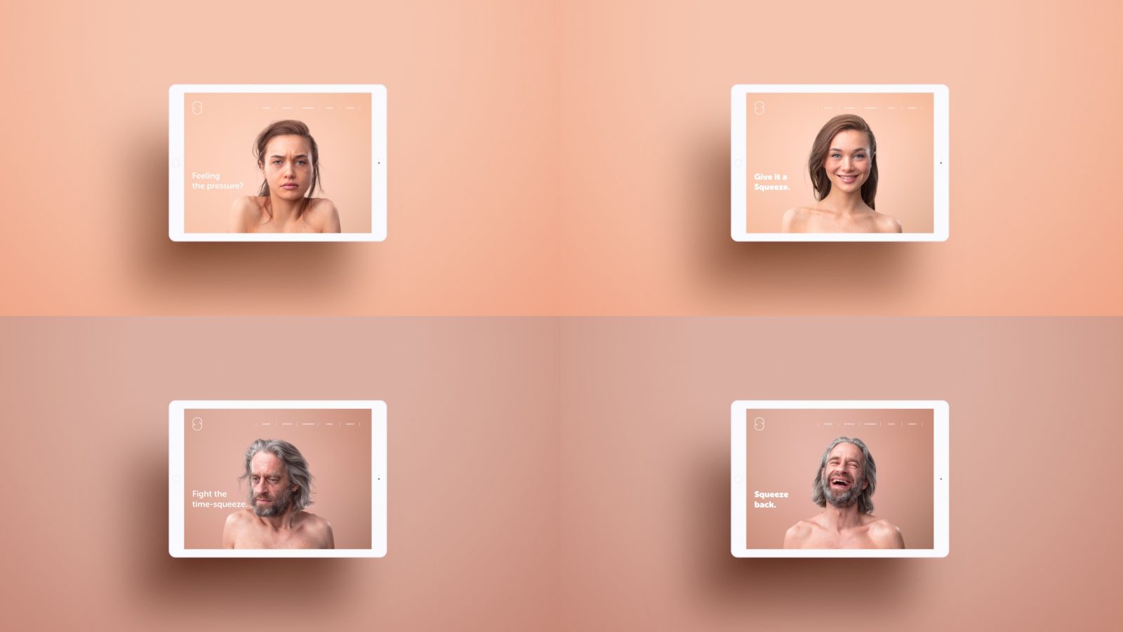
Squeeze, a Norwegian massage chain, has revolutionised the massage industry by focusing on affordable drop-in sessions on the go. The solution is convenient, simple, and effective, providing stress relief at your fingertips. Life is hard, Squeeze is a friendly, comfortable, and soft escape. Feeling the pressure? Give it a squeeze.
Strategic Locations:
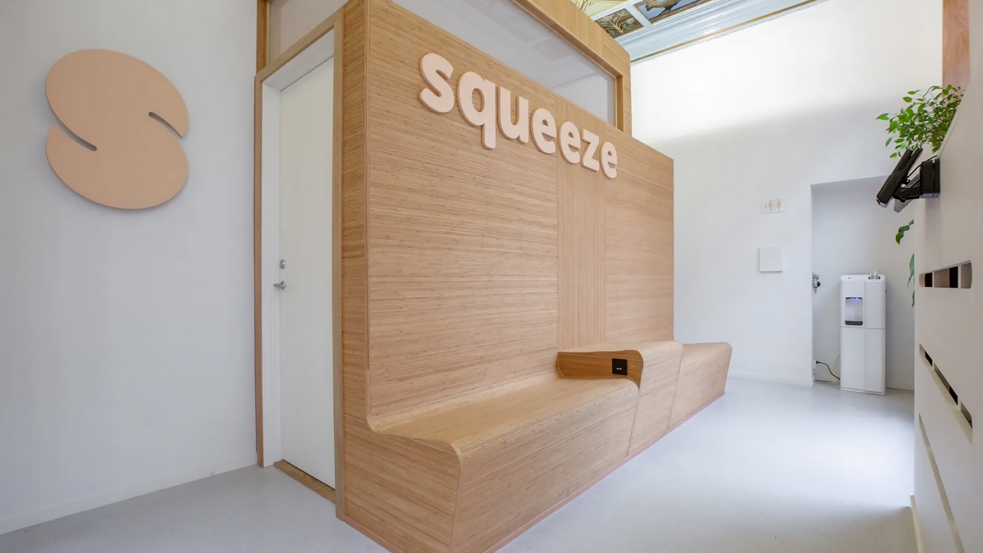
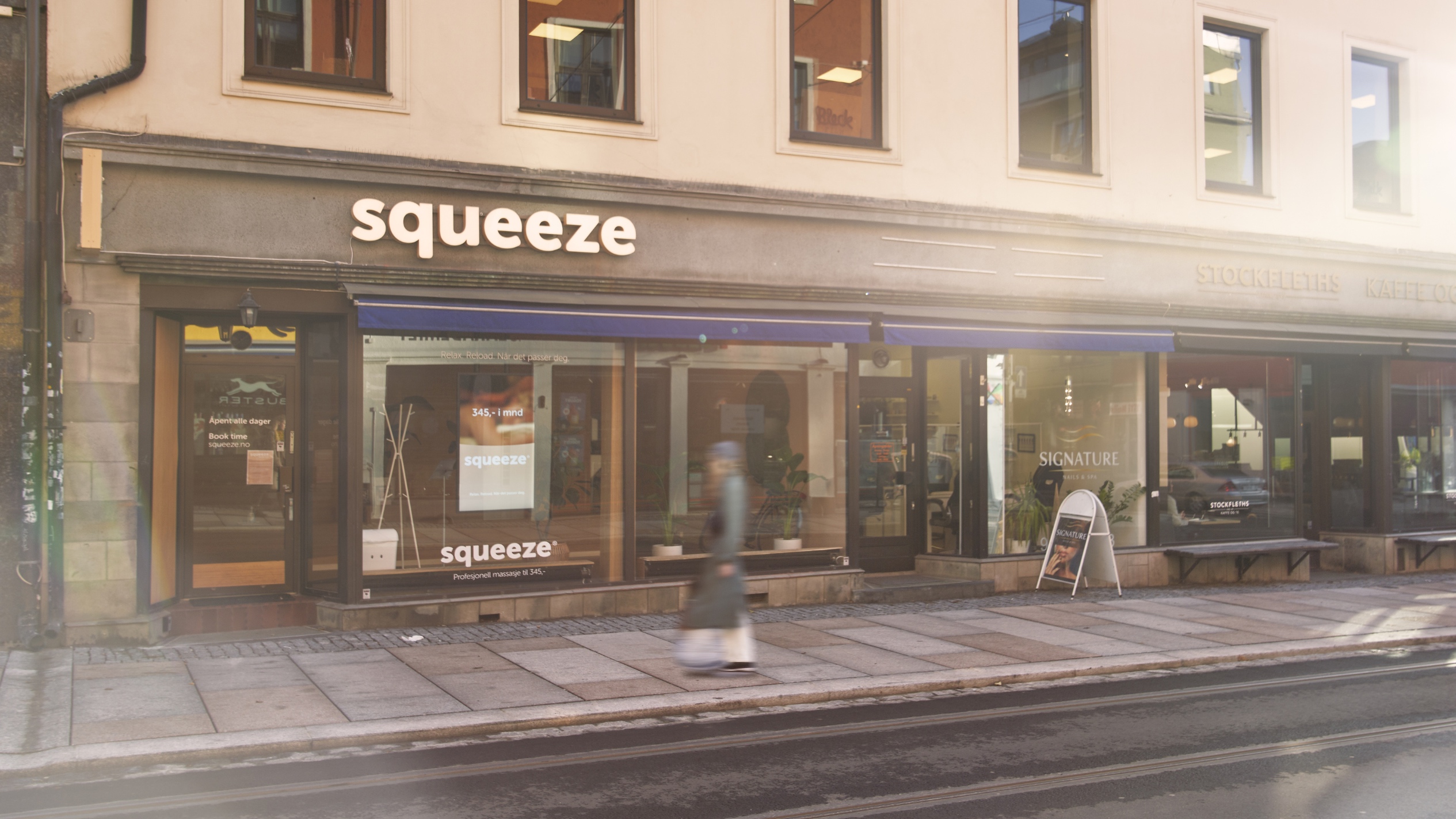
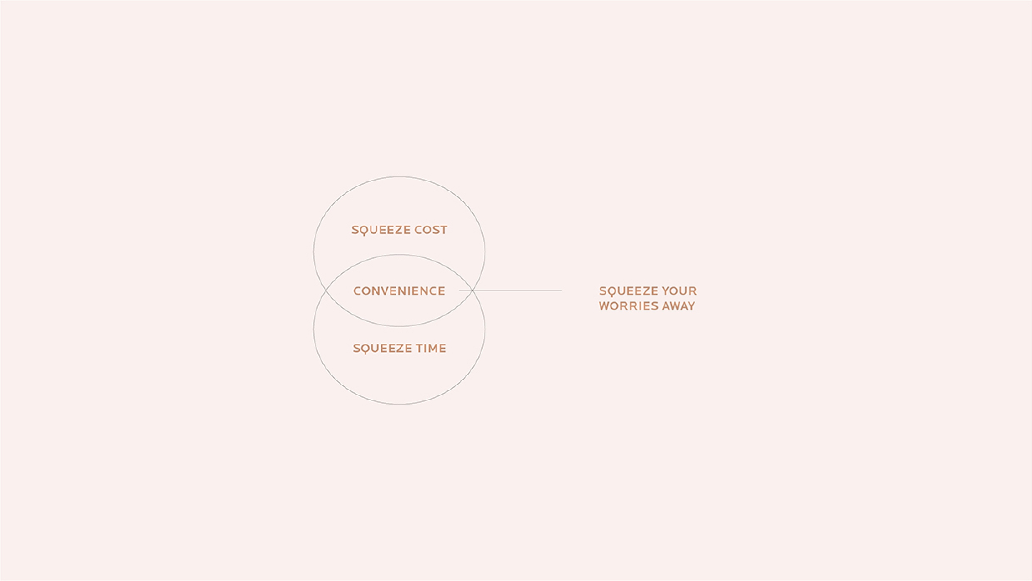
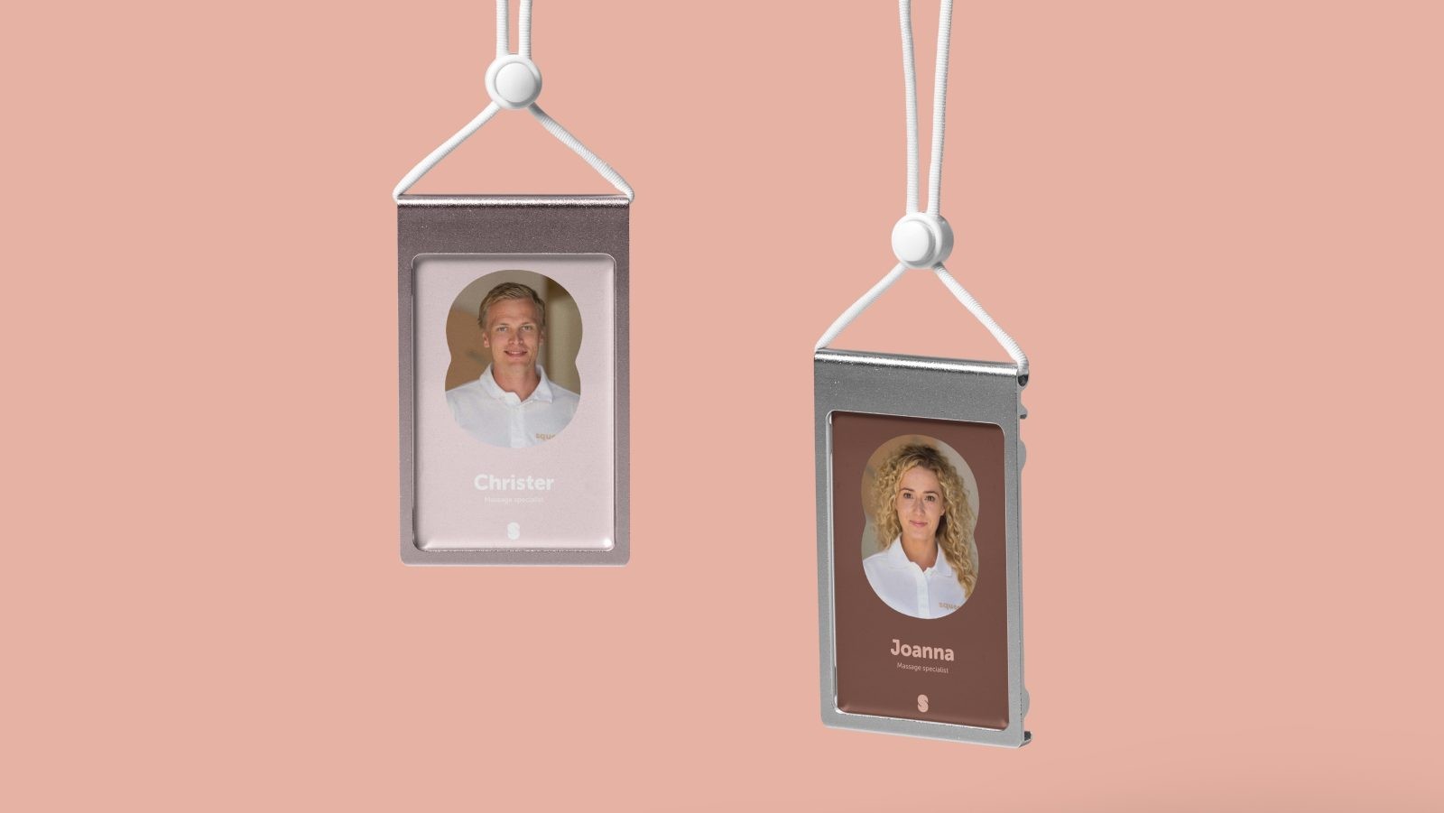
Squeeze strategically positions its massage centres where people need immediate stress release—airports, coworking spaces, and city streets. Modern salons, friendly staff, efficient scheduling at low prices—Squeeze offers a sanctuary to organise your therapy efficiently. With a membership, you can even choose your therapist. Squeeze time, squeeze cost, squeeze your worries away.
Market Positioning:
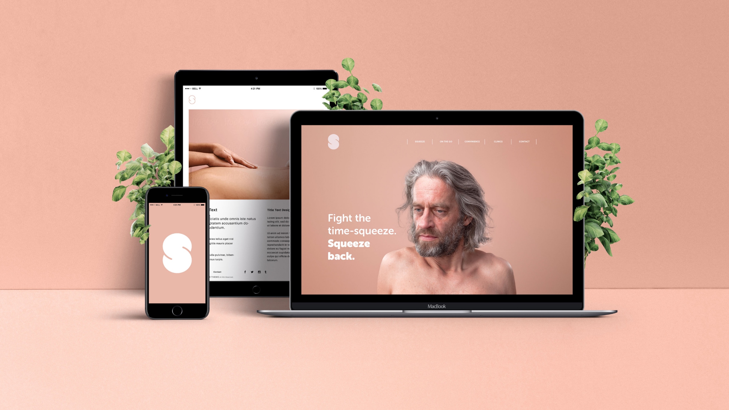
Squeeze bridges the divide by identifying a market gap between expensive luxury clinics and more budget-friendly yet less professional massage parlours. Leveraging digital solutions for quick and efficient bookings, Squeeze has rapidly become a household name in Norway for physical well-being.
Soft Human Touch:
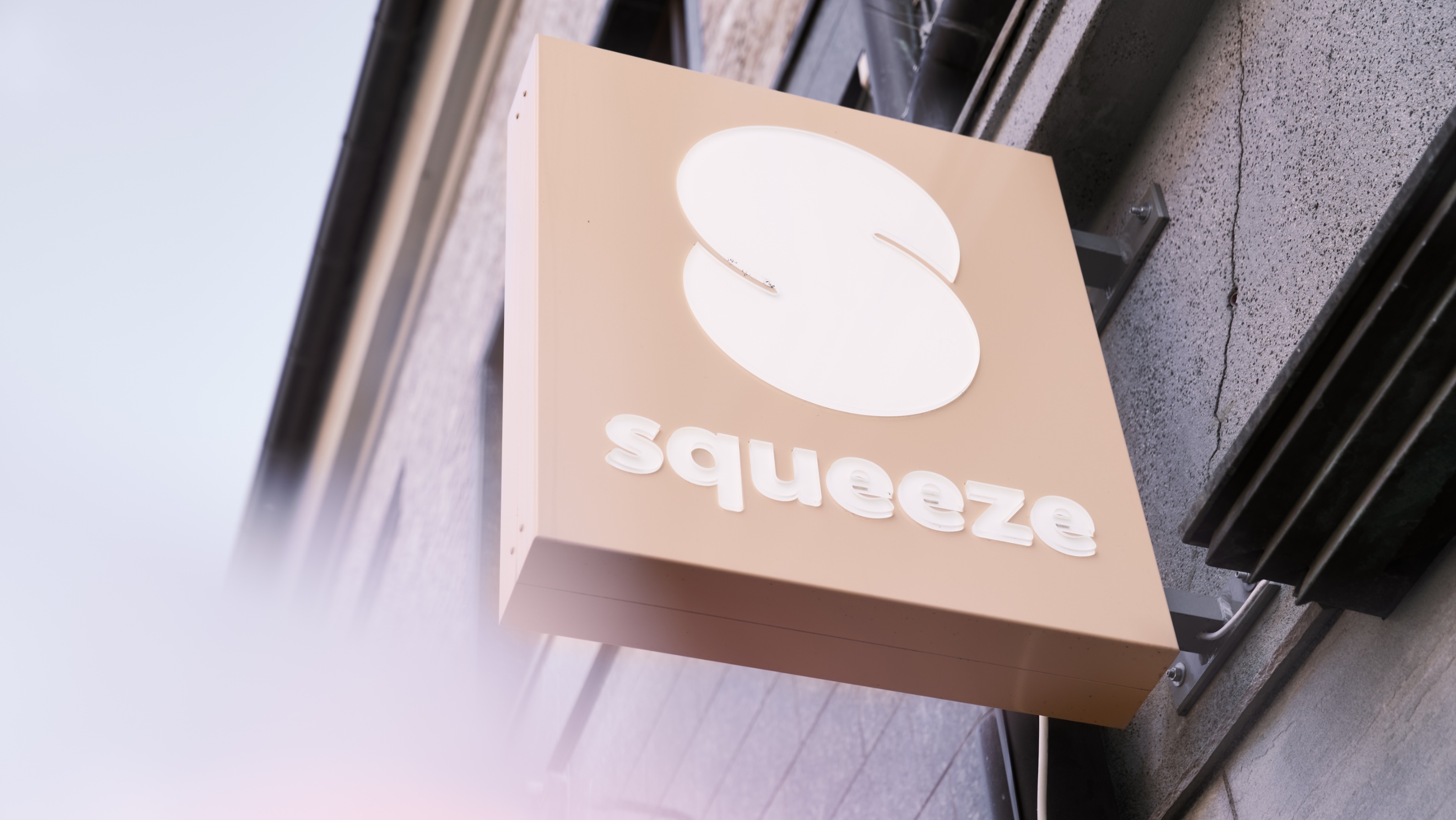
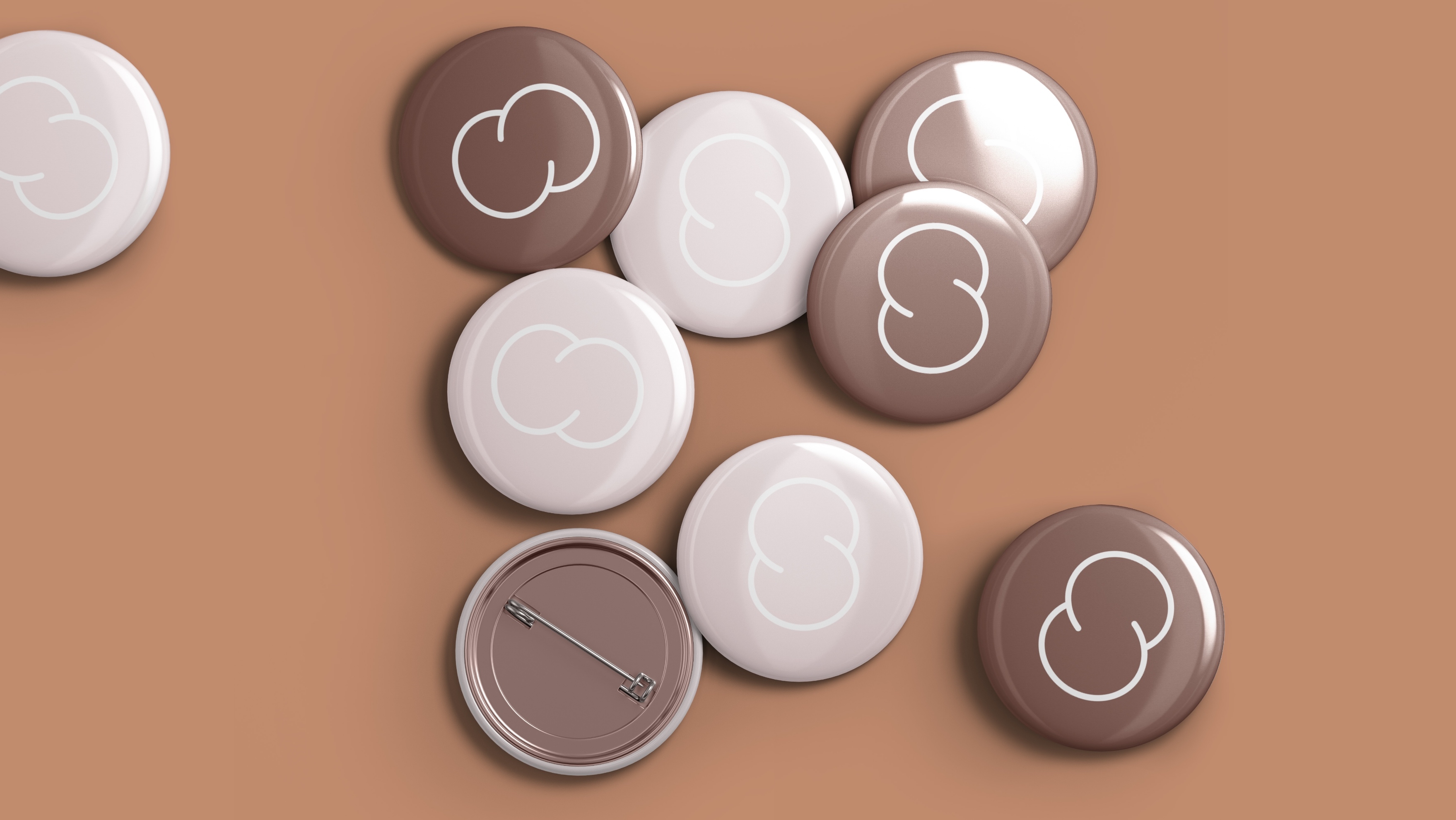
Squeeze’s visual identity draws inspiration from soft, human forms. The ’S’ in the logo is playfully squeezed, reflecting a gentle and friendly touch. Humour and approachability are key elements in communication and imagery, humanising both the clinics and the brand, making them more relatable and approachable.
Friendly and Approachable:
Humour and a lighthearted approach to communication and visual style contribute to the brand’s accessibility. By incorporating these elements, Squeeze has successfully made its clinics and services more down-to-earth, resonating with a broader audience.
Dynamic Palette:
The dynamic colour palette takes cues from skin tones, creating a warm and human-centric identity. The chosen colours evoke a sense of comfort and friendliness, reinforcing the brand’s commitment to providing a welcoming and enjoyable experience.
Typography:
Squeeze employs a rounded grotesque typeface known for its friendly and warm characteristics. This choice in typography aligns with the brand’s identity, conveying a sense of approachability and warmth.
Communication Style:
The brand’s communication is characterised by humour, simplicity, and positivity. Squeeze has crafted a fun narrative, ensuring its messaging resonates positively with the audience. This approach differentiates the brand and establishes a memorable and engaging connection with customers.
Squeeze’s visual branding is a testament to the brand’s commitment to creating an effective but also friendly, comfortable, and soft environment—a true reflection of the brand’s ethos.
Conclusion:
Squeeze is not just a massage; it’s a lifestyle choice. Transforming the perception of massages from a luxury to a necessity, Squeeze stands out as a brand that understands the pulse of modern life—fast-paced, demanding, and in need of an instant escape. The brand journey of Squeeze showcases how simplicity, accessibility, and a touch of comfort can redefine an entire industry.

CREDIT
- Agency/Creative: KIND (Conceptual Branding AS)
- Article Title: Squeeze Massage Chain Brand Design Creation
- Organisation/Entity: Agency
- Project Type: Identity
- Project Status: Published
- Agency/Creative Country: Norway
- Agency/Creative City: Bergen
- Market Region: Europe
- Project Deliverables: Brand Identity
- Industry: Health Care
- Keywords: Identity, Brand Design Creation
-
Credits:
Chief Creative Director: Tom Emil Olsen
Design Director: Knut Harald Longva
Senior Designer: Emil Olsen
Graphic Designer: Michal Leonchuck
Cinematographer: Stian Servoss
Director of Photography: Christoffer Meyer
Key Account Manager: Beate Myren Romslo
Key Account Manager: Marianne Erdal Holm
Project Manager: Laure Mediavilla
Strategic Brand Director: Thomas Danielsen
Strategic Brand Consultant: Jan Willy Skjølberg
Strategic Brand Consultant: Brede Lie Reime
Photographer: Dag Sandven


