Araújo Contabilidade is a company providing general accounting, consultancy and auditing services, through physical and online monitoring. The company’s mission is to transform accounting into a strategic advantage for our clients, offering reliable and personalized financial solutions, driving business success and promoting financial peace of mind.
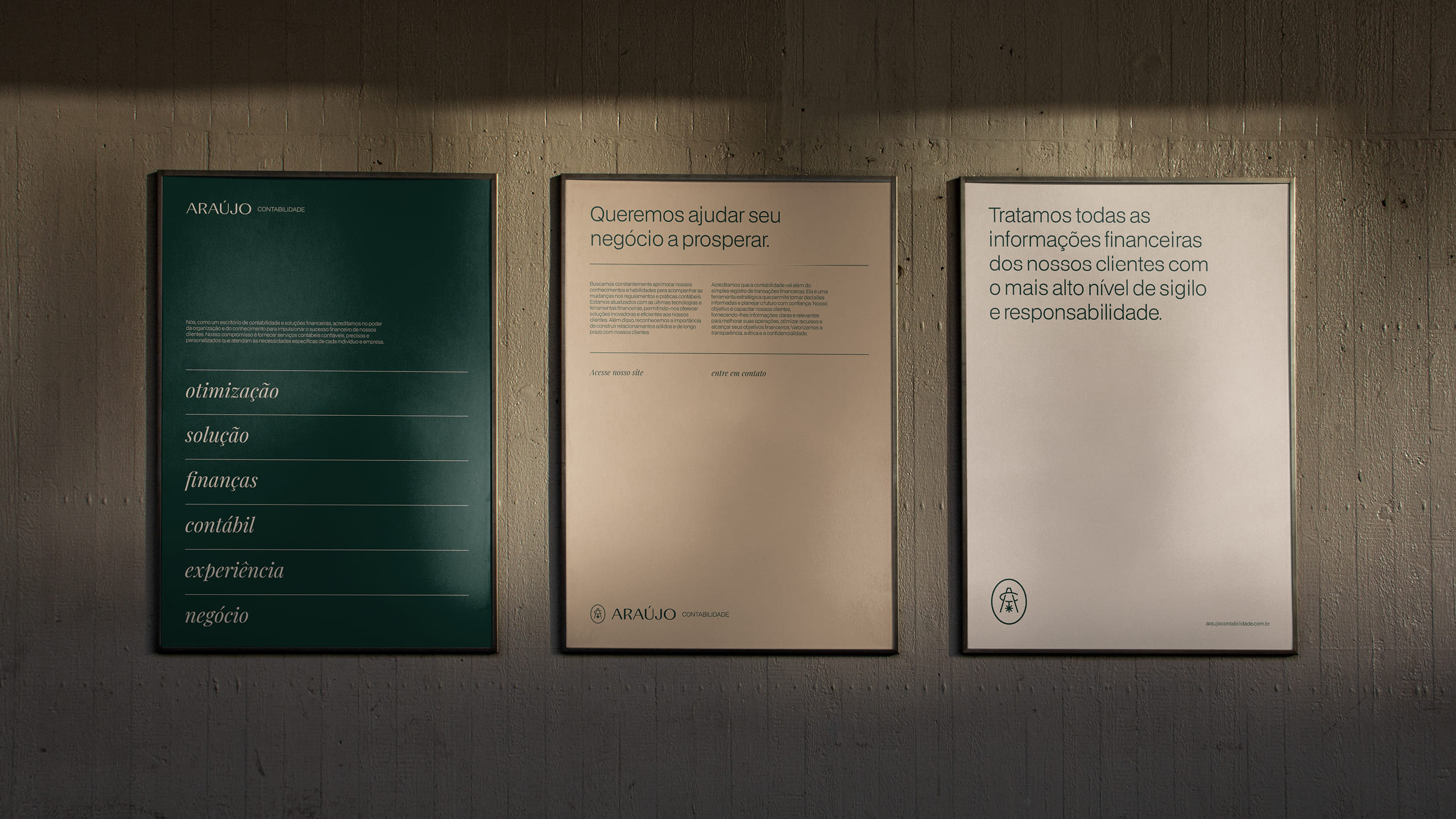
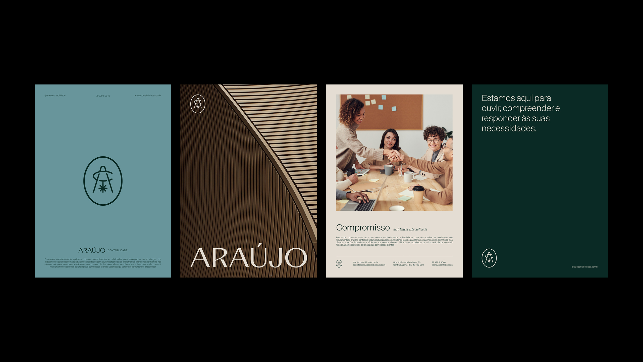
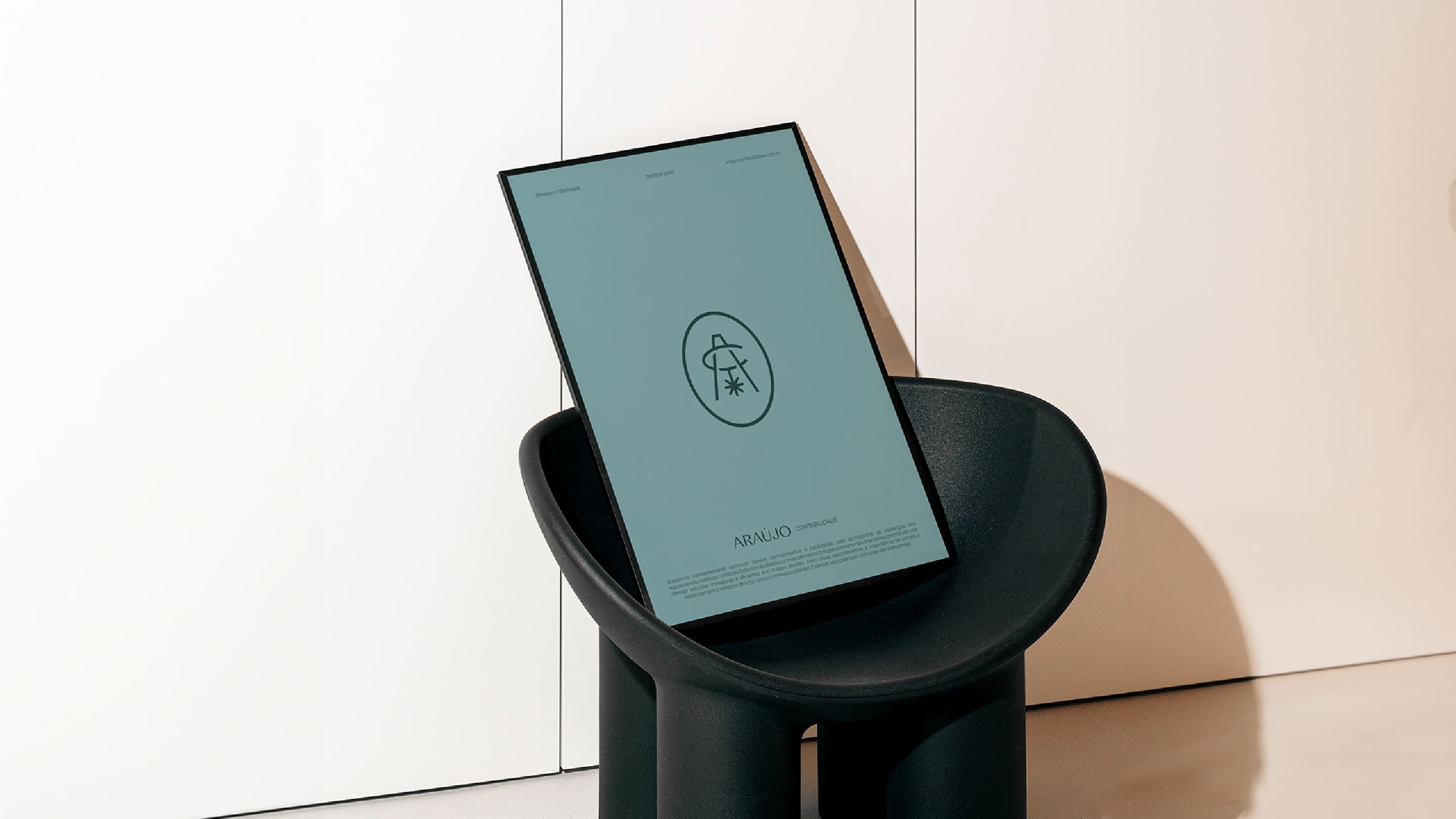
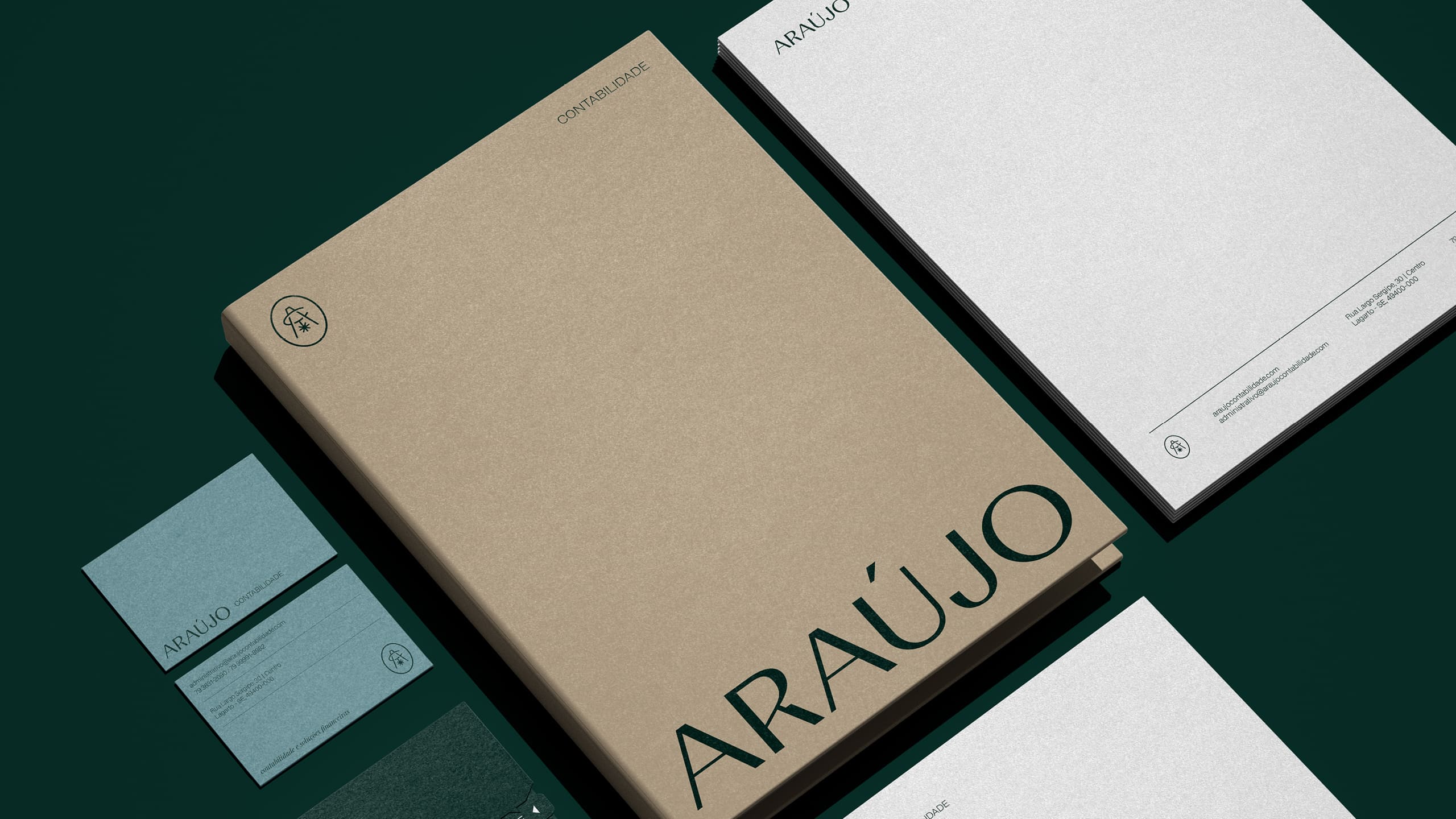
The conceptual visual identity strategy for the elegant and classic accounting office seeks to convey a sense of formality, confidence and sophistication. The visual identity was designed with a classic and elegant aesthetic, reflecting the nature of the business and the importance of conveying trust to customers. The main objective of the conceptual strategy is to convey to clients an immediate feeling of confidence and professionalism when they encounter the accounting firm’s visual identity.
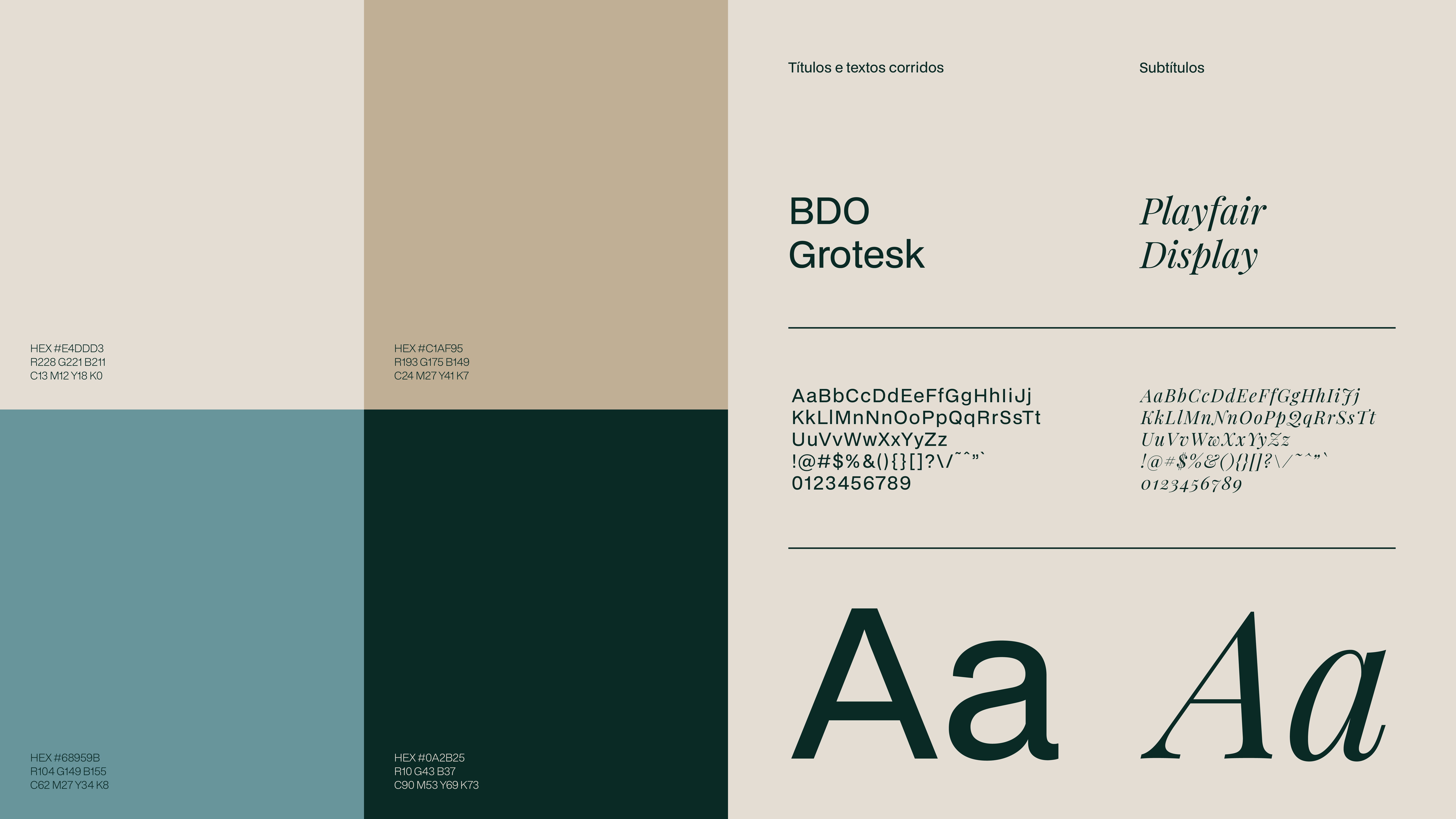
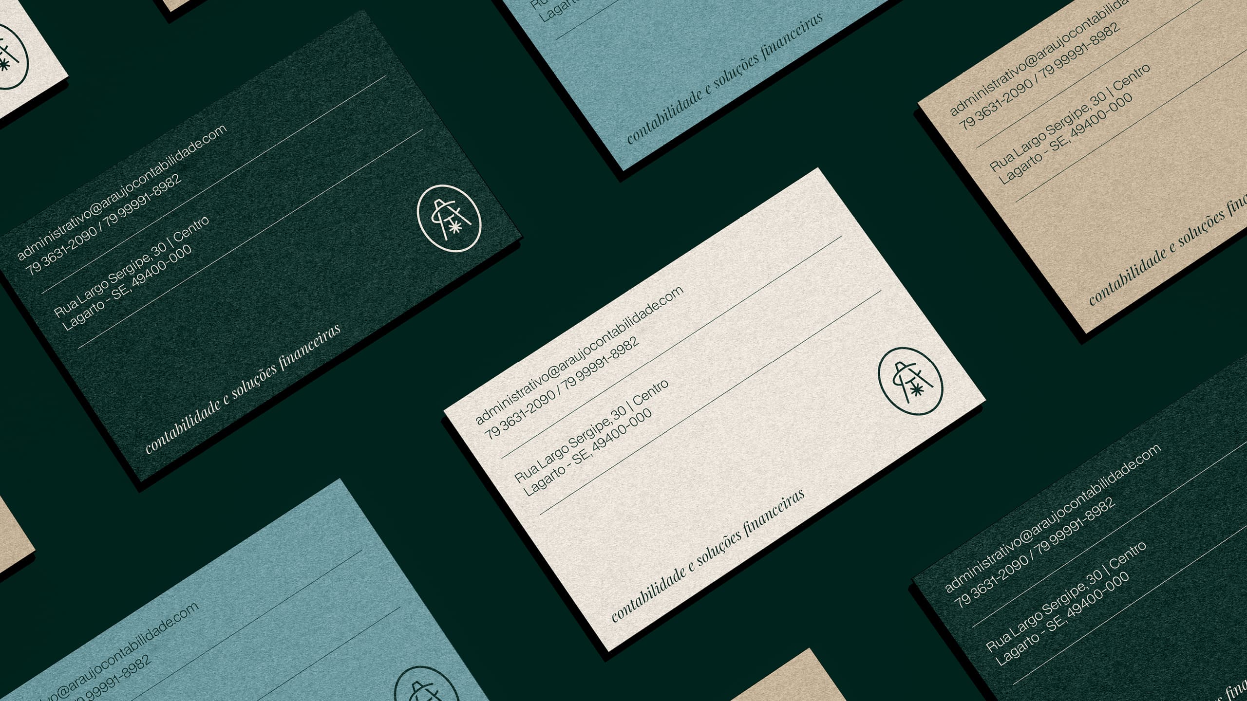
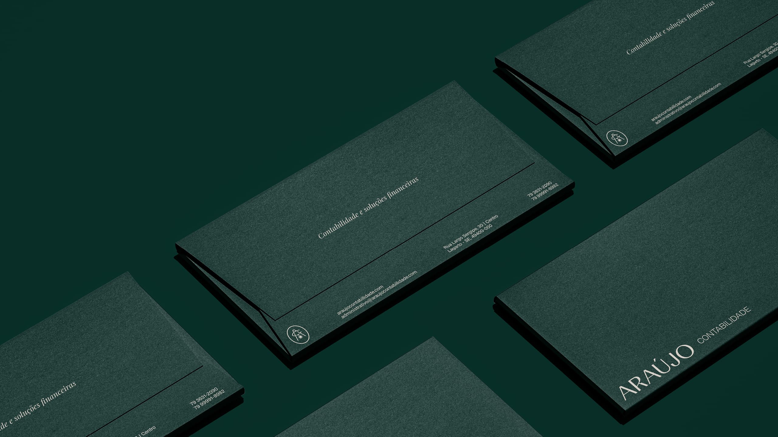
The classic and elegant aesthetic, combined with sober colors and harmony with the surrounding architecture, seeks to establish an emotional connection and instill a feeling of security and credibility. The typography chosen for the accounting firm’s visual identity has a modern aesthetic with a classic touch, especially for small texts. We chose to use a serif and italic typography, in order to convey elegance, refinement and sophistication. This combination of serif and italics creates a balanced aesthetic, where classic meets with the modern. The serif brings a sense of tradition and authority, while the italics add a touch of movement and fluidity, conveying an image of professionalism and currentity.
The colors chosen for the accounting office’s visual identity were carefully selected to convey a feeling of formality, confidence and harmony with the architecture of the environment, which features woody materials. To reflect this proposal, we opted for sober colors that evoke a professional and sophisticated environment. These colors are widely used in corporate and professional contexts, being associated with a high level of professionalism.
The classic aesthetic, the typography with and without serif and italics, the sober colors and the harmony with the office architecture are key elements that work together to create a consistent visual identity, establishing an immediate connection with the target audience and reinforcing the The firm’s reputation as a reference in high-quality accounting services.

CREDIT
- Agency/Creative: Estúdio Xico Liborio
- Article Title: Estúdio Xico Liborio Creates Brand identity for Araújo Contabilidade Accounting, Consultancy and Auditing Services
- Organisation/Entity: Agency
- Project Type: Identity
- Project Status: Published
- Agency/Creative Country: Brazil
- Agency/Creative City: Aracaju
- Market Region: South America
- Project Deliverables: Art Direction, Brand Creation, Brand Design, Brand Guidelines, Brand Identity, Brand Redesign, Brand Strategy, Branding, Design, Graphic Design, Typography
- Industry: Financial
- Keywords: branding, brand identity, brand design, brand, logo design, logo, naming, brand strategy.
-
Credits:
Brand Designer: Xico Liborio


