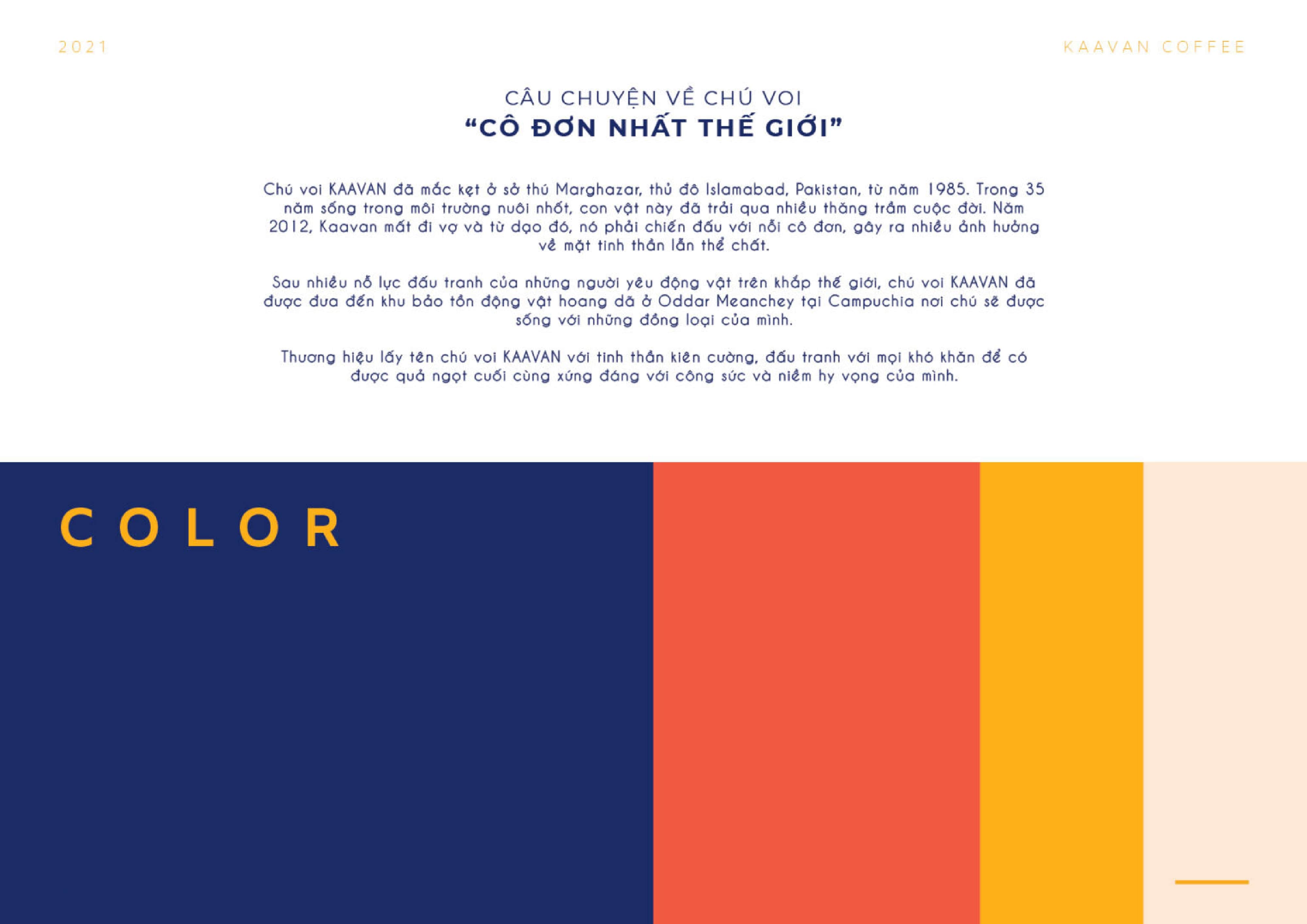
Kaavan Coffee draws inspiration from the loneliest elephant in the world, named Kaavan, who was trapped in a zoo for 35 years, experiencing solitude and torment. After relentless efforts, Kaavan was relocated to a wildlife sanctuary, where he now shares his life with his companions.
About the Logo
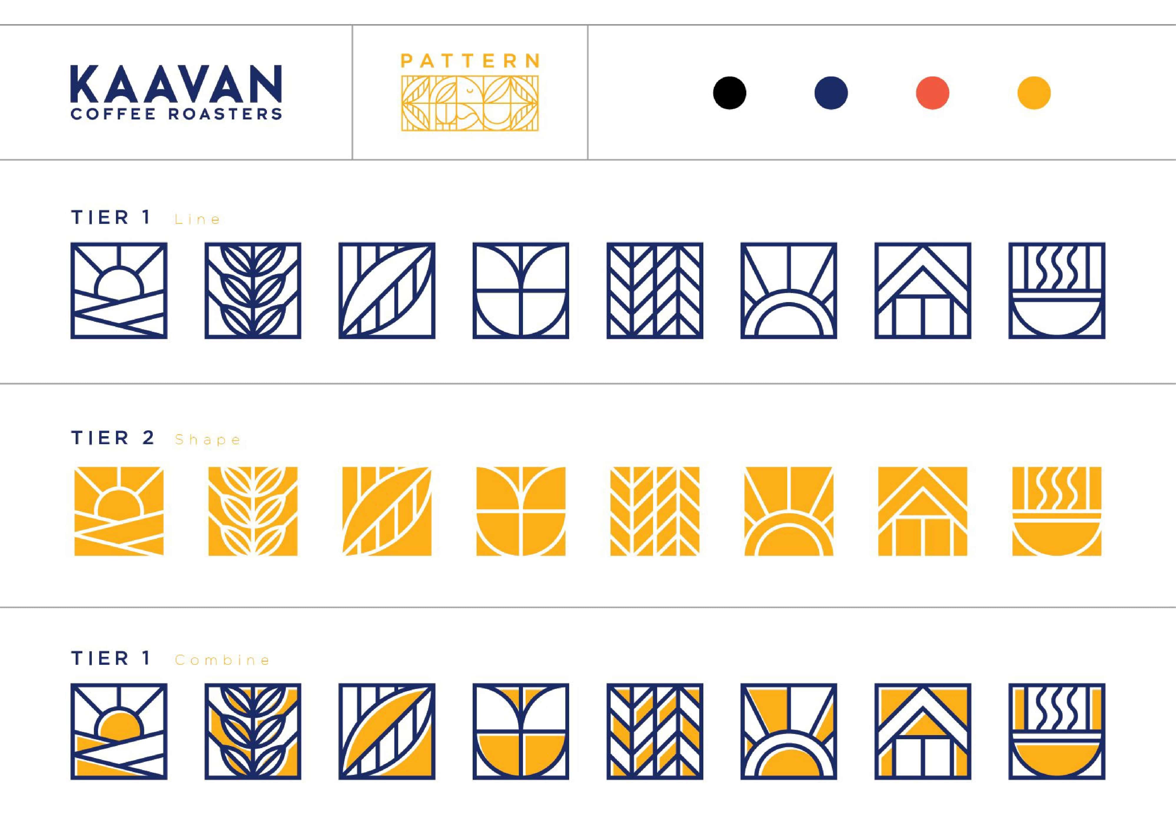
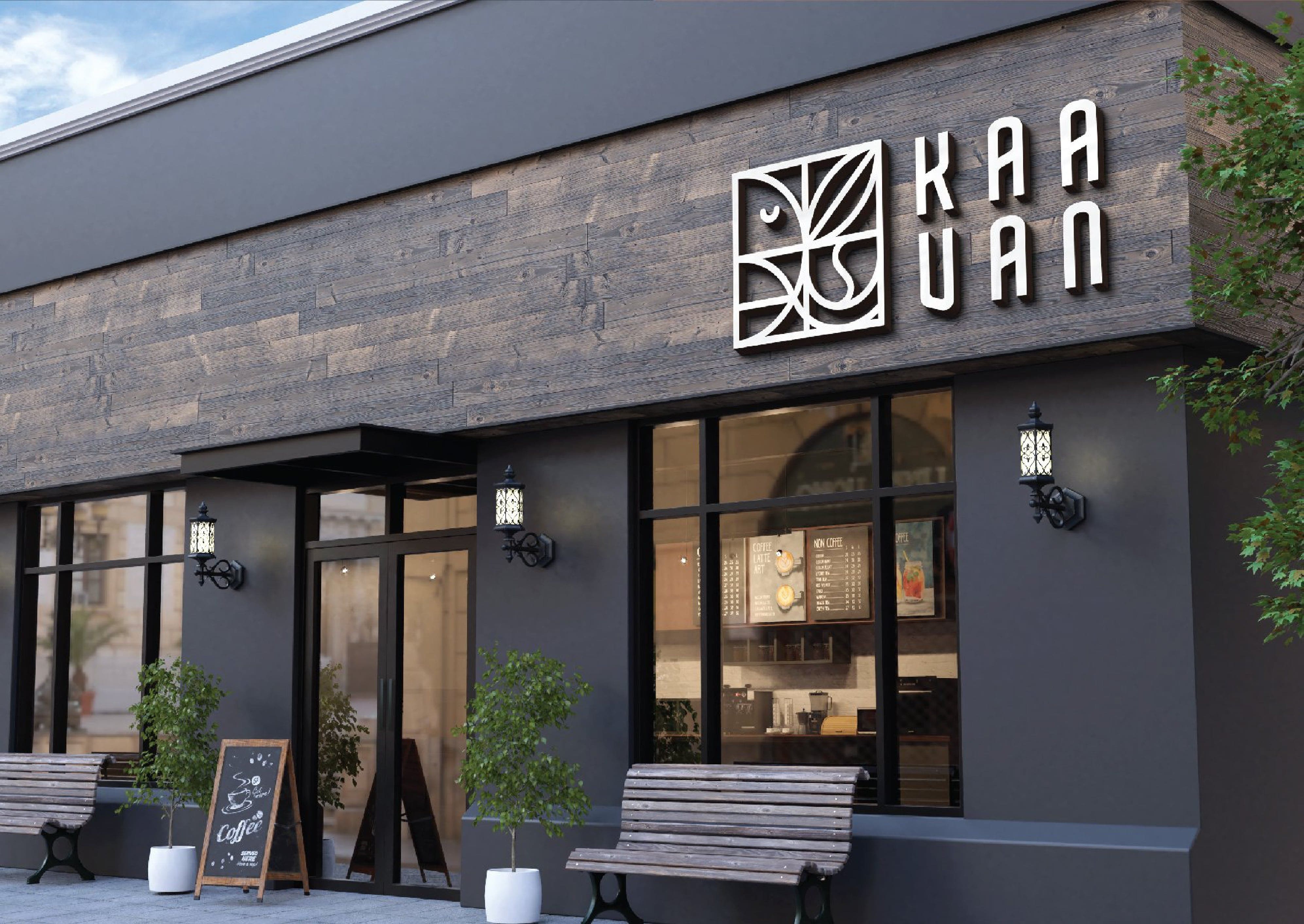
The logo adopts a geometric style—a form of visual art, featuring simple geometric shapes. With this style, the Kaavan logo stands out with a blend of soft lines and a tight, unified layout, creating a unique and artistic feel.
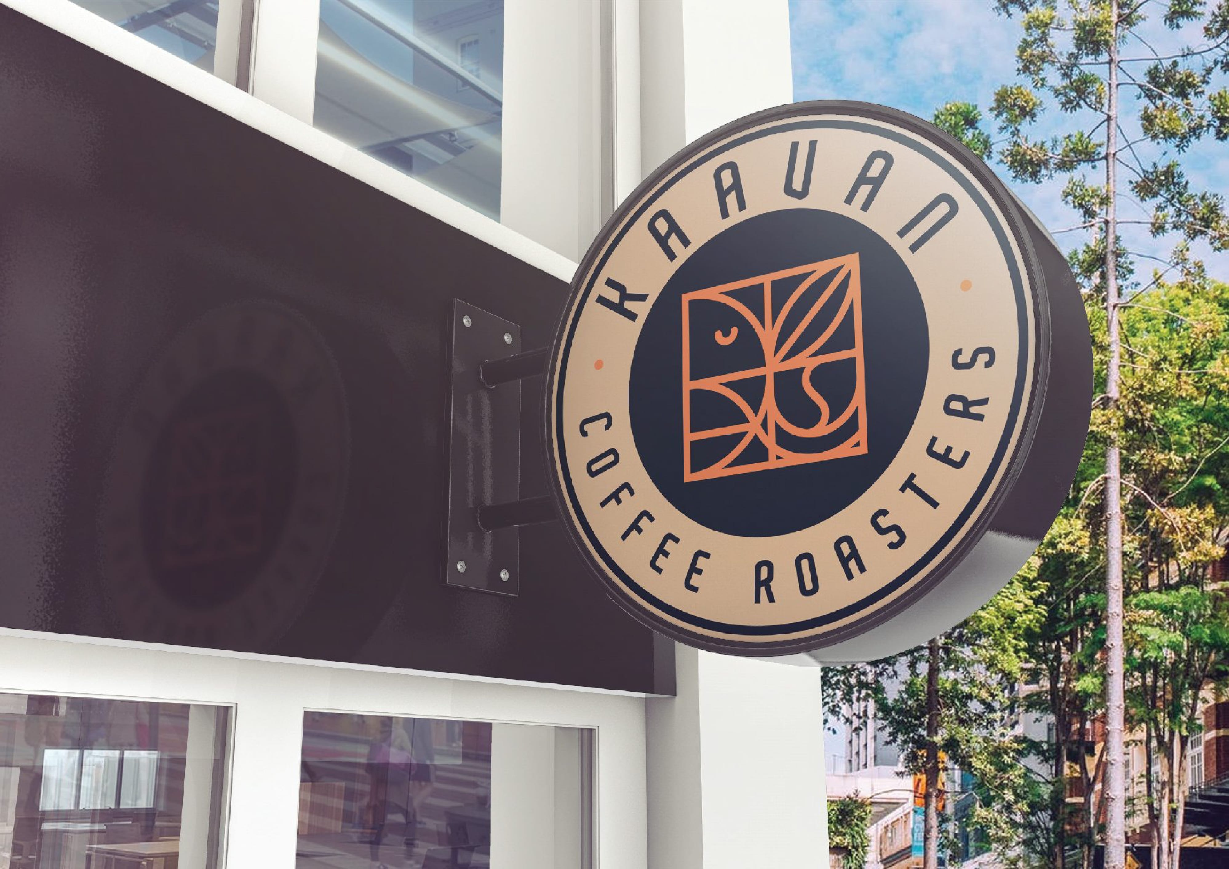
The square shape exudes a sense of robustness and resilience, akin to the enjoyment of a bold cup of coffee. Inside, the imagery combines four elements: the elephant (Kaavan), the leaf (peace, hope), the coffee cup (brand product), and coffee beans (related to the industry). All are tightly intertwined, enhancing the rich and robust beauty the brand seeks to convey.
About the Key Visual
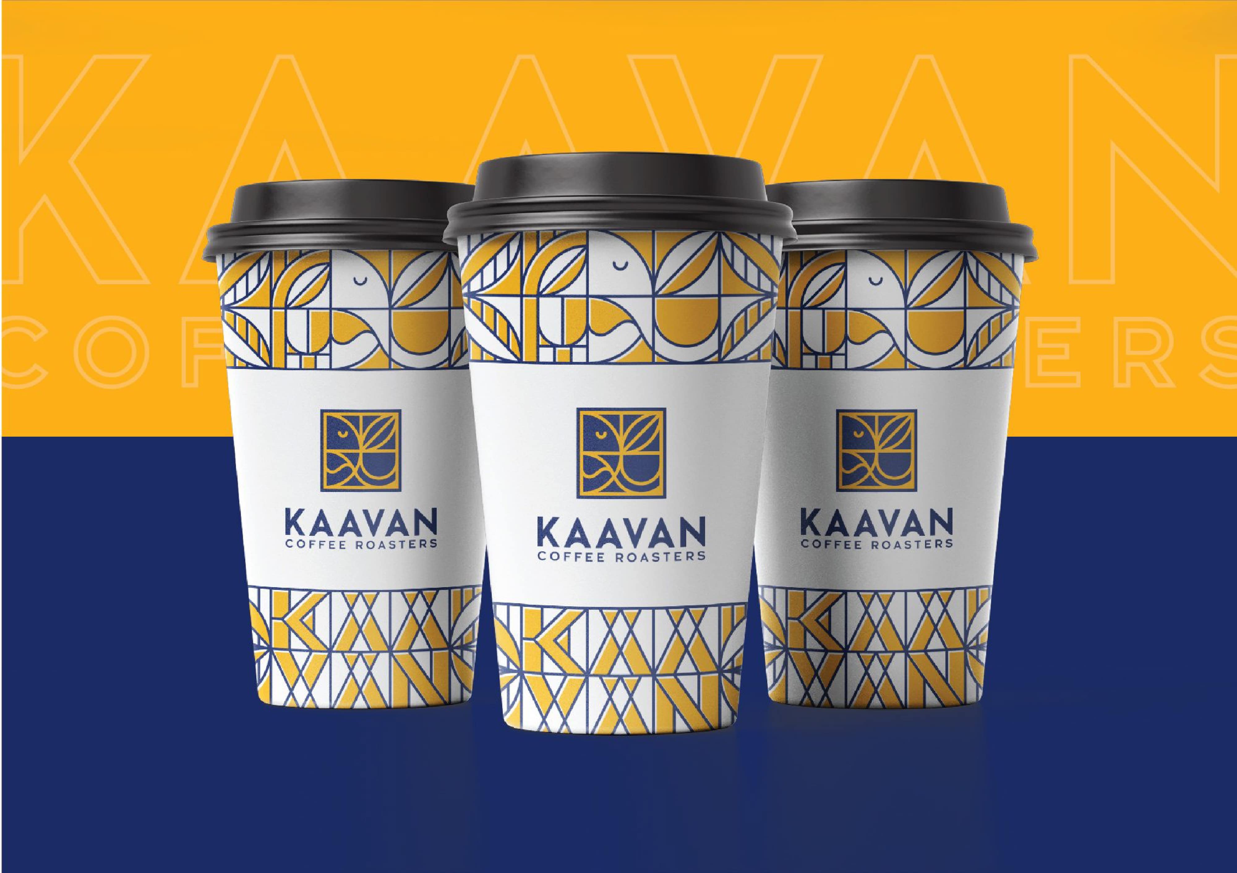
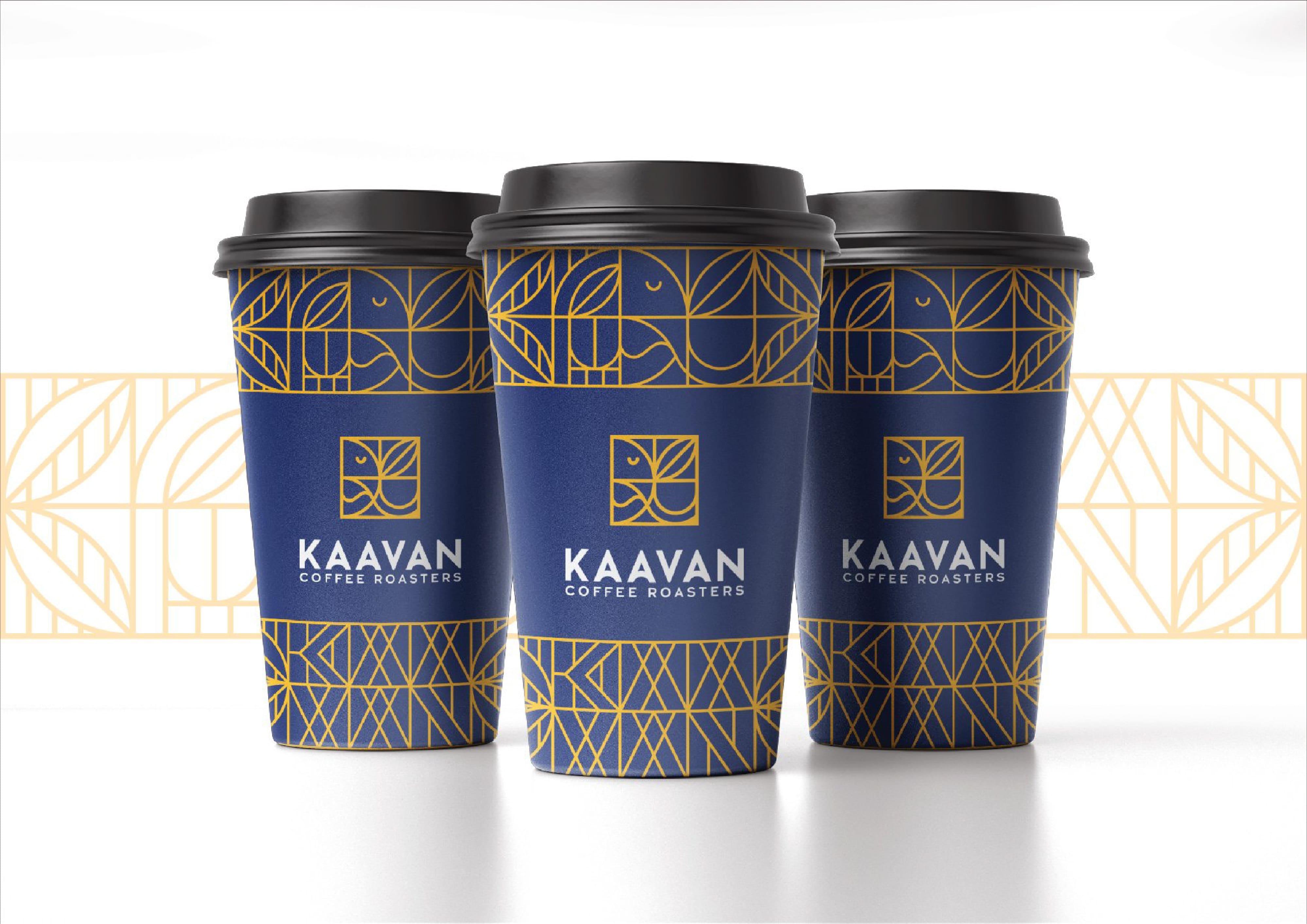
Abstract patterns on a deep navy background exude sophistication in a subtle, well-highlighted manner. Similar to coffee enthusiasts savoring this exquisite drink, slowly sipping its flavor, gently perceiving its strength, a sense of passion awakens in each sensation.
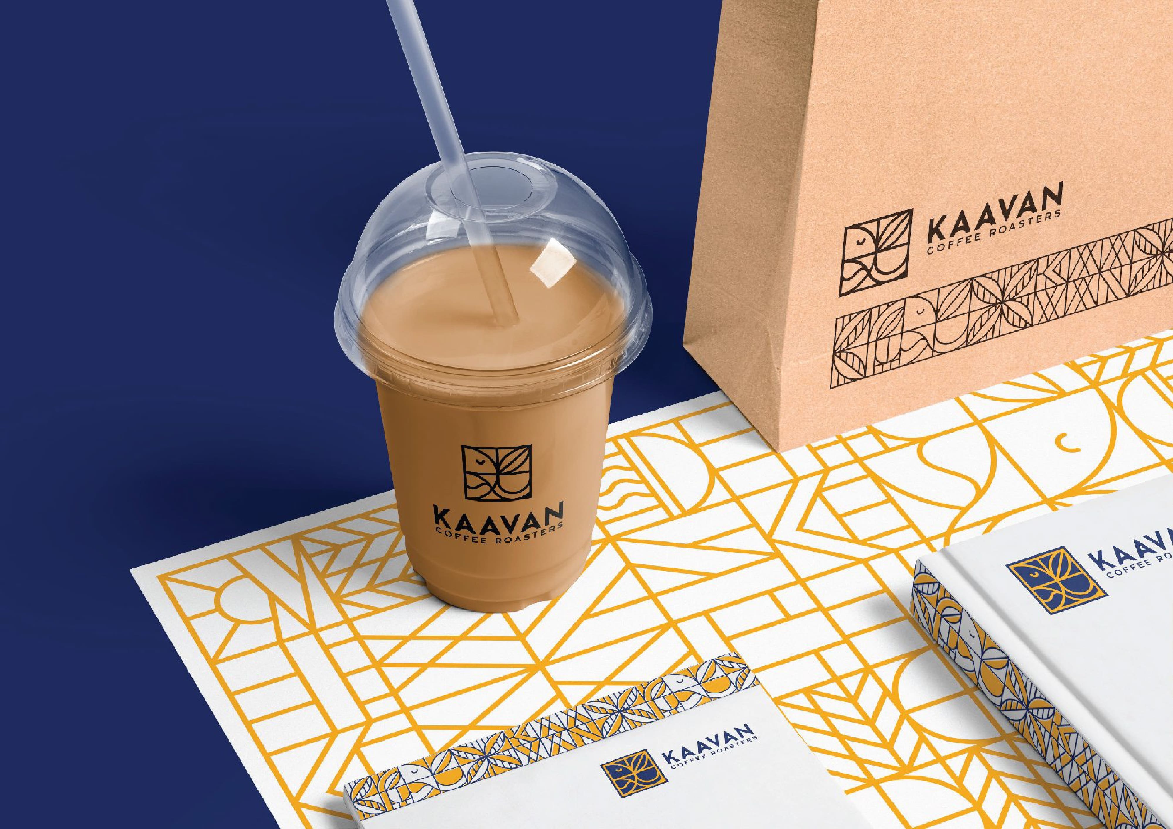
The combination of yellow and green increases the contrast, implying that in adversity, there is always hope, and in hardship, there is always a dawn. Additionally, the system of small squares with captivating patterns not only attracts attention but also adds to the resilient beauty of the brand.
CREDIT
- Agency/Creative: Brandall Agency
- Article Title: Kaavan Coffee’s Logo and Visual Design Story Created by Brandall Agency
- Organisation/Entity: Agency
- Project Type: Identity
- Project Status: Published
- Agency/Creative Country: Vietnam
- Agency/Creative City: Hồ Chí Minh City
- Market Region: Asia
- Project Deliverables: Brand Identity
- Industry: Food/Beverage
- Keywords: Brandall, Kaavan Coffee, Brand Identity, Logo, Logo design, 2D design
-
Credits:
Desgin Firm: Brandall Agency


