Panther Ultra stands as a groundbreaking energy elixir meticulously formulated to transcend the ordinary and invigorate the spirit. Venturing into unexplored realms, we embarked on the journey to create a brand deeply entrenched in a distinctive domain. The challenges encountered were two-fold: navigating the constraints posed by packaging format and design while navigating a competitive landscape and a target audience hailing from industries unfamiliar to us. The culmination of this arduous development journey manifests in a design that radiates dynamism and modernity, encapsulating the very essence of Wild Energy Boost drinks.
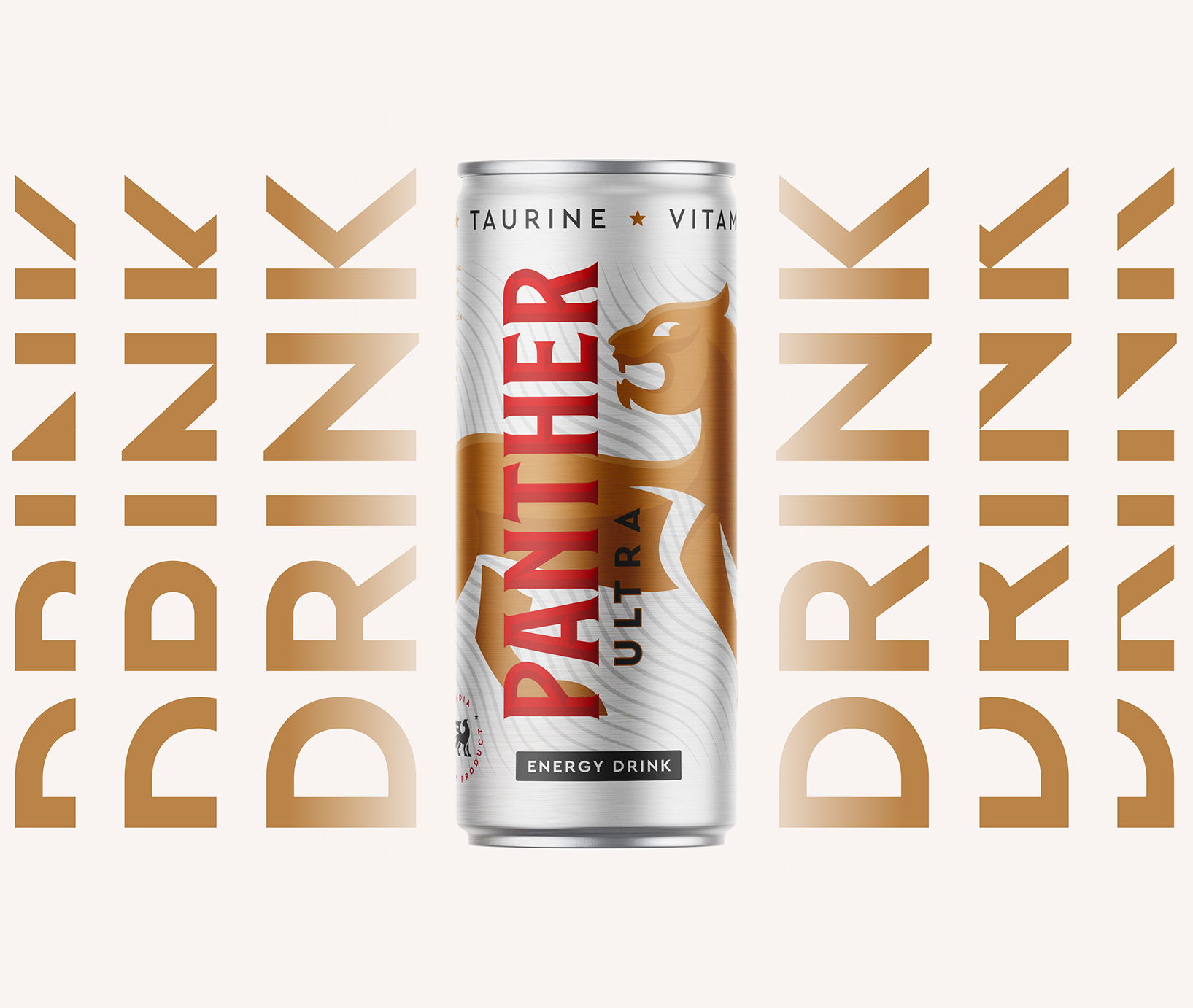
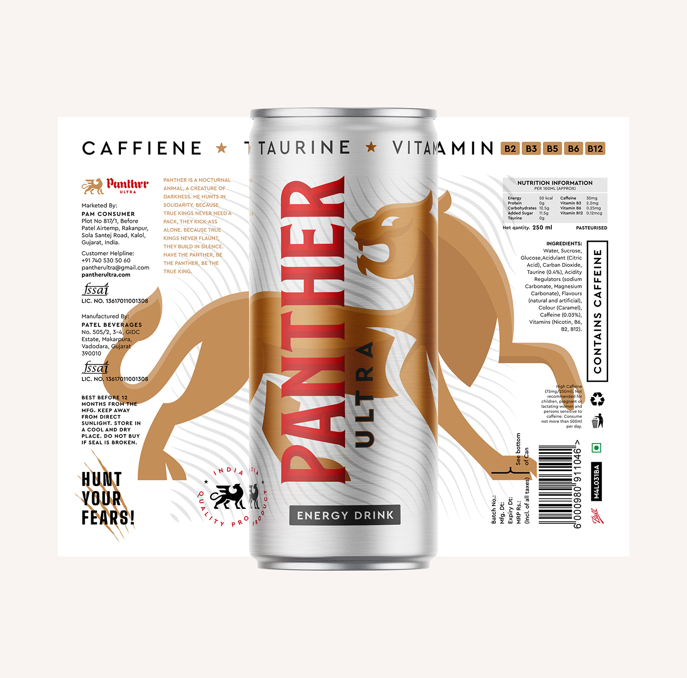
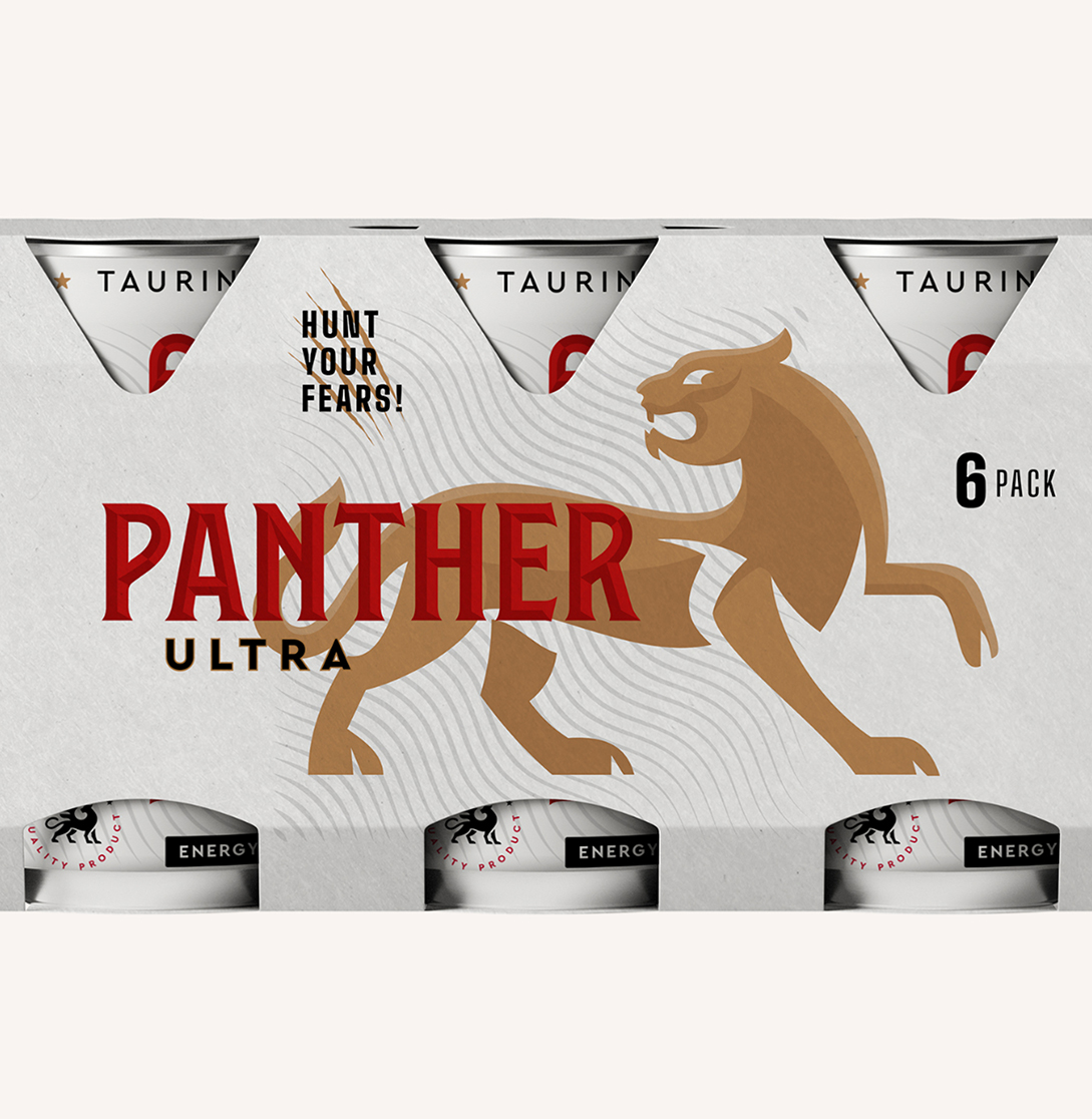
At the heart of our endeavours lay the paramount objective of forging the visual identity of Panther Ultra. A pivotal component emerged—the “eye-stopper.” A commanding illustration of a panther, meticulously embracing the contours of the container, stands as the preeminent product identifier, effortlessly commanding attention on retail shelves. The decision to employ an illustrative typography for the brand name “Panther” not only captivates consumers with its distinctive form but also successfully demarcates the beverage from its competitors. This intentional choice serves as a visual testament to our commitment to uniqueness and innovation in a saturated market.
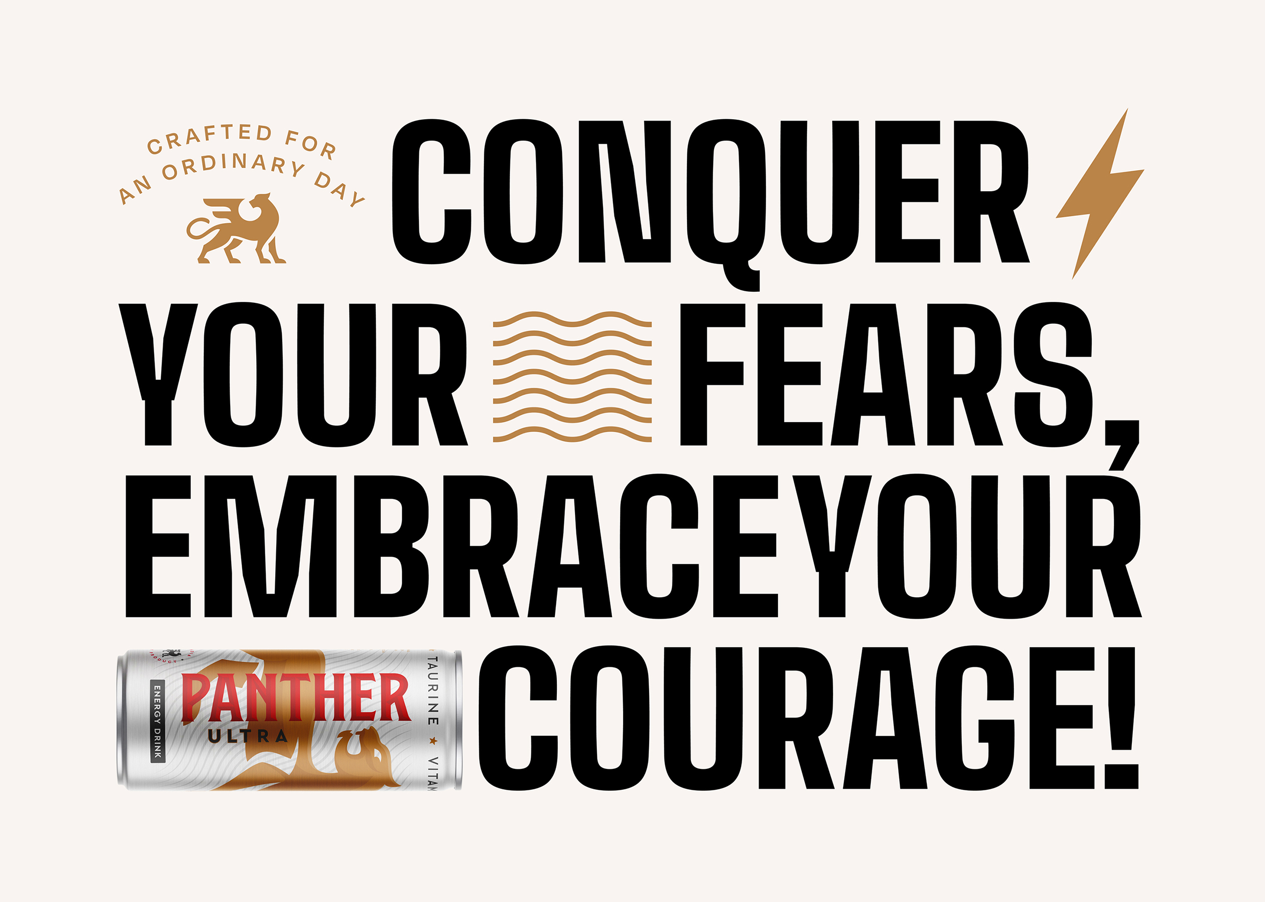
In our pursuit of visual distinctiveness, complementary graphic elements were artfully introduced into the background, amplifying the drink’s inherent dynamism within the confines of the sleek can. These elements not only contribute to the overall aesthetic appeal but also serve as a visual narrative, narrating the story of Panther Ultra as a symbol of untamed energy and unstoppable vitality. The interplay of vibrant colors and dynamic patterns further heightens the sense of excitement associated with the consumption of Panther Ultra, creating an immersive experience for consumers.
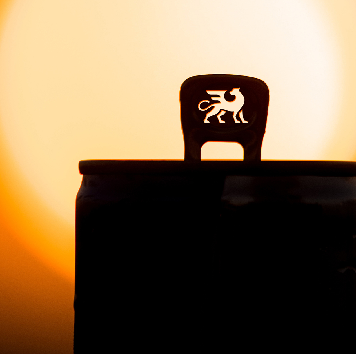
The meticulous attention to detail in both design and functionality reflects our dedication to providing a holistic brand experience. Panther Ultra is not merely an energy drink; it is a statement—a convergence of artistry, innovation, and invigorating energy. As the can grace the hands of consumers, it becomes a symbol of untapped potential and an invitation to embrace the extraordinary. In Panther Ultra, we’ve not just crafted an energy drink; we’ve curated an experience, a testament to our commitment to pushing boundaries and redefining the landscape of energy beverages.

CREDIT
- Agency/Creative: Dhaval Modi Design
- Article Title: Dhaval Modi Design Create Panther Ultra Packaging Design
- Organisation/Entity: Freelance
- Project Type: Packaging
- Project Status: Published
- Agency/Creative Country: India
- Agency/Creative City: Ahmedabad
- Market Region: Asia
- Project Deliverables: Logo Design, Packaging Design
- Format: Can
- Industry: Food/Beverage
- Keywords: Energy Drink, Packaging Design, Food and Beverages, Creative Packaging, Panther Ultra, Can packaging
-
Credits:
Brand Designer: Dhaval Modi


