Summary
Our rebrand of Ariels VCNA breathed new life into a 93-year-old netball club that was desperately lacking unity, identity and inspiration. With a new look and feel, better aligned to their passion and professionalism, and a new set of values carefully designed to catapult them to success, the club is now well equipped to rise to iconic status, and well on its way to becoming a ‘destination club’.
The rebrand has been effective in attracting high calibre athletes and played a pivotal role in the ongoing success of the club. The board believe that the rebrand showcases a fresh and innovative approach that sets it apart from other sporting organisations.|
Insight
Founded in 1930, Ariels VCNA is one of the oldest netball clubs in Australia, with teams competing from junior representatives to senior championship levels. As a pathways club to national leagues, the brand was disparate, uninspiring and lacked identity.
Brief
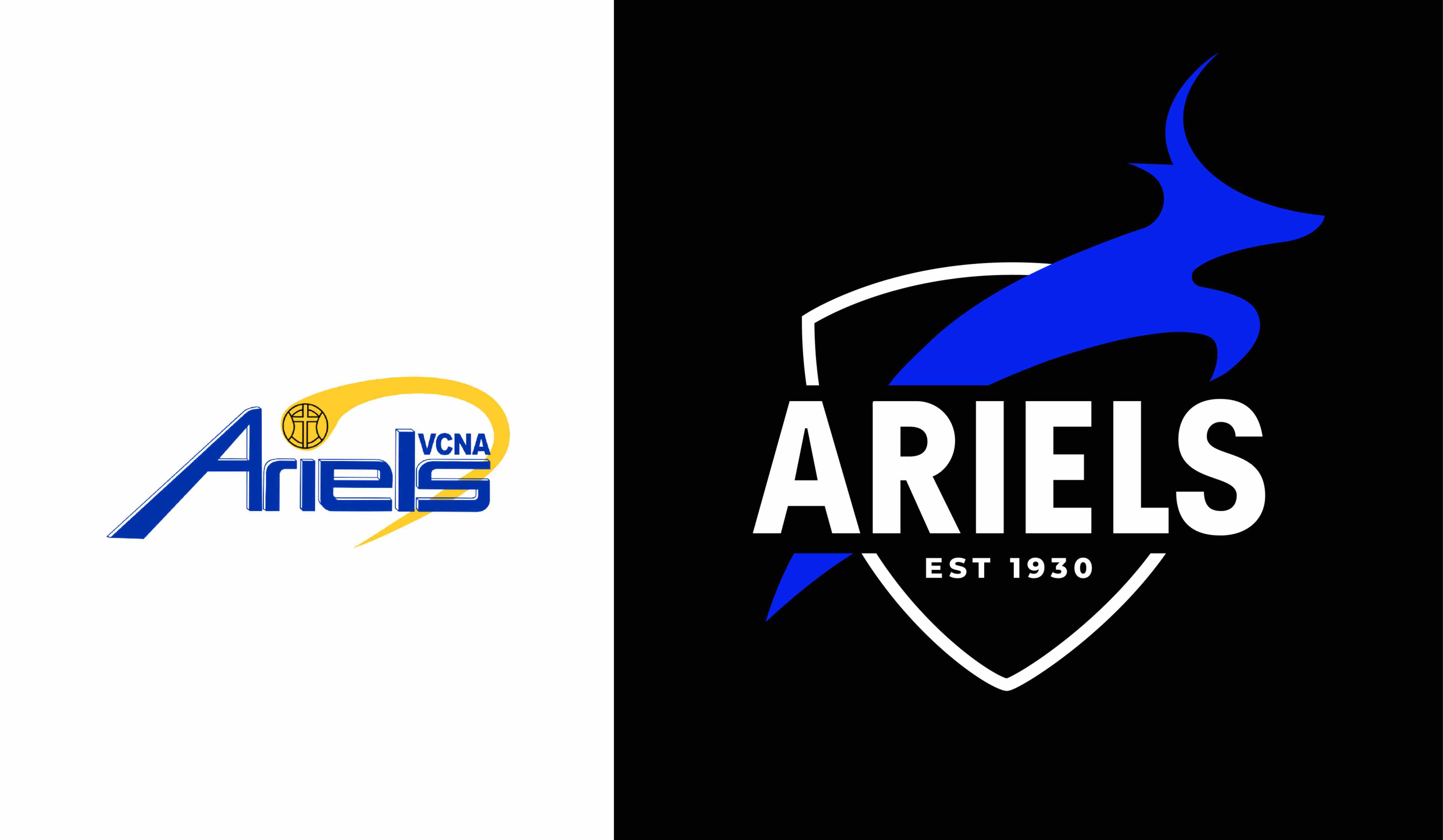
The opportunity was to create a ‘destination club’. A club with a winning culture. A club that athletes aspire to represent. A club that the community are proud to support, and that sponsors see value in. We sought to breathe new life into a 93-year-old Ariels brand with a new iconic visual identity.
Solution
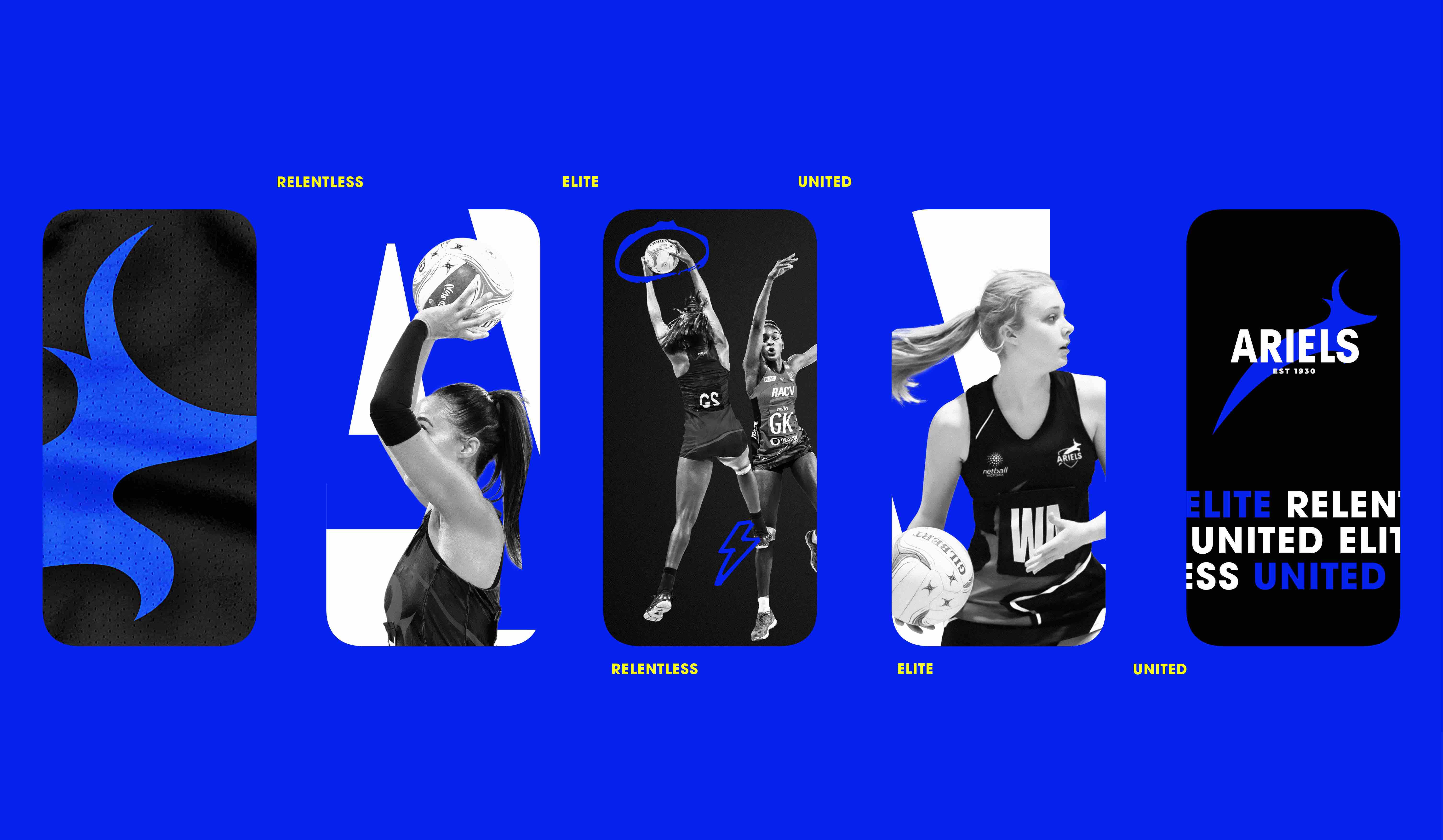
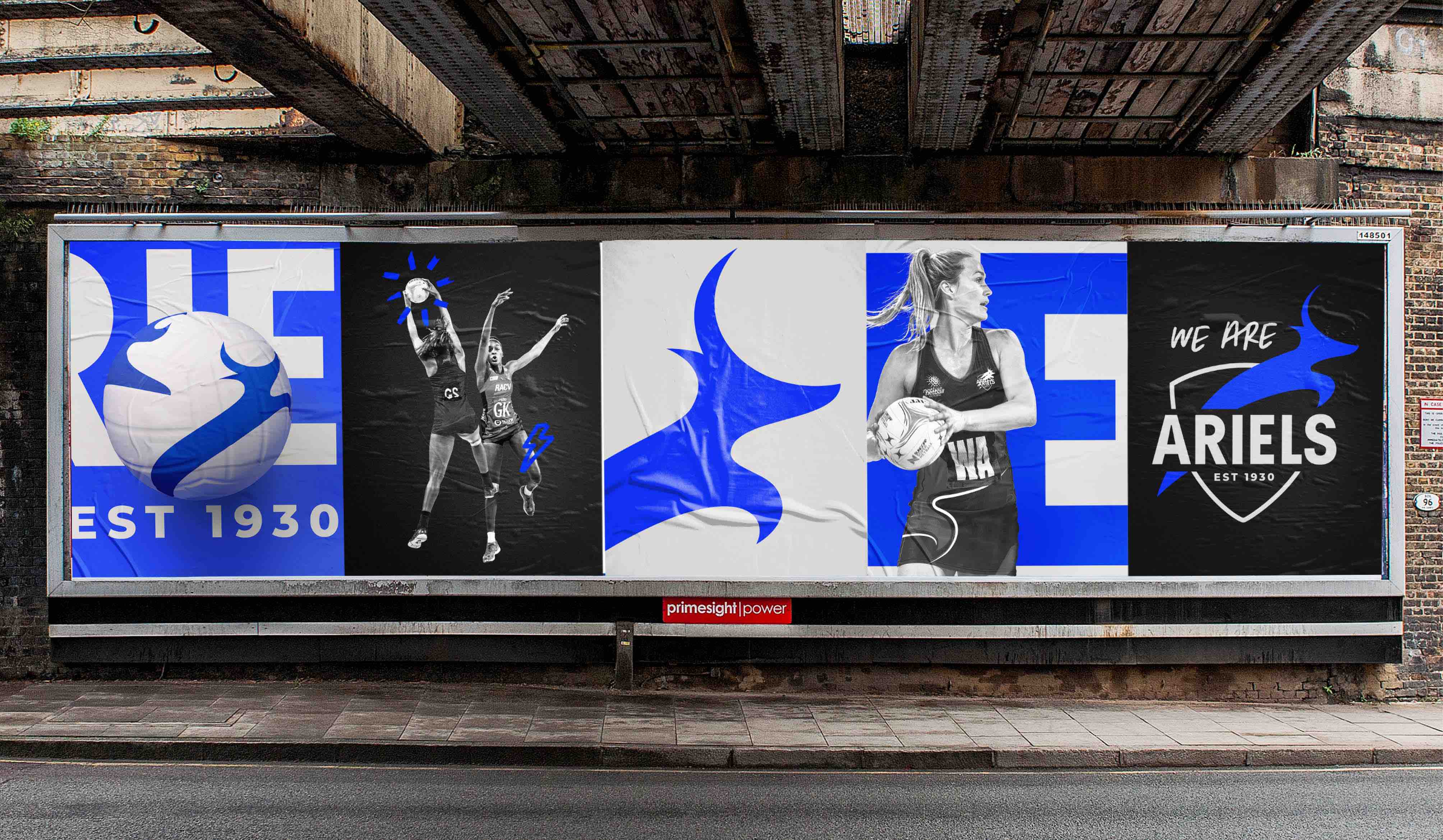
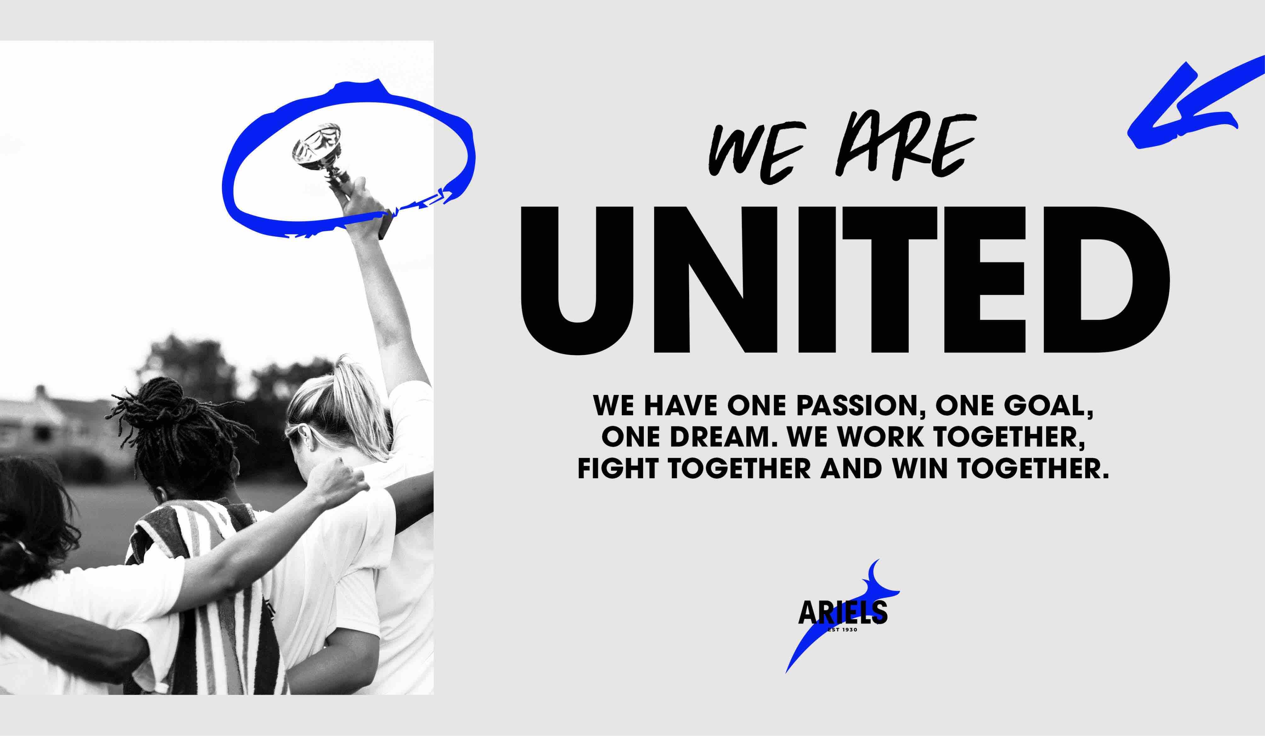
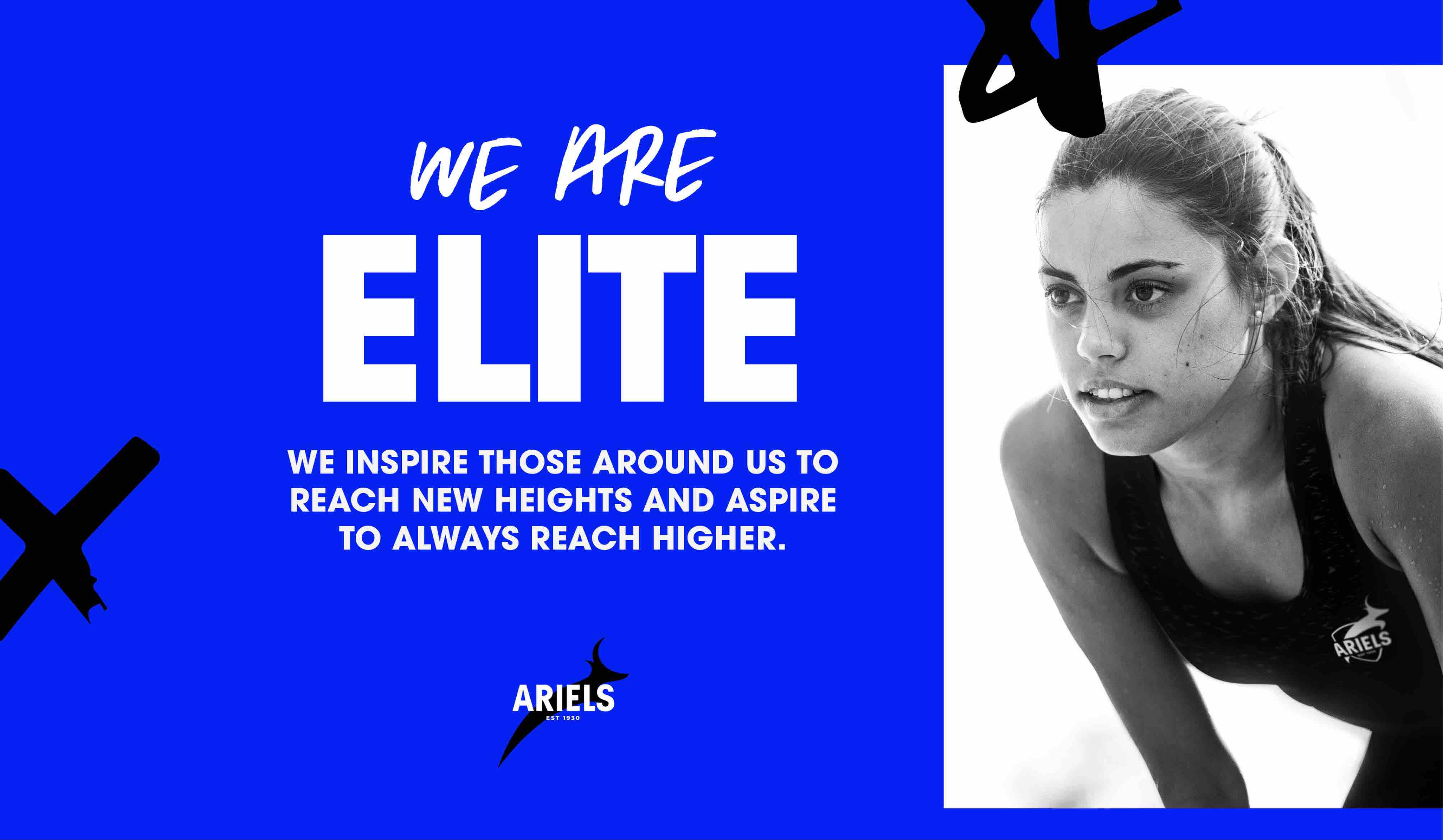
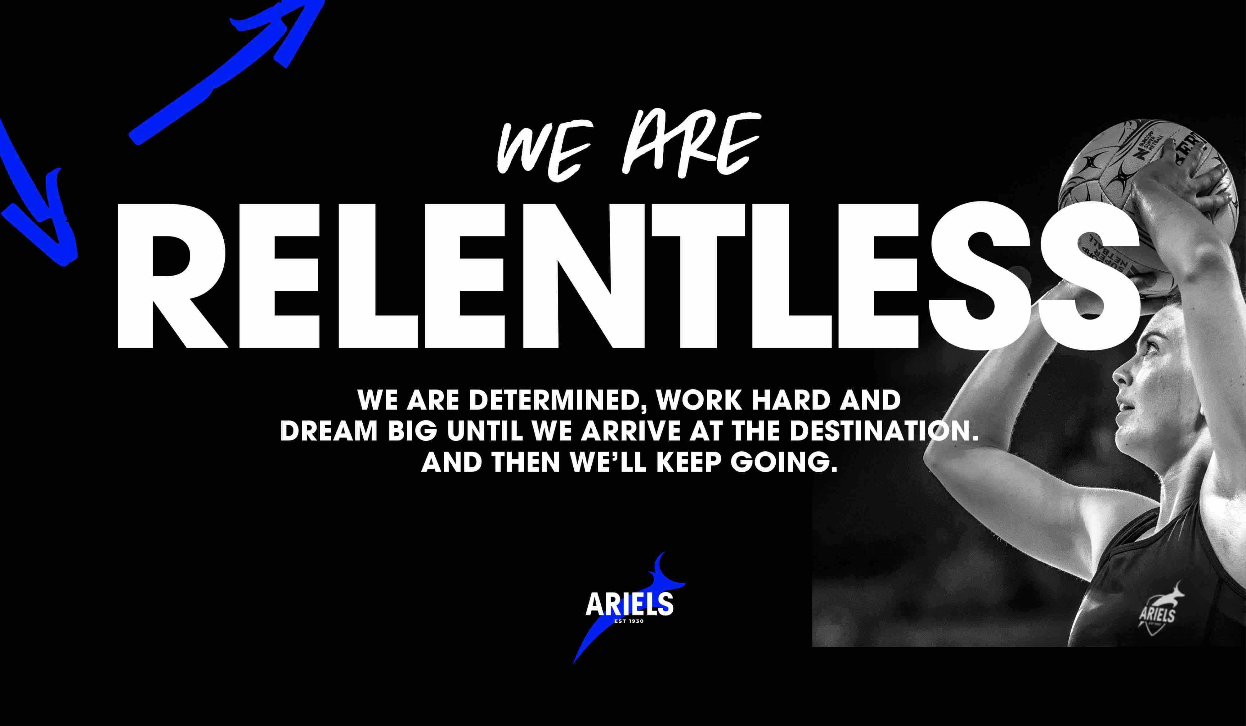
The notion that ‘you can only be what you can see’ inspired us at every decision-making moment. We wanted to craft a brand that captured the pinnacle of professionalism, eliteness and positivity. So that every athlete, coach and club member could visualise success and feel inspired to reach their full potential. Establishing a new set of values was critical to the club’s transformation. With a newly appointed board and coaching roster, we defined our lived values for all levels of the club. Co-collaboration sessions drove a better understanding of who we are and what we stand for to inform the behaviours expected of a destination club. The new values also represented a chance for us to create a tone for the brand that was full of passion and personality. We chose values that were relatable enough for junior players to connect with, but also bold enough to inspire those playing at the pinnacle of championship netball. We used impactful language and liberally overlaid illustrations to enhance the sense of movement and authenticity.
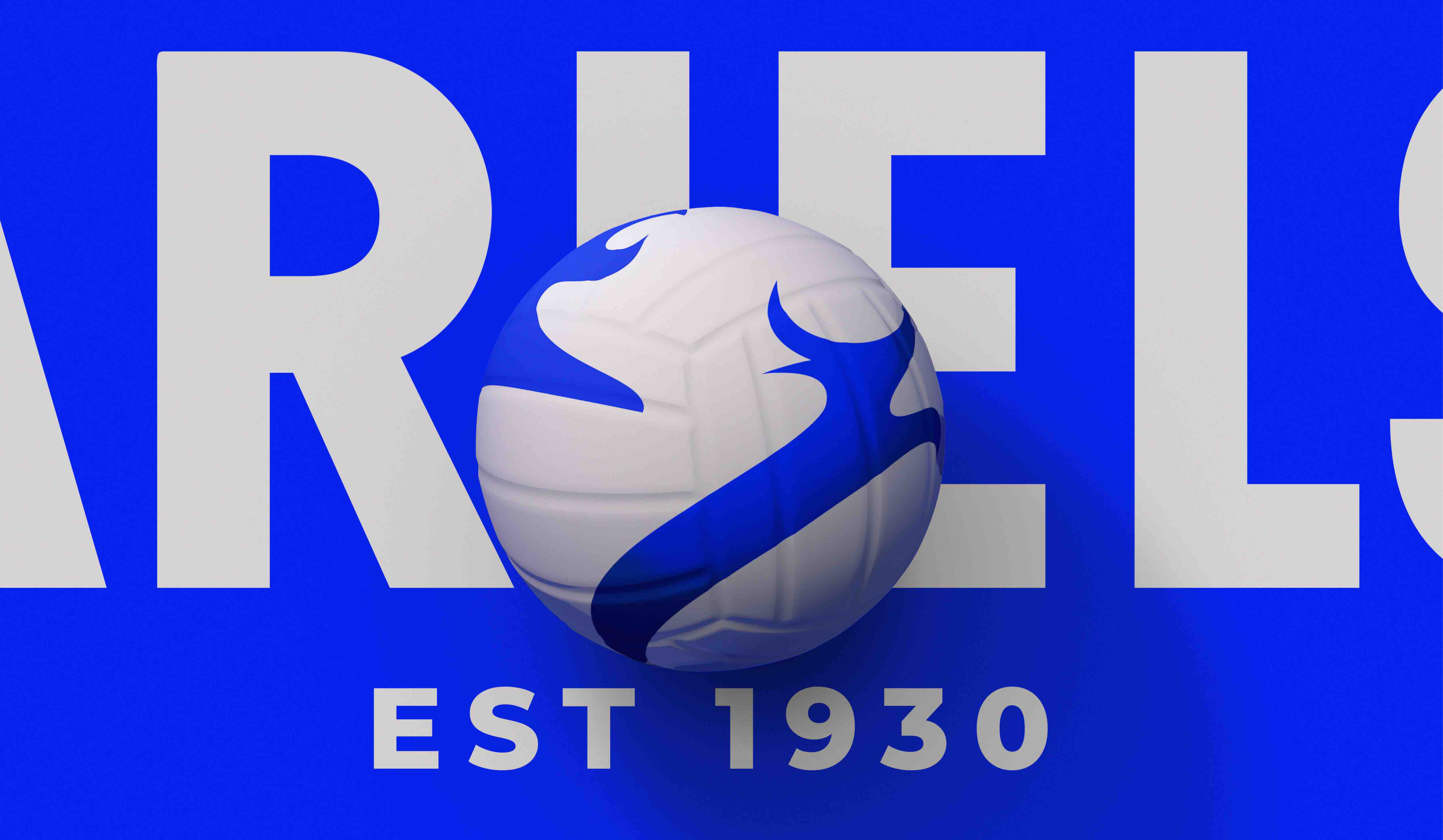
We doubled down on black for its ferocious, confident energy. And refined our blue to inject an electric sense of vitality. Together, these two colours form a bold, modern palette for Ariels, with a clear potential for iconic status.
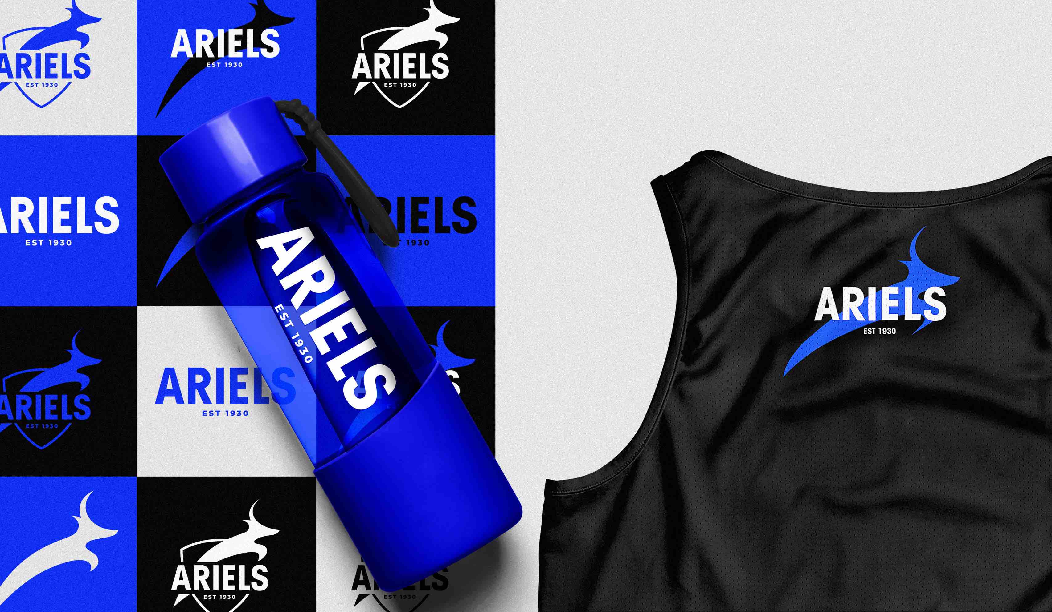
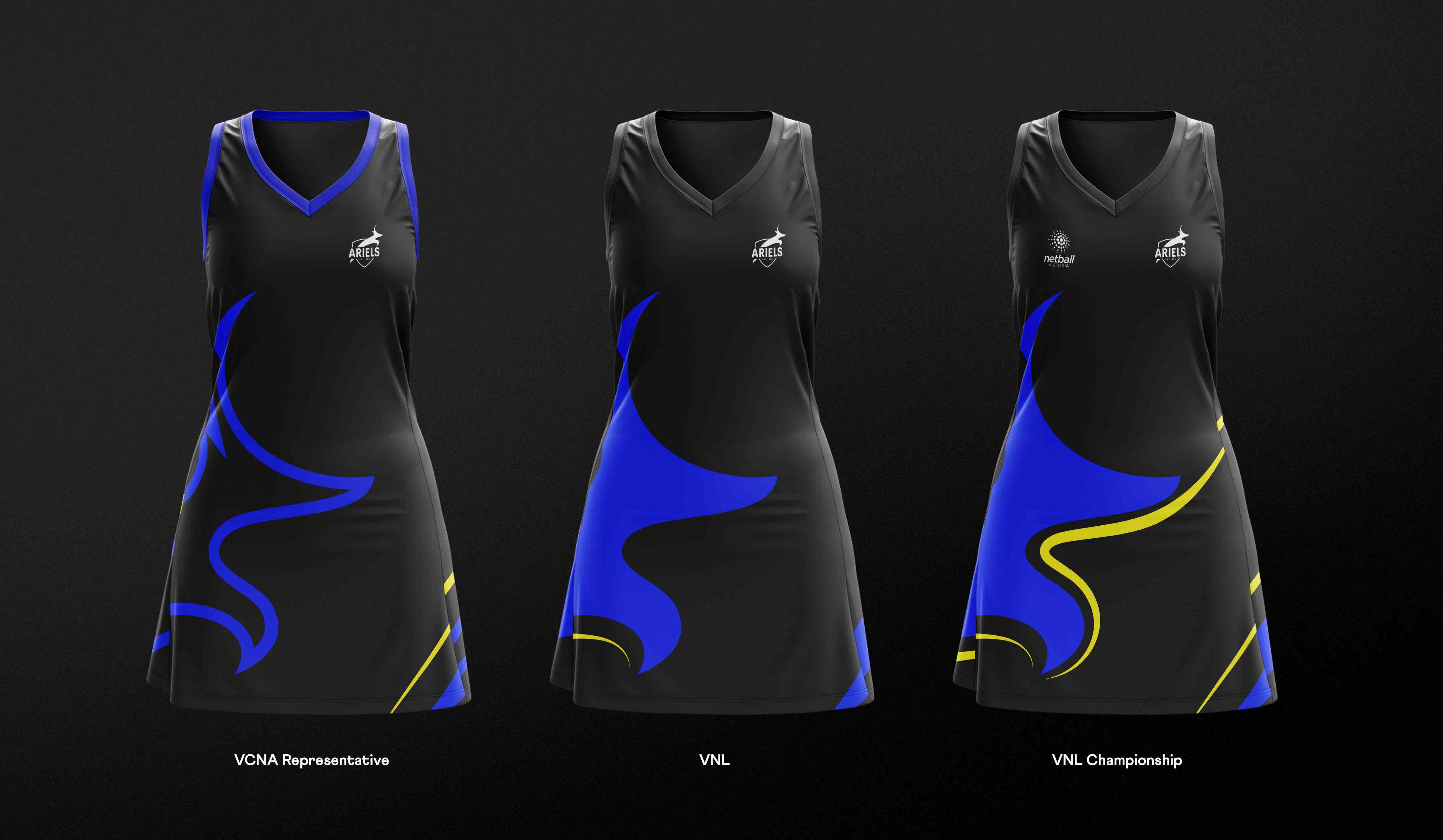
The uniform redesign was about more than giving our athletes a fresh look. It introduced our new colours to the netball world and was a way for the club to strategically create cohesion across all divisions. We carefully designed a new range of uniforms that were connected enough to unify the club but different enough to symbolise the athlete’s journey from representative to championship level.
To ensure every experience of the Ariels club felt elite and brand-proud, we designed a suite of merchandise for players and fans to enjoy.
Bringing the brand to life across digital was the perfect opportunity to showcase the undeniable strength of the brand. Full of motion and energy, and clearly focused on the athletes behind the brand, the content captures the essence of the brand and communicates its new values. With no touchpoint left untouched, the Ariels brand is now one the club can wear proudly. Full of gravitas, it successfully carries the legacy of the club, the eliteness of the teams and the passion of every athlete. It exudes the strength, energy and aspiration of a destination club. Of course, becoming a destination club doesn’t happen overnight. It takes more than just a winning rebrand. But now that the Ariels can see it, they have the power to be it.
CREDIT
- Agency/Creative: the thrills™
- Article Title: Ariels: A Fresh New Brand for Australia’s Oldest Netball Club
- Organisation/Entity: Agency
- Project Type: Identity
- Project Status: Published
- Agency/Creative Country: Australia
- Agency/Creative City: Richmond
- Market Region: Oceania
- Project Deliverables: Brand Identity
- Industry: Entertainment
- Keywords: WBDS Agency Design Awards 2023/24
- Keywords: Identity, Brand Redesign
-
Credits:
Design Agency: the thrills™


