Overview
Cocoa Parlor’s recent rebranding and package design project is a revolutionary step in resonating with a modern, younger consumer base that actively seeks organic sweets. This project encapsulates a radical transformation of brand identity, emphasizing whimsy and uniqueness, setting it apart from conventional offerings on the market.
Brand Identity
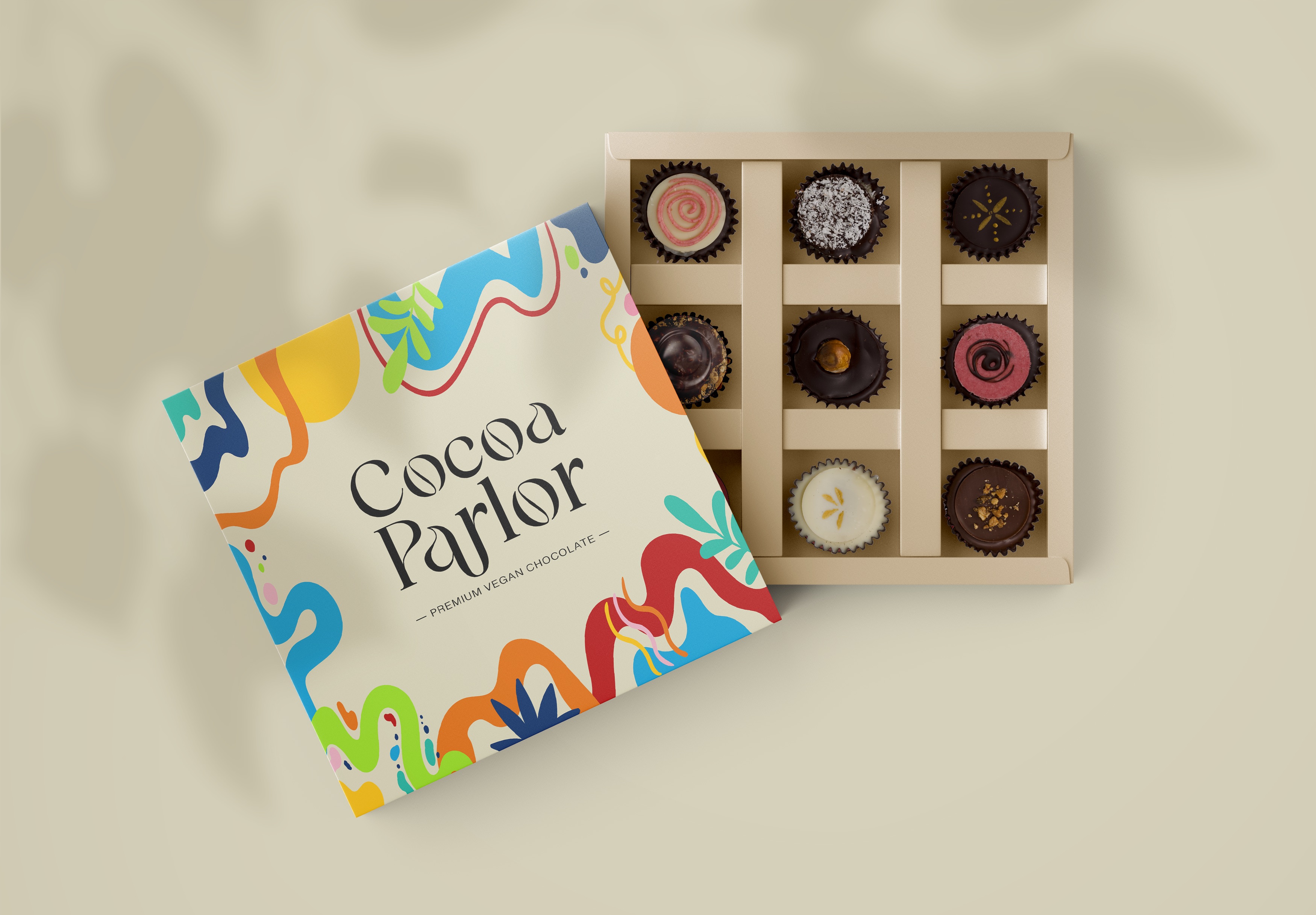
The reimagined brand identity of Cocoa Parlor is rooted in its whimsical character, a deliberate strategy to appeal to the youthful, health-conscious demographic. This approach is a departure from traditional designs, ensuring that Cocoa Parlor stands out on shelves with its distinctive style. The core of this identity is to evoke a sense of playfulness and joy, aligning with the preferences of our target consumers who value both quality and fun in their food choices.
Packaging Design
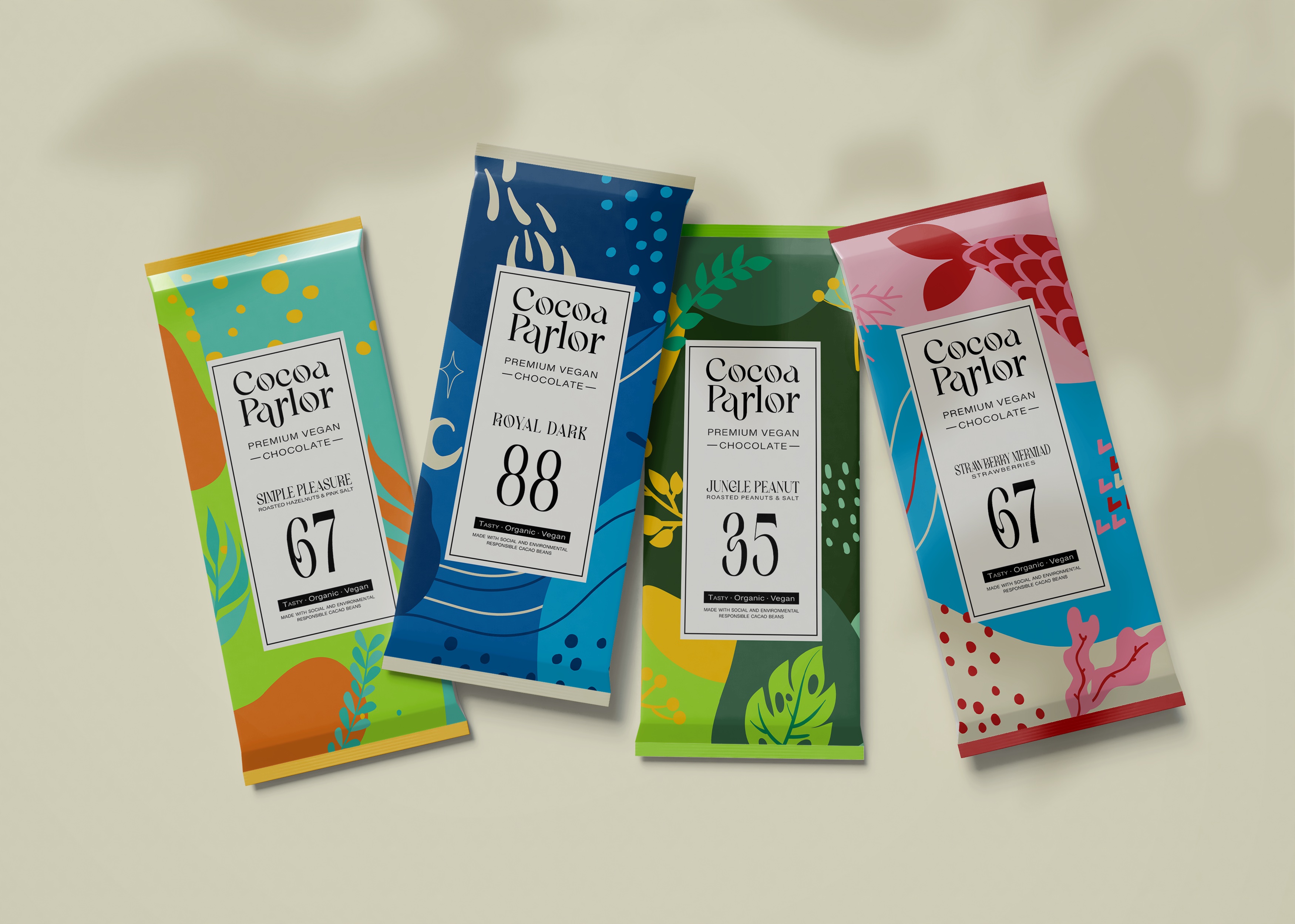
Central to this rebranding effort is the innovative packaging design for each chocolate bar. The design cleverly highlights the organic ingredients, using vibrant, playful visuals and typography that communicate the product’s natural essence. This approach not only underlines the organic quality but also makes the product extremely approachable and relatable, particularly for consumers who appreciate the transparency and simplicity in their food products.
Logo and Typography
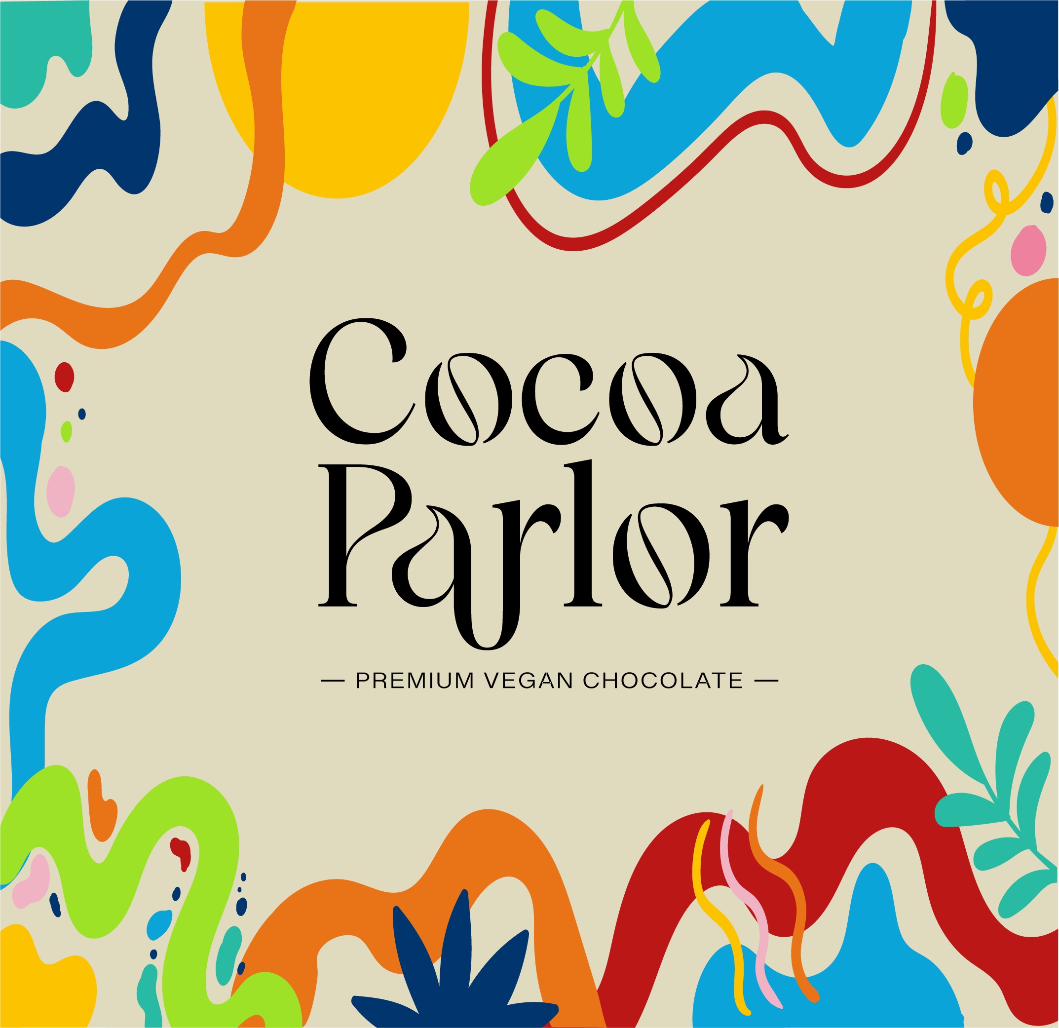
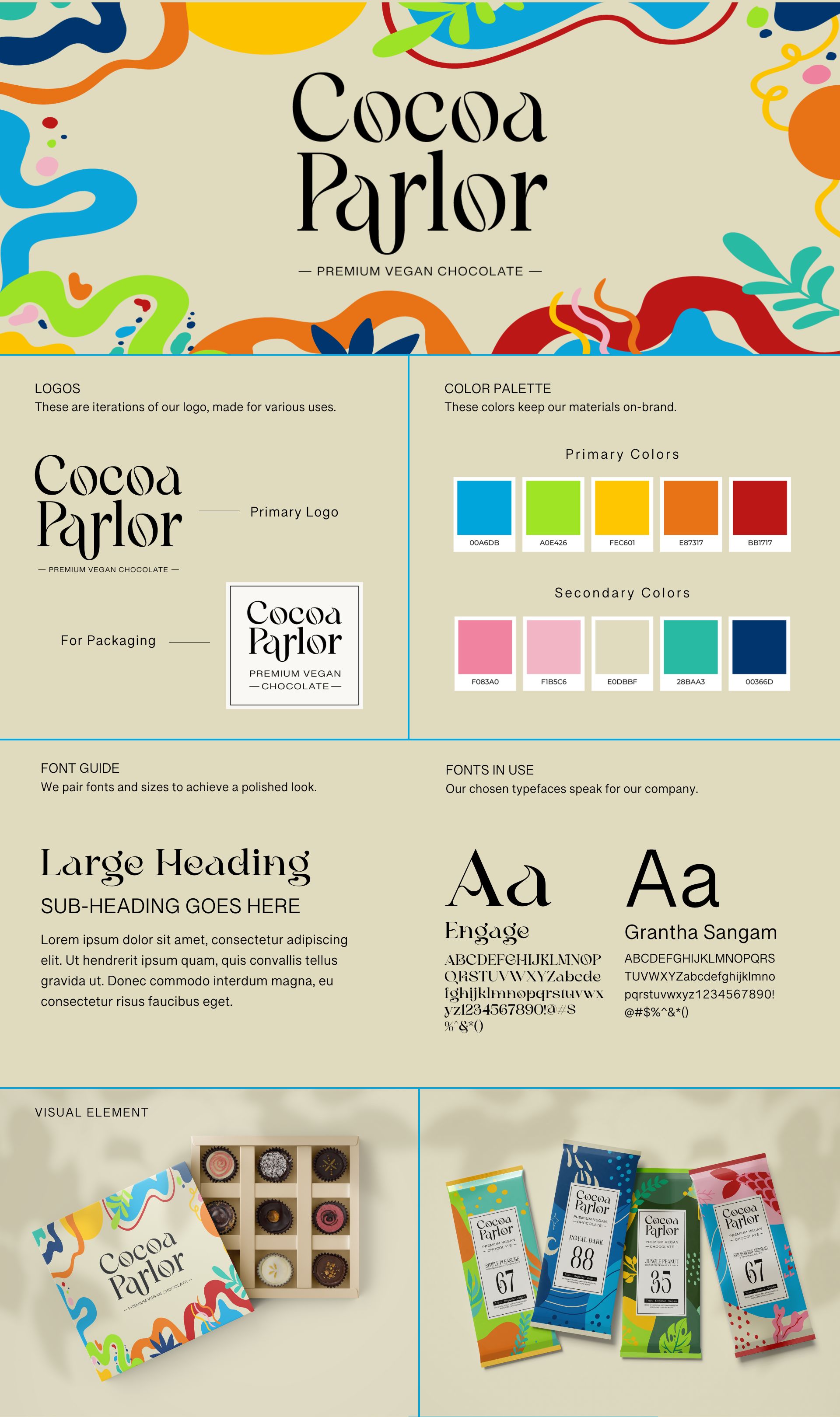
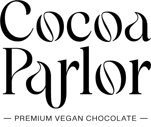
The new logo of Cocoa Parlor is a testament to the premium nature of the product. It employs a sophisticated serif font, symbolizing elegance and quality. This choice is a nod to the traditional values of craftsmanship and excellence in chocolate making, while still appealing to modern sensibilities. The logo acts as a bridge between the rich heritage of chocolate and the contemporary expectations of consumers.
Color Palette
A key element in the rebranding is the vibrant color palette. This choice not only infuses energy and vivacity into the brand but also complements the premium nature of the chocolates. The colors are carefully chosen to reflect the richness and variety of the organic ingredients used, creating a visual feast that promises a delightful taste experience. This vibrant palette also plays a crucial role in making the product stand out on the shelves, capturing the attention of consumers instantly.
Conclusion
In conclusion, the rebranding and package design of Cocoa Parlor is a bold statement in the world of organic sweets. It successfully marries whimsy with sophistication, organic ethos with playful presentation, and quality with approachability. The result is a brand identity and packaging that not only stands out in a crowded market but also resonates deeply with a younger, health-conscious audience. With every detail, from the serif font in the logo to the vibrant color palette, this design ensures that consumers can indeed “feel the love in every bite.”
CREDIT
- Agency/Creative: Marketin Monster
- Article Title: Crafts Innovative Branding and Packaging for Organic Delights, Cocoa Parlor Rebrand by Marketin Monster
- Organisation/Entity: Freelance
- Project Type: Identity
- Project Status: Non Published
- Agency/Creative Country: United States
- Agency/Creative City: Chino Hills
- Market Region: North America
- Project Deliverables: Brand Guidelines, Brand Identity, Brand Redesign, Packaging Design
- Industry: Food/Beverage
- Keywords: Rebranding, Rebrand, Visual Identity, Packaging
-
Credits:
Branding Specialist: Cassidy Merideth


