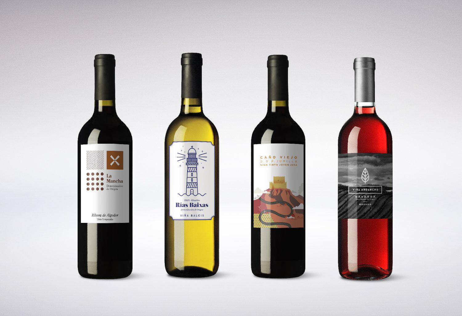
” Día Supermarkets is one of the leading chains in Spain in terms of distribution. For this project, they trusted us to redesign its private label wines to position them in direct competition with other brands.Baud has worked on several wine packaging projects, so we understand that for wine lovers there’s a big difference between a glass of Albariño and a glass of Chardonnay. That’s why we decided to create a different image for each bottle in line with its origin and personality.”
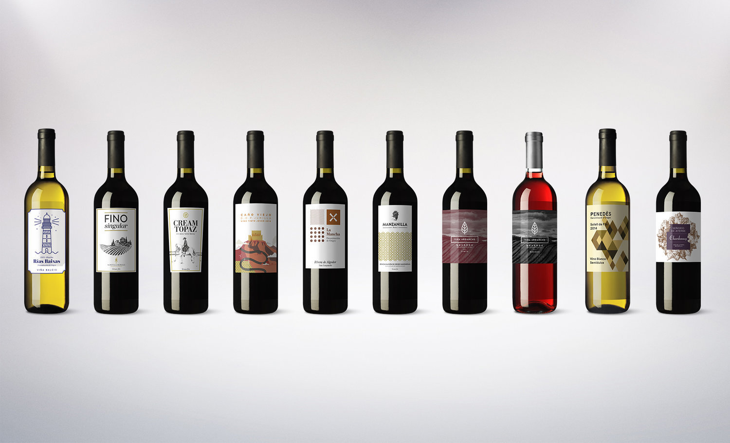
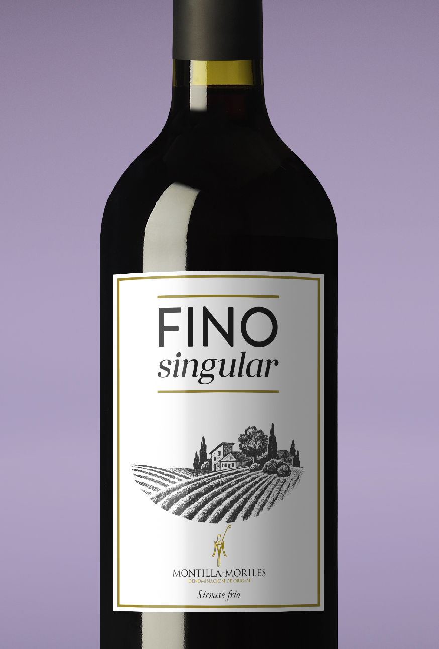
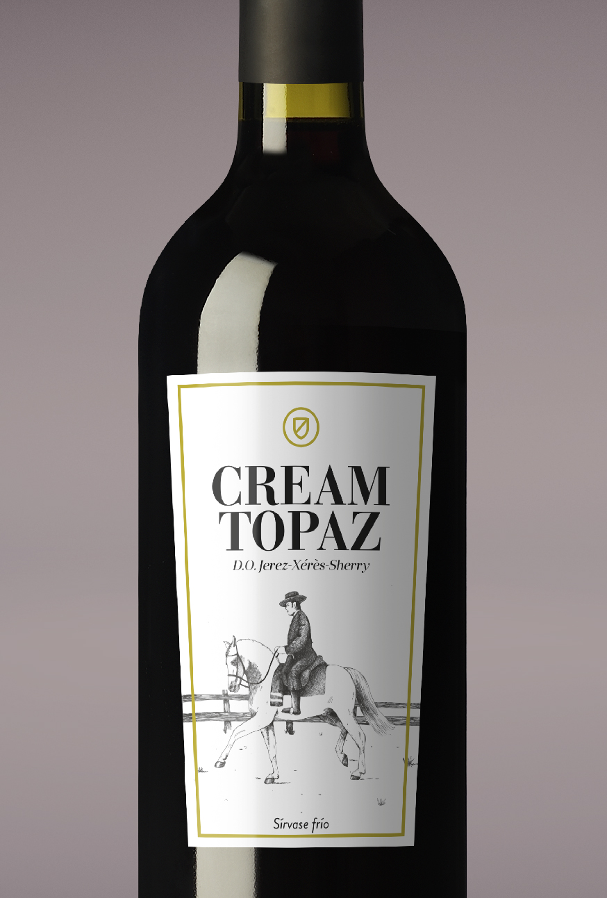
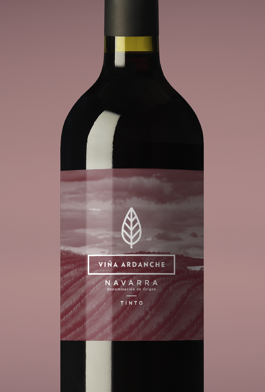
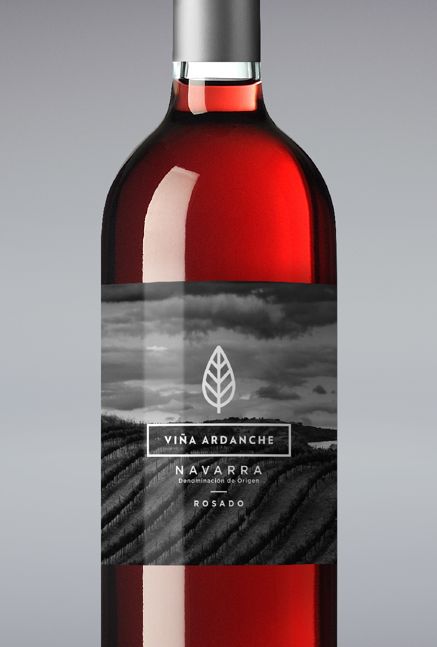
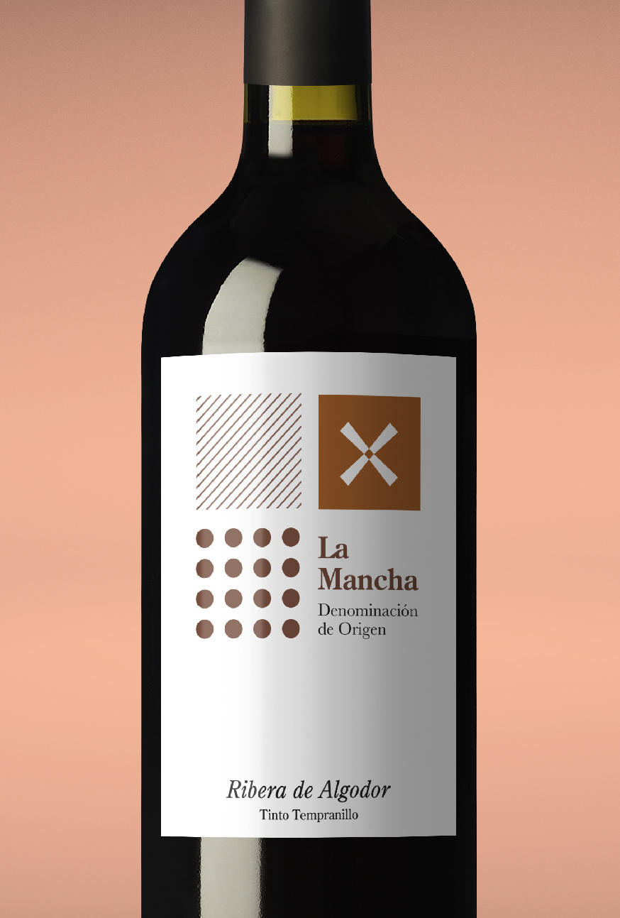
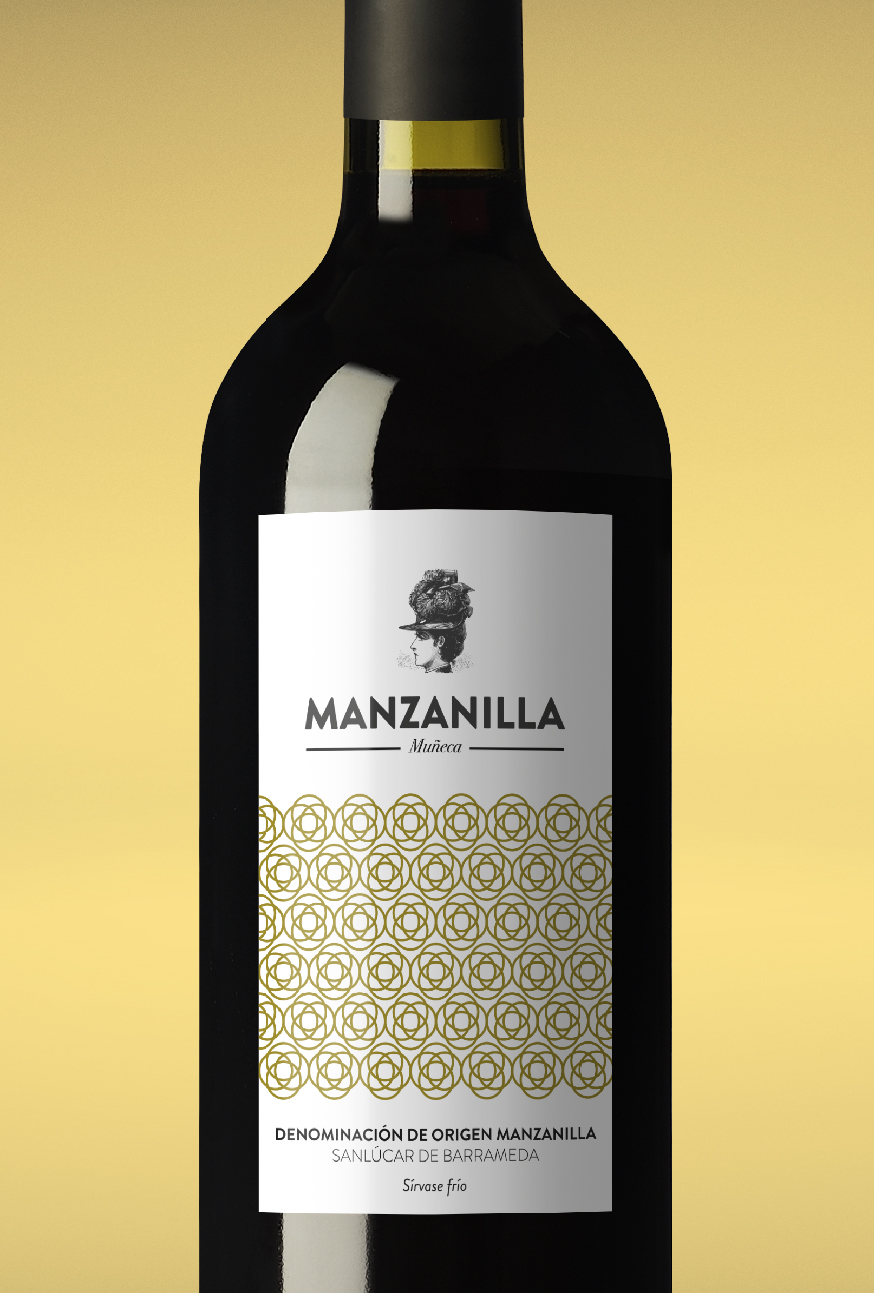
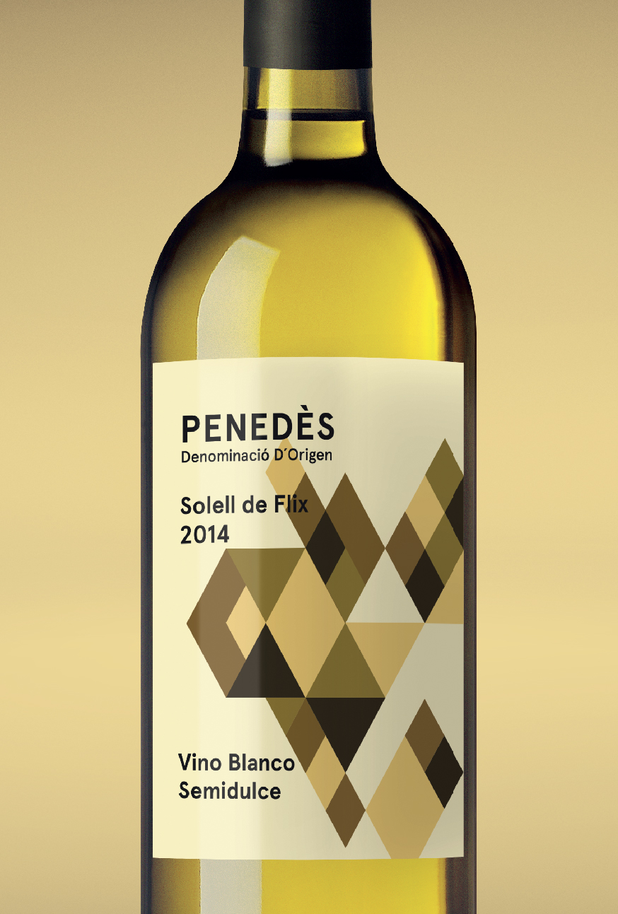
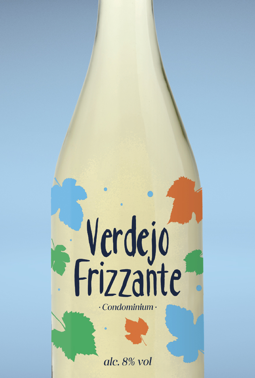
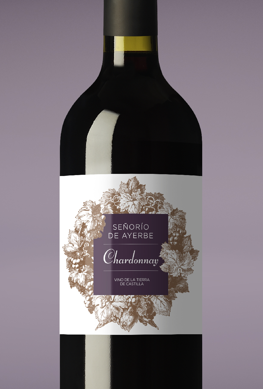
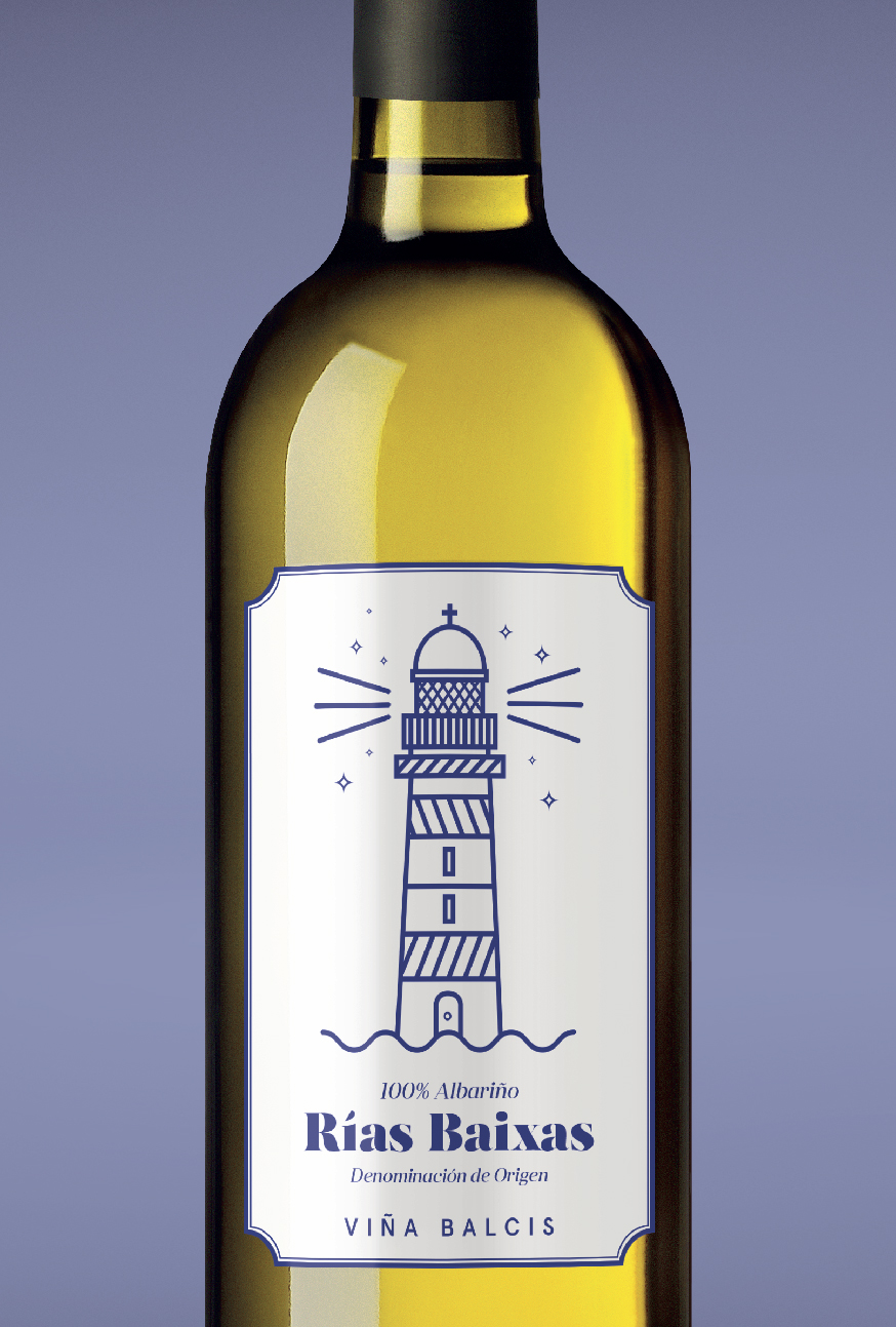
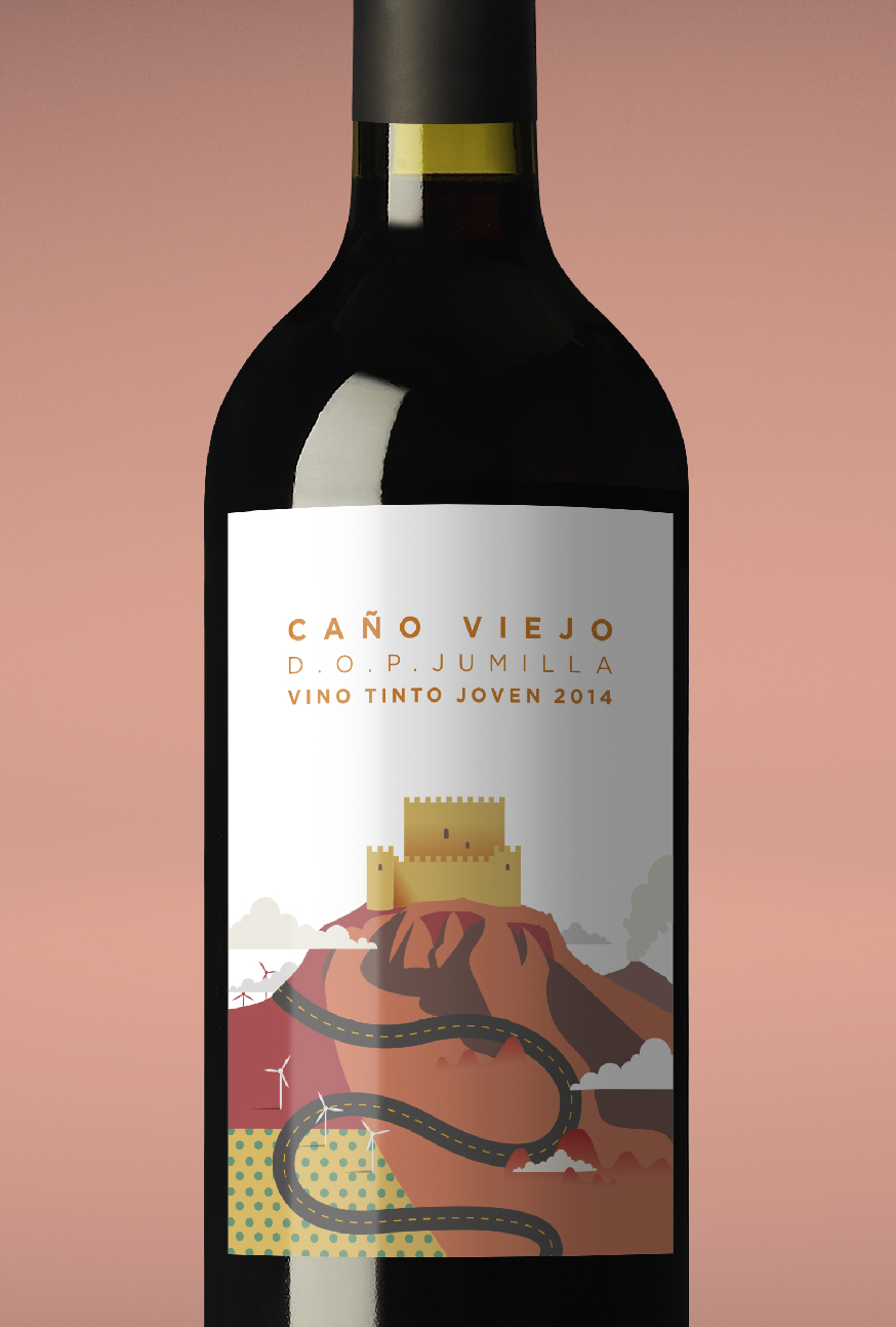
“Fino singular: Classic wine label design prominently featuring the designation of origin and a traditional illustration of the Andalusian countryside.Jumilla: The grapes used to make wines from this designation of origin lend an intense colouration that inspired this packaging, featuring an illustration of the Jumilla castle surrounded by the Castilian countryside.La Mancha: This area is known best for its landscape, represented here through geometric shapes and earth tones to highlight the wine’s origin.Manzanilla: Customary Andalusian carnation flowers are featured on this label, with a modern geometric style that sets it apart from the competition.Jerez Cream: Subtle hints of gold for a typical Andalusian wine with a design featuring another classic of southern Spain: an Andalusian horseman in traditional dress.Navarra: A simple yet elegant design based on images of the Navarre countryside, using colours to differentiate between reds and rosés.Penedés: The typical ochre tones of these lands combine with the colour of the wine in attractive geometric shapes, resulting in a unique and appealing bottle.Chardonnay: We represent this classic wine with an etching of grapes combined with a simple sans-serif font that livens it and adds a touch of modernity.Rías Baixas: A design as fresh as Albariño itself, conveying the maritime origin of the wine in a fun and unique way.Verdejo Frizzante: A refreshing, surprising and natural design that highlights the values of the wine itself.”


