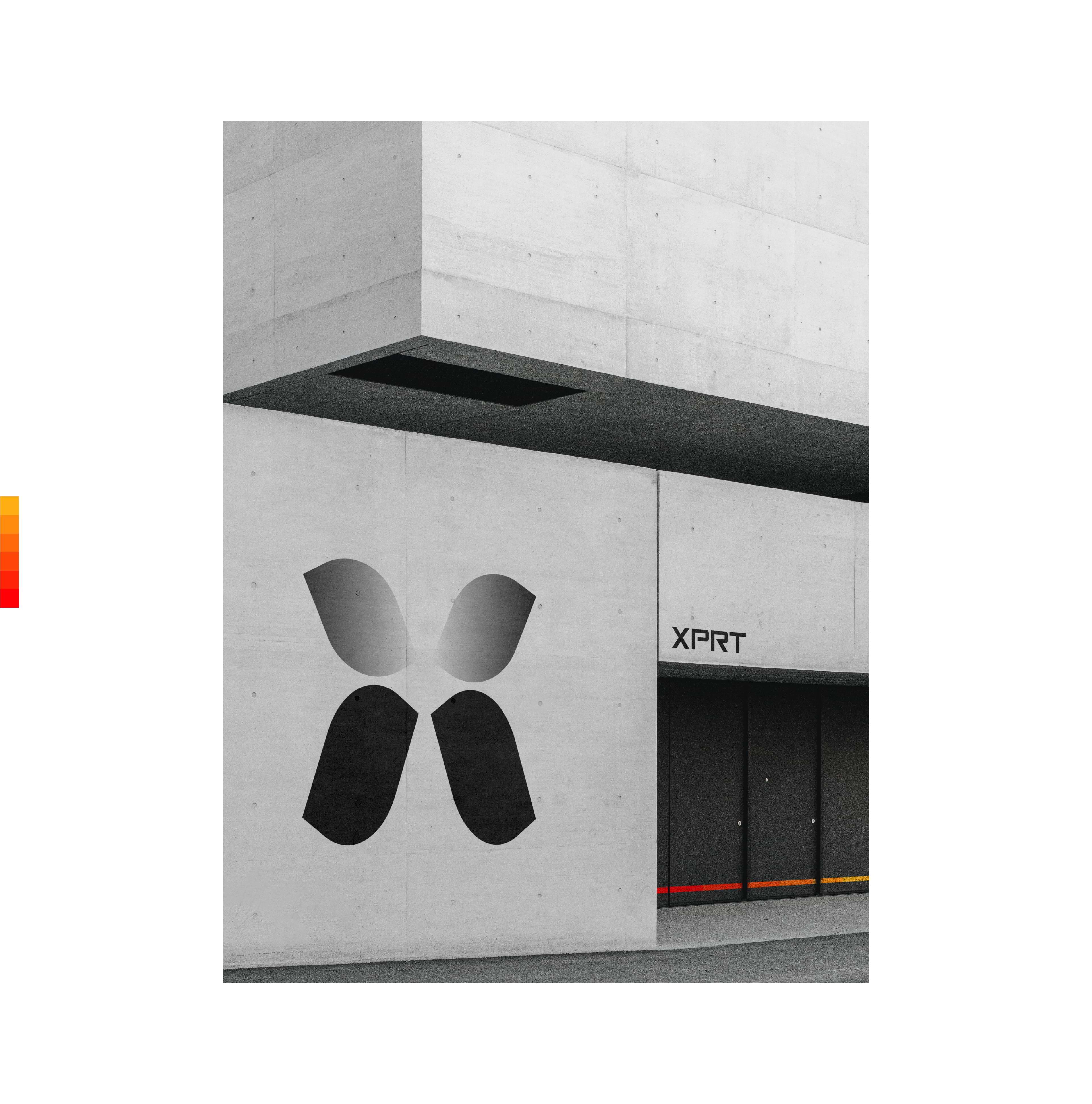
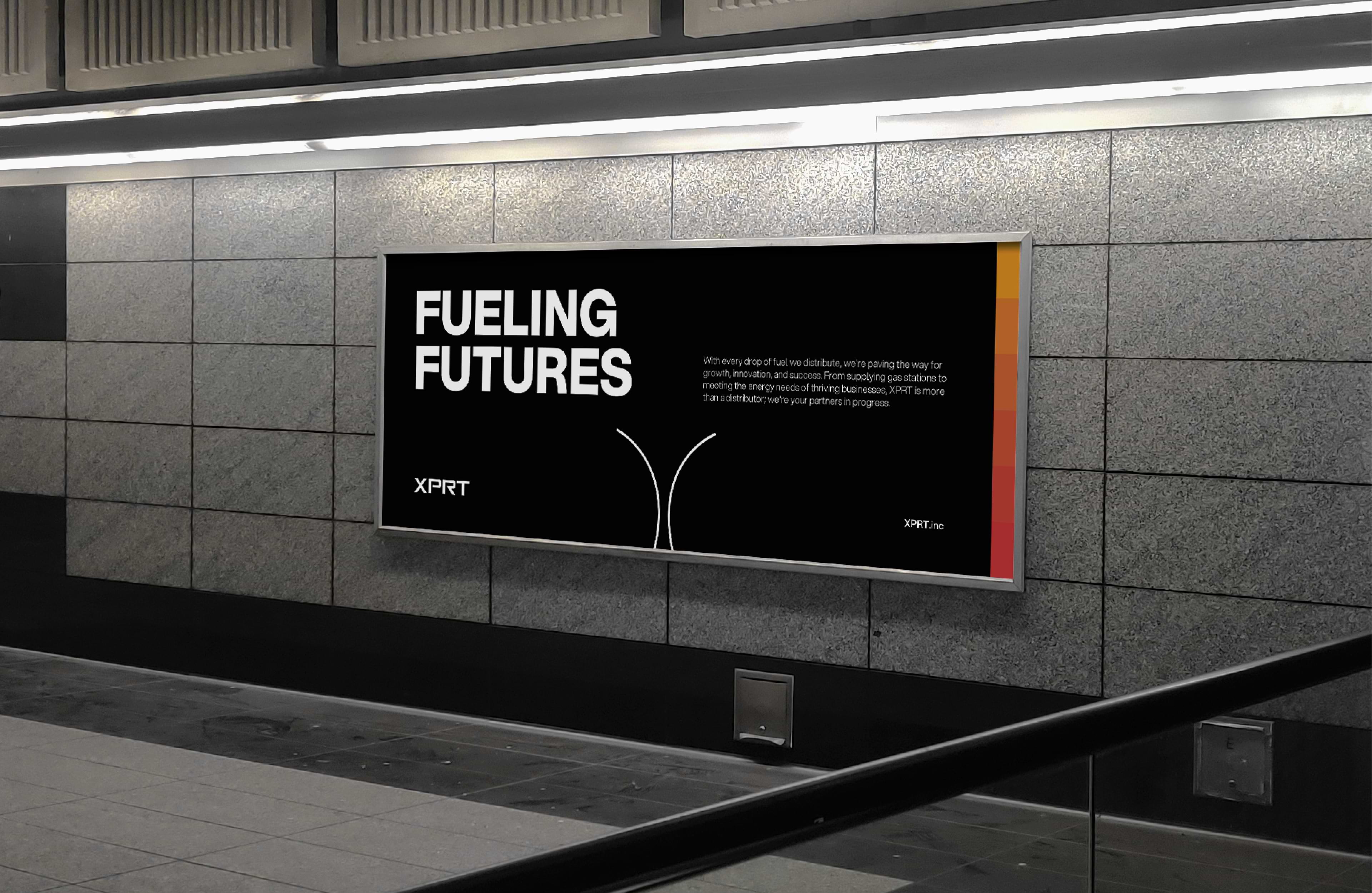
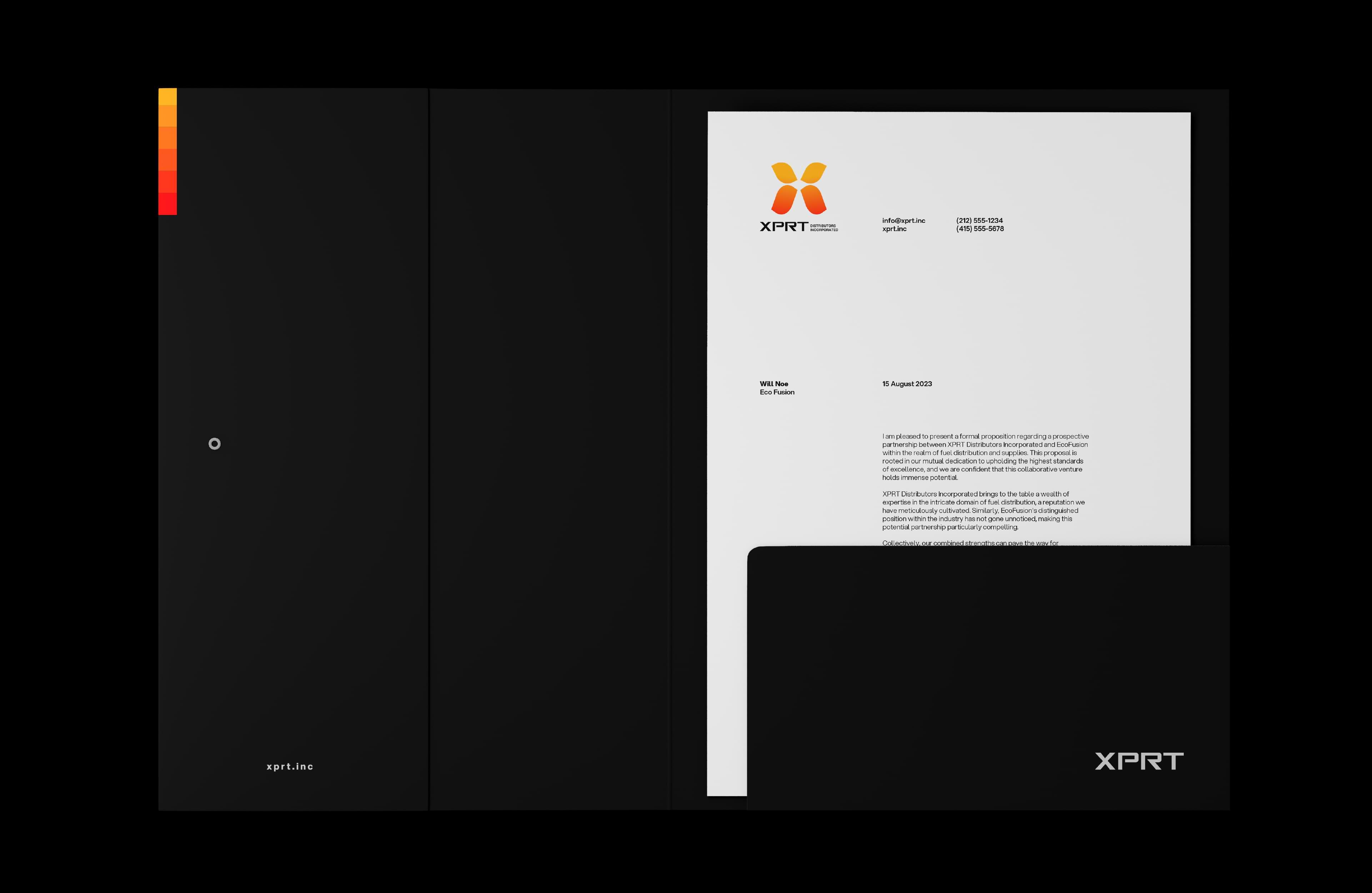
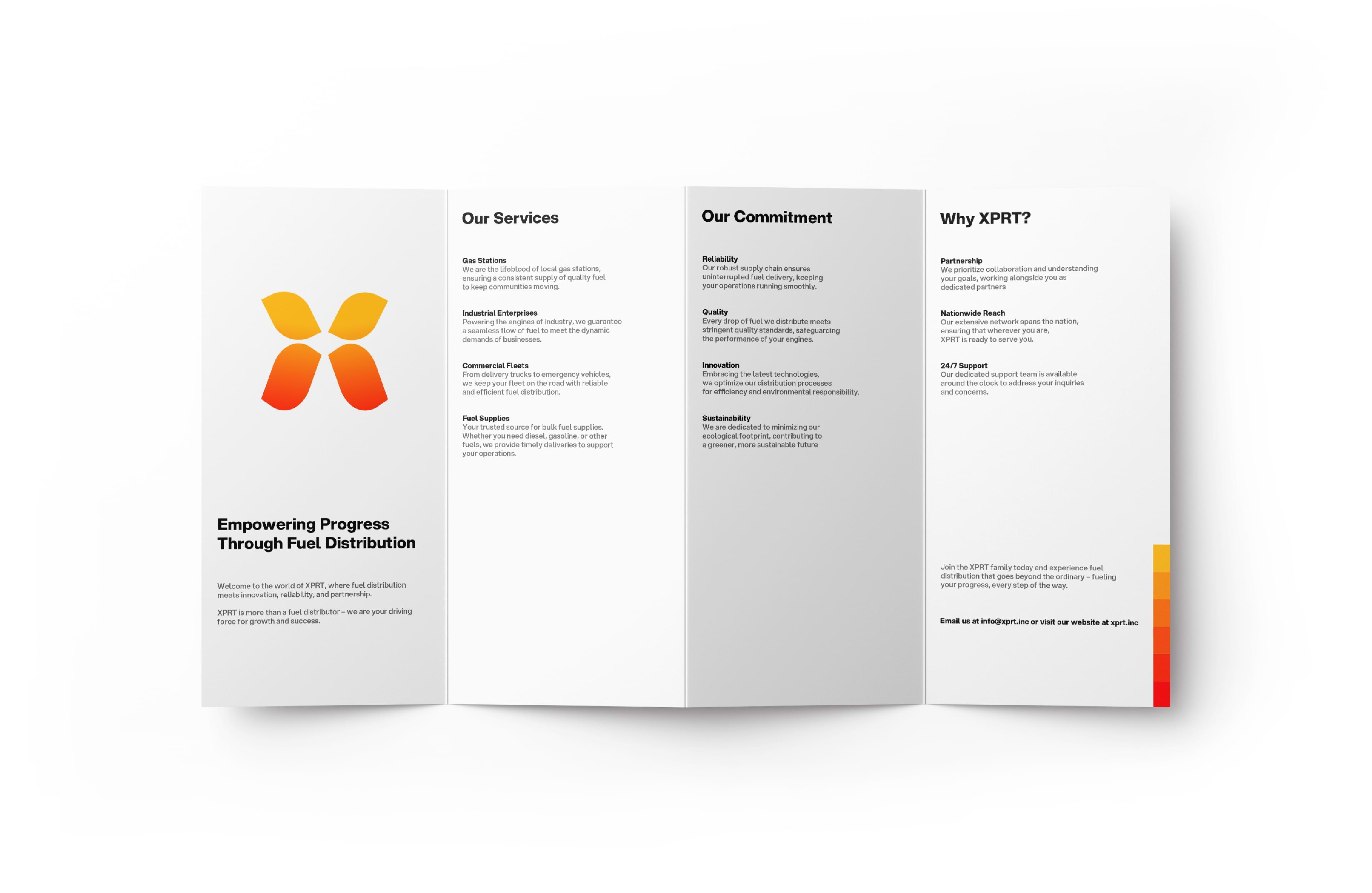
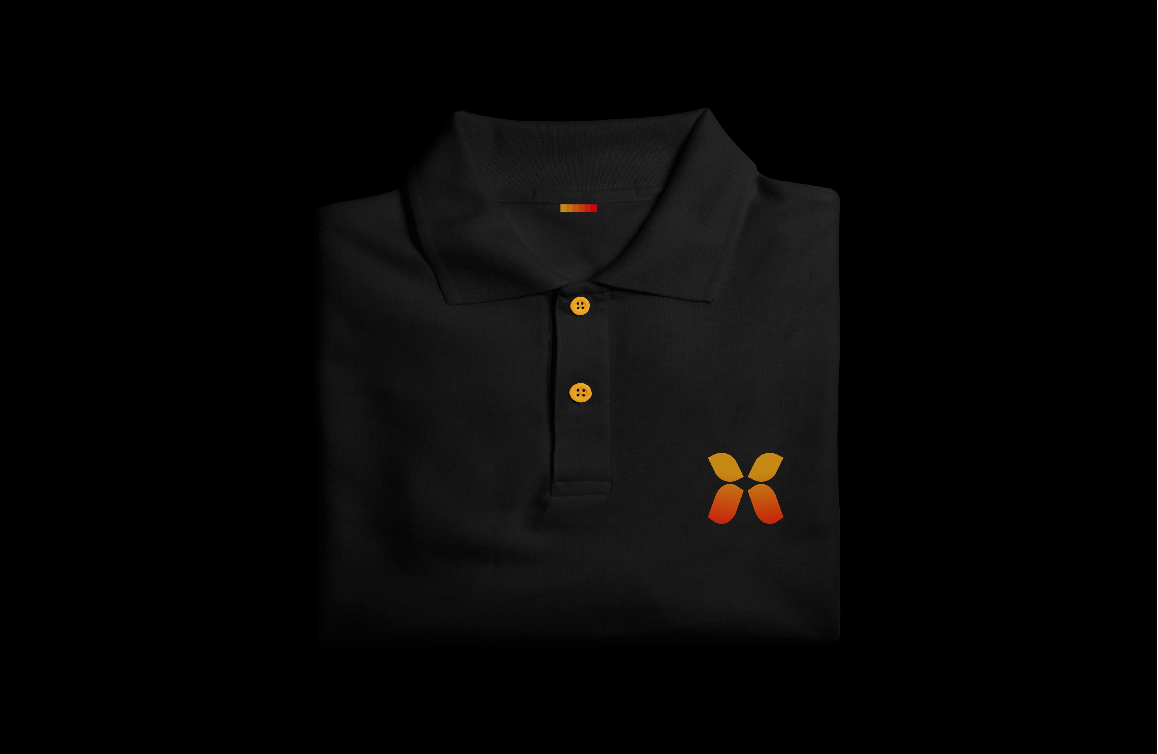
ANTRV was invited by XPRT Distributors Inc. to create its visual identity. The core objective of this collaboration was to establish a modern brand representation that seamlessly aligns with the fuel sector. The outcome of this creative endeavor incorporates a minimalist yet profoundly iconic ‘X’ element, symbolizing the energy and motion associated with fuel. It represents the continuous flow of energy, emphasizing the concept of providing fuel to keep things moving.
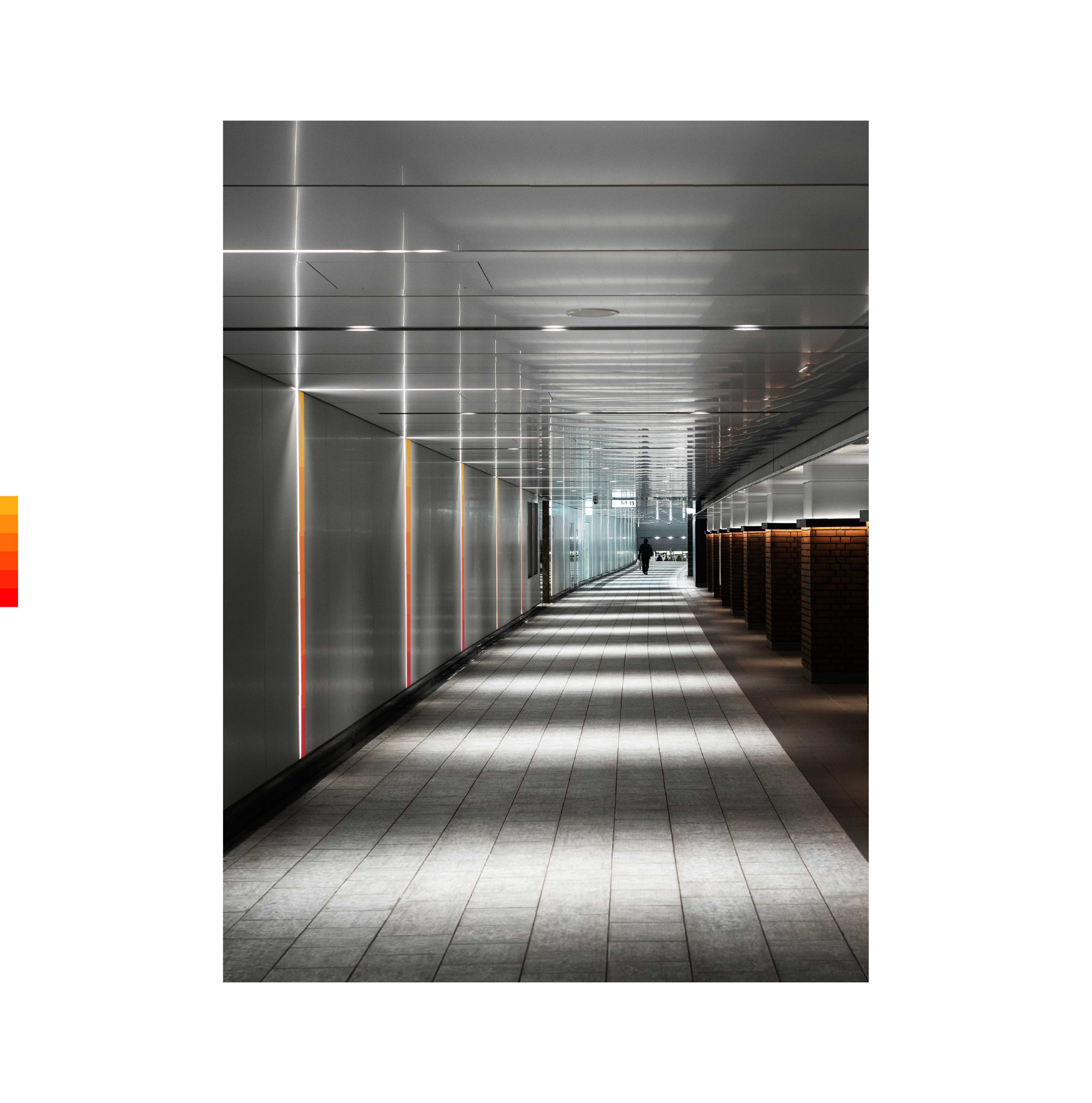
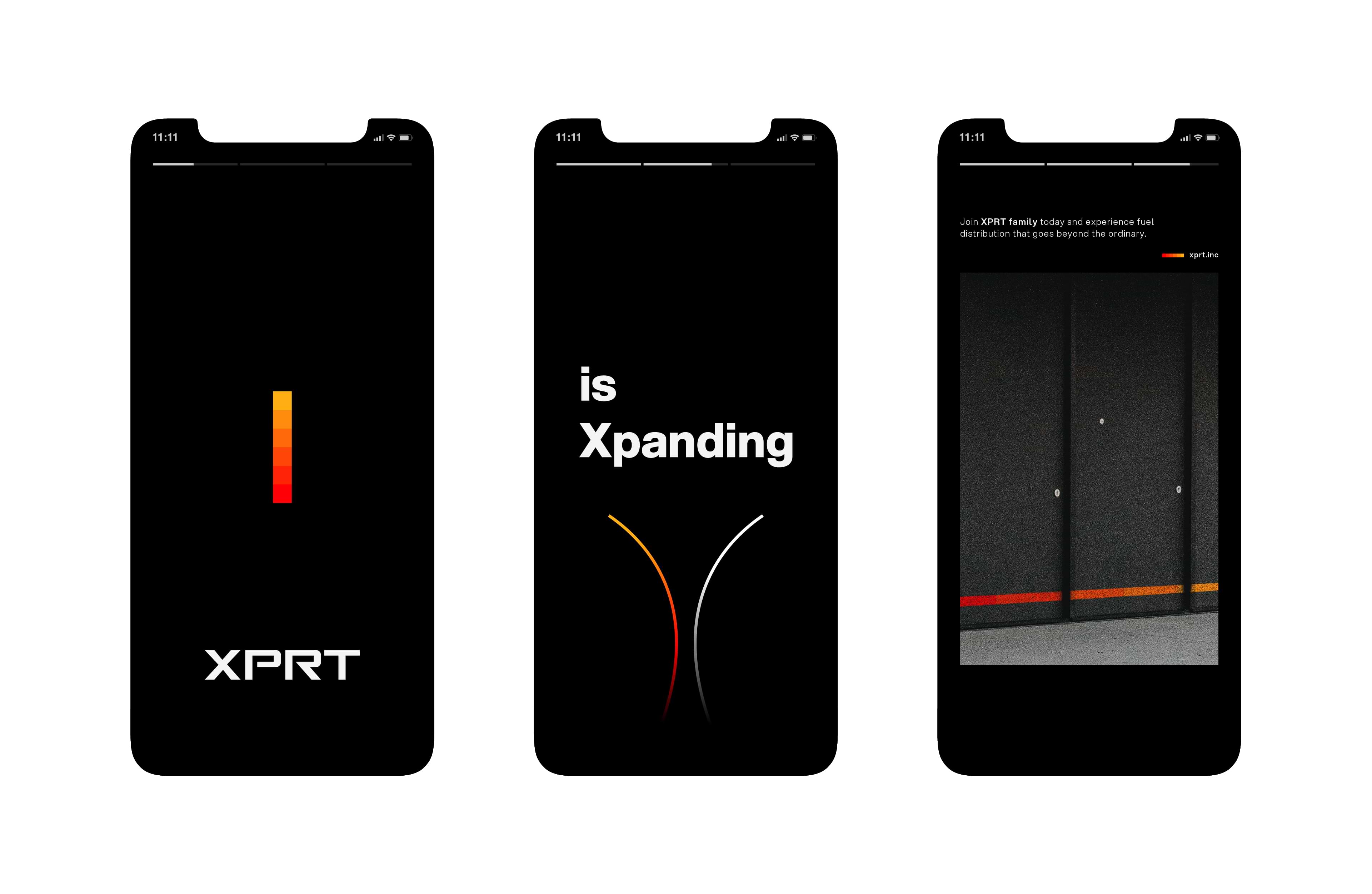
The colour palette further reinforces the brand’s identity. The transition from orange to red is not arbitrary; rather, it reflects a deliberate decision to convey a sense of progression and intensity. Orange, at the lighter end of the spectrum, symbolizes the beginning of the energy cycle – the ignition of potential. As the colour transitions to red, it signifies the peak of energy and motion.
Moreover, the warm tones of orange and red evoke emotions of passion and determination, aligning with XPRT Distributors Inc.’s commitment to excellence. The visual identity, therefore, becomes a powerful tool in communicating the company’s values and aspirations to both existing and potential clients.
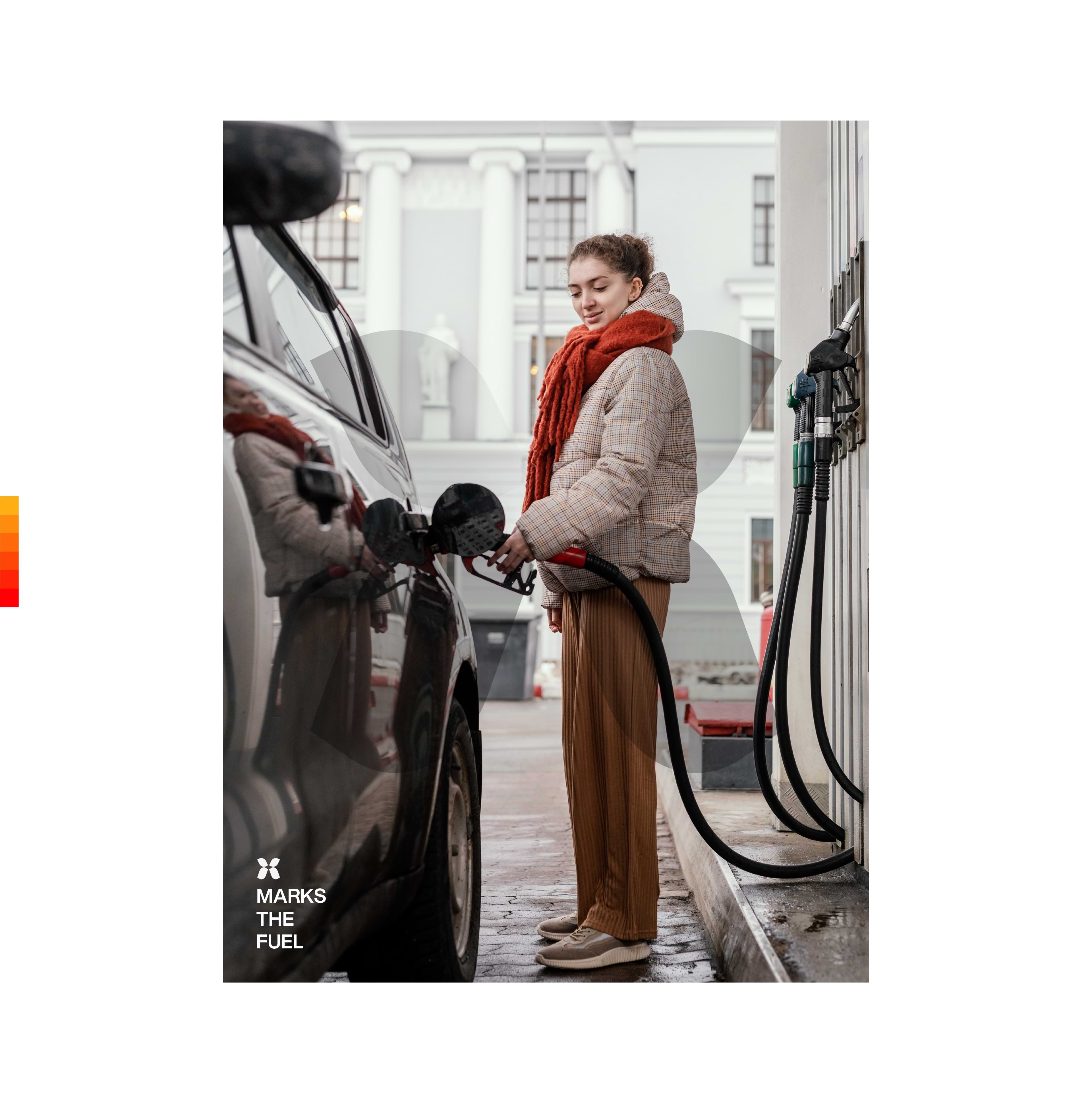
XPRT Distributors Inc. operates as a distinguished fuel distributor, catering to the fuel requirements of gas stations and businesses. Positioned as a cornerstone of reliable fuel provision, XPRT not only responds to current needs but also envisions expansion on a nationwide scale, envisaging comprehensive service across the entire country.


CREDIT
- Agency/Creative: ANTRV | Paul Antonio
- Article Title: Visual Identity for XPRT Distributors Inc.
- Organisation/Entity: Freelance
- Project Type: Identity
- Project Status: Published
- Agency/Creative Country: Philippines
- Agency/Creative City: ANTRV
- Market Region: Asia
- Project Deliverables: Brand Design, Brand Identity, Branding, Logo Design
- Industry: Energy
- Keywords: Fuel, Energy, Gas, Brand Identity, Branding
-
Credits:
Designer: Paul Antonio


