A rebrand that reflects it’s fabric of people and place and sparked national conversation.
Rebranding one of Britain’s most beautiful National Parks, reflecting its fabric of people & place.
We were asked to deliver a simple brand refresh that ultimately become something more engaging, bigger and far more important.
Weeks of interviews, workshops and research programmes were undertaken to discover the leading themes that run through the veins of the National Park. What we discovered was that the Park’s identity had come to be seen as dated, stale and not reflecting the Park’s future ambitions to those who live and work within it.
What followed was a two year process of discovery and collaboration that led a launch that over 816 million people interacted with, across 600 pieces of coverage from 25 countries, gaining a coverage value of £8.3 million with a 77% positivity rate, the project sparked a global conversation around Welsh heritage, history and the importance of remembering who we are as a country and reflecting that to the World.
A new visual identity and language for one of the country’s natural treasures.
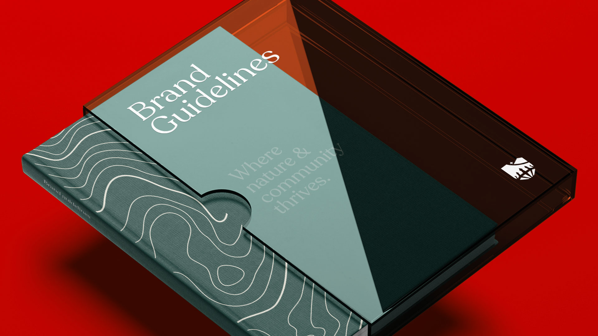
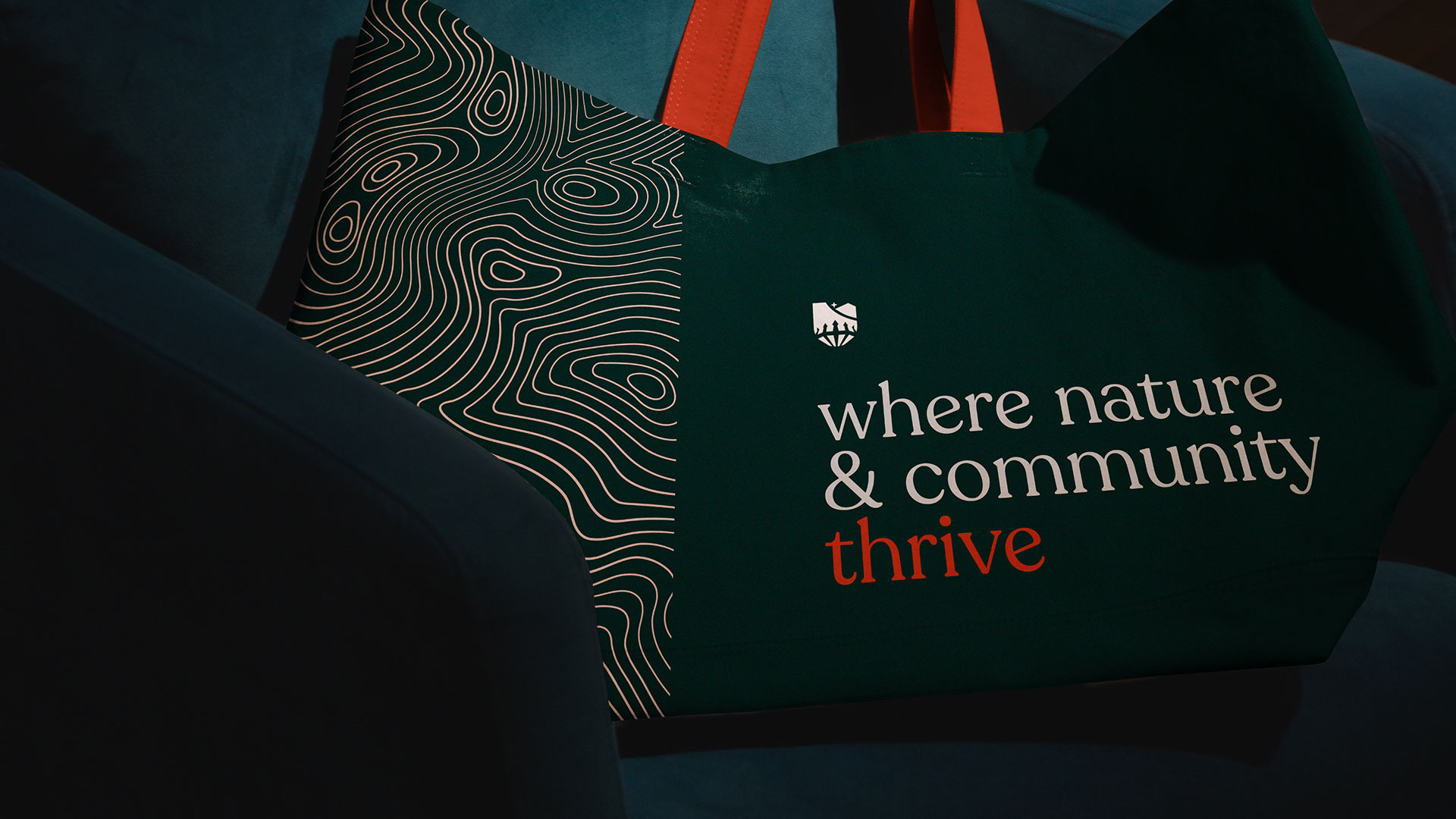
We took a comprehensive approach, leaving no touchpoint unaddressed. From the core marque to robust, history reflecting typefaces, we carefully considered every aspect of the brand’s visual identity. In addition, we also developed guidelines for values, tone of voice, photography, and experiential initiatives to ensure a cohesive and consistent brand experience across all sectors. Our goal was to create a unified brand approach that would resonate with audiences globally, across multiple industries. By carefully considering every brand touchpoint, we were able to create a strong and recognisable brand that would stand the test of time.
The rebrand isn’t just an identity; it’s a feeling, a movement, a foundation for Bannau Brycheiniog National Park to shine across global audiences. Our goal was to engage, educate, challenge, and inspire a broad audience, both at home and abroad, while creating a cohesive brand that reflects the Park’s missions, objectives and it’s people. We’ve taken the diverse and vibrant threads of the Park’s Welsh cultural heritage and woven them together into a powerful tapestry that connects the Park in new, bold and dynamic ways.
From the majestic heights of its mountain skyline to the electric energy of its bustling towns and businesses, Bannau Brycheiniog National Park is truly the cultural heart of Cymru, and the rebrand captures that spirit in a unique and powerful way.
This historic name, which has stood the test of time is derived from the Welsh word “bannau” meaning “peaks”, and “Brycheiniog”, the name of our old kingdom, and was first mentioned in the Itinerary of John Leland, a 16th century manuscript documenting his journey across Britain. This truly reflects the idea of an ‘old name for a new way to be’.
An identity & visual language steeped in history & meaning.
Our Beacons:
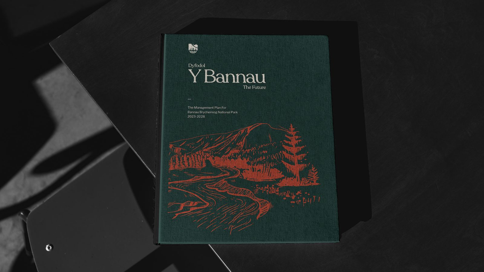
The majestic silhouette of Pen-y-Fan and its surrounding mountain skyline embody our visual identity, symbolising both the striking beauty of our landscape and our commitment to preserving our cherished National Park for future generations.
Our Guiding Light:
The shining star celebrates our Dark Skies Reserve status, symbolising hope and inspiring us to honour the past while pursuing a brighter future.
Our Waters:
A single line cuts through our landscape, reflecting the waters of our rivers and waterfalls. It acts as a reminder for our support in the provision of clean and sustainable water resources for our National Park.
Our Heritage:
The brazier is nod to our past, whilst also representing a majestic crown. Deeply connected with our new name, the crown serves as a powerful tribute to our rich heritage.
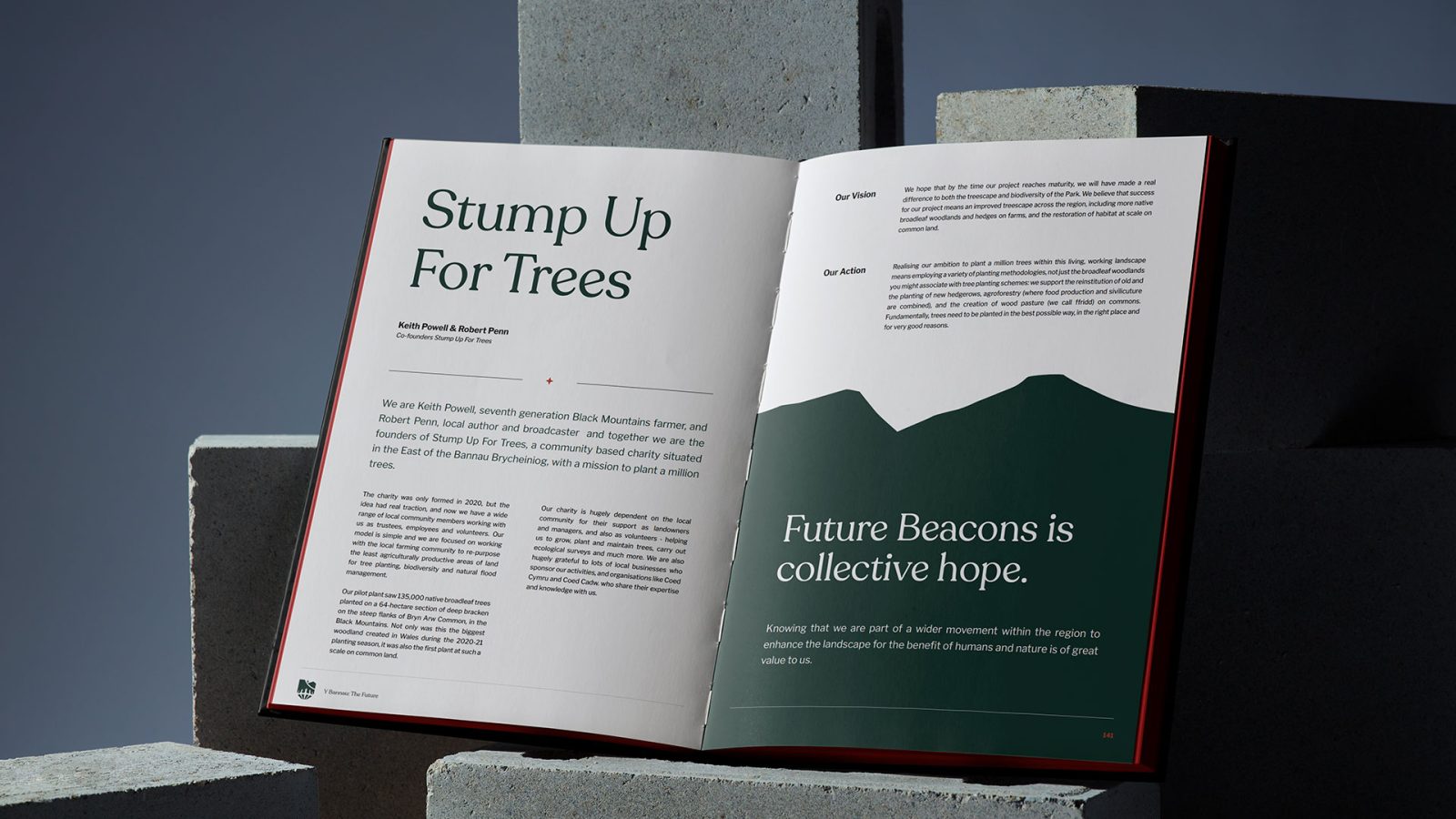
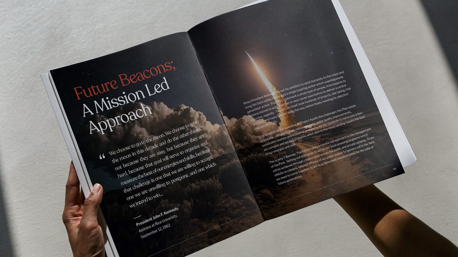
Our typeface pays homage to the revered Welsh bible sleeves that graced the pews of our chapels. Infused with the essence of our storied past, each letter exudes a distinct sense of place and character, evoking a deep emotional connection to our beloved heritage. Serving as the bedrock of our visual brand identity, this singular typography unites us as a community, like the chapels of old, and boldly projects our authentic and innovative spirit to the world.
A brand to be seen in the midst of the landscape.
The Park’s staff and wardens are the heartbeat of the Park and in turn, are one of its most important assets.
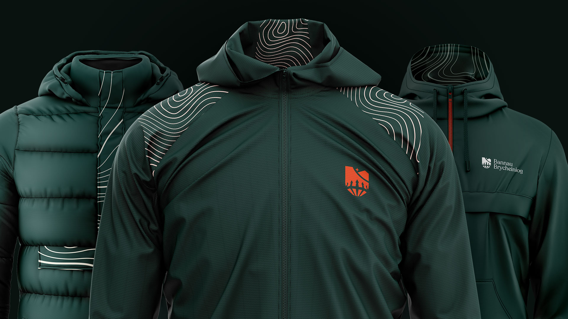
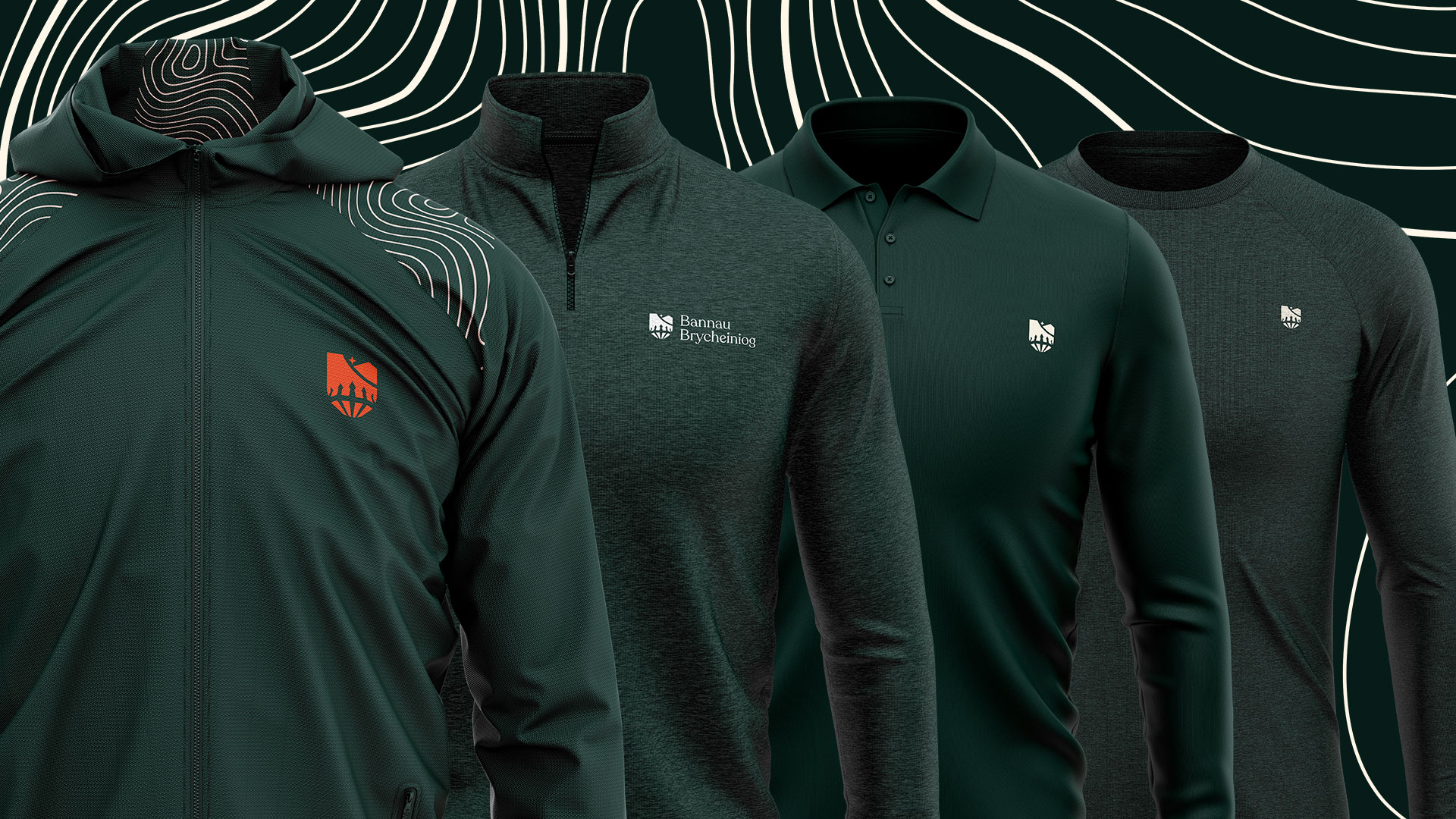
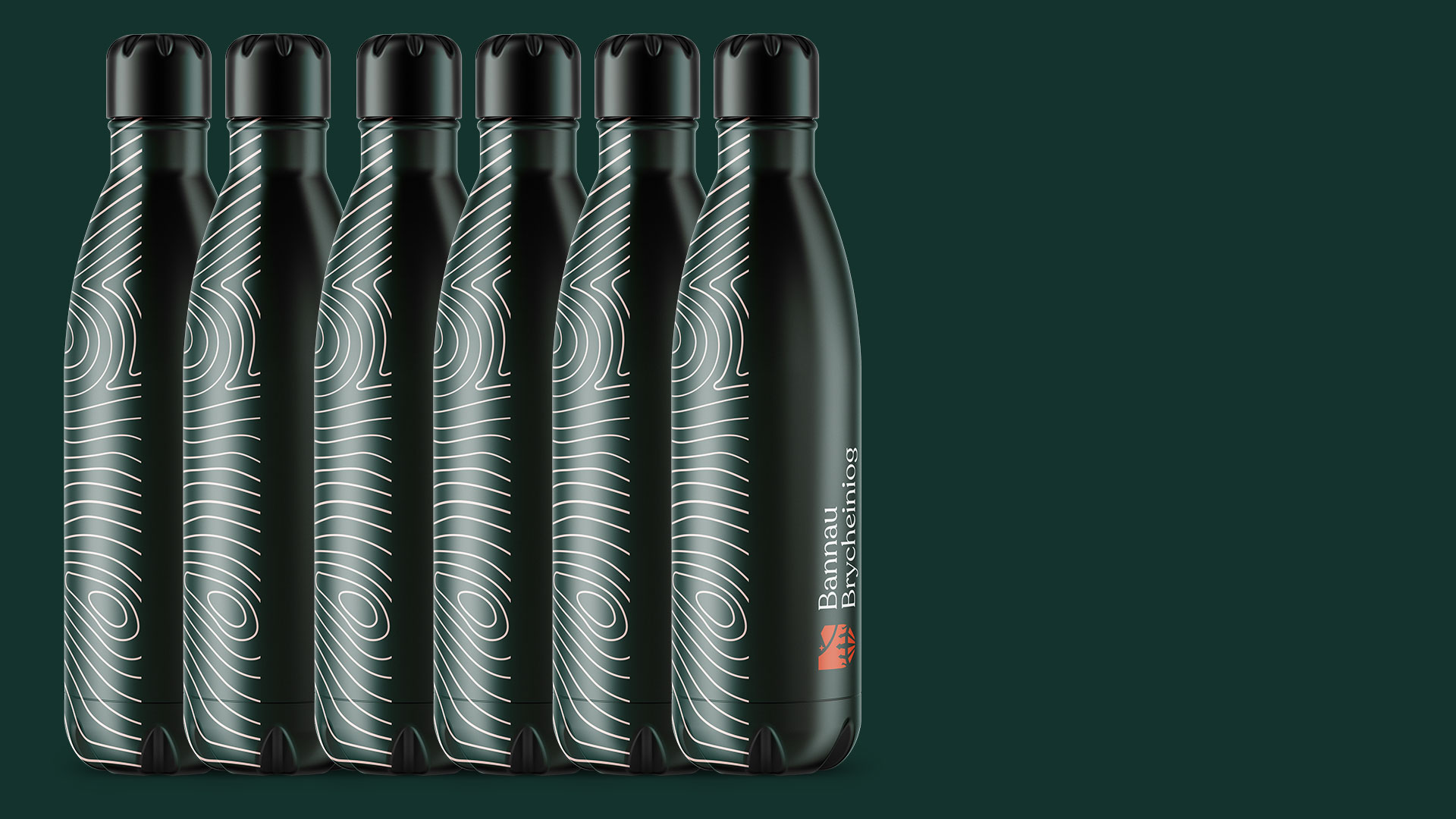
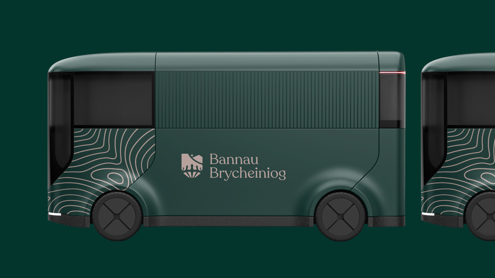
Staff kit features designs based on the topography of the Park and come in a range of brand colours for use all year round. We created designs to be more reflective and safer than previous uniforms. Warden’s now standout amongst the landscapes of the Park. By adding a hyper-reflective material on the shoulders of certain items to demonstrate the movement of the Park wardens at night in sometimes dangerous situations, and amped up the colours for day time use. In warmer climates we were asked to design kit that allowed them to keep cool and staff/wardens in colder areas of the Park wanted truly robust waterproof kit to keep them dry and comforable. Livery took a similar approach. New vehicles entering the Park’s pool car system now feature the brand in a unique to further help staff and warden’s standout to members of the public. This resulted in a uniform / kit and livery system that connects practicality with design and allows staff to embrace the Park’s identity with pride and truly embrace what it means to be a part of it.
Giving a voice to our vision.
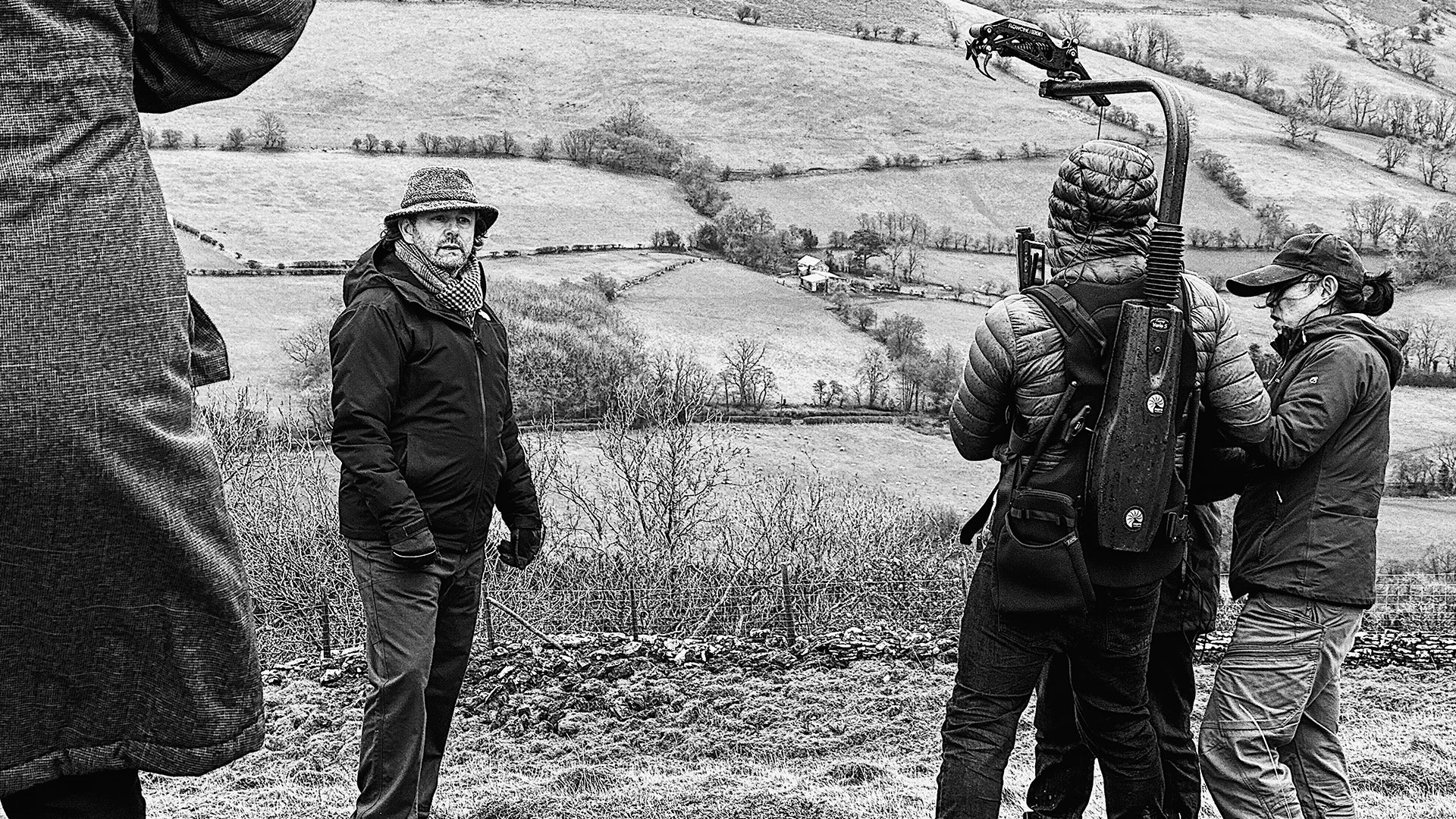
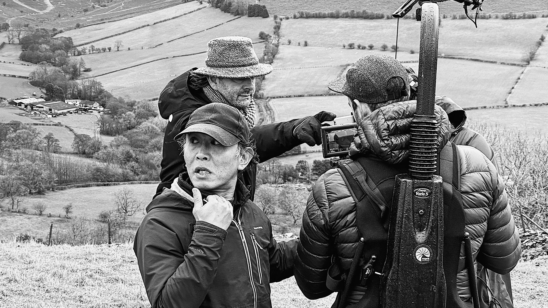
To introduce the Park’s retention of the Welsh name, mission and identity to the world we invited a true Welsh
icon – Michael Sheen – to be the voice of our ambitious new management plan. With his passion for Wales and his unwavering commitment to issues of equality and inclusion, Sheen was the perfect personality to embody the essence of our revised brand and focus.
To find the words for our message we asked one of Wales’s most celebrated writers, Owen Sheers, to craft a poem that would resonate with our audience on both an emotional and intellectual level. Sheers’s lyrical approach, combined with his passion for ecological progress, imbued our message with an authenticity and gravitas that captures the heart of our new identity.
Together, Sheen and Sheers proved to be a potent pairing, bringing our new management plan to life in a way that truly showcases our exciting, world-leading vision for the future.


CREDIT
- Agency/Creative: Creo Interactive
- Article Title: Bannau Brycheiniog National Park
- Organisation/Entity: Agency
- Project Type: Identity
- Project Status: Published
- Agency/Creative Country: United Kingdom
- Agency/Creative City: Cardiff
- Market Region: Europe
- Project Deliverables: Brand Identity
- Industry: Public Utility
- Keywords: WBDS Agency Design Awards 2023/24
- Keywords: Identity, Brand Design Creation
-
Credits:
Creative Director: Jordan Thorne
Senior Designer: Connor Jones
Strategic Director: Kathryn Shaw


