The body care category hasn’t enjoyed nearly the same fuss and attention as its skincare counterpart. It is a flat and functional space with no major players generating any real buzz or brand love.
We partnered with the Vaseline team to seize on this opportunity, bringing both more emotion and expertise to the brand, positioning it as the standout, more advanced choice. It was time for a new visual identity to reflect the superiority of the brand’s formulas.
Challenge
Vaseline body lotion operates in a typically low engagement category where brands are slow to reinvigorate and evolve their packaging in line with changing category trends.
We were asked to redesign Vaseline’s lotion range globally, to better reflect consumer behaviour and concerns as well as embody the brand’s new product and purpose story – ‘Skin Health for All’.
The visual challenge lied in showcasing the brand’s moisturisation expertise while bringing the overall look and feel to be in line with the beautifully contemporary skincare world of today.
And last, but by no means least, due to the category dynamics, the design had to be unmissable and instantly recognisable as Vaseline.
Solution
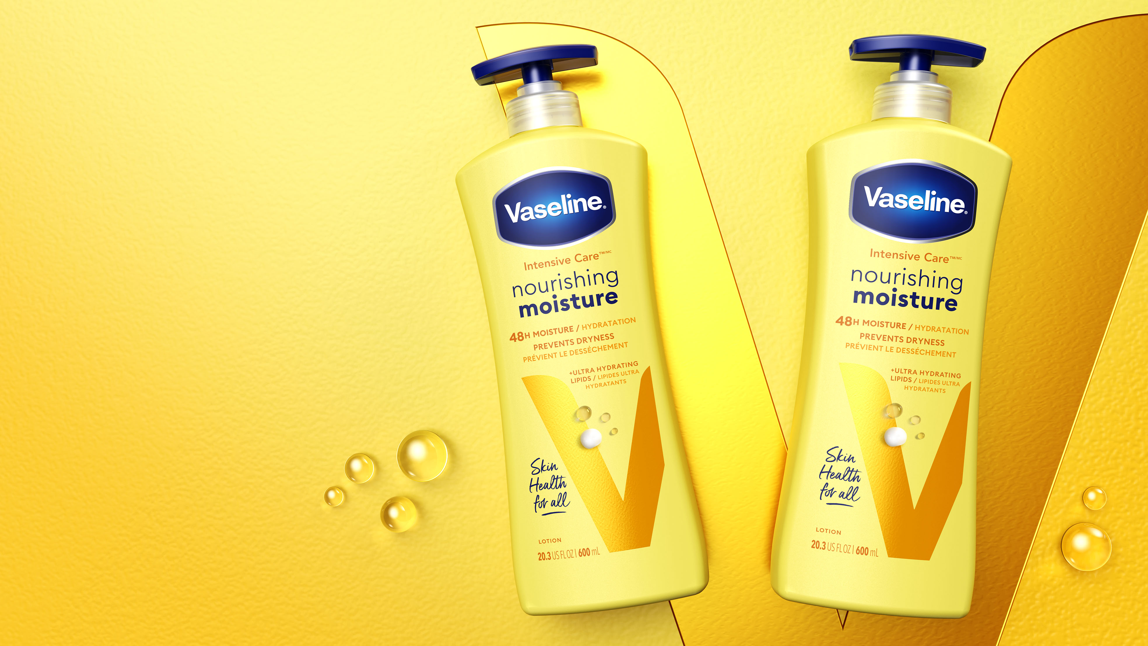
Taking inspiration from the world of skincare, our design balances clinical cues with contemporary beauty, resolving the tension between efficacy and care.
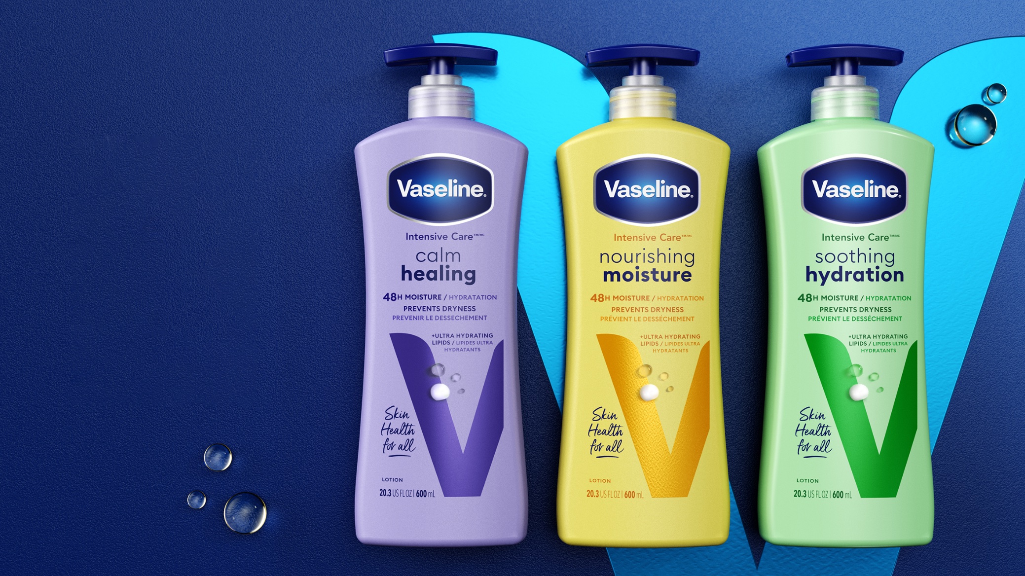
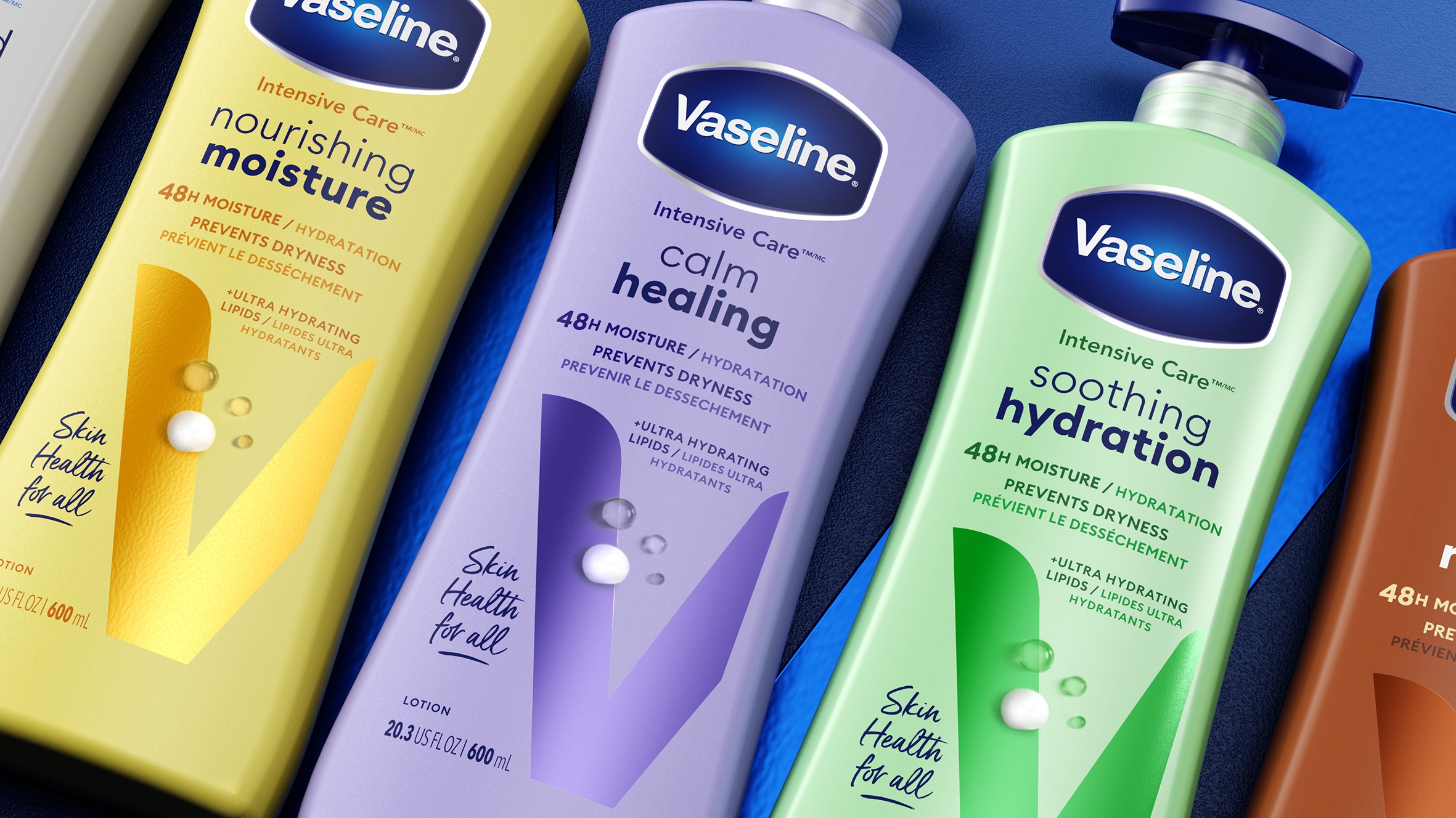
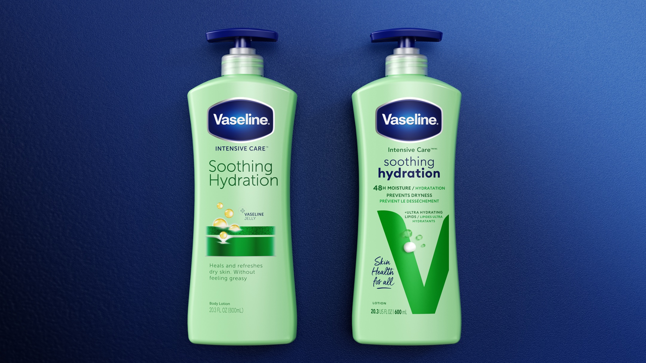
For maximum recognition, we retained the variant colours and logo placement, as these were working well. The compelling part of this redesign for us was creating a new ownable brand asset (to replace the rather predictable and cross-category swirl of lotion).
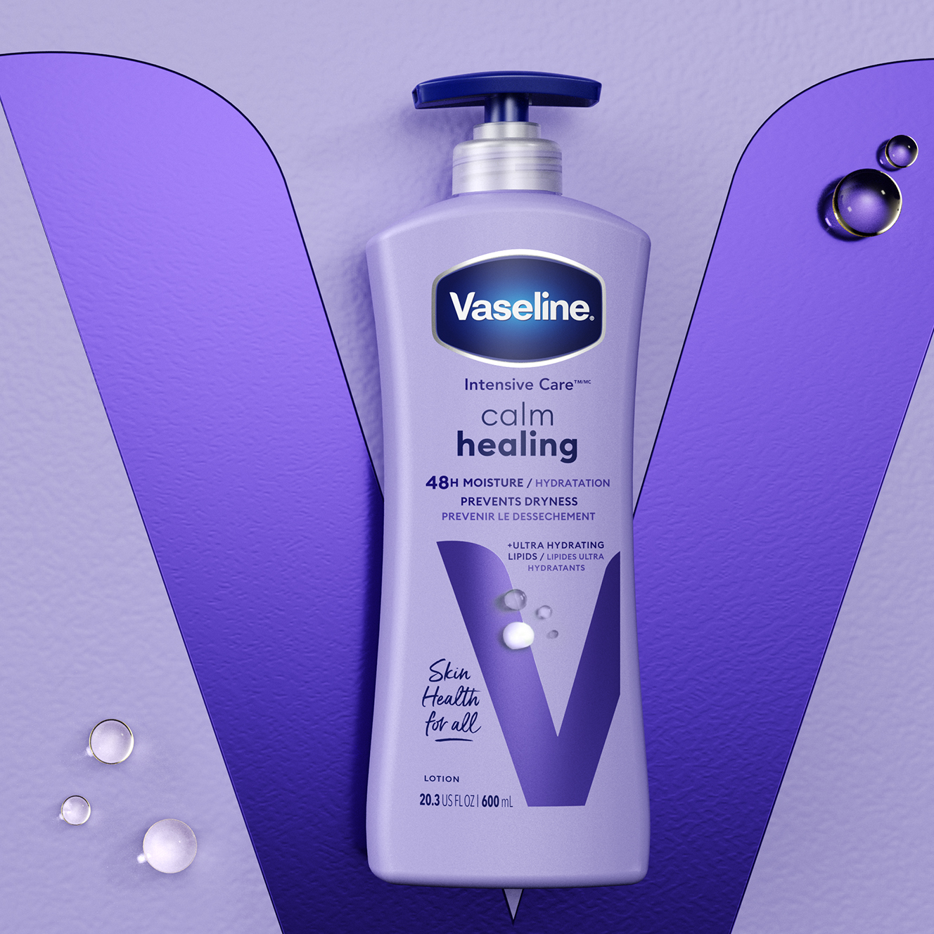
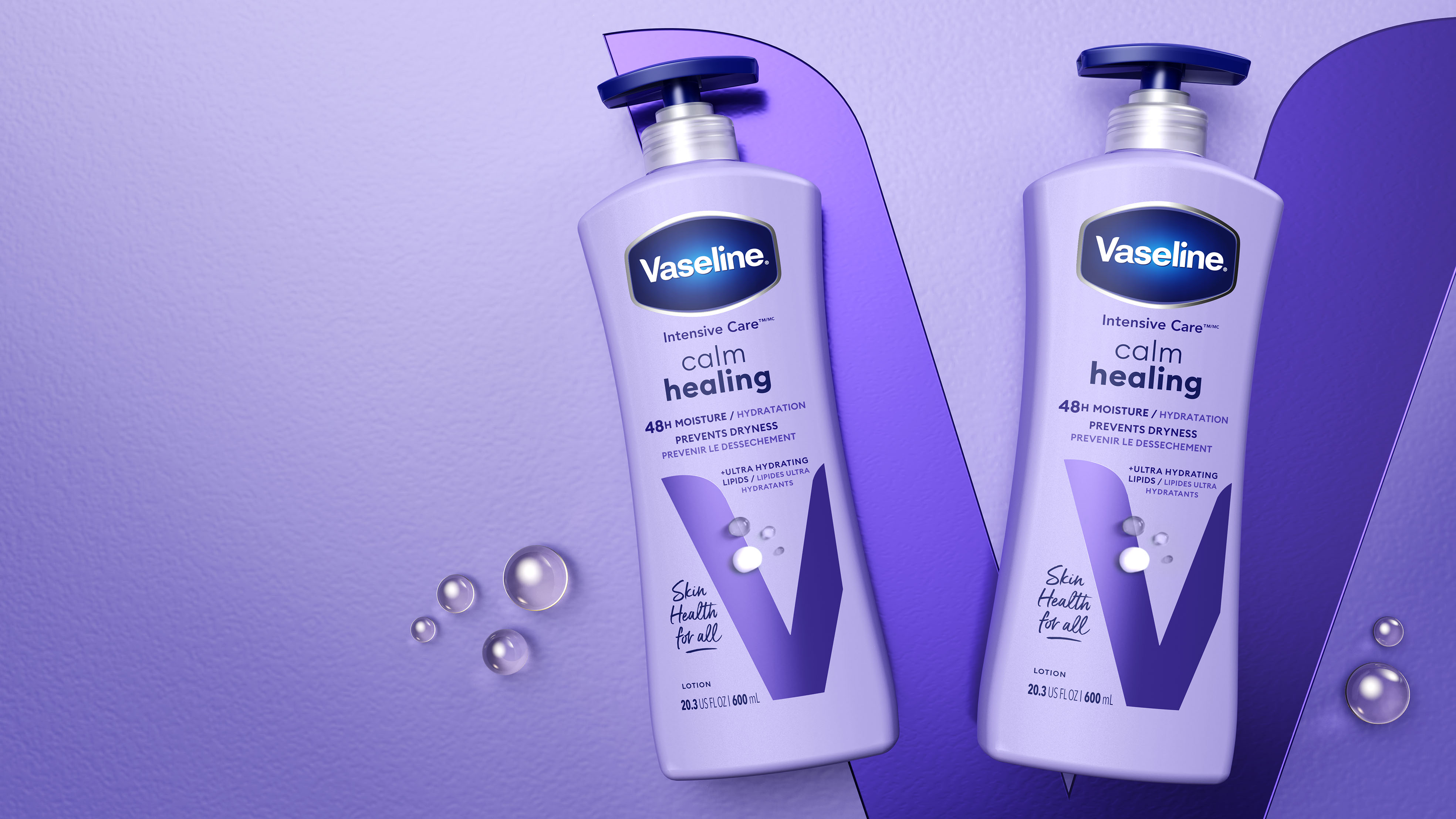
The enlarged and prominent placement of the new ‘V’ delivers greater standout while projecting confidence. To support this typographic asset and amplify its beauty, foils are incorporated too. By introducing a new on-pack messaging hierarchy, the new design can better reflect how consumers shop the category. Additionally, the introduction of an approachable typeface appropriately celebrates the human tone of the brand’s ‘Skin Health for All’ message.
This new ‘V’ asset provides body care with a category flex that has a distinctive visual identity that is still undeniably Vaseline, while re-establishing the sense of superiority of these products amongst competitor brands.
Results
The end result is an elegant expression that feels bathroom counter worthy rather than destined for the bathroom cupboard. The ownable new ‘V’ asset ultimately builds brand equity and provides significant potential to come to life off pack.
CREDIT
- Agency/Creative: PB Creative
- Article Title: Vaseline Body Care Packaging Design
- Organisation/Entity: Agency
- Project Type: Packaging
- Project Status: Published
- Agency/Creative Country: United Kingdom
- Agency/Creative City: London
- Market Region: Global
- Project Deliverables: Packaging Design
- Format: Bottle
- Industry: Beauty/Cosmetics
- Keywords: WBDS Agency Design Awards 2023/24
- Keywords: Packaging Design, Product Refinement
-
Credits:
Global Brand Manager, Unilever: Lalida Ashmun
Global Marketing Manager: Mairi Scott Dickins
Global Assistant Marketing Manager: Eva Penris


