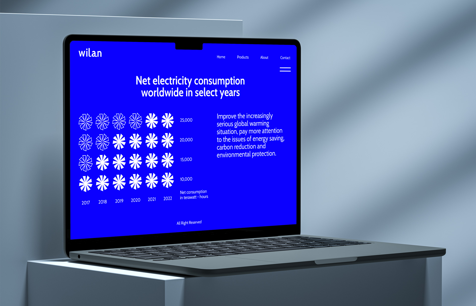
Wilan is a manufacturer of electric fans. Creating electric fans that are both environmentally friendly and provide a good experience is something Wlan is interested in. By focusing more on energy savings, carbon reduction, and environmental protection, we aim to improve the increasingly serious global warming situation.
The concept given to Wilan was ‘balance’. The concept demonstrates the value of Wilan in balancing fan performance and energy consumption. At the same time, balancing the use of Earth’s resources and the development of human life is necessary.
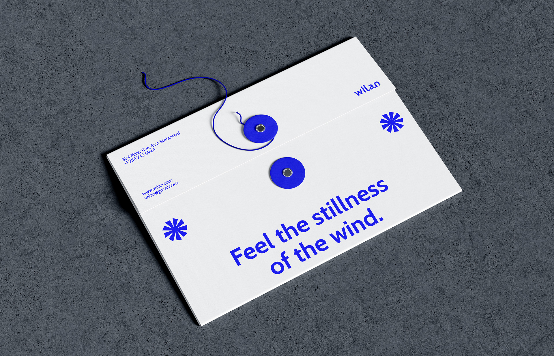
The blue color used is a reflection of Wilan’s advanced aerodynamic technology, resulting in a cool breeze blowing with minimal energy consumption.
Cabin sans serif is a modern and technological font. The contrast in lines is a reflection of humanity. Communicate the message of a company that manufactures fans using technology to fulfill human needs.
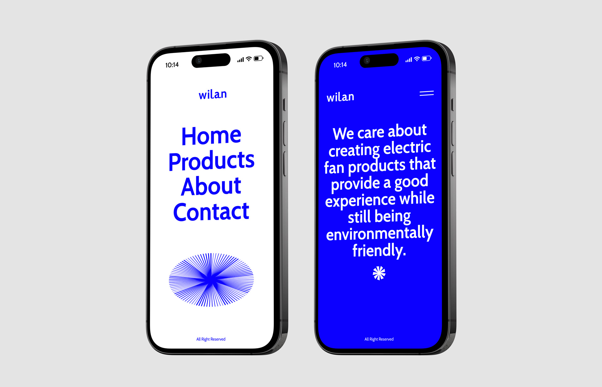
The design is given a sense of balance and solidity by having a header that is centered.
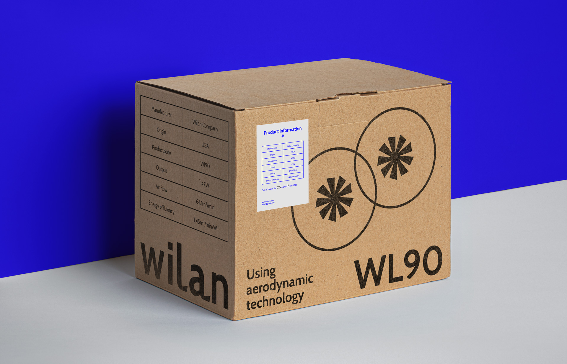
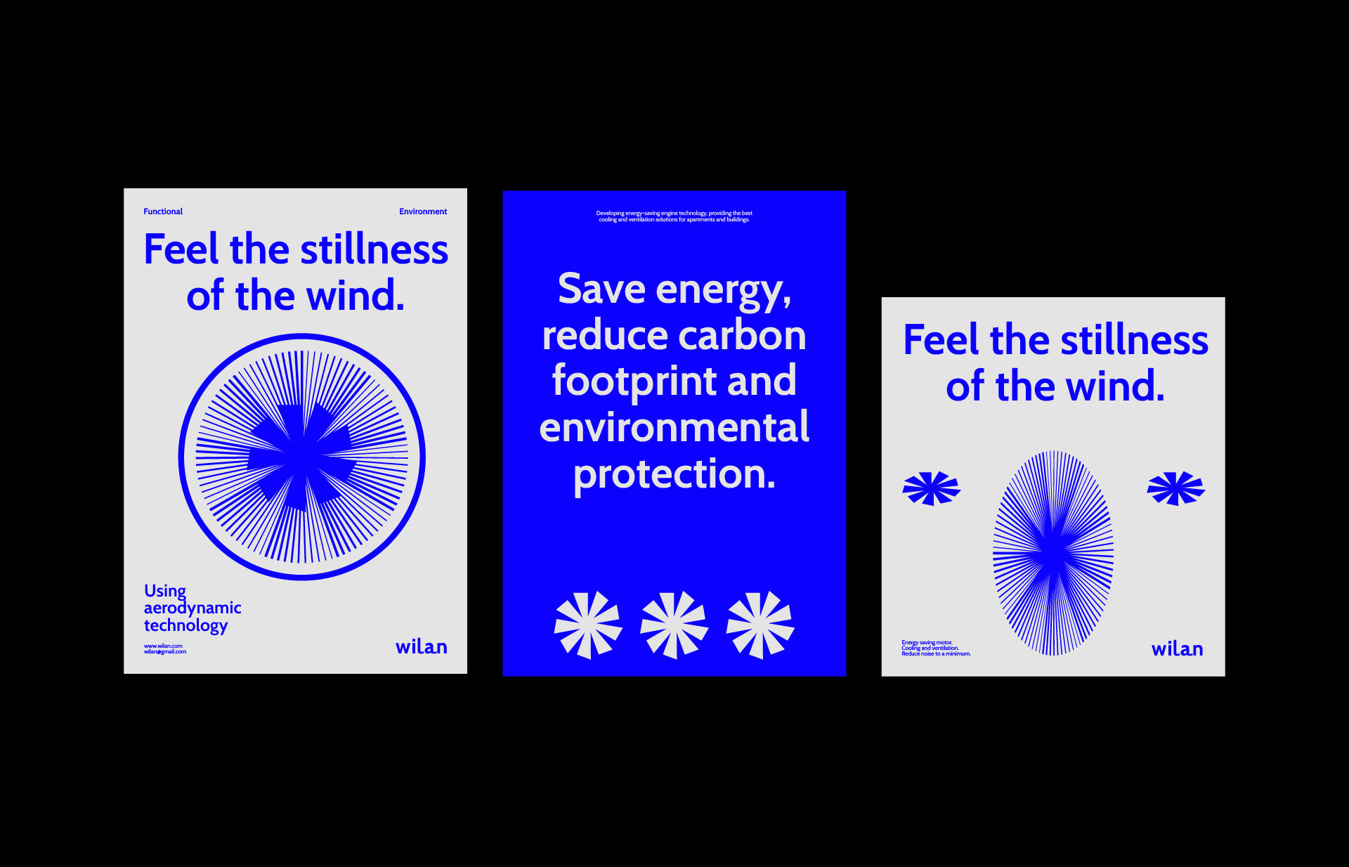
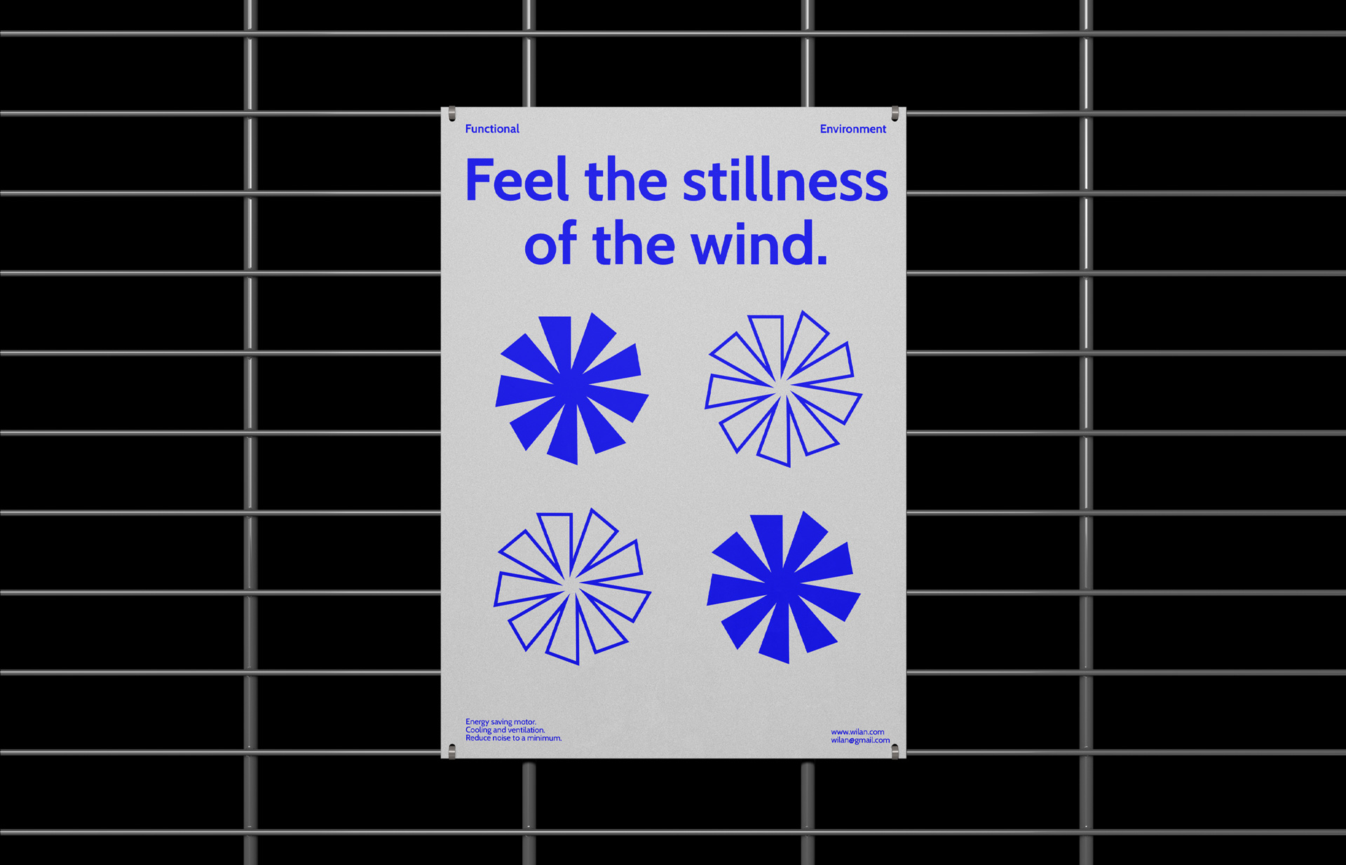
The graphics hold significance for the environment, fan products, and aerodynamic technology. Built in a circular shape, it conveys the message of achieving a stable balance in creating products that meet human needs and protect the environment. By distorted them, a sense of space is created, which demonstrates a multidimensional perspective in balancing Wilan’s products.
Minimalism in color use shows modernity, science, and streamlined technology. Just like a fan can produce a large amount of air but is quiet.
CREDIT
- Agency/Creative: Jenni Hoang
- Article Title: The Brand Identity That Aims to Emphasise Balance in Electric Fan Production for Wilan
- Organisation/Entity: Student
- Project Type: Identity
- Project Status: Published
- Agency/Creative Country: Vietnam
- Agency/Creative City: Ho Chi Minh City
- Market Region: Global
- Project Deliverables: Brand Identity, Branding
- Industry: Technology
- Keywords: Technology, Modern, Minimal.
-
Credits:
Resource: Is.graphics
Stock: Unsplash
Resource: Mockupworld


