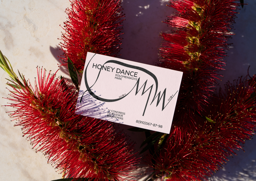
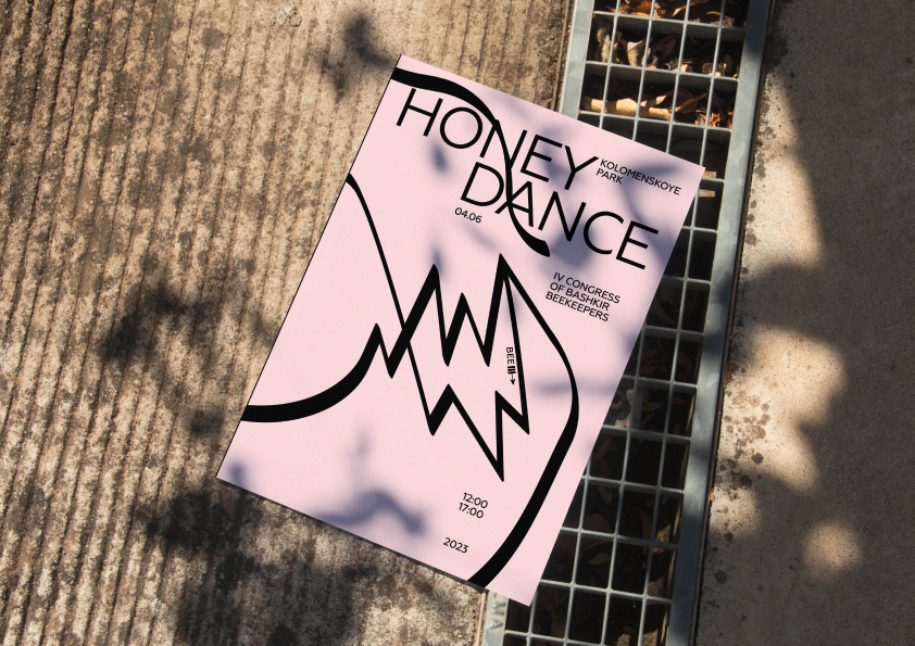
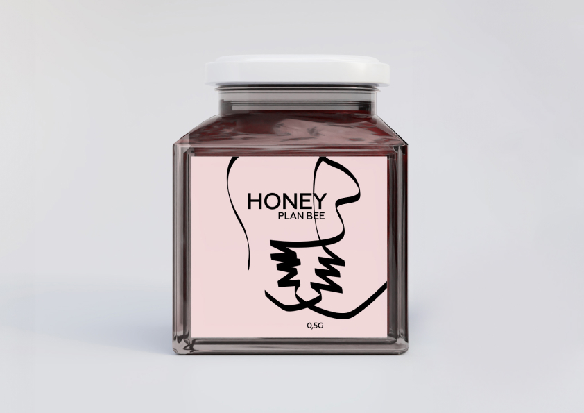
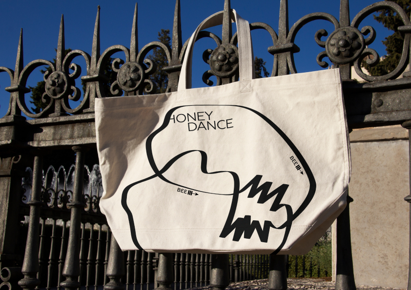
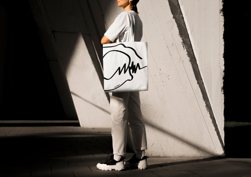
“HoneyDance” designed for Honey Fair and inspired by the bee dance path and creates a warm and cozy atmosphere for visitors. The main design elements are smooth curved lines repeating the bee flight path and warm honey shades that symbolize the naturalness and taste of honey. honey packaging are decorated with an path of a dancing bee, and the text on the packaging is connect with graphic. Such a design will definitely draw attention to the products of the fair and create an unforgettable experience for visitors. This design creates a cozy and welcoming atmosphere, perfect for a honey fair.
Bee dance is a complex process that has several functions. First of all, it is a way for bees to communicate with each other. By dancing, bees can transmit information about the location of a food source, danger, and other important things.
Bee dance consists of two parts: circular dance and waggle dance. Circular dance shows the distance to the food source, and waggle dance shows the direction to it. The bee starts with a circular dance, then moves on to a waggle dance, which shows which way to fly.
This design is perfect for the honey fair, as it creates a warm atmosphere that encourages visitors to interact and taste the honey. The use of curved lines and dancing bee imagery is playful and engaging, making the products more appealing to consumers.
This project was completed as part of my art directing course at the HSE School of Design. Thanks to my teacher Tatyana Dunaevа, whose support and encouragement, the project was successfully completed.
CREDIT
- Agency/Creative: Vinogradova Yulia
- Article Title: Creating Buzz at the Honey Fair: HoneyDance Student Packaging Design
- Organisation/Entity: Student
- Project Type: Identity
- Project Status: Non Published
- Agency/Creative Country: Russia
- Agency/Creative City: Vinogradova Yulia
- Market Region: Global
- Project Deliverables: Brand Identity
- Industry: Food/Beverage
-
Credits:
Student: Yulia Vinogradova


