Manja is one of the most recognised names in the bakery-pastry family of products, and in their almost thirty years of presence, they have gone through several upgrades of their visual identity. Considering the changes in the market, the growth of production and the increased volume of production, the bakery Manja recognised the need to completely reposition itself and build a solid position with a new visual identity, a new approach through all communication channels and strengthen its position as one of the leaders on the market.
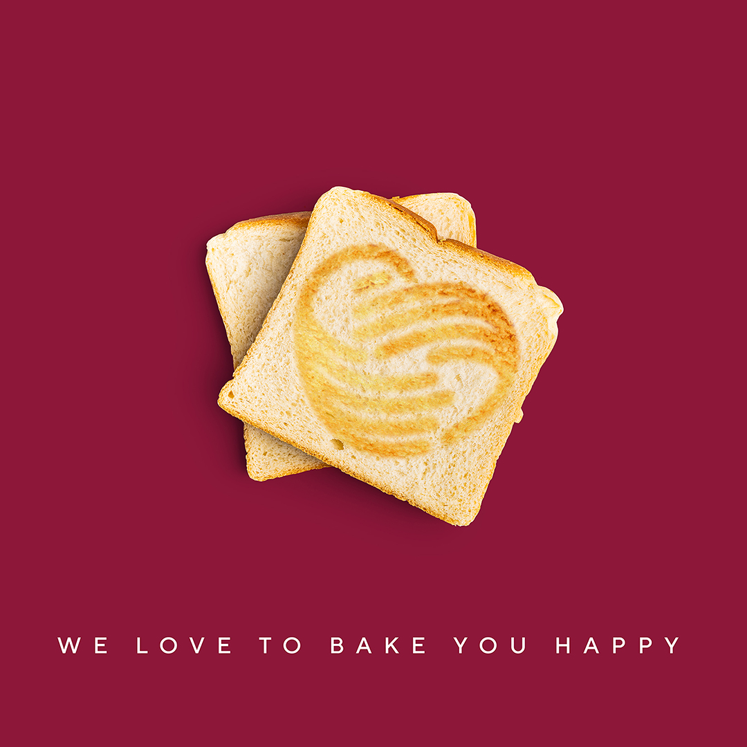
Manja Bakery boasts an assortment of almost 200 sweet and bakery products, and some of these delicious snacks need an appropriate packaging system.
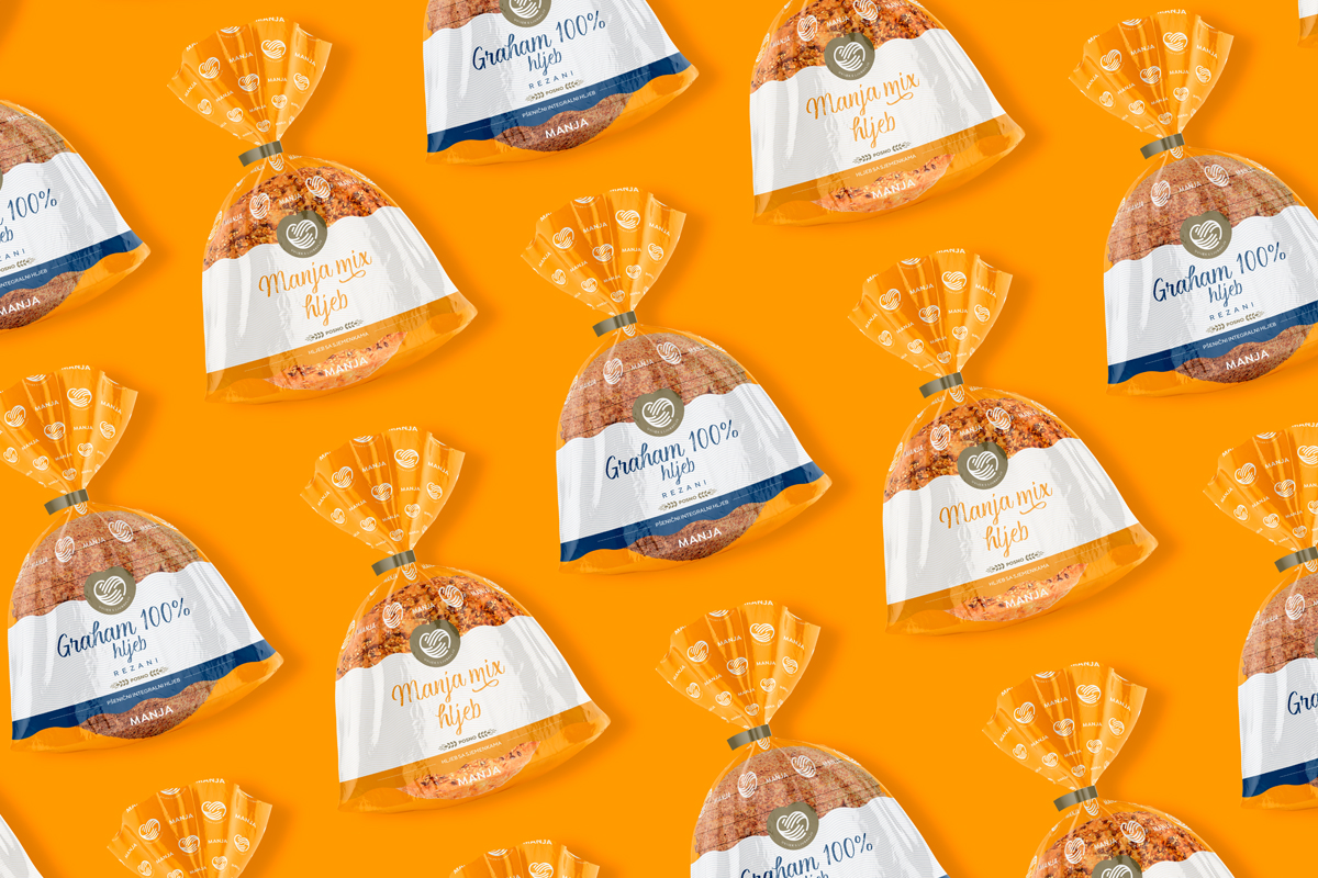
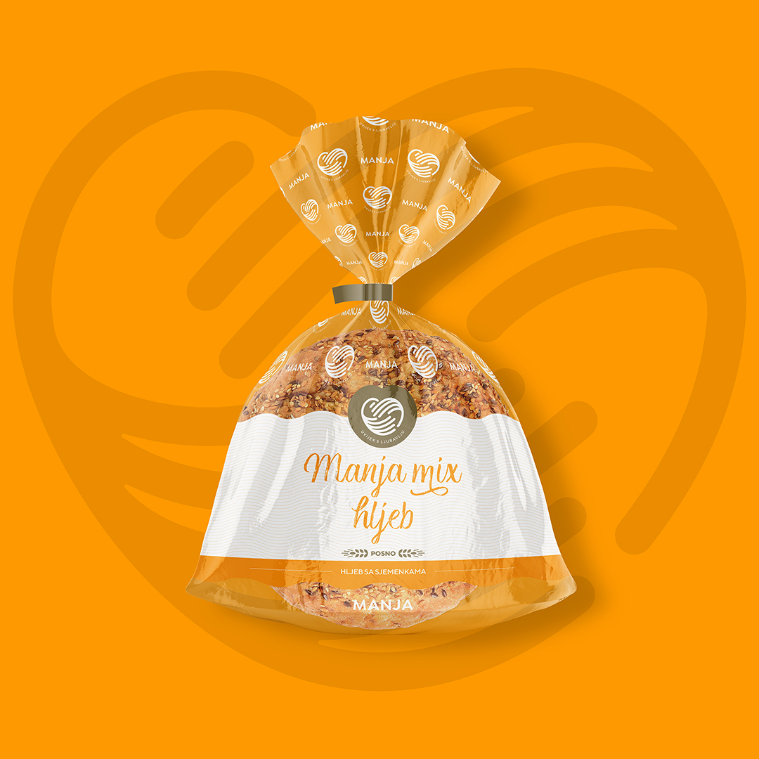
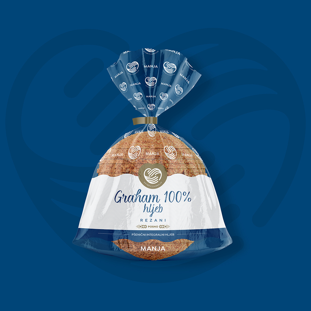
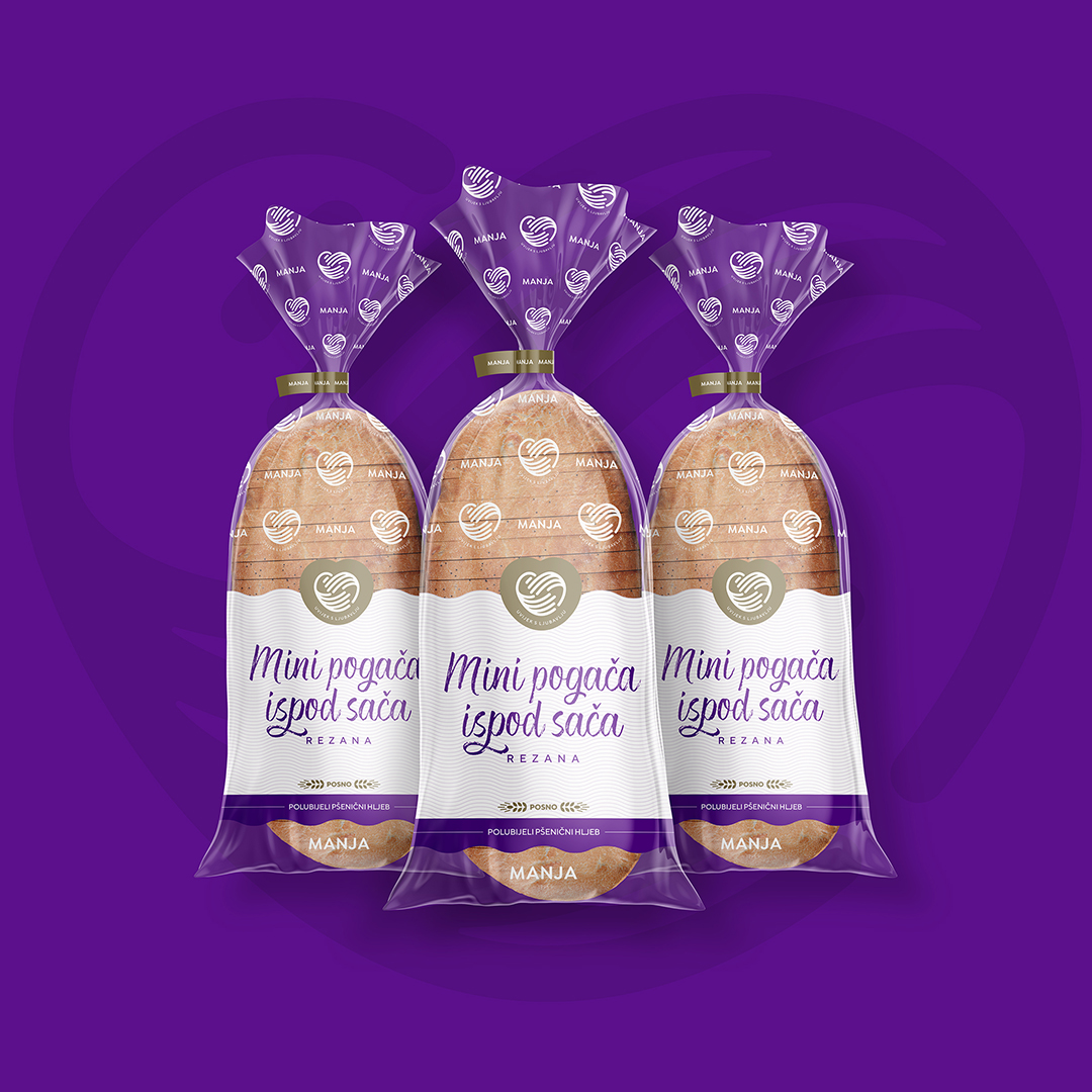
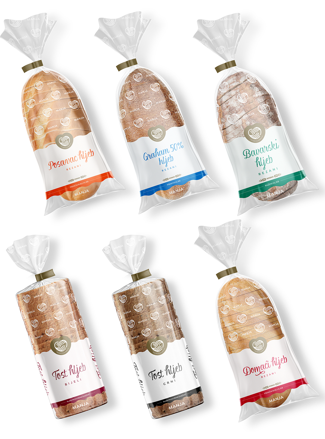
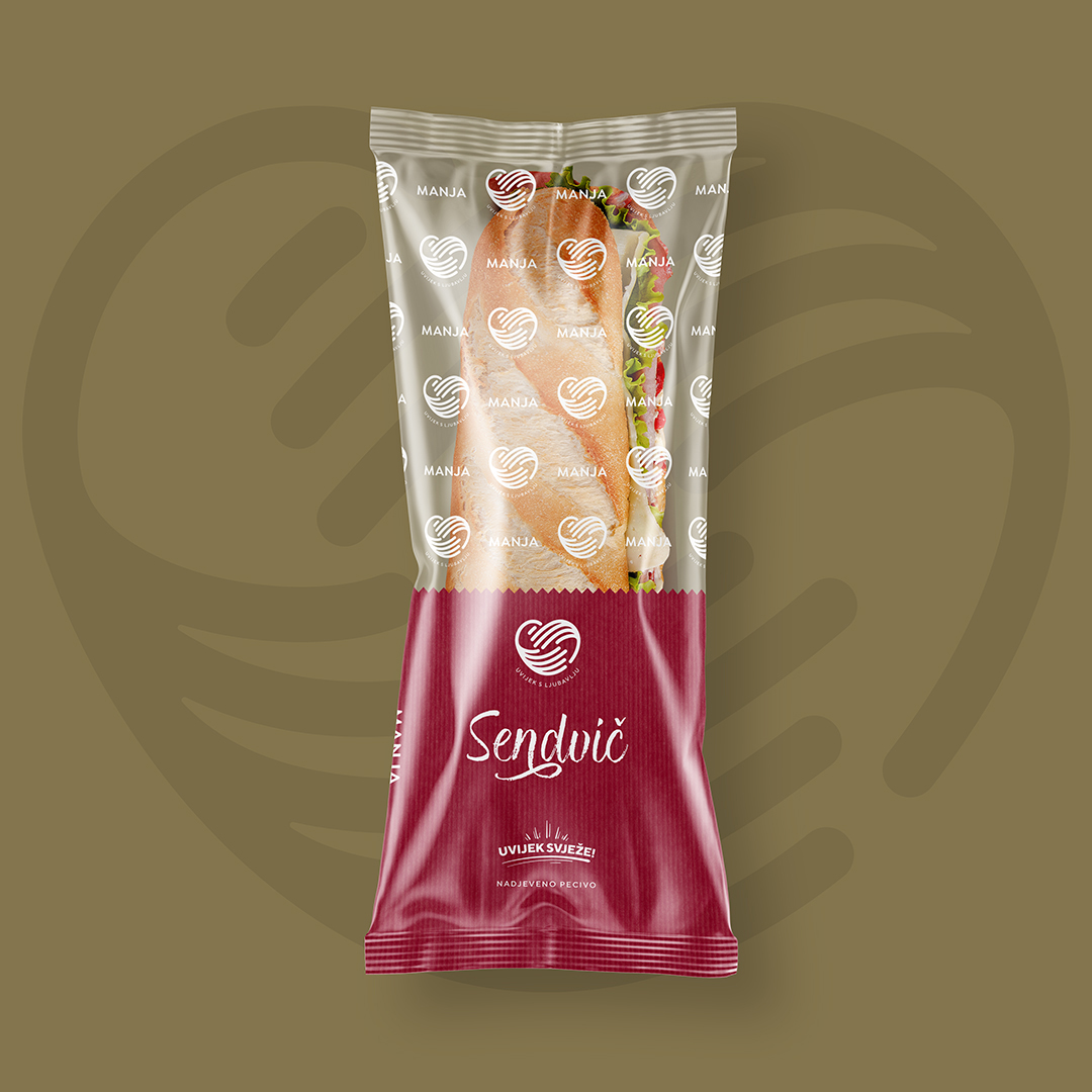
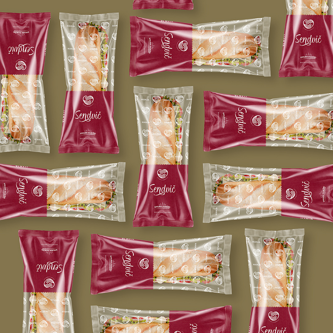
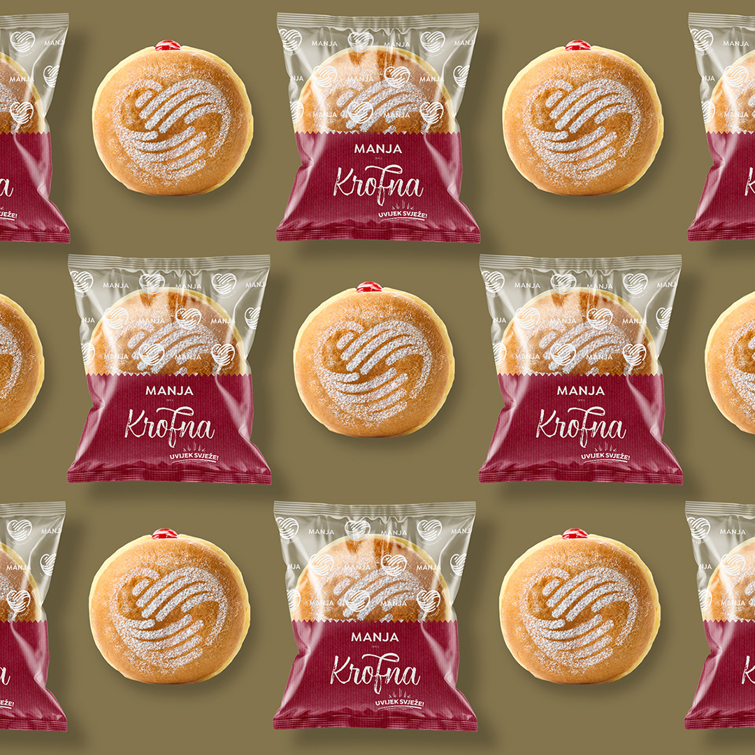
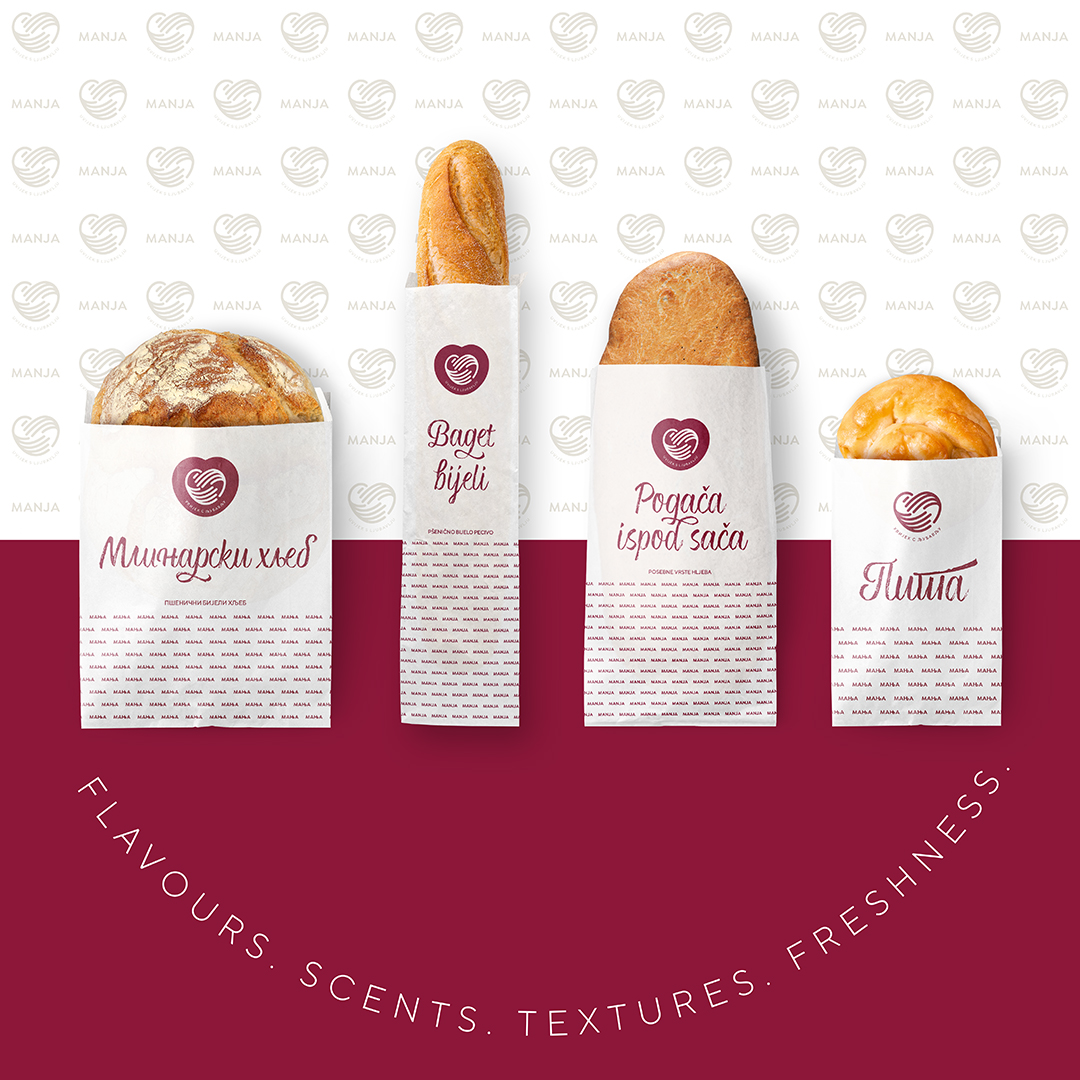
Considering that we have recently completed a new visual identity, our goal in packaging design is to communicate that new look and product quality inside the packaging. By using a minimum of 50% transparency of the material, we have consistently enabled the quality of the product to be visible, and by subtly creating a pattern made of a mark or logo, we strengthen the visibility and recognition of the new identity. We emphasized the name of each product not only by its size but also by the choice of cursive letters that suggest artisanal, handmade production.
For the series of bread packaging with extended shelf life, we used a palette of vibrant colours. We thus emphasized the diversity of the product – making it easier to recognize and increased visibility on the shelves compared to the competition, but also showing the evolution and innovation of the brand.
We also aimed to use, wherever possible, biodegradable materials or materials that are suitable for recycling, which will not impair the quality and durability of the product or increase the price of the product.
CREDIT
- Agency/Creative: Studio Nenad Dosen
- Article Title: Manja Bakery’s Visual Identity and Sustainable Packaging Transformation
- Organisation/Entity: Agency
- Project Type: Packaging
- Project Status: Published
- Agency/Creative Country: Bosnia and Herzegovina
- Agency/Creative City: Banja Luka
- Market Region: Europe
- Project Deliverables: Brand Design, Creative Direction, Packaging Design
- Format: Bag
- Industry: Food/Beverage
- Keywords: bakery, packaging, bread, toast bread, food, pastry, savoury, sweets, sandwich, donuts, sliced bread
-
Credits:
Creative director: Nenad Dosen
Photographer: Bojan Crnokrak


