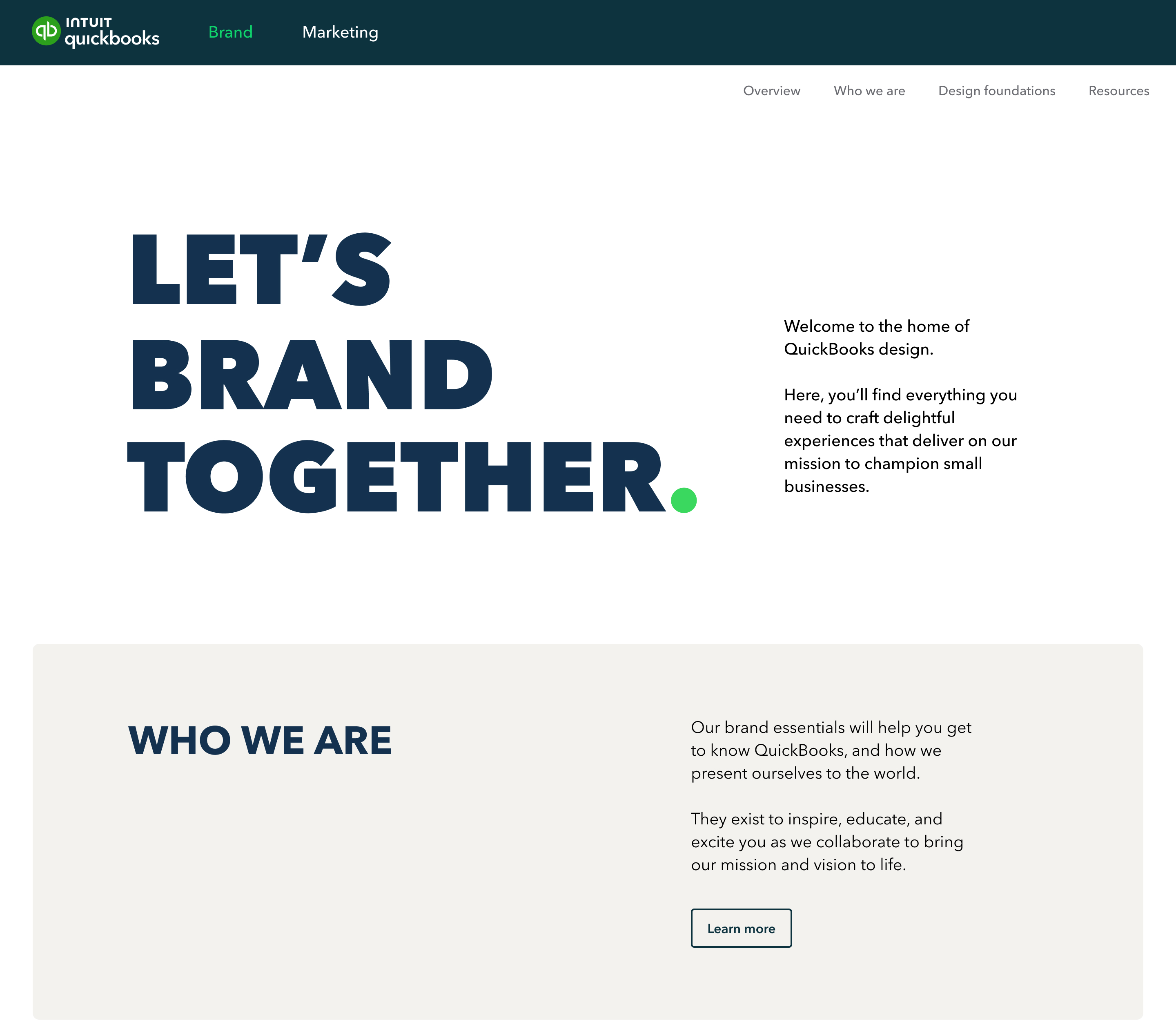
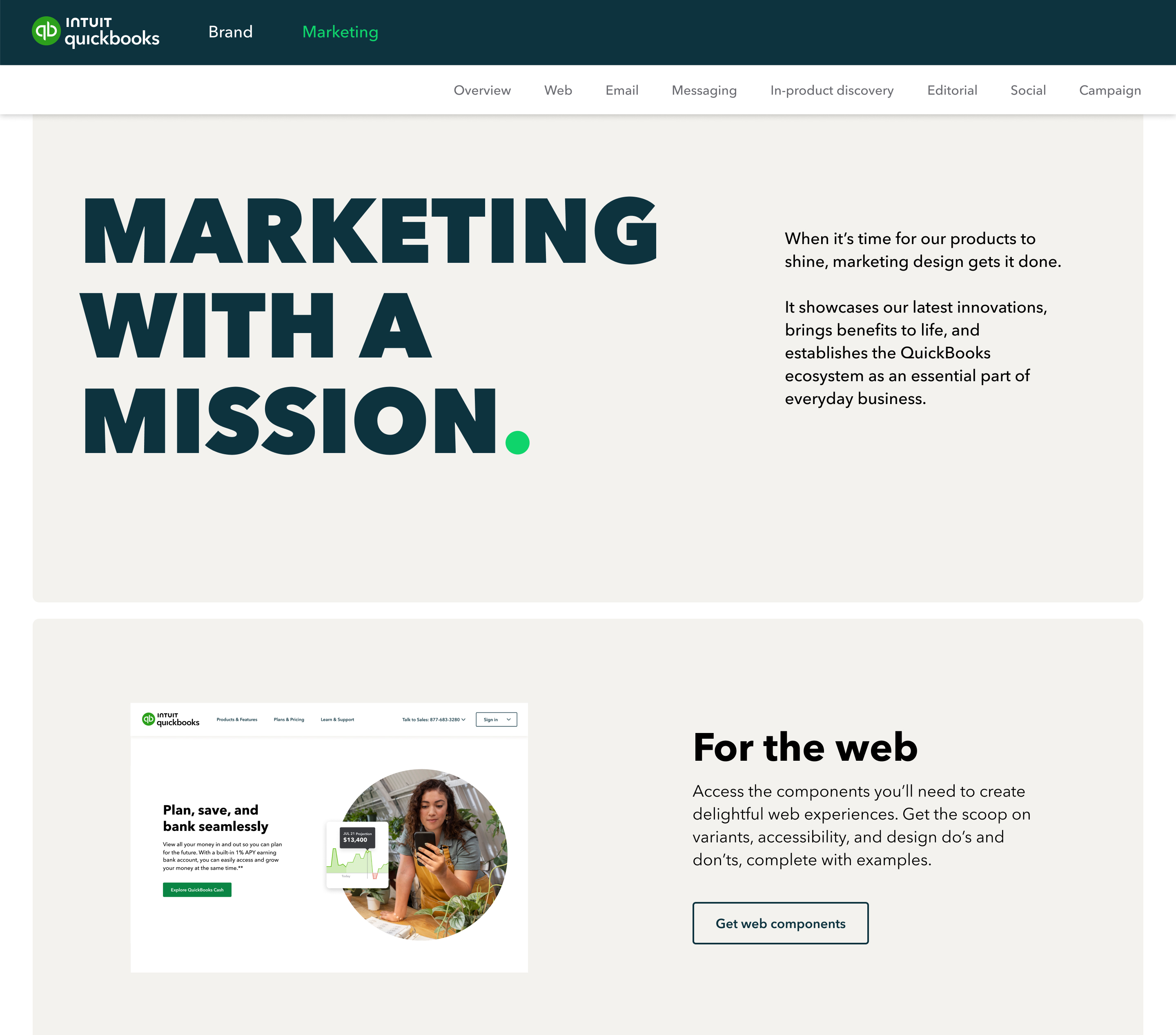
When people visit our QuickBooks Design site, we want them to see more than static designs on a page—we want to provide a delightful interactive experience. When starting this project, we set out to provide a stunning and inspiring design site that expresses our brand, marketing, and product design foundations to anyone looking to learn more about our design, and to make a bold statement that “This is QuickBooks Design.”
QuickBooks has already established its reputation as an industry design leader. We’ve positioned ourselves at the forefront of design systems through our gold-standard, public-facing website for product design. The evolution of our brand & marketing design led us to create an overarching site that goes beyond product.
Our goal was simple: To create a beautiful experience that informs and inspires creatives to do their best work.
Our approach:
QuickBooks brand & marketing didn’t have a single, source-of-truth repository for agencies, marketers, and in-house designers to find design guidelines and download foundational assets, toolkits, playbooks, and templates.
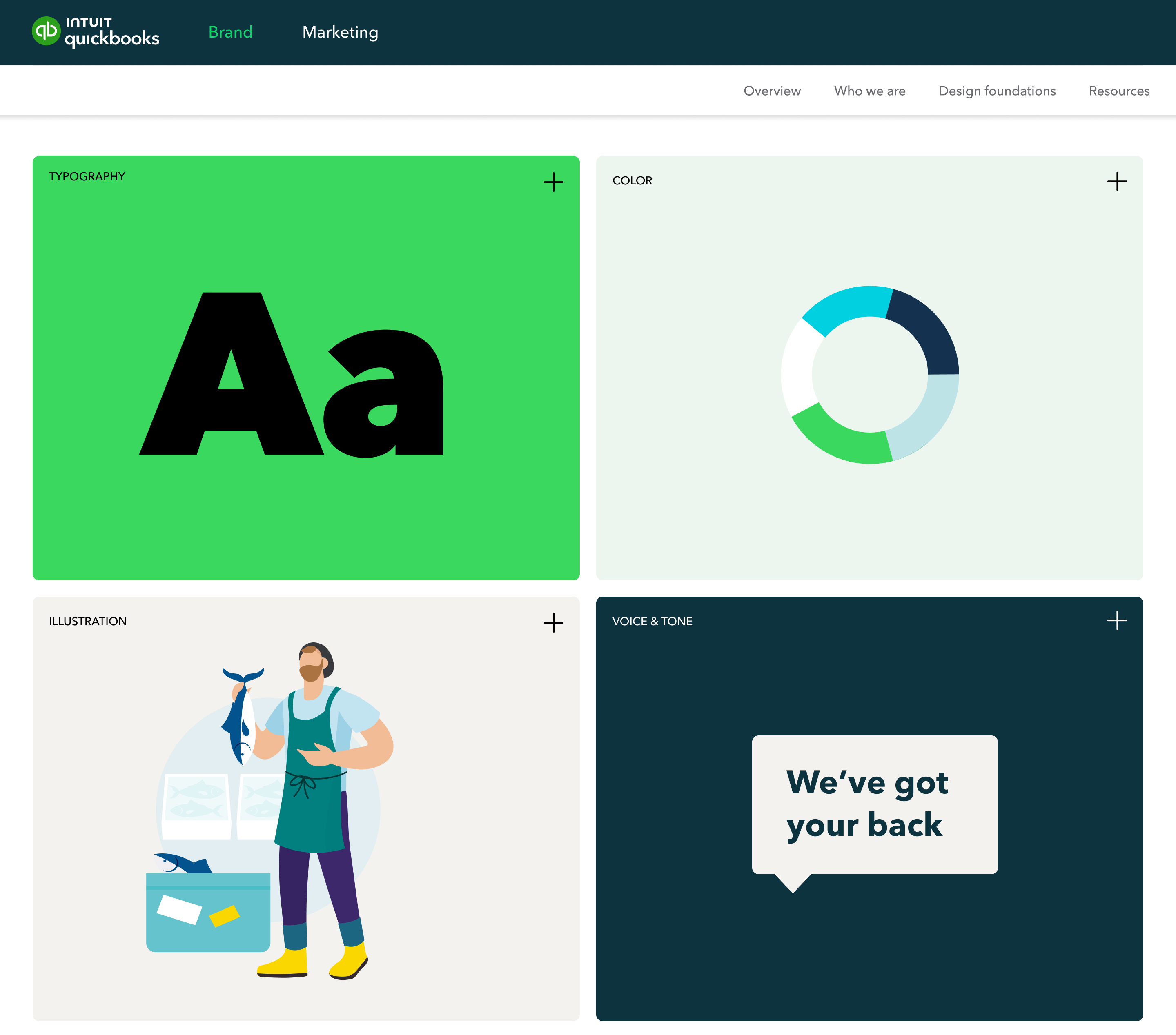
It was important for us to create a single source of truth for all of QuickBooks Design—including brand, marketing, and product—so we created “hubs” that give each discipline ownership of their space and still feel like a part of the QuickBooks Design family. The hubs for brand and marketing are currently live, with the product hub coming soon.
We assembled an all-star team of in-house designers across various disciplines, including visual, content, platform, and motion, from the US, Canada, and the UK. We created and compiled a broad range of design explorations, information architecture options, and prototypes.
Once we aligned on a creative concept, we tested it with design teams to ensure the experience was easy and intuitive, the information clear, and the guidelines and assets readily discoverable. We migrated important information and guidelines that were previously scattered across various internal locations, refining, updating, and optimizing all resources to be as user-friendly as possible.
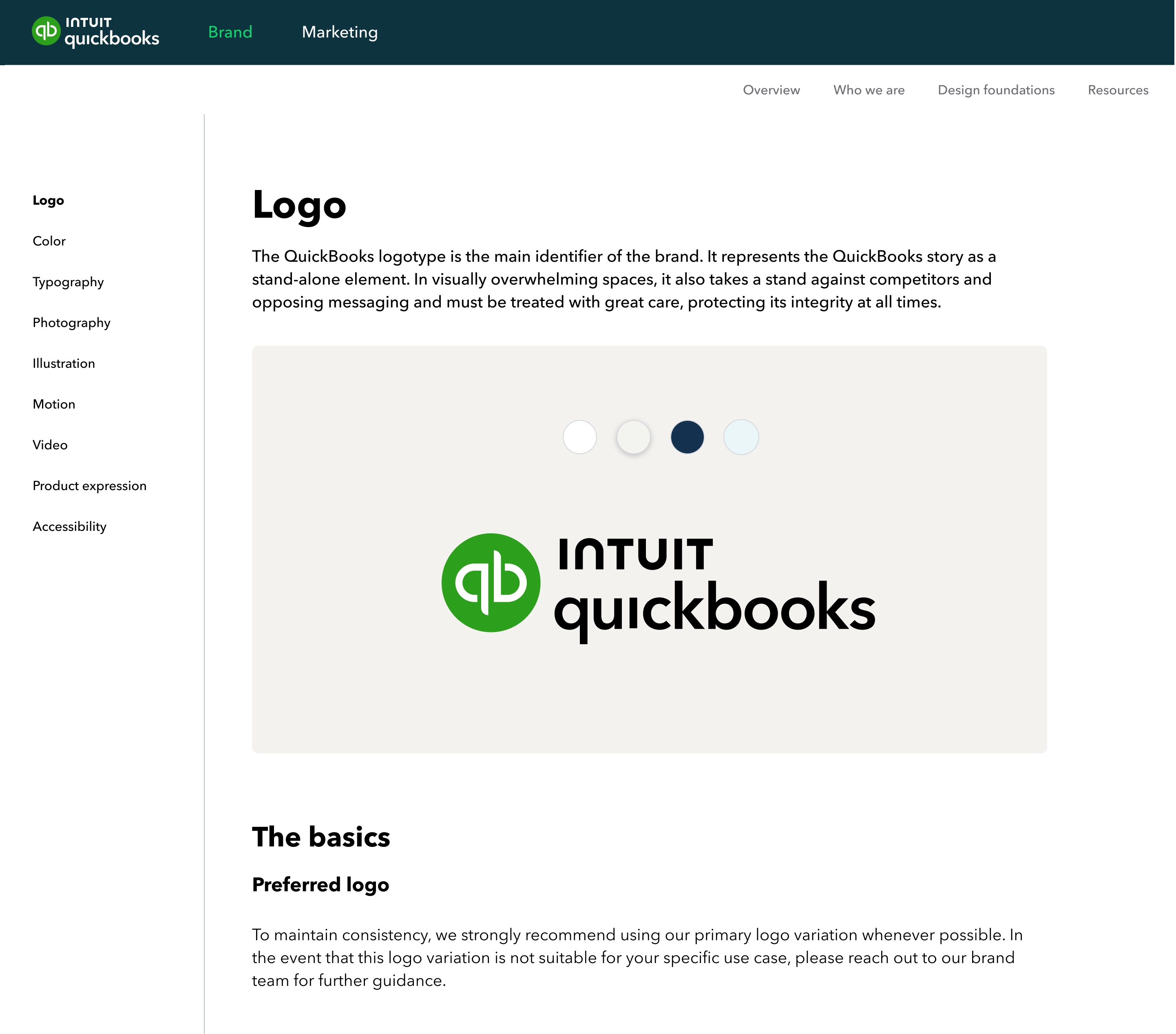
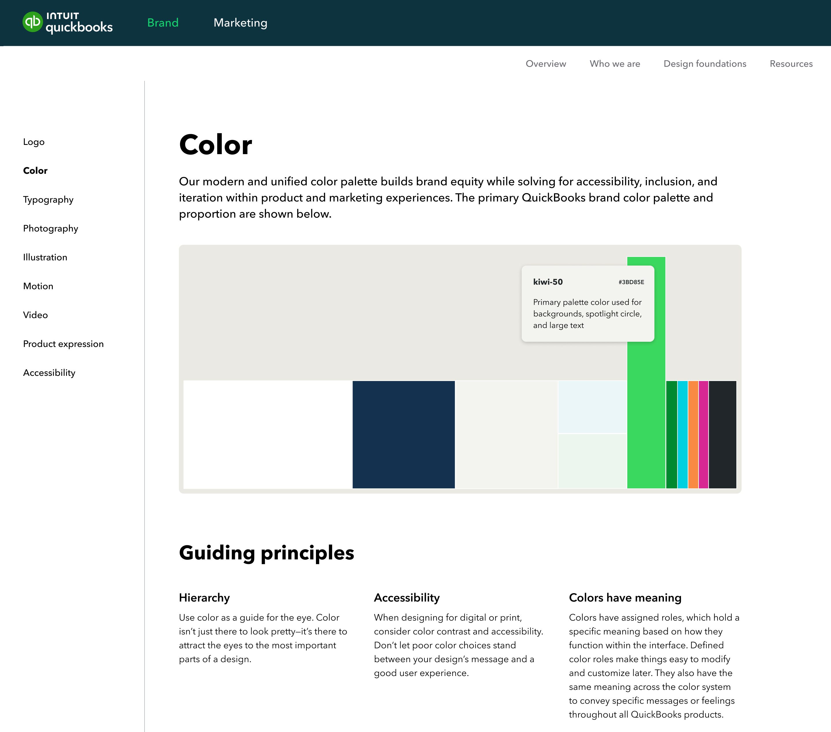
We used our own design system and platform when creating the website so that every page is an example of what our components can do. The site is built with scalable information architecture, featuring reusable components and templates, that seamlessly integrate with our existing asset management platform for convenient downloading of assets for both internal and external users.
CREDIT
- Agency/Creative: Intuit QuickBooks
- Article Title: QuickBooks Digital and Website Design
- Organisation/Entity: In-House
- Project Type: Digital
- Project Status: Published
- Agency/Creative Country: United States
- Agency/Creative City: Mountain View
- Market Region: North America
- Project Deliverables: Digital Art, Web Design
- Industry: Retail
- Keywords: WBDS In-House Design Awards 2023/24
- Keywords: Digital Design, Website
-
Credits:
Product design strategist u2014 visual: Tina Yuan
Product design strategist u2014 visual: Suncica Lukic
Principal product designer: Aaron Ranftl
Principal content designer: Stacey Chase
Principal product designer u2014 visual: Adam Thomas
Principal product designer u2014 visual: Jesse Bray
Principal product designer u2014 visual: Manjia Zhao
Principal product designer u2014 visual: Dario Lofish
Principal product designer u2014 visual: Nava Tummalapalli
Senior product designer u2014 motion: Benjy Deng
Senior product designer u2014 visual: Ashley Meadows
Senior product designer u2014 visual: Sarah Struck
Senior product designer u2014 visual: Shaun Cavanaugh
Product design strategist u2014 visual: Hetal Soni
Senior content designer: Alex Glenn
Head of web development u2014 Europe: Adrian Jacob
Senior web developer: Brian Bento
Web development manager 2: Dixit Patel
Senior marketing operations manager: Amy Im
Product manager u2014 web platform: Judy Lee
Senior SW Engineer: Sreekanth Gubiligari
Staff SW Engineer: Afzal Yusuf Gousjan
Senior design technologist: Junjun Pan
Design technologist: Kiran Nasim


