Background
Substance use has reached a crisis point in the workplace, with 46% of American workers having experienced personal or family problems involving substance or alcohol use.
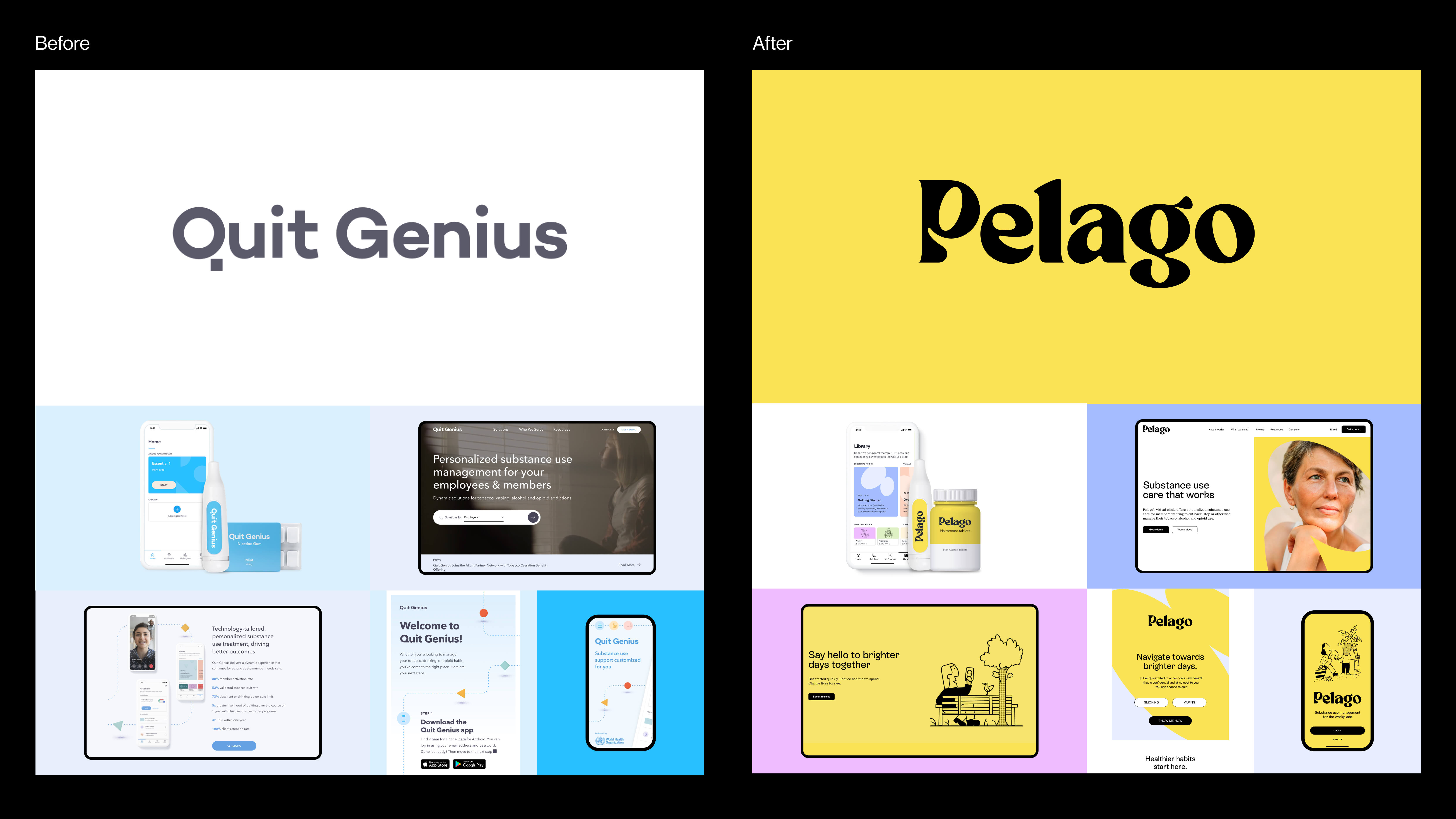
Despite 2 in 3 workers believing employers should offer support, only 17% report having this benefit. Quit Genius was created in 2017 as a virtual clinic that partners with employers to provide discreet substance use treatment at scale. Despite traction and success, the brand was failing to connect with audiences, and with the company also looking to expand their platform to cover other areas of substance misuse, a new brand was therefore needed.
With the realization that people who suffer from substance use feel isolated and alone, A LINE created an optimistic new brand that addresses the stigma around addiction and makes substance use support approachable and accessible.
Brand Strategy: Creating a category
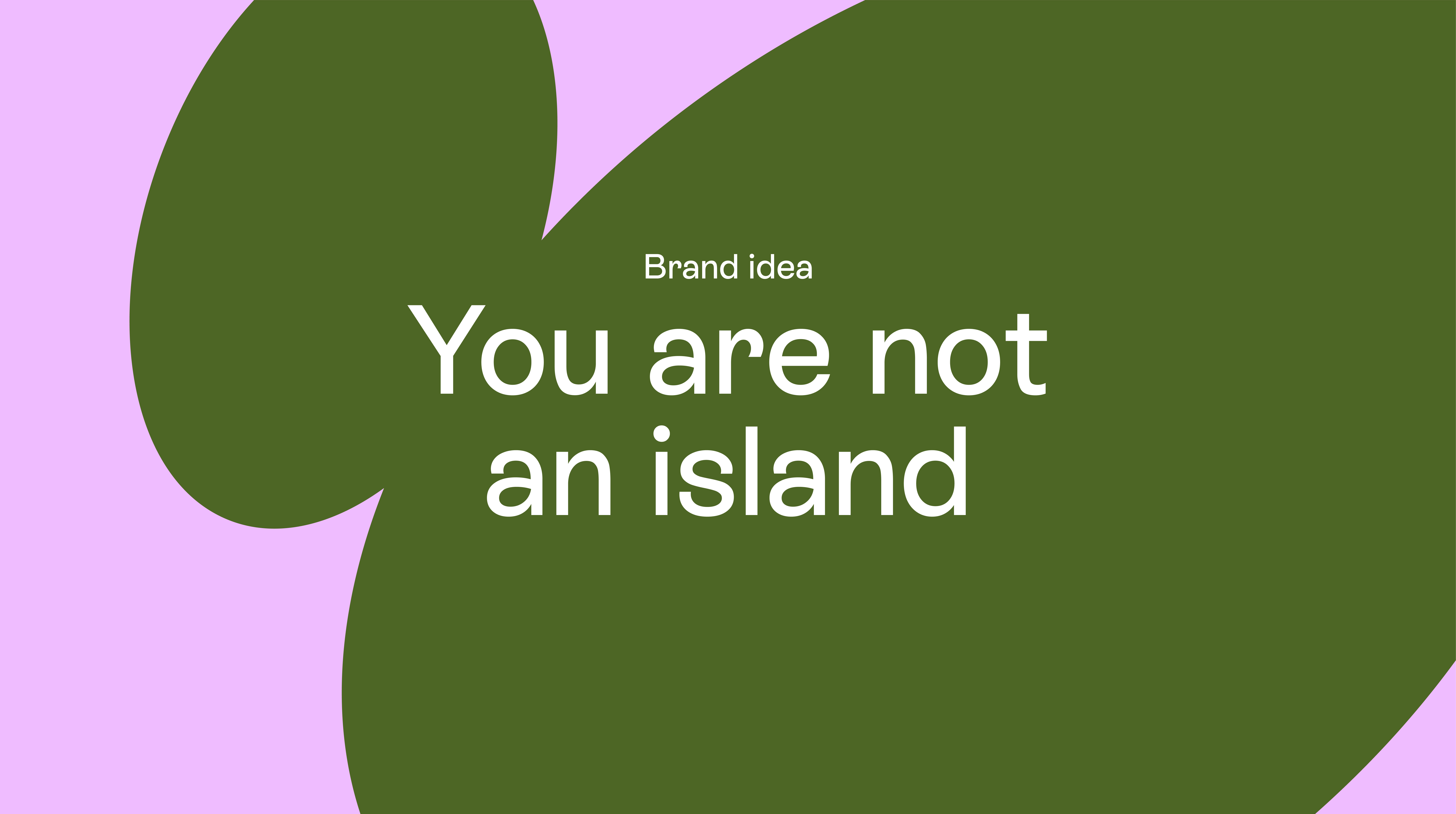
In a sector loaded with terms like “Addict” and “Rehab”, there was a clear opportunity to change the conversation around substance use. By defining a new category of “Substance use management for the workplace”, and a brand idea of “You are not an island,” we built a narrative grounded in empathy that would help remove the stigma and better support access to substance use care that works.
Naming and Logotype: You are not an island
With research showing the name “Quit Genius” as potentially problematic, and with the opportunity to create more positive member engagement, we embarked on an in-depth naming process that led to “Pelago”.
Rooted in the word “Archipelago”, which is a chain of islands scattered in the sea, Pelago alludes to islands that moved away from the continent to which they were attached, but, remain close enough to be still connected.
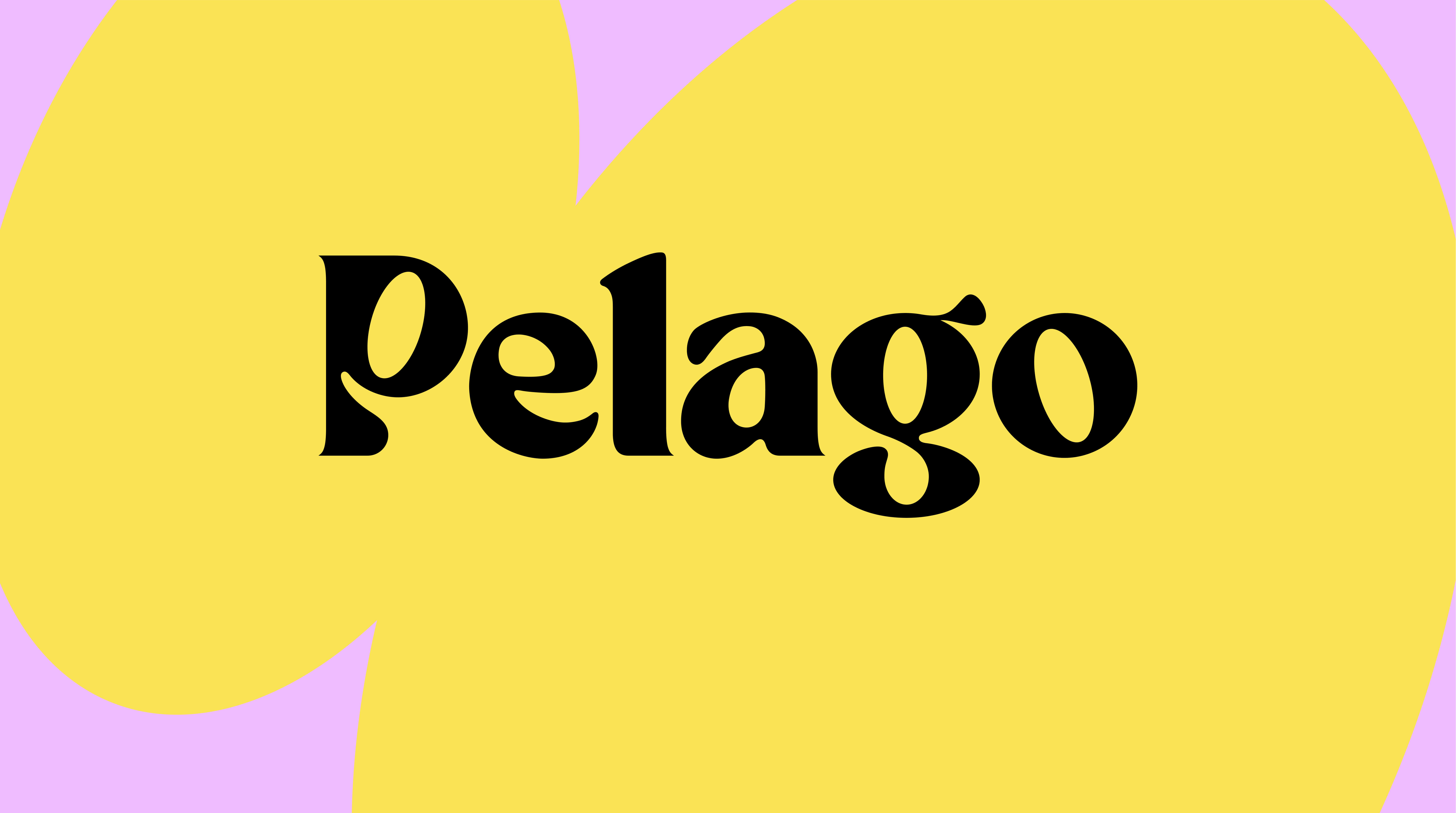
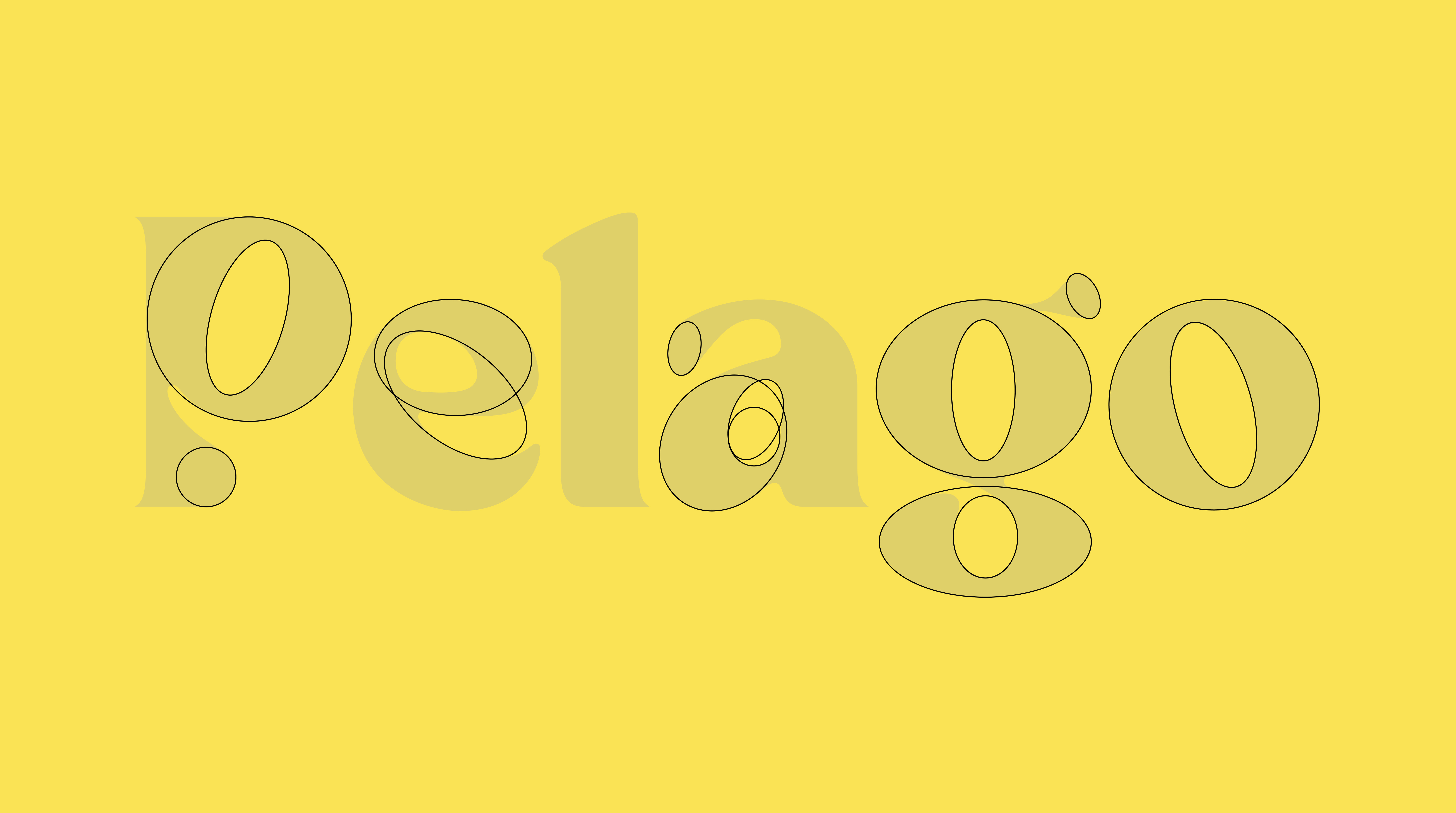
The custom logotype was design to feel optimistic and accessible, using ovals to construct each letter.
Brand Personality: Propelling people forward
To bring Pelago to life, we created a balanced brand personality to guide the visual identity, tone of voice and key messaging.
“Optimistic” and “Ally” represent Pelago’s commitment to supporting members every step of the way. “Centered” and “Progressive” represent the technology and data-driven insights used to deliver care informed by science.
Messaging & TOV:
Pelago’s messaging and tone of voice builds on their core brand idea and personality, to create a guiding set of Tone of Voice principles and Messaging examples:
Inviting, not cheeky.
Compassionate, not soft.
Purposeful, not clinical.
Forward-looking, not techie.
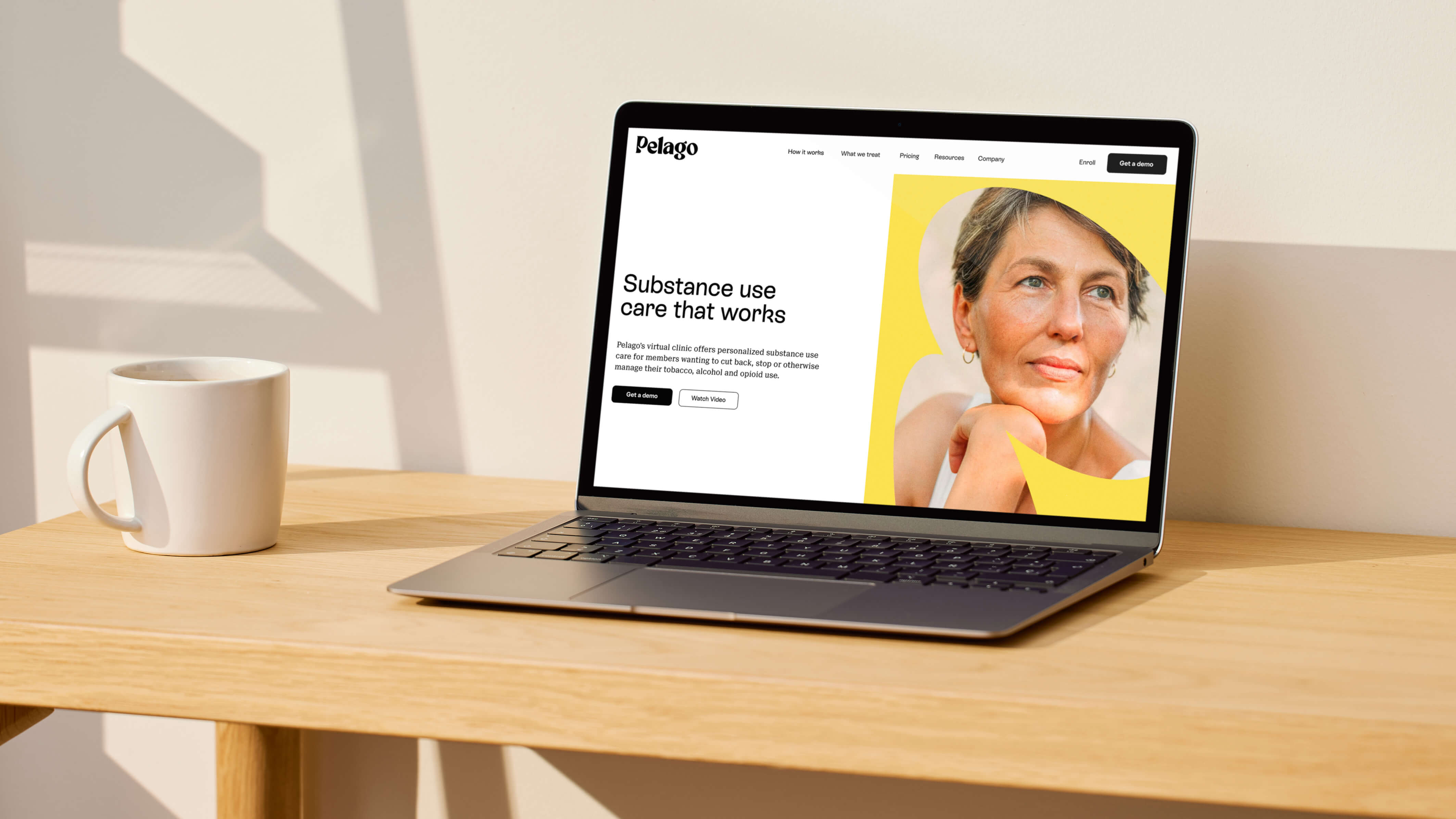
Website: Say hello to brighter days
Pelago’s new website and digital product experience had to carefully balance the unique requirements of client and member audiences. Motion is used to build member engagement and bring the new brand’s optimistic and progressive personality to life.
Design System and Brand Applications
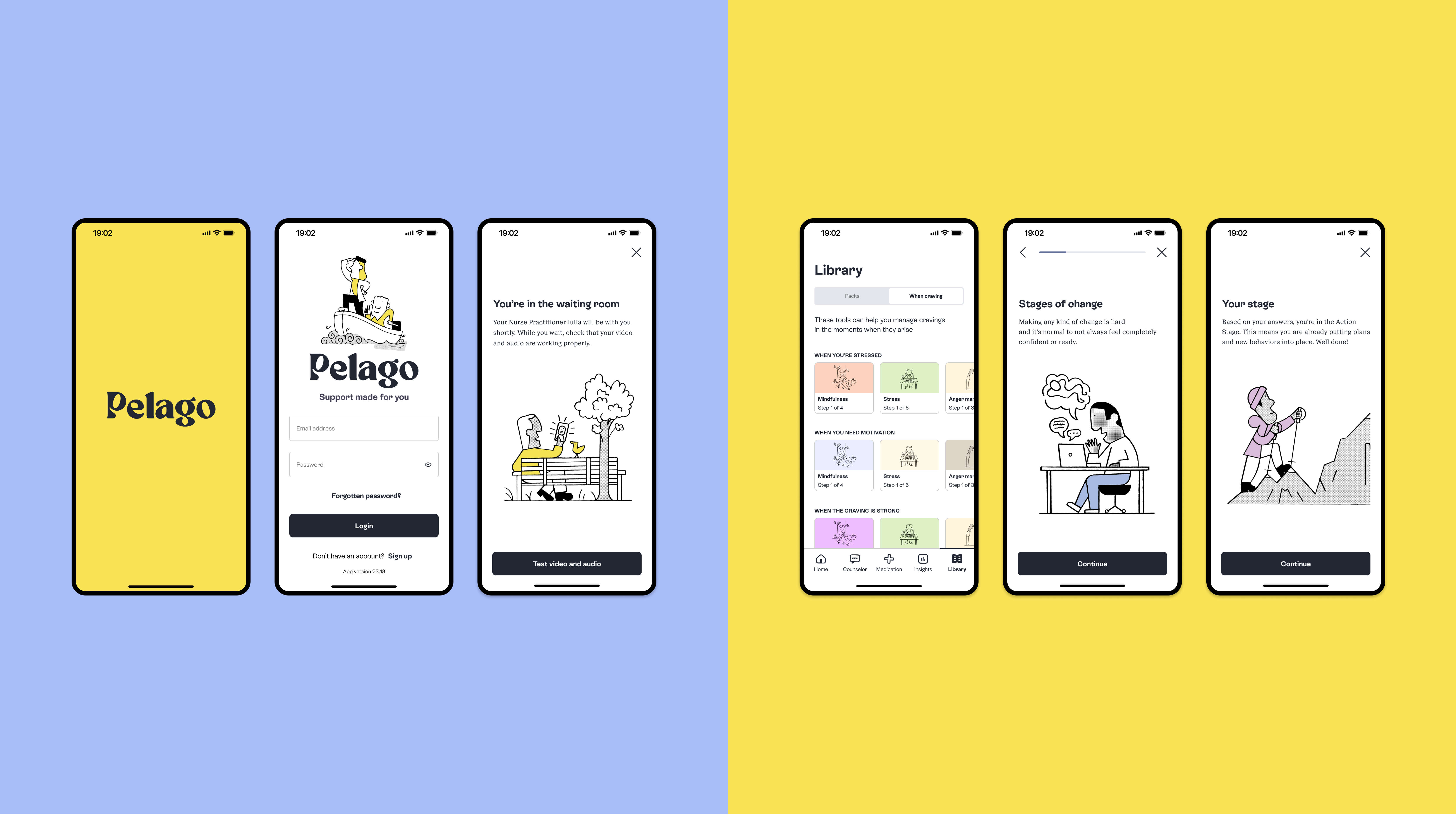
App: Guidance was created for Pelago’s app which included data visualization, as well as illustration usage to create key moments in the patients success journey, helping keep people motivated and engaged.
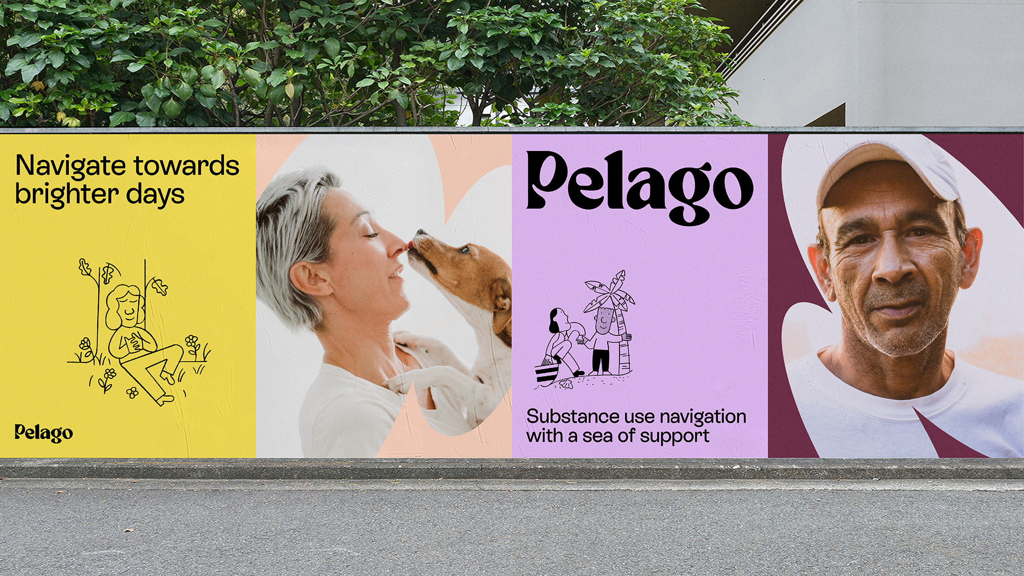
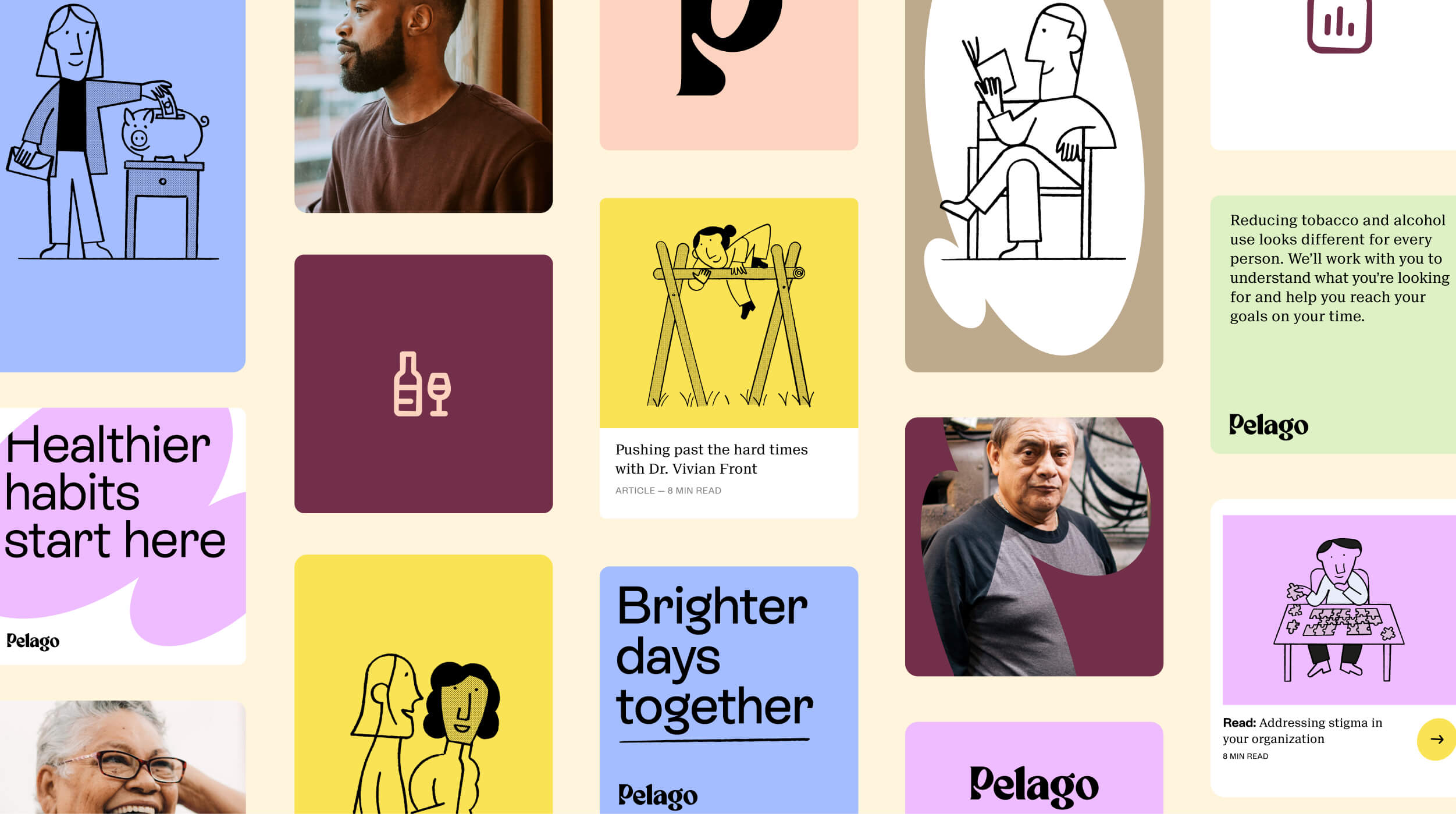
OOH: Out of home combines the main brand identity elements to create ads that feel optimistic and relatable.
Social: A flexible yet distinct system was created for sharing across Pelago’s social media.
Logotype: The idea of using ovals to represent islands in the identity system carried through when crafting a custom logotype. The ovals in there e “P”, “g”, and “o” were positioned leaning in towards each other to help with the feeling of support.
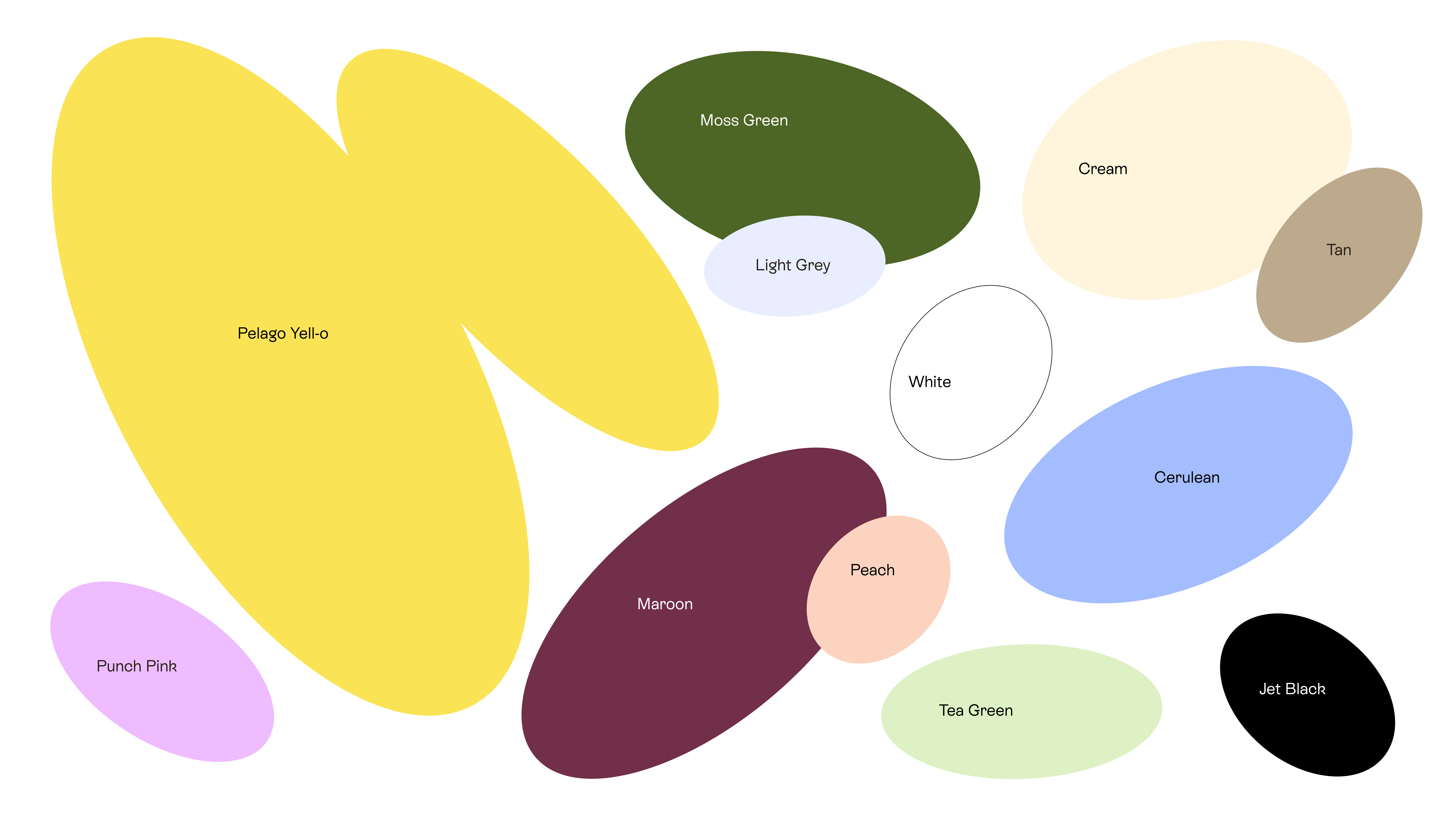
Color Palette: color palette pairs the optimistic hero color “Pelago yell-o” with approachable earth tones that speak to a grounding in understanding and knowledge.
Typography: Pelago’s typefaces reflect their optimistic, accessible and informed nature, allowing them to adapt to context and conversation while remaining recognizable. Rebond Grotesque was chosen for its calligraphic, deeply human feel. Suisse Neue was chosen to bring an informed feel to balance their typography.
Iconography: Iconography is designed to create clarity while also being friendly and approach-ably imperfect. An extensive set of over one hundred icons were created ranging from very specific to more commonly recognized icons. All icons were constructed on a custom grid and finished by angling the inside shape by 3 degrees, making the icons relatively easy to create while being distinct.
Illustrations: Illustrations, created by Jay Cover, were designed to feel quirky and relatable while varying from functional to expressive.
Photography and art direction: The selection of imagery was chosen to reflect Pelago’s diverse audience. Imagery is warm, optimistic, and honest with a journalist approach, capturing real people, not models and actors.
CREDIT
- Agency/Creative: A Line
- Article Title: Optimistic Brand Design for Pelago
- Organisation/Entity: Agency
- Project Type: Identity
- Project Status: Published
- Agency/Creative Country: United States
- Agency/Creative City: San Francisco
- Market Region: North America
- Project Deliverables: Brand Identity
- Industry: Professional Services
- Keywords: WBDS Agency Design Awards 2023/24
- Keywords: Identity, Brand Design Creation
-
Credits:
Creative Director: James Trump
Project Lead: Tess Lenk
Motion Designer: Barney Fagan
Senior Designer: Brandi Steele
Senior Designer: Mackenzie Pringle
Writer: Laura Kelley
Creative Strategist: Victoria Tessa
Designer: Grace Cai
Business Lead: Nick Monkhouse
Illustrator: Jay Cover


