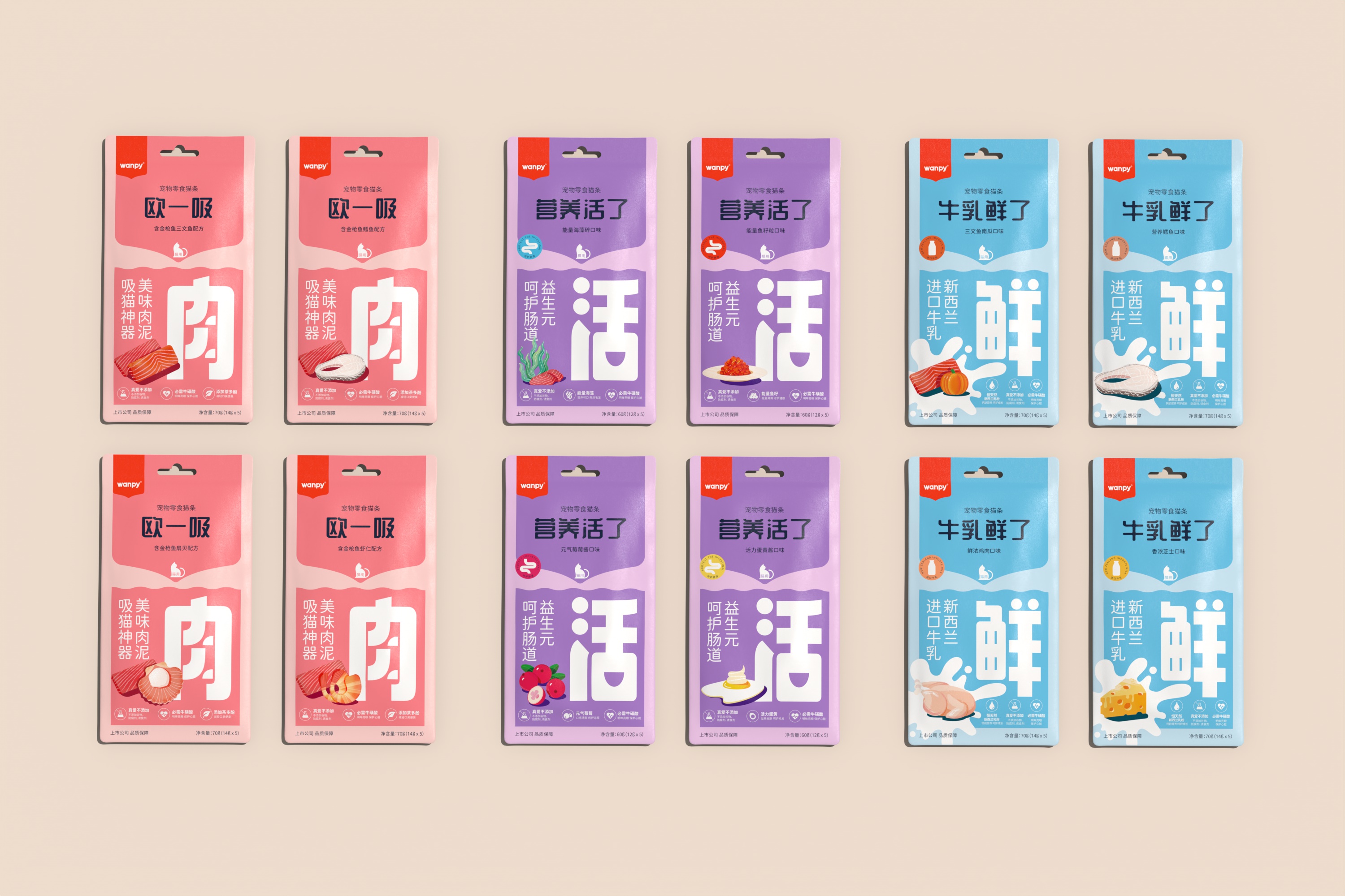
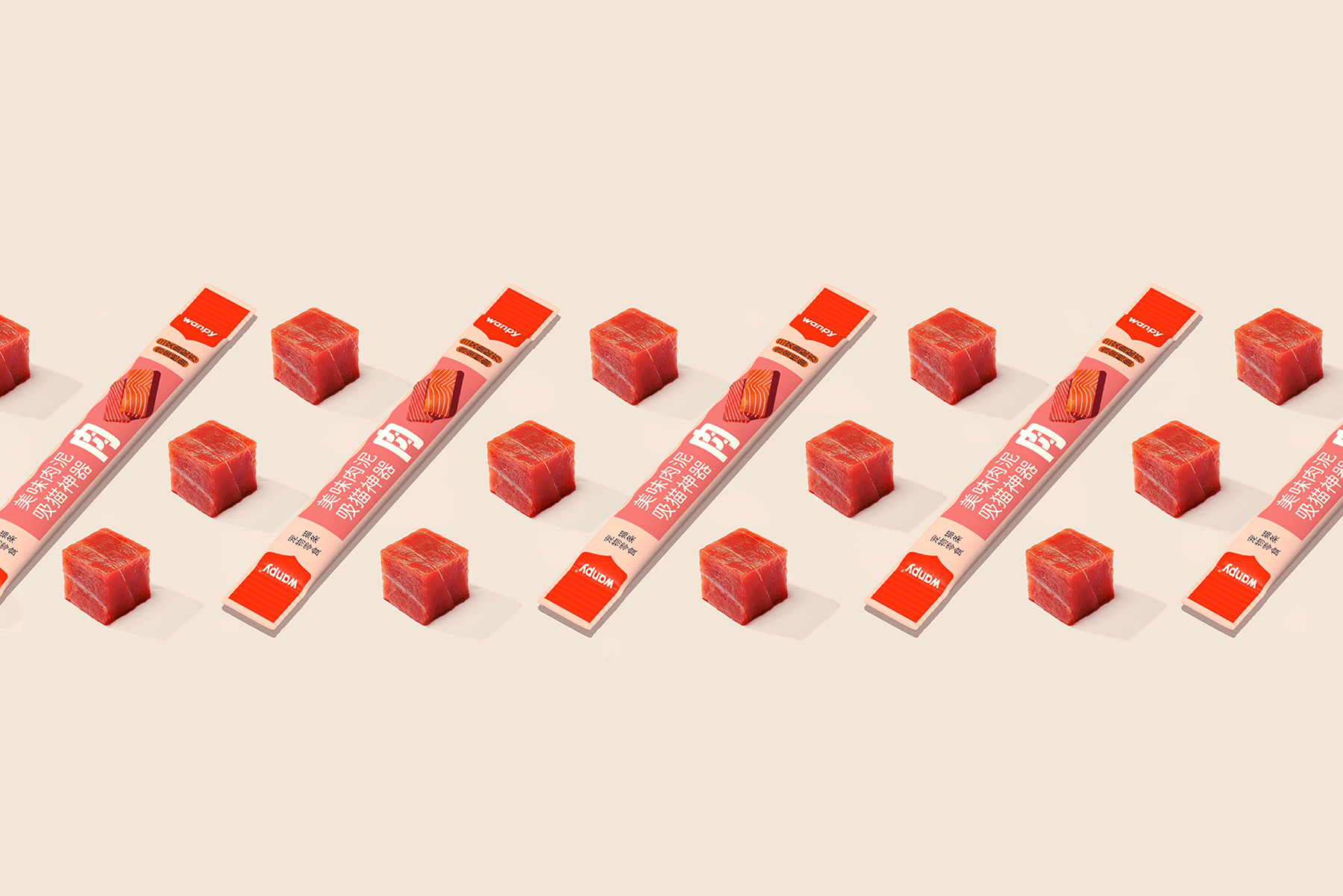
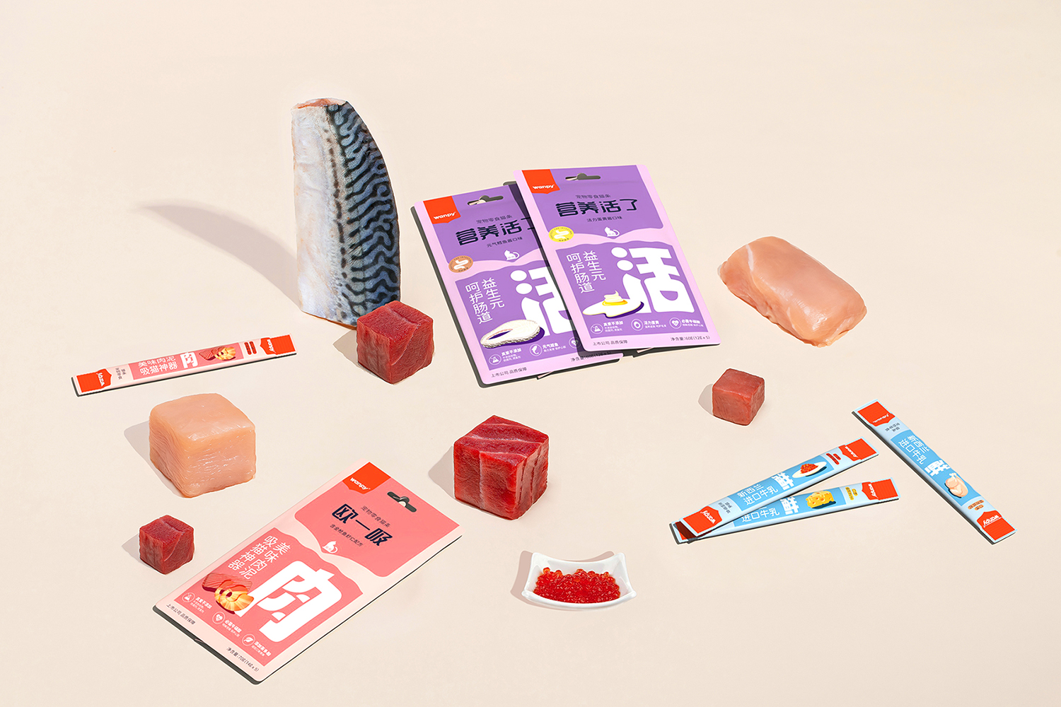
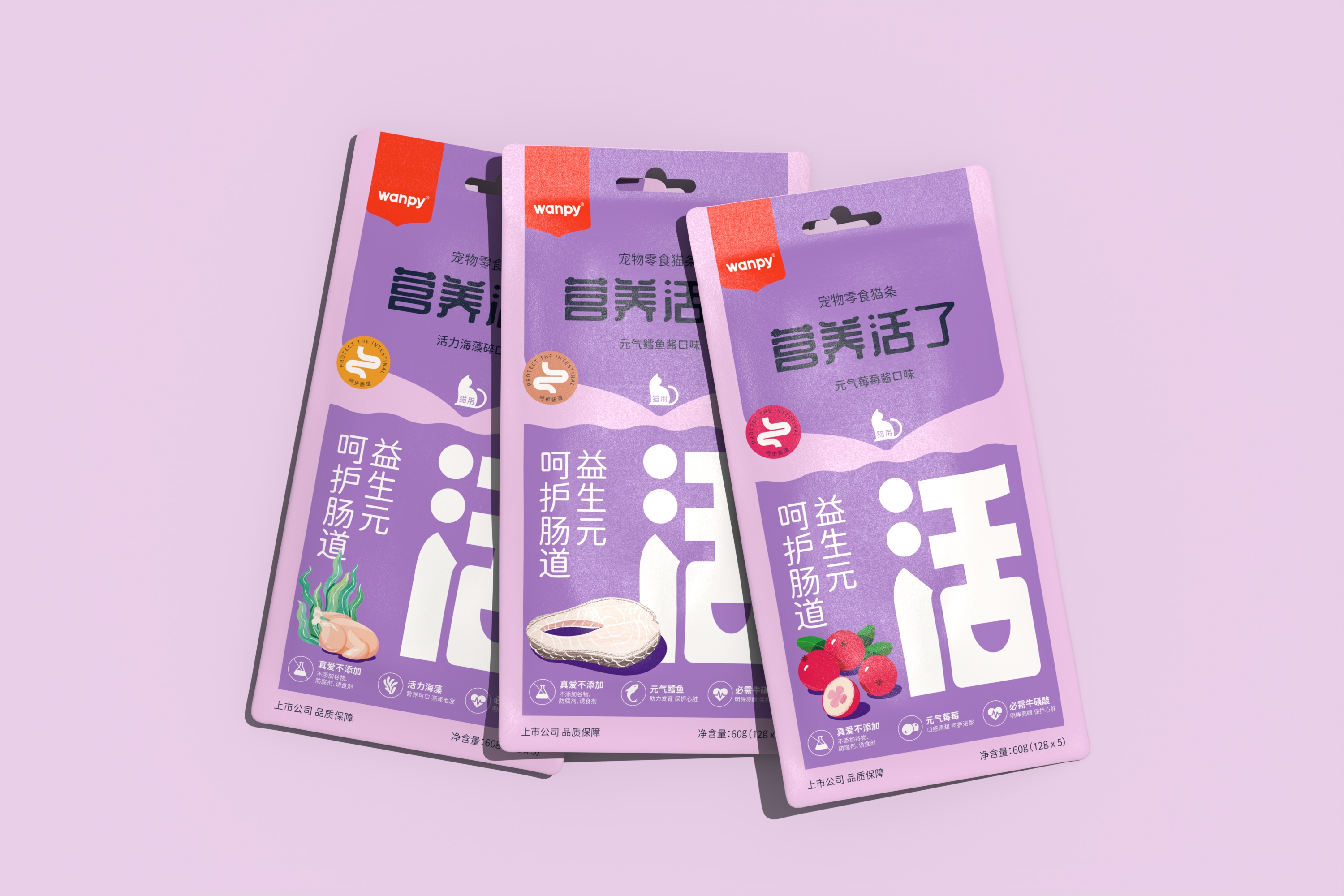
Build a visual framework, establish a series of product logic, multi-level illustration to express the association of food materials, graphic language to form a brand visual symbol, so that the series of products unified and orderly.
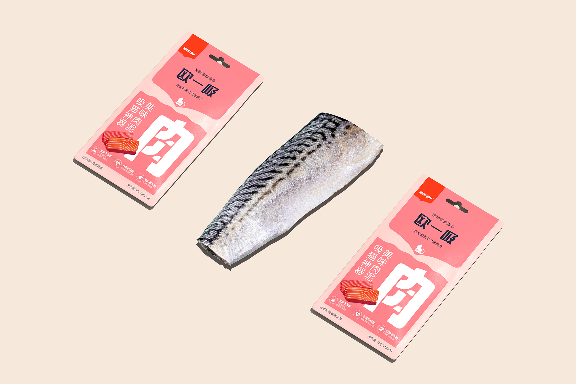
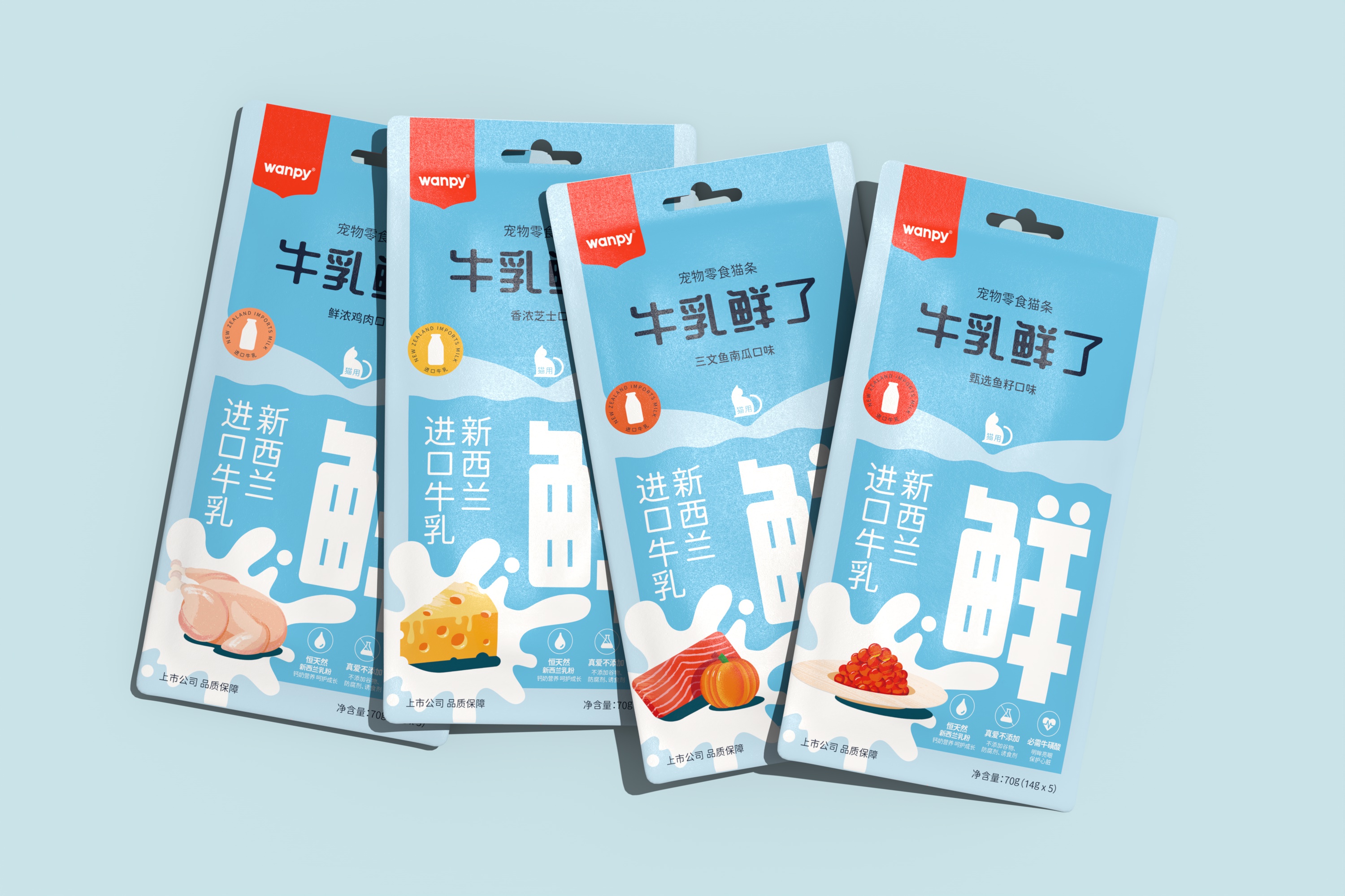
Use interesting illustrations to shape the illustration style of the brand, and use illustrations to replace the original food photography. This sensory expression replacement makes the packaging produce new vision, and the rich colour palette can accommodate more expression possibilities of food ingredients. At the beginning of the packaging update design, we began to discuss the direct trade-off and balance between brand and product personality, we arranged the importance of visual logic, so that the brand texture dominates, followed by the distinction between the series of colors, and finally, the food and product differentiation. At the detail level, ICONS and text arrangement rules are used to standardize the visual style of each package. Our goal is to design a packaging vision system that can accommodate more products and product lines, help the brand express the quality and inclusiveness of the brand, and the future packaging can refer to such visual logic to derive unique brand characteristic packaging.



CREDIT
- Agency/Creative: B&W Graphic Lab
- Article Title: Pet Snacks Creating a Unified Brand Visual Symbol: A Case Study in Food Packaging Redesign
- Organisation/Entity: Agency
- Project Type: Packaging
- Project Status: Published
- Agency/Creative Country: China
- Agency/Creative City: shanghai
- Market Region: Asia
- Project Deliverables: Graphic Design, Packaging Design
- Format: Blister-Pack
- Industry: Food/Beverage
- Keywords: packaging
-
Credits:
Designer: BENXU
Designer: Wynne


