Pâtisserie Chez Mikki, a charming sweet delicatessen located in Tokyo, takes pride in using locally sourced, high-quality ingredients for their delectable baked goods. Renowned for their wide array of freshly baked treats, the shop not only serves customers directly but also supplies pastries to numerous coffee shops and train stations. Seeking to distinguish themselves from others in the market, Pâtisserie Chez Mikki partnered with andKuo to develop a visual identity that effectively conveys their passion for baking and showcases their specialty on the package.
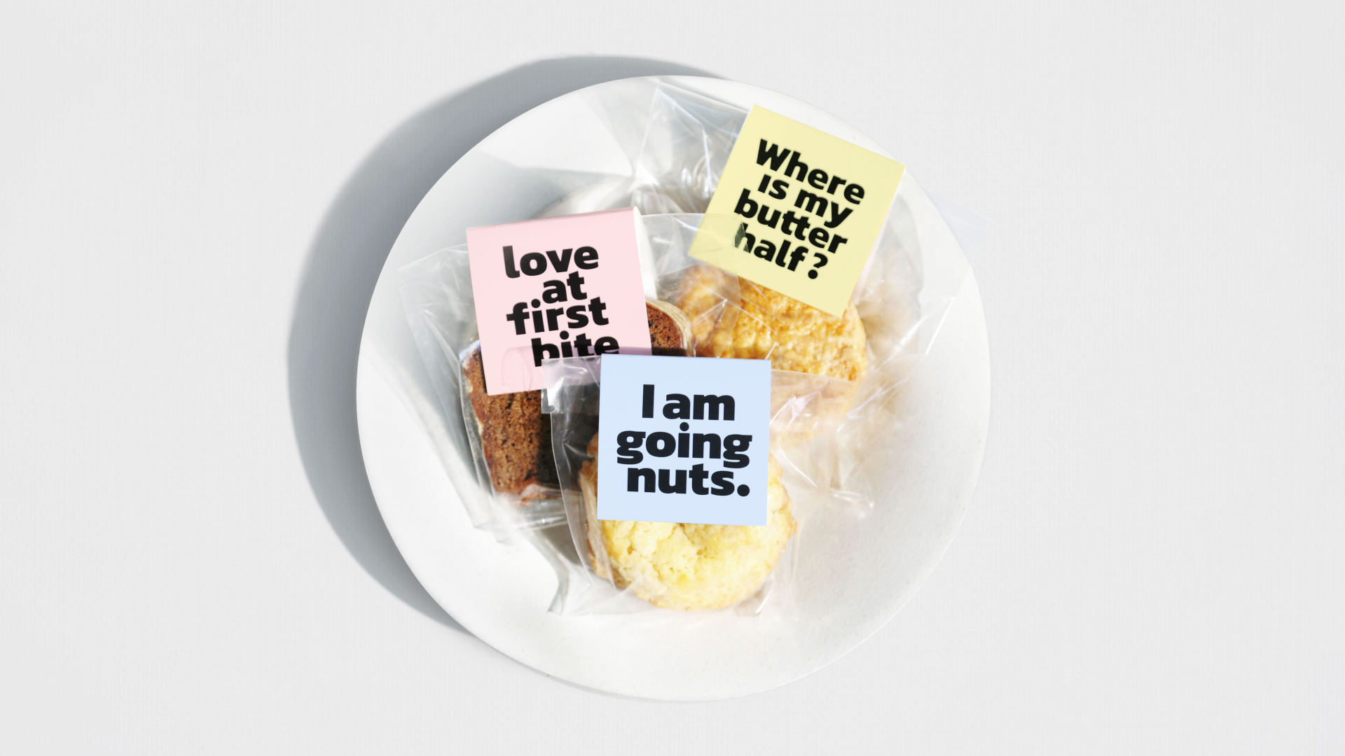
Our work began with thorough industry research and analysis, including an examination of competitors and observations of store displays in shops and stations. Throughout this process, we identified a significant challenge faced by many small pastry businesses: their packages looked strikingly similar in the marketplace. Most utilized plastic sleeve bags with relatively small labels, making it difficult for customers to discern the differences between products.
As we embarked on shaping design direction, we recognized the untapped potential for unique positioning by challenging the traditional hierarchy of messaging. Our solution involved a bold and innovative approach: leveraging the package cover as a dynamic canvas for communication.
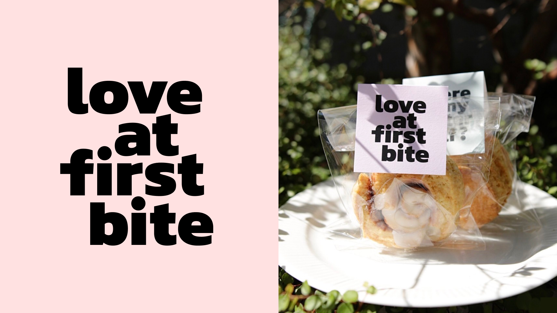
The redesign aims to create a tasteful and visually engaging word universe, incorporating clever messages and bold typography to emotionally resonate with Chez Mikki’s customers. The objective is not only to capture their attention and ignite curiosity about the brand’s offerings but also to bring joy and delight through their day.
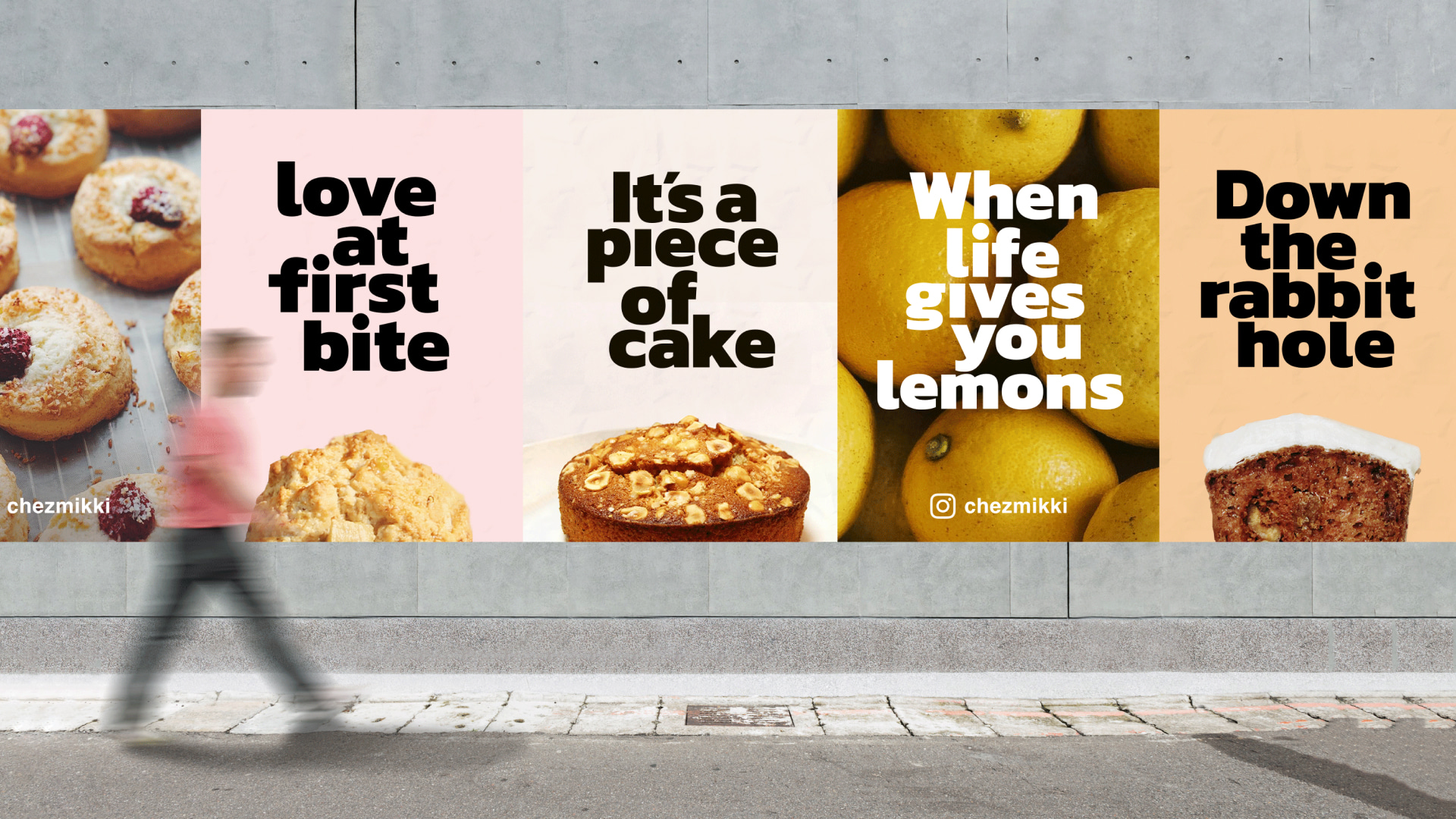
The overall design establishes a robust brand identity with a unified visual appearance. The centerpiece is the typography, commanding attention and effectively communicating the brand’s personality. Pastel colors are strategically employed to highlight each product’s uniqueness, creating visual interest and setting them apart on retail shelves. Additionally, to ensure consistency and structure, we implemented a clean grid system across all print and digital materials, including business cards, out-of-home posters, and social media promotional assets.
The new look has successfully elevated Chez Mikki’s brand presence, creating a cohesive and visually appealing experience for customers across various touchpoints. Since the introduction of the redesign, retail sales have seen a notable increase, with messages that not only evoke positive responses but also spread happiness to the community through the power of words.


CREDIT
- Agency/Creative: Sherry Kuo
- Article Title: Pâtisserie Chez Mikki Packaging Design
- Organisation/Entity: Freelance
- Project Type: Packaging
- Project Status: Published
- Agency/Creative Country: United States
- Agency/Creative City: New York
- Market Region: Asia
- Project Deliverables: Packaging Design
- Format: Bag
- Industry: Food/Beverage
- Keywords: WBDS Creative Design Awards 2023/24
- Keywords: Packaging Design, Product Redesign
-
Credits:
Lead Designer: Sherry Kuo
Project manager: Hsinhui Kuo
Photographer: Hsinhui Kuo, Hidetsugu Watanabe, Noski Onasu, Coffee Elementary School


