A gateway opening onto two cultures.
As part of the creation of a new range of craft beers, a renowned distillery in India entrusted Studio Boam with the mission of designing a new reference identity for a craft beer, with the aspiration of unifying two cultures in a single product. Campai is the meeting between two cultures and two continents.
The starting point of the story between Campai and Studio Boam is a marketing question: how can we conceive of an Indian beer for the domestic Indian market but at the same time exploit European graphic codes. The goal is to succeed in offering an unprecedented signature in the field of global craft beer.
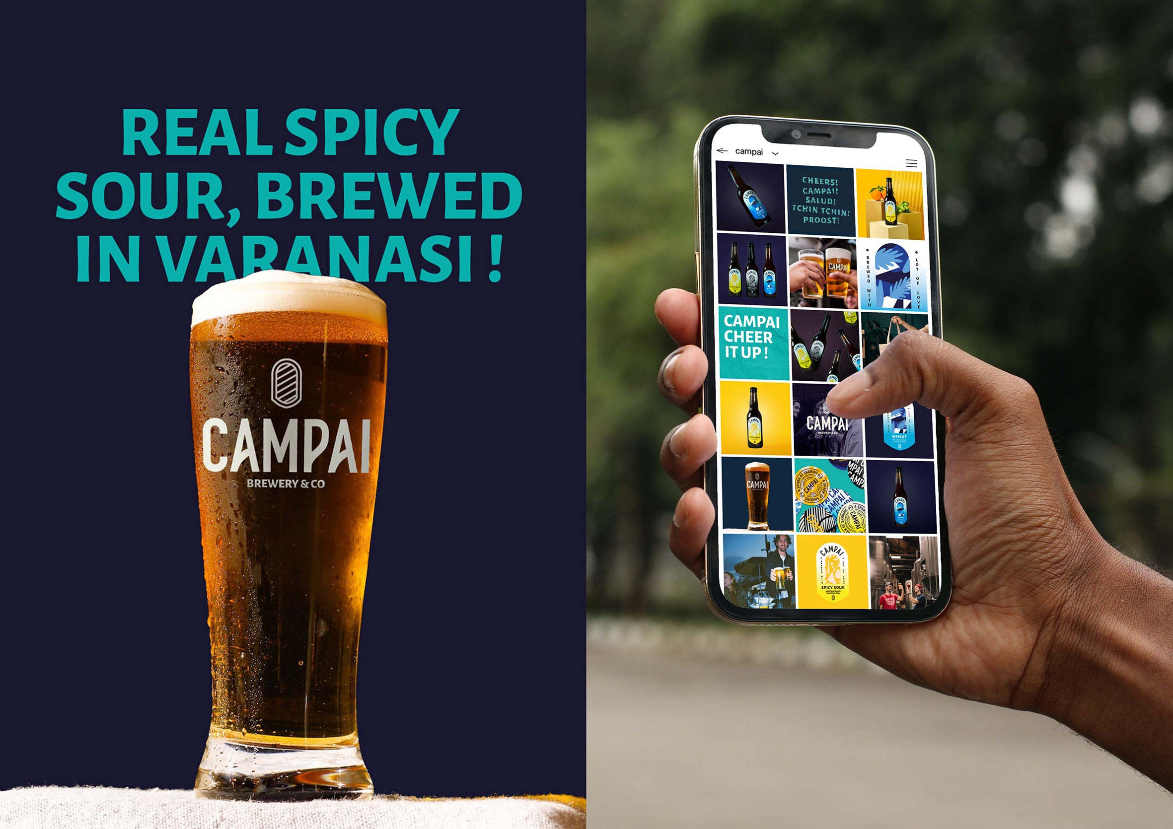
Studio Boam, experienced in the subtle art of mixing branding worlds and explosive cocktails from multiple references, wanted to implement a strong and confident artistic direction based on the great value of conviviality.
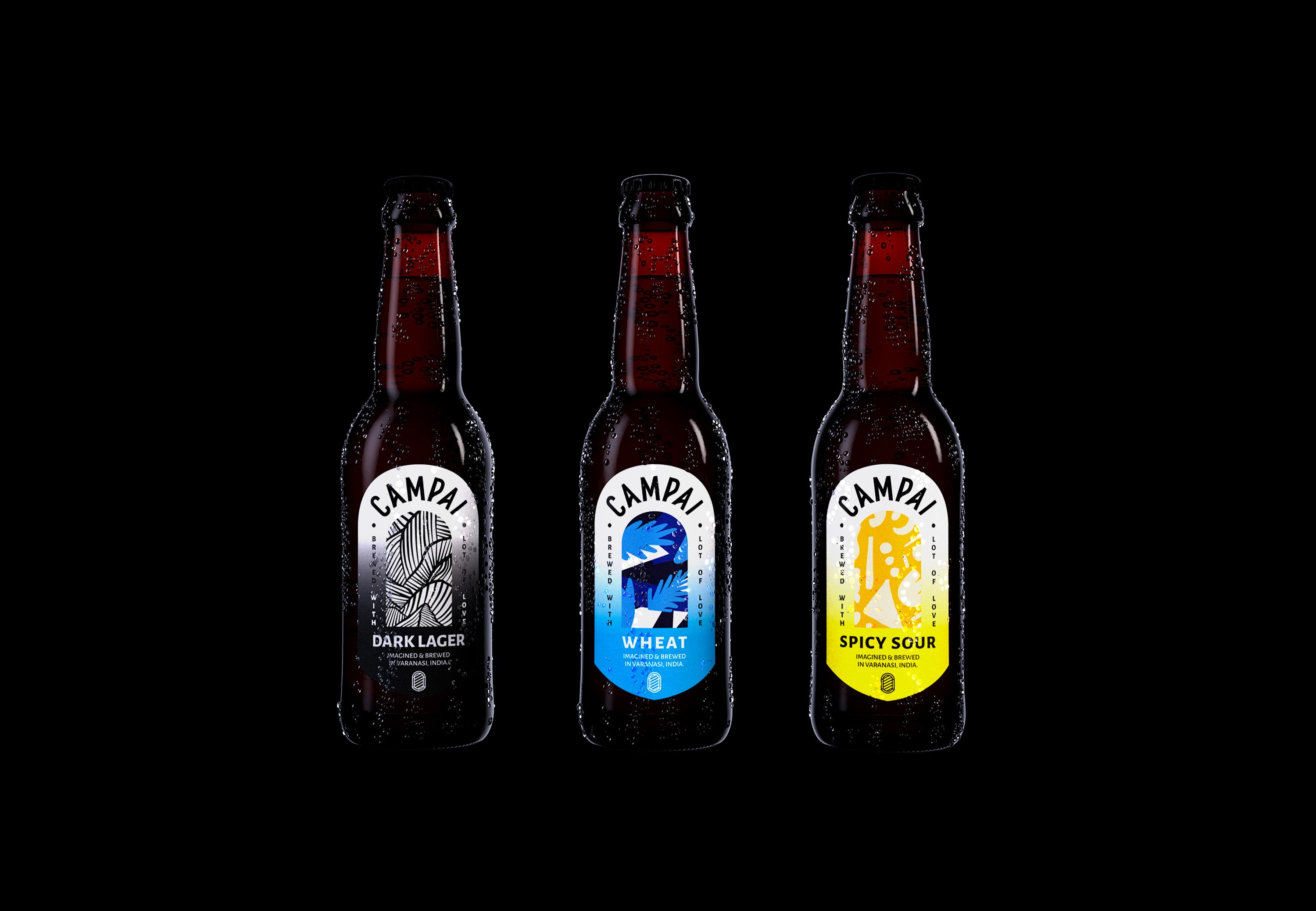
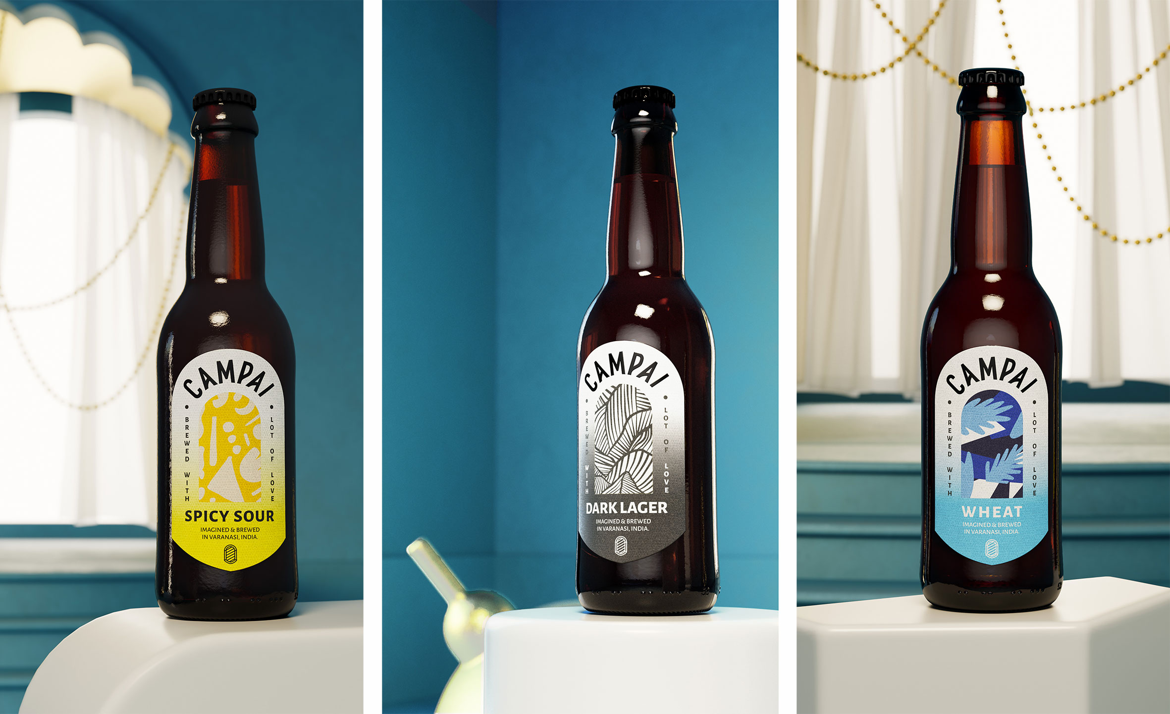
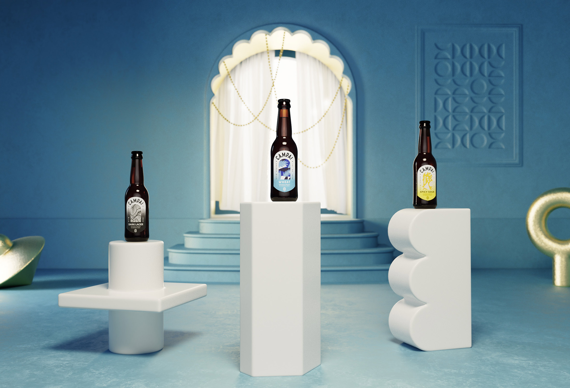
The Campai range, a translation of tchin-tchin, a symbol of international conviviality, revolves around three beer references, each with its specific flavor characteristics and easily identifiable graphics. The graphic concept juxtaposes information or large blocks of text, centered around an abstract visual motif.
This staircase effect pays homage to the architectural composition and the thousands of stairs present in the city of Varanasi, where the distillery originated. It is one of the oldest and most historic cities in India.
The graphic composition of each of the three labels unfolds in a concentric pattern, starting from the center of the work and expanding outwards.
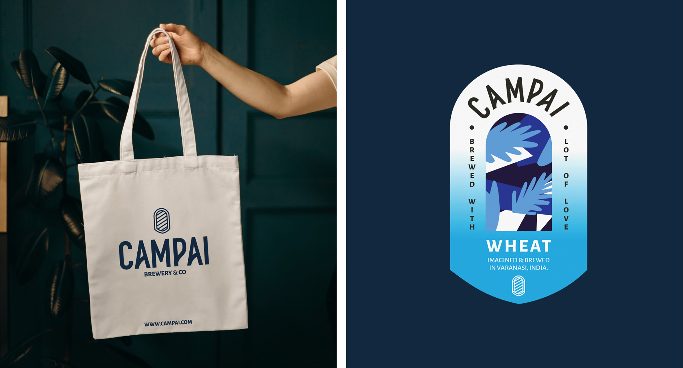
In the center we find in a unique form, the iconic shape of “the door”, a symbol of the openness of cultures to each other. Between European artistic abstractions and Indian weaving patterns, this free space gives the brand infinite possibilities for narrative variations.
On the periphery, tailor-made typography picks up the name of the range and all the other information present. The treatment of this typography alternates between the rigor of the layout and a flexible curve, here too symbolically blending the two cultures in a true expression of their interconnectedness.
Finally, the color choices of each reference accentuate the brand’s visibility and impact among the competition on the shelves of points of sale, but also reinforce its uniqueness in an assertive media campaign.



CREDIT
- Agency/Creative: Studio Boam
- Article Title: Packaging Design for Campai Craft Beers
- Organisation/Entity: Agency
- Project Type: Packaging
- Project Status: Published
- Agency/Creative Country: France
- Agency/Creative City: Paris
- Market Region: Asia
- Project Deliverables: 3D Design, Brand Design, Branding, Graphic Design, Logo Design
- Format: Bottle
- Industry: Food/Beverage
- Keywords: #beer #indianbeer #brewery #graphicdesign #branding #label #3Ddesign
-
Credits:
Creative director: Alexandre Arzuman
Graphic designer: Lucie Thomas
3D designer: Miguel Maldonado


