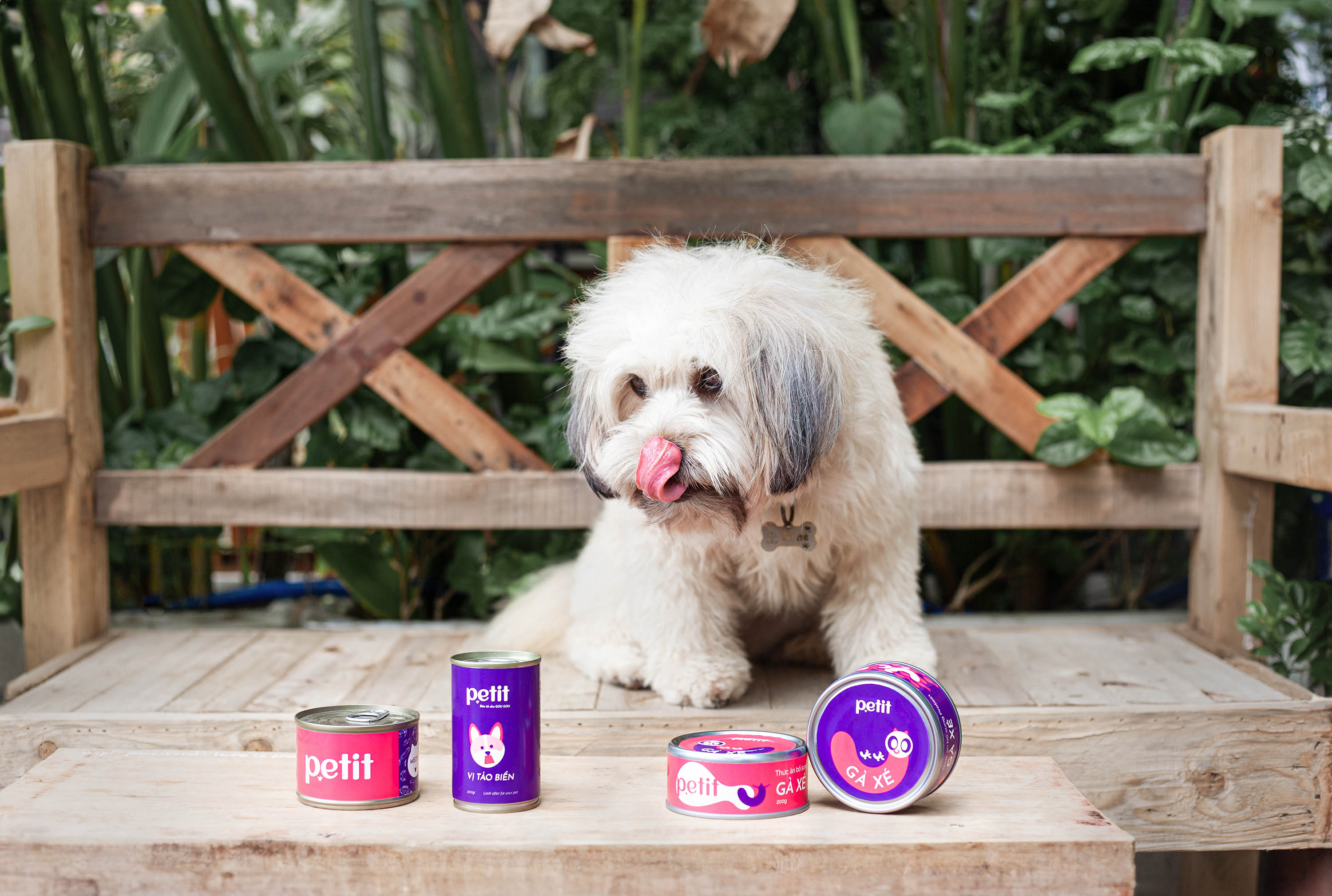
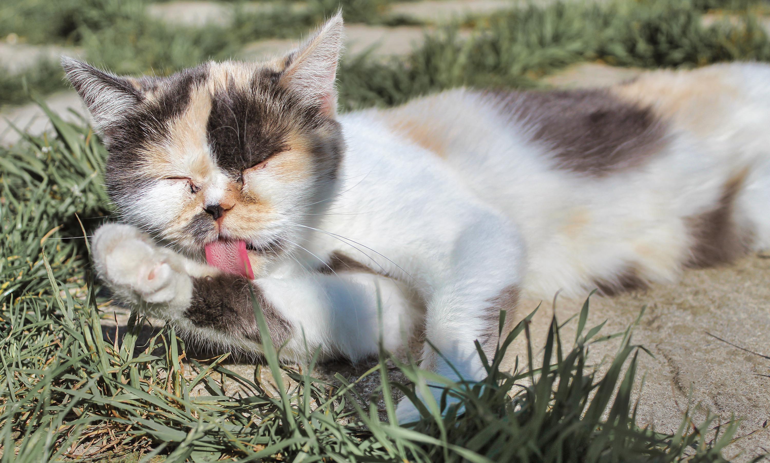
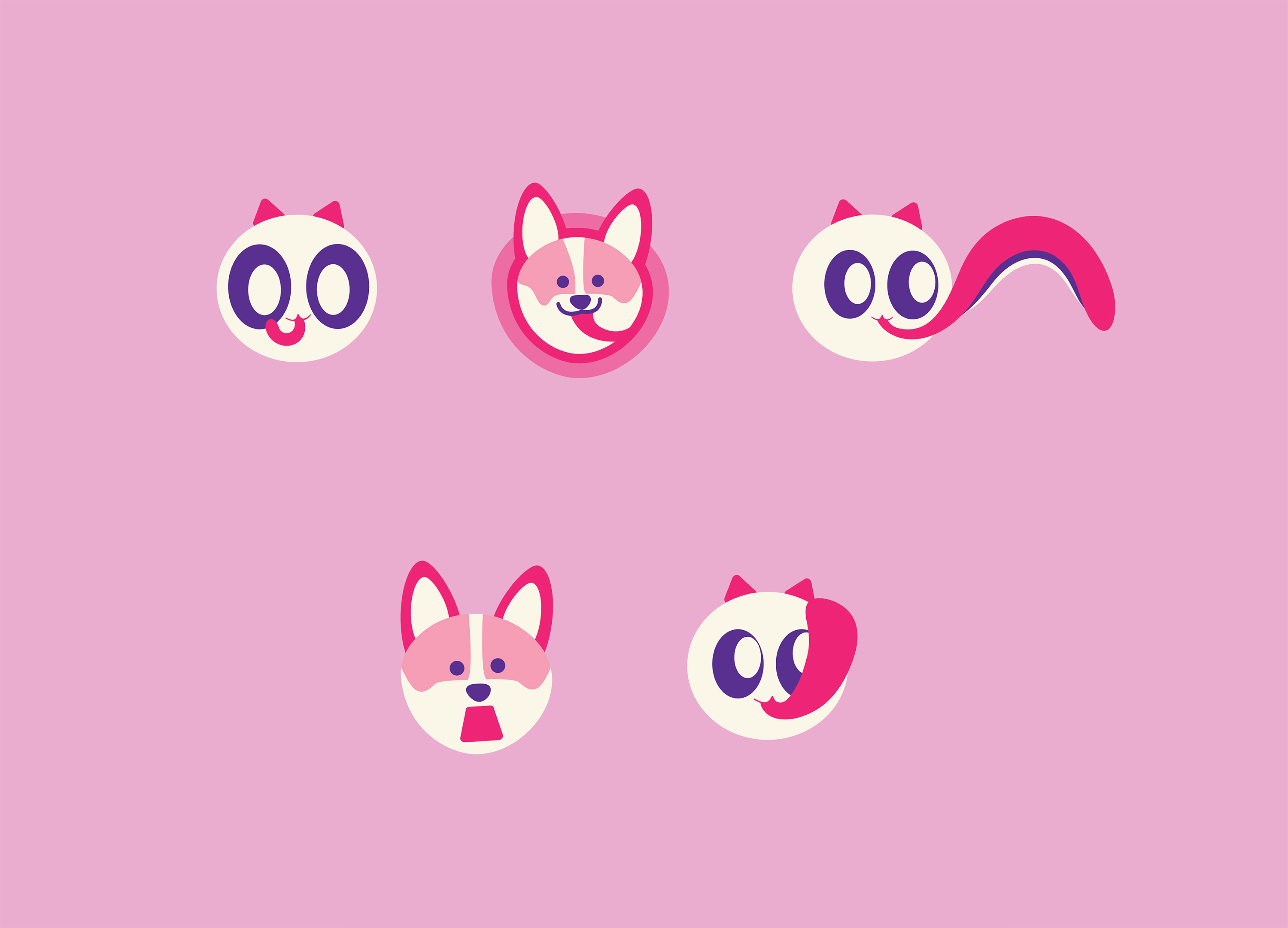
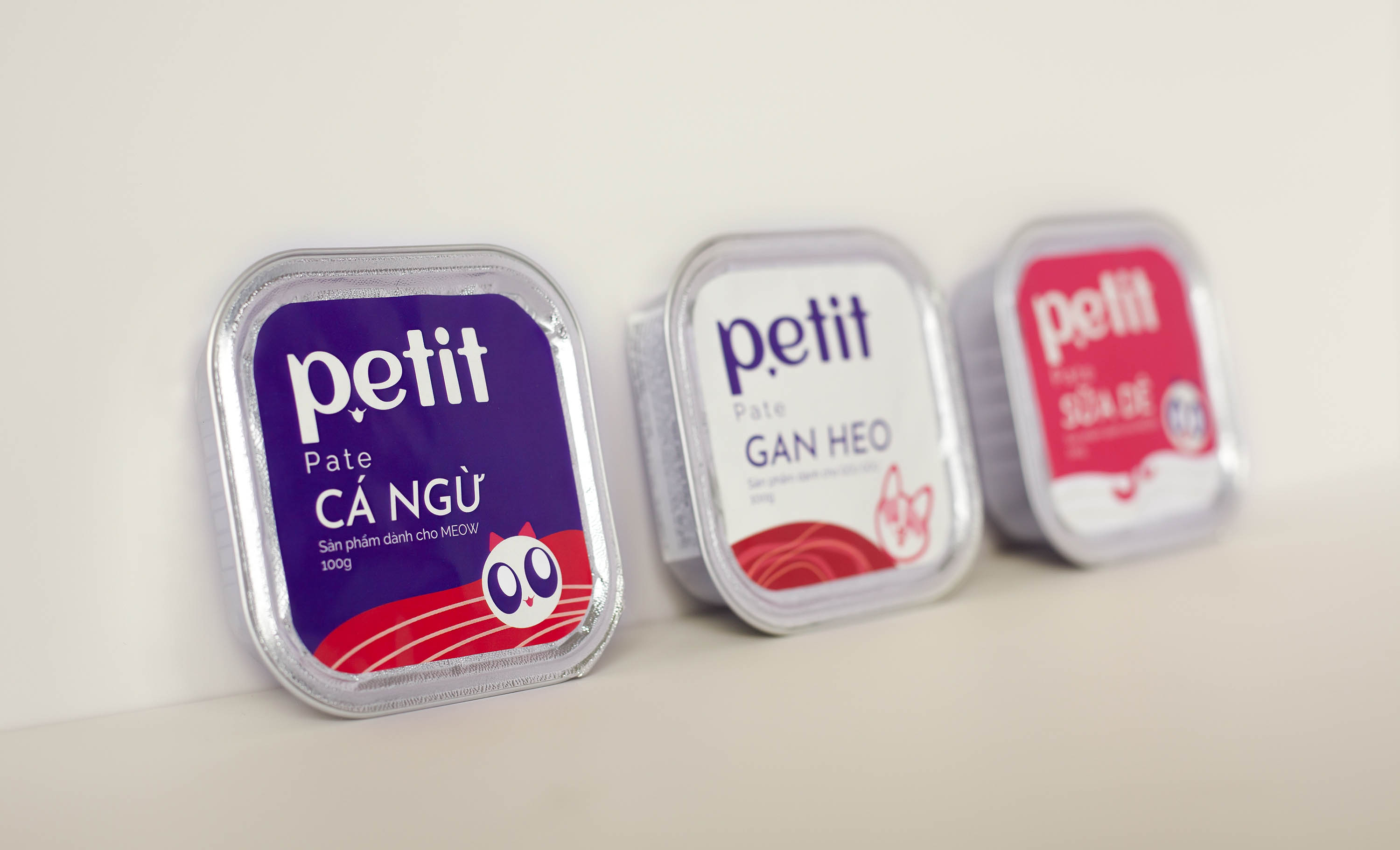
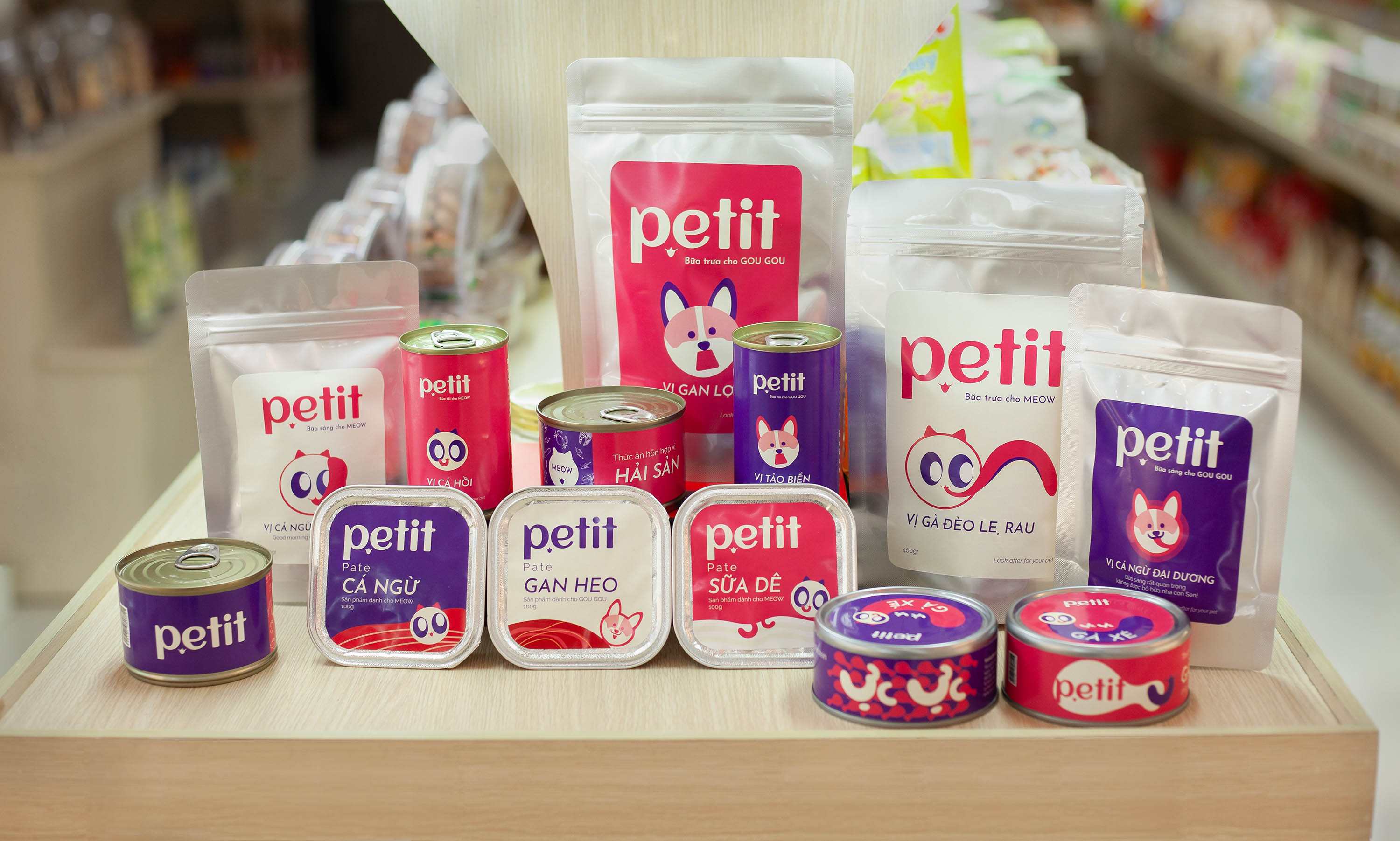
Petit is a brand that provides pet food and accessories. The eyes and tongue of a cat are inspiration to aim for building emotional space in design. Each form of the tongue will represent for each state of the pet, from whining, appetite, eat full to flatter the owner. The tongue is not only used for eating but also used by pets to show affection for their owners. Petit focuses on emotions, anthropomorphize pets from pets in the house become a companion, cared for and protected.
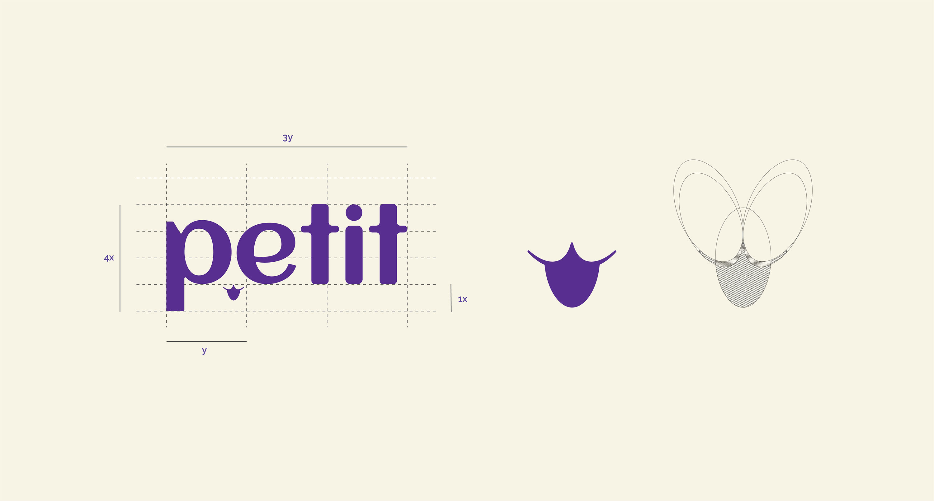
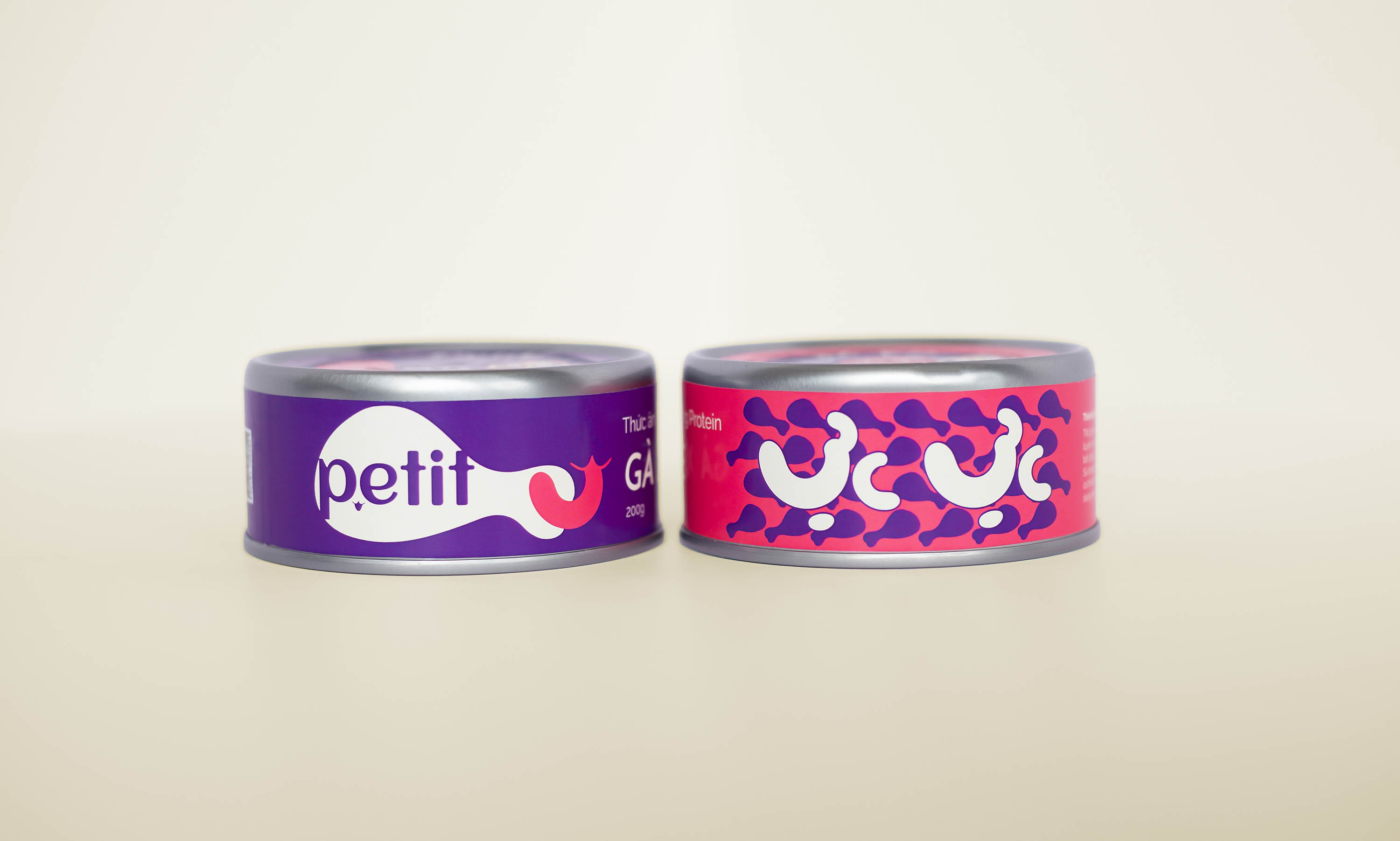
The logo evokes the image of a cute cat’s face with its tongue sticking out and one eye closed, creating the cutest, cutest hello image of a pet. In there, the element of negative space is used to the maximum to create depth appeal. Graphic elements are arranged compactly, combined with fonts that aren’t edited. All aimed at creating simplicity, easy to remember, easy to see the main highlight but no less cute, loveable like the brand personality.
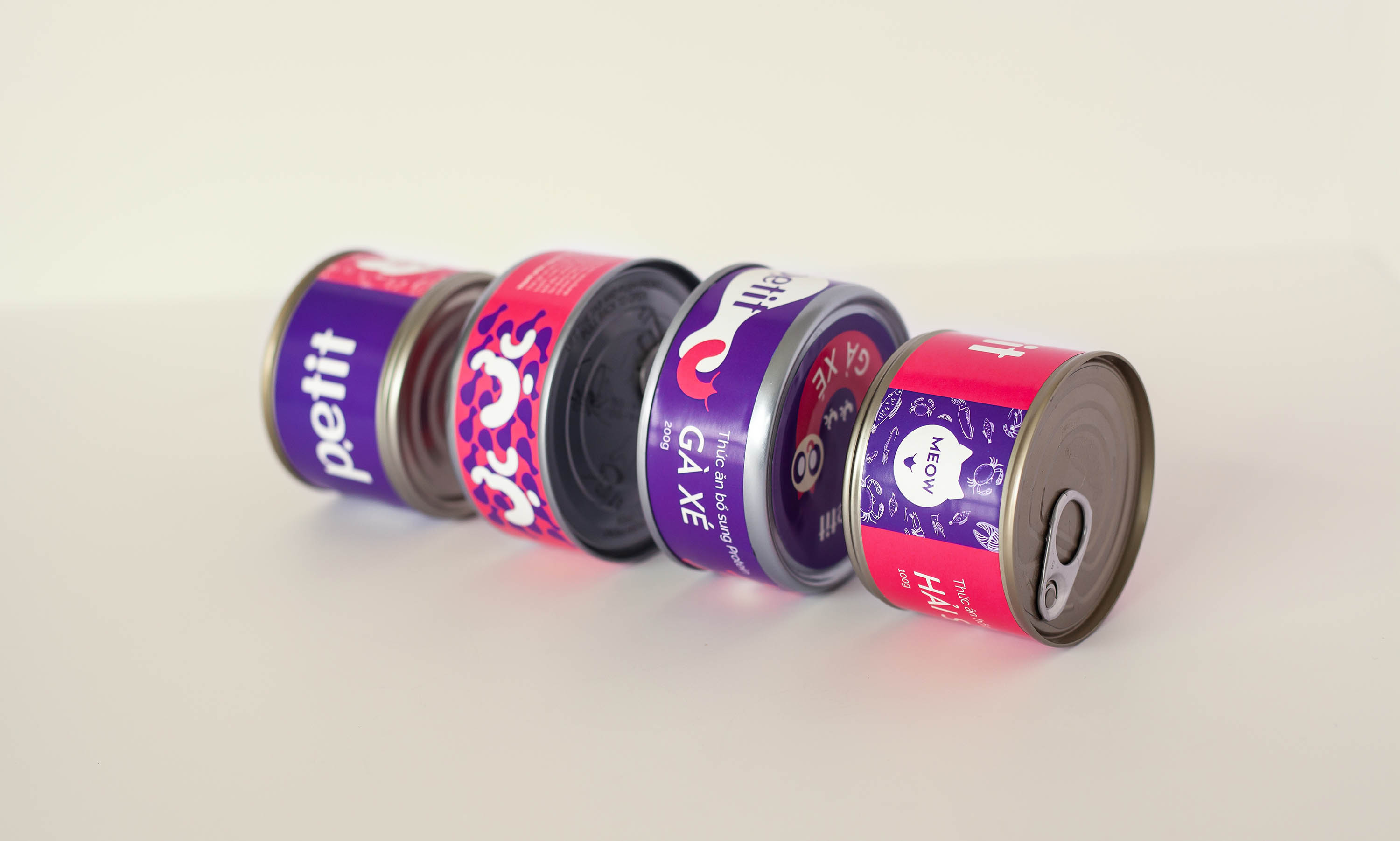
Colors are selected based on complementary, support, to create balance for the whole. Purple color with deep bass properties, create trust, durability, loyalty represents quality, reputation that the brand targets for each product. In the other direction, pink color with youthfulness, dynamism, and personality to represent joy, youthfulness, modernity, creative innovation suitable for customer segments are people of the younger generation. By providing the main product of pet food, so the color representing the food chosen is beige. Beige with neutral characteristics acts as a balance for purple and pink.
Typography with two Sans Serif Typefaces are Josefin Sans and Raleway. Josefin Sans exudes personality, at the same time, it is no less certain expressed through sharp contrast of characters. In the other direction, Raleway with plump characters, steadily, evokes hilarity, lovely, close. Typography in the project has contributed to expressing well the key personalities that the brand wants to target.
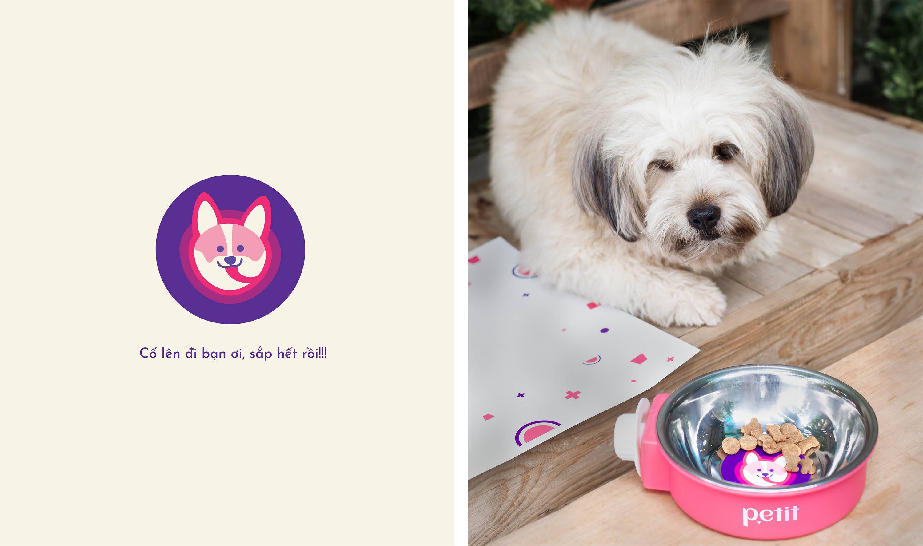
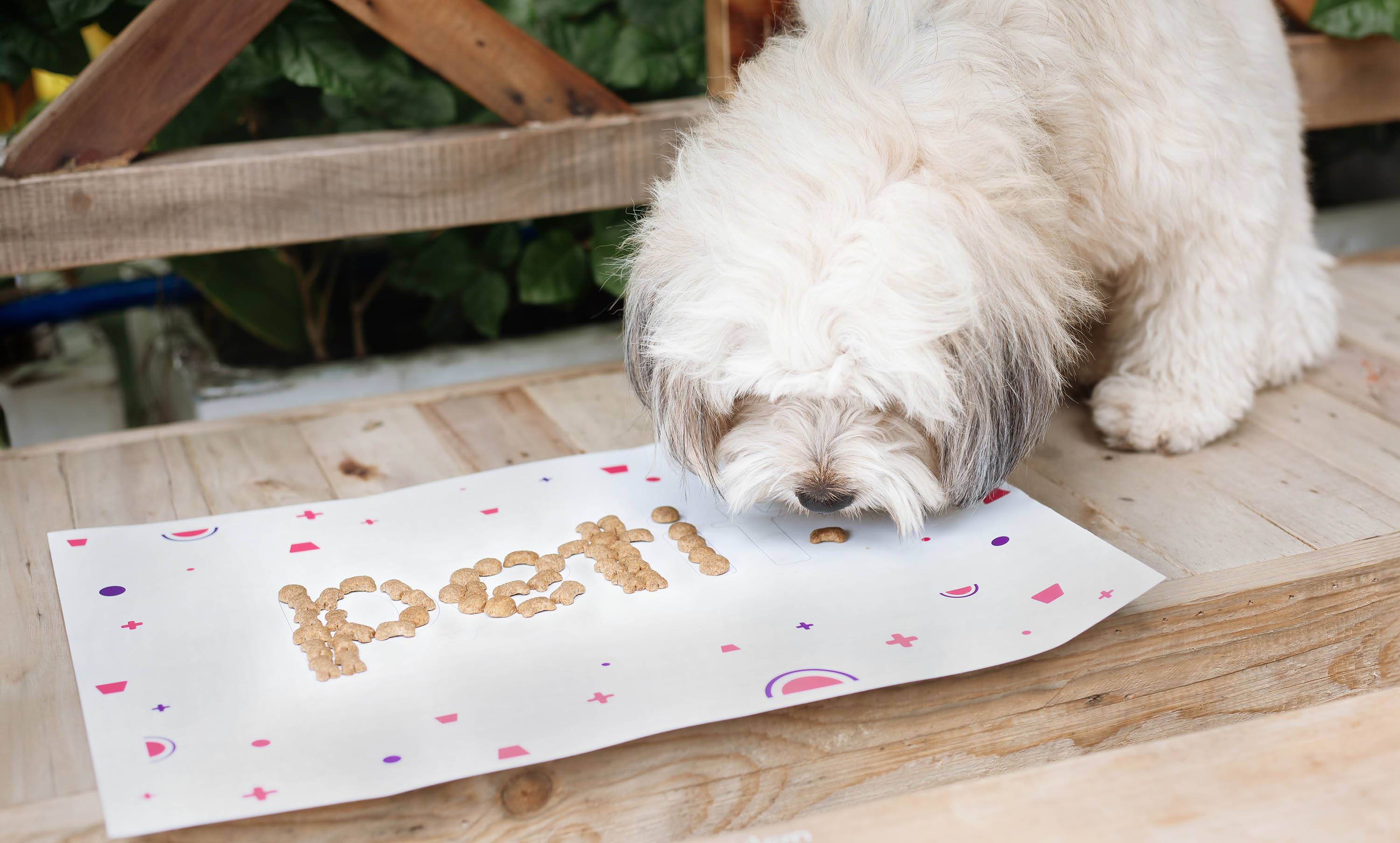
Emotions are what make the soul vibrate. This project focuses on highlighting the cute emotions of pets. It is the emotional harmony between pet and owner that creates the bond of friendship on the journey together.
CREDIT
- Agency/Creative: Horus Academy
- Article Title: Petit Brand Identity Design
- Organisation/Entity: Student
- Project Type: Identity
- Project Status: Published
- Agency/Creative Country: Vietnam
- Agency/Creative City: Horus Academy
- Market Region: Asia
- Project Deliverables: Brand Identity
- Industry: Food/Beverage
- Keywords: pets, horusacademy, brand identity, packaging, food
-
Credits:
Made at: Horus Academy
Designer: Minh Tu, Truong Giang
Photographers: Minh Tu, Truong Giang
Instructors: Phuoc Thien, To Quyen, Minh Tuan


